Japanese architect Ryue Nishizawa has teamed up with design studio Nendo to create a hillside pavilion, filled with stools designed to look like troops of wild mushrooms (+ slideshow).
Nishizawa, who is best known as one half of architecture duo SANAA, worked with Nendo to construct the wooden pavilion on a steep hillside on the campus of Kyoto University of Art and Design.
The smooth timber roof of the structure follows the incline of the hill and is supported by dozens of narrow timber columns. In some places these are anchored into the ground and in other spots they are fixed to the surface of an outdoor staircase.
“The pavilion’s spatial experience is intended to remind visitors of walking in the mountains under thick tree cover,” said the designers.
Curved steel tubes were used to make a series of stools both inside and outside of the shelter, and were designed with different shapes and sizes to mimic the way fungi grows in the wild.
“We wanted to design architectural elements that would ‘grow’ naturally from the space, rather than to put furniture in a room,” the designers explained.
Some stools form an extension to the staircase balustrade, while others wrap around columns and some interlock with one another.
The university plans to plant a grove of Japanese plum trees on the site next to the pavilion. “Their fragrant early spring blossoms will only add to an already beautiful site,” added the designers.
Here’s a project description from Nendo:
A small pavilion “roof and mushrooms” in Kyoto
A small pavilion on the campus of Kyoto University of Art and Design, born from a collaboration between architect Ryue Nishizawa and design office nendo. The location: a steep hill face covered in luxurious vegetation.
On a clear day, you can almost count the 36 crests of the hills that line Kyoto’s eastern edge. The adjacent area is earmarked for a new grove of Japanese plum trees, and their fragrant early spring blossoms will only add to an already beautiful site. Nishizawa used a single roof to incorporate these elements into the pavilion’s design.
The roof is subtly inclined to follow the angle of the site. Dipping under it, visitors realise that the roof, delightfully and ambiguously, is also a wall.
The pavilion’s spatial experience is intended to remind visitors of walking in the mountains under thick tree cover.
To date, many of Nishizawa’s buildings have felt like bright, open and airy fields or gardens, and the furniture inside them like wildflowers that blur the boundary between interior and exterior space while adding brightness and colour.
But for the shady interior of this wooden structure, clinging onto the hillside exposed to the elements, we thought that furniture like fungi would be much more appropriate.
Our mushroom-like stools for the space were handmade by artisans to slightly different shapes and sizes, giving a more natural effect.
The stools’ layout – clustered at the base of pillars, or in the nooks and crannies by stone walls and staircases – evokes the way that mushrooms growing the wild, and details like a handrail that transforms into a mushroom continue the metaphor.
We wanted to design architectural elements that would ‘grow’ naturally from the space, rather than to put furniture in a room.
Japanese architect Kazuyo Sejima has added a circular courtyard and a renovated timber shed to her series of galleries on Inujima island, Japan.
A-Art House
Sejima, the female partner of architecture studio SANAA, has been working on the Inujima Art House Project since 2010, when she and art director Yuko Hasegawa opened three galleries and a small pavilion in the island’s village.
A-Art House
The two new buildings, entitled A-Art House and C-Art House, will join F-Art House, S-Art House and I-Art House to create a series of spaces that can host coinciding exhibitions.
A-Art House
Clusters of artificial flower petals decorate the acrylic walls of A-Art House, giving a colourful backdrop with shades of pink, orange and yellow to the open-air courtyard that makes up the space.
A-Art House
Instead of a precise circle, the structure has gently fluted walls that bulge outwards, creating an outline reminiscent of a flower shape. A rectangular opening forms an entrance through one of the walls, while silver stools offer a pair of seats for visitors.
C-Art House
C-Art House, the second of the two galleries, occupies a renovated nineteenth-century timber shed near the coastline.
C-Art House
The structure of this building is revealed inside, where ageing wooden trusses are supported by modern timber columns. Timber panels line the walls, while a panoramic screen provides a surface for film screenings.
C-Art House
To tie in with the opening of the new galleries, all five spaces are presenting a combined exhibition where each space is dedicated to the work of a different artist.
News:Japanese architecture studio SANAA has won a competition to design the Taichung Cultural Centre in Taiwan.
SANAA‘s proposal for a stack of warped cuboids beat proposals by international firms including Eisenman Architects of New York and Mass Studies of Seoul.
Translucent mesh will be draped from the edges of the roofs to create curving curtains around the buildings. The cuboids will sit at angles to one another and overlap at the corners to link exhibition spaces, libraries and reading areas within the new Taichung Cultural Centre.
Visitors will enter through a large plaza beneath the volumes in the centre of the complex. Inside there will be three main storeys interspersed with mezzanines.
A spiralling ramp will connect private study areas piled on top of each other around the sides in one of the largest spaces. The offset volumes will create large covered outdoor spaces and roof terraces, providing seating areas for cafes.
News: Japanese studio SANAA has presented designs for a new campus for Israel’s leading design school within Jerusalem’s historic Russian Compound.
Scheduled for completion in 2017, the new 37,000 square-metre campus for the Bezalel Academy of Art and Design will be constructed in one of Jerusalem’s oldest districts, between the Holy Trinity Cathedral and the Museum of Underground Prisoners.
Architects Kazuyo Sejima and Ryue Nishizawa of SANAA are working alongside local firm Nir-Kutz Architects on the design of the building, which is intended to encourage collaboration between the eight traditionally separate departments of the school.
Classrooms and studios will be arranged over a series of staggered horizontal slabs that correspond with the site’s natural topography. Numerous ramps and staircases will connect the split levels, while voids in the floorplates will create balconies between floors and increase natural light.
The plans also include a pair of auditoriums, public exhibition galleries and cafes for both students and visitors.
Here’s a project description from the design team:
The site of the new campus for the Bezalel Academy of Arts and Design is located on the top of a hill in the Russian Compound, overlooking the old city of Jerusalem. The Academy includes several departments comprised of studios, classrooms, workshops and administration offices and of public areas such as exhibition galleries, a store, a café and a cafeteria.
The building is composed of slabs. The slabs are stacked following the natural gradient of the landscape, and all are at different levels. Throughout both the exterior and the interior of the building, the slabs are connected through ramps and stairs so that it is possible to walk freely from one to the other, moving horizontally and vertically.
On the exterior, the slabs connect to form a terraced roof overlooking the city. On the interior, the slabs are detached from one another to create vertical void spaces throughout the building. The void spaces allow visual connection between different parts of the program that are hosted on each slab. As a consequence, each part of the building maintains its independence, but at the same time is fully connected with all other parts. Because of the layout of the slabs, natural light can filter freely through the building both from above and from the sides, penetrating also in those spaces that sit in the middle of the largest footprint areas.
The scale of the building is determined by its context and by its program. The volume is composed to fit properly within the city of Jerusalem and, at the same time, accommodate the spaces necessary for students and faculty of the Academy to work comfortably. The building also fits into the natural context as it mimics the terraced landscape, and resonates with its colour and texture.
Japanese studio SANAA has completed a circular production hall with rippled acrylic walls for furniture brand Vitra, making it the latest addition to the firm’s campus of buildings by famous architects in Weil am Rhein, Germany (+ slideshow).
Architects Kazuyo Sejima and Ryue Nishizawa of SANAA were asked to replace an old factory hall with a larger facility to accommodate production and distribution for Vitra’s shop-fitting company Vitrashop.
The new single-storey building features a circular plan that can be subdivided to allow separate operations to take place simultaneously. The main section of the production hall is used for product assembly, while the northern side provides a stockroom for materials and the southern end is used for the storage of finished products.
The undulating plastic cladding encases the entire facade, concealing the building’s prefabricated concrete and steel structure. Each acrylic component comprises a transparent exterior and an opaque white inner layer, and was vacuum-moulded to create the wavy shape.
Loading bays are distributed around the perimeter and can be converted into offices if necessary. There are also a few windows positioned along the tops of the walls, plus skylights help to bring more natural light in through the roof.
The SANAA-designed Factory Building joins structures by a host of internationally renowned architects on the site, including Herzog & de Meuron’s VitraHaus showroom, the Vitra Design Museum by Frank Gehry, a conference hall by Tadao Ando and a fire station by Zaha Hadid.
Photography is by Julien Lanoo, apart from where otherwise stated.
Here’s a more detailed project description from Vitra:
Development of the Vitra Campus
After 1993 – the year in which Tadao Ando’s Conference Pavilion and the Fire Station by Zaha Hadid were completed, followed by the dedication of Álvaro Siza’s factory hall one year later – no new buildings were constructed on the Vitra Campus in Weil am Rhein for more than a decade. A new expansion phase began in 2006 with commissions assigned to Herzog & de Meuron and the Japanese architectural team SANAA. The Basel-based architects were entrusted with the VitraHaus project on a site outside of the actual production compound in the northern corner of the Campus. The VitraHaus, which opened in early 2010, serves as a presentation venue for the Vitra Home Collection and marks the entrance to the company premises together with Frank Gehry’s Vitra Design Museum. SANAA began to plan a production facility for Vitrashop – a shop fitting company within the Vitra Group – on the south side of the Campus. The completion of these two new buildings also achieved a partial restructuring of the Campus grounds by separating operational logistics from public visitor traffic. The central axis leading to the Hadid Fire Station is now mainly used by visitors, while deliveries and dispatches are primarily routed through the access road that lies on the eastern side of the premises.
Photograph by Christian Richters
A production facility without a role model
Almost all of the major projects that SANAA has completed up until now have been buildings for cultural institutions or universities. In Weil am Rhein – with the first industrial facility to be designed by SANAA – the idea was to apply a similar approach to the construction of a production hall.
The plan for the new structure was initiated by the desire of Vitra’s management to replace an old factory building near the southern corner of the premises that had survived the great fire in 1981 with only minor damage. The extant building was not only showing its age, but was also too small for current demands. The new facility was to provide 20,000 square metres of floor area – compared to 12,000 square metres in the old structure.
The architectural brief presented to SANAA by the company management specified a division of the total space into four separate areas that could operate independently from one another, but would also provide optimal conditions for operations that required use of the entire space. After making a detailed analysis of the brief, SANAA suggested that the preliminary decisions be revised, replacing the four orthogonal volumes that were correlated to the existing grid of the Campus with a single circular building. This proposal, which at first seemed unusual, was based on the realization that logistics and production methods no longer adhere to strictly hierarchical principles, but require flexibility. This was especially true in the case of the future occupants of the new facility, the shop fitting company Vitrashop. Although Vitrashop primarily utilizes standard components in the interiors that it creates for retail and commercial customers, the elements are customized to suit the specifications and desires of the individual clients. This contradicts a strictly linear flow of goods and fabrication methods. Consequently, the interior of the hall is divided into different zones: the northern section provides high rack storage for delivered materials and semi-finished goods; the central zone is reserved for assembly operations; and the southern section contains the storage area for finished products prior to shipping. The circular footprint of the building permits the delivery and loading of goods in completely different locations, so that the flow of traffic inside the hall is reduced, optimized and simplified. The assembly zone in the middle of the building can also be variably configured to meet new requirements based on current orders.
A circular footprint is unusual for a factory building, but all of the conditions in Weil favoured this solution, so that SANAA was able to convince the client to accept their proposal. Another ideal feature of the circular structure is the proportional relationship of the façade’s surface area to the volume of the interior space.
With a diameter of more than 160 metres, the round production hall – which in fact does not circumscribe an exact circle – covers a greater surface area than any other building on the Vitra Campus. Measuring 11.4 metres in height, the hall contains a basement storey in the southeastern half with a spacious underground parking garage and several auxiliary rooms. The building was erected in two stages in order to minimize interference with daily operations. The first semi-circular structure was erected next to the old factory, which was subsequently demolished to make room for the corresponding second half that completed the plan. The façade and the diameter wall that separates the two halves of the building are made of prefabricated concrete elements. Positioned as upright rectangles, the double- walled concrete elements were filled on site, thereby connecting them with one another. Due to the enormous dimensions of the perimeter, it was unnecessary for the individual elements to be curved. Together with the central wall, the round shape creates a perfect, rigid structure, which contains an orthogonal steel framework in its interior. The roof construction is supported by 9.5 metre-high steel columns positioned in a grid based on units of 17.5 x 22.8 metres. Since the exterior concrete walls brace the structure, it was possible to minimize the dimensions of the interior columns.
One of the major challenges for the architects was to find a solution for the installation of complex building technology – electronics, ventilation, roof drainage, fire sprinklers etc., which are distributed in different configurations throughout the interior space – that was compatible with the filigree components of the hall’s support structure. This problem was solved with astonishing precision, resulting in an interior that is clearly different from typical factory spaces. The architects did not treat this interior as a multifunctional, flexible empty space within the shell of a façade, but as a central aspect of the architectural task. Every detail, right down to the screws in the high rack storage shelving, reveals the design intentions of the architects, who left nothing to chance. Excellent lighting conditions contribute to the pleasant work atmosphere in the hall, provided by the close rhythm of parallel rooflights in the ceiling. They are augmented by individual windows in the upper part of the façade. Another essential element of the interior’s atmospheric quality is the radically reductive use of colour. Various shades of grey and white define the interior space, while the signal colours so common to typical industrial interiors are completely absent.
The shelving system, which is positioned in parallel rows that follow the structural grid of the interior – along with the central wall and sparingly distributed windows – provides a means of orientation in a building with enormous dimensions. The high rack storage system can be removed or reconfigured as needed. The loading bays are arranged on both sides of the building in a space along the façade that also contains offices. The radial arrangement of the partition walls is almost imperceptible due to the huge diameter of the hall. Depending on future needs, loading bays can be transformed into offices or vice versa. A workshop for emission- intensive or high-decibel activities is the only other enclosed room on the eastern side of the hall; the open upper deck serves as a lounge area.
Curtain façade
The design of the façade, whose elements are suspended in front of the exterior insulation on the concrete walls and encompass the entire building volume, presented a great challenge. The façade elements are made of acrylic glass with an undulating surface, measuring 1.8 metres in width by 11 metres in height – equal to the height of the building. The outer layer of acrylic is completely transparent, while the inner layer is an opaque white colour. The individual panels were first cast in flat sheets, then heated to 60 degrees Celsius and vacuum moulded to create the wave structure. Since no manufacturer could be found who was capable of moulding such large pieces, an oven had to be specially constructed for the purpose.
One of the architects’ main concerns was to avoid obvious visual repetition. For this reason, three different elements with varying wave patterns of narrower and wider folds were developed. Since the hanging panels – whose mounting hardware is concealed – can be rotated 180 degrees and mounted on either end, this resulted in a series of six distinct types. The aim was to arrange them in a way that avoided a recognizably repetitive pattern and that also conformed perfectly to the openings in the façade (windows, loading bays, doors).
Presenting a homogenous appearance from a distance, with an almost surreal aura due to its luminous white surface, the façade gains vivacity and depth the closer one approaches. Since it is only possible to see just a part of the entire volume, the building appears to be much smaller than it actually is. It gives an impression of lightness and transparency, even though it allows no views into the interior. On the contrary: the building remains an enigma, revealing almost nothing about its function. The almost immaterial character of the factory hall is emphasized by the fact that, from the outside, only the skin of the façade – suggestive of a textile covering – is visible, while the exterior walls, roof and structural framework remain concealed.
Viewed from the outside, one does not recognize – or even suspect – that the geometry of the floor plan deviates from a perfect circle; yet perhaps this unconformity is unconsciously perceptible. Just as SANAA avoids the use of classical symmetry in their architecture, they frequently employ slightly distorted geometric figures. This may recall the aesthetic concept of wabi sabi, the Japanese notion that imperfection and aesthetic consummation are not necessarily contradictory. The subtle shape of the ‘Alessi Tea Set’ (2004) by SANAA points in this direction. In reference to their project for Vitra, Kazuyo Sejima and Ryue Nishizawa also spoke about transferring some of the liveliness inherent in freehand drawing, which always stands at the beginning of their design process, to the reality of computer calculations. Or in their own words: ‘My impression is that the circle, the perfect circle, is a bit too rigid.’
News: twelve international firms including OMA, Herzog & de Meuron, BIG and SANAA have been shortlisted to design a new headquarters and visitor centre for the Nobel Prize in Stockholm, Sweden.
Situated on a small peninsula called Blasieholmen (above), the building will become the new home of the Nobel Foundation, which has been based in Stockholm since it was set up in the name of philanthropist and inventor Alfred Nobel in 1900.
Also shortlisted are British architect David Chipperfield, 3XN from Denmark, Snøhetta from Norway and Johan Celsing Arkitektkontor from Switzerland.
Public spaces for exhibitions, conferences and events are also included in the proposed programme, as well as a library, cafe, restaurant and shop.
“We are confident that we will secure the necessary financing to begin the architectural competition and carry out the project during the current calendar year,” said Lars Heikensten, executive director of the Nobel Foundation.
The remainder of the shortlist comprises Swiss architects Marcel Meili and Markus Peter, French firm Lacaton & Vassal Architectes, Swedish studio Wingårdhs and Danish architects Lundgaard & Tranberg.
Here’s the announcement from the Nobel Foundation:
During the winter there has been a selection process to choose the architects who will be invited to participate in the planned architectural competition to design a Nobel Center at Blasieholmen in Stockholm. In total, over 140 architects have been considered by a specially appointed evaluation committee. Of these, 12 have been selected to be invited to the architectural competition.
We are now happy to be able to announce the names of the 12 architects selected:
Within the two-stage competition, the architects’ task will be to design the building that will become the new home of the Nobel Prize in Stockholm. The building will house the Nobel Foundation, together with associated activities that the foundation initiates within research, educational efforts, museum operations and digital media. The building will contain public rooms for exhibitions, scientific conferences, meetings and events, as well as a library, restaurant, café and shop. The ambition is that the Nobel Center will become one of Stockholm’s main attractions.
Important criteria in selecting the architects included design and artistic abilities and experience working in intricate urban environments where historical context and the natural environment must be considered with sensitivity. Practical considerations included the architects’ ability to develop the project in close cooperation with the client over the course of a lengthy planning process and their experience managing construction projects cost-effectively. The names of members of the jury will be published in conjunction with the start of the competition.
“The competition will begin once the majority of the project’s financing has been secured. Encouraging discussions are currently on-going with several donors, and we are confident that we will secure the necessary financing to begin the architectural competition and carry out the project during the current calendar year,” says Lars Heikensten, Executive Director of the Nobel Foundation.
Slideshow feature: these images by French photographer Julien Lanoo document the opening week of the Louvre Lens, the Musée du Louvre’s new sister gallery designed by Japanese architects SANAA and New York studio Imrey Culbert.
The museum features a 360-metre-long chain of cuboidal glass and aluminium galleries that house a permanent collection as well as temporary exhibitions and art from the local neighbourhood. Located in Lens, northern France, the building opened to the public last week. Find out more about the Louvre Lens in our earlier story.
The Louvre Lens, a new outpost of the Musée du Louvre by Japanese architects SANAA and New York studio Imrey Culbert, opens to the public next week in Lens, northern France (+ slideshow).
Comprising a chain of rectangular volumes, the 360-metre long-building has walls of glass and brushed aluminium that appear to be straight but actually feature subtle curves.
Above: photograph is by Hisao Suzuki
“The project avoids the strict, rectilinear shapes that would have conflicted with the subtle character of the site, as well as of free shapes that would have been overly restrictive from the perspective of the museum’s internal operations,” explain SANAA architects Kazuyo Sejima and Ryue Nishizawa. “The slight inflection of the spaces is in tune with the long curved shape of the site and creates a subtle distortion of the inner areas while maintaining a graceful relationship with the artwork.”
SANAA and Imrey Culbert won a competition to design the museum back in 2006 and it is located on the site of an overgrown coal mine that had been closed down since the 1960s.
“In keeping with a desire to maintain the openness of the site and to reduce the ascendancy of this large project, the building was broken down into several spaces,” said Sejima and Nishizawa. “Through their size and layout, which follow the gradual changes in terrain elevation, the buildings achieve balance with the scale of the site and the shape of the paths and landscape features, evoking its mining history.”
Visitors enter the building through the glazed central hall, where curved glass rooms contain a bookshop, a cafe and other facilities.
Doors at opposite corners of this hall lead through to the two exhibition galleries. To the east, the 125-metre-long Grande Galerie provides the setting for a permanent collection of artworks dating back through six centuries, while to the west is a gallery for temporary exhibitions that adjoins an auditorium.
Daylight filters into the galleries though glazed panels on the roof, but rows of louvres prevent direct sunlight from entering. Meanwhile, the aluminium walls create fuzzy reflections inside the rooms.
“Context makes the content of art speak differently to each of us,” architect Tim Culbert told Dezeen. “The palette and forms of the gallery wings heighten our perceptive awareness in a subtle way, impacting how we look at the art.”
Beyond the Grande Galerie is another room with walls of glass, used for displaying art from the neighbourhood of Lens.
Above: photograph is by Hisao Suzuki
Storage areas are buried underground and can be accessed from the central hall, while two additional buildings accommodate administration rooms and a restaurant.
Above: photograph is by Hisao Suzuki
The architects collaborated with landscape architect Catherine Mosbach to surround the buildings with gardens and pathways.
Photography is by Iwan Baan, apart from where otherwise stated.
Here’s some more information from the design team:
Louvre Lens
The Architectural Design
The choice of placing the museum on a former mine illustrates the intent of the museum to participate in the conversion of the mining area, while retaining the richness of its industrial past. The Louvre-Lens site is located on 20 hectares of wasteland that was once a major coal mine and has since been taken over by nature since its closing in 1960. The land presents some slight elevation, the result of excess fill from the mine.
Above: ground floor plan – click above to see a larger image
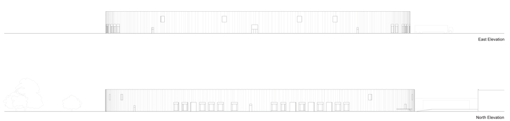
The Japanese architects from SANAA, Kazuyo Sejima and Ryue Nishizawa wanted to avoid creating a dominating fortress, opting instead for a low, easily accessible structure that integrates into the site without imposing on it by its presence. The structure is made up of five building of steel and glass. There are four rectangles and one large square with slightly curved walls whose angles touch.
Above: basement floor plan – click above to see larger image
It is reminiscent of the Louvre palace, with its wings laid almost flat. The architects wanted to bring to mind boats on a river coming together to dock gently with each other. The facades are in polished aluminum, in which the park is reflected, ensuring continuity between the museum and the surrounding landscape. The roofs are partially in glass, reflecting a particular advantage to bringing in light, both for exhibiting the works and for being able to the sky from inside the building.
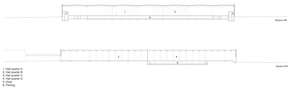
Above: section AA – click above to see larger image
Natural light is controlled by means of a concealment device in the roof and interior shades forming the ceiling. Designed as an answer to the vaulted ceiling, the surface retains in its light the change of seasons, hours and exhibitions.
Above: section BB – click above to see larger image
The entire structure of 28,000 square meters extends over 360 meters long from one end of a central foyer in transparent glass to the other. The buildings located to the East of the entrance – the Grande Galerie and the Glass Pavilion – primarily house the Louvre’s collections.
Above: floor plan of La Galerie du Temps- click above to see larger image
To the West of the entrance is the temporary exhibition gallery and La Scène, a vast «new generation» auditorium, whose programs are in direct relation with the exhibitions.
Above: section of La Galerie du Temps – click above to see larger image
The museum also includes a large, invisible, two level space, buried deep in fill from the site. This space will be dedicated to service functions for the public, but will also be used for storage and logistical functions of the museum. Two independent buildings house the administrative services, to the South, and a restaurant, to the North, thus establishing a link between the museum, the park and the city.
Above: elevation – click above to see larger image
Get 40% off this watch by Japanese architects SANAA to look like a cat curled around the wrist in the Dezeen Watch Store summer sale. Available in green, yellow or pink, the Neko watch is now only £45 (UK and EU) or £37.50 (rest of the world). Get yours here »
Dezeen Watch Store: over on Dezeen Watch Store we’re now stocking Neko (above), the new design by Japanese architects Sanaa for Italian brand Alessi.
The design features a flexible polyurethane strap that wraps around without a fastening.
Tiny ears on top of the casing and feet on the strap are designed to look like a little cat curled around the wearer’s wrist. The watch is available in pink, green, brown, yellow and black.
Dezeen Watch Store is a carefully curated store specialising in watches by named designers and boutique brands.
This is site is run by Sascha Endlicher, M.A., during ungodly late night hours. Wanna know more about him? Connect via Social Media by jumping to about.me/sascha.endlicher.


