Hartô from France

Bloesem Living | Harto, Furniture from France

Another amazing label that recently exhibited  at Maison & Objet fair 2014 is Harto Design. We admire this French furniture brand’s aesthetics, with their clean lines and form along with the use of color in collaboration with the natural wood finishing. A great marriage between entrepreneurship and design, the are definitely a brand to watch.. can’t wait to see what else they have up their sleeves. 

Bloesem Living | Harto, Furniture from France

Bloesem Living | Harto, Furniture from France

Bloesem Living | Harto, Furniture from France

Bloesem Living | Harto, Furniture from France

Bloesem Living | Harto, Furniture from France

Bloesem Living | Harto, Furniture from France

Harto8

Harto9

Harto10

.. Harto design

White Polygonal Pavilion

Située sur une pente raide au milieu d’une forêt de la ville de Karuizawa, cette incroyable galerie d’art privée offre un panorama hors du commun. Mais c’est surtout sa forme singulière qui nous interpelle : blanche, polygonale et minimaliste. L’architecte Makoto Yamaguchi, à l’origine de ce projet, a conçu cette villa avec des matériaux tels que du bois, de l’acier inoxydable et du verre. À découvrir.

Polygonal White Pavilion-11b
Polygonal White Pavilion-9
Polygonal White Pavilion-8
Polygonal White Pavilion-4
Polygonal White Pavilion-3bb
Polygonal White Pavilion-3b
Polygonal White Pavilion-2
Polygonal White Pavilion-1bb
Polygonal White Pavilion-1b
Polygonal White Pavilion-0

Appetizing Sweets Coin Purses

Voici d’appétissants portes-monnaie en forme de donuts, gaufres et macarons très réalistes et déclinés en plusieurs couleurs et parfums. Pistache, rose ou chocolat, avec un coulis de caramel ou nappé de crème à la fraise, ces jolis petits étuis sont à découvrir dans la suite et sur le site Firebox.

Appetizing Sweets Coin Purses-14
Appetizing Sweets Coin Purses-13
Appetizing Sweets Coin Purses-12
Appetizing Sweets Coin Purses-11
Appetizing Sweets Coin Purses-10 copie
Appetizing Sweets Coin Purses-9
Appetizing Sweets Coin Purses-8
Appetizing Sweets Coin Purses-7
Appetizing Sweets Coin Purses-6
Appetizing Sweets Coin Purses-5
Appetizing Sweets Coin Purses-4
Appetizing Sweets Coin Purses-3
Appetizing Sweets Coin Purses-2
Appetizing Sweets Coin Purses-1

Zurich office block by Max Dudler features a gridded granite facade

Swiss architect Max Dudler has completed a granite office building near Zurich featuring a regular gridded facade and a street-level colonnade (+ slideshow).

Richtiring office building by Max Dudler

The Richtiring building was designed by Max Dudler for a plot within a 72,000-square-metre masterplan developed by Italian architect Vittorio Magnago Lampugnani for the suburb of Wallisellen.


It is the final building to be completed in the new Richtiareal mixed-use development, which is located on a former industrial site between Wallisellen’s railway station and a 1970s shopping centre.

Richtiring office building by Max Dudler

The angular five-sided building borders a new public square along one edge and incorporates a series of “classic courtyards, alleys, arcades, and squares” intended to emulate the urban fabric of cities such as Berlin, Paris or Milan.

Richtiring office building by Max Dudler

“The new building has the dimensions of a small city block, its design incorporating the classic elements of European urbanism,” said the architect in a statement.

Richtiring office building by Max Dudler

On the side facing the new main street, Dudler has introduced a covered arcade lined on one side by huge granite columns and on the other by shops and restaurants.

Richtiring office building by Max Dudler

Two underground levels provide car parking while the five storeys above the ground floor accommodate offices, containing space for around 1,400 desks.

Richtiring office building by Max Dudler

The uniform facades are also clad in slabs of grey granite, interrupted by evenly spaced rows of windows with bronze surrounds.

Richtiring office building by Max Dudler

“Vertical columns, horizontal beams and deeply set large-format square windows give the large facades an even structure,” the architect said. “The irregular cut of the building’s basic shape gives the low-key, almost abstract design a special expression.”

Richtiring office building by Max Dudler

A triangular courtyard at the centre of the building is surrounded by white rendered walls, punctuated by rows of windows that overlook a landscaped garden and seating areas.

Richtiring office building by Max Dudler

The offices are currently occupied by Switzerland’s largest cable network provider UPC Cablecom. The positioning of entrances means they can easily be subdivided if the building is eventually required to accommodate different tenants.

Richtiring office building by Max Dudler

Another of the buildings developed as part of the Richti district is the office of financial services company Allianz, which was designed by Dutch firm Wiel Arets Architects with a fritted glass facade that resembles onyx marble.

Photography is by Stefan Müller.


Project credits:

Project managers: Eva Hepke, Claudio Pasquini (until 2013), Nicole Gamisch (until 2010)
Full-service general contractor: Areal Generalunternehmung AG, Zurich
Team: Helene Bihlmaier, Merry Classen, Anne Gramatzki, Max Nalleweg, Luca Pessina, Tobias Schaer, Helga Schützeichel, Markus Weissenmayer, Pascal Glatz, Fabrice Passaplan, Franz Staeudinger, Larisa-Maria Vranceanu, Antonia Weyermann
Structural engineers: Jauslin + Stebler Ingenieure AG
Electrical planning: Herzog Kull Group Zurich AG
Building services: Brunner Haustechnik AG
Building physics and acoustics: Basler & Hofmann AG
Facade planning: Buri Müller Partner GmbH
Fire protection: Braun Brandsicherheit AG

Richtiring office building by Max Dudler
Floor plan – click for larger image
Richtiring office building by Max Dudler
Section – click for larger image

The post Zurich office block by Max Dudler
features a gridded granite facade
appeared first on Dezeen.

Black-and-white Hong Kong cinema interior evokes "old movies"

Inside Festival 2014: Virginia Lung of interior design firm One Plus Partnership explains why she used a palette of black and white for the interior of the Cine Times cinema in Hong Kong (+ movie).

Cine Times cinema in Hong Kong by One Plus Partnership

Cine Times, which won the Civic, Culture and Transport category at Inside Festival this year, occupies the thirteenth floor of Hong Kong’s Times Square shopping centre.

Cine Times cinema in Hong Kong by One Plus Partnership

It replaces an earlier cinema on the ground floor that had to close a few years earlier because of unaffordable rents.

Cine Times cinema in Hong Kong by One Plus Partnership

“This cinema has been in Hong Kong for many years,” says One Plus Partnership co-founder Lung in the movie, which was filmed in Singapore at Inside Festival 2014.


“Hong Kong people we went there a lot. But it is a memory because it [closed] a couple of years ago.”

Cine Times cinema in Hong Kong by One Plus Partnership

Because of local people’s nostalgia for the old cinema, Lung wanted to evoke a sense of old movies in the new cinema.

“Because of the memory [of the original cinema], I decided to use the old world of a movie,” she explains. “So that’s why we’re using black and white only.”

Cine Times cinema in Hong Kong by One Plus Partnership

The lights in the ceiling are designed to look like they are from a movie set, while undulating panels along the walls represent rolls of film.


“You can see the abstract form of rolls of film everywhere in the cinema,” Lung says. “Especially the lobby.”

Cine Times cinema in Hong Kong by One Plus Partnership

The cinema’s air-conditioning system is also hidden behind these wall panels, allowing for much more generous ceiling heights.

“The air-con company told us we couldn’t have a ceiling height higher than 2.4 metres,” explains Lung.

“But because it was such an important cinema for our client – it is their flagship – we thought a lot and finally decided to put all the ducts along the wall.”

Cine Times cinema in Hong Kong by One Plus Partnership

Inside Festival took place at Marina Bay Sands in Singapore from 1 to 3 October. Award entries for next year’s festival are open from February 2015.

We’ve been publishing interviews with all the category winners from this year’s event over the last few weeks. You can watch all the movies below.

The post Black-and-white Hong Kong cinema
interior evokes “old movies”
appeared first on Dezeen.

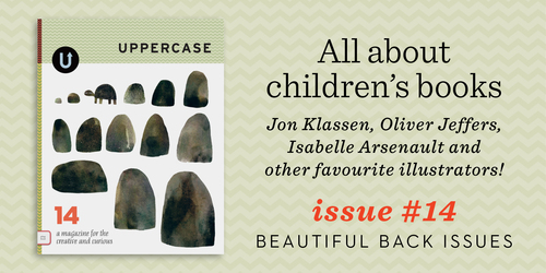
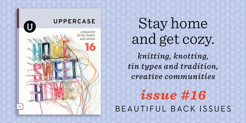
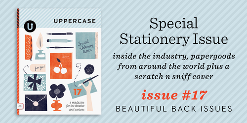
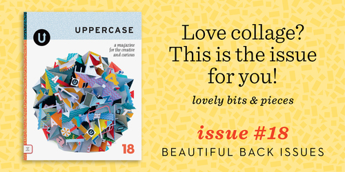
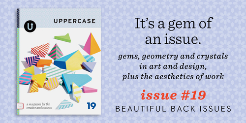
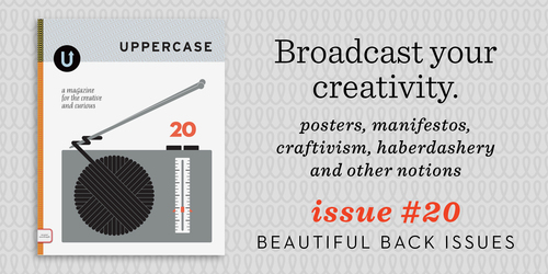
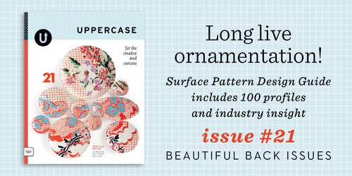
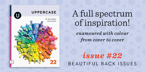
Back issues are just $10 through Monday.

backissues-issue10.jpg

backissues-issue11.jpg

Look at all the work I’ve done over the years! How time flies when you keep yourself passionately busy. 

All of my babies are available to enjoy while inventory lasts (issue 10 and 11 are running low at this point). On sale for just $10 apiece until end of day Monday, I’d suggest getting one of each. Subscribe starting with #23, the current issue, and you’ll be all set for an inspired year ahead.

p.s. Use the code “thankyou” for another $15 off orders over $80.

Kristen Wrzesniewski Photography

Basée à Austin, la jeune photographe Kristen Wrzesniewski réalise de très beaux portraits empreints d’une atmosphère aérienne et d’une délicatesse féminine. A travers des jeux de reflets, dédoublements et de surimpressions, le corps et le visage des femmes se dessinent avec sensualité et légèreté dans des lieux souvent naturels.

KristenWrzesniewski29
KristenWrzesniewski28
KristenWrzesniewski27
KristenWrzesniewski26
KristenWrzesniewski25
KristenWrzesniewski24
KristenWrzesniewski23
KristenWrzesniewski22
KristenWrzesniewski21bis
KristenWrzesniewski21
KristenWrzesniewski20bis
KristenWrzesniewski20
KristenWrzesniewski19
KristenWrzesniewski18
KristenWrzesniewski17bis
KristenWrzesniewski17
KristenWrzesniewski16
KristenWrzesniewski15
KristenWrzesniewski14
KristenWrzesniewski13
KristenWrzesniewski12
KristenWrzesniewski11
KristenWrzesniewski10
KristenWrzesniewski09
KristenWrzesniewski08
KristenWrzesniewski07
KristenWrzesniewski06
KristenWrzesniewski05
KristenWrzesniewski04
KristenWrzesniewski03
KristenWrzesniewski00
KristenWrzesniewski0

Penholder Turned into Tiny City

Le studio de design Tripleliving a eu l’ingénieuse idée de concevoir une série de porte-plumes en forme d’immeubles à la façade minimaliste intitulée « Tiny City ». La composition de ces immeubles crée une ville miniature sur votre bureau. Composé de béton et de bois, ce projet de mini-design architectural est à découvrir en images.

Penholder Turned into Tiny City_6
Penholder Turned into Tiny City_5
Penholder Turned into Tiny City_4
Penholder Turned into Tiny City_3
Penholder Turned into Tiny City_2
Penholder Turned into Tiny City_1
Penholder Turned into Tiny City_0

Design Methods fills Seoul hotel with open-source furniture

Open-source furniture designs and 3D-printed signage are found throughout the Small House Big Door boutique hotel in Seoul, by local studio Design Methods (+ slideshow).

Small House Big Door by Design Methods

Tucked away down a tight alley, Small House Big Door is one of 150 designated Seoul Design Spots around the city, which form a trail for residents and visitors attending this week’s Seoul Design Week to explore.


Small House Big Door by Design Methods

Design Methods converted a 1960s building in the South Korean capital into a 25-room boutique hotel, leaving space for a small gallery, a bistro and an events area on the ground floor.

Small House Big Door by Design Methods

After entering through the large entrance door alluded to in the hotel’s name, guests are greeted at a reception area lined with plywood panels.

Small House Big Door by Design Methods

These panels extend across the ceiling and over the metal-clad service counter for the cafe.

Small House Big Door by Design Methods

Towards the back of the open-plan area, the polished concrete floor steps down to create a sunken events space.

Small House Big Door by Design Methods

Bleachers along two edges of the square face extended corner walls, onto which images can be projected for presentations.

Small House Big Door by Design Methods

Cafe seating next to this area spills out through glass doors onto a small wooden terrace.

Small House Big Door by Design Methods

Beside the entrance, the building’s original staircase was left intact and links the four levels. The space beneath it on the ground floor is used to show artworks, which can be viewed through the window facing onto the street.

Small House Big Door by Design Methods

Ten guest rooms are located on each of the first and second storeys, where the hallways are painted dark grey.

Small House Big Door by Design Methods

An additional five rooms are found on the top floor, contrastingly decorated white apart from the concrete ceiling beams left exposed between roof lights.

Small House Big Door by Design Methods

Many elements around the hotel – including room and floor numbers, key fobs, “do not disturb” signs and lampshades – were made using a 3D printer.

Small House Big Door by Design Methods

The white three-dimensional numbers sit at an angle to the base plates, so they can be viewed from a certain direction better than from others.

Small House Big Door by Design Methods

“We thought about ways of presenting information with 3D printing,” studio co-founder Kihyun Kim told Dezeen. “These designs can’t be created using moulding or carving.”

Small House Big Door by Design Methods

Other furniture items have been built from Design Methods’ open-source designs that are available online.

Small House Big Door by Design Methods

Template files are used to cut sections of aluminium, medium-density fibreboard (MDF) or pine, which are then assembled into chairs, tables, storage racks and beds.

Small House Big Door by Design Methods

All the bedrooms are decorated white and are sparsely furnished to make maximum use of the tight spaces.

Small House Big Door by Design Methods

As another solution to the space restrictions, the designers built cuboid units that open up when needed to reveal storage for clothes, fridges, desk space and the TV.

Small House Big Door by Design Methods

Rooms on the top floor have access to a terrace, which can divided by a folding partition so adjacent rooms can enjoy a private outdoor space.

Small House Big Door by Design Methods

Design Methods also created the branding and graphics for the hotel, which opened earlier this year.

Small House Big Door by Design Methods

Cafe menus, stationery and guest feedback forms are all minimally designed using a consistent typeface.

The post Design Methods fills Seoul hotel
with open-source furniture
appeared first on Dezeen.

"MORE HUNGER GAMES" — A Bad Lip Reading of Catching Fire

Katniss picks out a name for her band, and she’s afraid she’s in a castle…(Read…)