Let's stick with the insect trend … this time make some bumblebees yourself … a wonderful new Craft Project posted on BKids today … you want to make them too?
There are six billion people on the planet, and something like 2.5 billion camera phones. Facebook alone gets more than 3,000 photos uploaded to it every second; since you started reading this entry, another 10,000 have gone up. Capturing images, once such a difficult and expensive process, has become something we unthinkingly do with little more than our thumbs. Photos are disposable. Forgettable.
Two years ago, photographer Daniel Carillo took a daguerreotype workshop at Rochester’s George Eastman House photography museum. Seattle-based Carillo fell in love with the process, which is about as opposite to digital photography as you can get: An image isn’t a quickly-captured string of code that lives on a website, but something that has been painstakingly burned into a shiny, solid piece of metal using alchemy and elbow grease. It took Carillo a year just to acquire the tools and materials needed to produce a single daguerreotype.
In the video below, fellow shooter Patrick Richardson Wright captures Carillo’s process. It’s so beautiful, you’ll want to pull your cell phone out and snap a picture of it.
Launched less than a year ago, Detroit’s consumer goods company Shinola is still picking up speed, as well as worldwide recognition. In July 2012 we had the opportunity to visit their expansive HQ in midtown…
Réalisée par Axel Morin et Julien Capelle, cette vidéo nous montre Alexis Taieb, plus connu sous le nom de Tyrsa, composer une illustration pour la marque Air Jordan à l’occasion de la sortie de Jordan V Grape. Mélangeant typographie et images de basket, cette belle vidéo est à découvrir sur une musique de Supa!.
With both attuned expats and locals on the ground, boutique hospitality company Oasis Collections is doing the necessary footwork to create a highly selective portfolio of attractive properties around South America. The Airbnb-like service evolved in…
One of the things I miss most about being in art school was… the casual graffiti. Students of all stripes have a tendency to make flyers, deface signage and scribble on bathroom walls, but no student does it with the flair of an art student. From the relatively lowbrow “Pratt Industrial Design Diplomas – Take One” drawn over the toilet paper roll in the men’s bathroom, to more intricate fare like a flyer in the dorm stating “I lost my keys – they look like this” hovering over a photorealistic drawing of their entire keychain, there was plenty of creativity going on outside of the classrooms.
As for in-classroom creativity: While these may or may not be from art students, Student Beans has compiled a list of the best textbook and exam-paper defacements they could find from around the globe.
They vary in quality, but they all have that twisted art school vibe. Click here to check them all out, but beware that some are outright disturbing—we’ve posted the tamer ones here—and many are NSFW!
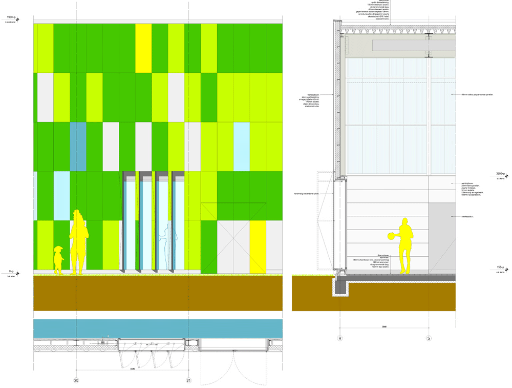
This sports hall in Lelystad, the Netherlands, by Dutch firm Slangen + Koenis Architects is coloured in fluorescent shades of green, yellow and blue (+ slideshow).
The De Rietlanden Sports Hall was designed by Slangen + Koenis Architects to extend and combine two existing sports buildings located beside a secondary school in the small Dutch city.
The architects sandwiched the new building between the two existing structures in a space formally occupied by a bicycle stand, then added the brightly coloured cladding to create a welcoming atmosphere for students staying after school for sports.
Photograph by Bart Solinger
“The starting point of the design was to not only create a friendly volume that combines the two existing buildings into one centre, but also to create a fresh and bright impulse for the drab and grey surroundings,” say the architects.
“To accentuate the placement of the new structure, we created very colourful facades at the two sides that intersect the existing buildings, accentuating the contrast between old and new.”
The hall itself is the size of three basketball courts. Changing rooms stretch along the length of the courts on one side, while a spectator balcony and restaurant are located on a mezzanine floor above.
A glazed entrance is positioned opposite an outdoor sports pitch at one end of the hall, plus extra routes lead through from both of the old buildings on either side.
Photography is by Marcel van der Burg, apart from where otherwise indicated.
Here’s a project description from Slangen + Koenis Architects:
Sports hall ‘De Rietlanden’
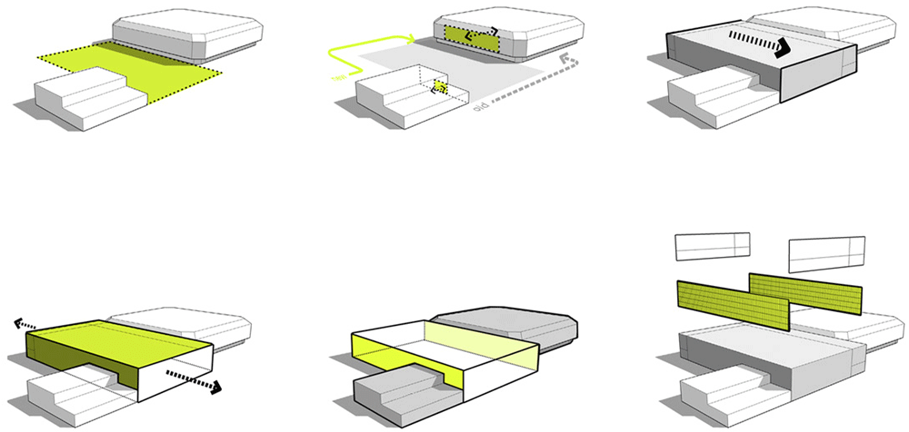
The new sports hall ‘De Rietlanden’ will, together with its existing neighbouring sport facilities, form a new important in- and outdoor sports centre in Lelystad. The existing situation already had two sports halls, though separated by a bike stand from the local secondary school. This unusual separation made it very hard to combine the different sport and social activities. Also the site has a very grey and pale colour pallet with an unwelcoming atmosphere, especially after school hours. The starting point of the design therefore was to not only create a friendly volume that combines the two existing buildings into one centre, but also to create a fresh and bright impulse for the drab and grey surroundings. By moving the entrance to the other side of the building we created a centre that is more accessible from a spacious and more inviting entrance square that welcomes the visitors.
Since both of the neighbouring buildings had to remain, the new sports hall had to fit into the relatively narrow empty spot, where the bike stand used to be. To accentuate the placement of the new structure, we created very colourful facades at the two sides that intersect the existing buildings, accentuating the contrast between old and new. The two front facades are very crisp and light with white colours in varying materials. The new entrance faces towards the outdoor sport fields through large glass windows, as well as the covered terrace on the upper floor, that can function as a grandstand. In order to create an optimal sports and teaching environment, windows allows light and views into the sports hall. But they can also be closed if it is convenient for the activities. To create extra relief and agility to the entrance square the shutters can be adjusted to the needs of the users, causing the building to open or close towards the square.
The floor plan clearly shows how the new structure is implemented on the site and in between the other buildings. There’s a hallway connecting the sports halls on ground level and the 6 changing rooms. These spaces are optimized to leave maximum space for the optimal layout. On the upper floor a spectator zone is situated along the length of the field with a restaurant. The restaurant is an important connection between the old and the new building on grandstand level.
AMV BBDO has built on the successful ‘You’re Not You When You’re Hungry’ campaign for Snickers in the UK, with an amusing digital campaign.
The agency worked with Google technology to serve the campaign to the search engine’s users. Starting from the premise that office workers are ‘off their game’ when hungry, the agency used a special algorithm to identify various misspellings of some of the most commonly searched for terms on Google. Each time someone misspelt one of the words, the search results included a tailored ad message, encouraging the user to grab a Snickers (see screen grab below).
The three-day campaign ran in early April and reached more than 500,000 people within three days, without any seeding. The agency also released the following video about how it put together its quirky little digital spin on a successful ongoing campaign:
Credits: Agency: AMV BBDO Creative Directors: Alex Grieve & Adrian Rossi Copywriter: Rich McGrann Art Director: Andy Clough
Out now, the May 2013 issue of Creative Review is our biggest ever. Features over 100 pages of the year’s best work in the Creative Review Annual 2013 (in association with iStockphoto), plus profiles on Morag Myerscough, Part of a Biggler Plan and Human After All as well as analysis, comment, reviews and opinion
You can buy Creative Review direct from us here. Better yet, subscribe, save money and have CR delivered direct to your door every month. If you subscribe before May 3, you will get the Annual issue thrown in for free. The offer also applies to anyone renewing their subscription. Details here
CR for the iPad Read in-depth features and analysis plus exclusive iPad-only content in the Creative Review iPad App. Longer, more in-depth features than we run on the blog, portfolios of great, full-screen images and hi-res video. If the blog is about news, comment and debate, the iPad is about inspiration, viewing and reading. As well as providing exclusive, iPad-only content, the app will also update with new content throughout each month.
This is site is run by Sascha Endlicher, M.A., during ungodly late night hours. Wanna know more about him? Connect via Social Media by jumping to about.me/sascha.endlicher.


