Ruiz Company

Une société basée à Barcelone en Espagne, et spécialisée depuis plusieurs années en packaging produits et identité visuelle. De nombreux clients comme Levi’s, Nike, Diesel ou Chocolate Factory. A découvrir sur leur portfolio ou dans la suite de l’article.


7_llibre1

12_chocolat10

13_cooked01

28_womo01

13_cooked02

45_xtvl5

7_gracies


Previously on Fubiz

Teet

This image has no alt text

Ashley Linnenbank designed this bold concept for milk packaging that would surely get noticed on the shelves at the grocery stores. At a time when people are interested in getting more in touch with where their food comes from – it’s a very fun idea – almost looks like it came from Ikea.

Great Vintage Ammunition Packaging (23 Examples)

VINTAGE_AMMO_CARTRIDGE11

I happened to stumble upon some really awesome vintage design in the unexpected form of ammunition packaging. Here's a collection we gathered from around the web – we hope you'll find it as a source of inspiration.

What I liked most about some of the older boxes in this collection is  the heavy wordiness evident in most vintage packaging, the classy and ornate fonts and almost feminine detailing. The way the whole design pulls together gives me a truckload of inspiration for my next packaging design project. This stuff would totally inspire me for a single malt or beer label for instance, or maybe a men's body care collection.

Continue reading to see the entire collection of printed vintage ammunition boxes and labels.

B32522usc38cal


VINTAGE_AMMO_CARTRIDGE1
 

VINTAGE_AMMO_CARTRIDGE7 

VINTAGE_AMMO_CARTRIDGE8 

VINTAGE_AMMO_CARTRIDGE6

The above Winchester package in red/yellow seems to be not quite as old as some of the earlier Winchester packaging.

VINTAGE_AMMO_CARTRIDGE4

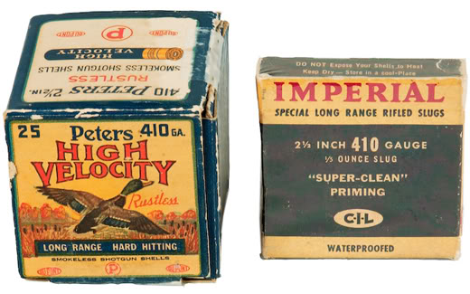
Above, Peters shotgun shell packaging features a pretty, full-color illustration of a flying mallard duck.


VINTAGE_AMMO_CARTRIDGE3

The first Peter's package in this image has an interesting design with an elongated 'P' encircling the shell illustration.


Picture 6

I get the feeling of 'high quality' from the Winchester label above. The little signed note adds to the effect. (Notice the spelling of 'staynless')


Picture 7

Nice branding touch – large 'W' on the side for Winchester, one of the most popular brands of cartridges it seems.


Picture 8
 

Picture 5 

F4228cc335e0c107012230c5be602f37 

28brown 

B31716robinhood 

Defianceshell009 

Defiance brand shot-shells – they mean business. Good name.


Higunshell
 

Gorgeous packaging for Peters Cartridge Co. in illustrated full color. This looks as if it were the cream-of-the-cartridge-crop at the time.


Higun001
 

Idealshell007

Newclubshell018 

Remington's package above has incredibly sweet detail in the borders (check out those chains) plus the company name (six words long!) along with the full address on the front – lend prestige to the brand. (Unlike the way packaging today often features the company line on the back panel in small letters out of the way.)


Remumc011

Refereeshell 

Sportshell

Want more vintage ammunition packaging? Here are some resources of auctions and collectors:

Lucy & Lumper

Vintage Shell Boxes

Vitamin Boxes

We came across this solid packaging by Viktoriya Gadomska the other day and thought it was worth a mention.

“Taking the Arnell out of Tropicana”

As many of you know Tropicana’s packaging rebrand has been somewhat of a rollercoaster ride having reverted back to its original look designed by Sterling Brands a few months back. Trop50 is the only product left that uses a splash of some of the design elements The Arnell Group came up with for the rebrand failure.

The new design on the right reverts back to many of the successful brand elements that the original had, while still keeping the Trop50 logo and that darn glass of orange juice.

via:

Tetley in Design Edge

This image has no alt text

Our packaging for Tetley’s line of cold tea as well as a new product called Infusions was featured in Design Edge Canada.

AmoebaCorp.’s Mike Kelar spoke with Design Edge to give them the low down on the process. Read the article here. Tetley’s cold teas are available in supermarkets and corner stores across the country and they’re delicious.

Puff on this

Pentagram takes on tobacco.

This month the Senate approved new legislation that will heavily restrict the nicotine content and marketing of cigarettes, including the requirement that colorful ads and displays be replaced with black-and-white-only text. The bill is expected to pass in the House and President Obama has said he will sign it. For a piece in its Sunday Perspectives section, the St. Petersburg Times asked DJ Stout what cigarette companies might do to follow the new marketing rules. (The full article is print only; we’ve posted it here.) Stout suggests that to comply with the new crackdown, cigarette manufacturers like Marlboro should embrace the restrictions and make cigarettes look truly dangerous. This, of course, will still appeal to a core group of smokers.

“Over the years there has been an onslaught of public awareness messaging about the evils of smoking,” says Stout. “Unless you’ve been living in a cave for the last 50 years you are very aware that smoking is not only bad for you, it could very likely kill you. All smokers know this for sure but it doesn’t deter them.

“Our marketing advice to cigarette companies in the new heavily regulated era is to fully accept the new aggressive anti-smoking restrictions and wallow in the government’s apocalyptic health warnings. Don’t make excuses or dance around the stepped-up marketing regulations, just transform the whole cigarette pack into a three dimensional warning label.”

Newspaper Patterns


Here’s another D&AD Yellow Pencil winner that is worth a mention. The project developed by Dentsu used old newspaper and overprinted vibrant patterns on it to create something new. We’ve included the project brief below for your review.

BRIEF:
Design a package for a street vendor that sells farm-grown vegetables and fruits. The brief required somethig original, easy to use and low cost.

SOLUTION:
We focused on old newspaper used to wrap vegetables with. Newpaper was used for good reasons – for its moisture retention quality which helps keep vegetables fresh longer and for its reuse value. Under the “Newspaper for New Paper” project we utilised what was already there – the newspapers – and added an element of design that would be playful and make people smile… both those selling the vegetables and those buying them. By re-using old papers that would be thrown away, the project was friendly to the environment as well as to the budget. By simply adding colourful dots or stripes to the old paper we came up with a totally new package design.

RESULT:
Sales grew by 20%, as did the number of customers. There was more interaction with customers. Because they liked the design, people didn’t just throw away our New Paper but re-used it for something else. News of the low-cost, original design wrapping paper spread virally to other stores that used newspaper for wrapping. The New Paper project was not just a new design for wrapping paper but a pointer to a better lifestyle for us all.

Source:

The Troublemakers


“Such tragedy could have been easily avoided”. Love it!

“Wptt Contraceptive (a brand name) hopes to create a new packaging of novelty and visual impact. The objective is to emphasize the high contraceptive effectiveness of the products by indicating the painful consequences of having sex without a condom. More than 100,000 people have used the condoms and the sales increased by 21%.”

Peak below for additional condom packaging.

Pope Benedict XVI (Anti) Condoms

Wrap it up


Sex is Natural, Sex is Good


via:

If you drink bottled water drink this!

While drinking from the tap is preferred, this innovative concept by Perennial Design has integrated a cup within the packaging and is worth a mention.

Thanks Tom for the tip.

via: