Party Wall by CODA at MoMA PS1

Ithaca design studio CODA has installed a wall that squirts water and is clad with skateboard offcuts in the courtyard of MoMA PS1 in New York.

Party Wall was the winning entry of this year’s Young Architects Program, an annual contest organised by the Museum of Modern Art (MoMA) for a temporary installation offering seating, shade and water during the outdoor events of the MoMA PS1 contemporary art gallery.

Party Wall by CODA opens at MoMA PS1

CODA‘s installation is a steel-framed structure that functions as a giant aqueduct. Water travels alongs the top of the wall and is forced by a pressure tank to form a fountain, feeding a misting station and a series of paddling pools.

The cladding is made from interlocking wooden panels, recognisable as the offcuts from a skateboard manufacturer. There are also 120 removable elements that can function as benches or tables.

Party Wall by CODA opens at MoMA PS1

Water-filled plastic pillows are suspended inside the structure and help weight it down. At night, these inflatable elements are illuminated and glow through the gaps in the facade.

Party Wall will remain in place until the end of August and will be used during the annual Warm Up event – a showcase of experimental music and sound.

Party Wall by CODA opens at MoMA PS1

CODA fended off a shortlist of five architects to win the competition in January, becoming the fourteenth studio to participate in the programme. Last year’s installation was a blue spiky air-cleaning sculpture by HWKN, while previous editions have been completed by SO-IL, Interboro Partners and Ball-Nogues.

See more stories about MoMA and MoMA PS1 »

Photography is by Charles Roussel.

Here’s some more information from MoMA:


The Museum of Modern Art and MoMA PS1 Present Party Wall by CODA, winner of the 2013 Young Architects Program, at MoMA PS1 in New York

The Museum of Modern Art and MoMA PS1 announce the opening of Party Wall, the CODA (Caroline O’Donnell, Ithaca, NY)–designed winner of the annual Young Architects Program (YAP) in New York. Now in its 14th edition, the Young Architects Program at MoMA and MoMA PS1 is committed to offering emerging architectural talent the opportunity to design and present innovative projects, challenging each year’s winners to develop creative designs for a temporary, outdoor installation at MoMA PS1 that provides shade, seating, and water. The architects must also work within guidelines that address environmental issues, including sustainability and recycling. CODA, drawn from among five finalists, designed a temporary urban landscape for the 2013 Warm Up summer music series in MoMA PS1’s outdoor courtyard.

Party Wall is a pavilion and flexible experimental space that uses its large-scale, linear form to provide shade for the Warm Up crowds, in addition to other functions.

The porous facade is affixed to a tall self-supporting steel frame that is balanced in place with large fabric containers filled with water, and clad with a screen of interlocking wooden elements comprised of donated from Comet, an Ithaca-based manufacturer of eco-friendly skateboards.

The lower portion of the Party Wall’s facade is capable of shedding its “exterior,” as 120 panels can be detached from the structure and used as benches and communal tables during Warm Up and other diverse events and programs such as lectures, classes, performances, and film screenings.

A shallow stage of reclaimed wood weaves around Party Wall’s base to create a series of micro-stages for performances of varying types and scales. At various locations under the structure, pools of water serve as refreshing cooling stations that can also be covered to provide additional staging space or a shaded area from the direct sunlight.

Party Wall’s steel-angle structure is ballasted by water-filled “pillows” made of polyester base fabric that will be lit at night to produce a luminous effect. Party Wall acts as an aqueduct by carrying a stream of water along the top of the structure. The water is projected from the structure, via a pressure-tank, into a fountain that feeds a misting station and a series of pools.

“CODA’s proposal was selected because of its clever identification and use of locally available resources—the waste products of skateboard-making—to make an impactful and poetic architectural statement within MoMA PS1’s courtyard,” said Pedro Gadanho, Curator in MoMA’s Department of Architecture and Design. “Party Wall arches over the various available spaces, activating them for different purposes, while making evident that even the most unexpected materials can always be reinvented to originate architectural form and its ability to communicate with the public.”

“CODA developed an outstanding, iconic design that will support the many social functions of our large-scale group exhibition EXPO 1: New York, while creating a unique and stunning object for our outdoor galleries,” added Klaus Biesenbach, Director of MoMA PS1 and Chief Curator at Large at MoMA.

The other finalists for this year’s MoMA PS1 Young Architects Program were Leong Architects (New York, NY, Dominic Leong, Chris Leong); Moorhead & Moorhead (New York, NY, Granger Moorhead, Robert Moorehead); TempAgency (Charlottesville, VA, and Brooklyn, NY, Leena Cho, Rychlee Espinosa, Matthew Jull, Seth McDowell); and French 2D (Boston, MA, and Syracuse, NY, Anda French, Jenny French).

The post Party Wall by CODA
at MoMA PS1
appeared first on Dezeen.

Dalston House by Leandro Erlich

It might look like these people are scaling the walls of a London townhouse but they’re actually lying on the ground, reflected in a huge mirror as part of an installation by Argentinian artist Leandro Erlich (+ slideshow).

Dalston House by Leandro Erlich

Located in Hackney, Dalston House by Leandro Erlich is a temporary installation comprising a reconstructed house facade lying face-up and a mirror positioned over it at a 45-degree angle.

Dalston House by Leandro Erlich

As a person walks over the surface of the house, the mirror reflects their image and creates the illusion that they are walking up the walls. Similarly, visitors can make it look like they are balancing over the cornices or dangling from the windows.

Dalston House by Leandro Erlich

The brick walls and decorative window mouldings of the three-storey facade are designed to mimic the nineteenth-century Victorian terraces that line many of London’s streets, particularly a row of houses that once occupied this site on Ashwin Street.

Dalston House by Leandro Erlich

Commissioned by the Barbican gallery, the installation opened to the public yesterday as part of the London Festival of Architecture 2013 and will remain on show until 4 August.

Dalston House by Leandro Erlich

Leandro Erlich is well-known for using visual illusions in his artworks. Past projects include a seemingly floating remnant of a house created in Nantes and a fake pool of water in Toulouse. He also created a similar house reconstruction in Paris in 2004.

Dalston House by Leandro Erlich

Last year Dezeen ran a special feature celebrating world-class architecture and design created in the London Borough of Hackney and also hosted a event of talks and discussions, shown in a series of movies we published.

Dalston House by Leandro Erlich

See more installations on Dezeen, including an arched foam screen with hundreds of building-shaped holes and a topographical landscape of stone and water.

Dalston House by Leandro Erlich

Photography is by Gar Powell-Evans.

Here’s some extra information from the Barbican:


Leandro Erlich: Dalston House

Internationally known for captivating, three-dimensional visual illusions, Argentine artist Leandro Erlich has been commissioned by the Barbican to create Dalston House, an installation in Hackney. The work resembles a movie set, featuring the façade of a late nineteenth-century Victorian terraced house. The life-size façade lies on the ground with a mirrored surface positioned overhead at a 45-degree angle. By sitting, standing or lying on the horizontal surface, visitors appear to be scaling or hanging off the side of the building. Sited at 1–7 Ashwin Street, near Dalston Junction, Erlich has designed and decorated the façade – complete with a door, windows, mouldings and other architectural details – to evoke the houses that previously stood on the block. Leandro Erlich: Dalston House opens on 26 June 2013 and is presented on Ashwin Street in association with OTO Projects. It is also part of the 2013 London Festival of Architecture.

Dalston House by Leandro Erlich

Leandro Erlich: Dalston House is installed on a disused lot that has largely remained vacant since it was bombed during the Second World War. The installation extends the Barbican’s programme of Curve commissions to east London and is part of Beyond Barbican, a summer of events outside the walls of the Centre that includes pop-up performances, commissions and collaborations across east London. Beyond Barbican builds on the Barbican’s long history of programming work in east London that connects communities in the boroughs surrounding the Centre with some of the best art from around the world. The commission follows the success and legacy of Dalston Mill by EXYZT, a temporary installation and participatory project staged by the Barbican in Hackney in 2009, which reopened in 2010 as the Eastern Curve Garden.

Dalston House by Leandro Erlich

Dalston House is presented on Ashwin Street in association with OTO Projects. The Barbican is an official partner of the London Festival of Architecture 2013. Supported using public funding by Arts Council England. Additional support from the Embassy of the Argentine Republic.

The post Dalston House by
Leandro Erlich
appeared first on Dezeen.

Konstantin Grcic at Appartement N° 50

Industrial designer Konstantin Grcic has furnished an apartment in Le Corbusier’s iconic Cité Radieuse housing block with his own products and blown-up pages from a punk fanzine (+ slideshow).

dezeen_Konstantin Grcic at Appartement N°50_2
Products shown: Mayday lamp for Flos and Diana side tables for ClassiCon

Appartement N°50 is a privately owned home in the Modernist apartment block in Marseille, France, which retains the original layout and features designed by Le Corbusier in 1952.

dezeen_Konstantin Grcic at Appartement N°50_3
Products shown: Pallas table for ClassiCon and Venice armchair for Magis

Konstantin Grcic chose to furnish the apartment with pieces including his 360° stools for Magis, Pro chair for Flötotto, chair_ONE for Magis, and Mayday lamps for Flos.

dezeen_Konstantin Grcic at Appartement N°50_4
Product shown: 360° container for Magis

He also scanned pages of a punk fanzine, expanded them and hung them on the walls of the apartment, creating a deliberately enigmatic contrast with the sparsely decorated interior.

dezeen_Konstantin Grcic at Appartement N°50_5
Products shown: Topkapi marble table for Marsotto and 360° chairs for Magis

“The punk motifs are tempting a slightly devious link between two completely unrelated worlds: Le Corbusier’s architecture and punk rock,” says Grcic.

“Without forcing the idea of common grounds, I find that both have a rawness and uncompromising spirit which I have always found compellingly beautiful. Bringing both cultures together in this project felt most inspiring and, in the end, surprisingly fitting.”

dezeen_Konstantin Grcic at Appartement N°50_6
Products shown: Medici chairs, side tables and foot stools for Mattiazzi; Mayday lamp for Flos

Appartement N°50 has previously hosted temporary installations by Ronan and Erwan Bouroullec in 2010 and Jasper Morrison in 2008. Grcic’s edition will be open to the public from 15 July to 15 August 2013.

dezeen_Konstantin Grcic at Appartement N°50_7
Products shown: Medici chairs and side tables; Mayday lamp for Flos

The Cité Radieuse was damaged last August when a fire broke out in a first floor apartment, while French designer Ora-Ïto has overseen the creation of a contemporary art space on the building’s roof that opened this month.

Marseille is the European Capital of Culture 2013 and has seen significant architectural projects completed this year, including a reflective steel canopy by Foster + Partnersan archive and research centre featuring a cantilevered exhibition floor and an underwater conference suite and a museum clad in lacy concrete.

dezeen_Konstantin Grcic at Appartement N°50_8
Products shown: Mayday lamp for Flos, Jerry stools for Magis, Pro chair for Flötotto, and 2-Hands laundry basket for Authentics

An exhibition of Le Corbusier’s work is currently on show at the Museum of Modern Art (MoMA) in New York.

In Milan earlier this year, Grcic launched a collection of furniture designed for Herzog & de Meuron’s Parrish Art Museum in Long Island with American brand Emeco, and a flat LED light inspired by Achille Castiglioni’s Parentesi lamp.

dezeen_Konstantin Grcic at Appartement N°50_9
Products shown: Jerry stools for Magis

See more stories about Konstantin Grcic »
See more stories about Le Corbusier »

Konstantin Grcic at Appartement N° 50

Photography is © Philippe Savoir & Fondation Le Corbusier/ADAGP

Here’s a short text about the installation:


APPT.N50 installation by Konstantin Grcic 2013

There is an apartment in Le Corbusier’s famous Cité Radieuse (radiant city) in Marseille, which is almost completely preserved in its original 1952 condition.

Appt.N°50 is privately owned and it is thanks to the generosity and passion of its owner/occupant that the place is made accessible to a wider public during the summer months of each year.

As proof that Le Corbusier’s visionary Unité d’Habitation has the same vibrancy today as when it was originally conceived the apartment is turned into a temporary stage for the ideas and works of contemporary designers.

A short series of scenographic installations has been realized over the years; my project is the third in line following Jasper Morrison (2008) and Ronan & Erwan Bouroullec (2010).

Apart from placing a selection of my favorite furniture and objects I decided to tag the walls of the apartment with four blown up scans from an original punk fanzine. The punk motifs are tempting a slightly devious link between two completely unrelated worlds: Le Corbusier’s architecture and punk rock. Without forcing the idea of common grounds, I find that both have a rawness and uncompromising spirit which I have always found compellingly beautiful. Bringing both cultures together in this project felt most inspiring and, in the end, surprisingly fitting.

dezeen_Konstantin Grcic at Appartement N°50_10
Exterior of Cité Radieuse

The objects in use are: 360° chairs (by Magis), Topkapi marble table (by Marsotto), Miura bar stool (by Plank), 2-Hands laundry basket (by Authentics), Pro chair (by Flötotto), Jerry stools (by Magis), Mayday lamps (by Flos), Medici chairs, side table and foot stool (all by Mattiazzi), 360° container (by Magis), Venice armchair (by Magis), Pallas table and Diana side tables (by ClassiCon), Myto chair (by Plank), Tip bin and H2O buckets (by Authentics), chair_ONE (by Magis).

In contrast to Le Corbusier ́s enigmatic color scheme of the interior, the intervention is kept in iconic red, black and white.

The post Konstantin Grcic at
Appartement N° 50
appeared first on Dezeen.

Ellen Gallagher: Don’t Axe Me: Meticulous layering breaks through the canvas to reinvent visual contexts and explore future possibilities in the New Museum exhibition

Ellen Gallagher: Don't Axe Me


by LinYee Yuan Those familiar with the work of American artist Ellen Gallagher often view her delicate works on paper and canvas through the lens of racial and gender politics—Gallagher’s “DeLuxe” series famously abstracted African-American beauty and…

Continue Reading…

Voyage to Uchronia by Matali Crasset at Galerie Thaddaeus Ropac

French designer Matali Crasset is showing a series of mysterious hooded furniture at an exhibition in Paris (+ slideshow).

Voyage to Uchronia by Matali Crasset at Galerie Thaddaeus Ropac

The group of furniture is entitled the Permanents and is designed to evoke the habits and rituals of an imaginary human community.

Voyage to Uchronia by Matali Crasset at Galerie Thaddaeus Ropac

Folded sheets of felt create structures that envelop the body and form hoods overhead.

Voyage to Uchronia by Matali Crasset at Galerie Thaddaeus Ropac

Each piece is given a unique purpose – as a place to lie down, sit or come together – and some incorporate objects including a chair and a wooden bell.

Voyage to Uchronia by Matali Crasset at Galerie Thaddaeus Ropac

Orange mats or chair coverings inside the felt structures highlight functions and represent the warmth of the body, while the grey shell emphasises its protective quality.

Voyage to Uchronia by Matali Crasset at Galerie Thaddaeus Ropac

The furniture is being shown at Galerie Thaddaeus Ropac together with a film directed by Matali Crasset and Paris and Berlin-based artist Juli Susin, which shows people wearing coloured versions of the hoods performing a series of rituals on an imagined journey to a mystical mountain.

Crasset says: “I think of the exhibition as a space for introspection. I’m interested in presenting elements of a moving and developing line of thought by using formalizations far removed from my usual practice with the ‘exhibition’ object.”

Voyage to Uchronia by Matali Crasset at Galerie Thaddaeus Ropac

“I question my own practice as much as I question design in all its entrenchments, by thinking of it as an autonomous activity, detached from any basic premise,” she adds. “Thinking, and suggesting hypotheses, is what excites me in this context.”

The exhibition continues until 20 July.

Voyage to Uchronia by Matali Crasset at Galerie Thaddaeus Ropac

Matali Crasset designed a sofa system comprising two removable upholstered chairs and pebble-like cushions that was launched in Milan earlier this year and she has also created a range of products and furniture made from concretesee all projects by Matali Crasset.

Voyage to Uchronia by Matali Crasset at Galerie Thaddaeus Ropac

A chair with armrests that extend to form a protective loop around the sitter was popular on Dezeen this week – see all furniture design.

Here’s some more information about the exhibition from Galerie Thaddaeus Ropac:


Matali Crasset, Voyage to Uchronia, Pantin

Galerie Thaddaeus Ropac is delighted to be hosting matali crasset’s project Voyage en Uchronie (‘Voyage to Uchronia’) in our Pantin gallery. Following the exhibition of the blobterre at the Centre Pompidou in 2012, Voyage to Uchronia, crasset’s fifth exhibition at Galerie Thaddaeus Ropac, continues her reflection on experimental environments.

Voyage to Uchronia is a fiction that takes place in a separate time. This exhibition questions notions of utopia and rituals, which are central elements in matali crasset’s practice.

The exhibition is made up of a series of furniture pieces, the Permanents, built around the same structure and a film directed with Juli Susin of the Royal Book Lodge, titled Voyage to Uchronia, salvatico è colui che si salva.

Voyage to Uchronia by Matali Crasset at Galerie Thaddaeus Ropac

The Permanents

Voyage to Uchronia brings together a group of furniture, the Permanents, that evoke a group of humans and their rituals.

The Permanents are built around a unique form that envelops the body and is present through its various activities. The module partially surrounds the body whilst standing, seated or laying down. The folded form protects the head, inviting us to meditate. The exterior grey color accentuates it’s protective side, the interior has orange areas highlighting an invitation to read, to sit, to lay down, to see, to remember, to listen…

These structures are in their simplest forms, closest to the human being. We recognize in the different elements in this scheme that evoke a primitive life: a chair, a cabinet of curiosities, a portrait gallery, a wooden bell, a puppet, one to lay down in, one used for thinking, for concentrating in and a module to meet others, composed of several Permanents. The pieces are made in felt, a material evoking protection and the unchanging.

Voyage to Uchronia by Matali Crasset at Galerie Thaddaeus Ropac

Voyage to Uchronia: salvatico è colui che si salva

This film was born out of a collaboration between matali crasset and Juli Susin realized through his collaborative platform: the Royal Book Lodge. It is their first film together and includes Julia Rublow’s participation.

In the forest where the mystical mathematician Pythagoras lived and died, a tribe carries out imaginary rituals. Against the backdrop of water, air and sun, Uchronia’s universe unfolds, a world born out of a collision of figures and colors.

Do other worlds appear and disappear on the way to ours? What remains? Were the numbers at the origin of forms and colors there before us? This transformation of the Pythagorean question where the origin of our civilization crosses path with the future, is a temporal transgression and colorful introspection that gives birth to the film with a pulsating and hypnotic rhythm.
At the end of the film a herd of wild boar gathered around an airplane evoke Leonardo da Vinci’s metaphor “Salvatico è colui che si salva,” which means “Wild he who saves himself.”

Flee into the air? Flee in a dream? Flee in space? Flee human beings?

The artist will always remain an enigma.

Voyage to Uchronia by Matali Crasset at Galerie Thaddaeus Ropac

About Uchronia

In 1936, Régis Messac offered this definition of Uchronia in Primaires, the review he edited: “An unknown country, discovered by the philosopher Renouvier, located at a remove from time or outside time, to which, like old moons, events that might have happened but did not are relegated”.

The word was invented by Charles Renouvier, who used it in the title of his 1876 novel Uchronie, l’utopie dans l’histoire, (‘Utopia in History’).

Uchronia is a 19th century neologism constructed on the pattern of ‘Utopia’, which Thomas More coined in 1516 as the title of his famous book Utopia. Where the Greek elements ‘u-topia’ suggested ‘no-place’ (ou – topos), ‘u-chronia’ suggests ‘no-time’ (ou-chronos in Greek). Etymologically, therefore, the word designates non-existent time.

This project is part of the Designer’s Days 2013 program.

The post Voyage to Uchronia by Matali Crasset
at Galerie Thaddaeus Ropac
appeared first on Dezeen.

Strange Symphony by Philipp Weber

German designer Philipp Weber’s glassblowing pipe with valves like a trumpet won the New Talents Award at DMY Berlin last week (+ movie).

Creation of a Strange Symphony by Philipp Weber_2

Philipp Weber studied at Design Academy Eindhoven, where he became intrigued by the glassblowing process and the possibility of altering the outcome by adapting the blowing pipe.

Creation of a Strange Symphony by Philipp Weber_1

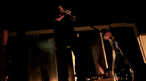
He added a system of valves to the pipe so that Belgian glassblower Christophe Genard could influence the inner shape of the glass by opening and closing different air streams.

Creation of a Strange Symphony by Philipp Weber_5

A video documenting the use of the new instrument focuses on the sounds and rhythms created as the glass is formed by blowing and manipulating it using a series of tools.

Creation of a Strange Symphony by Philipp Weber_4

“The relation between the glassblower and his tool is very important, since it bridges his connection to the material,” says Weber. “What if I change the tool? Does it change the material? And what if design doesn’t start at the product but at the tool?”

Creation of a Strange Symphony by Philipp Weber_10

The DMY International Design Festival Berlin is one of the stops on our Dezeen and MINI World Tour, and we’ll be publishing more stories and videos from the event in the next few days.

Creation of a Strange Symphony by Philipp Weber_11

Last week a glass pendant with a tiny brass chandelier inside it was presented at ICFF in New York, while Norwegian designers StokkeAustad and Andreas Engesvik created a series of blown-glass trees for Stockholm Design Week earlier this year – see all stories about glass.

Here are some more details about the project:


In ‘Creation of a strange Symphony’ Philipp Weber portrays the performance of a glassblower using a new and unusual tool.

Creation of a Strange Symphony by Philipp Weber_12

Pivotal to this work was Weber’s desire to discover the world of a glassblower. In Belgium he was able to watch glassblower Christophe Genard working with the hot material. The designer questioned himself, ‘How can I inspire his interest to work with me?’.

Creation of a Strange Symphony by Philipp Weber_13

Genard’s most important tool, the blowing pipe, caught Weber’s attention. In the past 2000 years only minor alterations have been made to the 1.5m long steel pipe, with no effect to the material. ‘What would happen to the glass if the function of this tool radically changed? How would Christophe adapt to a new pipe?’.

Creation of a Strange Symphony by Philipp Weber_14

And so, by manipulating the pipe, he took influence on the inner shaping of the glass.

Creation of a Strange Symphony by Philipp Weber_15

Simultaneously to this process, Weber also sensed a strong rhythm and musicality in the way Genard was working on the glass. The pipe as a tool for glass production, appeared to be like a musical instrument to him.

Creation of a Strange Symphony by Philipp Weber_16

He could not resist the idea to translate the mechanism of a trumpet into an application for blowing glass.

Together with an engineer and the knowledge from preceding experiments for a new tool, he worked on an ‘instrument’ – an allegoric bond of craft and music – inspiring Genard to ‘improvise’ the glass, to start a dialogue with the material.

Playing the valves, Genard would shape the glass from inside, activating different air streams. The transformation of the pipe into an instrument provoked a performance of glass making. A short-movie, several glass objects and the instrument itself communicate this dance with the fire.

The post Strange Symphony
by Philipp Weber
appeared first on Dezeen.

Ads with a New Purpose by Ogilvy & Mather for IBM

These billboards by creative agency Ogilvy & Mather stretch outwards to double as street furniture (+ movie).

Designed for IBM‘s Smarter Cities campaign, the strategy fuses advertising with helpful additions to the street such as benches, shelters and ramps.

Ads with a New Purpose by Ogilvy and Mather for IBM

Ogilvy & Mather designed one billboard that curves over at the top to form a rain shelter and another that peels up from the wall to create a seat. A ramp covering steps assists those wheeling bicycles or suitcases through the streets.

Ads with a New Purpose by Ogilvy and Mather for IBM

Each ad uses simple graphics in bold colours to represent its function, with text encouraging users and passers by to interact online.

The billboards were first launched in London and Paris, and IBM intends to roll out the designs across other cities around the world.

Ads with a New Purpose by Ogilvy and Mather for IBM

Last month we reported that researchers from IBM had redesigned the bus routes across Ivory Coast’s largest city using data from mobile phones.

Other stories about street furniture include a bollard with a foot rest and handle to help cyclists keep their balance at traffic lights and a perforated street lamp.

See more street furniture design »

Ogilvy sent us the extra information below:


IBM & Ogilvy France Create Ads with a New Purpose

IBM is committed to creating solutions that help cities all over the world get smarter, in order to make life in those cities better.

That’s why IBM and Ogilvy are working together to spark positive change with the “People for Smarter Cities” project, and unite city leaders and forward-thinking citizens.

To spread the word, Ogilvy created outdoor advertising with a purpose: a bench, a shelter and a ramp that are not only designed to be beautiful, but to be useful to city dwellers as well.

Initially launched in London and Paris, IBM has plans to take this idea to cities around the world and inspire citizens to think about simple ways they can help make their cities smarter.

The post Ads with a New Purpose
by Ogilvy & Mather for IBM
appeared first on Dezeen.

Prima installation by Zaha Hadid for Swarovski at Vitra Campus

An angular installation by Zaha Hadid has been unveiled in front of the architect’s Fire Station at the Vitra Campus in Weil am Rhein, Germany (+ slideshow).

Prima by Zaha Hadid at Vitra Campus_5

The work was commissioned by crystal manufacturer Swarovski to mark the twentieth anniversary of the opening of the Vitra Fire Station, Zaha Hadid‘s first completed building.

Called Prima, it comprises five components that can be arranged in different configurations to create adaptable seating landscapes.

Prima by Zaha Hadid at Vitra Campus_2

Hadid’s original drawings for the Fire Station were translated into three-dimensional fragmented forms to create the seating. Highly polished surfaces reflect the sky and the angles of the nearby building, while strips of LED lighting illuminate the structure at night.

“I have a particular affection for Vitra Fire Station as it was my first building,” says Hadid. “Returning to Vitra to work with Swarovski on this installation has been a very rewarding experience.”

Prima will be on show at the Vitra Campus in Weil am Rhein, Germany, from tomorrow until 11 August.

Prima by Zaha Hadid at Vitra Campus_6

First established in the 1980s, the Vitra Campus has become well-known as an unofficial museum of contemporary architecture, including Herzog & de Meuron’s VitraHaus showroom, the Vitra Design Museum by Frank Gehry and a conference hall by Tadao Ando.

A SANAA-designed Factory Building is the latest addition, opened in April, and the building proposed for the site will be a children’s art workshop by Chilean architect Ale­jan­dro Ar­ave­na.

Prima by Zaha Hadid at Vitra Campus_8

Zaha Hadid has recently proposed a masterplan for a site beside a lagoon in Izmir as part of Turkey’s bid to host the World Expo 2020 and has also been appointed to design a stadium in Qatar for the 2022 FIFA World Cup.

Prima by Zaha Hadid at Vitra Campus_1

More about architecture and design by Zaha Hadid »
More about the Vitra Campus »

Photography is by Hélène Binet, unless stated otherwise.

Here’s some more information from Swarovski:


A spectacular new Swarovski commission – Prima

Swarovski has commissioned Zaha Hadid to create a celebratory installation marking the completion twenty years ago of her first major built project, the Fire Station at Vitra Campus, Weil am Rhein, Germany.

The installation, entitled Prima, is an angular piece made from five highly polished components that can be moved into different configurations. It will be installed in front of the Fire Station, reflecting and honouring the design process of the building. The project recalls the dynamism of Hadid’s original drawings created for the Vitra Fire Station, exploding in three dimensions from the lines and planes of the paintings and sketches. Its reflective surfaces contain seating for visitors and are illuminated with LED technology.

One of the world’s most celebrated architects, Zaha Hadid was the first woman to win the Pritzker Prize, the most prestigious award in architecture. For years, her radical designs remained on the drawing board, but the turning point came in 1993 with the opening of the Vitra Fire Station commissioned by Vitra’s Chairman Rolf Fehlbaum.

Prima by Zaha Hadid at Vitra Campus_3

Painting formed a critical part of Hadid’s early career as the design tool that allowed powerful experimentation in both form and movement – leading to the development of a new language for architecture. Hadid’s interest in the concepts of fragmentation and abstraction is evident throughout her repertoire and continues to this day. Originally engaging with the work of Kazimir Malevich, Hadid translated the warped and anti-gravitational space of Russian avant-garde painting and sculpture into her own unique architectural practice.

Using the advanced design and manufacturing technologies available today, the facets of Prima are a direct translation of the dynamic two-dimensional lines and planes on the canvas, reflecting Hadid’s detailed experimentation to perfect the Fire Station design. The installation continues this research, documenting Hadid’s remarkable journey as an articulator of complexity: a 2D sketch evolves into a workable space, and then into a realised building.

Zaha Hadid commented: “I’m equally proud of all my projects as they each represent different times of my career and periods of research, but I have a particular affection for Vitra Fire Station as it was my first building. Rolf Fehlbaum shares my passion for architecture and was inspired by my early visualizations. He dared to engage me without seeing a prior track record and without the certainty of public success. Returning to Vitra to work with Swarovski on this installation has been a very rewarding experience.”

Prima by Zaha Hadid at Vitra Campus_4

Nadja Swarovski, Member of the Swarovski Executive Board, commented: “Zaha is an astonishing force of nature who imparts her designs with power and grace in equal measure. It has been an honour to work with her once again on this exciting celebratory commission. Prima is a dramatic sculptural installation – half art, half furniture, and stunningly beautiful.”

Rolf Fehlbaum, Chairman of Vitra, said: “I am happy to have worked with Zaha Hadid at such an early stage of her dazzling career. Her Fire Station is a spectacular building and it looks as impressive now as it did when it was first built. Few other architects would have been able to transform a modest commission like ours into a masterpiece of contemporary architecture. Zaha has been able to do so, thanks to an incredible sense of space and a radically new vision of what architecture can represent.”

Prima by Zaha Hadid for Swarovski at Vitra Fire Station on the Vitra Campus, Weil am Rhein, Germany. Prima will be showcased outside the Fire station from 12 June to 11 August 2013. The installation can be viewed as part of the public architectural tours.

The post Prima installation by Zaha Hadid for
Swarovski at Vitra Campus
appeared first on Dezeen.

Garson Yu: The Interactive New York (T.I.N.Y.): Layers of audio and visuals create a reactionary site-specific installation at NYC’s Pier 57

Garson Yu: The Interactive New York (T.I.N.Y.)


As the founder and creative director of yU+co, a renowned LA-based studio specialized in film title sequences, Garson Yu knows a thing or two about telling a story in a matter of minutes. Yu’s creative expertise…

Continue Reading…

INAHO by Hideki Yoshimoto and Yoshinaka Ono

Little tubes of golden light gently lean towards approaching visitors in this installation by Japanese design duo Hideki Yoshimoto and Yoshinaka Ono.

Inaho by Hideki Yoshimoto and Yoshinaka Ono

Hideki Yoshimoto and Yoshinaka Ono of tangent: studio wanted to create the impression of golden ears of rice slowly swaying in the wind.

Inaho by Hideki Yoshimoto and Yoshinaka Ono

INAHO, which means “ear of rice” in Japanese, is composed of LEDs encased in golden tubes fixed to the end of three-millimeter-wide carbon fibre stems.

Inaho by Hideki Yoshimoto and Yoshinaka Ono

Tiny perforations in the tubes distribute the light into a smattering of blurry dots reminiscent of a rice paddy field, while movement sensors within the base of each stem draw the golden tips in the direction of passing people.

Inaho by Hideki Yoshimoto and Yoshinaka Ono

The installation was awarded first place in the Lexus Design Awards and was subsequently presented at the Lexus space during the Salone Internazionale del Mobile in Milan last month.

Inaho by Hideki Yoshimoto and Yoshinaka Ono

We recently interviewed the new Salone del Mobile president on how he plans to tackle issues that “damage Milan”.

Inaho by Hideki Yoshimoto and Yoshinaka Ono

We previously featured a music box that uses the movement of the musical mechanism to cause sticks of barley to gently sway.

Inaho by Hideki Yoshimoto and Yoshinaka Ono

See all our stories about Milan 2013 »
Read about more installations »

Inaho by Hideki Yoshimoto and Yoshinaka Ono

Here’s a description of Inaho from the designers:


INAHO is an interior lighting inspired by a golden ear of rice slowly swinging in the wind. The product’s 3 mm wide stem is made of carbon fibre and a LED covered by a golden perforated tube is attached to its end, which creates light in dots reminding us of paddy rice. Human-detection sensors are embedded in the base and when a person comes by the INAHO, it begins to sway in that direction.
Dozens of Inaho would create a landscape that responds to and follows people, which will make an attractive entrance or corridor. By extracting the characteristics from an ear of rice and representing them with minimal elements, we approached a product which possesses novelty and nature-oriented familiarity together.

The post INAHO by Hideki Yoshimoto
and Yoshinaka Ono
appeared first on Dezeen.