House in Kawanishi by Tato Architects resembles Australian dwellings

Following the Australian home we published earlier this week based on Japanese architecture, this house in Hyogo, Japan, was designed by Tato Architects with the same hipped roof, stilted structure and wide balcony that are common to residences in Queensland, Australia (+ slideshow).

House in Kawanishi by Tato Architects based on Australia's "Queenslander" dwellings

Yo Shimada of Tato Architects decided to base the two-storey House in Kawanishi on the archetypal Australian dwelling known as “The Queenslander” after coming across photographs of the buildings in construction.

House in Kawanishi by Tato Architects based on Australia's "Queenslander" dwellings

“Since then, I have been interested in the form of this style of house,” said Shimada, explaining how he was later able to visit Australia and see the houses for himself. “It’s a design solution that mirrored my own thinking,” he added.

House in Kawanishi by Tato Architects based on Australia's "Queenslander" dwellings

The stilted structure of the house, comprising a system of exposed steel I-beams, allowed Shimada to recess part of the ground floor to allow ample room for a public walkway that runs alongside the property.

House in Kawanishi by Tato Architects based on Australia's "Queenslander" dwellings

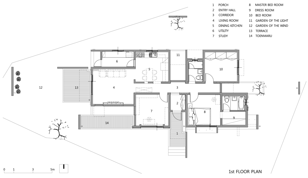
The first floor still continues to the edge of the site, sheltering part of the walkway but also framing the house’s entrance lobby – a transparent glass box containing a cabinet for storing shoes before entering.

House in Kawanishi by Tato Architects based on Australia's "Queenslander" dwellings

According to Shimada, this space is intended to highlight the boundary between the public space of the walkway and the privacy of the domestic interior. “It sits reminiscent of a bus stop containing furniture brought there by neighbours,” he said.

House in Kawanishi by Tato Architects based on Australia's "Queenslander" dwellings

Square in plan, the house has a non-symmetrical grid that defines the sizes of rooms contained within. Living, dining and kitchen areas occupy a large open-plan space on the ground floor, but are loosely separated by a boxy white bathroom.

House in Kawanishi by Tato Architects based on Australia's "Queenslander" dwellings

Two large voids in the ceiling allow views up to the floor above. One of these openings also functions as a stairwell and ascends up over a storage area at the front of house.

House in Kawanishi by Tato Architects based on Australia's "Queenslander" dwellings

A landing halfway up the stairs creates a sunken seating area for a study above, allowing the floor surface to be used as a desk.

House in Kawanishi by Tato Architects based on Australia's "Queenslander" dwellings

The entire first floor is lined with lauan plywood. Internal windows allow views between rooms on this level, while skylights bring extra daylight in through the sloping roof above.

House in Kawanishi by Tato Architects based on Australia's "Queenslander" dwellings

The house’s balcony stretches across the entire south facade. A garage is positioned underneath and can be accessed by sliding back an industrial metal door.

House in Kawanishi by Tato Architects based on Australia's "Queenslander" dwellings

Concrete-block walls with occasional perforations enable a system of natural ventilation, with hot air released through a chimney at the rear.

House in Kawanishi by Tato Architects based on Australia's "Queenslander" dwellings

Photography is by Shinkenchiku-sha.

Here’s a project description from Tato Architects:


House in Kawanishi

Layered Boundaries

The project presented an unusual challenge: A public walkway ran adjacent to the western boundary of the house. It narrowed awkwardly from a three metre-wide road on approach from the north to a mere seventy centimetres on the eastern border to the southern corner of the site. If walls had been built to the boundary of the site to protect the residents’ privacy from the many passers-by who used this path, the path would narrow oppressively and become more difficult for the area’s residents to use.

House in Kawanishi by Tato Architects based on Australia's "Queenslander" dwellings

Instead, the ground floor was set back from the boundary to give space to the path and to give the impression that the full width of the path continued through. Then the second floor of the house was built back over the path, out to the boundary of the site and its border with the road. There is a glazed entrance area containing a shoe cabinet that appears to sit beyond the border between the public and private spaces. It sits reminiscent of a bus stop containing furniture brought there by neighbours.

House in Kawanishi by Tato Architects based on Australia's "Queenslander" dwellings

This theme of crossing borders between road and site is carried through the entire house design. Using the line of the neighbour’s concrete block wall, a new block wall has been built through to the south, crossing an interior space to become the wall of a storage space. This harnesses the height differences originally found in the site.

House in Kawanishi by Tato Architects based on Australia's "Queenslander" dwellings

The area above the storage space then forms a landing for the stairs, and the level of the first floor has been adjusted to function as a desk sitting over the landing. This creates a space that is partly a border between a floor and partly a desk. Seen from the street, the ground floor, the first floor, and the interior and the exterior all appear to cross over.

House in Kawanishi by Tato Architects based on Australia's "Queenslander" dwellings

The interior walls of the upper volume are all lauan plywood, which creates a singular space that lives in clear contrast to the ground floor, which contains a variety of materials and features. The whole design suggests an evolving living space with features that appear to cross beyond boundaries yet control them at the same time.

House in Kawanishi by Tato Architects based on Australia's "Queenslander" dwellings

Gaining anonymous knowledge

The house style called a “Queenslander” is a stilt house with a wooden structure and a balcony design specific to Queensland in Australia. While some researchers in Japan have studied it, I had little knowledge of it until I encountered photographs of Queenslander houses being lifted during their conversion and renovation from one to two-story structures. Since then, I have been interested in the form of this style of house.

House in Kawanishi by Tato Architects based on Australia's "Queenslander" dwellings

By a curious coincidence, last year I received a request from an Australian man to design his house. I flew there in June in 2013 for the site research, where I found the city space was surprising. Most of the Queenslanders I saw had hipped roofs with overhangs that covered all of the exterior space of the house. These roofs were clad in corrugated iron, painted white or silver to reflect the heat. To facilitate ventilation, which is normally difficult with a hipped roof, ventilators were installed on top. During their conversion to their two-storey form, various additional house features were being built in under the lifted volumes.

House in Kawanishi by Tato Architects based on Australia's "Queenslander" dwellings

It’s a design solution that mirrored my own thinking in the design of this house, which was under construction at that time. While I design my architecture, I am sometimes encouraged by the knowledge I gain from anonymous predecessors who have had to deal with similar matters beyond time and regions. It is a wonderful moment to be able to touch an unbroken line of history in architecture and accumulate knowledge from it.

House in Kawanishi by Tato Architects based on Australia's "Queenslander" dwellings
Ground floor plan – click for larger image

Structure

The plan is defined by a grid, with four squares slightly shifted off centre, and a modified square hipped roof formed by raising it at the centre. The simple, slim rigid joint frame structure consists of 125mm×125mm square steel columns and 200mm×100m H section steel beams. It realises its strength through its stiffness, by the low ceiling height and by the column bases buried in the foundation.

House in Kawanishi by Tato Architects based on Australia's "Queenslander" dwellings
First floor plan – click for larger image

On the edge of the eaves, small section flat steel pipes are inserted to channel the steel rafters around the structure. The concrete block wall on the ground floor stands without counterforts through the support of flat steel bars inserted into some of the block holes.

House in Kawanishi by Tato Architects based on Australia's "Queenslander" dwellings
Section – click for larger image

Location of site: Hyogo, Japan
Site area: 120.54 sqm
Building area: 59.84 sqm
Total floor area: 107.73 sqm
Type of Construction: steel
Program: house
Project by: Tato Architects
Principal designer: Yo Shimada
Structural engineer: S3 Associates Inc.

The post House in Kawanishi by Tato Architects
resembles Australian dwellings
appeared first on Dezeen.

Mun Jeong Heon house by A.M Architects is surrounded by a huge concrete frame

A massive concrete frame wraps over the top of this house in South Korea by A.M Architects and shelters a traditional narrow porch (+ slideshow).

Mun Jeong Heon house by A.M Architects is surrounded by a huge concrete frame

The house near the town of Bongsan-myeon also features an assortment of freestanding walls and projecting canopies.

Mun Jeong Heon house by A.M Architects is surrounded by a huge concrete frame

“The concept of ‘architecture like promenade’, which accumulates spacial experience is well expressed in piled walls with sequential views of the interior and exterior, serving as an element to add a sense of depth and the direction of entry,” said A.M Architects.

Mun Jeong Heon house by A.M Architects is surrounded by a huge concrete frame

Beginning with a straightforward cuboid, the architects removed boxy sections to create voids in the building’s facades and reduced these volumes to surfaces that act as a backdrop for three trees planted around the boundaries of the site.

Mun Jeong Heon house by A.M Architects is surrounded by a huge concrete frame

The rectangular frame that surrounds the front of the building casts dynamic shadows onto the toenmaru – a narrow wooden patio that can be accessed from the study.

Mun Jeong Heon house by A.M Architects is surrounded by a huge concrete frame

A freestanding concrete wall signals the main entrance to the house, which is accessed via a short flight of wooden steps.

Mun Jeong Heon house by A.M Architects is surrounded by a huge concrete frame

As well as the front steps, wood is used for the terraces and to clad one section of the building’s front facade, providing a warm contrast to the stark cast concrete walls.

Mun Jeong Heon house by A.M Architects is surrounded by a huge concrete frame

From inside the entry hall a window directly opposite provides a view of one of the trees at the back of the property.

Mun Jeong Heon house by A.M Architects is surrounded by a huge concrete frame

A corridor traversing the house from east to west culminates in a window on the east elevation that looks out at another tree.

Mun Jeong Heon house by A.M Architects is surrounded by a huge concrete frame

The house’s bedrooms, study and living room are arranged off this central corridor, which incorporates a skylight to introduce natural light into the space.

Mun Jeong Heon house by A.M Architects is surrounded by a huge concrete frame

The main living room at the west end of the corridor connects to the kitchen and dining area and to a large wooden deck that projects into the garden.

Mun Jeong Heon house by A.M Architects is surrounded by a huge concrete frame

Low windows provide additional daylight and views of the gardens outside, while a tall window looks out towards a distant mountain that is framed by the large concrete rectangle.

Photography is by Kim Jae Kyeong.

Here’s a project description from A.M Architects:


MUN JEONG HEON

Architecture like Promenade

The concept of Architecture like Promenade, which accumulates spacial experience, well expressed in piled walls with sequential view of interior and exterior, which servers as an element to add sense of depth and the direction of entry.

The controlled form of the entrance placed in the entry part is an objet for moving toward another space. On going into the entry space, the house, surrounded by horizontal free-standing walls floating in the air, appears overlapped. Free-standing walls of exposed concrete to emphasise horizontal stream are used as a method to attract people’s eyes and become visually magnified.

Site plan of Mun Jeong Heon house by A.M Architects is surrounded by a huge concrete frame
Site plan – click for larger image

The light of nature falling long in dynamic angles through the cantilever decoration beam protruded from the flat surface of the wall, the light of nature falling is naturally ushered to the deck in front of the entrance with the property of concrete, and makes the place of main entrance recognised with free-standing walls. Also, the glance extending long along the stream of free-standing wall stays a little far in the foot of the mountain passing over spindle tree fence.

Floor plan of Mun Jeong Heon house by A.M Architects is surrounded by a huge concrete frame
Floor plan – click for larger image

Enter the inside, over the transparent window, we can see a tree in the back yard along the grass extending the floor all in one, which is the architectural element to induce boundless horizontal extension of the space visually.

As soon as we go into the living room along the corridor, we can feel the energy of the extended light going down softly through the ceiling. The composition of walls repeating solid and void serves as an element of architectural promenaded which makes us feel the outside and inside space sequentially with the natural light, and guides the direction of entry with tension.

Section of Mun Jeong Heon house by A.M Architects is surrounded by a huge concrete frame
Section – click for larger image

Free-Standing Walls for Selective View

The inner garden seen from the living room expressing the changing seasons with free-standing walls for selective view keeps an indirect eye on the landscape of distant mountain hanged at the end of exposed concrete free-standing walls through toenmaru connected visually with the study. Such architectural element becomes a device to draw nature selectively, and to makes a metaphoric communication between interior space and exterior space possible.

South elevation of Mun Jeong Heon house by A.M Architects is surrounded by a huge concrete frame
South elevation – click for larger image

The domain created through a layer and a layer communicates with nature along with various forms of walls controlling the visual and spatial movements. Organic setting up of interior and exterior spaces connecting to corridor, back yard, living room, inner garden, study and toenmaru creates the architecture of incessant relationship and stream.

West elevation of Mun Jeong Heon house by A.M Architects is surrounded by a huge concrete frame
West elevation – click for larger image

Architects: A.M Architects
Architect in charge: Kim Tae Yun
Location: Taehwa-ri, Bongsan-myun, Kimcheon-si, Kyeongsangbuk-do, Korea
Area: 99.82m2

The post Mun Jeong Heon house by A.M Architects
is surrounded by a huge concrete frame
appeared first on Dezeen.

Wooden structures combine partitions and furniture inside home by João Branco

Portuguese architect João Branco has converted a small office building in Coimbra into a home by installing softwood joinery that functions as furniture, storage and partitions (+ slideshow).

Apartment in Coimbra by João Branco

Described by Branco as being “closer to carpentry than building construction”, the project involved adding three sections of woodwork to the lower floor of the two-storey property to create a living room, dining area, study, kitchen and toilet.

Apartment in Coimbra by João Branco

“The intervention proposes to let the light flow, converting it into a diaphanous space and thus increasing the feeling of spaciousness,” said the architect.

Apartment in Coimbra by João Branco

The first wooden structure sits just beyond the entrance. It creates a study area for two people beneath the staircase, but also accommodates a cloakroom, a shelf and a gridded bookshelf.

Apartment in Coimbra by João Branco

Ahead of this, a low and narrow timber piece doubles as both a sideboard and a bench, separating the living and dining areas.

Apartment in Coimbra by João Branco

The kitchen and toilet are both housed within the third structure. This is made up of floor-to-ceiling partitions, some of which turn out to be doors, and also includes a row of kitchen cupboards and a countertop.

Apartment in Coimbra by João Branco

“The objects are designed to provide the greatest possible sobriety, resulting in a high degree of abstraction and giving the house enhanced spatial clarity,” added Branco.

Apartment in Coimbra by João Branco

An oak parquet floor was added throughout the space, while an existing staircase with wooden treads leads up to bedroom spaces on the level above.

Apartment in Coimbra by João Branco

Photography is by Do Mal o Menos.

Here’s a project description from João Branco:


Apartment in Coimbra

Three pieces of furniture create a home. The aim was to convert a former two-floor office into a rental apartment. The proposal, which develops at the lower level, focuses on reconverting a small area, originally subdivided and dark, to accommodate the social areas of the house.

Apartment in Coimbra by João Branco

The intervention proposes to let the light flow, converting it into a diaphanous space and thus increasing the feeling of spaciousness. The main decision is not to build, intervening by dispensing with traditional construction work, in favour of a dry approach, much simpler, without creating new walls or divisions. To that, the plant is emptied, introducing in the diaphanous space three wooden pieces of furniture that will organise the space.

Apartment in Coimbra by João Branco
Exploded axonometric diagram – click for larger image

Firstly, a box contains wet areas: kitchen and bathroom. A mobile with a bookcase and table gives form to the the entrance and to a small office under the stairs. Finally, a movable lower furniture separates the living and eating areas. With only these three pieces, shape is given to the spaces of the house, always visually connected to maintain unity and flow of southern light.

Floor plan
Floor plan

This work, closer to carpentry than building construction, focuses on the details and encounters. Reducing to a minimum the elements, fittings, switches, etc. the objects are designed to provide the greatest possible sobriety, resulting in a high degree of abstraction and giving the house enhanced spatial clarity.

The post Wooden structures combine partitions and
furniture inside home by João Branco
appeared first on Dezeen.

BLOXAS adds periscope-shaped extension and courtyard veranda to Melbourne house

Australian studio BLOXAS adopted elements from Japanese architecture to reorganise the spaces of this Melbourne residence around a courtyard then added a new timber-clad extension shaped like a periscope (+ slideshow).

Engawa House in Melbourne by BLOXAS adopts a traditional Japanese veranda

Located in the suburb of Fitzroy North, the renovated open-plan house was designed by BLOXAS to provide a “dynamic mix of spaces” for a family of four who had previously spent many years living and working in Japan.

Engawa House in Melbourne by BLOXAS adopts a traditional Japanese veranda

The building has an L-shaped plan that wraps around the long north-facing courtyard. A wooden deck runs along the edge of the lawn as an imitation of the traditional Japanese engawa – a narrow veranda –  and prompted the residence to be named Engawa House.

Engawa House in Melbourne by BLOXAS adopts a traditional Japanese veranda

“This design was structured around the concept of engawa,” explained architect and studio principal Anthony Clarke. “This space offers a transition between the yielding comfort of the grassed courtyard and the polished concrete floor of the interior.”

Engawa House in Melbourne by BLOXAS adopts a traditional Japanese veranda

Three red brick chimneys belonging to the old structure are dotted through the house. One sits along the street-facing southern elevation, forming a visual break between the white-painted weatherboards cladding the original house and the black-stained plywood walls of the extension.

Engawa House in Melbourne by BLOXAS adopts a traditional Japanese veranda

Comparing the building to a red brick factory across the street, Clarke added: “The black stained plywood exterior of the facade will age sympathetically with the warehouses surrounding it, offering a unique composition against the retained brickwork fireplace.”

Engawa House in Melbourne by BLOXAS adopts a traditional Japanese veranda

Living, dining and kitchen areas occupy a large rectilinear space at the centre of the house and can be opened out to the courtyard by sliding back a series of floor-to-ceiling glass doors.

Engawa House in Melbourne by BLOXAS adopts a traditional Japanese veranda

A staircase leads up from the living room to a mezzanine study, from which residents can survey activities going on beneath them.

Engawa House in Melbourne by BLOXAS adopts a traditional Japanese veranda

New timber-framed windows puncture the facade and a bathroom wraps around another of the old chimneys.

Engawa House in Melbourne by BLOXAS adopts a traditional Japanese veranda

Photography is by Peter Bennetts.

Read on for a project description from Anthony Clarke of BLOXAS:


Engawa House

Melbourne’s inner-north has a distinct European feel of community living. Small houses compel people towards local parks and curbside gardens, blurring the threshold between public and private. The Engawa House in North Fitzroy, embraces this atmosphere, as the dynamic and historical patchwork of the surrounding context becomes part of each living space.

Engawa House in Melbourne by BLOXAS adopts a traditional Japanese veranda

The clients, a family of four, described a space offering them a feeling of discovery, through a variety of intersecting planes, and the layering of natural light. They required a relocated central bathroom, kitchen, dining, living, additional bedroom with ensuite, as well as a mezzanine office and external entertaining area.

Engawa House in Melbourne by BLOXAS adopts a traditional Japanese veranda

A full facing northern wing, mixing a combination of single and double storey forms, attaches itself to the front rooms of the existing house. The simple orientation takes advantage of the full range of views from the mezzanine, whilst being sympathetic to its elevational context. The living, dining and bedroom/en suite skirt a large and long courtyard garden, maximising sustainable performance, and offering northern light into each new program.

Engawa House in Melbourne by BLOXAS adopts a traditional Japanese veranda

This design was structured around the concept of “Engawa”, referring to an exterior hallway on the side of a traditional Japanese dwelling. This space offers a transition between the yielding comfort of the grassed courtyard and the polished concrete floor of the interior. It also offers a transitional space for informal seating.

Engawa House in Melbourne by BLOXAS adopts a traditional Japanese veranda

The open living and mezzanine enhance a visual and auditory connection, with a distinct lack of privacy, embracing the family’s already strong connection.

Engawa House in Melbourne by BLOXAS adopts a traditional Japanese veranda

Rather than competing with the streetscape, BLOXAS utilised council restrictions to invite exploration yet maintain integrity. The striking black form signposts the street corner and its palette of styles.

Engawa House in Melbourne by BLOXAS adopts a traditional Japanese veranda

The Engawa House interplays scale and height, contributing to the elevational rhythm of the red factory brickwork, single-storey weatherboard terraces and the multi-storey residential context.

Engawa House in Melbourne by BLOXAS adopts a traditional Japanese veranda

Large timber windows to the southern boundary invite the engagement between neighbouring residents and the clients of the Engawa House.

Engawa House in Melbourne by BLOXAS adopts a traditional Japanese veranda

Underpinning the projects conceptual idea was a very tight budget. The addition provides a smaller overall footprint than the previous plan, now maximising the site’s potential. The black stained plywood exterior of the facade will age sympathetically with the warehouses surrounding it, offering a unique composition against the retained brickwork fireplace. This facilitated a high quality interior where the client desired a more minimal and refined finish.

Engawa House in Melbourne by BLOXAS adopts a traditional Japanese veranda

Architect: Black Line One X Architecture Studio
Location: Fitzroy North, Melbourne, Australia
Builder: Zachary Spark Constructions
Project Year: 2013
Furniture: Ross Gardam, Earl Pinto

Engawa House in Melbourne by BLOXAS adopts a traditional Japanese veranda
Ground floor plan – click for larger image
Engawa House in Melbourne by BLOXAS adopts a traditional Japanese veranda
Mezzanine floor plan – click for larger image
Engawa House in Melbourne by BLOXAS adopts a traditional Japanese veranda
Sections – click for larger image

The post BLOXAS adds periscope-shaped extension
and courtyard veranda to Melbourne house
appeared first on Dezeen.

Karri Loop House by MORQ folds around three indigenous Australian trees

Three mature trees were rooted to the centre of this site in Western Australia, but architecture firm MORQ managed to convince the owners to build their family house around the peeling trunks and burgeoning foliage (+ slideshow).

Karri Loop House by MORQ

Located south of Perth in the town of Margaret River, Karri Loop House was constructed around one large Karri tree and a pair of Marri trees – both of which are indigenous to this region of Australia – after MORQ came up with a design that prevented them needing to be chopped down.

Karri Loop House by MORQ

The single-storey residence has an H-shaped plan that wraps around the trunks of the three trees and also frames a pair of irregularly shaped courtyards.

Karri Loop House by MORQ

To avoid disturbing the delicate shallow roots, the architects raised the house off the ground by positioning it on hand-placed steel tripod footings, rather than digging pile foundations.

Karri Loop House by MORQ

Dramatic double-height ceilings and large windows were then added to the living room and master bedroom to “celebrate the presence of the trees” by offering residents views of the leaves and branches overhead.

Karri Loop House by MORQ

“These trees, their root systems and their unstable large branches presented a challenge to the build-ability of the house,” said the architects.

Karri Loop House by MORQ

“We like to think of this project as a mutually beneficial development; the building is designed to retain the trees, while the trees visually contribute to the quality of the inner space,” they added.

Karri Loop House by MORQ

A raised deck runs along the northern side of the house to create an outdoor seating area beneath the canopy of the Karri, while a sheltered triangular terrace at the end of the living room features a vertical window framing another view of the tree.

Karri Loop House by MORQ

A rainwater harvesting system is built into the roof, which channels water through to an irrigation system feeding the tree roots.

Karri Loop House by MORQ

Plywood clads the inner and outer walls of the house. On the outside, it has a roughly sawn surface coated with a layer of black paint, while interior surfaces have been sanded smooth to reveal the natural grain.

Karri Loop House by MORQ

Wooden ceiling beams were left exposed in various rooms inside the building. Straw bales were also added to provide insulation, but are concealed within the walls.

Karri Loop House by MORQ

Photography is by Peter Bennetts.

Here’s some more information from MORQ:


Karri Loop House

The mature trees located in the middle of the site (a Karri and two Marris) played an essential part in shaping our project. The first part of the design process was spent in investigating the requirements for retaining these trees, as well as convincing the clients of their unique presence on an otherwise anonymous site. With the support of a renowned arborist, the decision was finally made to keep the trees. As a result, the house sits in between the tree-trunks and its outline defines two open courtyards of irregular shape. These embrace the trees and the surrounding landscape, around which family life occurs.

Karri Loop House by MORQ

A tall window in the dining area and a periscope-like skillion in the master bedroom, celebrate the presence of the trees from within the house, framing views of both foliage and peeling trunks. These trees, their root systems and their unstable large branches presented a challenge to the build-ability of the house. We like to think of this project as a mutually beneficial development: where the building is designed to retain the trees, while the trees visually contribute to the quality of the inner space.

Karri Loop House by MORQ

To protect the integrity of the shallow root-system a matrix of steel tripod footings was used: each of them had to be dug by hand, and repositioned every time a root was encountered, resulting in an irregular structural grid. These footings also raise the house off the ground and give it a somewhat temporary look.

Karri Loop House by MORQ

Any part of the house footprint overlapping the root system would result in an uneven rainwater supply to the roots, which could cause a shock to the trees. Rainwater collected on the roof is therefore taken under the house, channelled into a trickling irrigation pipes and then evenly fed to the tree roots.

Karri Loop House by MORQ

Lightweight construction seemed the most appropriate response to the existing trees requirements, however straw-bales were chosen as a preferred form of insulation. This decision required all perimeter walls to be prefabricated as ladder-frames and later assembled on site. It also resulted in unusually thick perimeter walls, seldom employed in timber framed buildings.

Karri Loop House by MORQ
Floor plan – click for larger image

The house was mainly constructed out of timber, whose grain and texture inform both interior and exterior spaces. Wall linings use different grades of plywood: rough sawn, painted black on the outside, and sanded, clear-treated on the inside. The floor and ceilings are also in clear-treated plywood. The roof structure is resolved with Laminated Veneer Lumber beams, which are left exposed on the inside of the ceiling.

Karri Loop House by MORQ
Detailed section one – click for larger image

Project typology: new house
Site: Margaret River, Western Australia
Floor area: 290 sqm
Year: 2013
Number of inhabitants: 2 adults + 3 children

Karri Loop House by MORQ
Detailed section two – click for larger image

The post Karri Loop House by MORQ folds around
three indigenous Australian trees
appeared first on Dezeen.

Oller & Pejic’s Desert House designed to look “like a shadow”

This all-black house in the Yucca Valley desert was designed by Los Angeles office Oller & Pejic to look “like a shadow” (+ slideshow).

Oller & Pejic's Desert House designed to look "like a shadow"

Located within the borders of the Joshua Tree National Park, where sunlight is often painfully harsh, Desert House was designed by husband and wife architects Monica Oller and Tom Pejic as a volume that would be easy to rest the eyes on.

Oller & Pejic's Desert House designed to look "like a shadow"

They explained: “Our client had given us a brief but compelling instruction at the start of the process – to build a house like a shadow.”

Oller & Pejic's Desert House designed to look "like a shadow"

Despite its remote rural location, the house was constructed on a site that had been flattened in the 1960s. This meant the building couldn’t be staggered down the slope and was instead designed with a mostly level floorplate that ends at the edge of a precipice.

Oller & Pejic's Desert House designed to look "like a shadow"

“The house would replace the missing mountain that was scraped away, but not as a mountain, but a shadow or negative of the rock,” said the architects, explaining how they imagined the design early on in the process.

Oller & Pejic's Desert House designed to look "like a shadow"

The two wings of the house sprawl out across the site, framing various outdoor spaces. A courtyard is sandwiched between the bedrooms and living spaces, while a swimming pool sits in the south-east corner and a sheltered triangular patio points northwards.

Oller & Pejic's Desert House designed to look "like a shadow"

“We wanted the experience of navigating the house to remind one of traversing the site outside,” added Oller and Pejic.

Oller & Pejic's Desert House designed to look "like a shadow"

The open-plan living room and kitchen forms the the largest space of the house. Floor-to-ceiling windows open the space out to the courtyard and offer panoramic views of the vast desert landscape.

Oller & Pejic's Desert House designed to look "like a shadow"

Both this space and the adjoining bedroom wing feature black walls inside as well as out, intended to create a “cave-like feeling”.

Oller & Pejic's Desert House designed to look "like a shadow"

“During the day, the interior of the house recedes and the views are more pronounced. At night the house completely dematerialises and the muted lighting and stars outside blend to form an infinite backdrop for contemplation,” said the architects.

Oller & Pejic's Desert House designed to look "like a shadow"

Here’s a project description from Oller & Pejic:


Black Desert House

Oller & Pejic Architecture is a husband and wife architecture partnership located in Los Angeles, California.

Oller & Pejic's Desert House designed to look "like a shadow"

This project began with an e-mail and a meeting in fall of 2008 for a house in Yucca Valley, which is located near Palm Springs, east of Los Angeles in the high desert near the Joshua Tree National Park.

Oller & Pejic's Desert House designed to look "like a shadow"

We had completed two projects in Yucca Valley and occasionally received inquiries about projects in the desert. In the midst of the economic downturn typically these inquiring led nowhere. We had just had our second child and things were looking rather uncertain. We decided to meet with Marc and Michele Atlan to see if their project was a reality. Even from the first communications, Marc’s enthusiasm was noticeable.

Oller & Pejic's Desert House designed to look "like a shadow"

After the first meeting, we found that we shared a common aesthetic and process and after seeing the property we knew this was a project like nothing else we had done, really almost a once in a lifetime opportunity. There was no looking back, we immediately began work on the house.

Oller & Pejic's Desert House designed to look "like a shadow"

Beyond the technical and regulatory challenges of building on the site – several previous owners had tried and given up – there was the challenge of how to build appropriately on such a sublime and pristine site. It is akin to building a house in a natural cathedral.

Oller & Pejic's Desert House designed to look "like a shadow"

Our client had given us a brief but compelling instruction at the start of the process – to build a house like a shadow. This had a very specific relevance to the desert area where the sunlight is often so bright that the eye’s only resting place is the shadows.

Oller & Pejic's Desert House designed to look "like a shadow"

Unfortunately, the site had been graded in the 1960s when the area was first subdivided for development. A small flat pad had been created by flattening several rock outcroppings and filing in a saddle between the outcroppings. To try to reverse this scar would have been cost prohibitive and ultimately impossible. It would be a further challenge to try to address this in the design of the new house. The house would be located on a precipice with almost 360 degree views to the horizon and a large boulder blocking views back to the road.

Oller & Pejic's Desert House designed to look "like a shadow"

A long process of research began with the clients showing us images of houses they found intriguing – mostly contemporary houses that showed a more aggressive formal and spatial language than the mid-century modern homes that have become the de-facto style of the desert southwest.

Oller & Pejic's Desert House designed to look "like a shadow"

We looked back at precedents for how architects have dealt with houses located in similar topography and found that generally they either sought to integrate the built work into the landscape, as in the work of Frank Lloyd Wright and later Rudolf Shindler or to hold the architecture aloof from the landscape as in the European modernist tradition of Mies van der Rohe. While on a completely virgin site, the lightly treading minimalist approach would be preferred, here we decided that the Western American tradition of Land Art would serve as a better starting point, marrying the two tendencies in a tense relationship with the house clawing the ground for purchase while maintaining its otherness.

Oller & Pejic's Desert House designed to look "like a shadow"

The house would replace the missing mountain that was scraped away, but not as a mountain, but a shadow or negative of the rock; what was found once the rock was removed, a hard glinting obsidian shard.

Oller & Pejic's Desert House designed to look "like a shadow"

Concept in place, we began fleshing out the spaces and movement through the house. We wanted the experience of navigating the house to remind one of traversing the site outside. The rooms are arranged in a linear sequence from living room to bedrooms with the kitchen and dining in the middle, all wrapping around a inner courtyard which adds a crucial intermediate space in the entry sequence and a protected exterior space in the harsh climate.

Oller & Pejic's Desert House designed to look "like a shadow"
Site plan – click for larger image

The living room was summed up succinctly by Marc as a chic sleeping bag. The space, recessed into the hillside with a solid earthen wall to lean your back against as you survey the horizon is a literal campsite which finds its precedent in the native cliff dwellings of the south west.

Oller & Pejic's Desert House designed to look "like a shadow"
Floor plan – click for larger image

The dark colour of the house interior adds to the primordial cave-like feeling. During the day, the interior of the house recedes and the views are more pronounced. At night the house completely dematerialises and the muted lighting and stars outside blend to form an infinite backdrop for contemplation.

Oller & Pejic's Desert House designed to look "like a shadow"
Section – click for larger image

The project would never have come about without the continued efforts of the entire team. The design was a collaborative effort between Marc and Michele and the architects. The patience and dedication of the builder, Avian Rogers and her subcontractors was crucial to the success of the project. Everyone who worked on the project knew it was something out of the ordinary and put forth incredible effort to see it completed.

Oller & Pejic's Desert House designed to look "like a shadow"
North elevation – click for larger image
Oller & Pejic's Desert House designed to look "like a shadow"
West elevation – click for larger image
Oller & Pejic's Desert House designed to look "like a shadow"
South elevation – click for larger image
Oller & Pejic's Desert House designed to look "like a shadow"
East elevation – click for larger image

The post Oller & Pejic’s Desert House designed
to look “like a shadow”
appeared first on Dezeen.

Unknown Architects updates 200-year-old house with twisting staircase and wooden furniture

Emerging Dutch firm Unknown Architects has renovated a 200-year-old house in Leiden by stripping back its interior, and inserting built-in furniture and a twisting white staircase (+ slideshow).

Unknown Architects updates 200-year-old house with twisting staircase and wooden furniture

Daan Vulkers and Keimpke Zigterman of Unknown Architects were careful to restore some of the house’s character and spatial simplicity by removing non-original partitioned walls and suspended ceilings to create open-plan spaces on all three floors.

Unknown Architects updates 200-year-old house with twisting staircase and wooden furniture

Wooden furniture elements were built on each level to accommodate seating areas, work surfaces and screens, while timber ceiling beams overhead were purposefully left uncovered to provide a contrast to the modern additions.

Unknown Architects updates 200-year-old house with twisting staircase and wooden furniture

Keeping to their client’s preference that the kitchen was the hub of the home, the architects allowed it take over the entire middle floor.

Unknown Architects updates 200-year-old house with twisting staircase and wooden furniture

Bleached nutwood was used here to build worktops and cupboards along the side wall, as well as a dining table with banquette seating and an adjoining dresser.

Unknown Architects updates 200-year-old house with twisting staircase and wooden furniture

The ground floor can be used as an office, dining room or guest bedroom. Vulkers and Zigterman built a wooden platform at one end of the space, creating a raised seating and storage area that incorporates a fold-out guest bed.

Unknown Architects updates 200-year-old house with twisting staircase and wooden furniture

A screen wall separates the staircase from a desk that cantilevers off one wall. It also contains recesses to provide extra storage.

Unknown Architects updates 200-year-old house with twisting staircase and wooden furniture

The main bedroom occupies the loft and includes a new bamboo dresser.

Unknown Architects updates 200-year-old house with twisting staircase and wooden furniture

Photography is by Raoul Kramer.

Read on for more text from Unknown Architects:


Unknown Architects completed the renovation of a 17th century house in the historic city centre of Leiden

Unknown Architects is established by two students, studying at the Technical University in Delft. During their studies they became curious about working with clients. As a part of the honours programme they started this project, where they tried to translate the ambitions and wishes of a client in a design proposal. This cooperation turned out so well that this client decided to commission Unknown Architects for their first project, which was completed in November 2012.

Unknown Architects updates 200-year-old house with twisting staircase and wooden furniture

All the non-authentic parts of this monument, like partition walls and suspended ceilings, were removed to bring back the authentic character and spatial clarity. In this relatively small house three fixed multifunctional furniture elements were added.

The ground floor functions as office and second bedroom. One bamboo furniture element incorporates storage space and a platform, covering a guest bed which can be pulled out.

Unknown Architects updates 200-year-old house with twisting staircase and wooden furniture

An important wish of the client was to make the kitchen “the heart of the house” where all activities could come together. This was translated in two kitchen elements, made out of bleached nutwood. The central element includes a table, kitchen dresser and a fixed bench that shields the stairwell andprovides the best sightlines to the outside.

Unknown Architects updates 200-year-old house with twisting staircase and wooden furniture

On the second floor we added one small dresser made of bamboo shielding the stairwell and providing a place to sit under the dormer.

Unknown Architects updates 200-year-old house with twisting staircase and wooden furniture

In this project, we worked with different carpenters who specialised in working with different materials. In order to create a varied experience when ascending through the apartment, we opted for a different choice of wood for the ground floor and the first floor. All the floors – rubber – and walls – fine clay stucco finish – have the same finish.

The uncovered ceilings are intentionally kept as we found them and form a contrast with the new.

Unknown Architects updates 200-year-old house with twisting staircase and wooden furniture
Exploded isometric diagram – click for larger image

Client: DoorZigt B.V.
Location: Leiden, The Netherlands
Program: renovation of house and office
Gross floor area: 75 m2
Project architects: Daan Vulkers, Keimpke Zigterman
Interior design: Unknown Architects
Contractor: Bouwbedrijf Degewij
Interior fit-out: Klaas Olthoff Keukenmakerij, Intopmaat

The post Unknown Architects updates 200-year-old house
with twisting staircase and wooden furniture
appeared first on Dezeen.

Tokyo house by Atelier Tekuto with skylight designed to “frame the sky”

This Tokyo house by Japanese office Atelier Tekuto features a huge triangular window that angles up over the rooftops of surrounding houses to bring daylight in from above (+ slideshow).

Tokyo house by Atelier Tekuto with skylight designed to "frame the sky"

The four-storey house is located within one of the city’s many dense residential areas, so Atelier Tekuto tried to make the most of natural light by framing a view of the sky and clouds, hence the project title Framing the Sky.

Tokyo house by Atelier Tekuto with skylight designed to "frame the sky"

“We realise that skylights are the most important openings in urban houses,” said the architects. “It is because the sky is the only element of nature left in the urban context, and the skylight serves as an interface between people and nature.”

Tokyo house by Atelier Tekuto with skylight designed to "frame the sky"

The huge window is positioned above a double-height living room on the second floor. It is set at an angle to bring light right across the space, and through to a kitchen and loft bedroom just behind.

Tokyo house by Atelier Tekuto with skylight designed to "frame the sky"

“When you stand under this large skylight, you feel plenty of sunlight showering onto your body,” said the architects.

Tokyo house by Atelier Tekuto with skylight designed to "frame the sky"

The two lower levels of the house both meet the ground, which allowed the architects to separate the main entrance from the garage access.

Tokyo house by Atelier Tekuto with skylight designed to "frame the sky"

A small study sits behind the garage and has a ceiling of glass blocks to bring light in from above. These become the floor of the entrance corridor, leading residents through to a staircase that features wooden treads and a balustrade made of vertical pipes.

Tokyo house by Atelier Tekuto with skylight designed to "frame the sky"

Wooden joinery features throughout, from the shelves and cupboards in the kitchen to desks, sideboards and seating areas elsewhere in the house.

Tokyo house by Atelier Tekuto with skylight designed to "frame the sky"

Photography is by Toshihiro Sobajima.

Here’s some information from Atelier Tekuto:


Framing the Sky

This house is situated in an urban residential district at Aoyama in Tokyo. The polygon-shaped site has a 2.7 meter gap therefore we located the garage entrance on the basement floor on the south side and the main entrance to the house on the first floor on the west side.

Tokyo house by Atelier Tekuto with skylight designed to "frame the sky"

The program requested by the clients are as follows; garage and bicycle parking space on the basement floor; main entrance, bathroom and master bedroom on the ground floor; Living room /dining space with kitchen on the second floor; and children’s room in the loft space. The main design concept of this house is “framing the sky”.

Tokyo house by Atelier Tekuto with skylight designed to "frame the sky"

We focus on the relationship between nature and people in the city. We realise that skylights are the most important openings in the urban houses. It is because the sky is the only element of nature left in the urban context, and the skylight serves as an interface between people and nature.

Tokyo house by Atelier Tekuto with skylight designed to "frame the sky"

The volume of the house is decided according to height restriction lines, and the size of the skylight is determined according to the maximum glass size.

Tokyo house by Atelier Tekuto with skylight designed to "frame the sky"

When you stand under this large skylight, you feel a plenty of sunlight showering onto you body. It makes you feel that you are a part of nature in this blue urban sky.

Tokyo house by Atelier Tekuto with skylight designed to "frame the sky"

Location: Tokyo, Japan
Building use: private house
Site area: 69.15m2
Building area: 38.72 sqm
Total floor area: 77.44 sqm

Tokyo house by Atelier Tekuto with skylight designed to "frame the sky"

Construction: Reinforced concrete (basement) + steel
Architectural design: Yasuhiro Yamashita – Atelier Tekuto
Constructional design: Jun Sato – Jun Sato Structural Engineers
Construction management: Takahiro Watai – Nissho Kogyo Co.Ltd.

Tokyo house by Atelier Tekuto with skylight designed to "frame the sky"
Floor plans – click for larger image
Tokyo house by Atelier Tekuto with skylight designed to "frame the sky"
Elevation

The post Tokyo house by Atelier Tekuto with
skylight designed to “frame the sky”
appeared first on Dezeen.

Krampon house by Shogo Aratani climbs over a rocky site

This house by Japanese architect Shogo Aratani clambers over a steep rocky site in Hyogo, so it was named Krampon after the spiky devices that strap onto shoes to improve grip for climbing (+ slideshow).

Krampon house by Shogo Aratani climbs over a rocky site

Shogo Aratani designed the two-storey house for a site with an 11-metre change of level from front to back, so he divided the building into a series of blocks that stagger up to follow the slope of the hill.

Krampon house by Shogo Aratani climbs over a rocky site

“We decided to place volumes along the sloped ground to minimise excavation,” said the architect. “We designed the spatial sequence in relation to the landscape by placing three volumes along contour lines.”

Krampon house by Shogo Aratani climbs over a rocky site

The three rectilinear volumes fan out around a triangular central section that accommodates the houses’s main staircase, but which also functions as a small library. Books can be stored on shelves around the three edges of the space, as well as within the gaps between treads.

Krampon house by Shogo Aratani climbs over a rocky site

The living rooms are all positioned on the upper floor of the house to offer the best views of the surrounding neighbourhood, and open to a large wooden roof deck.

Krampon house by Shogo Aratani climbs over a rocky site

A skylight above the living room reveals the branches of a camphor tree and cherry tree at the top of the site, while the kitchen features a stainless steel countertop and glass doors leading out to a narrow balcony.

Krampon house by Shogo Aratani climbs over a rocky site

Black powder-coated metal panels clad the exterior walls. There’s also a concrete retaining wall framing a driveway at the lowest level of the site.

Krampon house by Shogo Aratani climbs over a rocky site

Photography is by Yutaka Kinumaki.

Here’s a project description from Shogo Aratani:


Krampon

This is a residential area where the magnificent nature still remains. The site is situated on a sloped land among natural forest. Two large trees with beautifully shaped branches (one is a camphor tree and the other a cherry tree) stand on top of the site. These trees are integrated into the residential design.

Krampon house by Shogo Aratani climbs over a rocky site

The entire site is steeply sloped, and the gap between the top and the bottom is as large as approximately 11 meters. And the ground composed of a rock bed is extremely hard. Considering these landscape conditions, we decided to place volumes along the sloped ground to minimise excavation.

Krampon house by Shogo Aratani climbs over a rocky site

In order to provide the best view, the main spaces are located on the top floor and the other interior spaces are connected along the slope down to the street level. We designed the spatial sequence in relation to the landscape by placing three volumes along contour lines.

Krampon house by Shogo Aratani climbs over a rocky site

The upper volume is placed right underneath the two large trees. A skylight is provided in the living room to see the trees above. The volume on the north is allocated for bathroom. The volume on the lower level contains private rooms on the first floor and a wood-decked terrace on the roof, accessible from the living room. We place stairs with the same inclination as the ground at the intersection of the three volumes. The stair space is used as a library, while the stairs are designed to accommodate a large number of books.

Krampon house by Shogo Aratani climbs over a rocky site

By designing the three volumes along the landscape, diverse activities are generated and one can enjoy unique spatial sequences as they are.

Krampon house by Shogo Aratani climbs over a rocky site

A sizeable volume of rock was excavated upon construction of the garage, and it is reused as exterior finish on pavements and steps along the entryway.

Krampon house by Shogo Aratani climbs over a rocky site
Upper floor plan – click for larger image

Location: Hyogo, Japan
Principal Use: House
Structure: timber frame
Site Area: 360.35 sqm
Building Area: 104.53 sqm
Total Floor Area: 136.65 sqm (84.05m2/1F, 52.60m2/2F)
Structural Engineer: S3 Associates Inc.
Construction: Amerikaya Co.,Ltd.

Krampon house by Shogo Aratani climbs over a rocky site
Sections – click for larger image

Material Information
Exterior Finish: Lap Siding / Oil Paint
Floor: Ash Flooring t18 / White Oil Paint
Wall: Plasterboard t12.5 / Emulsion Paint with Sand
Ceiling: Basswood Plywood t4

The post Krampon house by Shogo Aratani
climbs over a rocky site
appeared first on Dezeen.

House in Fontinha by Manuel Aires Mateus has a cross-shaped plan and a missing corner

A corner appears to have been sliced away from this hilltop house in Portugal by architect Manuel Aires Mateus (photos by Fernando Guerra + slideshow).

House in Fontinha by Manuel Aires Mateus

Manuel Aires Mateus – who alongside brother Francisco runs Lisbon studio Aires Mateus – teamed up with Ana Cravino and Inês Cordovil of fellow Lisbon office SIA Arquitectura to design House in Fontinha for a site outside the rural town of Melides.

House in Fontinha by Manuel Aires Mateus

Positioned at the peak of a hill, the two-storey house was conceived as a lookout point offering views out across the Fontinha Estate, but was also planned to offer the same seclusion as a typical courtyard residence.

House in Fontinha by Manuel Aires Mateus

“The house is designed in the balance between a courtyard house, with a protected core relating to the sky, and an opening to the distant ocean view,” said the architects.

House in Fontinha by Manuel Aires Mateus

The building occupies a cross-shaped footprint. Rooms are arranged around three quarters of the plan, while a rectangular terrace extends out from the middle and a swimming pool runs along one side.

House in Fontinha by Manuel Aires Mateus

The base of the structure is set into the ground, creating level entrances on both floors. “The topography is modelled, to protect it from the access road, and release the view,” said the architects.

House in Fontinha by Manuel Aires Mateus

Instead of rectilinear shapes, each block is also gently tapered to make the building appear larger than it actually is.

House in Fontinha by Manuel Aires Mateus

The sliced-off corner creates a partial arch on the lower level of the building and accommodates an entrance to a living room.

House in Fontinha by Manuel Aires Mateus

This curved shape reoccurs within the houses’s minimal white interior, in the arched ceiling that spans the stairwell.

House in Fontinha by Manuel Aires Mateus

The house contains three bedrooms, all located on the upper floor. The two smaller rooms sit bedside one another at the back, while the master bedroom is positioned beside the swimming pool and features its own marble-lined shower area.

House in Fontinha by Manuel Aires Mateus

The kitchen is also on this floor and features a worktop with a skylight overhead, as well as a triangular fireplace recessed into a corner.

House in Fontinha by Manuel Aires Mateus

Three pivoting glass doors open the spaces of this floor out to the terrace, offering residents the opportunity to survey the landscape.

House in Fontinha by Manuel Aires Mateus

Photography is by Fernando Guerra.

Here’s a short description from Manuel Aires Mateus:


House in Fontinha

On the Grândola crest, the house is designed in the balance between a courtyard house, with a protected core relating to the sky, and an opening to the distant ocean view.

House in Fontinha by Manuel Aires Mateus

The topography is modelled, to protect it from the access road, and release the view. The perimeter delineates the internal lodgings and its transitions. High volumetric spaces, occupied by elements that define functions and atmospheres.

House in Fontinha by Manuel Aires Mateus

Location: Melides, Portugal
Date of project: 2009-2011
Date of construction: 2012-2013

House in Fontinha by Manuel Aires Mateus

Architecture: Manuel Aires Mateus
With: SIA arquitectura
Collaborators: Ana Rita Martins
Client: Nuno Correia de Sampaio
Engineer: Betar | Promee | Campo d ́água
Constructor: Mateus Frazão

House in Fontinha by Manuel Aires Mateus

Surface Area: 130 + 108 sqm
Building Area: 160 + 130 sqm
Site Area: 50000 sqm

House in Fontinha by Manuel Aires Mateus
Site plan – click for larger image
House in Fontinha by Manuel Aires Mateus
Upper floor plan – click for larger image
House in Fontinha by Manuel Aires Mateus
Lower floor plan – click for larger image
House in Fontinha by Manuel Aires Mateus
Section one – click for larger image
House in Fontinha by Manuel Aires Mateus
Section two – click for larger image

The post House in Fontinha by Manuel Aires Mateus has
a cross-shaped plan and a missing corner
appeared first on Dezeen.