Mediterrani 32, Sant Pol de Mar by Daniel Isern

Mediterrani 32, Sant Pol de Mar by Daniel Isern

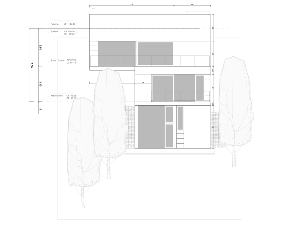
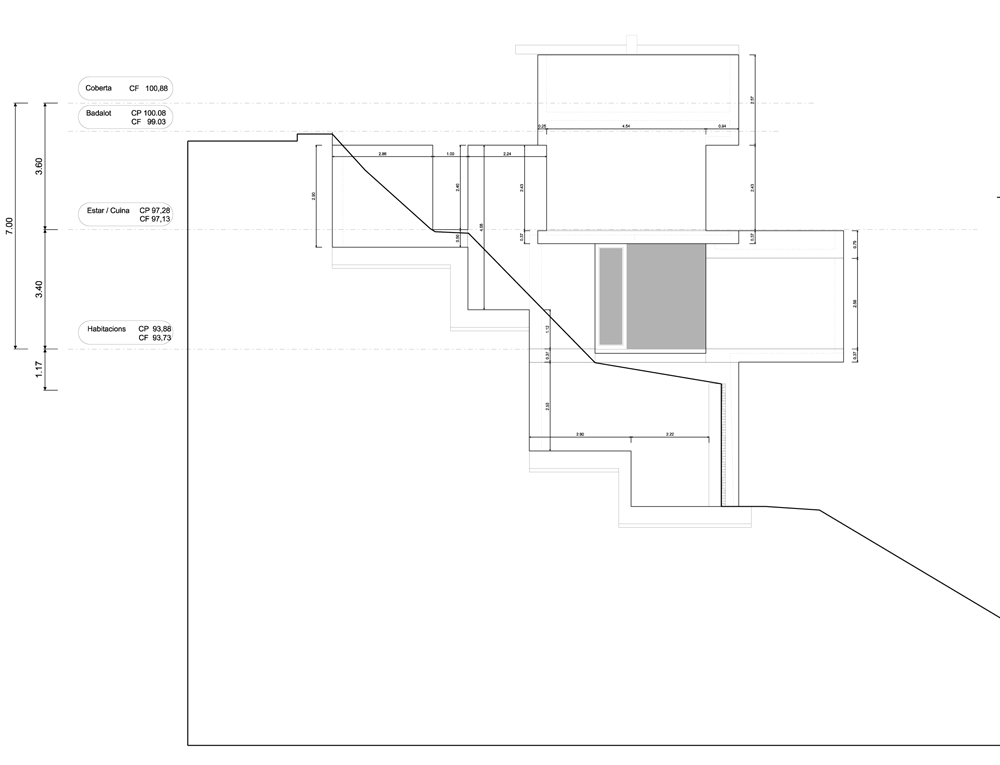
This house by Spanish architect Daniel Isern looks like a cluster of concrete cubes, stacked up on a steep hillside on the outskirts of Barcelona.

Mediterrani 32, Sant Pol de Mar by Daniel Isern

The rural site faces out towards the coast, so Daniel Isern designed the four-storey residence with balconies and terraces on three of its floors, as well as a pair of glazed sunrooms.

Mediterrani 32, Sant Pol de Mar by Daniel Isern

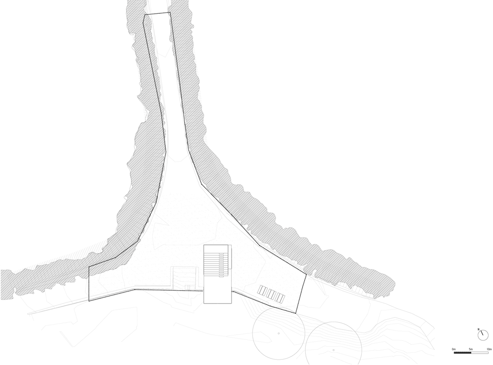
The form of the building comprises overlapping volumes that integrate several cantilevers. Isern explains: “The reduced dimensions of the plot and the desire to leave the minimum imprint on the land led us to seek out a floor plan which, matching the trees that surround it, emerges from a trunk well anchored to the land and opens up in branches on each floor.”

Mediterrani 32, Sant Pol de Mar by Daniel Isern

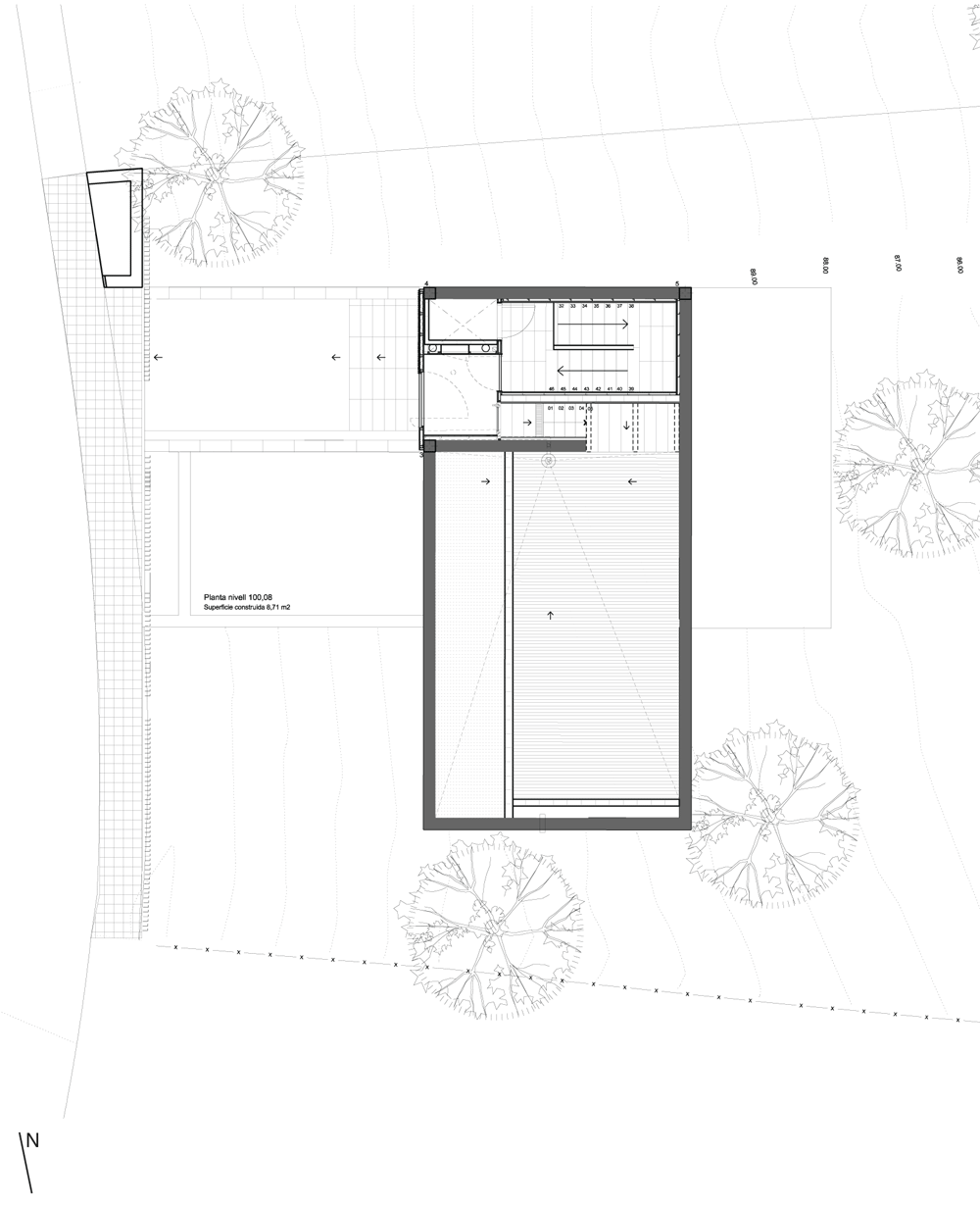
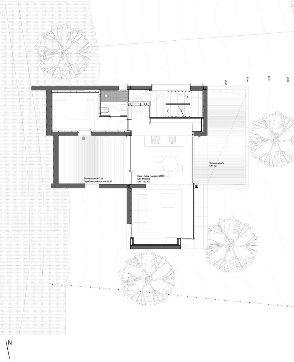
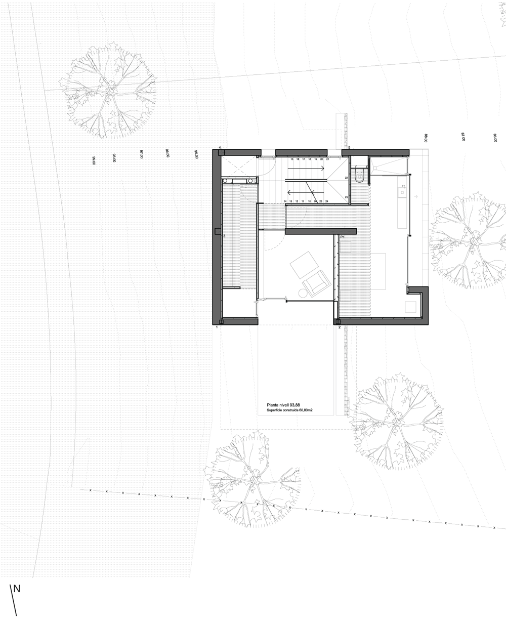
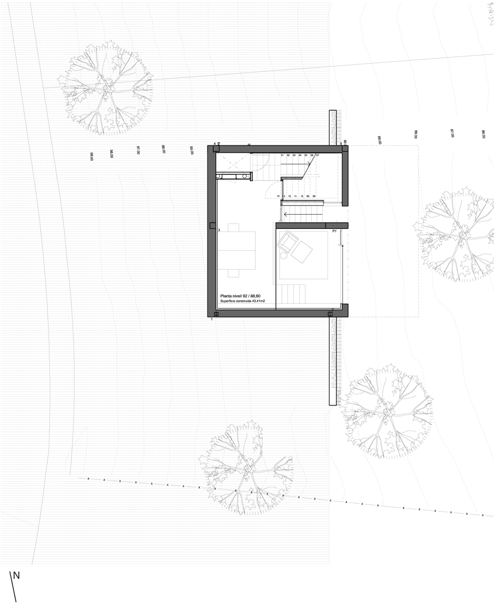
The entrance to the house is on the uppermost floor. There are no rooms at this level, so residents work their way downstairs to find a living room and bedroom on the next level down, a dining room below that and a master bedroom on the bottom floor.

Mediterrani 32, Sant Pol de Mar by Daniel Isern

A concrete walls extends out from the north and south sides of the house and integrates a storage area for firewood.

Mediterrani 32, Sant Pol de Mar by Daniel Isern

Other concrete houses from Spain to feature on Dezeen include a stark building with richly stained timber shutters and an X-shaped house that hangs over a hillside. See more houses in Spain.

Mediterrani 32, Sant Pol de Mar by Daniel Isern

Photography is by Adrià Goula.

Here’s a statement from Daniel Isern:


Mediterrani 32, Sant Pol de Mar 2012

“For me, a landscape does not exist in its own right, since its appearance changes at every moment; but the surrounding atmosphere brings it to life – the light and the air which vary continually. For me, it is only the surrounding atmosphere which gives subjects their true value.” Claude Monet.

Mediterrani 32, Sant Pol de Mar by Daniel Isern

The project for this house emerged from a very simple premise, to build on a very steep piece of land with a gradient of almost 100%, boasting wonderful views and on a tight budget. It was this highly complicated plot of land, surrounded by pine trees, that defined a good part of this project. The land, and its perspectives, constantly changing as the hours pass, the colour of the trees, the movement of sun and shadows…

Mediterrani 32, Sant Pol de Mar by Daniel Isern

On the one hand, the reduced dimensions of the plot and its complex orography, and on the other the desire to leave the minimum imprint on the land led us to seek out a floorplan which, matching the trees that surround it, emerges from a trunk well anchored to the land and opens up in braches on each floor, in such a way that each branch becomes the terrace of the upper level at the same time as it becomes the porch of the lower one.

Mediterrani 32, Sant Pol de Mar by Daniel Isern

All this helps create a very formal building, with huge cantilevers facing out to emptiness, the woods and the sea which lie before it. A structure which opens up to these views and the sun, and which thanks to the terraces and the porches confuse the interior with the exterior. A building which is equally formal in both its volume and the materials which compose it. Concrete, iron, timber and stone combining in a way that emphasises the character of each one. In the end, the whole building represents a dialogue between emptiness and fullness, between materials, between outside and inside; seeking out a balance between these highly contrasting parts.

Mediterrani 32, Sant Pol de Mar by Daniel Isern
Level four floor plan – click for larger image
Mediterrani 32, Sant Pol de Mar by Daniel Isern
Level three floor plan – click for larger image
Mediterrani 32, Sant Pol de Mar by Daniel Isern
Level two floor plan – click for larger image
Mediterrani 32, Sant Pol de Mar by Daniel Isern
Level one floor plan – click for larger image
Mediterrani 32, Sant Pol de Mar by Daniel Isern
East elevation – click for larger image
Mediterrani 32, Sant Pol de Mar by Daniel Isern
South elevation – click for larger image

The post Mediterrani 32, Sant Pol de Mar
by Daniel Isern
appeared first on Dezeen.

Rio de Moinhos Open-Air Theatre by Ateliermob

This concrete staircase into the air by Lisbon architecture studio Ateliermob functions as a riverside amphitheatre on the banks of the Tagus in central Portugal (+ slideshow).

Rio de Moinhos Open-Air Theatre by Ateliermob

Positioned on the northern shore of the river near the village of Rio de Moinhos, the structure is built on the site of an old fishing boat dock that had fallen out of use due to regular flooding.

Rio de Moinhos Open-Air Theatre by Ateliermob

Ateliermob‘s brief was to create a public installation on the site. To withstand the changing water levels, the intervention needed a solid structure that would resist decay even if submerged for a few days a year.

Rio de Moinhos Open-Air Theatre by Ateliermob

The chunky concrete bleachers rise up in a northerly direction, facing a stage that cantilevers out across the riverbank. A telescope is mounted at the very top, while rectangular concrete benches and tables provide a picnic area on one side.

Rio de Moinhos Open-Air Theatre by Ateliermob

“The new element wipes out the boundary between land and water, projecting itself on the river, and on a flat terrain it erupts in the air as a reference in the landscape,” say the architects.

Rio de Moinhos Open-Air Theatre by Ateliermob

The Rio de Moinhos Open-Air Theatre is the latest in a series of riverside installations designed by Ateliermob for the banks of the Tagus since 2007.

Rio de Moinhos Open-Air Theatre by Ateliermob

Other amphitheatres on Dezeen include a summer theatre in Estonia and a stage set in Sicily designed by OMA.

Rio de Moinhos Open-Air Theatre by Ateliermob

Photography is by Zoraima de Figueiredo.

Rio de Moinhos Open-Air Theatre by Ateliermob

Read on for more details from Ateliermob:


Rio de Moinhos Open Air Theatre

Following an international competition for the banks of the Tagus River in four counties in central Portugal where ateliermob got the first prize, they were asked to design three projects in the municipality of Abrantes.

Rio de Moinhos Open-Air Theatre by Ateliermob
Site plan – click for larger image

Located on the right bank of the Tagus River, near the village of Rio de Moinhos, the Cais das Barcas served as a fishing boat dock and transported people and goods between the two banks. Over the years, that space lost its essence, both due to the nearly non-existent maintenance as the constant flooding of the Tagus (the height of the pier is +18.00 m, and the 1979 flood overflowed the river, which rose to 31.00 m).

Rio de Moinhos Open-Air Theatre by Ateliermob
Floor plan – click for larger image

Following a study of the dynamics of the local population, which can be characterised as having intense activity in recreational and popular associations, and it was understood that an outdoor space that could serve as an informal area for groups and communities and that could withstand submersion for a few days of the year. The new element wipes out the boundary between land and water, projecting itself on the river, and on a flat terrain it erupts in the air as a reference in the landscape.

Rio de Moinhos Open-Air Theatre by Ateliermob
Long section – click for larger image

The project seeks to recreate a place that spring-starts from the renovation of the pier, adding new collective reference meanings and uses. A new space for the local people that acts as a gathering place for the community or as an idyllic meeting place. The entire area around the auditorium, parallel to the existing dock, is redrawn maintaining its natural character, yet providing it with urban furniture – benches and tables for a more effective use by the population. Rio de Moinhos has experienced a difficult relationship with the river, noticeable its urban morphology – from times of flooding to times of drought. Every year, during the rainy season, this structure may become partially submerse.

The proposed structure seeks to reclassify the area, creating a new meeting space for the local community. When no events are taking place, this amphitheatre will be ideal to contemplate the river, the landscape and from its highest point, Rio de Moinhos.

Rio de Moinhos Open-Air Theatre by Ateliermob
Cross section – click for larger image

Project: Rio de Moinhos Open Air Theatre
Place: Rio de Moinhos, Abrantes, Portugal
Promoter: Câmara Municipal de Abrantes (city council)
Construction: Construforte – Sociedade de construções e Empreitadas, Lda
Architecture: ateliermob – Andreia Salavessa and Tiago Mota Saraiva with Vera João, João Torres, Ana Luísa Cunha, Zofia Józefowicz and Sophia Walk (competition: Carolina Condeço, Nuno Ferreira)
Structures: Betar Estudos – José Pedro Venâncio and Maria do Carmo Vieira
Lights: João Pedro Osório

The post Rio de Moinhos Open-Air Theatre
by Ateliermob
appeared first on Dezeen.

Concrete Tangram

Il Tangram di per sé non mi ha mai più di tanto sfagiolato ma questo in cemento disegnato da Vanessa Mikoleit resta comunque un bell’oggetto.

Concrete Tangram

Concrete Tangram

Concrete Tangram

Concrete Tangram

Islamic Cemetery by Bernardo Bader Architects

Prayer rooms with walls of red concrete lead out to a staggered sequence of graveyards at this Islamic cemetery in western Austria by local studio Bernardo Bader Architects (+ slideshow).

Islamic Cemetery by Bernardo Bader Architects
Photograph by Adolf Bereuter

Located within the Alpine countryside, the cemetery serves the eight-percent Muslim population in the Austrian state of Vorarlberg and comprises a simple rectilinear building with five burial enclosures.

Islamic Cemetery by Bernardo Bader Architects
Photograph by Marc Lins

Bernardo Bader Architects used red-tinted concrete for the construction of the building and its surrounding walls. The surfaces remain exposed both inside and outside the complex, revealing the rectangular imprints of wooden formwork.

Islamic Cemetery by Bernardo Bader Architects
Photograph by Adolf Bereuter

A long rectangular window stretches across the facade, screened by a latticed oak framework that displays one of the traditional patterns of Islamic mashrabiya screens.

Islamic Cemetery by Bernardo Bader Architects

The building accommodates both prayer rooms and assembly halls. The largest room opens out to a private courtyard and features lighting fixtures set into circular ceiling recesses.

Islamic Cemetery by Bernardo Bader Architects
Photograph by Marc Lins

The five rectangular graveyards are lined up at the back of the building. Each one contains several trees, benches and small patches of grass.

Islamic Cemetery by Bernardo Bader Architects
Photograph by Adolf Bereuter

Completed in 2011, the Islamic Cemetery is one of 20 projects on the shortlist for the Aga Khan Award 2013. Five or six finalists will be revealed later this year and will compete to win the $1 million prize.

Islamic Cemetery by Bernardo Bader Architects
Photograph by Adolf Bereuter

Other architect-designed cemeteries completed in recent years include a seaside graveyard in Italy and a pair of wooden pavilions in Belgium. See more stories about cemeteries, funeral chapels and memorials.

Here’s a short project description from the Aga Khan Award organisers:


The cemetery serves Vorarlberg, the industrialised westernmost state of Austria, where over eight percent of the population is Muslim. It finds inspiration in the primordial garden, and is delineated by roseate concrete walls in an alpine setting, and consists of five staggered, rectangular grave-site enclosures, and a structure housing assembly and prayer rooms.

Islamic Cemetery by Bernardo Bader Architects
Site plan – click for larger image

The principal materials used were exposed reinforced concrete for the walls and oak wood for the ornamentation of the entrance facade and the interior of the prayer space. The visitor is greeted by and must pass through the congregation space with its wooden latticework in geometric Islamic patterns. The space includes ablution rooms and assembly rooms in a subdued palette that give onto a courtyard. The prayer room on the far side of the courtyard reprises the lattice-work theme with Kufic calligraphy in metal mesh on the ‘qibla’ wall.

The post Islamic Cemetery by
Bernardo Bader Architects
appeared first on Dezeen.

Biblioteca Sant Josep by Ramon Esteve Estudio

Four courtyards penetrate the rectilinear volume of this concrete library in Ibiza by Spanish architects Ramon Esteve Estudio (+ slideshow).

Biblioteca Sant Josep by Ramon Esteve Estudio

Completed in 2010, Biblioteca Sant Josep is a single-storey public library in the village of Sant Josep de sa Talaia.

Biblioteca Sant Josep by Ramon Esteve Estudio

Ramon Esteve Estudio slotted courtyards into recesses on three of the building’s four elevations. One accommodates the entrance approach, while the other three are filled with plants and trees.

Every window faces towards a courtyard, rather than out the building’s perimeter. “This library is a small closed universe in which light and green penetrates under controlled conditions,” say the architects.

Biblioteca Sant Josep by Ramon Esteve Estudio

The outlines of the courtyards continue through the inside of the building, generating the curved shapes of four reading rooms with a communal lobby at the centre.

One of the curved spaces contains a children’s library, while another houses the multimedia room. The third has an area for magazines and newspapers in its corner and the fourth includes the lending desks.

Biblioteca Sant Josep by Ramon Esteve Estudio

The board-formed concrete walls remain exposed both inside and outside the building. Books are slotted into plain white bookshelves, while circular lighting fixtures are dotted across the ceilings.

The spaces behind the courtyards are filled with offices and storage areas.

Biblioteca Sant Josep by Ramon Esteve Estudio

Other libraries featured on Dezeen include a converted house in Mexico and a university library with robotic book retrieval system in the US. See more libraries on Dezeen.

Biblioteca Sant Josep by Ramon Esteve Estudio

Photography is by Diego Opazo.

Here’s some more information from Ramon Esteve Estudio:


Sant Josep Library

The library is a detached building within green surroundings splashed with trees that penetrate into the openings of the building. It is a prism box where the interior fragments with planes that flow between the spaces of the layout of the library. Between two fissures, the building opens to the exterior and allows the interior spaces to reach out to the vegetation that surrounds all of the building.

The building is composed of two different rooms, part of the functional design: the multi-purpose space, the children’s one, the general background, and the space for magazines, newspapers, music and images.
The soul of the library is the books that accompany the walls that form the structure that organizes the different areas.

Biblioteca Sant Josep by Ramon Esteve Estudio

The surroundings give unity and include all of the space of the different areas, marking the limits but maintaining the continuity and fluency of the spaces.

The building opens to the exterior through polygonal courtyards that generate intersecting views between rooms and fleeting views of the environment. A large amount of skylights of different diameters filter a similar, neutral, clean light, generating a warm atmosphere that encourages reading and reflection.

Biblioteca Sant Josep by Ramon Esteve Estudio
Ground floor plan – click for larger image

Architect: Ramon Esteve
Collaborator Architects: Esther Broseta, Rubén Navarro, Olga Badía
Collaborators: Silvia M. Martínez, Tudi Soriano, Patricia Campos, Estefanía Pérez
Building Engineer: Emilio Pérez
Promoter: Ajuntament d’Ontinyent
Construction company: Díaz-Sala
Works manager: Manuel Pamies
Project: 2008
Completion date: 2010

The post Biblioteca Sant Josep by
Ramon Esteve Estudio
appeared first on Dezeen.

Casa Montfullà by Hidalgo Hartmann Arquitectura

Barcelona studio Hidalgo Hartmann Arquitectura has completed a concrete house with a triangular profile in the rural outskirts of Girona, Spain (+ slideshow).

Casa Montfullà by Hidalgo Hartmann Arquitectura

Casa Montfullà is located on a hillside overlooking the plains, but the house’s plot itself is approximately level, so Hidalgo Hartmann Arquitectura added sloping walls to create a building that appears to grow out of the ground.

Casa Montfullà by Hidalgo Hartmann Arquitectura

“We placed a silent, hermetic volume that emerges from the site and adopts the original profile of the hill, like a fortress that visually dominates the landscape,” explain the architects.

Casa Montfullà by Hidalgo Hartmann Arquitectura

Laid out in three horizontal bands, the building contains both a two-storey house and a terrace behind its triangular concrete walls.

Casa Montfullà by Hidalgo Hartmann Arquitectura

A two-storey entrance area at one end accommodates bedrooms, bathrooms and a parking garage, while the middle section is a double-height living and dining room with a glazed elevation offering a view towards the fields.

Casa Montfullà by Hidalgo Hartmann Arquitectura

During warmer months residents can slide open the glass to make use of the split-level terrace and swimming pool at the far end of the structure.

Casa Montfullà by Hidalgo Hartmann Arquitectura

Hidalgo Hartmann Arquitectura is led by architect Jordi Hidalgo Tané and interior designer Daniela Hartmann. Other concrete buildings by the pair include a centre for rescued turtles, dolphins and birds and a house with four wings and an underground entrance.

Casa Montfullà by Hidalgo Hartmann Arquitectura

Other recently completed Spanish residences include a social housing block on the Canary Islands and a stark concrete house with richly stained timber shutters. See more architecture in Spain.

Casa Montfullà by Hidalgo Hartmann Arquitectura

Photography is by Jordi Hidalgo Tané.

Casa Montfullà by Hidalgo Hartmann Arquitectura

Here’s a project description from Hidalgo Hartmann Arquitectura:


Casa Montfullà

We find ourselves on a horizontal ground, a corner plot raised on two large slopes like a vantage point from which to enjoy superb views towards the agricultural plain that stretches at his feet until reaching Salt and the city of Girona.

Casa Montfullà by Hidalgo Hartmann Arquitectura

It is thus an exceptional setting that claims for an intervention that recognizes the attributes of the site and put them in value.

Casa Montfullà by Hidalgo Hartmann Arquitectura

We placed a silent, hermetic volume that emerges from the site and adopts the original profile of the hill, like a fortress that visually dominates the landscape.

Casa Montfullà by Hidalgo Hartmann Arquitectura

The volume encloses itself from the outside and is protected from the mediocre constructions that surround it by using the broken geometry of two thick walls. These walls comprise a continuous space from the inside out that creates in form of a terrace, a world of its own, which turns our attention to the distance.

Casa Montfullà by Hidalgo Hartmann Arquitectura

The section shows the continuity of its spaces from the outdoor space to the studio on the top floor across the living room and the courtyard that separates and unites at the same time. The use of concrete for the construction of the house gives the object weight, mass and texture which is needed to provide coherence to the idea.

Casa Montfullà by Hidalgo Hartmann Arquitectura
Site plan

Location: Montfullà. Girona
Year: 2007-2012
Surface: 340 sqm

Casa Montfullà by Hidalgo Hartmann Arquitectura
Ground floor plan

Authors of the project: Hidalgo Hartmann. Jordi Hidalgo Tané, arquitecto, Daniela Hartmann, interiorista.
Technical Architect: Rafel Serra Torrent.

Casa Montfullà by Hidalgo Hartmann Arquitectura
First floor plan

Collaborators: Ana Roque, arquitecto, Rafel Serra Torrent, arquitecto técnico, Julia Fernandez Roldán, arquitecto.
Promoters: Carme Ferrer i Xavier Puig.

Casa Montfullà by Hidalgo Hartmann Arquitectura
Roof plan

Construction:
Estructures Olot S.L (company structures)
LI-BRA S.L (general construction company)
Fusteria Serra (wood carpentry)
Plantalech (aluminium carpentry)
Electrica Masaló (company facilities)

Casa Montfullà by Hidalgo Hartmann Arquitectura
South elevation and section
Casa Montfullà by Hidalgo Hartmann Arquitectura
North elevation and section
Casa Montfullà by Hidalgo Hartmann Arquitectura
East elevation and section
Casa Montfullà by Hidalgo Hartmann Arquitectura
West elevation and section

The post Casa Montfullà by
Hidalgo Hartmann Arquitectura
appeared first on Dezeen.

Residence in Kato Kifissia by Tense Architecture Network

This family house in Athens by Greek office Tense Architecture Network comprises a boxy concrete upper floor perched atop a glazed living room and kitchen (+ photographs by Filippo Poli).

Residence in Kato Kifissia by Tense Architecture Network

Tense Architecture Network designed the residence with an industrial aesthetic, featuring exposed concrete walls, basalt-cobble flooring and a folded steel staircase suspended by wire cables.

Residence in Kato Kifissia by Tense Architecture Network

The ground and first floors are offset from one another and dark-tinted concrete columns support the overhanging bedroom floor.

Residence in Kato Kifissia by Tense Architecture Network

“The main volume is vigorously elevated – nearly four metres high – in order to liberate the ground floor,” architect Tilemachos Andrianopoulos told Dezeen. “The top floor’s austerity towards the public facade realises an intentional contrast to the receptivity of the ground-floor spaces, which open up completely to the garden through the sliding glass panels.”

Residence in Kato Kifissia by Tense Architecture Network

A system of wires is strung up around the house, intended to encourage climbing plants around the building. “The industrial material character of the house is advantageously complemented by the greenery,” explained Andrianopoulos.

Residence in Kato Kifissia by Tense Architecture Network

A pivoting door provides the entrance and leads through to the living room and kitchen, which are divided on split levels. The steel staircase ascends towards three bedrooms on the top floor, while a concrete staircase descends to the basement.

Residence in Kato Kifissia by Tense Architecture Network

Athens studio Tense Architecture Network also recently completed another concrete house in the Greek countryside. See more architecture in Greece.

Residence in Kato Kifissia by Tense Architecture Network

See more photography by Filippo Poli on Dezeen or on the photographer’s website.

Residence in Kato Kifissia by Tense Architecture Network

Here are a few words from Tense Architecture Network:


Residence in Kato Kifissia, Athens

The residence’s plot is small and an adjacent building almost blocks the southern sun. The complete “colonization” of the suburb has almost eliminated the previously exuberant vegetation in the rush to meet individualistic private housing.

Residence in Kato Kifissia by Tense Architecture Network

As a first act, the desire to reside defines an area and makes a house, in it: a cubic shell of plants creates a limit for the residence, as area. In order to reside, one withdraws inward.

Residence in Kato Kifissia by Tense Architecture Network
Ground floor plan

The residential space claims the whole field, as well as the sun; two parallelepiped volumes, one small and attached to the north, the other cantilevered and central, free the ground and enable the sun to enter.

Residence in Kato Kifissia by Tense Architecture Network
First floor plan

When the plants are fully grown the green facade will be penetrated only by the black, central column of the shelter by exposed concrete. The basalt-watery surface on which it is anchored reflects the light in the interior.

Residence in Kato Kifissia by Tense Architecture Network
Front elevation

Project Team: Tilemachos Andrianopoulos, Kostas Mavros, Nestoras Kanellos

The post Residence in Kato Kifissia
by Tense Architecture Network
appeared first on Dezeen.

Motoazabu Apartment sYms by Kiyonobu Nakagame Architect & Associates

Diagonally stepped floors and ceilings divide triangular zones inside this pair of studio apartments in Tokyo by Kiyonobu Nakagame Architect & Associates (+ slideshow).

Motoazabu Apartment sYms by Kiyonobu Nakagame

Located in the Motoazabu area of the city, the apartment block has a rectilinear concrete structure that at a glance could be mistaken for an office building or car park.

Motoazabu Apartment sYms by Kiyonobu Nakagame

“What we aimed to do with this structure was to create something that would blend with its surroundings and maintain absolute simplicity,” explains architect Kiyonobu Nakagame.

Motoazabu Apartment sYms by Kiyonobu Nakagame

Four diagonal supports raise the structure off the ground and create a sheltered car park on the lowest floor, while stairs climb the side of the building to lead into apartments on the first and second storeys.

Motoazabu Apartment sYms by Kiyonobu Nakagame

Both residences have similar layouts, with kitchen worktops lining one wall and glazed bathrooms on the opposite side.

Motoazabu Apartment sYms by Kiyonobu Nakagame

The diagonal step in the floor runs through the centre of each apartment, separating the kitchen and dining zones from the bedroom and study areas, while the staggered ceilings cut across them in the opposite direction.

Motoazabu Apartment sYms by Kiyonobu Nakagame

Other concrete apartment blocks we’ve featured from Japan include a building with boxy balconies in Kyoto and one with indoor balconies in Tokyo. See more architecture in Japan.

Motoazabu Apartment sYms by Kiyonobu Nakagame

Photography is by Shigeo Ogawa.

Motoazabu Apartment sYms by Kiyonobu Nakagame

Here are a few words from Kiyonobu Nakagame:


Motoazabu Apartment sYms

Once known as a high-class residential area, Motoazabu is developing into more of a modern diversified metropolitan region resultant of the economic boom.

Motoazabu Apartment sYms by Kiyonobu Nakagame

The neighborhood consists of skyscrapers like the famous Roppongi Hills development alongside smaller just as unique small developments. But within the chaotic big city life of this area you can still find tranquil quietness.

Motoazabu Apartment sYms by Kiyonobu Nakagame

Above: concept diagram

What we aimed to do with this structure was to create something that would blend with its surroundings and maintain absolute simplicity. The true character of the building can be found on the inside. A structure consisting of four corner columns with a footprint of 6.8m x 7.8m comprising one room.

Motoazabu Apartment sYms by Kiyonobu Nakagame

Above: ground floor plan

The design concept takes in a diagonal line of 450mm in room level difference which lends itself to create four distinct living areas all within a single space. The two different elevations of the floor combined with the two different ceiling heights lends itself to create four distinct living areas all within a single space.

Motoazabu Apartment sYms by Kiyonobu Nakagame

Above: first floor plan

The office and living area take up the stage with views of the city and the bedroom space surrounded by post beams provides openness and a sense of privacy to modern city life in one room.

Motoazabu Apartment sYms by Kiyonobu Nakagame

Design: 2011.01-2011.09
Construction period: 2011.10-2012.06

Motoazabu Apartment sYms by Kiyonobu Nakagame

Above: section A

Structure: Reinforced Concrete
Number of floors: 3

Motoazabu Apartment sYms by Kiyonobu Nakagame

Above: section B

The post Motoazabu Apartment sYms by
Kiyonobu Nakagame Architect & Associates
appeared first on Dezeen.

Omnibus House by Gubbins Arquitectos

Chilean architect Pedro Gubbins designed this concrete residence as a rural retreat for himself and his family and has balanced it on top of a dry-stone wall (+ slideshow).

Omnibus House by Gubbins Arquitectos

Named Omnibus House, the long and narrow residence is constructed on the side of a hill and the wall beneath it functions as a retainer against the sloping landscape.

Omnibus House by Gubbins Arquitectos

Gubbins wanted the house to be visually linked to the outdoor spaces of its woodland location, so he designed the concrete volume with lengths of glazing stretching across its longest facades, allowing views right through the building.

Omnibus House by Gubbins Arquitectos

“All the issues with privacy are solved because of the slope of the location,” said Jose Quintana Cabezas, an architect at Gubbins Arquitectos. “There are neighbours, but they are far away enough to not to have visual contact, plus all the tree trunks help.”

Omnibus House by Gubbins Arquitectos

One of the most prominent features of the house is a concrete staircase that cuts through its centre, connecting the rooms on the main floor with an entrance on the storey below and a terrace on the rooftop.

Omnibus House by Gubbins Arquitectos

Corridors run along both sides of the building, while rooms are arranged in sequence between. Glazed partitions divide the living and dining rooms, either side of the staircase, while wooden boards separate the bedrooms at the western end.

Omnibus House by Gubbins Arquitectos

The concrete walls are exposed inside the building, plus polished concrete floors run through each room.

Omnibus House by Gubbins Arquitectos

Santiago studio Gubbins Arquitectos also recently completed a hillside house with walls of timber and concrete.

Omnibus House by Gubbins Arquitectos

Other recent projects in Chile include an earthquake-proof house and a hotel for stargazers. See more architecture in Chile.

Omnibus House by Gubbins Arquitectos

Here’s some more information from Gubbins Arquitectos:


Omnibus House

Life and leisure space

To break the typical areas of an urban house; kitchen, living–dining room and dormitories, this house has a double circulation that deconstructs these areas into a set of complimentary places.

Omnibus House by Gubbins Arquitectos

This creates a way of inhabiting that moves away from a typical urban arrangement into a more playful one.

Omnibus House by Gubbins Arquitectos

To inhabit the exterior from within

To inhabit the exterior of a holiday house does not only imply the direct interaction with the outside of the house, but also the interaction through the house.

Omnibus House by Gubbins Arquitectos

This has been achieved through its own structure and arrangement, allowing the possibility of re-discovering new views from the terrace-roof; from the back terrace through the living room, from the corridor or galleria by the main façade or sheltered along the houses stone base.

Omnibus House by Gubbins Arquitectos

A sustainable architecture

The north orientation of the houses main façade (23.5 metres width by 3.1 metres height) offers the possibility of becoming a large solar collector that at night time re-emits the accumulated thermal energy gathered during the day, by its walls, concrete slabs and roof.

Omnibus House by Gubbins Arquitectos

Materiality and construction

The use of concrete as the main material, gives a sense of mass that is necessary for relating to the context.

Omnibus House by Gubbins Arquitectos

Its colour complements the surrounding trees and allowed the used of a large span for the roofing and the use of different textures produced by the rough sawn timber formwork sold by a local retailer.

Omnibus House by Gubbins Arquitectos

Above: ground floor plan – click for larger image

Omnibus House by Gubbins Arquitectos

Above: first floor plan – click for larger image

Omnibus House by Gubbins Arquitectos

Above: roof plan – click for larger image

Omnibus House by Gubbins Arquitectos

Above: east elevation – click for larger image

Omnibus House by Gubbins Arquitectos

Above: west elevation – click for larger image

Omnibus House by Gubbins Arquitectos

Above: north elevation – click for larger image

Omnibus House by Gubbins Arquitectos

Above: south elevation – click for larger image

The post Omnibus House by
Gubbins Arquitectos
appeared first on Dezeen.

EEL Nakameguro by Schemata Architecture Office

Japanese architect Jo Nagasaka has stripped an office in south-west Tokyo back to the concrete to create a fashion boutique that looks more like an abandoned warehouse for Japanese brand EEL (+ slideshow).

EEL Nakameguro by Schemata Architecture Office

Nagasaka, of Schemata Architecture Office, explains that he associates garments with uncomfortable warmth, so wanted to design a cool interior that counteracts this feeling. “I wanted to make the background as calm as possible,” he explains.

EEL Nakameguro by Schemata Architecture Office

Rather than adding new elements to the space, most of the renovation involved peeling away unnecessary layers and sanding down rough surfaces.

EEL Nakameguro by Schemata Architecture Office

“Our construction process was mostly subtraction,” he says. “We intend to leave this space somewhat incomplete and when clothes are set in place it will be complete.”

EEL Nakameguro by Schemata Architecture Office

The architects removed the carpet of the old office and sanded down the exposed floor to create a smooth surface. They also pulled down a suspended ceiling to reveal lighting fixtures, electric cables and ventilation pipes.

EEL Nakameguro by Schemata Architecture Office

Bookshelves and large boxes made from lauan plywood are scattered around the room as display areas for folded garments and accessories. Other hang from welded stainless-steel racks or from cables strung across the ceiling.

EEL Nakameguro by Schemata Architecture Office

A wall of concrete blocks separates the shop floor from storage areas at the back, while a glass partition creates a small meeting room to one side.

EEL Nakameguro by Schemata Architecture Office

Jo Nagasaka launched Schemata Architecture Office in 1998 and has since worked on a number of shop interiors, as well as residential projects, office interiors and furniture design. Past projects include Paco, a house contained in a three metre cube, and the Tokyo flagship for fashion brand Takeo Kikuchi. See more design by Schemata Architecture Office on Dezeen.

EEL Nakameguro by Schemata Architecture Office

Photography is by Takumi Ota.

EEL Nakameguro by Schemata Architecture Office

Here’s a project description from Jo Nagasaka:


EEL Nakameguro

Creating a sense of ‘incompleteness’ was the key to our design. In my mind clothes are associated with warmth of human body, sometimes that feeling gets too intense and uncomfortably hot. This is why I wanted to make the background as calm as possible.

EEL Nakameguro by Schemata Architecture Office

We intend to leave this space somewhat incomplete and when clothes are set in place it will be complete. So our construction process was mostly ‘subtraction’, that is, dismantling, peeling, and scraping unnecessary layers, except for a few ‘additional’ elements.

EEL Nakameguro by Schemata Architecture Office

The site was formerly used as office space. For the floor, we peeled off the existing carpet and sanded exposed mortar undercoat thoroughly to make it perfectly horizontal and ‘super-flat’.

EEL Nakameguro by Schemata Architecture Office

As a result we created unique random mosaic pattern. In some places aggregates are revealed, and in other places finer particles cover up the surface.

EEL Nakameguro by Schemata Architecture Office

We also removed all the finishing materials – paint, baseboard, insulation etc. – from walls and ceiling, and hidden surface of concrete that is unfinished and not ready for public viewing is now exposed. By reversing the construction process, a state of ‘incompleteness’ reappears.

EEL Nakameguro by Schemata Architecture Office

Display fixtures are also constructed halfway and left at a state of ‘incompleteness’. Stainless steel mirror and frame are welded for assembly and we left the weld joint unpolished, so it creates interesting patterns on the surface.

EEL Nakameguro by Schemata Architecture Office

Hanging racks are made of anti-corrosive coated steel pipes. Surface coating is removed at joints then they are welded together. And we erase burnt traces of welding but leave steel surface unpainted.

EEL Nakameguro by Schemata Architecture Office

Wooden boxes, used as display base, are made of lauan wood. It is a kind wood usually used for underlay, but we leave it unpainted. These unfinished elements reinforce our design concept of ‘incompleteness’.

EEL Nakameguro by Schemata Architecture Office

Other elements are added to this space: glass partition wall, fitting room, concrete block masonry wall separating shop and back room, and a thick steel tension cable that is used to hang clothes, lighting fixtures and electrical wiring for lighting. When the final design element clothes are displayed, the space is complete.

EEL Nakameguro by Schemata Architecture Office

Title: EEL Nakameguro
Architects: Jo Nagasaka/Schemata Architects
Address: Higashiyama Meguro, Tokyo
Usage: Apparel shop

EEL Nakameguro by Schemata Architecture Office

Construction: TANK
Floor area: 123m²
Structure: RC
Completion: 02/2013

EEL Nakameguro by Schemata Architecture Office

Above: floor plan – click for larger image

EEL Nakameguro by Schemata Architecture Office

Above: ceiling plan – click for larger image

EEL Nakameguro by Schemata Architecture Office

Above: section A-A’ – click for larger image

EEL Nakameguro by Schemata Architecture Office

Above: section B-B’ – click for larger image

The post EEL Nakameguro by
Schemata Architecture Office
appeared first on Dezeen.