Town house EM by Areal Architecten

Belgian studio Areal Architecten inserted this brick and concrete townhouse into a residential streetscape in Mechelen near Antwerp.

House in Mechelen by Areal Architecten

Internally the three floors are united visually by a void topped with a skylight, which brings light down the stairwell to the ground floor.

House in Mechelen by Areal Architecten

This internal “canyon” separates the open-plan living spaces from the bedrooms.

House in Mechelen by Areal Architecten

“It’s a single family row house in the city but with amazing views and voids, and the use of a combination of raw and refined materials,” says Thomas Cols of Areal Architecten.

House-in-Mechelen-by-Areal-Architecten-2

The brick facade is sliced and faceted to relate the otherwise austere volume to its neighbours.

House in Mechelen by Areal Architecten

Instead of a front door onto the street, the house is entered via a porte-cochère.

House in Mechelen by Areal Architecten

Inside, the material palette is restrained, with ribbed concrete soffits, brick walls, timber and concrete floors and large internal single-pane windows.

House in Mechelen by Areal Architecten

The staircase is of white-painted steel and features blade-like treads.

House in Mechelen by Areal Architecten

The upper floors are of timber while the living quarters and kitchen have fitted timber-fronted storage units.

House in Mechelen by Areal Architecten

The open-plan first floor features a living room giving on to a terrace while the kitchen is on the ground floor.

House in Mechelen by Areal Architecten

The stone-clad ground floor rises in steps to manage the transition between the street level and the lower garden.

House in Mechelen by Areal Architecten

Here’s some text from the architects:


House in Mechelen

By a set of subtle surfaces, the front facade is struggling to blend into the template of the street. It balances between integrating and standing out. Inside a continuous open space made of large and generous rooms, connected to each other by some unexpected views creates a compressed urban-like space.

House in Mechelen by Areal Architecten

A “canyon” of light allows to create a dinstinction between the living spaces and the bedrooms while extending itself to the ground floor through a void which receives the staircase.

House in Mechelen by Areal Architecten
Site plan

The traditional spaces of a house are put together here into a single organic space with raw finishing such as a concrete grid on the ceiling and the prominent interior brick wall.

House in Mechelen by Areal Architecten
Facade

A difference of level on the ground floor creates a smooth transition between the street and the back of the house which is ended with a longitudinal garden.

Through precise openings and a terrace in extension of the living room, the boundaries between inside and outside in this townhouse are fading.

Project title: Town house EM

Architect(en): AREAL  ARCHITECTEN

Location: Vrijgeweidestraat 42, 2800 Mechelen, Belgium

Finished: March 2013

Program: single family house, house in a row

Client: private commission

Built surface: 340 m²

Architect’s website: www.arealarchitecten.be

House in Mechelen by Areal Architecten
Ground floor plan
House in Mechelen by Areal Architecten
First floor plan
House in Mechelen by Areal Architecten
Second floor plan
House in Mechelen by Areal Architecten
Section
House in Mechelen by Areal Architecten
Section

The post Town house EM by
Areal Architecten
appeared first on Dezeen.

Markthuis by Barcode Architects

Dutch studio Barcode Architects has renovated a house in Belgium to make room to display a collection of hunting trophies.

Markthuis by Barcode Architects

Named Markthuis, the two-storey residence has been reconfigured to create a central atrium, helping to bring more daylight onto a double-height “exhibition wall” of paintings and antlers.

Markthuis by Barcode Architects

Barcode Architects replaced the original staircase with a freestanding wooden structure that folds back and forth through the atrium between clear-glass balustrades.

Markthuis by Barcode Architects

A frosted glass wall separates the staircase from the entrance lobby just in front, where a bearskin rug is spread across the floor.

Markthuis by Barcode Architects

Beyond the atrium, most of the original partitions have been removed to create a large open-plan space on both storeys. At ground-floor level, this room functions as reception room for entertaining guests, while the floor above is used as a general living and dining room.

Markthuis by Barcode Architects

“From any point in the villa there is a clear view out, to the sky and the green,” says Barcode Architects. “Combined with the ‘lofty’ floor plan, it delivers the house with a unique transparency and quality.”

Markthuis by Barcode Architects

Other recently completed house renovations include a converted stable block in England and an overhauled townhouse in the Netherlands. See more renovations on Dezeen.

Photography is by Christian van der Kooij.

Here’s some more information from Barcode Architects:


Barcode Architects ‘Markthuis’ is completed

Barcode Architects design for the extension and renovation of ‘Markthuis’ is completed. The design is driven by the desire to optimise the daylighting in the house and the wish of the client to reserve a prominent place for his large collection of art and hunting trophies.

Markthuis by Barcode Architects
Ground floor plan – click for larger image

In order to maximize the spatial experience most of the interior walls are removed to remain with one open living space extending over the first two floors of the villa. Downstairs are comfortable spaces for receiving guests while on the upper first floor more intimate and private areas with an open plan kitchen, study, and lounge area are situated.

Markthuis by Barcode Architects
First floor plan – click for larger image

A large atrium connects the two layers and provides space for an exclusive, double high exhibition wall with an impressive amount of artefacts. The wooden staircase is placed as a freestanding piece of furniture within the vide, on one side guided by a 6 meter tall piece of glass. The glazed element separates the kitchen and the entrance lobby from the rest of the house and offers exciting plays of light and shadow.

Markthuis by Barcode Architects
Long section – click for larger image

Notice: Barcode Architects
Location: Belgium
Stage: Realized
Client: Private
Area: 400 sqm

The post Markthuis by
Barcode Architects
appeared first on Dezeen.

Market Hall by Robbrecht en Daem and Marie-José Van Hee

Light filters through hundreds of rectangular slits into this towering market hall in Ghent, Belgium, which is is one of the five finalists for the Mies van der Rohe Award 2013 (photos by Hufton + Crow).

Market Hall by Robbrecht en Daem and Marie-José Van Hee

Designed by Belgian studios Robbrecht en Daem and Marie-José Van Hee, the dual-gabled timber and concrete structure references the gabled forms of a nearby town hall to provide a grand shelter between the gothic structures of a church and belfry in the centre of the city.

Market Hall by Robbrecht en Daem and Marie-José Van Hee

The site had formally served as a car park, but the architects have paved over the ground surfaces to create a new public square.

Market Hall by Robbrecht en Daem and Marie-José Van Hee

The 40-metre-long Market Hall stretches across the square and is open on all sides, allowing pedestrians to enter from any direction.

Market Hall by Robbrecht en Daem and Marie-José Van Hee

Four chunky concrete feet support the asymmetric roof at each of its corners.

Market Hall by Robbrecht en Daem and Marie-José Van Hee

Glass squares clad the exterior surfaces of the building to protect the timber from the elements.

Market Hall by Robbrecht en Daem and Marie-José Van Hee

A fireplace is positioned inside one of the concrete feet for use during an annual festival and lets smoke out through a chimney in the roof.

Market Hall by Robbrecht en Daem and Marie-José Van Hee

The building was named on the shortlist for the European Union Prize for Contemporary Architecture in January, alongside a nursing home in Portugal, a concert hall in Iceland, a timber canopy in Spain and a city park in Denmark.

Market Hall by Robbrecht en Daem and Marie-José Van Hee

Other market buildings completed in recent years include a concrete fish market in Istanbul and a farmers’ market shelter in Virginia. See more markets on Dezeen.

Market Hall by Robbrecht en Daem and Marie-José Van Hee

See more photography by Hufton + Crow on Dezeen or on the photographers’ website.

Market Hall by Robbrecht en Daem and Marie-José Van Hee

Here’s a project description from Robbrecht en Daem Architecten:


Market Hall & Central Squares Ghent, 1996-2012

Following two demolition campaigns for a world exhibition in 1913 and an administrative centre never built in the 60s, Ghent’s historic heart degenerated for decades into a desolate parking lot in between a suite of three adjoining Gothic towers.

Market Hall by Robbrecht en Daem and Marie-José Van Hee

In two consecutive competitions between 1996 and 2005, Robbrecht en Daem architecten and Marie-José Van Hee architects proposed their own programme, countering the initial competition requirement.

Market Hall by Robbrecht en Daem and Marie-José Van Hee

Rather than just providing an open space for events, they sought, by meticulously positioning a market hall, to rectify this deficiency and reinstate the presence of old urban areas that had become unrecognisable.

Market Hall by Robbrecht en Daem and Marie-José Van Hee

The building positions itself between Poeljemarkt, Goudenleeuwplein, and a new lower ‘green’ connecting to the ‘brasserie’, bicycle park and public toilets below the hall. And although the building clearly occupies a position on the 24,000m2 site, it fits in well.

Market Hall by Robbrecht en Daem and Marie-José Van Hee

Compared to St. Nicholas Church, Belfry and Cathedral, it assumes the heights of a lower group of buildings such as the adjacent town hall, from which it derives, mathematically, its profile.

Market Hall by Robbrecht en Daem and Marie-José Van Hee

As an urban interior, the inside embraces the passer-by with a dual modulated wooden ceiling, whose small windows scatter light inwards.

Market Hall by Robbrecht en Daem and Marie-José Van Hee

The exterior, the entire building in fact, seems to assume a respectful role relative to the nobler historic stone buildings, by using a wooden, almost humble, finish.

Market Hall by Robbrecht en Daem and Marie-José Van Hee

A glass envelope protects the wood and provides a soft shine, with the sky reflected, integrated. Large buffer basins to absorb rainwater, principles of low energy consumption for the brasserie, use of truly natural materials, the contribution of public transport and a clear vision about giving new value to the historic centre with its old spatial structures, are just parts that broadly flesh out ‘sustainability’ for the future. The centre of Ghent will again become a social spot for people.

The post Market Hall by Robbrecht en Daem
and Marie-José Van Hee
appeared first on Dezeen.

Buda Art Centre by 51N4E

A five-sided pavilion made from pale sandy brickwork leads inside this former textile factory in Kortrijk that Belgian studio 51N4E has converted into an arts centre.

Buda Art Centre by 51N4E

The Buda Art Centre accommodates studio and exhibition spaces for artists in residence across all three floors of the old Budafabriek, the last remaining structure of the Desmet-Dejaeghere textile factory on Buda Island.

Buda Art Centre by 51N4E

The architects were keen to retain traces of the building’s history, so they left much of the interior unchanged and concentrated on inserting just two new pentagonal spaces.

Buda Art Centre by 51N4E

The first pentagon is the pale-brick entrance pavilion, which contrasts with the dark red tones of the existing factory buildings. The structure twists away from the neighbouring facades and points out towards the road, but it has no roof, encouraging anyone inside to look straight up to the sky.

Buda Art Centre by 51N4E

“The shape [of the pavilion] creates a friction between the existing buildings and the new intervention,” 51N4E‘s Paul Steinbrück told Dezeen. “Even though it gets very close to the surrounding buildings, it doesn’t touch them at any point. It is not an open space and not a building.”

Buda Art Centre by 51N4E

Above: photograph is by Paul Steinbrueck

For the second pentagon, the architects hollowed out a space at the centre of the factory to create a triple-height atrium connecting all three floors. A new staircase winds around the walls, while clerestory glazing and a large skylight brings natural light through to the studios and galleries. “The vertical space creates a visual understanding of the building,” added Steinbrück.

Buda Art Centre by 51N4E

Stairs also lead up to the roof the building, where an expansive roof terrace offers a view of the River Leie and the city skyline beyond.

Buda Art Centre by 51N4E

“The Buda Art Centre is a new type of cultural space,” conclude the architects. “Making reference to its past, it remains a workshop of production. The warm palette of colours and the series of rather informal spaces invite people to appropriate and discover the building for their own production, exhibition and casual interaction.”

Buda Art Centre by 51N4E

Above: photograph is by Paul Steinbrueck

Also this week, Czech studio Atelier Hoffman revealed images of a riverside coal mill converted into a studio and exhibition space. Other artists’ studios we’ve featured include a pointy gallery and studio in Japan and a series of cabin-like studios on a picturesque Canadian island. See more artists’ studios on Dezeen.

Buda Art Centre by 51N4E

Photography is by Filip Dujardin, apart from where otherwise stated.

Buda Art Centre by 51N4E

Here’s some more information from 51N4E:


Buda Art Centre
51N4E

The last remaining textile factory on Buda Island – an area destined to become the cultural heart of the city – has been transformed into studios and exhibition spaces for artists in residence. This large volume, situated in the middle of a city block, has been adapted through two main interventions.

Buda Art Centre by 51N4E

Above: photograph is by Paul Steinbrueck

The first hollows out a large void in the centre of the building, bringing daylight deep into the vast floor plan. This pentagonal void houses a public staircase that gives access to a diverse range of spaces on four levels: a laboratory for manufacturing, multifunctional spaces of varying sizes and lighting conditions, music venues and a roof terrace. The biggest part of the structure is reused. Besides saving resources, the reuse allows for a large cultural building within a limited budget.

Buda Art Centre by 51N4E

The second intervention adds an open pavilion as an entrance hall from the street. Built from the yellow brick discovered in the original interior, this pavilion becomes the new facade of the complex: the tip of the iceberg. The pavilion itself functions as an antechamber, giving a foretaste of events inside.

Buda Art Centre by 51N4E

The Buda Art Centre is a new type of cultural space. Making reference to its past, it remains a workshop of production. The materials and details make it an approachable space for all kinds of activities and users. The warm palette of colours and the series of rather informal spaces invite people to appropriate and discover the building for their own production, exhibition, and casual interaction.

Buda Art Centre by 51N4E

While the majority of the building is hidden from its surrounding context, the roof terrace provides a sudden confrontation with the city of Kortrijk. The building is a tool to look, not an object to look at. It avoids becoming an image but instead creates an environment.

Buda Art Centre by 51N4E

Project name: Buda Art Centre
Name of building in use: Budafabriek
Location: Kortrijk, Belgium

Buda Art Centre by 51N4E

Programme: exhibition & event facilities, artists’ studios
Built surface: 4.240 m²
Budget: € 2.000.000

Buda Art Centre by 51N4E

Design period: 2005 (competition) – 2007
Construction period: 2010 – 2012

Buda Art Centre by 51N4E

Above: section – click for larger image

The post Buda Art Centre
by 51N4E
appeared first on Dezeen.

House DZ in Mullem by Graux & Baeyens Architecten

This house in Belgium by Ghent studio Graux & Baeyens Architecten is broken down into cubic volumes that are staggered to let more light into each room (+ slideshow).

House DZ by Graux & Baeyens Architecten

Located in the village of Mullem, the bright-white building accommodates a family house and a small practice for a physiotherapist.

House DZ by Graux & Baeyens Architecten

Graux & Baeyens Architecten were restricted from building too close to neighbouring houses, so were only left with a narrow plot to fit the house onto. This meant all rooms had to be organised on a linear axis with the physiotherapy practice tacked onto the end.

House DZ by Graux and Baeyens Architecten

“Planning regulations required a minimum clear gap of four metres between the neighbours on both sides of the already narrow site, which meant that the building’s organisation had to be very efficient with space,” explain architects Basile Graux and Koen Baeyens.

House DZ by Graux & Baeyens Architecten

Rooms are staggered back and forth on both floors of the two-storey building, adding space for additional windows on the protruding walls. As well as letting in more light, this prevents any problems with overlooking the neighbours.

House DZ by Graux & Baeyens Architecten

All bedrooms are positioned on the ground floor, freeing up space on the upper storey for an open-plan living and dining room with views out over the village rooftops. Different areas are loosely defined by the set backs in the walls, while balconies are slotted into the recesses.

House DZ by Graux & Baeyens Architecten

To integrate a parking space for the family car, the architects added an extra wall and shelter beside the house’s entrance.

House DZ by Graux & Baeyens Architecten

Other interesting houses in Belgium include a residence in a former laundry building and a glass house with a sunken swimming pool. See more architecture in Belgium.

House DZ by Graux & Baeyens Architecten

Photography is by Luc Roymans.

House DZ by Graux & Baeyens Architecten

Here’s a more detailed description from Graux & Baeyens Architecten:


House DZ in Mullem, Belgium

New construction of a private house + physiotherapist practice

The general concept of the building is responsive to the narrow plot and dense program as required by the clients. The brief was for both a family home and a physiotherapy practice.

House DZ by Graux and Baeyens Architecten

Planning regulations required a minimum clear gap of four metres between the neighbours on both sides of the already narrow site, which meant that the building’s organisation had to be very efficient with space.

House DZ by Graux & Baeyens Architecten

The first step in working with these limitations was to switch the traditional dwelling program. The daylight functions (kitchen, dining, living & terraces) are located on the first floor with bedrooms and bathrooms located on the ground floor. This allowed for better views from the spaces on the first floor along with much more natural light entering the most commonly used spaces. The monolithic volume was then separated into smaller blocks which could shift to achieve maximum direct sunlight entering the building along with selecting specific and beautiful views.

The first floor is kept open plan but the shifting rooms also act to define and separate the different spaces without actually creating physical divisions. Each space is visually connected but has its own atmosphere due to the location of the windows and shifting of the blocks. By shifting the blocks on the first floor balconies are also created for the kitchen and lounge space.

House DZ by Graux & Baeyens Architecten

The windows were carefully placed in the facade to capture surrounding views in particular the green areas to the east of the site and also to allow direct sunlight into the living spaces. The south facade is kept closed for privacy and to block the sun when its at its highest point.

House DZ by Graux & Baeyens Architecten

On the south west facade the windows are placed perpendicular to the neighbours. This is once again to maximise the amount of natural light entering the building and to ensure privacy for both the neighbours and our own clients.

House DZ by Graux & Baeyens Architecten

An efficient and sustainable volume is achieved due to the compact nature of the building along with its orientation to maximise natural sunlight wherever it’s possible.

House DZ by Graux & Baeyens Architecten

The buildings compactness is also evident with the efficiency of the program. The client requested a physiotherapy practice to be incorporated into the building. The ground floor is defined by a narrow corridor which has two stairs mirroring each other.

House DZ by Graux & Baeyens Architecten

One stairs connects the bedrooms and bathrooms to the living areas on the first floor. The public stairs connect two physiotherapy practices one on the ground floor and one on the first floor. These stairs separate the private and public functions but also help to bring light into the ground floor and to open up the corridor space, creating an airy and pleasant entrance to the building.

House DZ by Graux & Baeyens Architecten

The client also had a requirement for a car port and garden shed on the ground floor. These program requirements were used within the sites limitations to achieve their function and also define private external spaces.

House DZ by Graux & Baeyens Architecten

The car port acts as a private and secluded entrance for the physiotherapy practice and the garden shed defines a terrace which is secluded from the neighbours and opens out into the garden. External steps lead up to the lounge area connecting the first floor living functions to the garden.

House DZ by Graux & Baeyens Architecten

Address: Mullem, Belgium
Client: family DZ
Design: 2009-2010
Interior design: 2010-2012
Start construction: January 2011
Finished: February 2012
Site area: 810 sqm
Built area: 263 sqm
Design architect: Graux & Baeyens Architecten
Project architect: Graux & Baeyens Architecten

House DZ by Graux & Baeyens Architecten

Materials:
– Facade Facade System on EPS insulation
– Construction concrete and brick
– Windows Aluminium

House DZ by Graux & Baeyens Architecten

Above: concept diagram

House DZ by Graux & Baeyens Architecten

Above: ground floor plan

House DZ by Graux & Baeyens Architecten

Above: first floor plan

House DZ by Graux & Baeyens Architecten

Above: cross-section

The post House DZ in Mullem by
Graux & Baeyens Architecten
appeared first on Dezeen.

Wasbar Ghent by Pinkeye

Belgian design studio Pinkeye has combined a laundrette, a cafe and a hairdressing salon to create a place where customers can get a drink or a haircut while waiting for their washing.

Wasbar Ghent by Pinkeye

Located in Ghent, Wasbar is the first in a chain of stores proposed in different Belgian cities. Washing machines line the edge of the room, while pastel-coloured cafe furniture fills the centre and two hairdressing stations are located at the back.

Wasbar Ghent by Pinkeye

Pinkeye developed the concept searching for a better solution to the “garish strip-lighting” and “soundcloud din” of everyday laundrettes. At Wasbar, visitors are free to relax while they wait for the end of the washing cycle.

Wasbar Ghent by Pinkeye

Each washing machine has a name inscribed on the wall above it and all the pipes are tucked away out of sight. “There’s nothing about a washing machine which says it has to stand in an unpleasant space,” explains Pinkeye’s Ruud Belmans.

Wasbar Ghent by Pinkeye

Before the renovation, the building was used as a bookshop. The architects restored the original parquet flooring and added a coat of lacquer.

Wasbar Ghent by Pinkeye

An assortment of mismatched drawers are mounted onto the walls, displaying price lists and acting as shelving for plants.

Wasbar Ghent by Pinkeye

A graphic logo emblazoned with a clothes peg and a bottle opener is also printed onto the walls. “For us it was important to create a solid identity,” said Belmans, explaining how this is integral to rolling the project out in other cities. “A couple of pieces of vintage furniture doesn’t cut it,” he added.

Wasbar Ghent by Pinkeye

Another recently completed laundrette is Splash in Barcelona, where neon lights create the impression of a nightclub. We also recently featured a laundry building converted into a house.

Wasbar Ghent by Pinkeye

See more architecture and interiors in Belgium »

Photography by Arne Jennard.

Here’s a project description from Pinkeye:


Sometimes a solution is so obvious that it makes you wonder how on earth nobody came up with it before. Wasbar, a brand-new launderette/meeting place, is a fine example: while their dirty laundry spins, the people of Ghent can enjoy a drink with friends or get a new hairdo in one of the two hairdresser’s chairs. The all-in-one concept was elaborated by Pinkeye.

The property that Wasbar occupies was formerly a bookshop. Its worn-out parquet floor was given a fresh coat of lacquer, while the ceiling with its decorative mouldings was left intact. The technical aspect presented the biggest challenge. “A launderette primarily requires plenty of brainwork and preparatory work: you need extra power to keep everything running and we wanted to hide the pipes and wiring from view,” Pinkeye’s creative director Ruud Belmans explains. The pipes and wiring are ensconced in the cellar, leaving just the rows of sleek machines in the space above. “There’s nothing about a washing machine which says it has to stand in an unpleasant space.”

Wasbar Ghent by Pinkeye

Wasbar is perfectly suited to the student or young professional who is cramped for space – something that is not unknown in this Flemish city of students. ‘What does the student want?’ wondered the young, ambitious proprietors, Dries Henau and Yuri Vandenbogaerde. To spend their time more usefully, I mean more enjoyably, than sitting in a cheerless, bare space with garish strip-lighting in the midst of a ‘soundcloud’ din of whirring machines.

So Wasbar is quite the opposite: cosy and convivial. The washing theme plays the lead role in the elongated interior. The 18 ‘grand old ladies’, the washing machines that bear the names of a grandma, are lined up proudly along the wall. The tumble dryers take the names of grandpas, all crowdsurfed via Facebook.

Wasbar Ghent by Pinkeye

Opposite the washing machines stands the colourfully tiled bar, with a collage of wooden drawers in various types of wood mounted on the wall, all recycled from discarded furniture from grandma’s day. The contents of the drawers serve as a display for the food menu, the washing prices and washing possibilities, the haircut options and so on. Some of the drawers have been reborn as alternative planters.

Besides employing this kind of upcycling, Pinkeye conceived a palette of toned-down salmon pink, pistachio, cornflower and royal blue, as well as a graphic identity in the form of a two-fold logo: a clothes-peg crossed with a bottle-opener. They created lampshades from coat-hangers and colourful clotheslines playfully break up the space. Second-hand chairs were given a lick of green or blue paint. Fashion designers Black Balloon created dapper laundry bags so that you don’t have to trawl through the city with a transparent plastic bag full of personal wares.

Wasbar Ghent by Pinkeye

“For us it was important to create a solid identity,” says Belmans. “The concept will probably be rolled out in other cities in Belgium, which makes a distinctive image important. Then a couple of pieces of vintage furniture doesn’t cut it.” The designers have even thought about the potential laundry errors of the inexperienced washer: as a warning there are examples of what happens if you throw a red sock in with a white T-shirt or give your woollen sweater a hot wash.

Wasbar taps into the social trend of people wanting to commune again, to meet face-to-face instead of whiling away an hour with ‘wassups?’ on an iPhone. You can even practice your riffs on the Wasbar piano. And if you really want to, then you can stay in touch with the virtual world via wifi.

The post Wasbar Ghent
by Pinkeye
appeared first on Dezeen.

Transforming a laundry building by Alain Hinant

French architect Alain Hinant has converted a former laundry building outside Brussels into a three-storey family house.

Transforming a laundry building by Alain Hinant

The building originally served three houses in the suburban area of Uccle and is positioned as an annex at the back. An access corridor stretches through the ground floor of one of these houses, creating an entrance from the street.

Transforming a laundry building by Alain Hinant

Swathes of black and blue coat the walls, floors and ceilings of the house as part of an artwork by Jean Glibert.

Transforming a laundry building by Alain Hinant

“The relationship between [the colours] is the point, not really the colour itself,” Hinant told Dezeen. “The glossy black is not easily visible when you come into the space. Its reflection works like a mirror and changes all the time. The matte blue, a pure colour, defines a virtual volume linking the three levels.”

Transforming a laundry building by Alain Hinant

A staircase winds up through the converted building, connecting a kitchen and dining room on the ground floor with a large ensuite bedroom on the first floor and a study in the attic.

Transforming a laundry building by Alain Hinant

A skylight added above the staircase helps to increase natural light in the building, while a glazed wall at the back opens the ground floor out to a garden and patio.

Transforming a laundry building by Alain Hinant

“This annex is located in the middle of a small paradise of greenery – well oriented and very quiet,” added Hinant. “The poetry of this project comes from its simplicity and ordinary nature.”

Transforming a laundry building by Alain Hinant

Other recently completed projects in Belgium include an ice rink designed to look like a whale and a performance centre with a camouflaged facade. See more architecture and interiors in Belgium.

Transforming a laundry building by Alain Hinant

Here’s some more information from the architect:


Transforming a laundry in Uccle

The annex, attached to the rear of a group of three identical houses in the centre of the commune of Uccle, in the Brussels region, played host in the last century to a laundry. Its three storeys and the ground floor of the street-facing house are now the owners’ family home.

Transforming a laundry building by Alain Hinant

The renovations tied the three floors together visually, improved the natural lighting and opened up views over the garden. A large open space was created at the centre of the annex, in the middle of which unfurls a staircase lit by skylights in the roof overhead.

Transforming a laundry building by Alain Hinant

Above: colour concept diagram

From the street, the view extends through a large bay window at the far end of the annex into the garden.

Transforming a laundry building by Alain Hinant

Above: site plan

By painting sections of the walls, floors and ceilings, the artist Jean Gilbert has created a mass of colour that transcends the various levels and engages with the building through reflections in the glossy black paintwork.

Transforming a laundry building by Alain Hinant

Above: ground floor plan – click above for larger image

The works, which were simple and inexpensive, were largely carried out by the owners themselves. They also provided an opportunity to improve the energy efficiency of the building, which will give rise to substantial savings in future.

Transforming a laundry building by Alain Hinant

Above: first floor plan – click above for larger image

Architect: Alain Hinant
Artist: Jean Glibert
Structural engineer: René Troisfontaines

Transforming a laundry building by Alain Hinant

Above: long section – click above for larger image

Sanitary, heating, thermal insulation: Bruno Hendrichs (Neologik)
Metal works: Philippe Gerstmans
Kitchen furniture: Alain Grousse (Menuiserie Marcel Adelaire)

Transforming a laundry building by Alain Hinant

Above: cross section

Location: Uccle, Belgium
Area: 120 sqm

The post Transforming a laundry building
by Alain Hinant
appeared first on Dezeen.

Olympic Ice Rink of Liège by L’Escaut

Shimmering aluminium skin and a gaping mouth give this ice rink in Belgium by architects L’Escaut the look of a whale (+ slideshow).

Ice rink of Liège by L’'Escaut

The architects describe their design as a “round, fluid and generous shape” that evolved to take the form of “a sea monster, a whale covered with 200,000 aluminum scales”.

Ice rink of Liège by L’'Escaut

The ice rink is located in the city of Liège and forms the new wing of the recently constructed Médiacité shopping complex that sits beside the river in Longdoz.

Ice rink of Liège by L’'Escaut

A protruding window with softly curving edges gives the whale a large eye, while the open mouth provides an entrance for cars to the parking area below the building.

Ice rink of Liège by L’'Escaut

The pedestrian entrance to the ice rink is located within the shopping centre and there are no additional windows, aside from a few small portholes along one edge.

Ice rink of Liège by L’'Escaut

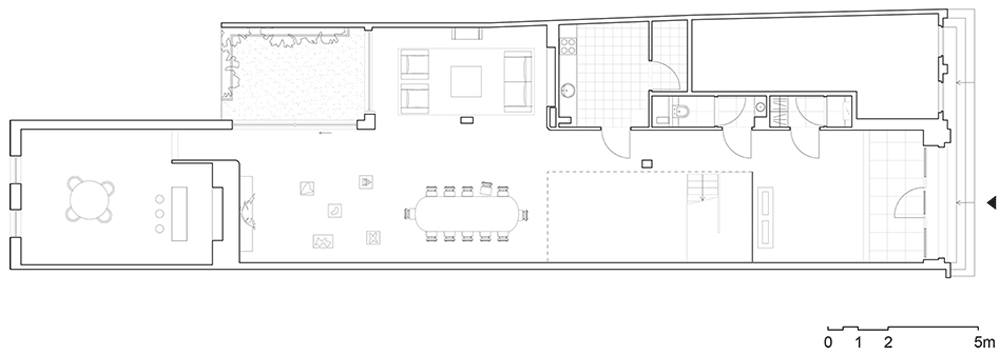
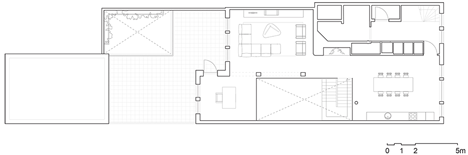
The 1200-spectator ice rink fills the interior of the building and is large enough to host international competitions in speed skating, ice hockey and figure skating. Recycled seating furnishes the arena and was salvaged from the interior of an ice rink, just a short drive away in Coronmeuse.

Ice rink of Liège by L’'Escaut

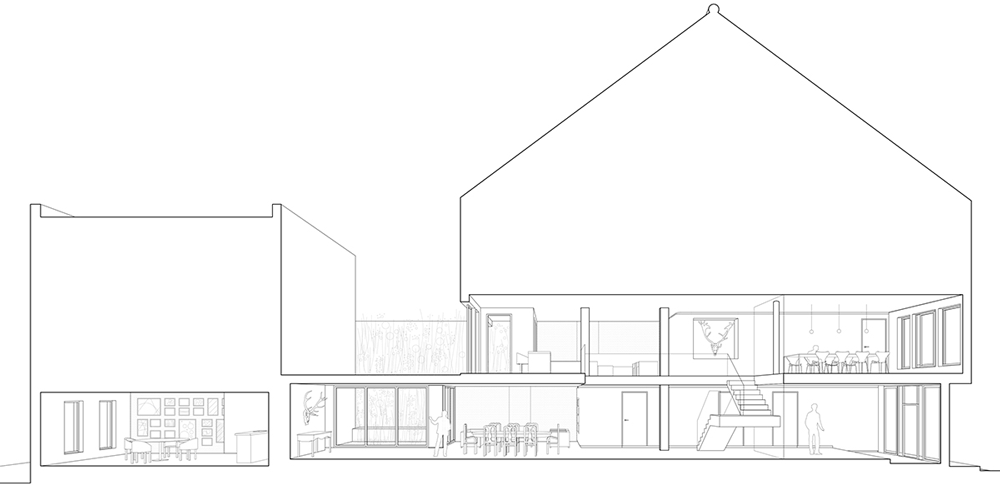
Glue-laminated timber beams and joists give the structure its curved profile and wrap around a recreation room and cafe on the edge of the rink.

Ice rink of Liège by L’'Escaut

Brussels studio L’Escaut designed the building in collabotarion with local architects BE Weinand.

Ice rink of Liège by L’'Escaut

Whales have provided the inspiration for a number of designs in recent years, including a flying hotel proposed in France and a whale-shaped cultural complex in Hungary. We also recently featured a staircase concept inspired by a whale’s spine.

Olympic Ice Rink of Liège by L'Escaut

Above: exploded diagram – click above for larger image

Photography is by Marc Detiffe.

Here’s a project description from the architects:


Olympic Ice Rink of Liège

At the root of the project: a round, fluid and generous shape, as a metaphor of a universe of ice. As its construction progressed: a sea monster, a whale covered with 200,000 aluminum scales.

Public/Private

The new ice rink of Liège is embedded into a crevice of the Médiacité, private real estate development project which came to redevelop a former industrial site on the right bank of the Meuse. It inherits several constraints that it clarifies in an autonomous and unitary form, until incorporating the access to the mall’s car park in its climax: the whale’s head.

As the opacity of the building is essential to insulate it from the heat, it is its entire body, by its nature, its material and its shape that means the relational dimension it wants to maintain with its environment. Moreover, the composition of its outer shell (on the mass-spring-mass principle) achieves a noise attenuation of 50db and protects the residents of the adjacent street.

Apart from a succession of portholes to the street sidewalk that suggest the activity of the strange object, the only transparent opening in the façade, is this bay as big as an antechamber that realizes a frank and larger indoor/outdoor contact.

On the one hand, the public building is integrated into the multitude of store names of the mall, as the main entrance is located at the “gallery” side. On the other hand, through its secondary entrance, it is inserted at the back of the service street of the shopping centre, giving a more positive urban value to this dead end. This “public mammal”, stranded behind a scene dedicated to consumers, plays with the shimmering of its metal skin and the glare of its white interior to attract citizens and encourage them to skate.

The whale’s head above the car park entrance

The main access to the car park of the mall is located at the only “end cap”, identity pointer of the rink. This dome is the most curved and spectacular area of the façade, where the careful scheme of the scales is revealed. This volume rises gently to allow cars to go. A load bearing element straight out of the 70’s reminds us of the glorious past of Liège, a time when car was queen in town planning as in some architectural projects (residence Simenon and its included petrol station, residence Belvedere with its architectural ramp). Today, it is no longer welcome, but it is still omnipresent in the city. Why should we deny it? Let us honor it by adding the atmosphere of New York in the 20’s and its “diners”.

The interior space of the rink focuses on the heart of the matter: functionality, economy and pleasure.

Guided tour

In the Médiacité, at the entrance to the ice rink, a white light shower of 1000 lux indicates the direction of the world of ice. Once past the airlock chamber, we dive into an ambient temperature of 16 ° C all year round.

In the whale’s stomach

Upon arrival in the foyer, the whole rink and volume of the building is visible through a transparent metal wall. Here you can sometimes have a hint at amateurs, sometimes hockey teams or figure skaters. The skating area is directly accessible from the foyer. We get our skates, pull them on and are ready to slide!

The “wood room” adjacent to the rink is a recreation room with a solid oak flooring. One can enjoy Liège waffles, perhaps even Lacquemants in October? As visitors, walking along the metal wall until the end, we are reaching the first floor and its cafeteria. On the way, by looking through the mesh, the kinetics of storage is shown: skate drying and sharpening.

While climbing the stairs, we discover the dome and a large window with rounded edges, and finally the carcass of a marine mammal… Ah yes, the whale!

If we’re coming by car, we quickly identify that it is the glued laminated timber structure completely laid bare before our eyes that creates the strange shape previously penetrated. Are we inside the Venturi’s duck?… The scales ratio is therefore increased tenfold. Just a quarter turn to the right and the rink, surrounded with its 1200 seats, presents itself to our eyes. The inhabitants of Liège will recognize the seats of the former ice rink from Coronmeuse, hosted in the “Grand Palais des fêtes”, built for the Universal Exhibition of 1939.

During events, the cafeteria is transformed into a XXL taproom, integrating the walkway along the façade that merges with the rink volume: the domestic scale of the bar is then confronted with the massiveness and the emotion of a hockey match or a figure skating gala.

Thirsty racehorse

The pleasure of the skater, the player, the spectator and the visitor is made for by the space, but also by the performance of this tool: an outer shell with an insulation factor of K22, equivalent to a passive house; 2 refrigeration units developing 1000kW coupled with 4 sets of air coolers; a ventilation system of the room with a flow rate of 60,000 m3/h for dehumidifying the air of the rink; 80 spotlights ensuring a perfect homogeneity of 1200 lux during matches and competitions, particularly when broadcasted.

Formidable engineering was necessary to allow this sea monster to perform at a high level, but also to reuse consumed energy: heat pump, ventilation system and hot water tank recovering a part of the heat produced by the refrigeration units, a piping system as a Tichelmann loop to better distribute the cooling liquid under the rink and thus consume less.

During the preliminary studies, a connection to the heating system of the shopping centre was also considered to carry away part of the generated heat. It can still be done later if the centre wishes.

Place: Longdoz district, Liège (Belgium)
Program: Olympic ice rink with 1200 seats /1800 skaters on ice.

Client: City of Liège
Funding: SPW Infrasports
Process: competition
Technical control: SECO
Project authors: L’Escaut-BE Weinand (Momentary Association)
L’Escaut Architectures: David Crambert, Annelies Kums, Michael Bianchi, Olivier Bastin Claire Laborde, François Lichtlé, Deborah Vanderlinden, Tilman Gappa

Structure: Bureau d’études Weinand: Yves Weinand, Arianit Shevelli
Fluids: BET Nicolas Ingénieries
Acoustics: CAPRI acoustique
Health and Safety Coordinator: SIXCO
General contractor: Moury Construct
Timber structure: Lamcol
Cooling production: Axima Refrigeration
Electrical system: Balteau
Finishing: Keppenne

Surface areas: 6700 sq m
Duration: 2007-2012

The post Olympic Ice Rink of Liège
by L’Escaut
appeared first on Dezeen.

The Village by Gert Robijns

The ghost town depicted in these images by photographer Tim Van de Velde is a replica that Belgian artist Gert Robijns built to recreate part of the village he grew up in (+ slideshow).

The Village, Het Dorp by Gert Robijns

Constructed on a former military airfield just a few miles away, the fake buildings included a full-size copy of a church and neighbouring house, both entirely stripped of colour.

The Village by Gert Robijns

“I got the idea to make a parallel world for my dead grandfather,” Gert Robijns told Dezeen, after explaining how he was approached by the Mayor of the nearby village to make a temporary public artwork.

The Village by Gert Robijns

“The idea was to create a mental archtitectural context, splitting the world into a concrete and a mental world,” he added. “The idea was that the world was slightly changed while still repeating itself, since it stayed close to the original.”

The Village by Gert Robijns

The artist built the structures using chunky chipboard and a metal framework, and each building has only part of a facade. This means that the scene can only be viewed from one angle before the skeletal framework is revealed to the eye.

The Village by Gert Robijns

Robijns described how the installation attracted both tourists and local residents. “People from the village came to look at ‘themselves’ from a certain distance and people from the art world came to visit both the replica village and the original place,” he said.

The Village by Gert Robijns

The exhibition ended in December and the structures have since been dismantled.

The Village by Gert Robijns

Other recent architectural installations we’ve featured include a bridge held up by balloons and a set of star-shaped lights in the desert.

The Village by Gert Robijns

See more stories about installations »

The Village by Gert Robijns

See more photography by Tim Van de Velde on Dezeen, or on the photographer’s website.

The Village by Gert Robijns

The post The Village by
Gert Robijns
appeared first on Dezeen.

Iconic Typography

A la demande de l’agence belge Canada Gent, l’artste Kevin Devroo nous propose de découvrir un travail typographique de toute beauté. Alliant avec talent lettres et matériaux, le rendu de ce projet appelé « Iconic » rend hommage au design avec des créations 3D du plus bel effet. A découvrir en images dans la suite.

f86785fa02dbf7611dbd9556da731924
b5222b5e7d7b4e638dbe594f06f6282e
Iconic Typography7
Iconic Typography6
Iconic Typography5
Iconic Typography3
Iconic Typography2
Iconic Typography
Iconic Typography1
Iconic Typography8