O’Donnell + Tuomey complete faceted brick student centre at London School of Economics

Irish architects O’Donnell + Tuomey mapped sight lines along the narrow streets of the London School of Economics campus to generate the faceted red brick structure of the university‘s new student centre (+ slideshow).

Saw Swee Hock Student Centre at London School of Economics by O'Donnell + Tuomey

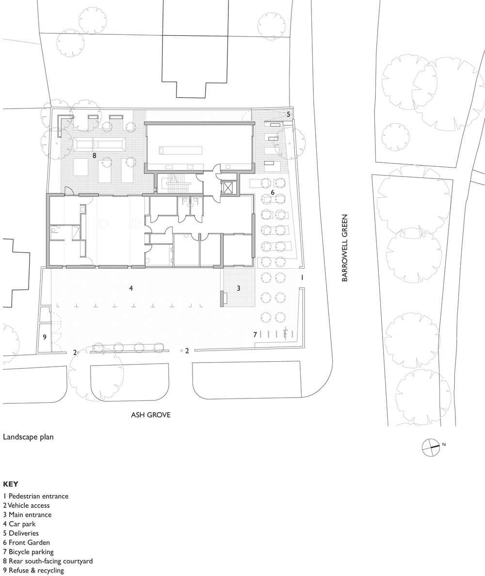
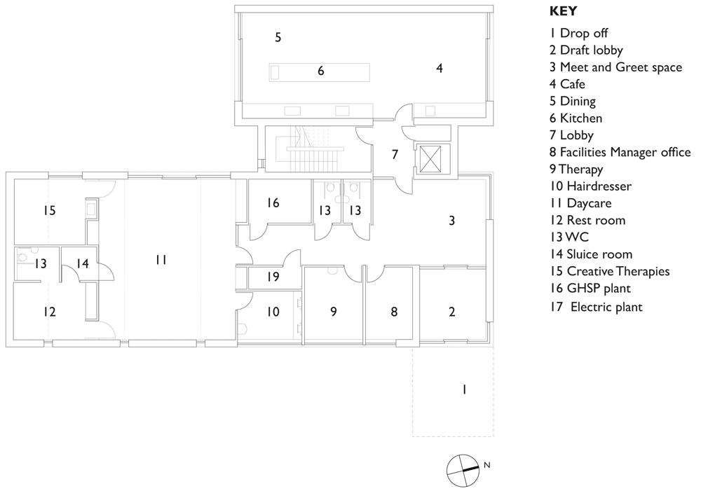
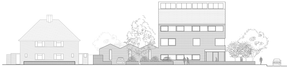
The Saw Swee Hock Student Centre consolidates all of the university’s student facilities under one roof at the LSE‘s historic Aldwych campus. Designed by architects Sheila O’Donnell and John Tuomey, the seven-storey-high building has an irregular faceted shape informed by the angular geometries of its site and surroundings.

Saw Swee Hock Student Centre at London School of Economics by O'Donnell + Tuomey

Walls angle inwards along the eastern facade to give the centre a recessed public entrance that lines up with approaching streets to the north, south and east.

Saw Swee Hock Student Centre at London School of Economics by O'Donnell + Tuomey

“The public space at the threshold of the student union, on axis with St Clement’s Lane, creates a place of exchange; a spatial bowtie that intertwines circulation routes, splices visual connections between internal and external movement, and pulls pedestrian street life into and up the building,” said the architects.

Saw Swee Hock Student Centre at London School of Economics by O'Donnell + Tuomey

“Like a Japanese puzzle, our design is carefully assembled to make one coherent volume from a complex set of interdependent component parts,” they added.

Saw Swee Hock Student Centre at London School of Economics by O'Donnell + Tuomey

Red brick was used to construct the walls of the building using a typical flemish bond. In some places the material forms solid walls, while in others it creates perforated screens across windows.

Saw Swee Hock Student Centre at London School of Economics by O'Donnell + Tuomey

“The perforated planes are constructed from a single leaf of brickwork with spaces in the flemish bond pattern to allow light to both infiltrate the interior spaces and filtrate out at night to create a pattern effect,” said the architects.

Saw Swee Hock Student Centre at London School of Economics by O'Donnell + Tuomey

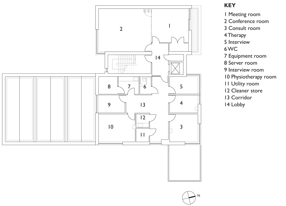
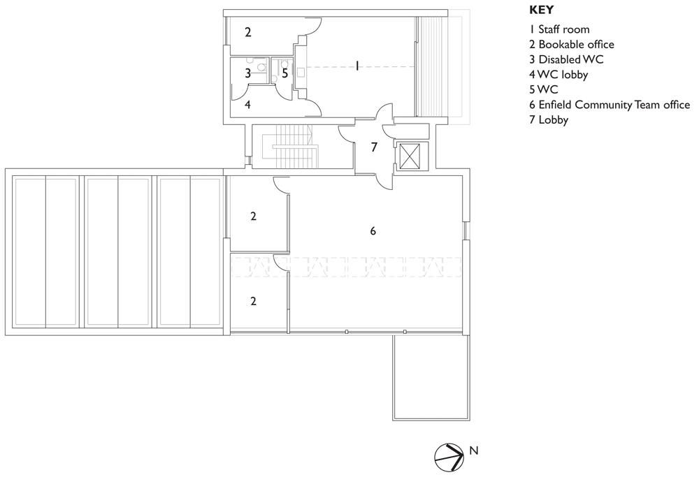
Spaces within the building accommodate a variety of functions, including an events venue, a bar, a cafe, a gym and dance studios. There are also prayer rooms, offices and multimedia facilities.

Saw Swee Hock Student Centre at London School of Economics by O'Donnell + Tuomey

Designed to resemble a “lived-in warehouse”, the building has an exposed structure that combines steel columns and trusses with concrete floor slabs.

Saw Swee Hock Student Centre at London School of Economics by O'Donnell + Tuomey

Floor plates differ in shape and size on different floors. Angular stairwells are positioned at three corners of the building, while a spiral staircase is positioned near the entrance.

Saw Swee Hock Student Centre at London School of Economics by O'Donnell + Tuomey

“Space flows freely in horizontal plan and vertical section, with stairs gently twisting and slowly turning to create a variety of diagonal break-out spaces at landings and crossings throughout the building,” said the architects.

Saw Swee Hock Student Centre at London School of Economics by O'Donnell + Tuomey

An assortment of windows and skylights ensure that each corridor receives daylight, and an events hall in the basement can be naturally lit though a row of clerestory windows.

Saw Swee Hock Student Centre at London School of Economics by O'Donnell + Tuomey

The building will open next month, but its surrounding landscaping is not set to be finished until the summer.

Saw Swee Hock Student Centre at London School of Economics by O'Donnell + Tuomey

Photography is by Dennis Gilbert/VIEW.

Here’s a project description from O’Donnell+Tuomey Architects:


Saw Swee Hock Student Centre, London School of Economics

Client Brief

The brief was to bring student facilities together under one roof. The multi-functional building includes a venue, pub, learning café, media, prayer, offices, gym, careers, dance studio and social spaces. The brief asked for the “best student building in the UK” and had the aspiration for BREEAM Excellent rating. The design achieved BREEAM Outstanding.

Saw Swee Hock Student Centre at London School of Economics by O'Donnell + Tuomey

Planning Constraints

The site lies within the Strand Conservation Area. The context was complex and the site was restricted by surrounding building lines. Specifications were closely monitored by Westminster planners, who supported the ambition for a contemporary design integrated with its setting. Throughout the building process, the planners maintained a commitment to the enduring quality of carefully crafted construction.

Saw Swee Hock Student Centre at London School of Economics by O'Donnell + Tuomey

Street Life

The site is located at the knuckle-point convergence of narrow streets that characterise the LSE city centre campus. The faceted facade operates with respect to the Rights of Light Envelope and is tailored to lines of sight, to be viewed from street corner perspectives and to make visual connections between internal and external circulation. The brick skin is cut along fold lines to form large areas of glazing, framing views. Analysis of the context has influenced the first principles of a site specific architectural design.

Saw Swee Hock Student Centre at London School of Economics by O'Donnell + Tuomey

Embodiment

The building is designed to embody the dynamic character of a contemporary Student Centre. The complex geometries of the site provided a starting point for a lively arrangement of irregular floor plates, each particular to its function. Space flows freely in plan and section, with stairs turning to create meeting places at every level.

Saw Swee Hock Student Centre at London School of Economics by O'Donnell + Tuomey

Construction, Colour and Atmosphere

London is a city of bricks. The building is clad with bricks, with each brick offset from the next in an open work pattern, creating dappled daylight inside and glowing like a lattice lantern at night.

Saw Swee Hock Student Centre at London School of Economics by O'Donnell + Tuomey

The building has the robust adaptability of a lived-in warehouse, with solid wooden floors underfoot. The structure is a combination of reinforced concrete and steelwork. Steel trusses or ribbed concrete slabs span the big spaces. Circular steel columns prop office floors between the large span volumes and punctuate the open floor plan of the café. Concrete ceilings contribute thermal mass with acoustic clouds suspended to soften the sound.

Saw Swee Hock Student Centre at London School of Economics by O'Donnell + Tuomey

There are no closed-in corridors. Every hallway has daylight and views in at least one direction. Every office workspace has views to the outside world. The basement venue is daylit from clerestory windows.

Saw Swee Hock Student Centre at London School of Economics by O'Donnell + Tuomey

Inclusive Design

The building is designed with accessibility and inclusive design as key considerations. Approaches are step free. Floor plates are flat without steps. Circulation routes are open and legible with clearly identifiable way-finding. Services are located at consistent locations. The central wide stair was carefully designed to comply with standards and details agreed with the approved inspector.

Saw Swee Hock Student Centre at London School of Economics by O'Donnell + Tuomey

Architect: O’Donnell+Tuomey Architects
Executive Architect: O’Donnell+Tuomey Architects
Structural Engineer: Dewhurst Macfarlane and Partners/Horganlynch Consulting Engineers

Saw Swee Hock Student Centre at London School of Economics by O'Donnell + Tuomey

Services + Environmental Engineer: BDSP
Security / Fire / Acoustics / Transport & Logistics / Venue: Arup
Catering: Tricon Foodservice Consultants
Access:David Bonnett Associates
Archaeology: Gifford
Project Manager: Turner & Townsend

Saw Swee Hock Student Centre at London School of Economics by O'Donnell + Tuomey

Quantity Surveyor: Northcroft
Planning Consultant: Turley Associates
Party Wall Consultant: Anstey Horne
Building Control Consultant: Carillion
CDM Coordinator: Gardiner & Theobald
Main Contractor (D&B): Geoffrey Osborne Limited

Ground floor plan of Saw Swee Hock Student Centre at London School of Economics
Ground floor plan – click for larger image
First floor plan of Saw Swee Hock Student Centre at London School of Economics
First floor plan – click for larger image
Second floor plan of Saw Swee Hock Student Centre at London School of Economics
Second floor plan – click for larger image
Third floor plan of Saw Swee Hock Student Centre at London School of Economics
Third floor plan – click for larger image
Fourth floor plan of Saw Swee Hock Student Centre at London School of Economics
Fourth floor plan – click for larger image
Fifth floor plan of Saw Swee Hock Student Centre at London School of Economics
Fifth floor plan – click for larger image
Sixth floor plan of Saw Swee Hock Student Centre at London School of Economics
Sixth floor plan – click for larger image
Basement floor plan of Saw Swee Hock Student Centre at London School of Economics
Basement floor plan – click for larger image
Lower basement floor of Saw Swee Hock Student Centre at London School of Economics
Lower basement floor – click for larger image
Section one of Saw Swee Hock Student Centre at London School of Economics
Section one – click for larger image
Section two of Saw Swee Hock Student Centre at London School of Economics
Section two – click for larger image
Section three of Saw Swee Hock Student Centre at London School of Economics
Section three – click for larger image

The post O’Donnell + Tuomey complete faceted brick
student centre at London School of Economics
appeared first on Dezeen.

Vaulted brick pavilion in Barcelona by Map13

Spanish architecture collective Map13 combined a traditional Spanish construction technique with digital design tools to create this vaulted brick pavilion in a Barcelona courtyard (+ slideshow).

Bricktopia by map13

Named Bricktopia, the structure was designed by Map13 using a Catalan vault – a method where plain bricks are laid lengthways across gently curved forms to create a series of smooth low arches.

Bricktopia by map13

“Unlike the construction that can be seen these days, this project aims to restore the expertise and imagination of the building hands,” explained the architects.

Bricktopia by map13

The structure was conceived using three-dimensional modelling software program Rhino and a plugin called Rhinovault. This enabled the architects to test the geometries of the structure and adapt it so that only compression stresses act on the vault.

Bricktopia by map13

This approach is based on a prototype developed by researchers Philippe Block, Matthias Rippman and Lara Davis at the Technical University of Zurich.

Bricktopia by map13
Photography by eme3

“This research collects the material tradition and the constructive knowledge of tile vaulting and combines them with contemporary computational tools,” said the designers.

Bricktopia by map13
Photography by eme3

The structure was built by architecture students and volunteers, who used criss-crossing metal rods and pieces of cardboard to outline the basic frame.

Bricktopia by map13

The completed structure comprised four vaulted spaces with curved openings that form doors and windows.

Bricktopia by map13

Bricktopia was constructed as part of the Eme3 International Festival of Architecture, which took place in June, and was used to host a programme of summer events including talks, activities and film projections.

Bricktopia by map13

Photography is by Manuel de Lózar and Paula López Barba, unless otherwise stated.

Here is some more information from the architects:


Bricktopia, Contemporary Crafts Festival EME3

Bricktopia, by the architects of the international collective Map13, is the winning project in the “Build-it” category at the International Festival of Architecture Eme3 held from the 27th to 30th of June in Barcelona. It can be visited during this summer at one of the courtyards of the former factory Fabra i Coats, in the district of Sant Andreu.

Bricktopia by map13

This intervention configures a new square where different activities can be performed, both under the building and around it. It includes bathing public spaces and sundecks, a bar and a stage for enjoying the summer 2013.

Bricktopia by map13

It is a vaulted structure made of brick using a traditional construction technique called tile-vault (or “Catalan vault”). It has been designed with new digital tools to optimise the structure through geometry. The proposal is the result of the academic research currently carried out by Marta Domènech Rodríguez, David López López and Mariana Palumbo Fernández, co-founders of the group Map13, with the help of different Professors from different fields and various schools of architecture.

Bricktopia by map13

This construction takes as a reference the prototype built by Philippe Block, Matthias Rippman and Lara Davis at the Technical University of Zurich, with which they demonstrated the reliability of “RhinoVault”, a plug-in for Rhinoceros, used to design the pavilion.

Bricktopia by map13

As “Bricktopia” is a pilot project which makes this traditional technique work to its limits, its implementation has required the expansion of the team, which has been enlarged with Paula López Barba and Josep Brazo Ramírez. The construction has also required the effort of Eme3 festival that gives support to young talented people to carry out their projects, the sponsorship of the companies that contributed with workforce and materials and the help of volunteers and students of architecture.

Bricktopia by map13

This research collects the material tradition and the constructive knowledge of tile vaulting and combines them with contemporary computational tools. This project, developed in the enclosed area of a nineteenth-century factory made of brick, uses the same material raising a new topography in the old courtyard. However, it is opposed to the industrial construction offering a concave and protected space that links the origins of all cultures.

Bricktopia by map13

The vaulted pavilion sets out the contemporary validity of this traditional system, native of Catalonia and widely used in various parts of the world for centuries. It is economical, sustainable, with formal and functional versatility and nowadays it is also offering the possibility of being built in developing countries for roofs, stairs, drainage systems, etc.

Bricktopia by map13

Unlike the construction that can be seen these days, this project aims to restore the expertise and imagination of the building hands. “Bricktopia” has been built by excellent builders who have made an unprecedented craftsmanship. The challenge that requires good layout in tile vault construction, specially with a complex shape like this one, suggests the work as an opposite to the mechanical work.

Bricktopia by map13
Site plan – click for larger image
Bricktopia by map13
Plan – click for larger image
Bricktopia by map13
Concpet drawings – click for larger images
Bricktopia by map13
Section and perspective

The post Vaulted brick pavilion in Barcelona
by Map13
appeared first on Dezeen.

Friendship Centre by Kashef Mahboob Chowdhury/URBANA

A labyrinth of brick walls, arches and courtyards are protected from flooding behind a man-made embankment at this open-air community centre in rural Bangladesh (+ slideshow).

Friendship Centre by Kashef Mahboob Chowdhury/URBANA

Designed by Bangladeshi architect and URBANA founder Kashef Mahboob Chowdhury, the complex functions as the centre for a charitable organisation. It offers training programmes for the poorest individuals in Gaibandha, a town where most of the community are employed in agriculture.

Friendship Centre by Kashef Mahboob Chowdhury/URBANA

The Friendship Centre is built on low-lying land surrounded by fields. Despite the threat of flooding, the cost of raising the building above the flood plain was too great so instead the designers created their own defence by building up the earth surrounding the site.

Friendship Centre by Kashef Mahboob Chowdhury/URBANA

Each building within the complex is constructed from a uniform brickwork, creating a maze of pavilion-like structures. Each block has the same height and every rooftop is covered with grass.

Friendship Centre by Kashef Mahboob Chowdhury/URBANA

“In the extreme limitation of means was a search for the luxury of light and shadows, of the economy and generosity of small spaces and of the joy of movement and discovery in the bare and the essential,” said Chowdhury.

Friendship Centre by Kashef Mahboob Chowdhury/URBANA

The architect also compares the project to some of the ancient Buddhist monasteries constructed elsewhere in the region. “Simplicity is the intent, monastic is the feel,” he added.

Friendship Centre by Kashef Mahboob Chowdhury/URBANA

Rooms are divided into two zones to separate reception and training rooms from dormitories and other more private quarters. There’s also a library, a conference room, a prayer space and a small shop.

Friendship Centre by Kashef Mahboob Chowdhury/URBANA

Large openings in the walls bring natural light and ventilation through the buildings, while a sequence of small courtyards and pools allow cool air to circulate.

Friendship Centre by Kashef Mahboob Chowdhury/URBANA

Excessive rainwater is collected in some of these pools and pumped into a nearby pond, while a complex network of septic tanks and wells prevents sewage mixing with flood water.

Friendship Centre by Kashef Mahboob Chowdhury/URBANA

Other projects designed to combat possible flooding include a floating house in New Orleans and a whole neighbourhood in Copenhagen.

Friendship Centre by Kashef Mahboob Chowdhury/URBANA

Here’s more text from the design team:


Friendship Centre

The Friendship Centre near the district town of Gaibandha, Bangladesh, is for an NGO which works with some of the poorest in the country and who live mainly in riverine islands (chars) with very limited access and opportunities. Friendship uses the facility for its own training programs and will also rent out for meetings, training, conferences etc. as income generation.

Friendship Centre by Kashef Mahboob Chowdhury/URBANA
Axonometric diagram – click for larger image

The low-lying land, which is located in rural Gaibandha where agriculture is predominant, is under threat of flooding if the embankment encircling the town and peripheries break.

Friendship Centre by Kashef Mahboob Chowdhury/URBANA
Floor plan – click for larger image

An extensive program with a very limited fund meant that raising the structures above flood level (a height of eight feet) was not an option: nearly the entire available fund would be lost below grade. Being in an earthquake zone and the low bearing capacity of the silty soil added further complications. The third and final design relies on a surrounding embankment for flood protection while building directly on existing soil, in load-bearing masonry. Rainwater and surface run-off are collected in internal pools and the excess is pumped to an excavated pond, also to be used for fishery. The design relies on natural ventilation and cooling, being facilitated by courtyards and pools and the earth covering on roofs. An extensive network of septic tanks and soak wells ensure the sewage does not mix with flood water.

Friendship Centre by Kashef Mahboob Chowdhury/URBANA
Roadside elevation – click for larger image

The ‘Ka’ Block contains the reception pavilion, offices, library, training/conference rooms and pavilions, a prayer space and a small ‘cha-shop’. The ‘Kha’ Block, connected by three archways, is for more private functions and houses the dormitories, the dining pavilion and staff and family quarters. The laundry and drying shed is located on the other side of the pond. There is no air-conditioning and the entire lighting is through LED and energy efficient lamps.

As in construction, so in conception – the complex of the centre rise and exist as echo of ruins, alive with the memory of the remains of Mahasthan (3rd century BC), some sixty kilometres away. Constructed and finished primarily of one material – local hand-made bricks – the spaces arc woven out of pavilions, courtyards, pools and greens; corridors and shadows. Simplicity is the intent, monastic is the feel.

Friendship Centre by Kashef Mahboob Chowdhury/URBANA
Site section – click for larger image

The centre serves and brings together some of the poorest of poor in the country and, by extension, in the world, yet in the extreme limitation of means was a search for the luxury of light and shadows of the economy and generosity of small spaces; of the joy of movement and discovery in the bare and the essential.

The post Friendship Centre by Kashef Mahboob
Chowdhury/URBANA
appeared first on Dezeen.

Town house EM by Areal Architecten

Belgian studio Areal Architecten inserted this brick and concrete townhouse into a residential streetscape in Mechelen near Antwerp.

House in Mechelen by Areal Architecten

Internally the three floors are united visually by a void topped with a skylight, which brings light down the stairwell to the ground floor.

House in Mechelen by Areal Architecten

This internal “canyon” separates the open-plan living spaces from the bedrooms.

House in Mechelen by Areal Architecten

“It’s a single family row house in the city but with amazing views and voids, and the use of a combination of raw and refined materials,” says Thomas Cols of Areal Architecten.

House-in-Mechelen-by-Areal-Architecten-2

The brick facade is sliced and faceted to relate the otherwise austere volume to its neighbours.

House in Mechelen by Areal Architecten

Instead of a front door onto the street, the house is entered via a porte-cochère.

House in Mechelen by Areal Architecten

Inside, the material palette is restrained, with ribbed concrete soffits, brick walls, timber and concrete floors and large internal single-pane windows.

House in Mechelen by Areal Architecten

The staircase is of white-painted steel and features blade-like treads.

House in Mechelen by Areal Architecten

The upper floors are of timber while the living quarters and kitchen have fitted timber-fronted storage units.

House in Mechelen by Areal Architecten

The open-plan first floor features a living room giving on to a terrace while the kitchen is on the ground floor.

House in Mechelen by Areal Architecten

The stone-clad ground floor rises in steps to manage the transition between the street level and the lower garden.

House in Mechelen by Areal Architecten

Here’s some text from the architects:


House in Mechelen

By a set of subtle surfaces, the front facade is struggling to blend into the template of the street. It balances between integrating and standing out. Inside a continuous open space made of large and generous rooms, connected to each other by some unexpected views creates a compressed urban-like space.

House in Mechelen by Areal Architecten

A “canyon” of light allows to create a dinstinction between the living spaces and the bedrooms while extending itself to the ground floor through a void which receives the staircase.

House in Mechelen by Areal Architecten
Site plan

The traditional spaces of a house are put together here into a single organic space with raw finishing such as a concrete grid on the ceiling and the prominent interior brick wall.

House in Mechelen by Areal Architecten
Facade

A difference of level on the ground floor creates a smooth transition between the street and the back of the house which is ended with a longitudinal garden.

Through precise openings and a terrace in extension of the living room, the boundaries between inside and outside in this townhouse are fading.

Project title: Town house EM

Architect(en): AREAL  ARCHITECTEN

Location: Vrijgeweidestraat 42, 2800 Mechelen, Belgium

Finished: March 2013

Program: single family house, house in a row

Client: private commission

Built surface: 340 m²

Architect’s website: www.arealarchitecten.be

House in Mechelen by Areal Architecten
Ground floor plan
House in Mechelen by Areal Architecten
First floor plan
House in Mechelen by Areal Architecten
Second floor plan
House in Mechelen by Areal Architecten
Section
House in Mechelen by Areal Architecten
Section

The post Town house EM by
Areal Architecten
appeared first on Dezeen.

Retro Brick Phone

If we imagine a world without Smartphones, then it’s easy to picture this Just 5 Brick Phone by Art Lebedev Studio as a must-have. However, we do live in the world of Technicolor so a large-key, monochromatic graphics-display phone sounds a bit off. Or does it? Specs like retractable antenna, radio, alarm clock, flashlight, calculator, calendar, handheld meter, only one game – “Race” and mapping are nostalgic. The winner of course is the one-week battery power. Will you trade this for your iPhone or Samsung Galaxy?

Designer: Art Lebedev Studio


Yanko Design
Timeless Designs – Explore wonderful concepts from around the world!
Shop CKIE – We are more than just concepts. See what’s hot at the CKIE store by Yanko Design!
(Retro Brick Phone was originally posted on Yanko Design)

Related posts:

  1. Brick: the exhibition
  2. Not Another Brick In The Wall
  3. The Best Brick for the Job


Another Brick In The Wall

As our USB sticks keep getting smaller, chances of us losing them in our bags and backpacks keep getting higher. This inverse proportion can be curbed thanks to the unique Brick USB Stick Design. The pint-sized stick rests snugly in your smartphone’s headphone jack. The design allows you the flexibility of carrying your USB without the bother of losing it, plus the dense pattern lets you know the storage capacity.

Designers: Hongshik Kim and Se-eun Kim


Yanko Design
Timeless Designs – Explore wonderful concepts from around the world!
Shop CKIE – We are more than just concepts. See what’s hot at the CKIE store by Yanko Design!
(Another Brick In The Wall was originally posted on Yanko Design)

Related posts:

  1. Not Another Brick In The Wall
  2. Is That A Steel Brick In The Wall?
  3. The Best Brick for the Job


Star Wars X-Wing Lego

La marque Lego a installé le 23 mai sur Times Square à New York un chasseur X-Wing issu de l’univers « Star Wars » en grandeur nature. Composé de plus de 5 millions de briques, cet objet de 20 tonnes a demandé près de 17 000 heures de travail par une équipe de 32 personnes. Une installation à découvrir en images.

Star Wars X Wing Lego6
Star Wars X Wing Lego5
Star Wars X Wing Lego4
Star Wars X Wing Lego3
Star Wars X Wing Lego2
Star Wars X Wing Lego
Star Wars X Wing Lego7

Long Farm by Lucy Marston

This house in rural England was designed by British architect Lucy Marston to reference old English farmhouses and features red brickwork, a steep gabled profile and a corner chimney (+ slideshow).

Long Farm by Lucy Marston

Located in the county of Suffolk, Long Farm is a three-storey family residence clad in a mixture of regional materials that includes terracotta roof tiles, lime mortar and timber details.

Long Farm by Lucy Marston

“We wanted to make a building that belonged on the site,” says Lucy Marston. “Familiar building elements and materials were carefully composed to create a house that is clearly of its time, but with an identity firmly routed in its locale. It was intended to be immediately recognisable as a Suffolk house that feels at home on the farm.”

Long Farm by Lucy Marston

Skylights are lined up along both sides of the roof, while large windows cover all four elevations, allowing light to filter into the house at different times of day.

Long Farm by Lucy Marston

A similar materials palette continues through the interior. Martson explains: “Whitewashed brickwork, painted timber linings and exposed ceiling beams were used to give honest depth, texture and character to a modern interior.”

Long Farm by Lucy Marston

The client works as a writer and requested quiet spaces for working as well as larger areas for entertaining guests or spending time as a family.

Long Farm by Lucy Marston

Marston thus added a a series of rooms on the ground floor that can be opened out to create a large living room or subdivided to create a “snug”, a reading room and a playroom for the children. There’s also a study across the corridor.

Long Farm by Lucy Marston

A large kitchen is located at the opposite end of this floor and features a dining table that can seat up to ten people, as well as a traditional farmhouse sink and a double stove.

Long Farm by Lucy Marston

Four bedrooms occupy the first floor and include two master bedrooms with private bathrooms, plus a pair of children’s rooms that can be combined to form one large room.

Long Farm by Lucy Marston

“The clients wanted to build a simple, modest building that would adapt to accommodate them as the family developed,” says the architect.

Long Farm by Lucy Marston

Other rural English houses featured on Dezeen include a converted stable block in Hampshire and a stone house on the Isle of Man. See more houses in the UK.

Long Farm by Lucy Marston

Photography is by Jack Hobhouse.

Long Farm by Lucy Marston

Here’s the full project description from Lucy Marston:


Long Farm, Suffolk

Long Farm is a new family home in rural Suffolk, England. The house sits high among a group of existing farm buildings, facing east across salt marshes and open fields, towards the sea.

Long Farm by Lucy Marston

We wanted to make a building that ‘belonged’ on the site and so the design emerged from its context. The steeply pitched roof and linear form were influenced by the traditional ‘long house’ form that can be seen throughout that part of the country.

Long Farm by Lucy Marston

Familiar building elements and materials – a corner chimney, brick and lime mortar, teracotta tiles and timber – were carefully composed to create a house that is clearly of its time, but with an identity firmly routed in its locale. It was intended to be immediately recognisable as a Suffolk house that feels at home on the farm.

Long Farm by Lucy Marston

Capturing the unique views around the house, in all directions was key. From the dawn in the east over the sea to sunset over the reed beds to the far west, windows and rooflights were placed precisely to track the sun and and views throughout the course of the day. Windows were kept large to frame dramatic views, but balanced with the occupants’ domestic desire for enclosure, privacy and warmth.

Long Farm by Lucy Marston

Internally, the vernacular references continue: a super-sized inglenook in the sitting room, a generous hall and landing that almost become rooms, window sills deep enough to sit in and a ‘farmhouse kitchen’ arranged around a large family table. Whitewashed brickwork, painted timber linings and exposed ceiling beams were used to give honest depth, texture and character to a modern interior.

Long Farm by Lucy Marston

The house was designed to accommodate a family of four with guests, with room for different age groups to carry out activities in different parts of the house.

Long Farm by Lucy Marston

As a writer with young children, the client had conflicting requirements, requiring solitude in order to work and also sociable interlinked spaces for the everyday bustle of sociable family life and frequent visitors.

Long Farm by Lucy Marston

The plan, an update of the traditional single room depth long house layout, was developed as a series of smaller rooms with their own identities (a playroom, a reading room, a snug).

Long Farm by Lucy Marston

These can be closed off and used separately with access via the hall or opened up with sliding doors to create a more fluid semi-open plan space. Likewise the childrens’ bedrooms can be opened up to form one big room or closed off for privacy.

Long Farm by Lucy Marston

The clients wanted to build a simple, modest building that would adapt to accommodate them as the family developed. They also wanted a building that would weather well, would require little or no maintenance and minimal energy to run.

Long Farm by Lucy Marston

At Long Farm, we aimed to make a building that was not only robust and flexible enough to age well over time, but one that aimed to be sustainable long term in an aesthetic sense, that had a timeless or ‘classic’ quality to it.

Long Farm by Lucy Marston

Landscape Consultant: Marie Clarke, Clarke Associates
Structural Engineer: David Cantrill, JP Chick and Partners
Contractor: Robert Norman Construction

Long Farm by Lucy Marston
Site plan – click for larger image
Long Farm by Lucy Marston
Ground floor plan – click for larger image and key
Long Farm by Lucy Marston
First floor plan – click for larger image and key
Long Farm by Lucy Marston
Second floor plan
Long Farm by Lucy Marston
Cross sections one and two – click for larger image
Long Farm by Lucy Marston
Cross sections three and four – click for larger image

The post Long Farm by
Lucy Marston
appeared first on Dezeen.

North London Hospice by Allford Hall Monaghan Morris

London practice Allford Hall Monaghan Morris used pale brick walls, gabled roof profiles and domestic furniture to make this London hospice look like an oversized house (+ slideshow).

North London Hospice by Allford Hall Monaghan Morris

The North London Hospice was designed to provide support and treatment for patients with a life-limiting or terminal illness, within a less clinical environment than a hospital ward.

North London Hospice by Allford Hall Monaghan Morris

“We wanted to give the building a domestic quality,” AHMM‘s Paul Monaghan told Dezeen. “This is a healthcare building that does not feel institutional or clinical. And this was the aspiration, that people feel at home in this building.”

North London Hospice by Allford Hall Monaghan Morris

The architects added a pale brick to give a uniform appearance to the exterior walls. “Brick, of course, has strong associations with the idea of a home,” added Monaghan. “Its use also enabled us to blend in with the adjacent suburban semi-detached houses, although its lighter tone was intended to subtly highlight the building’s public nature.”

North London Hospice by Allford Hall Monaghan Morris

The main volume of the structure comprises two prominent gables, both three storeys in height, while a single-storey extension accommodates extra rooms at the rear and frames a south-facing courtyard.

North London Hospice by Allford Hall Monaghan Morris

Visitors arrive through an entrance on the eastern facade. There’s no reception, to avoid the feel of an institution, so this route leads directly to an informal lounge at the heart of the building.

North London Hospice by Allford Hall Monaghan Morris

From here, visitors can walk through to a daycare room at the back of the building, or find their way to treatment rooms on either of the two lower floors.

North London Hospice by Allford Hall Monaghan Morris

A kitchen and dining room is located within the second gable on the western side of the building and opens out to the private courtyard.

North London Hospice by Allford Hall Monaghan Morris

North London Hospice is the latest in a string of domestic buildings designed for patient care, following a number of Maggie’s cancer-care centres to complete in recent years. See more stories about healthcare buildings.

North London Hospice by Allford Hall Monaghan Morris

Allford Hall Monaghan Morris is best-known for its Stirling Prize-nominated Angel Building and Westminster Academy, also both in London. See more London architecture on Dezeen.

North London Hospice by Allford Hall Monaghan Morris

Photography is by Tim Soar.

North London Hospice by Allford Hall Monaghan Morris

Here’s a project description from AHMM:


North London Hospice

The North London Hospice provides a new uplifting base for the North London Hospice charity that incorporates a range of new services and encourages patients to drop-in for a chat, join in creative therapies, undergo treatments or simply relieve their carers.

North London Hospice by Allford Hall Monaghan Morris
Site plan – click for larger image and key

Completed in May 2012, the building fulfils the aspiration to increase the provision of palliative care in Enfield in a contemporary, beautiful and non-clinical environment. Over the course of three years the client, architect, design team and user group worked closely to develop a brief and building that meets and exceeds patient needs by creating a special place for them in the heart of their community.

North London Hospice by Allford Hall Monaghan Morris
Ground floor plan – click for larger image and key

Set in a suburban residential area of north London, the building form is that of an overscale house – utilising pitched roofs and traditional brick construction. Located on a prominent corner, the two north facing gables form the main accommodation linked by circulation spaces and a single storey extension to the rear.

North London Hospice by Allford Hall Monaghan Morris
First floor plan – click for larger image and key

A generous entrance canopy receives visitors into a meet-and-greet space, leading through to a large multi-purpose daycare room and open plan kitchen and café area which frame a south facing courtyard. Smaller rooms for creative therapies, a hairdresser, and rest room support the key ground floor spaces. The first floor houses clinical, interview and teaching activities, with the pitched second floor providing flexible administrative facilities. All the upper rooms have generous views overlooking allotments to the south and playing fields to the north.

North London Hospice by Allford Hall Monaghan Morris
Second floor plan – click for larger image and key

It was important to both the client and architect that the building felt light and airy and created a domestic sense of wellbeing so as to avoid any negative institutional connotations. The simple palette of brick and timber and muted colours all contribute to a calm and gentle environment for patients and carers.

North London Hospice by Allford Hall Monaghan Morris
Long section

Client: North London Hospice
Client Representative: Procore Project Solutions Ltd
Architect: Allford Hall Monaghan Morris
Main Contractor: Pavehall Plc

North London Hospice by Allford Hall Monaghan Morris
Cross section

Landscape Architect: BB UK
Quantity Surveyor: Equals Cost Consultancy
Structural/Civil Engineer: Elliott Wood Partnership LLP
Services Engineer: Atelier Ten

North London Hospice by Allford Hall Monaghan Morris
North elevation – click for larger image

CDM Coordinator: Total CDM
Landscape Contractor: Gavin Jones Group
Acoustic Consultant: Paul Gillieron Acoustic Design
Ecological Consultant: John Wenman Ecological Consultancy LLP
Highways/Traffic Consultants: JMP Consultants
Approved Inspector: Guy Shattock Associates

North London Hospice by Allford Hall Monaghan Morris
East elevation – click for larger image

The post North London Hospice by
Allford Hall Monaghan Morris
appeared first on Dezeen.

A Pound of Flesh for 50p (study) by Alex Chinneck

Hackney artist Alex Chinneck has created a wall that melts in the sun as part of his research for a project to build a melting house.

A Pound of Flesh for 50p by Alex Chinneck

Chinneck has been working on a melting house to be built in Kent, England, in the summer of 2014, but recently demonstrated the concept by constructing a two-metre-high wax wall that gradually became a pile of drips and rubble over the course of a day.

A Pound of Flesh for 50p by Alex Chinneck

“Architecture and light have such an inseparable relationship and a building is rarely designed or built without consideration to the sun’s movement around it,” the artist told Dezeen. “The melting house is being designed to describe this relationship in a literal and theatrical way because the sun physically shapes the form.”

A Pound of Flesh for 50p by Alex Chinneck

He continued: “I felt that my work was becoming so computer designed and engineered that I wanted to create a situation that sacrificed this kind of control. I like the idea of these wax structures being taken as far as a computer will allow before releasing the fate of the form to chance.”

A Pound of Flesh for 50p by Alex Chinneck

Each block used to build the wall was made from dyed paraffin wax, cast to the same dimensions of a standard brick used in the British construction industry. The artist added sand to the steel casting trays, giving each brick a subtly different texture with its own unique imperfections.

A Pound of Flesh for 50p by Alex Chinneck

He documented the melting of the wall for Art Licks Magazine. Although it was designed to diminish in just one day, it took longer than expected and Chinneck had to use a blowtorch to accelerate the process, highlighting the unpredictability of the design.

A Pound of Flesh for 50p by Alex Chinneck

The house will be installed in Margate, Kent, next summer. Unlike the wall, it is expected to melt slowly over a period of eight weeks. “I like the idea of spectacle having a subtlety, so this steady transformation feels pleasingly calm in contrast to the bold concept,” added the artist.

A Pound of Flesh for 50p by Alex Chinneck

Chinneck’s past artworks include a series of identically smashed windows at a derelict factory.

A Pound of Flesh for 50p by Alex Chinneck

See more art installations on Dezeen »

The post A Pound of Flesh for 50p (study)
by Alex Chinneck
appeared first on Dezeen.