Students design a $300 ventilator for the pandemic’s medical equipment shortage

As we all do our part in fighting the coronavirus pandemic, our health professionals are working round the clock without the required protective gear or medical equipment to safeguard themselves and continue saving lives. Without these essentials, they are at high risk of catching the virus and the lack of resources can impact the lives that can be saved. The global community is pitching in to help in every way they can – start-ups printed 3D valves and turned scuba diving masks into ventilators (if you have a printer to spare, the design file is available for download), designers at MIT making makeshift ICU pods and fashion brands producing PPE (personal protective gear) for healthcare professionals. Joining this force is Rice University’s Oshman Engineering Design Kitchen (ODEK) who has managed to develop a low-cost ventilator with the help of Metric Technologies.

There is a worldwide shortage of medical equipment, especially ventilators as traditionally they are expensive and time-consuming to produce at the rate this virus is moving. ODEK’s alternative costs less than USD 300 and it works on an automated mechanism that squeezes the common bag valve mask ventilation devices that are available in hospitals. This device is usually called an Ambu bag and can save the hours that healthcare professionals spend on manually pumping bags when there are no ventilators available. An exhausted human cannot pump air for extended periods of time with the precision of a machine, so with this device, it will be a lot easier to assist patients that need help to breathe. The device will also include feedback sensors that help fine-tune the flow of air to the lungs, as well as motors similar to those that power 3D printers for hours on end.

“The prototype device uses an Arduino board to facilitate programming that allows the adjustment of the rate at which the bag is squeezed,” says the team who is working on creating a custom integration circuit to replace the Arduino board that will further reduce the cost of the device. This will help in keeping non-critical patients stable and free up resources for those more in need of them. The students had created a plan for this in 2019 and they called it ‘Take A Breather’ unaware of the fact that in a few months their prototype could help save lives. The team wants to make the production plan public so anyone in the world can have access to it and join the effort in coping with the crisis, one of them said it was for all of humanity and we couldn’t thank these young world-changers enough.

Designer: ODEK (Rice University), Dr. Matthew Wettergreen, Dr. Rohith Malya, and Metric Technologies

Brian and Roger Eno on collaboration, humour and music

Musicians Brian and Roger Eno have released their first album together; here CR talks to them about the project and what makes a good creative collaboration

The post Brian and Roger Eno on collaboration, humour and music appeared first on Creative Review.

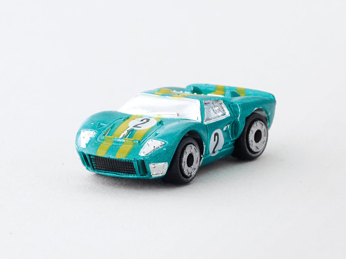
A new book is looking at the craft and legacy of Micro Machines

“Remember, if it doesn’t say Micro Machines, it’s not the real thing!” Some will no doubt recognise this slogan from the Micro Machines ads that aired in the late 80s and 90s. The line was uttered at lightening speed by John Moschitta Jr, otherwise known as the Micro Machines Man, who at the time earned himself a place in the Guinness Book of World Records as the world’s fastest talker.

Such zany adverts likely had a hand in putting these detailed miniature toy cars on the map, and they were soon cemented as a serious contender in the toy cars market – a territory previously dominated by Hot Wheels and Matchbox. In the 1988 issue of Toy & Hobby Magazine, Micro Machines were ranked the “third most popular toy on the market,” according to author Tim Smith in the introduction to his new book, Micro but Many. “Only Nintendo Entertainment System (NES) games and Barbie Doll ranked higher.”

“In the 80s, when I was just a small boy, I collected Micro Machines. Tiny little scale cars and planes, much smaller than your Hot Wheels or Matchbox cars,” Smith writes.

“They were expensive for a small boy, but thanks to some playground swapping and thieving, I managed to amass about a hundred of the things.” A foolish trade for a Teenage Mutant Ninja Turtle coin saw him lose his Micro Machines as a child, but in the last ten years he’s rebuilt a hefty archive deemed worthy of its own book.


Micro but Many collates images and writings on Smith’s extensive collection of Micro Machines – the line of highly detailed miniature vehicles, boats and aircraft created by Galoob (now owned by toy giant Hasbro). Curated by the original designers as well as fellow collectors, the book features over 1,000 Micro Machines – though Smith’s full collection extends to over 5,000 pieces.

Micro Machines became known for their realistic design,  nearly all of which were based on real cars. The book therefore takes a close look at the craft and detailed design that went into the models, and as well as prototypes and unreleased vehicles that never made it onto the shop floor.

Micro But Many book by Tim Smith

Readers can expect to find a history of the three generations of Micro Machines – broken up into the Kaplinsky, Miller and Hasbro years – which each left their distinct mark on the production of the miniatures. Plus, for Micro Machine fans looking to top up their trivia, there are insights about both Micro Machines and Galoob as brands, anecdotes about the wacky ads that aired during the 80s and 90s, and “never-before-seen insights from many of the original Galoobians”.

Such phrases confirm that this is undoubtedly a niche title, but Smith’s passion radiates throughout this colourful read – one that highlights how good design can capture people’s imaginations even at a ‘micro’ level.

From Micro But Many by Tim SmithFrom Micro But Many book by Tim SmithMicro But Many book cover

Micro but Many by Tim Smith is published by Bitmap Books, and is available to pre-order now; bitmapbooks.co.uk

The post A new book is looking at the craft and legacy of Micro Machines appeared first on Creative Review.

Yuri Suzuki's Easy Record Maker lets you engrave your own records

Japanese designer and sound artist Yuri Suzuki has created a machine that can be used to make and play records.

Created with Japanese publishing and toy company Gakken, the Easy Record Maker has a recording stylus that engraves sounds onto five-inch plastic disks.

Easy Record Maker by Yuri Suzuki

“You simply plug in your iPhone, computer, audio player – any sound source – through the mini audio jack to supply sound to record your own record,” Suzuki told Dezeen.

“Put the stylus down on the surface, select 33rpm or 45rpm and start making the record.”

Easy Record Maker by Yuri Suzuki

The compact record maker is designed to engrave five-inch disks, which Suzuki described as having a “nice lo-fi sound”.

Suzuki hopes that the Easy Record Maker will help introduce vinyl records to a generation that has never experienced them.

Easy Record Maker by Yuri Suzuki

“This idea has been my dream machine since I was teenager,” the London-based designer and Pentagram partner said. “With most of the existing media – CD, tape, and mp3 – it is relatively easy to make a copy or create your own original.”

“However, as it’s a complicated process with records, there is no way to create them at home,” he continued. “Of course professional-use record cutting machines exist, but they are very expensive.”

Easy Record Maker by Yuri Suzuki

As a teenager in a punk band Suzuki wanted to make his own records, but never did as it was too expensive.

“My life time art projects uses records, as I believe that is the only media to physically make sound – through scratching the groove and the stylus then making sound,” said Suzuki. “Records can even playback if we lost electricity in the future.”

Easy Record Maker by Yuri Suzuki

The designer believes the return of the vinyl record is due to both its warm sound and aesthetic qualities, with album artworks looking better on larger-sized record covers.

“I want to re-introduce how nice the record is, the value of having a physical music media and the sound, the listening experience,” Suzuki told Dezeen.

Easy Record Maker by Yuri Suzuki

“We are in an extreme time due to the pandemic lockup, but it’s easy to call or do an online meeting; we are experiencing alternative ways of communicating,” the designer said.

“I hope this device introduces another way to communicate for people – recording your own voice, making a record and sending it to a friend or family via post.”

Easy Record Maker by Yuri Suzuki

The Easy Record Maker is currently available in Japan and will be available in the UK and US later this year.

Suzuki’s previous creations include a re-imagination of a sixty-year-old electronic sequencer and a sonic playground. Suzuki also composed the original music for the Dezeen podcast Face to Face.

The post Yuri Suzuki’s Easy Record Maker lets you engrave your own records appeared first on Dezeen.

United Nations issues a call to arms for creatives to help tackle coronavirus

Creativity has long been used as a tool for good during turbulent times, as we’ve seen with the array of inventive projects and initiatives that have come out of the coronavirus pandemic over the last few weeks. In its new open brief to creatives across the globe, the United Nations is recognising the value of creativity in the ongoing effort to overcome the pandemic.

“We need to meet people where they are, with a stream of fresh, innovative content which drives home the personal behaviours and societal support needed today,” says Robert Skinner, executive director of the UN Office for Partnerships. “We look to the creative community, using factual, accurate and science-based knowledge and messages, to help reach everyone, everywhere in this fight against the coronavirus.”

Image by Shenja Tatschke (@shen.ja)

The brief, which is being managed by Talenthouse, calls on agencies, creative communities and individuals to come up with “iconic and visualling arresting” content spanning illustration, audio, video and copy. The content can be related to any of the UN’s key messages around the actions that the public can take to help combat the virus, which include personal hygiene; physical distancing; knowing the symptoms; kindness contagion; myth busting and do more, donate.

“This is the first time that we are fighting a war where everyone is on the same side,” says Clare McKeeve, CEO of Talenthouse’s parent company, TLNT. “Looking back at how the famous Rosie the Riveter and Your Country Needs You posters galvanised the public into action during wartime, we believe the creative community can create today’s iconic posters, images and artwork to impact all communities across the world as part of this global mission to help save lives.”

Image by Kaiq

The open brief is running until 9 April, and submissions will be made available for local authorities, organisations, brands and the public to download from Talenthouse’s website. A panel of industry experts will also be selecting a number of winning submissions to be shared more widely across a range of media channels.

To read the full brief and submit your work, head here

The post United Nations issues a call to arms for creatives to help tackle coronavirus appeared first on Creative Review.

3D architectural renders versus real designs that will inspire you

3D rendered designs are everywhere – right from movies to real-life settings, we have reached a time where it is almost impossible to distinguish between render and the real image of a place. Take for example the image here – on asking, most people prefer the image on the right, which may surprise you to know is a 3D render and not an actual image of the Living Wall, present in a home in Belgravia created by Biotecture.

What sorcery is this you ask? Meet Adrian Lobo, popular on Instagram by his company handle @a3render, a 3D visualization powerhouse working from Mexico whose skills have given a new life to this private garden. Using a mix of SketchUp, V-Ray, Revit, 3ds Max and more, the team specializes in creating realistic 3D visualizations of any given space. Scroll through to see more work by this dynamic team that will leave you in awe!

Below is the real architectural design – The Living Wall created for a private garden in Belgravia by Biotecture.

And this is the 3D render visualization by A3 Render.

The render captures the beautiful pebbles laid at the base with a yellow light that gives a warm, inviting contrast with white light streaming in from those sliding windows. An added spotlight from the top illuminates the entire structure.

Impressed? So are we. Here is some more great work by the A3 Render’s team for you to ogle and get inspired by!

Project Tulum House interior focuses on muted interiors with metallic accents to give the room a highlight.

Project Houston Maeva utilizes a splash of neon pink to create a focal point in the room.

The designer visualizes a chair and its fabric with great attention to detail that wows us!

Tons of natural lighting lights up the render of this Project named Restaurant Hacienda Centro.

Our friendly neighborhood Starbucks could surely use this interesting, inviting piece to entice us along with that heady aroma of fresh coffee!

The team at A3 Render sure loves adding a splash of retro with neon lighting and we love it too as seen in their Project Chroma.

The Project Colorado Springs showcases a raw concrete structure nestled between the surrounding hills. I’m sure this house will have some spectacular views of the mountain and the valley.

Marble, in both dark and light shades dominate the Bocce Restaurant.

The Puebla’s Cabin is a perfect mix of modern and rustic getaway for those who want a break from the cityscapes.

Riverside visitor centre in China built around existing trees

A visitor centre for the village of Xiahuangyu, China, is formed of interconnected pavilions built around existing pine trees by DnA_Design and Architecture.

Called Pine Pavilion, the project in Songyang County is made of wood, with big glass windows and doors looking out onto the Songyin River.

Pine Pavilion by DnA_Design and Architecture

Pine Pavilion includes a tearoom, shop, toilets, viewing platforms and exhibition areas, alongside a pedestrian and cycle path.

DnA_Design and Architecture described Pine Pavilion as “architectural acupuncture”.

Pine Pavilion by DnA_Design and Architecture

The studio worked alongside the county government to develop a space for the village to encourage in a more sustainable form of tourism.

Located on a narrow strip of land between the river and a fishpond surrounded by pine trees, the pavilion is part of the wider Songyin River Scenic District Development project.

Pine Pavilion by DnA_Design and Architecture

“As a public facility for both the village and tourists, these facilities will introduce the village’s heritage and history, inviting tourism as an effective strategy to regenerate the village and increase circulation,” said the studio.

“[Pine Pavilion is] a playful art installation introducing the heritage and the context, a large-scale, miniature landscape bonsai of this pine forest.”

Pine Pavilion by DnA_Design and Architecture

Sitting atop a concrete base, a sequence of pine frames form a long, thin run of interconnected volumes.

Pine was chosen as a nod to the area’s heritage. Songyang County’s has a history of pine resin production dating back over a thousand years.

Pine Pavilion by DnA_Design and Architecture

Many of these frames have been infilled with wood or glass, while others have been left open to the elements.

In some of these open areas, existing pine trees have been built around and brought into the structure.

Pine Pavilion by DnA_Design and Architecture

Full-scale, black and white vinyl images on the glass of workers tapping trees overlay views of the real trees.

Cutting through the structure, a series of narrow passages covered by wooden brise soleil create a connection between the riverside path and the fishpond, across which views of the village are visible.

Pine Pavilion by DnA_Design and Architecture

Slightly higher volumes house the more enclosed elements of the programme.

These are topped with clerestory glazing, and can be opened up to the surroundings with sliding glass doors.

Pine Pavilion by DnA_Design and Architecture

In January, DnA_Design and Architecture presented the Pine Pavilion at The World Around conference in New York, which was livestreamed on Dezeen.

Also in Songyang County, Chinese architect He Wei recently transformed a traditional rammed-earth residence into a youth hostel using a series of polycarbonate-clad rooms on wheels.

Photography is by Wang Ziling.


Project credits:

Architecture design: DnA_Design and Architecture
Principle architect: Xu Tiantian
Design team: Xu Tiantian, Zhang Longxiao, Zhou Yang

The post Riverside visitor centre in China built around existing trees appeared first on Dezeen.

Polaroid’s new $99 instant camera comes with autofocus and dual-exposure

Meet the Polaroid Now, an instant camera which, as its name rightfully suggests, wants you to live in the moments you capture. Designed around its i-Type film technology, the Polaroid Now is a simple, easy-to-use $99 instant camera that’s all about clicking great pictures. The Polaroid Now comes with an autofocus feature that allows it to automatically adjust between a 35mm and 40mm lens to capture your subject with great detail, be it a portrait or a landscape shot. It also has an adaptive flash that adjusts the flash hue based on the lighting of your scene. With a large, red camera trigger button on the front, all it takes for you to capture a great photo is to look into the viewfinder and click your picture when you’re ready. The Polaroid Now even comes with a double-exposure feature, allowing you to click trippy, artistic photos that print right out onto its i-Type film. Pretty impressive for a $99 camera!

Designer: Polaroid

LAVA MUSIC’s Innovative LAVA ME PRO Guitar

A carbon fiber guitar with embedded effects and aviation-inspired acoustics

Expanding upon design features from previous editions, LAVA MUSIC unveils the LAVA ME PRO, the instrument-maker’s most powerful guitar yet. The performance-oriented PRO allows for plenty of improvisation whether in the studio or on stage. Its unibody allows it to be light and easy to handle, and the expandable pre-amp system makes this ripe for plugging into a high-performing speaker set-up.

The LAVA ME PRO‘s entire configuration informs how the final acoustics sound. The unibody (crafted from a proprietary material called AirCarbon) references aviation design and uses honeycomb structuring to bring the overall weight down and the output volume up. Ultimately, this guitar weighs 25% less than a standard carbon fiber edition. Its final form—a combination of space-age designs and video game accessories, and an ergonomic upgrade from traditional models—looks appropriately futuristic, given its capabilities.

Embedded within are the tools needed to create effects without additional instruments, devices or applications. Intended to shed musicians of their reliance on pedalboards, the guitar has buttons and toggles for reverb, mix-control, chorus, delay and turbo modes. These settings—collectively referred to as the Freeboost system—can be toyed with until a desired sonic output is achieved, and easily replicated by returning to the mode, rather than a convoluted app or board. Turbo, for instance, amplifies the guitar by 50%, while Reverb turns the acoustic instrument into a glitzy bedroom-pop guitar.

The LAVA ME PRO’s body is also weatherproof in conditions up to 203 degrees Fahrenheit and its carry-case, made from “AirBuff,” acts as a defense system. Soft and elastic, when AirBuff is struck or dropped, a molecular-level reaction hardens and protects its contents.

The guitar, priced at $1399 and available in one size, is made-to-order and comes in two colors: black gold and space grey.

Images courtesy of LAVA MUSIC