Custom F4 Bread Knife

Handmade in the Barcelona workshop of Florentine Kitchen Knives (FKK), each F4 Bread Knife features a 27cm serrated blade, crafted from stainless steel and ideal for slicing into crusty baked goods. The knife can be customized with either FKK’s signature stacked handle (pictured) or with a less ornate scaled handle design. For the stacked option, users can design the mix of micarta and leather or leave it up to the artisans to design. Price is in Euros and represents all premium customization options (less expensive variations can be produced, as well).

Brands and social media: a live broadcast with We Are Social’s Mobbie Nazir

As we reported on CR this week, the coronavirus crisis has inspired a wave of creative uses of social media – from live workouts and virtual club nights to viral art challenges.

In a live conversation with CR’s associate editor Rachael Steven, Mobbie Nazir from global creative agency We Are Social, which works with brands including Guinness, Adidas and Domino’s, will discuss how brands can provide support and entertainment to audiences in isolation. They will also discuss the best way for brands to use social to talk to audiences at the moment, and how lockdowns could affect brands’ and consumers’ relationship with social in the future.

The conversation will take place on Tuesday April 28 at 11am. To join, please sign up here.

This conversation is part of Lowdown, a series of regular broadcasts from Xeim on how marketers, agencies and brands can help address the challenges brought by the Covid-19 pandemic. See more content from The Lowdown here.

The post Brands and social media: a live broadcast with We Are Social’s Mobbie Nazir appeared first on Creative Review.

Peckham apartment blocks by Tikari Works are covered in rust-red shingles

The Rye Apartments by Tikari Works

Rust-red tiles completely cover the facade of these angular apartments in south London, which Tikari Works has designed to have a “sibling relationship” with neighbouring properties.

Situated on a corner plot opposite Peckham Rye park, The Rye Apartments consists of two angular, shingled buildings that are each host to five homes.

They take the place of a post-war building and four garages that had fallen into a state of disrepair and subsequently had to be demolished.

The Rye Apartments by Tikari Works

When it came to designing the new apartments, Bermondsey-based Tikari Works wanted them to be in dialogue with nearby properties, particularly a red-brick Victorian terrace.

The studio decided to apply rust-red shingles across the entire exterior of the buildings, including their pointed roofs which feature photovoltaic panels.

The Rye Apartments by Tikari Works

“The materiality of the shingles helps to create a familiarity with the red or brown brick context,” the studio explained.

“Through a process of transformation, the buildings share a sibling relationship with their neighbourhood and with each other, without relying on pastiche or obvious reference.”

The Rye Apartments by Tikari Works

The facade is interrupted by different-shaped windows – some of them are huge squares, helping to flood the interiors with natural light, while others are slimmer and bend in line with the building’s eaves.

Trapezoidal openings look through to the apartments’ balconies.

The Rye Apartments by Tikari Works

To enhance the visual connection between the apartments, the studio has perched both buildings on top of concrete plinths.

These extend to form privacy fencing at street level.

The Rye Apartments by Tikari Works

The frame of the building is constructed from cross-laminated timber (CLT), selected for its lower level of embodied carbon compared to typical construction materials like concrete and steel.

This has been left exposed across the apartments’ gabled walls and ceilings, lending living spaces a cosy, more domestic feel.

The Rye Apartments by Tikari Works

Spruce wood has then been used to craft the kitchen cabinetry, storage units and shelving. Terrazo-style flooring with amber and cream-coloured flecks runs throughout.

Brick-red quarry tiles line the hallways and surfaces in the bathroom, in a wink to the building’s exterior.

The Rye Apartments by Tikari Works

Tikari Works was established in 2014 by married duo Nicola and Ty Tikari. Last year the studio completed their first built project, Pocket House, a half-subterranean property that’s fronted by slatted timber screens.

The Rye Apartments is the latest housing project to join the trendy Peckham neighbourhood – earlier this month, Peter Barber Architects completed a pale-brick tenement block that features a series of roof terraces.

Photography is by Jack Hobhouse.


Project credits:

Client, architect and main contractor: Tikari Works
Project team: Ty Tikari, Nicola Tikari, Nick O’Reilly, Ewelina Krol
Specialist craftsmen: VT Construct
CLT subcontractor: Eurban
CLT manufacturer: Stora Enso
Structural engineer: Webb Yates
Mechanical and electrical engineer: Syntegra
Acoustic engineer: Syntegra
Approved building inspector: MLM
CDM coordinator: MLM
Planning consultant: Barton Willmore

The post Peckham apartment blocks by Tikari Works are covered in rust-red shingles appeared first on Dezeen.

This Scandinavian-inspired sustainable coffee range gives you a barista level brew

During quarantine, I try to remind myself of the things I now have the time to enjoy. It is an important technique to train your mind to stay positive and appreciate the slowdown even if it is the little things. I used to rush out every morning and just grab a coffee to go. Being a coffee aficionado, this lockdown gave me the time to enjoy my coffee right from the brewing method to the last sip minus the worry of spilling it as I power-walked to my office. I am finally paying attention to the details of the coffee apparatus – usually, they are all either glass with cork accent or steel (no plastic, sustainable living all the way!) until I found Kork Kafeware which is a whole range that combines cork and stainless steel!

Kork Kafeware was designed to encourage people to take a break from the daily struggles and enjoy me-time. Functionally, it gives you the best of both worlds, stainless steel is durable and cork is heat-resistant. The eco-conscious range includes french press, espresso maker, goose-neck kettle, and coffee grinder which is all you need to enjoy a perfect cup at home. Kork uses the inherent qualities of cork and polished stainless steel to create a natural, functional product designed to last a lifetime. Cork is a sustainable alternative to plastic and offers unique insulative, elastic and lightweight properties to the design.

Inspired by Scandinavian design, the Kork Kafeware collection encourages you to appreciate the craftsmanship of the daily objects in our lives. Making coffee is an art and Chung wanted to inspire more people to appreciate that experience through his collection. You can customize the taste of your coffee to you liking – improvise and get creative as you go, you have all the right tools!

Designer: Samson Chung

This article was sent to us using the ‘Submit A Design’ feature.

We encourage designers/students/studios to send in their projects to be featured on Yanko Design!

Lockdown is an "exercise in presence and gratitude" says Beatie Wolfe

Ahead of today’s VDF collaboration with Beatie Wolfe, the musician says that the coronavirus lockdown is a chance to celebrate “the little things that are so often overlooked” in this video message for Virtual Design Festival.

“I’ve been finding this time to be a great exercise in presence and gratitude,” she said in the video filmed in Los Angeles.

Wolfe, who has been described as a “musical weirdo and visionary”, will be sharing her music and artworks with Virtual Design Festival today.

Her programme will start at 11:00am UK time with the online premiere of the singer-songwriter’s documentary Orange Juice for the Ears and will culminate at 5:00pm with a live interview and performance. You can see the schedule of the day here.

Wolfe is a Los Angeles-based musician and artist. She has previously created a set of business-card-sized vinyl records embedded with a near-field communication (NFC) chip, which listeners tap against a smartphone to play.

Wolfe’s video message features in Dezeen’s launch movie for Virtual Design Festival, for which she provided the soundtrack. Her messages features alongside contributions from 34 other architects, designers and artists in lockdown around the world, including Stefano GiovanniEs DevlinIni ArchibongBen van Berkel and Bec Brittain. You can watch the full movie here.

Send us a video message

Dezeen invited architects, designers, artists and industry figures to record video messages from lockdown and made a montage of 35 video messages to launch Virtual Design Festival.

We’ll be posting an individual video message each day. Check them out here. To submit your own message, see the brief here.

About Virtual Design Festival

Virtual Design Festival runs from 15 April to 30 June 2020. It intends to bring the architecture and design world together to celebrate the culture and commerce of our industry, and explore how it can adapt and respond to extraordinary circumstances.

We will host a rolling programme of online talks, lectures, movies, product launches and more. It will complement and support fairs and festivals around the world that have had to be postponed or cancelled and it will provide a platform for design businesses, so they can, in turn, support their supply chains.

To find out what’s coming up at VDF, check out the schedule. For more information or to join the mailing list, email vdf@dezeen.com.

The post Lockdown is an “exercise in presence and gratitude” says Beatie Wolfe appeared first on Dezeen.

Will the end of the pandemic bring about a new surge of entrepreneurs?

While the lockdown is undoubtedly difficult, the wave of creativity and learning on offer to those in quarantine may have positive results in the long run, says Emma Chiu, worldwide director at Wunderman Thompson Intelligence

The post Will the end of the pandemic bring about a new surge of entrepreneurs? appeared first on Creative Review.

Budweiser reworks classic ad Whassup? for quarantine

The new version of the ad features footage from the original spot (bar the one scene shot on the street) with new lines making reference to being in quarantine.

The original Whassup? ad was released by Budweiser in the US in late 1999. It was based on a short film by Charles Stone III, who also directed the ad, and was hugely successful internationally.

Interestingly, this new version has been created by Budweiser UK. It was made in response to YouGov information that one in five Brits are living alone during lockdown and the authentic friendships that lie at the heart of the ad make it the perfect vehicle for prompting people to keep in touch.

The ad has inspired countless versions across popular culture over the years, and has also been reworked by Stone twice for political purposes – both anti-Bush and pro-Obama films featuring the characters were released.

The new version of the ad ends with a hashtag #TogetherAtADistance and the endline ‘Buds support buds. Check on yours.’

The post Budweiser reworks classic ad Whassup? for quarantine appeared first on Creative Review.

Mále Uribe Forés makes wall tiles from Chilean desert salt

Chilean architect Mále Uribe Forés has turned salt into reactive wall tiles that will crystallise and grow over the course of her Salt Imaginaries installation.

Forés constructed an architectural surface from rows of geometric tiles, made from a mixture of plaster and salt taken from the Atacama desert in Chile.

The three-metre wall comprises 1,300 tiles made in two different finishes. An accompanying kinetic light system brings the wall to life by casting shifting shadows.

Over a longer period of time the salt will react to the humidity and temperature of the room, causing it to gradually crystallise and grow as a “living system”.

As Forés explained, in addition to its anti-bactericide and preservation properties, salt can also be naturally hydrophilic – meaning it can reduce moisture in interior environments to help regulate humidity.

“There are more than 14,000 known uses for salt and yet we often overlook its materiality,” said the designer.

“In the context of the boom of bio-materials and the environmental crisis, making visible the transformative power of materials is key for me as a designer,” she continued.

“The tiled wall is questioning how can we see our interiors as stable yet mutating environments, and ultimately questioning salt, and all materials, as cultural constructs.”

Forés wanted to highlight the historical and local narratives of salt, as well as showcasing how it can be used as a precious and versatile resource.

After visiting the Atacama desert, the designer was fascinated by the unusual salt formations that she found in the crust.

“They seemed like digitally rendered sculptures,” she told Dezeen. “I became obsessed about finding out how they took shape, what different salt compositions are there, etc, and started learning everything I could about salt.”

“Standing in the middle of the open landscape I was surprised to hear the loud cracking orchestra of these dry salt rocks naturally cracking everywhere reacting to temperature and light as if they had a world of its own,” she added.

Forés experimented with different salt residues, from discarded salts from lithium refining processes to salts left as residue on the roads that go from mines to the port.

Once she came to a stable composition, with the help of chemists from Chile and the UK, she then used this to make matrix moulds of the final desired shape and used these to cast the tiles in silicone moulds.

It took just over a month to make all the tiles, which were sanded and sealed to ensure a firm base before being assembled on-site to create the final structure.

The geometric pattern of the wall, which Forés describes as a stacking system, takes cues from the different architectural remains of old mining settlements that she found on her research trip to the Atacama Desert.

Here, in the region of Tarapacá, she came across a particular site made with saline mineral rocks that used a zig-zag pilling technique to make self-supporting walls that were incredibly well preserved.

“I have always been fascinated by geometry and repetitive patterns that can somehow play with our perception and therefore make us question what we are looking at,” the designer explained.

“For this project I wanted to keep playing with that and create an immersive effect, dragging the attention to the surface.”

Mále Uribe Forés was chosen as one of the Design Museum‘s 2020 “designers in residence”, where her Salt Imaginaries installation was on display until the museum had to close its doors due to the coronavirus pandemic.

The installation was accompanied by a soundscape of crackling salt and scenographic elements, such as a glowing sun, to create a “meditative” atmosphere that emulates the warm landscape of the desert.

London-based architect Stiliyana Minkovska was also selected as a designer in residence, which saw her present a birthing suite, called Ultima Thule, that offers women a “sanctuary-like” environment during childbirth.

Minkovska’s alternative to “hostile” hospital maternity wards comprises a trio of undulating birthing chairs designed to give the mother more control over her delivery and reproductive health.


Project credits:

Design: Mále Uribe Forés
Fabrication: Peter Bennett
Tile casting assistant: Joseph Wood
Sound design: Tom Burke
Lighting: Beam Lighting Design
3D animation: George Stamenov
Video editing: Dimitris Armenakis
Curators: Sumitra Upham, Maria McLintock

The post Mále Uribe Forés makes wall tiles from Chilean desert salt appeared first on Dezeen.

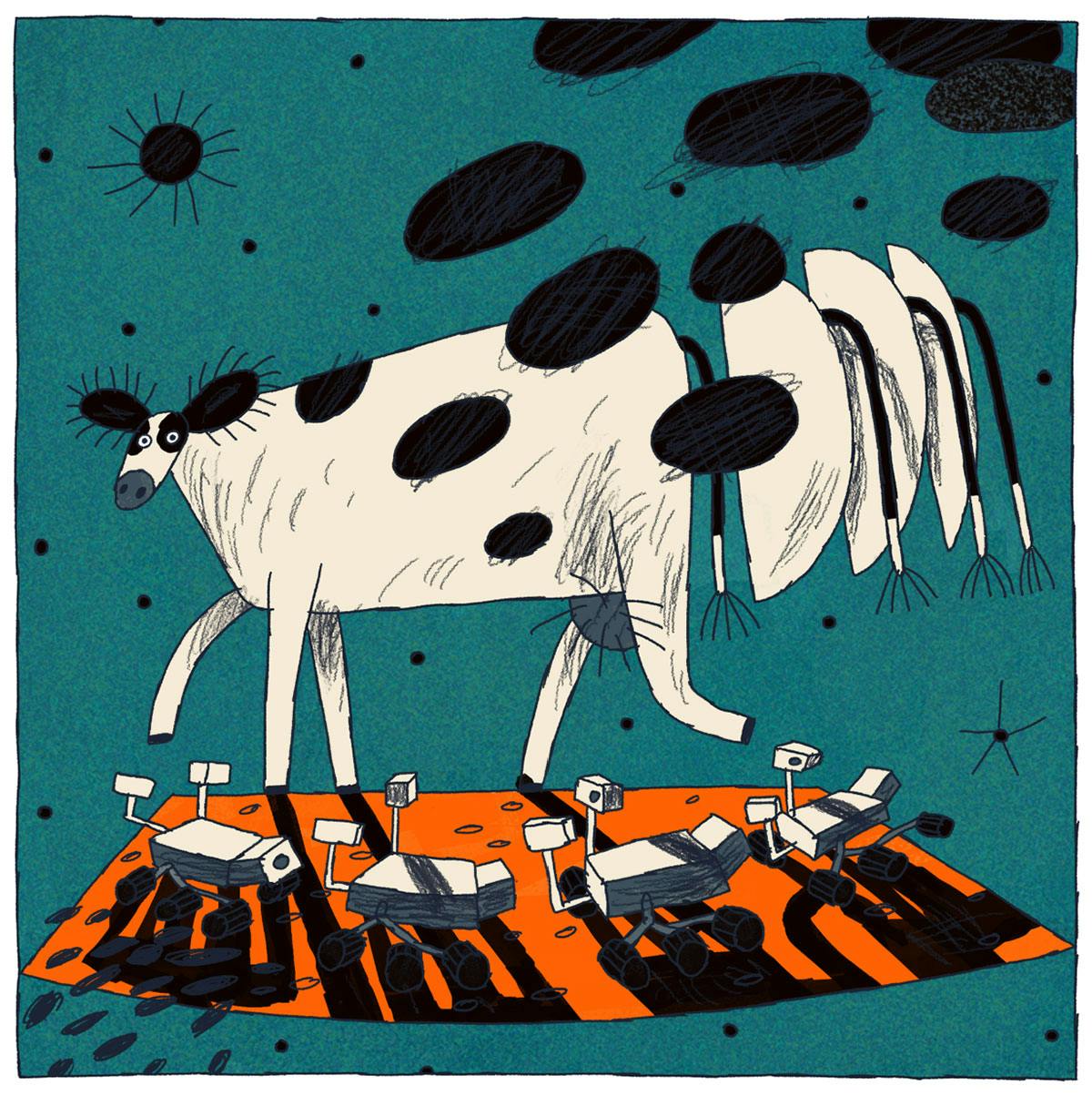
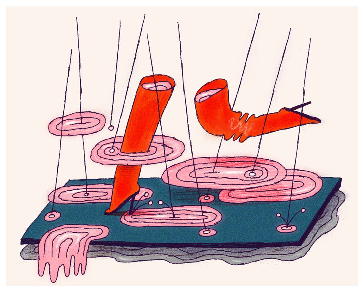
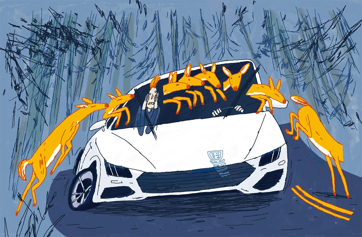
Nata Metlukh’s lively work captures the absurdity of urban life

Ukranian-born, San Francisco-based animator and illustrator Nata Metlukh aims to show the joys of absurd situations in urban settings in her lively work. “I don’t pay much attention to technique, and all my films have different aesthetics,” says Metlukh. But what ties her work together is this sense of movement and happy chaos as fine, purposeful line work combines with splotches of saturated colour.  

Metlukh studied illustration and initially taught herself the basics of animation as she had a desire to make short films. “My knowledge wasn’t enough though, and I went to Vancouver Film School to study animation, and later the Estonian Academy of Arts for a filmmaker/author course by cartoonist Priit Pärn,” explains the creative. 

Since then she’s been able to build a portfolio that balances personal with commercial and editorial work, working with clients such as Google, The Wall Street Journal, GQ, Eurostar and Men’s Health among others. 

All images Nata Metlukh

“In editorial illustration, what’s most valuable is a quick turnaround, when the process from idea to a final piece only takes a couple of days,” says Metlukh. “It can be quite a challenge to find a good metaphor for an article and find its best visualisation.” In her commercial work, Metlukh typically works on animated projects where she can put her more technical skills to good use. 

In between these projects are her personal explorations which often start from a sketch of a “funny or weird” situation. “Then I start thinking about its possible development and what preceded that situation. If the story grows, it becomes a film, if not, it becomes a gif or illustration,” says the illustrator. 

One idea that’s made it to animation status is Metlukh’s latest animation Awkward, which captures uncomfortable social interactions such as bumping into someone on a street corner, knocking over a shop display and someone reading over your shoulder on public transport. It serves as the perfect introduction to Metlukh’s work as it combines thoughtful observations with a touch of the surreal.

As Metlukh’s practice involves both illustration and animation she gives both approaches equal weight. “I treat illustration as a one-frame animation, and I think a good illustration contains a story and further development,” she explains. “An illustration is perhaps even harder to make than animation, as in just one static picture you have to show the whole film with its characters and conflict, all drawn in an interesting form. Trying to solve such problems makes me happy!”

Metlukh works purely digitally with her paper notebook reserved just for thumbnail ideas. While she works in just Photoshop and Animate CC there’s a lovely hand-drawn quality to the creative’s work, which enhances the energy seen throughout. One of the challenges she’s currently facing is making her commercial and personal styles more cohesive. “I want to find a balance between indie and commercial aesthetics,” she says. “But for now more rough works are only for personal projects, and sleek for commercial ones.”  

Despite this, for Metlukh, just the ability to create new work is enough. “Starting a new film is the biggest joy for me, and that’s what I’m doing these days, developing ideas and doing research,” says the creative.


notofagus.com

The post Nata Metlukh’s lively work captures the absurdity of urban life appeared first on Creative Review.

Practical Action’s new identity has a loud voice

Founded 50 years ago by economist Fritz Schumaher, Practical Action is focused on promoting a way of life that puts people and the planet before profits and exponential growth. The charity has a presence across four regions – East Africa, Southern Africa, Latin America and South Asia – and focuses on using technology to improve livelihoods for communities in developing nations.

In order to help Practical Action “reclaim its role as a unique voice in the development sector”, NB Studio was brought in to deliver a fresh visual identity – one that complements the organisation’s new positioning as “the ingenuity people”.

The new branding makes use of clean lines, vibrant pops of colour and a blend of serif and sans-serif typography that sits front and centre across the revamped identity. Simple, clear and weighty, the wordmark feels like an apt representation of the organisation’s name, and the use of different type sizes plays on the idea at the heart of its work – that “small actions can change the big picture”.

“Practical Action’s mission in a nutshell is Small Change, Big Difference,” explains NB Studio creative director Nick Finney. “We used two fonts, Druk and Geller, as visual counterparts to create a succinct and sustainable messaging platform based on this idea of small to big. We gave them the tools to write in a more structured yet natural way, then we worked hard to ensure the messages they write will translate across the globe in many different languages. If the identity looks typographic that’s because it’s all about helping to communicate and amplify their important messages.”

Part of the project involved distilling Practical Action’s wide-ranging work around the world into a clear and confident identity. “They have a lot of important things to say, stories to tell and causes to campaign for so we wanted to encourage clarity and brevity which is sometimes tricky to realise in the charity sector,” Finney says.

It marks a refreshing change of tack from the sometimes convoluted designs seen in the not-for-profit sector – however that wasn’t necessarily NB Studio’s ambition. “We spent a long time looking at and carefully tracing the positioning of peers and competitors in the charity development sector,” Finney explains.

“While this exercise revealed a great deal, from a visual perspective we didn’t necessarily set out to challenge any sector norms. Rather, we knew we wanted to avoid cliché, and that can push you into uncharted territory. When I look back through the work we produced, lots of ideas were left behind because they fell into the former (cliché) or the latter (uncharted territory).

“What we did know was that we didn’t want to impose a visual identity, rather that it should form itself around the things we needed it to do,” he adds. “Our thinking and our designs evolved as we delved further into the project and got to know our client more intimately. The result, we believe, is confidence.”

Practical ActionPractical Action

nbstudio.co.uk

The post Practical Action’s new identity has a loud voice appeared first on Creative Review.