Sustainable rice packaging becomes an artistic tissue box in afterlife

The Srisangdao rice grows in Thailand in a controlled environment and every year only a limited quality is produced. Because of how special the rice is, the environment where it grows and how it is stored is given the utmost care making sure there are no chemicals hampering the quality. To showcase Thung Kula Ronghai’s efforts of growing this gorgeous grain, a designer reimagined the packaging as a tribute to the process with a purpose that went beyond preserving rice.

The packaging is created using chaffs, a natural waste product from husking, which very literally incorporates the process which the designers wanted to celebrate through this product. The box has simple yet meaningful art surrounding the Srisangdao rice – it is die-formed with an oversized rice grain embossed on it which is the main artistic element. The grain graphic is complemented with wave-like lines and smaller embossed design of the crop in full bloom. The designer has also burn-stamped the logo of the rice mill from the Thung Kula Ronghai region on the box. A thoughtful detail that really completes the picture is the rice inside comes in a miniature sack just like the traditional one. All these pieces put together truly bring out the different elements of the rice’s identity and lifecycle.

What makes this organic packaging more interesting is the fact that it can be used as a tissue box after it has served its purpose of storing rice. It is completely eco-friendly as well as recyclable and generates minimal production waste. To see how a simple rice packaging can completely be reimagined and redesigned to tell a story while still providing value after its main job is done is an inspiration to continue being creative.

Designer: Somchana Kangwarnjit

Bompas & Parr forecasts post-coronavirus trends in Fluid Landscapes report

Post-corona prediction: Continued Hygiene

London studio Bompas & Parr has predicted design and lifestyle trends that will emerge during and after the coronavirus pandemic, including sanitiser party pieces and a museum dedicated to touch.

In its Fluid Landscapes 2020 trend report, the experience design studio forecasts the future of creativity in mid-virus and post-virus worlds.

It has identified three trends that it expects to proliferate over the coming weeks, as people adjust to life in shutdown, and a further three trends that will take shape once the main impact of the virus is over.

Each prediction is accompanied by two potential creative solutions. These include some of Bompas & Parr’s own projects, such as a travelling microscopic menagerie of germs, designed to attract those obsessed with sanitation.

“Fluid Landscapes offers an optimistic view on the future, as we shift perspectives from the freely flowing behaviours of a world without coronavirus, to a world restricted by stringent hygienic measures,” said the studio led by Sam Bompas and Harry Parr.

The project comes shortly after Bompas & Parr teamed up with Dezeen, the Design Museum and Christie’s to launch a design competition to rethink hand sanitisers.

The report is available to download from the studio’s website. It will also be presented as a live webinar today, Wednesday 4 April at 4pm UK time. To join, email rowena@bompasandparr.com in advance.

Here’s a rundown of all six trends:


Mid-corona trends prediction: The New Normal

Mid-coronavirus prediction: The New Normal

With people around the world forced to stay indoors and reduce virus spread, Bompas & Parr suggests two new methods of support.

A virtual spa could offer alternative healing therapies like autonomous sensory meridian response (ASMR) to treat treat anxiety, depression and other mental health issues. There might also be an online guru, a “Sanitiser Sommelier”, to help people navigate the best and worst in sanitising products.

“As we adjust to life indoors and at distance we look for new ways to continue life as best we can, whilst incorporating new and restrictive measures into our daily routines,” reads the report.

“We want to thrive, not just survive. Cue creative ways of living this new normal.”


Mid-corona prediction: Hacking the Home

Mid-coronavirus prediction: Hacking the Home

With many families now juggling work and childcare, Bompas & Parr predicts a rise in DIY creativity at home.

Adults and children are expected to build more dens than ever before, whether in the garden of under kitchen tables. Flowers will also become prevalent on social media, as people start to curate their flower beds and window boxes.

“Many face entertaining children for a long time within the limitations of their homes. People have risen to this collective creative challenge with an imagination that breaks the four walls,” reads the report.


Mid-corona trends prediction: Isolated Eating

Mid-coronavirus prediction: Isolated Eating

With more limited access to food, people will be exploring ways to make their meals more exciting. Bompas & Parr proposes two outcomes: a psychological tasting menu where moods influence flavours, and recipes cards featuring only ingredients found in tins.

“During the lockdown phase of the pandemic, we are being told to self-isolate, and certainly not mix with other households,” reads the report.

“This has lead to eating in becoming the new eating out, as we are left with no option but to create restaurant style dining experiences in the home.”


Post-corona trends prediction: New Taboos

Post-coronavirus prediction: New Taboos

Following a period of wearing gloves and face masks, and maintaining two-metre distances from other people, Bompas & Parr suggests that people might struggle getting used to touch again.

One outcome it suggests is the Haptics Museum, which will encourage people to interact with objects and other people.

“Dunk your hand into a pool of slime, stroke a wall of fur, or feel your way through a maze whilst blindfolded,” reads the report.

“A sensory stimulating experience, we hope this will encourage others to fall in love with touch again.”


Post-corona prediction: Continued Hygiene

Post-coronavirus prediction: Continued Hygiene

An obsession with hygiene and hand-washing is predicted to emerge, leading to a heightened awareness of microbial flora and fauna.

Bompas & Parr’s Microscopic Menagerie will offer one option, featuring activities like mould racing and faecal transplants.

The studio also suggests that sanitisers could be turned into sculptural party pieces. Suggestions include Cloud of Cleanliness, Sanitiser Fountain and Tornado of Sterility.

“If we are to effectively socialise post-coronavirus, we’ll need a way to do so whilst maintaining rigorous hygiene,” said Bompas & Parr.


Post-corona prediction: Celebratory Memoirs

Post-coronavirus prediction: Celebratory Memoirs

Forms of celebration will be an important part of the global recovery, suggests the report.

“Could the pandemic experience be marked and commemorated in a similar way to the great global conflicts of the 20th century?” asks Bompas & Parr.

Possible outcomes include creative street parties and a memorial monument to Wuhan, the Chinese city where the virus broke out.

The post Bompas & Parr forecasts post-coronavirus trends in Fluid Landscapes report appeared first on Dezeen.

This Japanese kettle’s detailed design will leave you wondering “real or render?”

Japanese culture has so many little practices that exude a sense of calm. My most favorite thing (besides enjoying a soulful bowl of ramen which I think is a form of meditation) is enjoying a warm cup of tea. There is nothing that can soothe you like a freshly brewed cup of tea and during these complex times I am definitely seeing an increase in the number of cups on my table so I started looking for a kettle and I came across the Seramikku.

When I saw it, I fell in love with the design of the kettle – it was a perfect balance of archetypal Japanese forms and minimalistic modern details. Its shape and texture are inspired by ‘Uwade kyusu’ which is one of the more traditional Japanese teapots known for their distinctive, almost floating, handles that hover on top of the lid. The designer has envisioned the Seramikku to be made from ceramic and iron with an electric heating base. Sadly, it is not for sale because it is concept design which a part of a Render Weekly challenge – yes, I had to look at it thrice because the detailing was so realistic that I wanted to believe I had stumbled upon my future favorite teapot.

I am going to go and brew myself a cup of Jasmine tea to recover from being in love with a design and then heartbroken by the lifelike render.

Designer: Shail Iyer

Ekow Eshun on a new era of photography from Africa

The writer and curator is diving into the breadth of photography coming out of the continent in his new book Africa State of Mind. He discusses the “troubled relationship” between photography and Africa, and what sets this new generation apart

The post Ekow Eshun on a new era of photography from Africa appeared first on Creative Review.

Ellis van der Does’ textural illustrations feature a cast of oddball characters

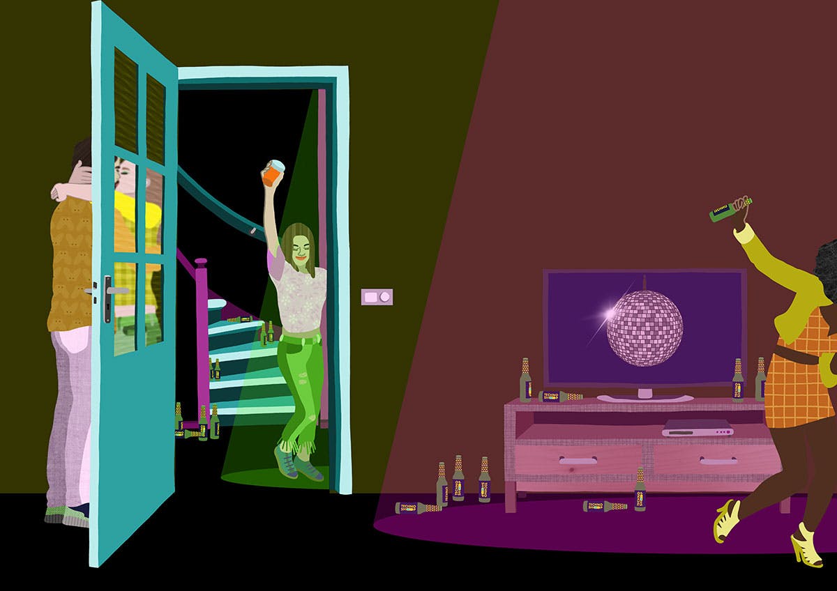
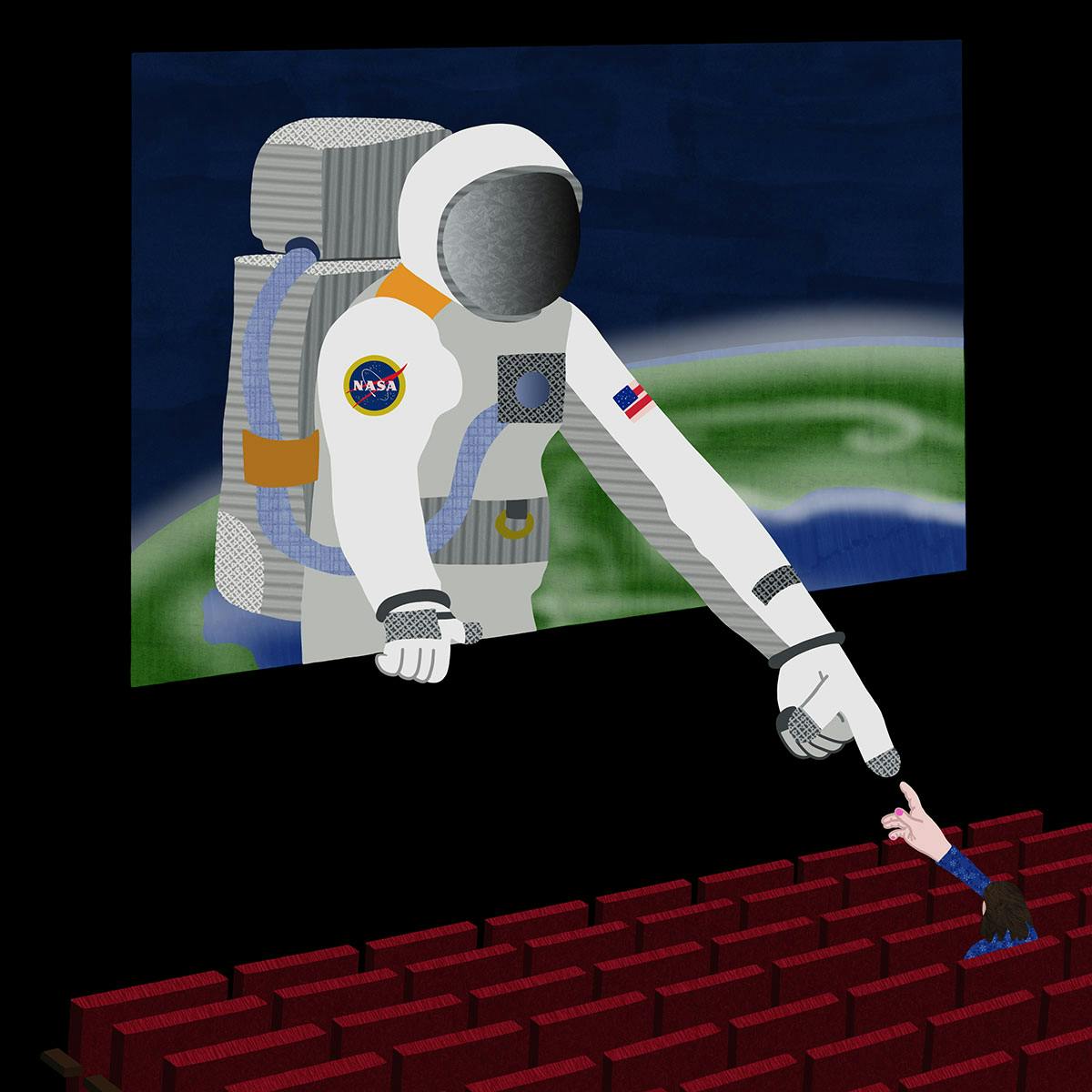
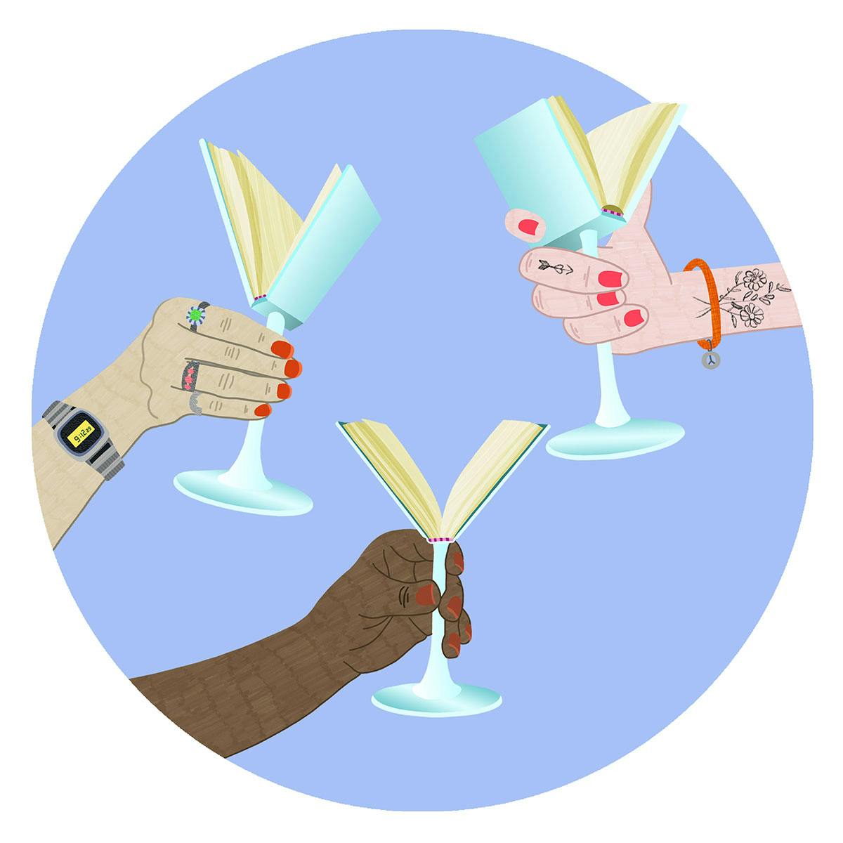
Dutch illustrator Ellis van der Does started on her creative journey when she was just 16 after deciding to enrol in a foundation course at the HKU University of the Arts Utrecht. At the time van der Does was in the Dutch equivalent of sixth form, and as the course was taught on Saturdays she could combine it with her regular studies easily. “I started the course without a plan,” she says. “But I just knew I really enjoyed making things.”

At the time, her understanding of illustration only stretched to cartoons and comics but towards the end of the course she specialised in visual communication, which was taught by one of the illustration tutors. “He showed us the variety of illustration styles and the ways of communicating within the medium,” explains van der Does. “After completing the foundation course I enrolled in the BA Illustration course at the same school.” After a gap year, van der Does came to London in 2015 to study on the MA Graphic Design course at Chelsea College of Art, and had remained there up until recently. She’s now back in Amsterdam working across an array of personal and commercial projects.  

With a diverse client list including Vice, Disney, BBC, Medium, Royal Academy of Dance London and Cambridge University, van der Does describes her style as graphic, colourful and full of texture. Often creating illustrations about people and the way we interact with the world around us, her work lends itself well to editorial commissions.

“Working on editorial briefs is a really fun part of the job for me,” says the illustrator. “Often these projects have a tight deadline and I really like the thrill of coming up with concepts quickly and developing the final work rapidly.” For van der Does, the more open the brief the better as it allows her to reflect a bit more on the topic and come up with more concepts for the art director. “It’s great to have a conversation together about what works best and some suggestions to make it even better before I start on the final artwork.” 

When starting a new project van der Does often writes down words linked to the theme in mind and then scribbles sketches using A4 paper and a fineliner pen. These early notions are often kept in black and white. “When I’ve settled on ideas I use Procreate to do the line drawings and also the colouring later on,” explains van der Does. “Then I move to Photoshop to add textures.” 

The varying patterns and finishes within van der Does’ illustrations provide depth to her 2D works and over the years the illustrator says her scenes have become more complicated, by using gradients and also adding in more animated elements into her practice. 

Though being freelance has provided the illustrator with a number of great opportunities, she says she found it difficult to know what to do, having not had any guidance while at art school. “I think it would have been great to learn more about the business side of a creative practice,” she says. “But most importantly to learn how to price and market your work. These are very essential skills and after graduating it took me a while to get the hang of it.” 

Since the pandemic began, the influx of jobs has been fairly quiet and van der Does has been spending her time doing more self-initiated work and learning more about animation. “Also I started working on a project with a friend before the pandemic, and as it’s a passion project for both of us we can now invest some extra time in it,” says van der Does. “But I’m also reading books, watching films and documentaries, and trying to stay active by doing at-home yoga.”  


ellisvanderdoes.com

The post Ellis van der Does’ textural illustrations feature a cast of oddball characters appeared first on Creative Review.

British Red Cross asks us all to be kind in new poster campaign

As coronavirus continues to wreak havoc on all our daily lives, there has been a renewed emphasis on the importance of kindness in our communities, whether it’s individuals offering to buy groceries for a vulnerable neighbour, or everyone coming together (at a safe distance, of course) every Thursday at 8pm for the Clap for our Carers campaign.

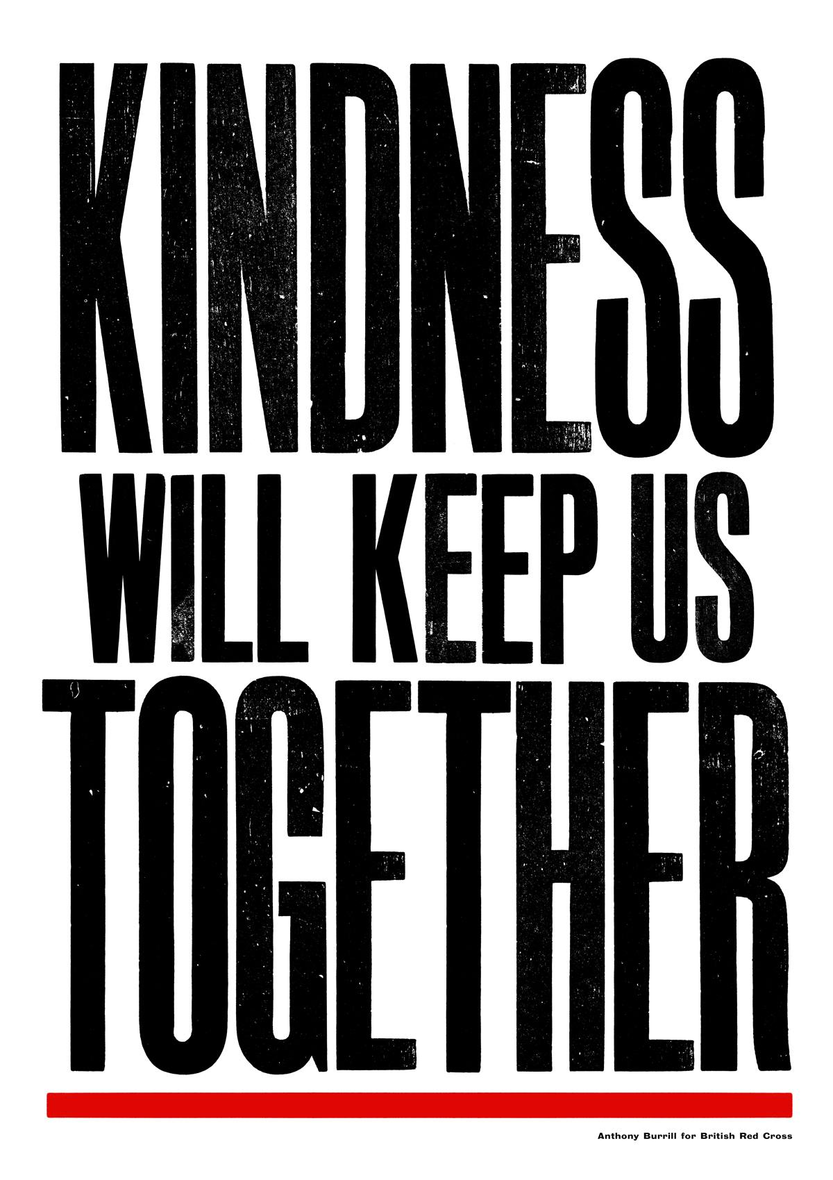
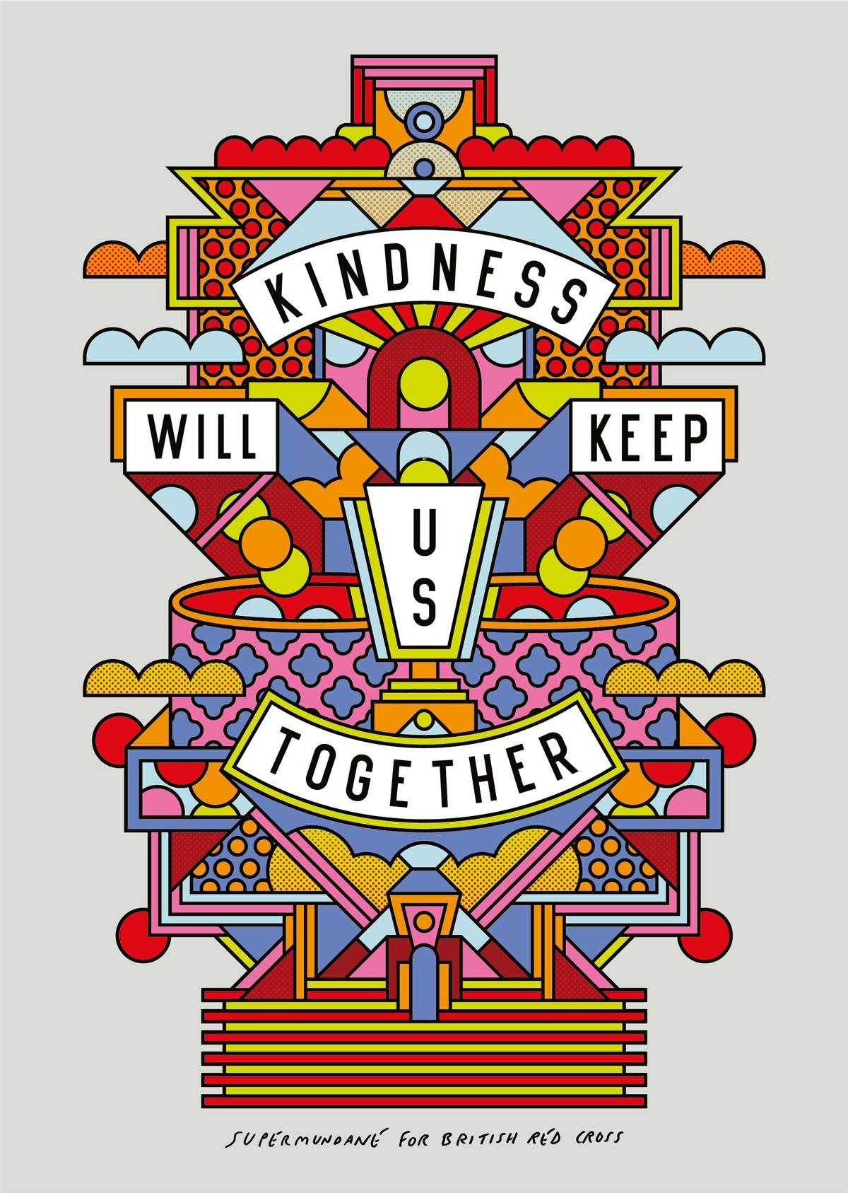
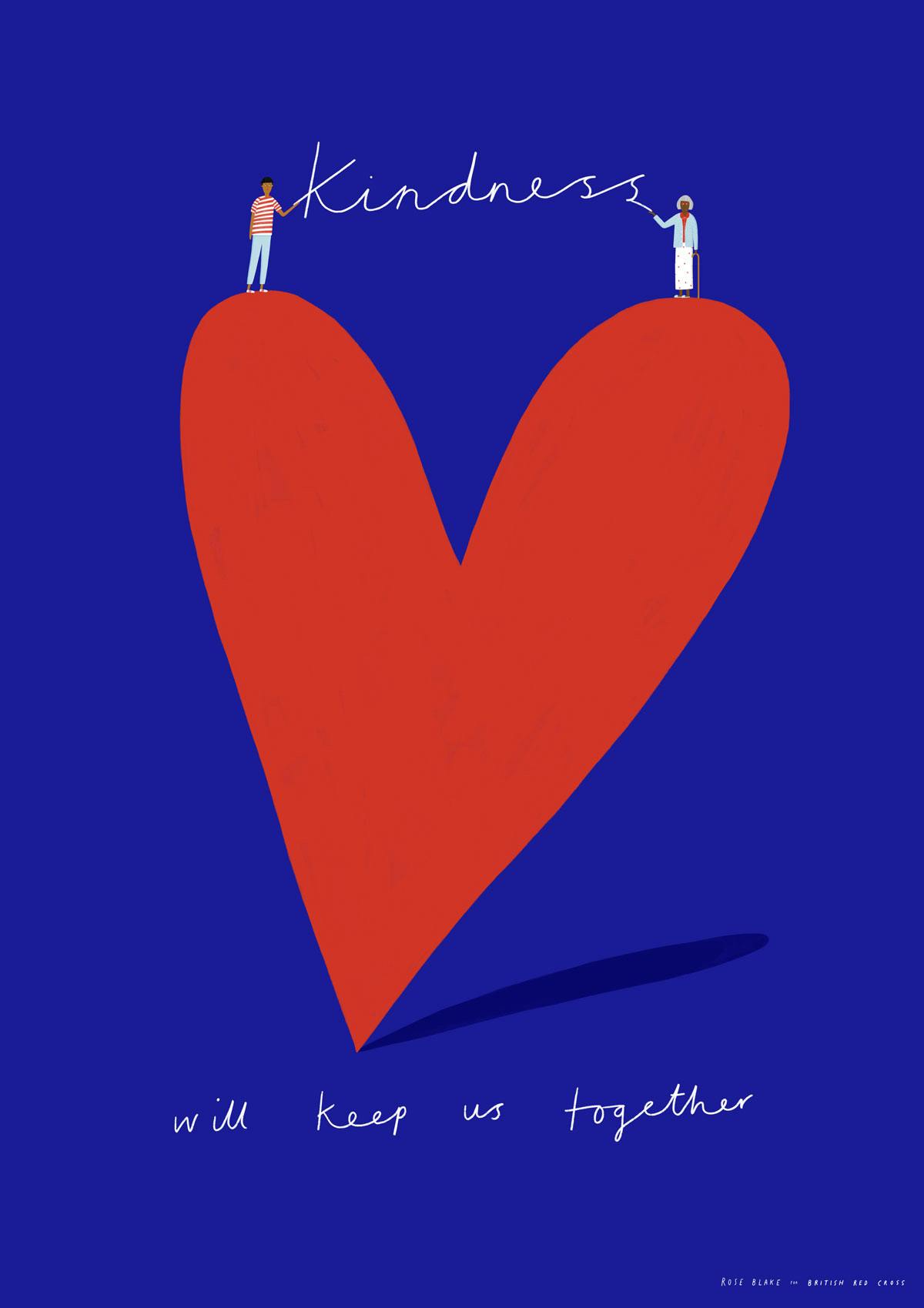
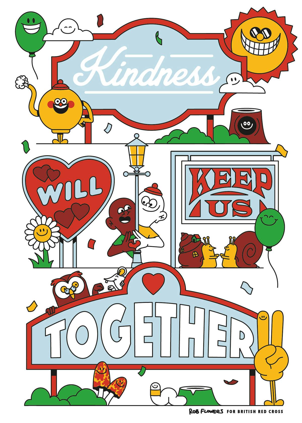
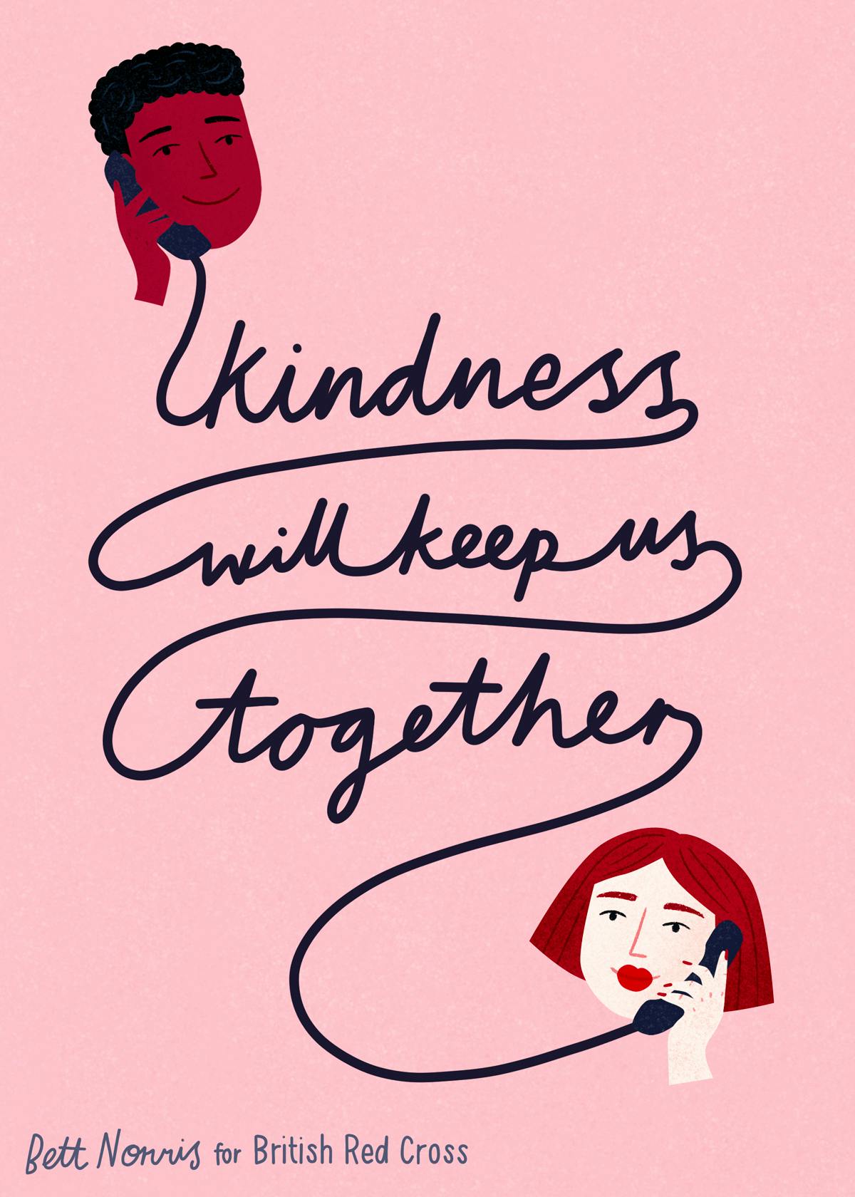
British Red Cross is putting goodwill at the centre of its new campaign by VCCP, titled Kindness will keep us together, which features poster designs from a number of UK-based creatives including Anthony Burrill and Supermundane’s Rob Lowe.


Other artists who have contributed include Rose Blake, Rob Flowers, Yukai Du, Timothy Hunt, Ruby Taylor, Nina Cosford, Bett Norris, Cajsa Holgersson, and Oli Frape, who each offer a different visual approach to the message that while the virus may keep us apart, kindness will keep us together.

To help spread the message and drive donations, 100 limited edition prints are on sale on the Red British Cross website, while black and white versions of the posters are available for children (and adults) to download, colour in, and share on social media or in their windows.


The artist collaboration is part of a wider campaign from British Red Cross demonstrating how small acts of kindness can make a difference. Zoë Abrams, the charity’s executive director, says: “The British Red Cross has supported people in crisis for over 150 years. Throughout two world wars we connected people who wanted to do their bit to help with those who were in need.

“Today as our nation faces this virus, we want these inspirational artworks to encourage people to take action and join our kindness movement. Remember that though you may be anxious and uncertain, you are not powerless and you are not alone.”


See the full range of posters on the British Red Cross site

The post British Red Cross asks us all to be kind in new poster campaign appeared first on Creative Review.

Architectural design renders that give us a glimpse into the future of humanity

The year is 2200 and humans are split into two clans – the first clan believes in living with simplicity and letting nature heal itself (proof of which are the dolphins swimming in the canals of Venice) while the other half is where humanity struggles to exist without making a change to their behavioral patterns. Meet @inwardsound, an Italian 3D artist on Instagram who creates these surreal yet realistic views of our future, kind of like showing different versions of Earth in parallel universes where one twist in fate or act of man resulted in the new society that would be formed under their influence. Hauntingly beautiful, detailed and thought-provoking, each render here begs to ask the question – are you taking a step on the right path?

Living in cities, with homes that are so close by, we often know the person on the window opposite, they are practically our neighbors too! Habitat imagines a city where gravity is under control, so people reside on the land level and sky level (literally!) in this amazing view of what the world would be like if we run out of space in our cities. New York 2200 is here, and chances are, you will have a friendly neighbor above you as well!

Named the Hidden City, this render takes me to an alternate dimension where Inception meets overcrowding in a planet where humans chose not to improve their ways. Literally looking like a case of tunnel vision, the slightly submerged city and concrete landscape have taken over the majestic mountains in the distance, the Hidden City is humanity at its edge.

Any fans of the Philip K Dick novel converted to Amazon Prime series – The Man in the High Castle? This imaginative render feels like it belongs to the alternate universe described in the series (I have yet to complete it so no spoilers here!) but a more futuristic version of the same universe. Pagoda-inspired architecture stands tall in a dystopian setup, clearly establishing their dominance over the people. And the Avengers Infinity War-like alien spaceship hovers nearby, keeping the CNTRL HUB safe.

Be still my fiction-loving heart! J. R. R. Tolkien’s masterpiece ended with Sauron’s reign coming to an end, but imagine if he took over Middle Earth and led it into the future. The O-Towers here bring to my mind the eye of Saron, revised in a more modern avatar to keep scanning the world while their master rules with the Ring of Power by his side. I wonder who the new-age Frodo would be?

The city that stays green together, survives together. Green architecture is the need of the hour and looking at this render gives me some hope for the future. Eternal City here is a balanced ecosystem, where existing architectural structures support and nurture the plants growing on them and waterway is a common and accepted medium of transport in the sea-level rising waters.

There are islands and then there are floating islands. Fracture depicts a scene where these little bits of paradise look like green filtration/ cleansing pods that float through the center of the populated city, giving a breath of fresh air to those living in the dense urban situation.

Forgive me for the pop culture and series references, but these illustrations bring out my fictional flair! Altered Carbon altered my imagination of the future and the Upper City looks like the perfect place for the Meths to live in. Can’t you see them sit back and watch the general population live as they literally live above the less fortunate people? The Upper City concept seems a precursor to the time when the Meth’s build their homes in the sky. And truly, whether or not Altered Carbon materializes, I do see a version of the society where the rich live above the rest to not pay heed to their troubles.

Layers layer this society. Looking like an entryway to hell inspired by Dante’s Inferno, Layers showcases a society living in a socio-economic divide that, if history is a lesson, will keep getting harder to bridge.

Aptly named the Protected Area, this is maybe what our planet would look like if Tony Stark managed to get a shield around our world, safeguard us from those evil forces. Though Corona does look like a manifestation of Thanos right now, I wonder if these grids would be enough to save the plant from its real foes, humans.

The Trip brings to mind the Titanic’s worst nightmare! Because truly, what could be scarier than escaping a destiny of sinking to only catch fire later!

Culdesac designs coherent interiors for Consum supermarket in Benicàssim

Consum supermarket in Benicàssim by Culdesac

Creative consultancy Culdesac has designed a store for supermarket chain Consum in Benicàssim, Spain, with simple, stripped-back interiors to make the shop’s arrangement understandable.

Valencia-based Culdesac designed the arrangement, signage and furniture of the store, which will serve as a model for Consum’s future shops, to be clearer and easier to understand than traditional supermarkets.

“Stores should be designed in order to make shopping easier,” explained Borja Berna, senior creative architect at Culdesac. “To help people and to make them travel in store in a comfortable way.”

Consum supermarket in Benicàssim by Culdesac

To do this, Culdesac has simplified the store’s interiors by removing “visual noise” such as aerial signage.

“This design was about figuring out which kind of elements were disturbing and deleting them, making only elements that were going to help shoppers,” Berna told Dezeen.

“We deleted noise and focused on the essential issues. Colours, signage, lights and communication had to create a happy visit to the store and, at the same time, create the brand image.”

Consum supermarket in Benicàssim by Culdesac

Within the store the different sections have been arranged according to an organisation chart developed by Culdesac and Consum, within a strict geometric arrangement.

“We’ve created an organistional chart: most important areas, corridors and head places, perimeter, and cashier area,” explained Berna.

“Each part has been assigned a graphic design according to the scale in space, but the most important is that all of them are in line with each other.”

Consum supermarket in Benicàssim by Culdesac

Throughout the interiors, natural tones have been combined with Consum’s orange branding.

“Colour has also its own function,” said Berna. “From a distance, it helps to define large areas and the cashier area. Orange is the brand colour, so the starting point is a welcome area in orange.”

Consum supermarket in Benicàssim by Culdesac

“An orange line connects the whole space, so this colour is never lost,” continued Berna.

“White allows us to create a warm, clear and close space. Moving away from techno spaces and getting close to a familiar, friendly store and shopping experience. Black lettering is also the best way [for shoppers] to read.”

Consum supermarket in Benicàssim by Culdesac

The design implemented at the Benicàssim store will be used at future Consum stores and will begin to be implemented across the chain’s 680 supermarkets in Spain.

Photography is by David Zarzoso.

The post Culdesac designs coherent interiors for Consum supermarket in Benicàssim appeared first on Dezeen.

Nesting chess pieces that create the illusion of ‘consuming’ defeated players!

While in theory, this attribute doesn’t extend to smaller players defeating larger ones, the Crownes Chess Set’s nesting ability is more a portability feature. Made from 3D printed metal, the chess pieces nest within one another, like a Russian Matryoshka doll. After nesting the pieces within one another, the two largest pieces (the king and queen) snap together magnetically, forming a compact collection of same-colored chess players. The player-groups come in a rather delightful matte anodized aluminum finish too, giving the chess set a premium look.

The Crownes Chess set’s approach to gameplay sort of gets influenced by its nesting ability too. Given that pawns are fairly often the first to lose their lives in games of chess, their small design lets them easily nest within other players. The chess set comes with a checkered board, as customary, but also features a magnetic platform for the king and queen pieces that hold discarded players. Each platform can hold as many as 4 pawns stacked on top of each other, followed by 4 other larger pieces (the elephant, horse, knight, and then the royalty). During gameplay, discarded or defeated players can just be snapped magnetically onto these platforms for convenient side-storage, or for dramatic effect, can be ‘absorbed’ by the opponent! When the game’s over, the 32 total pieces on both sides get docked into 4 groups of 8, which you then snap together and roll up into the flexible board!

Designer: Etho LLC.

Merch Aid’s Art-Driven Apparel for Local Businesses

Artists create exclusive merchandise for local businesses, and 100% of the profits go to the establishment

Created with the intention of providing relief to the long list of small businesses forced to close (hopefully) temporarily, Merch Aid—an initiative helmed by a team of RGA employees—pairs an established artist with a local business. The designer or artist creates exclusive merchandise (a T-shirt and a tote bag) for the company, with 100% of the sales going directly to the local business.

Localized to New York City for the time-being (though there are plans to expand), the first collection celebrates and supports businesses in Queens, Brooklyn and Manhattan: Keg & Lantern, Lighthouse restaurant, New Kam Hing coffee shop, Harlem Doggie Day Spa, Astor Place Hairstylists, and the Astoria Bookshop.

The designs are diverse, but each is an homage to the business. Standards Manual co-founder Hamish Smyth‘s text logo for the Harlem Doggie Day Spa playfully turns the serif Gs into wagging tails. Prolific illustrator Ilya Milstein‘s contribution for decades-old institution New Kam Hing promotes togetherness and the community that the coffee shop offers.

Below the latter product listing, Merch Aid offers a statement from the shop owner: “We just hope to get past this tough situation and keep this bakery going. We want to keep the tradition of sponge cakes alive and well in our beloved home we call Chinatown. We hope to see all of our regular customers and new hopefully very soon.” 

These businesses were chosen by the RGA team and future collaborations will be pulled from the pre-existing crop of internal suggestions and a public-facing submissions email. There, businesses or creatives can apply to partake in the project. Most importantly, the funds are given to business-owners, but this project is also a celebratory collaboration between artists, designers and beloved locals.

Images courtesy of RGA