Marshall Blecher and Studio Fokstrot to build "parkipelago" of floating islands in Copenhagen

Copenhagen Islands Marshall Blecher and Studio Fokstrot

A set of roaming artificial islands designed by Marshall Blecher and Studio Fokstrot are set to be built in Copenhagen‘s harbour.

Australian architect Blecher and Danish firm Studio Fokstrot created the Copenhagen Islands project to bring “wildness and whimsy” to the capital.

Anchored to the harbour floor, the modular islands will be made of steel and recycled floatation elements clad in sustainable Forest Stewardship Council-approved timber.

Copenhagen Islands Marshall Blecher and Studio Fokstrot
Copenhagen Islands will form an archipelago of floating parks

Forming an archipelago of floating parks, the islands will provide a platform for relaxing, fishing or watching the stars and will be accessible by boat, kayak or swimming.

The project follows the success of a prototype artificial island called CPH-Ø1, which launched in 2018 and has hosted talks, a photography exhibition and picnics. It will soon be joined by three more islands later this year.

Copenhagen Islands Marshall Blecher and Studio Fokstrot
The modular islands will be anchored to different locations

“The largest island will comprise nine modules with additional separate islands floating nearby,” Blecher told Dezeen.

Copenhagen Islands will also form a new habitat for wildlife, both above and below the surface of the water.

“The top of the islands will be planted with endemic grasses, bushes and trees, which will provide a sanctuary in the middle of an otherwise highly developed part of the city for the local seagulls, swans, pigeons and ducks,” said Blecher.

“The underside of the islands will provide an ideal environment for seaweeds and mollusks to attach themselves, in turn providing the perfect habitat for fish and other sea life to congregate.”

Copenhagen Islands Marshall Blecher and Studio Fokstrot
A prototype island was launched in 2018. Photo by Airflix

Blecher and Studio Fokstrot will build the islands in the harbour’s shipyard using traditional boatbuilding techniques. Once afloat, the plan is to move the islands between different parts of the harbour each season.

The project, which was a finalist for Beazley Designs of the Year, could be expanded even further in the future.

“We have plans to add more separate islands as the project develops,” said Blecher. “The project is inherently flexible and organic.”

Floating projects in urban areas have become a trend in northern Europe. In Rotterdam, Dutch architects Powerhouse Company is building a floating office with a swimming pool in the harbour, and the city is already home to a floating herd of dairy cows.

Visualisations are by MIR.

The post Marshall Blecher and Studio Fokstrot to build “parkipelago” of floating islands in Copenhagen appeared first on Dezeen.

Honeycomb Cake Pan

Made in the US by family-owned Nordic Ware, and exclusive to Williams Sonoma, this charming cast aluminum cake pan (with a golden finish) yields honeycomb-shaped sweets with sharable, pull-apart sections. Its premium nonstick interior makes release and clean-up easy, too.

New interiors categories for Dezeen Awards 2020 include bar interior and large retail interior

Dezeen Awards 2020

Interior designers have four new categories to enter for Dezeen Awards 2020. This year, there are awards for restaurant interiors, bar interiors, large retail interiors and small retail interiors.

Large retail interior

Any space more than 250 square metres where retail is the primary activity including shops, shopping centres, boutiques, opticians, bakeries, showrooms and sales centres.

Small retail interior

Any space less than 250 square metres where retail is the primary activity including shops, shopping centres, boutiques, opticians, bakeries, showrooms and sales centres.

Restaurant interior

Any interior project where people go to eat including restaurants and cafes.

Bar interior

Any interior project where people go to drink or socialise including bars, clubs and event venues.

The new categories have been created by splitting two of last year’s most popular categories into two. The restaurant and bar interior category into separate bar interior and restaurant interior categories; while the retail interior category has been divided into an award for spaces that are over 250 square metres in size and another for spaces smaller than that.

The Dezeen Awards programme celebrates the world’s best architecture, interiors and design, as well as the studios and the individual architects and designers producing the most outstanding work.

Interior design categories will be judged by industry-leading figures including Michelle Ogundehin and Paola Navone.

Enter interior design studio or emerging interior design studio of the year

The studio categories have been around ever since Dezeen Awards first launched and have been specifically created to highlight the architects and designers producing the most outstanding work.

Our panel of industry-leading judges will be selecting the designers and studios who they feel are set to make a big impact on the design world.

The emerging category is for all-round design excellence over a body of work by an individual or practice that has been in business for ten years or less.

Questions?

If you have any questions or you need help with your entry, please contact the Dezeen Awards team at awards@dezeen.com

Enter Dezeen Awards 2020 ›

Good luck with your entry!

The post New interiors categories for Dezeen Awards 2020 include bar interior and large retail interior appeared first on Dezeen.

Shanghai's Canal St shop is styled like the New York subway

Canal St store by Sò Studio

A subway car-style corridor, worn concrete walls and metal railings feature inside this Shanghai clothing shop, which Sò Studio has designed to emulate New York.

Canal St offers a selection of high-end streetwear and was designed by locally-based Sò Studio to “bring the downtown New York lifestyle to Shanghai”.

The studio believes the two major cities have much in common, despite their disparate locations.

Canal St store by Sò Studio

“In New York, you see the coexistence of elements made hundreds of years ago during the industrial age with cutting-edge art, fashion and pop culture,” said Sò Studio.

“Shanghai’s unique ethos is built upon Chinese traditional culture as well as nearly a century of concession,” added the designers. “There is the constant tension that everything new here has also been polished and precipitated by time.”

The New York theme is also suits the store’s name – Canal Street is a major road that runs from east to west of lower Manhattan.

Canal St store by Sò Studio

A staircase was removed from the centre of the store’s floor plan to create a short walkway that resembles a New York subway car.

Two plastic, orange-hued seats have been placed up against one wall.

Canal St store by Sò Studio

Overhead dangles a series of metal rings, mimicking the handles that standing subway passengers typically hold onto during journeys.

An illuminated yellow sign – akin to what would usually delineate the destination at the front of a train – has been used to point out the shop’s changing rooms. The doorways are partially covered by silver metal shutters.

Canal St store by Sò Studio

Other industrial touches throughout the two-floor store include steel clothes rails, exposed bolts in structural columns and wire mesh partitions.

The illuminated countertops of several display plinths have also been covered with sheets of gridded metal to mimic a manhole – covered openings dotted around New York that allow access to underground sewers.

Canal St store by Sò Studio

Surfaces throughout Canal St were initially meant to be freshened up with a coat of paint.

However, after completely stripping back the previous fit-out, the studio felt that existing dilapidated concrete walls better reflected New York’s dichotomy of old and new.

Canal St store by Sò Studio

“We typically try hard to create a narrative in a space, but this building could tell it itself instead,” the studio explained.

“We surprisingly figured that a hybrid structure with the mark of time turned out to be like a good narrator who attempted to tell us stories in its own way,” it continued.

Canal St store by Sò Studio

“We thus decided to reserve [the shop’s] original structure and walls, as we believed that when these old marks met with fresh design, it would produce a stimulating spatial experience.”

Splashes of colour are provided by a green glass box that’s been erected beside the new staircase, and a couple of boxy green display stands that present products.

Canal St store by Sò Studio

Sò Studio was established in 2016 by Jessica Wu and Mengjie Liu.

It’s Canal St project joins a number of trendy boutiques in Shanghai – others include Assemble by Reél, which is designed to reflect an urban cityscape, and Neri&Hu’s Comme Moi, which boasts cage-like display cabinets.

Photography is by Yuhao Ding, Elbe, Yufei Li and Mengjie Liu.


Project credits:

Design team: Sò Studio
Design director: Yifan Wu, Mengjie Liu
Space design: Yufei Li, Fei Wang
Image Production: MUYI Concept + Production

The post Shanghai’s Canal St shop is styled like the New York subway appeared first on Dezeen.

This smart home health monitoring device will prevent panic in a pandemic

There is no denying that the shortage of tests is causing more panic and unrest in the public. As a global community, we were not prepared with the right tools to curb the outbreak and we’ve learned our lessons the hard way. However, the learning is important and hopefully, this has taught our world leaders to put public health over profits and invest aggressively in resources like PPE and home testing kits so that should a similar situation arise again it won’t cause us to close down the world. Self-testing kits like Blink will ease the load on healthcare professionals and will inevitably educate the people on the protocols that can help flatten future curves.

Every industry from fashion to tech is doing their bit to contribute in this fight and designers are using their creative skills to come up with solutions like 3D printed or low-cost ventilators, facial protection gear or mobile ICU pods, and many other products that will mitigate situations like this in the future. Blink is yet another smart medical device created by designers who were influenced by our current situation. It is compact and was made to be used at home, it can perform basic medical tests and report on your vital signs. The user is guided through steps to measure their blood pressure, body temperature and even carry out basic blood, urine, and saliva tests. Blink collects the data and reports it to a physician who sends his feedback – this not only reduces the risk of transmission (especially in a pandemic) but also is reassuring instead of anxiety induced by overthinking.

Regularly monitoring your health will encourage people to adopt a better lifestyle. Blink’s inclusive design makes that choice accessible to our differently-abled demographic as well who may not be able to get their regular check-ups in quarantine which has a larger impact on their health and this gadget will enable them to be independent in complex times. The user interface is minimal and the user experience is simplified by making data easy to understand. These steps are enough to indicate when you should seek medical help and when you can treat yourself by simply resting up. Right now, most people are going for Covid-19 tests because they are panicking over one sneeze but having a home test kit can be reassuring and reduce strain on medical resources during a crisis. Blink was created to improve the healthcare system by saving time, money, energy and increasing the safety of everyone involved. It empowers you and helps you take better decisions in life – crisis or otherwise.

This project has received Gold awards in both IDEA and Spark Design Awards in 2017 and has been exhibited in Global Grad Show in Dubai.

Designers: Belfug Sener

This article was sent to us using the ‘Submit A Design’ feature.

We encourage designers/students/studios to send in their projects to be featured on Yanko Design!

Cadbury has been given a tasty new look

Cadbury is one of those brands that has managed to remain instantly recognisable over the years – from its regal purple brand colour, which dates back to the company’s origins in the 1800s, to the longstanding Glass and a Half logo seen on the Cadbury Dairy Milk chocolate bar.

In its newly unveiled brand identity, the company attempts to tread the fine line between heritage and modernity, retaining its signature purple hue but introducing a redrawn wordmark, new iconography and a fresh approach to typography.

The Cadbury logo: before and after

Created by design agency Bulletproof, the refreshed Cadbury wordmark is a contemporary take on the signature of the company’s founder, John Cadbury.

Meanwhile, the agency reimagined the Dairy Milk Glass and a Half logo so that it links directly with the brand’s chocolate chunk symbol, and developed a new pattern for the chocolate based on its original packaging from 1905.

Nick Rees, global creative director at Bulletproof, says: “We wanted to recapture the very spirit of Cadbury, so part of the research process involved digging into the Cadbury archives to reinterpret its iconic visual cues to create a modern and playful identity that still has a clear recognition for consumers.”

Much like Cadbury’s recent purpose-driven approach to advertising – which has proven somewhat divisive – the brand is also shining a light on its eco-friendly credentials with the new packaging, which highlights the work it does in its Cocoa Life sustainability programme.

The new brand identity is kicking off in Australia in May, followed by South Africa and Malaysia later in the year, and will be rolled out to other markets including the UK and Ireland at the beginning of 2021.

wearebulletproof.com

The post Cadbury has been given a tasty new look appeared first on Creative Review.

A new contest wants your best bad logo ideas

Bad logo competition

If a room full of people was asked to name the world’s most recognisable brands, it’s almost guaranteed that a few usual suspects would crop up. And while no singular element can be enough to carry an entire brand to success, these logos do some heavy lifting when it comes to recall, desirability and, eventually, legacy. But what exactly constitutes a strong logo – and what makes a bad one?

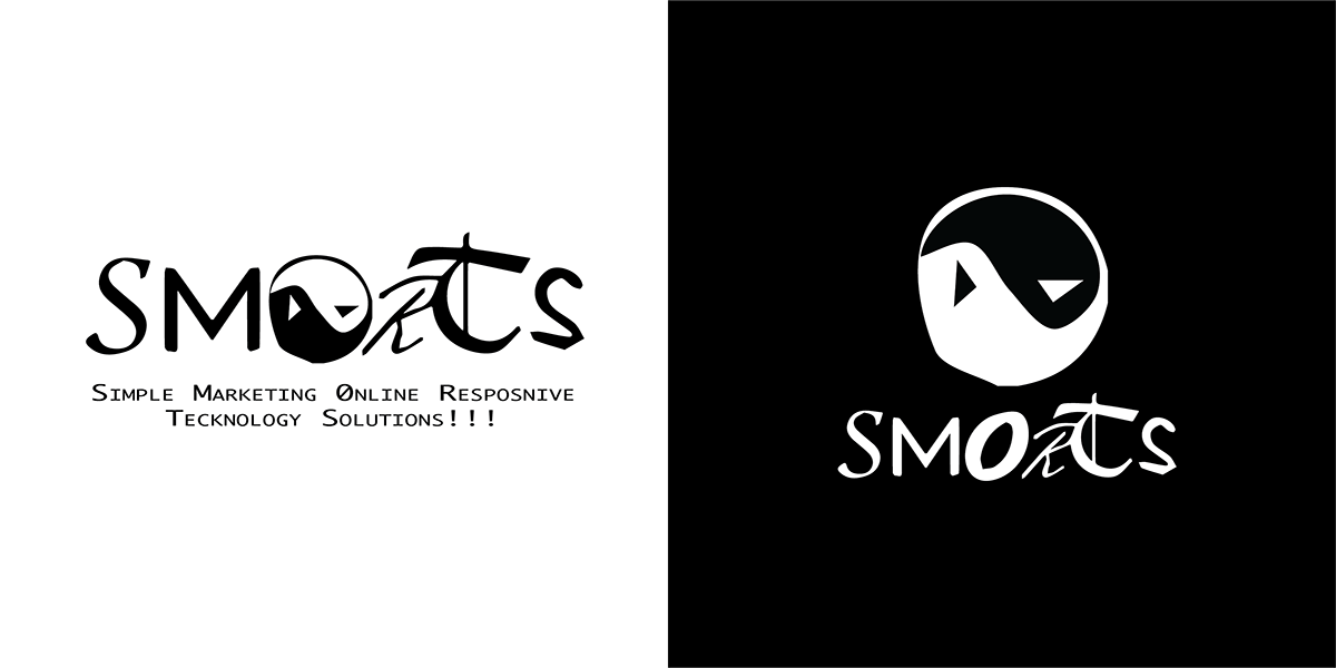
It’s a question that designers can pore over endlessly, but US creative studio Fuzzco is taking a fun approach to the subject with its new competition, How Low Can Your Logo? The brief is to create a bad logo (although in keeping with any poorly handled design challenge, people are free to skip the brief altogether). The client? Simple Marketing Online Responsive Tech Solutions, otherwise known as SMORTS.

The entries so far are satisfyingly ugly by most accounts, featuring heavy use of dodgy typefaces – including everyone’s (least) favourite of all time, Comic Sans. Clip art-style imagery figures prominently too, reminiscent of all those 2000s-era invitations and posters created in Microsoft Word that most of us thought we’d probably left behind. Many of the designs are cluttered and convoluted – perhaps indicative of the general gravitation towards minimalism – while misleading layouts of the brand name seem to be among the worst culprits.

The winning entry and runners up will be decided by a panel of six judges, including Pentagram partner Michael Beirut, illustrator and Wes Anderson collaborator Jessica Hische, and Google Design’s Carly Ayres. Creatives have until 10pm BST on Tuesday 21 April to enter their most ghastly logos.


howlowcanyourlogo.com; fuzzco.com

The post A new contest wants your best bad logo ideas appeared first on Creative Review.

Alex Bernas’ saucy animation sets out to be an antidote to pornography

Director, animator and story artist Alex Bernas’ latest film, Sex Moves, sets out to be an antidote to pornography and the unrealistic portrayals of sex we’re often subjected to. Inspiration for the film came after Bernas read a recent study that reported how more and more UK teenagers are watching porn to ‘learn what to do’, which troubled the creative.

“I’m sure we can agree that the sex portrayed in these films is unrepresentative and, at its worst, is aggressive and unnatural,” says Bernas. “Unlike the act itself, these films lack any semblance of humour or awkwardness. I wanted to add a bit of goofiness into the visual language; my film is about the sex but subverts the tropes of porn.” 

Navigating through a bright, multicoloured world, the film starts with the narrator asking strangers how to have sex. It leads to a cast of eclectic (and randy) characters acting out how they like to do the deed as a flurry of romps and innuendos ensue. 

The aesthetic is typical of Bernas’ fondness for bold colours and striking design, and here he borrows from a pop art colour palette with simple character designs made up of basic but malleable shapes. “This means that the characters are uncomplicated and easily identifiable despite the brevity of their scenes,” explains the director. “Keith Haring was a big inspiration for the colours used and for the use of clear, black linework to delineate the characters.”

As well as Haring, Bernas’ work in general is influenced by the many cartoons he watched in the 90s such as Hey Arnold, Ed, Edd and Eddy and The Simpsons. “As a habitual doodler I’m always drawing goofy faces with exaggerated expressions, and I reckon you can see the artefacts of my childhood obsession in my films,” he says.

Bernas gave himself a month to make Sex Moves, spending about a week designing and boarding it out, and then working with a small team over two weeks on the animation. “Giving myself a time limit forced me to make quick decisions, which made the whole process more intuitive than deliberated,” he explains. “Once I’d landed on the film’s concept, I had the framework to speedily make any creative decisions.”

For the sex moves themselves, Alex first took to miming in front of the mirror to work out “suitably evocative (but clean) movements” and then moved on to watching a lot of Marcel Marceau and interpretive dance videos on YouTube for further inspiration. “I didn’t want the sex moves themselves to be smutty, so porn wasn’t a viable source of inspiration,” he says, and it’s why the film is crammed with so many suggestive and saucy gesticulations.

Of course with this suggestiveness, the biggest challenge for Bernas and his team was to keep an air of innocence and avoid it being too seedy. “A big part of that was keeping all the sex moves opaque and open to interpretation,” explains the director. “The characters had to keep their clothes on and couldn’t actually perform any graphic sex acts, instead using visual double entendres and sound effects to convey what they were miming.… The animators focused on exaggerating the characters’ movements and emotions to heighten the sense of fun and create something cartoonishly positive.”

A big part of the film’s charm is the music and sound design, which saw Bernas work with frequent collaborators, composer Lindsay Wright and sound designer Sashko Potter Micevski. Bernas was keen to avoid the onomatopoeic ‘bow chicka wow wow’ type sleazy porn groove and instead settled on something more melodious and cheerful. “We wanted it to carry the action forward, reacting to the increasingly bizarre pantomimes on screen before its eventual climax,” says Bernas. “The sound design was tricky, it had to be visceral but not too gross. Sashko recorded a whole host of different squelches and fleshy thuds and slaps, and we balanced these with natural, diegetic sound. The happy music and disgusting sound effects compliment each other nicely, making sure the film is never repulsive.”

Represented by Partizan, London and LA-based Bernas has worked with big brands including Nike, Apple, Amazon and Google. Sex Moves is just as polished as his commercial projects, and provides a welcome dose of fun and weirdness during these uncertain times. “I’ve been stuck in my apartment for three weeks now, I’m going bananas,” says the animator. “Goodness knows I could use a laugh.” His hopes for the film are simply to make the audience chuckle, but also to open up the conversation around sex and to embrace the more funny, awkward and squelchy moments that happen during it. 

vimeo.com/alexbernas

The post Alex Bernas’ saucy animation sets out to be an antidote to pornography appeared first on Creative Review.

Flying Table by JCPCDR Architecture dangles from seat belt-like mechanism

Paris-based agency JCPCDR Architecture has invented an oak table that raises and lowers from the ceiling using a mechanism that looks like seat belts to save on space.

Designed by Jean-Christophe Petillault from JCPCDR Architecture, the Flying Table is suspended from four seat belt straps, attached to a docking element fixed onto the ceiling.

These straps are wound around a remote-controlled roller shutter motor, enabling the table to gradually lower down to the desired height.

JCPCDR Architecture constructs Flying Table with seat belt-like mechanism

The oak table can be left suspended by the straps to suit the height of the user, or lowered to the floor and stood on its four legs, which fold out from underneath.

When the table is brought to the floor, the straps can be detached and retracted back to the ceiling until they are needed again.

JCPCDR Architecture constructs Flying Table with seat belt-like mechanism

As Petillault explained, the idea for the Flying Table was born while he was working on several office refurbishment projects in Paris, and trying to find ways of making the spaces more adaptable.

“Due to cramped spaces in our city, it is very important that rooms remain versatile and can be used for multiple purposes,” the designer told Dezeen.

“Meeting rooms, for example, are not always occupied, but still represent a large part of the floor plan and are often crowded with furniture,” he continued.

“Obviously this issue is not exclusive to offices and we have the same need for flexibility in our homes. I wanted to design a large table that could serve multiple purposes and adapt to very various situations.”

The Flying Table can function as a desk or meeting table, or alternatively as a dining or coffee table.

JCPCDR Architecture constructs Flying Table with seat belt-like mechanism

According to Petillault, the mechanism inside the table is very simple, inspired by daily gestures and items such as seat belts, electric curtain motors, integrated lighting and foldable legs.

To highlight these everyday elements, Petillault chose to contrast them to oak wood, which makes up the main body of the table and its legs.

Custom lighting integrated into the ceiling dock is both as a functional and decorative element, making the large piece of wooden furniture seem lighter. It also adds a futuristic quality.

JCPCDR Architecture constructs Flying Table with seat belt-like mechanism

“This design allows a traditionally very large and heavy piece of furniture, to become a versatile, playful and contemporary object,” said Petillault.

“It can be used in homes, offices, workshops – basically any place where you would use a table, only this time you will also be able to use your room for different purposes: child games, yoga, dancing, photo-shoots, parties,” he added.

“On the ceiling or on the floor, this kind of table design will always remain a luxurious and sharp architectural feature, but won’t get in your way.”

JCPCDR Architecture constructs Flying Table with seat belt-like mechanism

Typically focused on architecture projects, JCPCDR Architecture previously built a small house-shaped pavilion in France, which hikers can use as a viewpoint to observe Lake Annecy.

Designed to complement its surroundings, the pavilion is made from local fir wood and is tucked in below the trees on a secluded mountainside site in Giez.

Photography is by David Foessel.

The post Flying Table by JCPCDR Architecture dangles from seat belt-like mechanism appeared first on Dezeen.

Call for entries to AHEAD Europe awards 2020

Heckfield Place by Ben Thompson

Dezeen promotion: architects and designers working across Europe are invited to submit their hospitality projects to the 2020 edition of the AHEAD Europe awards.

Carried out across four different regions – the Americas, Europe, Asia and the Middle East and Africa (MEA) – the AHEAD awards celebrates stand-out hospitality projects from across the world.

The AHEAD Europe 2020 competition will specifically look at projects that have opened, reopened or launched in the region between June 2019 and May of this year.

Palazzo Daniele won Hotel of the Year in the AHEAD Europe 2019 awards

Entries are arranged into 14 different categories: Bar, Club or Lounge; Event Spaces; Guestroom; Hotel Conversion; Hotel Newbuild; Hotel Renovation & Restoration; Landscaping & Outdoor Spaces; Lobby & Public Spaces; Lodges, Cabins & Tented Camps; Resort; Restaurant; Spa & Wellness; Suite and Transport.

Awards for Visual Identity, New Concept and the prestigious Hotel of the Year title are also up for grabs.

Judges commended Palazzo Daniele for its abundance of original details

Each project is then carefully evaluated by an expert panel of architects, designers, developers and leading commentators from the hospitality industry.

Judges last year included Patricia Holler, senior interior design director of Marriott International, Stefan Rier, co-founder of architecture studio NOA and Catherine Martin, managing editor of Sleeper magazine.

Long Room at Heckfield Place hotel by Ben Thompson
Heckfield Place topped the Hotel Renovation & Restoration category of AHEAD Europe 2019

The 2019 edition of AHEAD Europe saw Palazzo Daniele take home the Hotel of the Year award. Composed of just nine guest suites, the boutique hotel takes over a 158-year-old aristocratic home in Puglia, Italy.

Members of the judging panel were wowed by the building’s carefully-preserved historic fabric and intimate atmosphere, claiming that once guests enter the hotel they feel as if they’re in “a new world”.

Dezeen also produced a short film about the hotel, in which architect Roberto Palomba talked through the painstaking process of restoring several of the hotel’s original frescoes.

The Retreat at Blue Lagoon Iceland came first in AHEAD Europe’s Resort category last year

Other major winners from AHEAD Europe 2019 include Heckfield Place in Hampshire, England, which occupies an 18th-century residence. It came first in the Hotel Renovation & Restoration category, commended by judges for having a sense of “maturity that’s really quite elegant”.

The Resort category was won by The Retreat at Blue Lagoon Iceland, which is nestled amongst geothermal pools, while the winner of the Spa & Wellness category was Euphoria Retreat – a hotel carved out of a mountain in Mystras, Greece.

Euphoria spa in the Euphoria retreat by decaARCHITECTURE
Euphoria Retreat in Greece was the winner of the Spa & Wellness category in last year’s awards

Interested applicants have until 29 May 2020 to submit their projects, which can be done online via the AHEAD website. Winners of AHEAD Europe 2020 will be announced in a ceremony at Exhibition London on 18 November.

Champions from all four regions will go on to compete at the AHEAD global biennale that’s set for 2021, where worldwide titles can be won.

The post Call for entries to AHEAD Europe awards 2020 appeared first on Dezeen.