Pier 70’s new logo is a “love letter to San Francisco”

Once a shipbuilding and industrial hub, the area is in the middle of a 15-year regeneration project in the city that will open the waterfront up to the public and create a new home for the creative community as well as restaurants, homes, offices and shops.

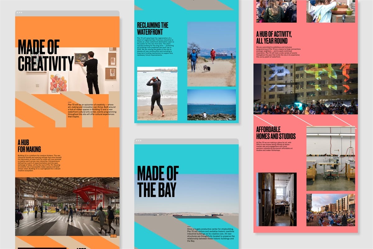
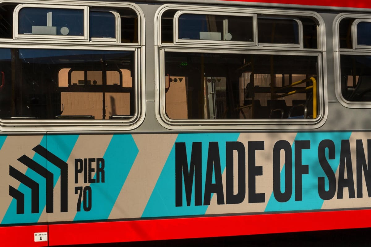
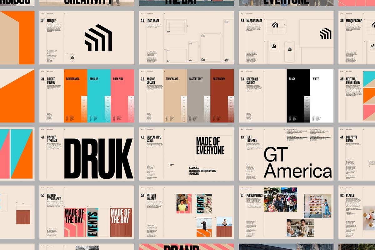
dn&co delved into Pier 70’s industrial past to create the new identity, which references the 50-foot steel frame that’s been turned into a new gateway for the area. The architecture also informs a series of linear patterns that cut through posters and adverts. According to the studio, the tagline, Made of San Francisco, is an effort to root the area in the heart of the community, after dn&co interviewed locals and found that many feel the city is losing its soul.

Brand colours reference the story of the pier as well as its surroundings, using bright orange, blue and pink alongside greys and browns that nod to Pier 70’s history. It takes Druk as its display typeface, using its solid letterforms as another reference to the area’s industrial heritage.

“In a city going through fierce debates about the loss of identity, we created a brand that looked instead at the key ingredients that have always made San Francisco great: its creativity, its openness and its relationship to the Bay,” says the studio. “The identity for this former shipyard signals a powerful renaissance of Pier 70’s industrial roots with a bold and distinctive visual language that’s a love letter to San Francisco.”


dnco.com

The post Pier 70’s new logo is a “love letter to San Francisco” appeared first on Creative Review.

Nendo adorns tuna fishing ship with graphic patterns to recall life on land

Nendo adorns Shofukumaru longliner boat with graphic patterns to recall life on land

Straight lines and geometric symbols feature inside and out this longliner tuna fishing ship, which Nendo designed to relieve the mental and physical stress imposed on its crew when out at sea.

Designed for Japanese tuna fishery Usufuku Honten, based in Kesennuma City in Japan’s Tohoku region, the Shofukumaru longliner ship weighs a total of 486 tonnes and has capacity for 15 crew members.

Nendo was given a brief with three key words – straight lines, unevenness and massiveness – which it used to create exterior and interior designs that offer a “sense of security on solid ground”.

Nendo adorns Shofukumaru longliner boat with graphic patterns to recall life on land

The crew spends a month at sea at a time, catching bigeye and bluefin tuna for the fishery – a job that is strenuous on their mental and physical wellbeing.

According to the company, this results in a turnover rate of more than 50 per cent among the younger members of the crew.

The fishery therefore tasked Nendo with designing an interior and exterior for the fishing vessel that would help alleviate the stress of the team, and in particular would appeal to its younger workers.

Nendo adorns Shofukumaru longliner boat with graphic patterns to recall life on land

Nendo deconstructed Usufuku’s trademark, comprised of the Japanese emblems including a chigai-yama (mountains), hoshi (star) and ichi (one), and modernised them to create a simple graphic pattern made up of straight lines and circles.

This pattern was then repeated in adapted forms across both the exterior surfaces and interior elements such as the onboard flooring.

Nendo adorns Shofukumaru longliner boat with graphic patterns to recall life on land

“The idea was conceived from the notion that our species, not originally accustomed to spending long periods of time at sea, might be comforted by linearity reminiscent of life ashore: the straight lines of buildings, windows, doors, and smartphone and TV screens,” Nendo explained.

Striped joints and rectilinear openings were incorporated into the interior design, softened with curved surfaces in certain locations to ensure safety.

Nendo adorns Shofukumaru longliner boat with graphic patterns to recall life on land

The studio also wanted to create an “unevenness” in the boat design, to avoid creating repetitive interiors that are often seen in environments focused on functionality, such as hospitals.

According to Nendo, these homogenous designs often cause “psychological stress” for users.

Linear patterns and materials were therefore scattered at random and in moderation across the vessel, to create spaces with different characters that the crew won’t get bored with.

Nendo adorns Shofukumaru longliner boat with graphic patterns to recall life on land

According to its creators, the Shofukumaru boat is the first domestic tuna fishing vessel to be equipped with a Wifi system.

Other additional features designed to recall life on land include the furniture, which sees bulky tabletops and “stump-like” stools that appear to be rooted to the floor.

The boat also boasts an increased per-person occupancy area alongside a higher ceiling height than conventional interiors.

Nendo is not the only studio to foray into boat design. Danish studio Norm Architects designed homely interiors for a 20-metre-long luxury yacht named Bella.

Back in 2014 architecture firm Foster + Partners designed a 20-metre-long motor yacht with a white leather interior, while in the same year Zaha Hadid designed the Jazz superyacht for German shipbuilders Blohm+Voss.

The post Nendo adorns tuna fishing ship with graphic patterns to recall life on land appeared first on Dezeen.

Amazing Collages from Old Photographs and Book Pages

En contemplant les collages de Hollie Chastain, on croirait s’immiscer dans des journaux intimes des années 50…

L’artiste américaine réutilise de vieux textes et de vieilles photographies qu’elle agrémente avec des points de suture et des bouts de papier éphémères pour créer des collages uniques et magnifiques.

« J’ai toujours été une collectionneuse de papiers et d’éphémères trouvés et anciens, le collage était donc un choix naturel. »  explique Chastain.

D’un coté des hommes jouent du saxophone, de l’autre un enfant à le crâne tressé… chaque oeuvre à son histoire. L’artiste utilise souvent des images des anciennes editions du National Geographic dont elle découpe les personnages forts ou en action.

« Je suis tombée amoureuse des gribouillages, des timbres, des identifications de bibliothèque et d’école, des marques d’eau et d’encre et de toute l’autre histoire visuelle et de la façon dont cela ajoutait et parfois altérait la composition de l’œuvre. »

Pour partager l’utilisation de ce medium, Hollie Chastain a publié un livre d’instructions expliquant les méthodes de création de ses collages vintage. Retrouvez If You Can Cut, You Can Collage dans sa boutique et suivez l’artiste sur Instagram.


In Praise of Judging

As coronavirus wreaks havoc with this year’s creative award shows, D&AD CEO Patrick Burgoyne reflects on why judging matters, if done well

The post In Praise of Judging appeared first on Creative Review.

Marazzi reveals new Crogiolo tile collection with designs that celebrate ceramic Italian tradition

Marazzi updates its Crogiolo tile collection with designs that celebrate flaws

Dezeen promotion: Italian flooring manufacturer Marazzi has released its Crogiolo ceramic and stoneware collection with four new series, including designs based on majolica pottery and tiles with a brush-stroke effect.

The new tile series – Lume, Scenario, Zellige and D_Segni Blend – join the D_Segni, D_Segni Scaglie and Colore series also in the Crogiolo collection.

Marazzi updates its Crogiolo tile collection with designs that celebrate flaws
The Lume range boasts an ultra-glossy finish

The Lume stoneware draws on Marazzi‘s extensive research into glazes and colour to offer a design that resembles the ultra-glossy handmade majolica tiles that are typical of southern Italian architecture.

Made with a dense glaze, each tile celebrates flaws such as smears, irregularities, pitting and variations in shade and pattern, making each piece and their relative compositions unique.

Marazzi updates its Crogiolo tile collection with designs that celebrate flaws
The Lume tiles come in the unconventional size of six-by-24 centimetres

The Lume range boasts an “unusual” size of six-by-24 centimetres and, according to the manufacturer, boasts straight edges that allow for almost joint-free installation.

It is available in six colours, including white, black, green, blue, musk and greige. The Lume tile is suitable for use as a wall covering in both residential and contract projects and is only recommended for use on floors in private homes where there is a low level of traffic.

Marazzi updates its Crogiolo tile collection with designs that celebrate flaws
The Zellige range celebrates the irregularities that occur during production

The Zellige tile is a 10-by-10-centimetre version of the traditional Moroccan terracotta tiles with the same name, which typically feature glossy glazes.

Like the Lume range, Zellige retains the “delightful flaws” that occur in the manufacturing process, resulting in a variety of textures and variations of the range’s 12 different colours ranging from turquoise and sage green to sand and coral.

The collection is completed by three 30 by 30-centimetre mosaics that can be made on demand using unevenly shaped chips and slant-cut pieces taken from the plain tiles.

Marazzi updates its Crogiolo tile collection with designs that celebrate flaws
The Scenario tiles feature geometric designs and “brush-stroke” effects

The new Scenario stoneware features graphic motifs and tone-on-tone “brush-stroke” effects, informed by Marazzi’s historic I Pennellati collection designed in 1958 by Italian painter and potter Venerio Martini.

The 20 by 20-centimetre Scenario tiles include two different surfaces that can be used together. One is matt and comes in three colours including Bianco, Nero and Blu, and is suitable for floors and walls.

The other is ultra-glossy and comes in the shades Bianco, Blu, Azzurro, Nero and Grigio. This version is more suited to wall coverings.

Marazzi updates its Crogiolo tile collection with designs that celebrate flaws
The D_Segni Blend range boasts a high degree of slip resistance

The final D_Segni Blend range of porcelain stoneware cement tiles was produced using Marazzi’s new StepWise technology, which grants products a high degree of slip resistance without compromising on the surface’s soft feel.

Available in 20 by 20-centimetre and 10 by 10-centimetre sizes, the Blend range is available in six colours, three brighter shades of Azzurro, Verde and Terra, and three more neutral tones of Grigio, Carbone and Osso.

More information on Marazzi’s Crogiolo collection can be found on the company’s website.

The post Marazzi reveals new Crogiolo tile collection with designs that celebrate ceramic Italian tradition appeared first on Dezeen.

This modular cat home is customized for your pet’s lifetime happiness

Browsing through Pinterest for your dream homes is so 2019, in 2020 we are browsing through pet homes and I am not ‘kitten’ when I say that cats certainly have cooler options than we ever will. They don’t pay rent and that is always going to be the coolest part but the pet homes are truly taking an artistic turn and I don’t mind having this modern cat home that is specifically customized for your feline friend’s happiness to last a lifetime! The design has been mindful of 3 elements – the space, the cat, and the person. Space is shared between the cat and the owner and this pet product works in the favor of that symbiotic relationship – all the cat’s needs are met and the owner’s interior space/style remains undisturbed.

The designer has imagined everything your pet needs to live their best life possible and included it in the details of this modular cat house. Every traditional shape and element has been reimagined to add a fresh perspective. The scratching board, for example, has been created to evoke an emotional response from the cat and make it a pleasant experience not bound by the stereotypical forms but still meeting the behavioral need to dig/scratch. Play around with the shape and structure, create something that works for you and your pet and if your pet gets bored easily, just switch up the arrangement and voila, a whole new apartment! The scratch pads can be set up in various different ways to increase the playing area while still being a practical element. “It is a balance between new and old. I have used our most common materials and structures in life to design new design styles, extend the life cycle of products, reduce product costs from another angle, and strengthen the relationship between brands and users by expanding product forms and functions,” says the designer.

It uses a familiar frame structure and it is flexible to the owner’s space and the cat’s demands – it also works for multiple cats! Sisal balls and corrugated paper complete the structure and encourage cats to behave as they would in their natural element, the choice of materials makes them more comfortable and the earthy tones bring a zen energy to the environment it is in. It integrates the human-cat-space elements into one pet product which is more entertaining, useful, and cost-effective because it serves multiple purposes. The cat house is adaptable and expandable to suit your flexible lifestyle. Add soft cushions, some toys, a litter box and you have a beautiful cat home with a minimal aesthetic that will fit your style and space!

Designer: He Yuhui

This article was sent to us using the ‘Submit A Design’ feature.

We encourage designers/students/studios to send in their projects to be featured on Yanko Design!

Studio Edwards designs minimal house on wheels Base Cabin

Base Cabin by Studio Edwards

Studio Edwards has turned the simple A-frame cabin into a mobile home with a sleek rubber skin.

Base Cabin is a wooden micro home on wheels – a far cry from the typical caravan or trailer.

Base Cabin by Studio Edwards

Melbourne-based Studio Edwards wanted the mobile retreat to be more akin to a minimal, contemporary building.

Architect Ben Edwards looked to both the Airstream – famous for its streamlined shaped – and the A-frame hut for inspiration.

The A-frame structure gives the building a distinct asymmetric geometry, but also makes it more structurally efficient.

Base Cabin by Studio Edwards

“The geometry is inspired by a combination of the A-frame cabin and the iconic Airstream trailer,” the architect told Dezeen.

“The A-frame uses less material than conventional portal framed buildings,” he said. “This was an important consideration in regards to the overall mass of the building – it had to be transportable.”

Base Cabin by Studio Edwards

Like the Airstream’s polished aluminium exterior, the Base Cabin is predominantly clad in just one material. Black rubber gives the structure as homogenous aesthetic, but also keeps it weatherproof.

“It was chosen for being both durable, mute in its appearance and able to seamlessly wrap the angular form,” said Edwards.

Base Cabin by Studio Edwards

Inside, the cabin is divided into three rooms. A bathroom at the centre of the floor plan separates the main living and dining space from a more secluded bedroom area.

The kitchen comes equipped with a sink, fridge and various cabinets, while the bathroom includes a shower, toilet and sink.

Base Cabin by Studio Edwards

The faceted geometries of the exterior create sloping walls inside, offering a sense of intimacy. This creates a triangular, tent-like space in the bedroom.

Wooden panels line the walls, while a skylight at the highest point of the roof brings daylight into all three rooms.

Base Cabin by Studio Edwards

Edwards founded his architecture studio in 2016, having previously been a director of Edwards Moore Architects.

The architect often works on small-scale projects, with previous examples including a mini art studio in a car park and an industrial-style roof extension.

He developed Base Cabin as the first design model for a company of the same name. Base Cabin builds bespoke mobile homes and micro homes. Customers can order this model or design their own.

Base Cabin by Studio Edwards

“Collaboration with designers is at the core or what we do,” reads the company statement.

“Whilst the cabins we build are small in size, we seek out the best finishes to incorporate them into our spaces. We believe in quality over quantity.”

Edwards hopes his design will help people rediscover the simple pleasures of the great outdoors.

Photography is by Studio Edwards.

The post Studio Edwards designs minimal house on wheels Base Cabin appeared first on Dezeen.

Architecture students complete Passivhaus in South Dakota

Passive House by Robert Arlt

Architect Rob Arlt and his group of students in South Dakota have completed an experimental gabled Passivhaus, which they claim is the first in the area to “sell energy back to the grid”.

Passive House by Robert Arlt

Arlt, an instructor in the South Dakota State University Department of Architecture, worked with students to complete the house in Brookings near the school campus.

As there is currently no statewide energy code that residential buildings must meet in South Dakota, the project is intended to highlight the possibilities for construction.

Passive House by Robert Arlt

“In a state that will not adopt energy codes, the design responds to showcase and demonstrate sustainable development to the region’s public, contractors, and building officials through site selection, systems and assemblies,” the team said.

The group obtained a housing grant from the Governor’s Office of Economic Development to design the project to meet standards set by the Passive House Institute.

According to the team, the 2,000 square-foot house is also the first in the area to produce more energy than it consumes.

Passive House by Robert Arlt

“The residence is 90 per cent more efficient than a similar house built to code and is the first house in the region to sell energy back to the grid,” it said.

Energy-saving and environmentally friendly details include photovoltaic panels installed on the roof to generate energy, a built-in water heater with a more efficient heat pump and quadruple glazed windows.

There is also a Zehnder HRV (Healthy Climate Heat Recovery Ventilation) ventilation system, which uses the heat of the stale air that is leaving the house to warm up the fresh air entering to reduce energy loss.

The roof is designed to hang over openings on the south-facing facade to offer shading in warm weather and the gutter is built-in to reduce heat loss through thermal bridging. All of the walls inside the house are coated in a white non-VOC (volatile organic compound) paint, which means it doesn’t contain any carbon.

Passive House by Robert Arlt

The house also has a striking appearance; dark grey fibre-cement lap siding covers the exterior and the windows and doorways are framed with cedar wood.

A portion of the front of the gabled house a portion is cut away to form a small entry porch. The inset entrance is entirely clad with cedar and features a bright red door.

Passive House by Robert Arlt

“A simple gabled massing responds to the neighbouring context and implements contemporary detailing to read as a single, subtracted volume with deep set apertures,” the team added.

At the rear of the house, an exterior courtyard covered in wood slats connects to the detached garage.

Inside, the living and dining area features double-height ceilings to view activities on the upper level, which includes two bedrooms and a loft on the upper level. The master bedroom is located on the ground floor.

Passive House by Robert Arlt

The team designed a wooden staircase made from cross-laminated timber and glulam, materials that are deemed to be more sustainable details that concrete and metal. These are among a number of wooden details, such as the basswood slat railings and ceiling beam, which are intended to contrast the plain interiors.

There is also a black accent wall grid system made from painted MDF panels constructed on both floors to conceal the master suite, bathrooms and mechanical rooms.

Passive House by Robert Arlt

Residents can monitor and adjust the air quality and energy usage via an online platform that provides information on the areas of the house using the most energy.

The property joins a number created to explore the possibilities for low energy and more sustainable design. Examples include a Kansas residence completed by students at the University of Kansas and architecture firm Snøhetta’s ultra-efficient HouseZero at Harvard University.

Photography is by Vondelinde.

The post Architecture students complete Passivhaus in South Dakota appeared first on Dezeen.

Mies van der Rohe's Lafayette Park in Detroit captured in new photographs

Lafayette Park by Mies van der Rohe

A modernist housing development in Detroit designed by Ludwig Mies van der Rohe is captured in photographs by architect and local resident Julio Alberto Cedano.

Called Lafayette Park, the project was built by the German-American architect in 1959 and comprises two superblocks of differently sized buildings.

Lafayette Park by Mies van der Rohe

Cedano photographed the development, which marks the largest collection of residential buildings by Mies van der Rohe, to pay homage to the design. For four years, he has lived in an apartment in one of the site’s twin Lafayette Towers that scales 22 storeys.

Lafayette Park by Mies van der Rohe

“Living in the Lafayette Towers allows me to document different moments through changing seasons, with new palettes of colour reflecting off the glass facades and providing visual excitement,” Cedano told Dezeen.

“It’s a unique opportunity, like living in an active museum of Mies buildings.”

Lafayette Park by Mies van der Rohe

Lafayette Park encompasses 46 acres (18 hectares) and includes a variety of buildings, from modernist high-rise condominium towers and two-story modular townhomes to single-storey dwellings. The centre of the site is defined by a greenway and many trees and plantings are interspersed throughout.

Cedano believes the surrounding natures pairs well with Mies van der Rohe’s structures, which feature gridded windows, flat roofs and steel facades.

Lafayette Park by Mies van der Rohe

“At Lafayette Park, van der Rohe creates a dramatic dialogue between architecture and nature,” he said. “The geometry of the grid juxtaposed with the natural surroundings is awe-inspiring. Nature creates the space that frames the architecture in place, allowing the simplicity of its beauty to radiate.”

Mies van der Rohe designed Lafayette Park with urban planner Ludwig Hilberseimer and landscape designer Alfred Caldwell on the eastern edge of Downtown Detroit.

Lafayette Park by Mies van der Rohe

The developer Herb Greenwald previously worked with the architect on his Chicago apartments at 860-880 Lake Shore Drive, which was completed in 1951 on the city’s lakefront.

Its northern section, which was planned and partially built by Mies van der Rohe, is listed in the National Register of Historic Places. It includes buildings by both Mies van der Rohe and other architects.

Before moving to Detroit, Cedano studied architecture and urban design at Columbia University in New York City. He currently works as an urban designer for the City of Detroit Planning and Development and uses photography to engage with architecture.

“As an architect and urban designer, I am constantly photographing my surroundings, whether with an iPhone or my digital SLR camera, and I use photography as a way to observe and understand light, space and the built environment,” he added.

Lafayette Park by Mies van der Rohe

Cedano created the photography series with architectural historian Jacqueline Taylor, who also used to live at the complex and work at the Detroit’s city planning department but is now based in Berlin.

“Lafayette Park provides a model for housing that combines density and diverse housing options with a respect for nature in an abundance of exterior green space, where limbs can stretch, lungs can expand, and minds can feel a sense of freedom,” Taylor told Dezeen.

Lafayette Park by Mies van der Rohe

Mies van der Rohe is considered one of the most significant architects of the 20th century. Known simply as Mies, he was the final director of the Bauhaus school and went on to live in the US and head the Illinois Institute of Technology (IIT) in Chicago.

His other projects include Farnsworth House in Illinois, which was illuminated with red lasers in an installation by Iker Gil and Luftwerk. The duo has also created a similar light design for the architect’s Barcelona Pavilion.

The post Mies van der Rohe’s Lafayette Park in Detroit captured in new photographs appeared first on Dezeen.

The First-Ever Free Techstars Startup Weekend Remote USA

Results from 54 hours of business development regarding Covid-19 relief

From 24 to 26 April, global investment platform Techstars (a certified B Corporation that aims to support entrepreneurs through mentorships, events and accelerators) brought their contributions and capabilities to a new level. With their first-ever free, national Startup Weekend Remote USA—a development born from their highly sought-after 54-hour weekend incubator—dozens of successful founders and C-suite mentors signed on to mobilize tech entrepreneurs in the fight against Covid-19. Entirely digital and distributed across the country, the event’s top 20 ideas—which could address health, vulnerable populations, communities and more—and the teams behind them, secured an opportunity at a business bootcamp (the next stage in idea advancement).

Roughly 3400 start-up weekends crop up globally each year. It’s no small feat to bring one—that stretches the USA—online. Mirroring such an effort, the top three finalists proposed solutions to immediate problems. From the east region, third place start-up COVIDX presented a citizen science app, wherein users of health-tech wearables can share their data and alert doctors if there’s a sustained elevated heart rate (which may telegraph the presence of the novel coronavirus 48 hours before the onset of other symptoms).

In second place, from the west region, MedFoyer proposed a virtual doctor’s office waiting room (part app, part platform), built through geolocation data, wherein patients can await their assessment appointment in their car. Clearly, this reduces the risks (for patients and staff) of close-proximity check-in.

First-place winner, Varna, pitched wearables paired with an AI-powered bio-senseing tool to monitor nurses’ symptoms in real time. Varna’s team is composed of engineers with AI backgrounds and their mission includes making thermal cameras more affordable.

With “giving first” as a core value of Techstars, perhaps even more than knowledge-sharing, the organization tapped Custom Ink for a collection of clothing and accessories that would function two-fold. It would act as a commemorative unifier for those who attended the event; and it would offer an opportunity to support a charity. Mark Katz, co-founder and CEO of Custom Ink (as well as a Startup Weekend mentor), Zoomed in from McLean, Virginia to explain that they chose to focus their efforts on children’s educational and mental health needs.

“We wanted to do something that would focus on this neglected group, all of these kids stuck inside, without necessary tools, being deprived of education,” Katz tells us. “We also thought that was fitting with Techstars, as an organization focused on using technology to solve problems.” Moreover, Katz explains that mental health became a natural extension, as children in these circumstances may face isolation, lack of safety and more.

To facilitate the donations, Charleston, South Carolina-based local organizer Stacey Segal—partner at BrightVine Solutions, who works with non-profits needing tech guidance; and founder of the non-profit Charleston Startup and STEM Foundation—stepped in. Segal’s organization will “select charities in different areas of the US and grant money to them, and work with Techstars to define the criteria to select these organizations,” she explains to us. In addition to securing transparency, they’ll handle reporting. Ultimately, their goal will be to enable responsible charities to acquire educational tablets, equipped with learning applications and mental health support. It’s one continual act of goodness from a weekend dedicated to helping others.

Images courtesy of Techstars