Crescent House by Andrew Burns

Australian architect Andrew Burns has installed a charred timber pavilion with deceptively curved walls in the garden of the Sherman Contemporary Art Foundation in Paddington, Sydney (+ slideshow).

Crescent House by Andrew Burns

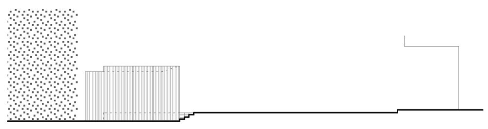
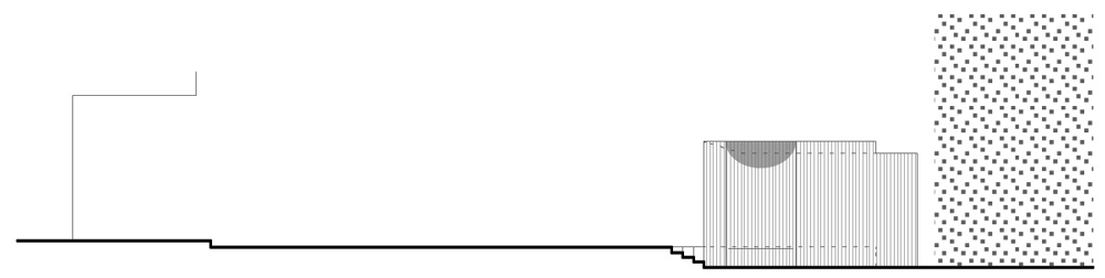
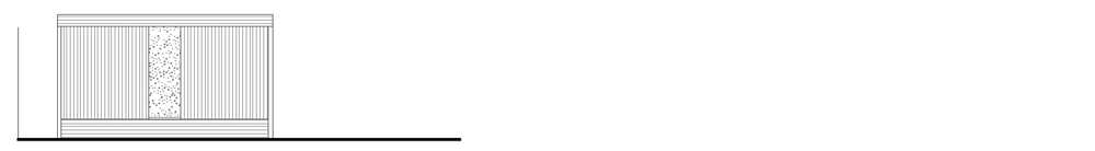
Named Crescent House, the structure was designed by Andrew Burns with a symmetrical geometry that comprises two intersecting arcs within a rectangular frame.

Crescent House by Andrew Burns

Visitors are invited to follow the curve of the walls to a secluded space at the pavilion’s centre, where light filters through tiny perforations to create a wall resembling the night sky.

Crescent House by Andrew Burns

The charred cedar cladding references the frequently occurring bush fires of the region. Meanwhile, the rectangular structure at the back frames a view of the hedge beyond.

Crescent House by Andrew Burns

“The pavilion has an ambiguous presence, between architecture and art object,” says Burns. “The structure responds to elemental themes: darkness and light, the wonder of the night sky, the arc of the sun and the presence of bushfire on this continent.”

Crescent House by Andrew Burns

Crescent House is the inaugural project in the Fugitive Structures programme, a series of temporary pavilions that will be installed annually in the Zen Garden of the Sherman Contemporary Art Foundation (SCAF).

Crescent House by Andrew Burns

Citing the Serpentine Gallery pavilions in London as an inspiration, the SCAF plans to invite emerging and mid-career architects to design four new pavilions each year.

Crescent House by Andrew Burns

Andrew Burns also recently completed a pointy gallery and studio for artists in Japan.

Crescent House by Andrew Burns

See more architecture that features blackened wood, including a rural residence outside Melbourne and a temporary tower installed in Norway.

Crescent House by Andrew Burns

Photography is by Brett Boardman.

Crescent House by Andrew Burns

Here’s some more information from Andrew Burns:


‘Crescent House’ is the first in an annual series of temporary pavilions to be installed at Sherman Contemporary Art Foundation in Paddington, Sydney. The aim of this ‘Fugitive Structures’ program is to engage a wide audience with architectural thought.

Crescent House by Andrew Burns

Two arcs are set within an apparently simple rectilinear form. The arcs bisect, creating a pair of infinitely sharp points and a threshold to the space beyond. This combination of fragility and robustness seeks to charge the conversations within the space with a particular quality.

Crescent House by Andrew Burns

The structure has an ambiguous presence; between architecture and art object. Through framing, it transforms an ordinary rose apple hedge into a landscape of beauty.

Crescent House by Andrew Burns

The pavilion responds to elemental themes; darkness and light, the wonder offered by the night sky and the burnt quality of yaki-sugi (charred cedar) recalling the presence of bushfires on this continent.

Crescent House by Andrew Burns

The pavilion and has been initiated and supported by Sherman Contemporary Art Foundation, BVN Donovan Hill, Andrew Cameron Family Foundation and the Nelson Meers Foundation.

Crescent House by Andrew Burns
Site plan – click for larger image

Crescent House by Andrew Burns
Floor plan

Crescent House by Andrew Burns
South elevation – click for larger image

Crescent House by Andrew Burns
East elevation – click for larger image

Crescent House by Andrew Burns
North elevation – click for larger image

Crescent House by Andrew Burns
West elevation – click for larger image

Crescent House by Andrew Burns
Detail section – click for larger image

The post Crescent House
by Andrew Burns
appeared first on Dezeen.

Hewlett House by MPRDG

Australian architects MPRDG were inspired by the shapes of tree branches to add a privacy screen across the glass-fronted upper storey of this family house in the Sydney suburb of Bronte (+ slideshow).

Hewlett House by MPRDG

Named Hewlett House, the three-storey residence is sited on a hillside close to the seafront and was designed as the home for a builder who specialises in complicated concrete shapes, so the architects planned a twisted upper storey that faces out towards the water.

Hewlett House by MPRDG

“The underlying design intent was to explore the notion of ‘prospect and refuge’ within a contemporary family house,” says MPRDG, explaining the “prospect” to be “the beach and coast views”, while the “refuge” is the creation of a “sense of sanctuary, enclosure and comfort”.

Hewlett House by MPRDG

Living and dining rooms are located on the uppermost floor to benefit from the views. With an open-plan layout, the space has glazed elevations to the north and south that let daylight and sea breezes filter though.

Hewlett House by MPRDG

Four bedrooms occupy the ground floor, but are pushed to the back for privacy, while a spiralling staircase at the front leads down to a second living room that opens out to a garden and swimming pool at the lowest level of the site.

Hewlett House by MPRDG

A glass-reinforced concrete structure shapes the building into its three levels, which all feature chunky outlines and chamfered edges. More curved and angled forms are added inside the building, from the twisted concrete body of the staircase to the slanted columns and circular skylight.

Hewlett House by MPRDG

Floors are finished in either oak or concrete, but walls and ceilings are painted white throughout.

Hewlett House by MPRDG

Other houses completed recently in Australia include a blackened timber residence outside Melbourne and a cyclone-proof building in Queensland. See more Australian houses on Dezeen.

Hewlett House by MPRDG

Photography is by John Gollings.

Here’s a project description from MPRDG:


The long standing client is a builder whom we have successfully worked with on several projects previously. He was open to ideas and had an ability to build complex forms and intricate details. The brief was for a modern family home to accommodate a couple and their three children. The house is located on the northern flank of the Bronte gully with views towards Bronte beach and the coastline beyond.

Hewlett House by MPRDG

Our design response was to place the living spaces on the upper floor as better views and more light were available. The bedrooms were located on the middle floor as this was more private and enclosed. The lowest floor has a rumpus area linking the garden and swimming pool to the house.

Hewlett House by MPRDG

The underlying design intent was to explore the notion of “prospect and refuge” within a contemporary family house. The “prospect” was the beach and coast views to the south of the site which change constantly depending on the season, weather and time of day. The “refuge” was the other desirable character where we created a quality of space that provides a sense of sanctuary, enclosure and comfort.

Hewlett House by MPRDG

These two driving desires for the house were explored and accommodated through devising two sculpted concrete forms responding to their particular use. The forms are rounded at the edges similar to tubes which are independent of each other enabling the upper tube to twist towards the view.

Hewlett House by MPRDG

The upper tube is open-ended which allows the northern winter sun to penetrate deeply into the living spaces while allowing an unimpeded outlook to the southern view. The form also provides efficient passive ventilation drawing the prevailing north-east breeze through the house.

Hewlett House by MPRDG

On the two lower levels the character of the spaces changes to places of privacy and refuge. The middle tube houses the bedrooms, each with a different aspect and outlook. The lower level has a cave like atmosphere with the room formed by a cut bedrock wall and a dark stone floor connecting the internal and external spaces. The pool provides a water element spanning between the rock wall and the garden.

Hewlett House by MPRDG

The house boldly sits as a modern insertion into the typically poor building stock of its surrounding environment. The context is of varying building styles, scales and materials so the house creates a deliberate contrast in form and colour. The homogenous appearance of the house allows the forms to be emphasised by sun and shadow with the play of light continually shifting and moving with the path of the sun.

Hewlett House by MPRDG

Detail elements have drawn upon surrounding natural forms for inspiration. For example, the angled bands on the front façade reference the tree branches of the native eucalypts. They also serve as a privacy screen for the dining space behind the façade.

Hewlett House by MPRDG

Above: site plan – click for larger image

Hewlett House by MPRDG

Above: lower ground floor plan – click for larger image

Hewlett House by MPRDG

Above: ground floor plan – click for larger image

Hewlett House by MPRDG

Above: first floor plan – click for larger image

Hewlett House by MPRDG

Above: section A to A – click for larger image

The post Hewlett House
by MPRDG
appeared first on Dezeen.

OMA, Hassell and Populous to redevelop Sydney’s Darling Harbour

News: a team made up of architecture firms OMA, Hassell and Populous has been selected to redevelop Sydney’s convention, exhibition and entertainment precinct at Darling Harbour (+ slideshow).

Darling Harbour, Sydney, by OMA, Populous and Hassell

Above: International Convention Centre

The Destination Sydney team, lead by developers Lend Lease, were today announced as the winning bidders with their plans to create a 40,000-square-metre exhibition centre, a red-carpet entertainment venue, a 900-room hotel and a new residential neighbourhood.

Dutch architects OMA will work alongside Hassell of Sydney and international firm Populous to deliver the 20-hectare masterplan, adding the new leisure complex to the north of Pier Street and new residential neighbourhood The Haymarket on the site of the existing Sydney Entertainment Centre and car park.

Darling Harbour, Sydney, by OMA, Populous and Hassell

Above: the theatre

“This project will redefine Sydney as a global city and create one of the world’s great meeting and entertainment destinations,” commented Destination Sydney’s chief executive Malcolm Macintyre. “Not only will it become a beacon for international visitors for conventions and events but will also build on the appeal of the Darling Harbour area for Sydney-siders creating an entertainment hub that promises to reconnect and re-energise the city.”

A phased redevelopment will see the existing Sydney Convention & Exhibition Centre close in December 2013, while the current Sydney Entertainment Centre will remain open until December 2015. Construction is set to complete in late 2016.

Darling Harbour, Sydney, by OMA, Populous and Hassell

Above: The Haymarket neighbourhood

Darling Harbour sit adjacent to Sydney’s city centre and has established itself as a centre for entertainment on the western edge of the central business district. Other recent developments in the area include an office complex that was awarded at the World Architecture Festival.

OMA have completed a number of projects over the last year, including the China Central Television Headquarters in Beijing and the headquarters of the Rothschild Bank in London.

See all our stories about OMA »

The post OMA, Hassell and Populous to redevelop
Sydney’s Darling Harbour
appeared first on Dezeen.

Sydney Tilt-Shift

Focus sur « Toy Boats » le nom que le photographe Nathan Kaso a donné à cette vidéo tournée en 3 jours dans la ville de Sydney. Utilisant la technique du tilt-shift associé à celle du time-lapse, cette création sur la bande son Bitstream Intercept par Chauncey Canfieldest est à découvrir dans la suite.

Sydney Tilt Shift6
Sydney Tilt Shift5
Sydney Tilt Shift4
Sydney Tilt Shift
Sydney Tilt Shift3
Sydney Tilt Shift2
Sydney Tilt Shift7

Workplaces can become “more hybrid in their nature” – Jeff Morehen on Darling Quarter

World Architecture Festival 2012: in this movie, Australian architect Jeff Morehen of Francis-Jones Morehen Thorp tells Dezeen editor-in-chief Marcus Fairs how the workplaces of the future should be “more hybrid in their nature” and accommodate public facilities, just like his Darling Quarter offices in Sydney that won the office category at the World Architecture Festival this month.

Darling Quarter by Francis-Jones Morehen Thorp

Located beside the harbour, the building curls around a large open space to create a public park and children’s play area. “Putting an office in a park was quite an unusual commission,” says Morehen, before explaining how his team had to overcome the “corporate nature and privatisation” that usually accompanies this kind of commercial building.

Darling Quarter by Francis-Jones Morehen Thorp

Above: photograph is by Florian Groehn

The architect compares the project to some of the public buildings his studio has worked on. “Often libraries that we’re invited to do are more than a library, they become a community meeting space with a whole series of overlaid functions,” he explains. “I think it’s very natural that we start thinking about that for our workplaces.”

Darling Quarter by Francis-Jones Morehen Thorp

Cafes, bars and restaurants line the edge of the ground floor, creating open spaces that can also be used as workplaces. Morehen describes how the current generation of office workers are “no longer tied to desks” and can use the city as their workplace. ”No longer are we individuals just tapping away at computers, he says. “More and more we’re collaborative and we need a range of settings to do that.”

Darling Quarter by Francis-Jones Morehen Thorp

We’ve filmed a series of interviews with award winners at the World Architecture Festival. See all the movies we’ve published so far, including our interview with architect Chris Wilkinson about the World Building of the Year.

Darling Quarter by Francis-Jones Morehen Thorp

See all our stories about WAF 2012 »

Photography is by John Gollings, apart from where otherwise stated.

The post Workplaces can become “more hybrid in their
nature” – Jeff Morehen on Darling Quarter
appeared first on Dezeen.

Yours to Care For

Supercyclers reinvent plastic drinking straws as elegant little vases

Yours to Care For

Liane Rossler and Sarah Kings’s latest project, “Yours to Care For,” transforms approximately 1,000 recycled straws into charmingly simple, single-stem vases. The crafty concept is one of several sustainably-minded ideas they have brought to fruition while working under the moniker Supercyclers, a collaborative group they co-founded last year. Sydney-based…

Continue Reading…


Castlecrag Residence by CplusC Architectural Workshop

Australian studio CplusC Architectural Workshop has extended a house in a Sydney suburb so that it looks like a doll’s house with the back wall taken off (+ slideshow).

A new black-stained timber canopy creates a roof and side walls around rooms and terraces on the ground and first floor, while glass walls slide open to connect the living room and kitchen to the garden.

The discarded timber beams of the house’s original roof have been reused to construct the new family dining table, which overlooks an outdoor swimming pool.

Reclaimed brick walls are exposed in the kitchen, where a cluster of pendant lights are suspended over a central breakfast counter.

Bedrooms occupy the first floor and are shaded by the overhanging roof.

Castlecrag Residence by CplusC Architectural Workshop

See more Australian houses on Dezeen »

Photography is by Murray Fredericks.

Here’s some more text from CplusC Architectural Workshop:


Located in the leafy suburb of Castlecrag, Sydney Australia, the natural beauty of timber is fundamental to the project, and embraces the ideals of Walter Burley Griffin’s design legacy for the area – “Building for Nature”.

The home maintains its original presentation to the street, but is transformed internally from a cellular and inward-looking mid-20th century brick house to a contemporary, open and light-filled home.

The kitchen is the pivotal room in the home, with Western Red Cedar doors disappearing seamlessly behind recycled brickwork allowing the internal living space to extend to a double-volume outdoor living space where Spotted Gum decking leads to the garden and swimming pool.

The external use of timber for seating, decking, fencing and screening terminates in a garden pavilion and transforms the yard into an intimate, peaceful oasis within a dense suburban context.

Both the functional and aesthetic qualities of timber have been drawn upon to heighten the experience of the home, and timber has been utilised in all aspects from structure and cladding, to internal finishes and external amenities.

The rough-sawn plywood canopy to the North is stained black and acts a shroud for the first floor, screening the neighbours and focusing the outlook towards the garden.

Plywood provides a neutral backdrop that allows the cedar cladding, doors and windows to be the focus of the home.

The materiality of this canopy is mirrored in the garden pavilion providing a visual balance.

The cabinetry of the home utilises the efficiency of Australian hardwood veneer and corresponds with the laminated Blackbutt Island bench.

Complementing the golden hues of the interior timbers is a custom Oregon dining table formed from the original roof beams, which has become the centrepiece of the home.

Architect and Builder: CplusC Architectural Workshop

The post Castlecrag Residence by
CplusC Architectural Workshop
appeared first on Dezeen.

Uchi Lounge 02 by Facet Studio

A screen made from century-old bricks divides this Japanese restaurant in Sydney, designed by Australia and Japan-based architects Facet Studio.

Uchi Lounge 02 by Facet Studio

Facet Studio inserted the wall to provide a new route from the restaurant’s entrance to the tables.

Uchi Lounge 02 by Facet Studio

Low steel beams jut out from the adjacent wall to steady the bricks.

Uchi Lounge 02 by Facet Studio

Previous projects by Facet Studio we’ve featured on Dezeen include a shop in Sydney full of vending machines that dispense T-shirts and a vintage boutique in Osaka with shelves made from stacked timber.

Uchi Lounge 02 by Facet Studio

See all our stories about bricks »
See all our stories about restaurants »

Uchi Lounge 02 by Facet Studio

Photographs are by Andrew Chung.

Here’s some more information from the designers:


This is an existing Japanese restaurant popular with regular customers who are after the chef’s specialty dishes. It seemed to have captured the regulars with not only the deliciousness of cuisine but also the indefinably nostalgia-filled space. So how do we enhance the experience of appreciating the cuisine, without destroying this atmosphere treasured by regulars? As we have been working with ‘repetition’ as a means to build up a deep excitement within people, we thought to utilise this effect to enhance, rather than break, this indefinable nostalgia.

Uchi Lounge 02 by Facet Studio

There we designed a new circulation path from entry to table, by ‘repeating’ the recycled bricks from 100 years ago (in response to the indefinable nostalgia) and rustic raw steel (in response to the client’s preference). It is a tunnel to enhance expectation towards the cuisines when one proceeds towards the table. The longer the distance of travel, the more room for enhancing this expectation.

Uchi Lounge 02 by Facet Studio

The ‘brickwall with 1/3 of its length punctured’ and ‘brickwall with 1/4 of its length punctured’ alternated for a lengthy 15m. The raw steel louvres, located 1m below the existing ceiling, correspond with the rhythm of the brick screen by spacing at one or two brick lengths. The resulting light and shadow create a repetitive rhythm, coming together in the tunnel. This repetitive rhythm enhances expectations, which in turn enhances the sensitivity to taste. When one reaches the table, it is the time the desire for the cuisine reaches its peak.

Programme: Restaurant fitout
Project team: Yoshihito Kashiwagi, Olivia Shih, Neo Di Sheng, Benjamin Chan
Location: Sydney, Australia
Area: 77 sq. m.
Year: 2011

The post Uchi Lounge 02
by Facet Studio
appeared first on Dezeen.

The Martian Embassy by LAVA, Will O’Rourke and The Glue Society

This young writers’ workshop in Sydney by architects LAVA is parading as an embassy for Martians on earth (+ slideshow).

The Martian Embassy by LAVA Will ORourke and The Glue Society

LAVA worked alongside producer Will O’Rourke and arts organisation The Glue Society to design the centre for creative writing charity The Sydney Story Factory, who organise classes where children can develop imaginative writing skills.

The Martian Embassy by LAVA Will ORourke and The Glue Society

A skeleton of plywood ribs surrounds the space, integrating seating, counters and shelves.

The Martian Embassy by LAVA Will ORourke and The Glue Society

Travel essentials for Martians fill the display areas and can be purchased at a plywood counter, while the workshop desks are located just beyond.

The Martian Embassy by LAVA Will ORourke and The Glue Society

“The concept is to awaken creativity in kids,” explains LAVA director Chris Bosse, ”so the design acts as a trigger, firing up the engines of imagination”.

The Martian Embassy by LAVA Will ORourke and The Glue Society

To see stories about normal embassy buildings, click here.

The Martian Embassy by LAVA Will ORourke and The Glue Society

Photography is by Brett Boardman, apart from where otherwise indicated.

Here’s some more information from LAVA:


The Martians have landed and they’ve set up their very own embassy in inner city Sydney!

The new embassy was designed by LAVA, with partners Will O’Rourke and The Glue Society, as a fusion of a whale, a rocket and a time tunnel, an immersive space of oscillating plywood ribs brought to life by red planet light and sound projections.

The Martian Embassy by LAVA Will ORourke and The Glue Society

Above: photograph is by Peter Murphy

LAVA’s design for the Martian Embassy is for The Sydney Story Factory, a not-for-profit creative writing centre for young people in Redfern, Sydney. The project was a collaboration with production company Will O’Rourke and their creative partners The Glue Society, who developed the Martian concept which was then road tested with kids – of all ages.

Chris Bosse, Asia Pacific director of LAVA said: ‘It’s the stuff great stories are made of – think of Moby Dick, H. G. Wells’ Time Machine and 2001: A Space Odyssey by Stanley Kubrick’.

The Martian Embassy by LAVA Will ORourke and The Glue Society

Above: photograph is by Peter Murphy

‘The concept is to awaken creativity in kids, so the design acts as a trigger, firing up the engines of imagination. It’s an intergalactic journey – from the embassy, at the street entrance, to the shop full of red planet traveller essentials, to the classroom. By the time kids reach the writing classes they have forgotten they are in “school”.’

‘Using a fluid geometry merging the three program components [embassy, school and shop], a computer model was sliced and ‘nested’ into buildable components. 1068 pieces of CNC-cut plywood were put together like a giant puzzle. Using technologies from the yacht and space industry the timber ribs create shelves, seats, benches, storage, counters and displays and continue as strips on the floor. Edged with Martian green, the curvy plywood flows seamlessly so that walls, ceiling and floor, space, structure and ornament, become one element.’

A mix of Martian essential oils infuses the tunnel to inspire young imaginations, whilst the sounds and lights of the red planet animate the space.

The Martian Embassy by LAVA Will ORourke and The Glue Society

Click the image above for a larger image

Martian passports, alien money, 1kg cans of gravity, abduction kits and SPF 5000 sunscreen are just some of the ‘Made on Mars’ gift products sold in the Martian Embassy store.

‘We had a lot of fun creating the first diplomatic mission from inner space’, added Bosse.
The Sydney Story Factory is a not-for-profit creative writing centre for young people in inner Sydney. Volunteer tutors help students to write and publish stories. Free programs target young people, from marginalized, Indigenous and non-English speaking backgrounds, but are open to everyone.

The Martian Embassy by LAVA Will ORourke and The Glue Society

Click the image above for a larger image


It was inspired by 826 Valencia, a creative writing centre for young people started by novelist Dave Eggers in San Francisco in 2002. A Pirate Supply Store fronts the centre, selling everything the working buccaneer needs: peg legs, eye patches, parrot feed. There are now eight chapters across the US, each with its own unique themed shop. In 2010 novelist Nick Hornby opened The Ministry of Stories in London, behind Hoxton Street Monster Supplies.

The Martian Embassy by LAVA Will ORourke and The Glue Society

Click above for larger image

Architects: LAVA: Laboratory for Visionary Architecture
Production: Will O’Rourke
Creative direction: The Glue Society
Project Manager: Berents Project Management
Lighting and acoustic design: ARUP
Builder: Redwood Projects
Lighting: Philips
Sound: Syntec
Oils: Avatar Air

The post The Martian Embassy by LAVA,
Will O’Rourke and The Glue Society
appeared first on Dezeen.

Hand Cut Paper Art

Focus sur le travail de l’artiste australienne Lisa Rodden, spécialisé dans les œuvres en papier et de plusieurs séries en « Paper Art ». Un découpage et pliage précis et très impressionnant afin de réaliser des plumes ou des écailles en reliefs et en couleurs. Elle sera exposé à Sydney à la galerie Art2Muse à partir du 8 août.

paper-9-640x415
paper-5-640x411
paper-2-640x480
Lisa-Rodden_14
Lisa-Rodden_15
Lisa-Rodden_03
Lisa-Rodden_04
Rodden_06
Lisa-Rodden_07
Lisa-Rodden_08
Lisa-Rodden
Lisa10
Rodden_11
Lisa-Rodden_12
Rodden_13