
Stag
Posted in: UncategorizedIf at the end of our current decade slab serifs are the new black, then Christian Schwartz may be the new Maggie Prescott.
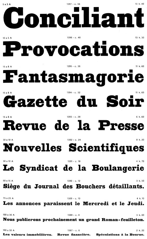
In 2005, Schwartz and Barnes’ Guardian included a masterful retelling of what an Egyptian could do in print with its wedge-shaped serifs, subtle weight contrast and proportions diverging from traditional, Figgins-esque slabs. With Stag, Schwartz takes that talent for new Antique forms even further. Commissioned for Esquire (and later expanded for Las Vegas Weekly), Stag conjures up an amalgamation of influences — the marked modulation of thicks and thins in George Trump’s Schadow or Robert Besley’s Clarendon; the interesting counterforms of Heinrich Jost’s bold faces for Beton; the rhythmic italic of Caslon’s two-line antique from the early 19th century, and this face Schwartz found in a Deberny & Peignot specimen from around 1835 — rolling them together into his own chunky recipe.
But Stag is no mere revival, it employs curious details, like the bracketing only on the outside of the serifs, with a giant x-height to create an completely new texture. This face sings like the fat lady in the heavy weights.
Christian Palino is a salty Cape Codder and currently a design strategist at Adaptive Path. He’s appeared in and written for various design publications and has taught courses on subjects including typography and service design at IUAV University of Venice, Domus Academy, and the Interaction Design Institute Ivrea.