Mountain Cabin by Marte.Marte Architects

Roughly hewn concrete gives a rocky texture to the walls of this Alpine holiday home by Austrian studio Marte.Marte Architects (+ slideshow).

Mountain Cabin by Marte Marte Architects

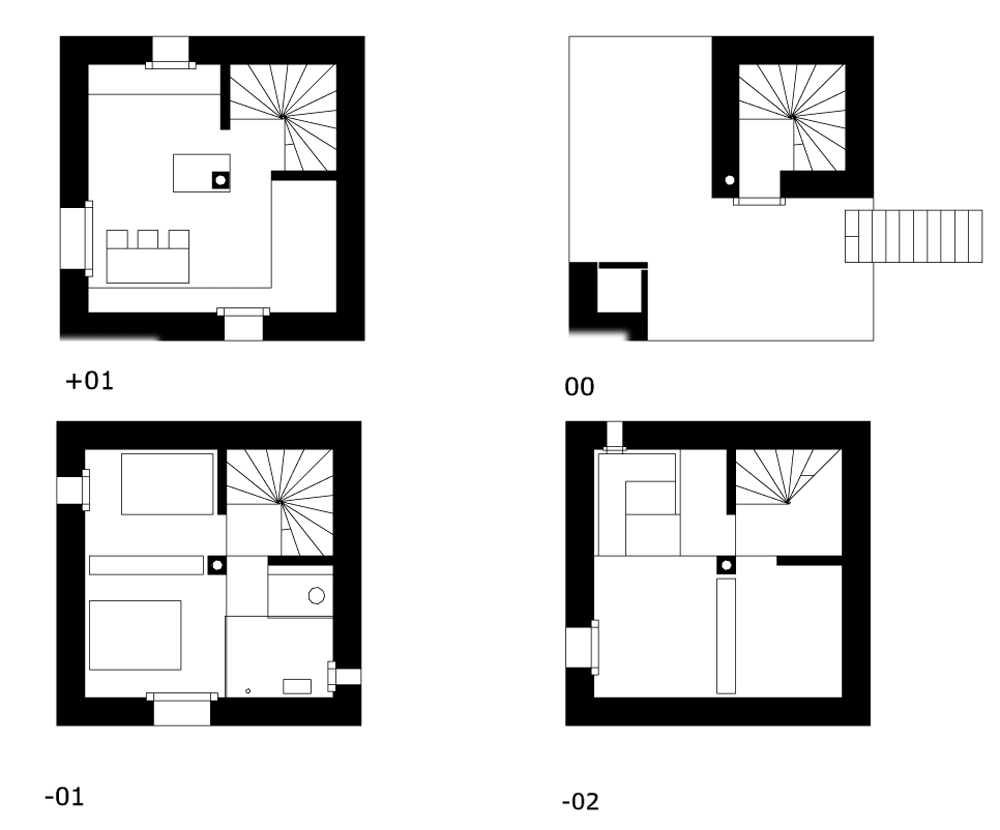
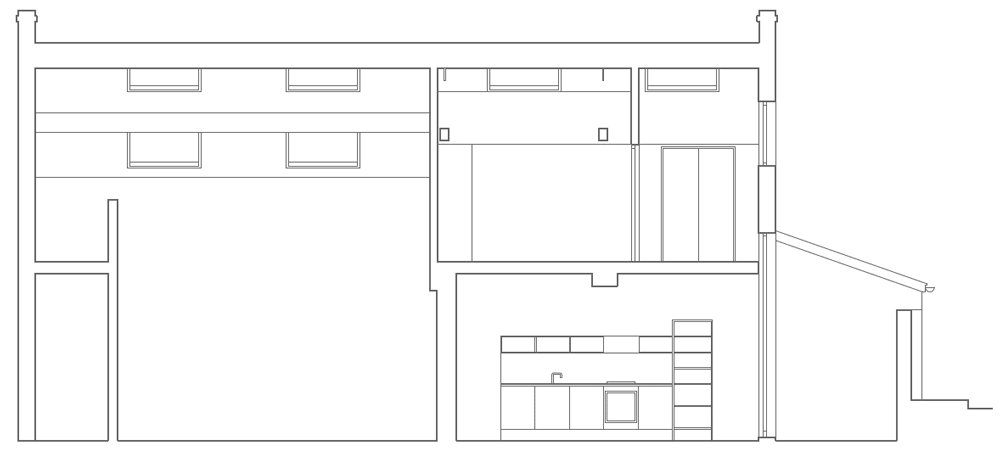
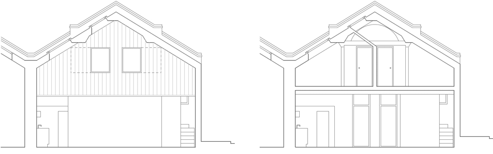
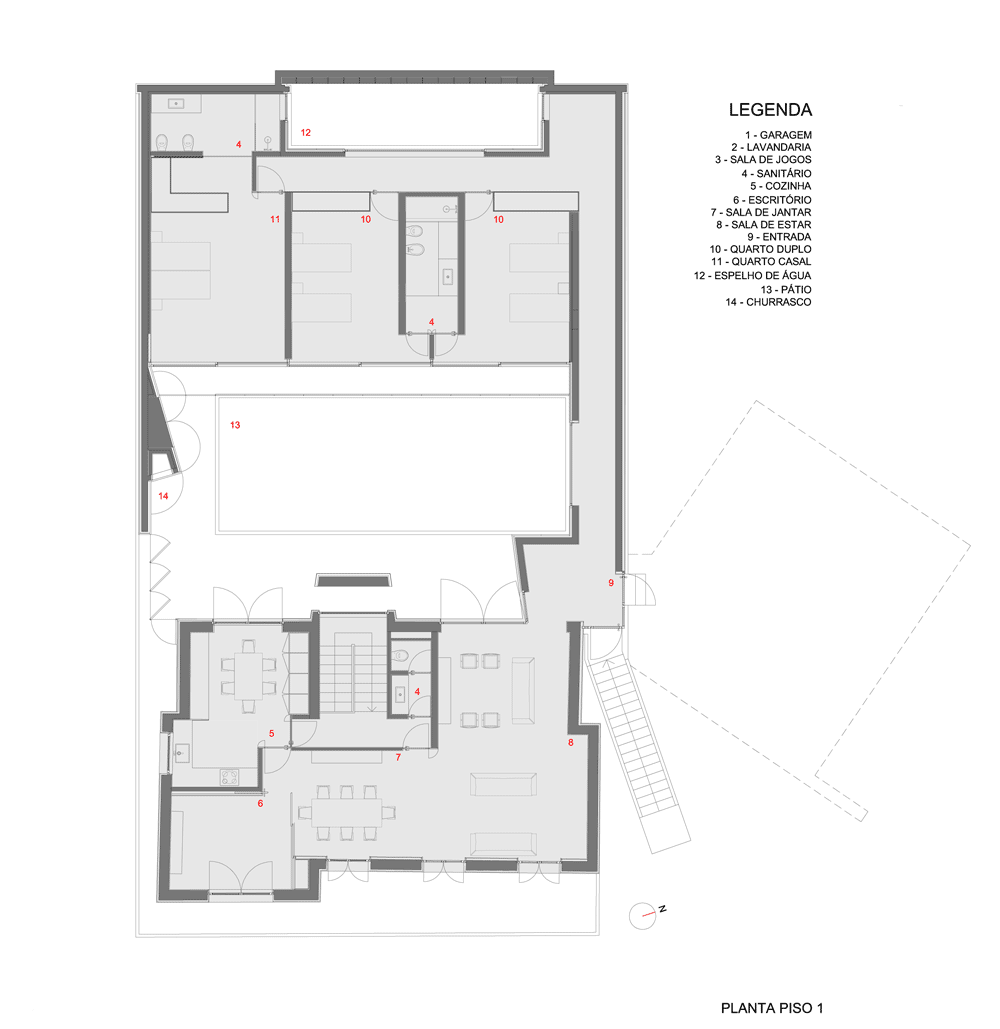
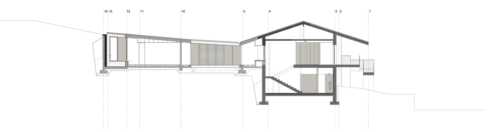
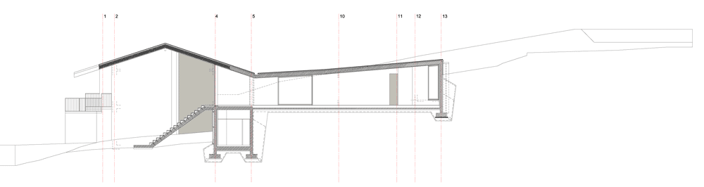
The four-storey Mountain Cabin was constructed by Marte.Marte Architects on the side of a hillside in Laterns, Austria, and boasts far-stretching views of the surrounding mountains and forests.

Mountain Cabin by Marte Marte Architects

Two rectangular openings wrap around the rectilinear body of the house, dividing it into two and creating a sheltered outdoor terrace on the upper-middle floor. This level functions as the building’s entrance and can be accessed via a staircase at the rear.

Mountain Cabin by Marte Marte Architects

A second staircase spirals down from this floor to bedrooms and storage areas on the lower levels and up to an open-plan kitchen and living room on the uppermost floor.

Mountain Cabin by Marte Marte Architects

Smooth concrete walls and ceilings are left exposed inside the house and contrast with the rugged surface of the facade. Floors, doors and window frames are oak, as is much of the furniture.

Mountain Cabin by Marte Marte Architects

Square windows are dotted around each elevation and are the only other interruption to the clean lines of the facade.

Mountain Cabin by Marte Marte Architects

“The openings punched into the double-walled concrete shell are transformed into framed landscape paintings,” says the studio, describing the views from the windows.

Mountain Cabin by Marte Marte Architects

We’ve published a few houses in the mountains of Austria, including a boxy concrete house surrounded by sloping meadows and a cabin built from locally sourced spruce, fir and elm. See more houses in Austria.

Mountain Cabin by Marte Marte Architects

Other winter retreats we’ve featured include a snowboarding cabin in Canada and a contemporary Alpine chalet. See more winter retreats on Dezeen.

Mountain Cabin by Marte Marte Architects

Photography is by Marc Lins.

Here’s a project description from Marte.Marte Architects:


Mountain cabin in Laternser valley

At the edge of a wooded ravine, beneath the imposing wooden house of the Catholic Community of Sisters, the small tower building rises from the steep hillside.

Mountain Cabin by Marte Marte Architects

Striking and modest in appearance, it stretches up out of a small hollow situated on a narrow path along the edge of the forest.

Mountain Cabin by Marte Marte Architects

The only change made to the hillside is the driveway and the terrain has been left in its original form.

Mountain Cabin by Marte Marte Architects

Fitting into the landscape as if it were a barn, the building, which is a fine example of the homogeneous use of materials, in this case, carefully hewn rough concrete, stands out against the meadow green and winter white. Its ashy-gray colour only contrasts slightly with the heavy oak front doors and the anthracite-coloured handrails blend in with the branches of the surrounding forest. As if they were punched into the walls, the square windows of different sizes are spread out across the walls, and their full effect is only achieved at the corners.

Mountain Cabin by Marte Marte Architects

The integration of the outer surfaces requested by the client is a kind of artifice. At the entry level, which is accessible via a flight a steps, the structure narrows down to two supporting corner columns, which not only provides guests with the unique opportunity to look through the building while at the same time enjoying a panorama view of the surrounding landscape, the whole time protected from the elements, but also lends the entrance a sense of significance.

Mountain Cabin by Marte Marte Architects

Inside the column, a spiral staircase connects the living area on the upper level with the two more private areas on the lower level, where the bedrooms and relaxation areas are interlocked like a puzzle. Semantically speaking, this gesture of the tower creates archetypes of fortified structures and abstract computer figures in your mind’s eye, making the tower seem familiar and strange at one and the same time.

Mountain Cabin by Marte Marte Architects

Inside, the openings punched into the double-walled concrete shell are transformed into framed landscape paintings by wide, matte solid oak window frames that do not take up much wall space. These framed windows direct the guest’s attention to the prominent mountain chain, the gentle slopes and the dense forest grove.

Mountain Cabin by Marte Marte Architects
Site plan

Besides the raw concrete surfaces and the untreated oak floors, doors and fixtures, the black metal surfaces complement the harmonious, austere combination of materials. The client and architects haven’t built a flimsy holiday house, but instead a place of retreat that will remain standing for generations, despite any forthcoming changes of climate and landscape.

Mountain Cabin by Marte Marte Architects
Floor plans – click here for larger image

Client: private
Planning: Marte.Marte Architekten
Location: 6830 Laterns-Vorarlberg-Austria
Site area: 485.4 sqm
Gross floor area: 102.6 sqm
Floor area: 87 sqm
Built-up area: 43.03 sqm

Mountain Cabin by Marte Marte Architects
Cross section

The post Mountain Cabin by
Marte.Marte Architects
appeared first on Dezeen.

Residence of Daisen by Keisuke Kawaguchi+K2-Design

This guest house consists of interconnected boxes that meander between the trunks of cherry and pine trees in a forest near Yonago City, Japan (+ slideshow).

dezeen_ Residence of Daisen by Keisuke Kawaguchi+K2-Design_1

Architect Keisuke Kawaguchi designed the house to fit into gaps between the existing trees, taking advantage of the available space without disrupting the natural surroundings.

dezeen_ Residence of Daisen by Keisuke Kawaguchi+K2-Design_8

“Sensitive dialogue with the site is requisite to building a house that lies in coexistence with nature,” says Kawaguchi. “Our building plan was drafted according to this idea.”

dezeen_ Residence of Daisen by Keisuke Kawaguchi+K2-Design_15

Roofs pitched at different angles squeeze beneath tree branches and add to the building’s staccato aesthetic, while short corridors link the functional spaces.

dezeen_ Residence of Daisen by Keisuke Kawaguchi+K2-Design_3

The largest volume contains a living space with double-height windows looking out onto a series of terraces and the forest beyond.

dezeen_ Residence of Daisen by Keisuke Kawaguchi+K2-Design_6

The house is raised off the ground on pillars to prevent snow from drifting against it in winter, and to stop moisture and heat from the ground penetrating the floors in summer.

dezeen_ Residence of Daisen by Keisuke Kawaguchi+K2-Design_10

Other architecture projects built in forests include a series of woodland cabins in Portugal, a tiny folly that pokes out from between trees at the edge of a pond in England, and a raised walkway that winds around tree trunks in an Estonian forest.

dezeen_ Residence of Daisen by Keisuke Kawaguchi+K2-Design_13

We recently created a Pinterest board with all our stories about Japanese houses, including one comprising five connected cottages in a forest and another with two trees installed in its living room.

dezeen_ Residence of Daisen by Keisuke Kawaguchi+K2-Design_16

Photography is by Koji Fujii.

Here’s some more information from the architect:


This is a guest house located in the forest of Daisen piedmont, Yonago City, Tottori Prefecture.

dezeen_ Residence of Daisen by Keisuke Kawaguchi+K2-Design_2

The house site is situated in the midst of abundant cherry and pine trees, standing at natural well-balanced intervals with trunks reaching towards the sky with bountiful leaves. The figures of the trees are beautiful. They are the legitimate habitants of the forest.

dezeen_ Residence of Daisen by Keisuke Kawaguchi+K2-Design_7

Sensitive dialogue with the site is requisite to building a house that lies in coexistence with nature. Our building plan was drafted according to this idea.

dezeen_ Residence of Daisen by Keisuke Kawaguchi+K2-Design_4

We arranged the house with most surrounding trees untouched and ensured the living space in the aperture to a maximum extent.

dezeen_ Residence of Daisen by Keisuke Kawaguchi+K2-Design_11

A style coexisting with the forest is the keystone of our design, so we carefully surveyed and analyzed the lot for building, and designed a way to connect each function space of the house by short connecting passages.

dezeen_ Residence of Daisen by Keisuke Kawaguchi+K2-Design_12

Differently-pitched roofs snuggling up to the extension of branches and foliage made it possible to take in sunlight effectively.

dezeen_ Residence of Daisen by Keisuke Kawaguchi+K2-Design_9

In Daisen we have almost two metres of snowfall in winter, so we adopted a piloti style with living spaces on the second floor in order to allow ample cross-breeze, while also reducing moisture and heat rising from the ground in summer. These considerations made it possible to maintain comfortable living conditions in all seasons.

dezeen_ Residence of Daisen by Keisuke Kawaguchi+K2-Design_14

The forms and colours of the forest seen from each room are as deep as the eye can see. Bright (red), tangible (white), obscure (blue), dark (black) – we may call them the colours of the day.

dezeen_ Residence of Daisen by Keisuke Kawaguchi+K2-Design_17
Ground floor plan

The changing seasons create a bountiful, colourful composition! How satisfying is the abundance of passing time that the forest beats when living in this house!

dezeen_ Residence of Daisen by Keisuke Kawaguchi+K2-Design_18
First floor plan

Even after the house completes its life in the future, the forest around it would continue on.

dezeen_Residence of Daisen_61
Elevation – click for larger image

Finally, our primary endeavour, coexisting with the forest, would be fulfilled.

dezeen_ Residence of Daisen by Keisuke Kawaguchi+K2-Design_18
Elevation section detail – click for larger image

The post Residence of Daisen by Keisuke
Kawaguchi+K2-Design
appeared first on Dezeen.

House for a Painter by Dingle Price Architects

London architect Dingle Price has revamped a warehouse in Hackney to create a bright spacious home and studio for a painter and his family.

House for a Painter by Dingle Price Architects

Dingle Price began by stripping the interior of the old Victorian warehouse where the artist and his wife had already been living for several years. Making use of an existing mezzanine, the architect divided the space in half to create two-storey living quarters on one side and a double-height studio on the other.

House for a Painter by Dingle Price Architects

“This idea of subdividing the space into equal parts led to a concept of inserting a house within the studio,” Price told Dezeen. “The position of the existing mezzanine decided which half would be which.”

House for a Painter by Dingle Price Architects

North-facing skylights allow daylight to flood the inside of the studio, where high ceilings offer enough room for several large canvases.

House for a Painter by Dingle Price Architects

Windows puncture the partition wall so residents can look into the studio from their two upstairs bedrooms.

House for a Painter by Dingle Price Architects

“It’s quite an internalised world,” said Price. “When you’re in there you don’t really look out. It’s a kind of internal landscape where, instead of looking at a landscape, you’re looking across a sequence of spaces.”

House for a Painter by Dingle Price Architects

Walls and ceilings are plastered white throughout and there are a mixture of both painted and exposed pine floorboards.

House for a Painter by Dingle Price Architects

Other artists’ studios to feature on Dezeen include a series of buildings on a Canadian island and a faceted house and studio for an artist in Spain.

House for a Painter by Dingle Price Architects

Photography is by Ioana Marinescu.

Here’s a project description from Dingle Price:


House for a Painter

Attracted by the large volume and excellent natural light, the artist and his wife lived and worked in this warehouse building in an ad hoc manner for some years, before the arrival of their first child necessitated a more formal inhabitation.

House for a Painter by Dingle Price Architects
Ground and first floor plans – click here for larger image

Dingle Price Architects proposed the insertion of a two storey house with a front facade overlooking and animating the studio space which attains the character of a small piazza or garden, a feeling further enhanced by the large landscape paintings in progress.

House for a Painter by Dingle Price Architects
Long section – click here for larger image

The design draws on the symmetrical character of the existing building to provide a series of interconnected rooms of varied scale and proportion. The existing interior consisted principally of white plastered walls, and both unfinished and white painted pine floorboards. Rather than introducing new materials, we chose to adopt and extend the use of this palette – staircase and cabinetry are constructed from southern yellow pine planks, and the elevation of the residence if partially clad in painted pine boards of a matching width to the floorboards.

House for a Painter by Dingle Price Architects
Cross sections – click here for larger image

Whilst the residence can be entirely or partially closed off from the studio when necessary, opening the doors and shutters reveals scenic views across the internal landscape.

House for a Painter by Dingle Price Architects
Concept sketch

The post House for a Painter by
Dingle Price Architects
appeared first on Dezeen.

32 houses in Poitiers by Lanoire & Courrian

Metal trellises offer a framework for climbing plants and vines around these recently completed houses in Poitiers, France, by Bordeaux studio Lanoire & Courrian (+ slideshow).

32 houses in Poitiers

Lanoire & Courrian has added 32 residences in the suburban district of Bel Air, including 22 rental properties and 10 houses for sale. Arranged in two rows, the houses create new streets that branch off a realigned Rue des Frères Morane.

32 houses in Poitiers

Each of the houses is clad with corrugated metal, which has been powder-coated in shades of grey and lilac. Timber fencing lines the base of the walls and marks the borders of each property.

32 houses in Poitiers

Rather than position the houses evenly, the architects used a staggered arrangement to break up the facades and create natural recesses. Narrow passageways were added between houses to offer visual corridors.

32 houses in Poitiers

“We imagined the project as a series of strips on a plot,” say the architects. “The idea is to have an overall geometry of buildings and vegetation.”

32 houses in Poitiers

A secondary road scoops in through the centre of the site, leading to some entrances and allowing access to driveways. Houses without driveways can make use of an underground car park with its entrance on Rue des Frères Morane.

32 houses in Poitiers

“We wanted to create an island that is both an intimate space and a porous and fluid space, allowing different modes of travel with respect to both the outside and inside,” add the architects.

32 houses in Poitiers

The houses follow a standard layout, with living rooms on the ground floor and bedrooms upstairs. Each residence also comes with a garden and a small shed.

32 houses in Poitiers

Other housing projects we’ve featured in France include a timber-clad retirement home near Paris and a social housing complex in Saint-Gilles Croix de Vie with camouflage print on its walls.

32 houses in Poitiers

See more housing projects »
See more architecture in France »

32 houses in Poitiers
Site plan overview

Photography is by Stephane Chalmeau.

32 houses in Poitiers
Site plan overview
32 houses in Poitiers
Ground floor plan – click for larger image
32 houses in Poitiers
First floor plan – click for larger image
32 houses in Poitiers
Site section one – click for larger image
32 houses in Poitiers
Site section two – click for larger image

The post 32 houses in Poitiers
by Lanoire & Courrian
appeared first on Dezeen.

Tinshed by Raffaello Rosselli

Australian architect Raffaello Rosselli has repurposed a corroding tin shed in Sydney to create a small office and studio apartment (+ slideshow).

Tinshed by Raffaello Rosselli
Photograph by Richard Carr

Rather than replace the crumbling structure, Raffaello Rosselli chose to retain the rusty corrugated cladding of the two-storey building so that from the outside it looks mostly unchanged.

Tinshed by Raffaello Rosselli

“The humble tin shed is an iconic Australian structure,” he explains. “As the only remaining shed in the area it is a unique reminder of the suburb’s industrial past.”

Tinshed by Raffaello Rosselli

The architect began by taking the building apart and replacing its old skeleton with a modern timber frame. He then reattached the cladding over three facades, allowing room for three new windows.

Tinshed by Raffaello Rosselli

The frames of the windows are made from sheets of Corten steel that display the same orange tones as the retained facade. “The materials have been left raw and honest, in the spirit of its industrial economy,” adds Rosselli.

Tinshed by Raffaello Rosselli

In contrast with the exterior, the inside of the building has a clean finish with white walls and plywood floors in both the ground-floor living space and the first-floor office.

Tinshed by Raffaello Rosselli

Photography is by Mark Syke, apart from where otherwise indicated.

Tinshed by Raffaello Rosselli

Here’s a project description from Raffaello Rosselli:


Tinshed

The humble tin shed is an iconic Australian structure. The project was to repurpose an existing tin shed at the rear of a residential lot, in the inner-city suburb of Redfern, Sydney.

Tinshed by Raffaello Rosselli
Photograph by Richard Carr

Located on a corner the existing shed was a distinctive building, a windowless, narrow double-storey structure on a single-storey residential street. As the only remaining shed in the area it is a unique reminder of the suburb’s industrial past.

Tinshed by Raffaello Rosselli
Original building

The project brief was to create a new use for the building as an office space and studio. The shed in its current state was dilapidated and structurally unsound. The original tin shed was disassembled and set aside while a new timber frame was erected. The layers of corrugated iron accumulated over generations of repair were reassembled on three facades.

Tinshed by Raffaello Rosselli
Ground and first floor plans – click here for larger image

Corten steel window boxes cut through the form and extend out over the lane and street, opening up the once windowless space. The materials have been left raw and honest, in the spirit of its industrial economy. The west face was clad in expressed joint fibre-cement panels, while plywood floors and joinery add warmth to the interior.

Tinshed by Raffaello Rosselli
Cross section – click here for larger image

The project embraces that it will continue to change with time through rust, decay and repair.

Tinshed by Raffaello Rosselli
Long section – click here for larger image

Designer: Raffaello Rosselli
Location: Sydney, Australia
Year: 2011

Tinshed by Raffaello Rosselli
Elevations – click here for larger image

The post Tinshed by
Raffaello Rosselli
appeared first on Dezeen.

BT House by Studio Guilherme Torres

A bulky concrete first floor balances above pale brick walls and tall grasses at this family house in Brazil by São Paulo architect Guilherme Torres (+ slideshow).

BT House by Studio Guilherme Torres

The two-storey house in Maringá has a square ground floor plan, while its upper floor is an offset rectangular volume that gently cantilevers over the edge of one wall.

BT House by Studio Guilherme Torres

Unlike the opaque brick walls of the lower level, this top floor is clad with latticed mashrabiya screens that bring light and ventilation into the family’s bedrooms, but also maintain privacy.

BT House by Studio Guilherme Torres

Guilherme Torres explains: “As soon as I saw the gently sloped plot surrounded by other houses, the idea of this large panel came to me, to ensure privacy for both the residents and their neighbours.”

dezeen_BT House by Studio Guilherme Torres_

The ground floor is split into two parts, with a large courtyard and swimming pool between. One half contains living and dining rooms, while the other functions as a pool house with a pair of changing rooms and an additional dining area.

BT House by Studio Guilherme Torres

Various furniture pieces by Torres are dotted through the building, alongside a selection of items by other Brazilian designers. “The decoration follows a jovial and Brazilian style,” explains the studio.

BT House by Studio Guilherme Torres

Landscape architect Alex Hanazaki designed the setting for the building, adding the Texan pampas grass that brushes against the outer walls.

BT House by Studio Guilherme Torres

We’ve featured a few concrete houses from Brazil recently. Others include a long and low residence near São Paulo and a house with a sunken living room and courtyard.

BT House by Studio Guilherme Torres

See more Brazilian houses on Dezeen »
See more residential architecture »

BT House by Studio Guilherme Torres

Photography is by Denilson Machado.

Here’s a project description from Studio Guilherme Torres:


BT House

São Paulo-based architect Guilherme Torres has developed ideas which fuse the modern and the traditional. Guilherme’s own house, designed by the architect himself, bears a chequered wood design, a kind of brise soleil called mashrabiya, which is a classic feature in Eastern architecture.

BT House by Studio Guilherme Torres

It was later assimilated by the Portuguese, who brought it to Brazil. This element, with its powerful aesthetic appeal, was adapted to this residence in the south of the country, and acts as a wooden ‘curtain’, allowing air flow, dimming light and also serving as a security feature.

BT House by Studio Guilherme Torres

“As soon as I saw the gently sloped plot surrounded by other houses, the idea of this large panel came to me, to ensure privacy for both the residents and their neighbours.” This monumental house stands out as a huge rectangular monolith with two large brickwork blocks in contrast with the upper volume in concrete. A few columns, huge spans and strategic walls create exquisite fine gardens that make up a refuge for this young couple and their two small children.

BT House by Studio Guilherme Torres

The decoration follows a jovial and Brazilian style with an alliance of Guilherme Torres’ design, including sofas and tables, and other great names of Brazilian design such as furniture designed by Sérgio Rodrigues and Carlos Motta. The composition of overlapping these Brazilian styles with international design is balanced by pieces from Tom Dixon and Iranian carpets, all sourced by the architect.

The garden, designed by Alex Hanazaki has given the house an ethereal atmosphere due to the movement of Texan plume grass.

BT House by Studio Guilherme Torres
Ground floor plan – Click for larger image
BT House by Studio Guilherme Torres
First floor plan – Click for larger image

The post BT House by
Studio Guilherme Torres
appeared first on Dezeen.

C. F. Møller designs world’s tallest wooden skyscraper

News: Scandinavian firm C. F. Møller has revealed proposals that could see the world’s tallest timber-framed building constructed in Stockholm.

As one of three shortlisted proposals in a housing design competition, the 34-storey Wooden Skyscraper is presented by architect C. F. Møller, architect Dinell Johansson and consultant Tyréns as a vision of future housing that would be cheaper, easier and more sustainable than typical steel and concrete constructions.

Wooden Skyscraper by C. F. Møller

“The main reason it hasn’t been done before is that concrete and steel have a big part of the market,” C. F. Møller architect Ola Jonsson told Dezeen. “But now the building industry has started taking responsibity for the environment.”

He continued: “Construction accounts for around 30-40 percent of CO2 produced in the world globally and if you look at the CO2 released in the production of wood it is a lot better than steel or concrete.”

Wooden Skyscraper by C. F. Møller

According to Jonsson, using wood could even be a cheaper alternative, as it is a lighter material that costs far less to transport. It is also more fire-resistant than steel or concrete.

“We have a long history of building wooden structures in Sweden,” he explains. “We have a higher knowledge of how to use the wood those days and we know that glued or nailed wood does have very strong construction qualities.”

Wooden Skyscraper by C. F. Møller

If built, the 34-storey building would exceed the height of the nine-storey Murray Grove tower in London, as well as a proposed 20-storey tower in Vancouver by architect Michael Green and a Swedish tower approved at 30 floors. “I’ve seen sketches of other buildings, but we are definitely at the highest end of this discussion,” said Jonsson.

Wooden pillars, beams, walls, ceilings and window frames will all be visible through the building’s glass facade. The presented designs also include a concrete core, although Jonsson says this could be replaced with wood. “We believe a modern building should use every material for its best purpose,” he adds.

Wooden Skyscraper by C. F. Møller
Typical floor plan – click for larger image

The winning entry in the competition, organised by Swedish building society HSB Stockholm, is scheduled to open in 2023 to coincide with the organisation’s 100th birthday. Anyone can vote for the winner using the HSB Stockholm Facebook page.

Other projects by C. F. Møller include an art and craft museum completed recently in Norway and a centre for entrepreneurs with a green fibre-cement staircase.

Wooden Skyscraper by C. F. Møller
Concept section – click for larger image

See more architecture by C. F. Møller »
See more skyscrapers »

Here’s some more information from C. F. Møller:


Wooden Skyscraper

For HSB Stockholm’s architectural competition 2023, three teams of architects have produced innovative proposals for private residences of the future at three different locations in the centre of Stockholm. Berg | C.F. Møller’s proposed design is a 34-storey skyscraper made of wood.

Berg | C.F. Møller Architects are working in partnership with architects Dinell Johansson and consultants Tyréns on their entry. The team has chosen to build upwards, and has designed a 34-storey residential building, which will be seen for miles.

The building will be built over a wooden construction with a concrete core, and it is intended to give the people of Stockholm a new and characteristic beacon and meeting place in their city.

Back to basics

Wood is one of nature’s most innovative building materials: the production has no waste products and it binds CO2. Wood has low weight, but is a very strong load-bearing structure compared to its lightness.

Wood is also more fire resistant than both steel and concrete. This is due to 15% of wood mass being water, which will evaporate before the wood actually burns. In addition, logs get charred which protects the core.

Wood secures a good indoor climate, perfect acoustics, helps regulating the inside temperature and can be exposed without being covered with plaster or other costly materials.

In Berg | C.F. Møller’s wooden skyscraper, the pillars and beams are made of solid wood. Inside the apartments, all the walls, ceilings and window frames are made of wood as well and will be visible from the exterior through the large windows.

Sustainable

Social and environmental sustainability is integrated into the project. Each apartment will have an energy-saving, glass-covered veranda, while the building itself will be powered by solar panels on the roof. At street level there is a café and childcare facility. In a new community centre, local people will be able to enjoy the benefits of a market square, fitness centre and bicycle storage room. A communal winter garden will provide residents with an opportunity to have allotment gardens.

All three design proposals are available on HSB Stockholm’s Facebook page. Here you can vote for your favourite and thus play your part in determining how private homes in Stockholm will look in the future.

About the competition

HSB Stockholm – Sweden’s largest building society – is 100 years old in 2023. At that time an ultra-modern residential high-rise building will be completed in Stockholm city. Three architectural teams are now preparing the competitive proposals for the spectacular house that will be placed at one of three different sites in Stockholm.

Berg | C.F. Møller Architects is working together with architects Dinell Johansson and the urban planning consultancy Tyréns. The other two competing teams are Equator Stockholm with Mojang (Minecraft) and Utopia Architects with Rosenberg Architects.

The post C. F. Møller designs world’s tallest
wooden skyscraper
appeared first on Dezeen.

House T by Takeshi Hamada

This plain white house in Osaka Prefecture was designed by Japanese architect Takeshi Hamada to look as simple as a block of tofu (+ slideshow).

House T by Takeshi Hamada

The three-storey residence was created for a family, who asked Takeshi Hamada for a basic rectilinear house “like a block of tofu” with lots of natural light and a living room on the ground floor.

House T by Takeshi Hamada

To achieve this, the architect designed a white-rendered building with windows on its sides rather than its front, then added a triple-height living room at the centre of the plan.

House T by Takeshi Hamada

Windows surround the living room on two of its walls, while glass doors lead out to a secluded courtyard beyond.

House T by Takeshi Hamada

Three bedrooms are located in the corners of the first floor, connected by balcony corridors that overlook the room below.

House T by Takeshi Hamada

“The design features a high ceiling above the living room to bring the light from the garden area into the house and at the same time create a continuum between the upper and lower floors,” says Hamada.

House T by Takeshi Hamada

Staircases and ramps inside the bedrooms lead to mezzanine lofts at the top of the house, where residents can also look down to the ground floor.

House T by Takeshi Hamada

“Some of the loft space is exposed through the atrium and some is closed, so there is an adjustable connection between public and private space,” adds the architect.

House T by Takeshi Hamada

House T is one of several houses Takeshi Hamada has completed and named with a letter. Others include House A, which has a stark concrete multi-purpose space on its ground floor, and House K, which features an arched entrance.

House T by Takeshi Hamada

See more houses by Takeshi Hamada »
See more houses in Japan »

House T by Takeshi Hamada

Photography is by Yohei Sasakura.

Here’s a project description from Takeshi Hamada:


House T

The site is in a quiet residential suburb on the outskirts of Osaka Prefecture. It is nearly 34 ‘tsubo’ in area, (111.67 sqm), completely surrounded by other properties except a 4 metre section directly north, which faces a narrow side road.

House T by Takeshi Hamada

The client requested the following three things. First of all, the house must be full of light! Next, the exterior must be extremely simple – like a block of tofu. Finally, the plumbing fixtures and living room must be on the ground floor.

House T by Takeshi Hamada

According to these requests, and after judging the piece of land, I decided on a plan for a house that opened out widely on the south side. By then closing the plan completely on the north side, a simple exterior was achieved, with a light and open interior. The first floor contains the living and dining areas, a tatami mat room, kitchen, bath and laundry areas. The living room and tatami room surround the private garden. The design features a high ceiling above the living room to bring the light from the garden area into the house and at the same time create a continuum between the upper and lower floors.

House T by Takeshi Hamada

On the second floor are the main bedroom and children’s rooms. Each of the rooms has a loft space and attic storage space. Some of the loft space is exposed through the atrium and some is closed, so there is an adjustable connection between public and private space. The atrium provides a continuum between the public first floor and private second floor.

House T by Takeshi Hamada

The central living area with two atrium spaces, a bridge and lofts link to form a complex labyrinth.

House T by Takeshi Hamada

Name of construction: House T
Location: Osaka Prefecture, Neyagawa City
Period of construction: August, 2012 to December, 2012
Extent of structure: wooden construction, two-storey

House T by Takeshi Hamada

Land area: 111.67 sqm
Building area: 64.85 sqm
Total floor area: 1110.65 sqm (first floor: 61.59 sqm, second floor: 49.09 sqm)

House T by Takeshi Hamada
Floor plans – click for larger image
House T by Takeshi Hamada
Cross sections – click for larger image

The post House T by
Takeshi Hamada
appeared first on Dezeen.

NP House in Vila Nova de Famalicão by NOARQ

Architecture studio NOARQ has doubled the size of a house in northern Portugal by extending its rooftop into the hillside (+ slideshow).

NP House by NOARQ

The resident family of four had outgrown its home in Vila Nova de Famalicão and asked Portuguese architect José Carlos Nunes de Oliveira of NOARQ to give them more space, as well as a garage.

NP House by NOARQ

The architect began by removing partitions in the existing house to create larger rooms. He then replaced any lost rooms in a new structure inserted between the house and the inclining landscape.

NP House by NOARQ

“The proposal harnesses the most important pre-existing element, the roof, and uses the force in its profile to merge into the woods,” he says.

NP House by NOARQ

Living and dining rooms are all accommodated in the original house, while three bedrooms are contained in the extension.

NP House by NOARQ

A protected terrace is slotted between the new and old structures with a corridor running along one of its sides. Residents can directly access the courtyard from various rooms, plus a set of pivoting Corten-steel doors leads out to the surrounding garden.

NP House by NOARQ

The garage, with room for up to three cars, sits at the lowest level of the site and is flanked by a retaining wall of pale stone.

NP House by NOARQ

Other Portuguese houses we’ve featured on Dezeen include a row of stables converted into a summer retreat and a set of cabins in a woodland park. See more residences in Portugal.

NP House by NOARQ

Here’s more text from NOARQ:


NP House

The project was for the extension and renovation of a single family house with 262.09 square metres of gross floor area, to adjust to the actual needs of comfort for a family of four persons and the housing laws and rules of construction and building regulations.

NP House by NOARQ

The building was currently in the middle of a great mass of trees, as a mark. The housing consists of two floors, the ground-floor dedicated to service functions and garage, and the top floor exclusively dedicated to housing.

NP House by NOARQ

Without questioning the value of the pre-existence, the proposal maintains the current volume, offering the services and the social spaces of the family.

NP House by NOARQ

The expansion develops in the direction of the slope (west), where it opens a space for external expansion, contained in the far west area of the new rooms and the corridor north by stitching both areas of housing.

NP House by NOARQ

Adjacent to the house at the ground-floor is nesting in the back of the hill, the garage, hidden under a coating plant.

NP House by NOARQ

The intervention is in essence an extension of each of the habitable areas, increasing the number of existing health services (maintaining the same number of rooms), yielding a total gross area of 469.11 square metres.

NP House by NOARQ

The landscape was the subject of major concern. The new emerges organically from the old. The building emerges as a root that grows, goes through the ground and anchors to life on earth.

NP House by NOARQ

On the point of view of language the proposal harnesses the most important pre-existing element – the roof – using the force in its profile to redesign and merge into the woods.

NP House by NOARQ

The house is raised on a structural system of walls, retaining walls and reinforced concrete slacks interspersed with faces of masonry. Interior floors have wood flooring American pine, with the exception of the service rooms cover with stony coverings. The garage and the den’s floor is in epoxy and the exterior spaces cover by wooden deck.

NP House by NOARQ

The entire building will be covered by an acrylic plaster reinforced with glass fiber network cladding clipped (ventilated wall system). The roof will be in zinc. The interior walls and ceilings are plastered and painted or plaster according to the spatial and functional requirements of each compartment.

NP House by NOARQ
Ground floor plan – click for larger image
NP House by NOARQ
First floor plan – click for larger image
NP House by NOARQ
Cross section – click for larger image
NP House by NOARQ
Cross section – click for larger image

The post NP House in Vila Nova de Famalicão
by NOARQ
appeared first on Dezeen.

Clear Lake Cottage by MacLennan Jaunkalns Miller Architects

This lakeside lodge in rural Ontario was designed by Toronto firm MacLennan Jaunkalns Miller Architects as a weekend retreat for a family of five (+ slideshow).

Clear Lake Cottage by MacLennan Jaunkalns Miller Architects

Clear Lake Cottage has a long narrow body with a metal-clad exterior and a hipped roof. It sits around 15 metres from the edge of the water and is tucked behind a cluster of trees.

Clear Lake Cottage by MacLennan Jaunkalns Miller Architects

Replacing a smaller structure with a tin roof, MacLennan Jaunkalns Miller Architects (MJMA) was asked to design a residence that would open out to the landscape as freely as it predecessor.

Clear Lake Cottage by MacLennan Jaunkalns Miller Architects

“The goal was to blend with the rural character of the quiet lake community and provide a clean modern environment that engages the landscape and captures a ‘cottage’ feel,” explain the architects.

Clear Lake Cottage by MacLennan Jaunkalns Miller Architects

The building is orientated eastwards to maximise views towards Clear Lake. This elevation is also stretched outward at the corners, giving the building a trapezoidal plan.

Clear Lake Cottage by MacLennan Jaunkalns Miller Architects

Rooms inside are divided into two rows, determined by different privacy requirements. Living rooms and a master bedroom are positioned along the front of the house, where they benefit from lake views, while extra bedrooms are lined up along the rear and include a first-floor loft inserted beneath the peak of the roof.

Clear Lake Cottage by MacLennan Jaunkalns Miller Architects

The smallest of two terraces sits within a recess on the eastern elevation, where it can catch the sun at breakfast time, and the second wraps around the north-east corner to provide an outdoor space beyond the living room.

Clear Lake Cottage by MacLennan Jaunkalns Miller Architects

The architects used Douglas fir to construct the angled roof, then clad the exterior walls in black corrugated metal as a reference to tar-painted fishing shacks. “The result is decidedly modern, but raw and industrial too,” they add.

Clear Lake Cottage by MacLennan Jaunkalns Miller Architects

See more Canadian houses on Dezeen, including one that appears to be climbing up a hill and one with patterned walls of concrete brick.

Clear Lake Cottage by MacLennan Jaunkalns Miller Architects

Photography is by Ben Rahn at A Frame Photography.

Read on more more details from MJMA:


Clear Lake Cottage

A Toronto family of five required a new four-season cottage to replace their existing 1950’s structure. The goal was to blend with the rural character of the quiet lake community and provide a clean modern environment that engages the landscape and captures a ‘cottage’ feel.

The site is located on Clear Lake in Seguin Township, Ontario. The lot has a large frontage and an existing dock. The orientation is predominately to the east collecting warmth and direct light in the morning. The building sits quietly behind trees away from the water.

Clear Lake Cottage by MacLennan Jaunkalns Miller Architects

Outside of their direct program requirements there were two related and compelling goals the clients wanted to achieve. First they wanted all the benefits of modern design: clean lines, abundant natural light, connection with the outdoors; but they also wanted to blend contextually with the character and humility of the surroundings. Secondly, although they requested a winterised facility, they did not want to lose the connection with the land they had come to appreciate in their uninsulated, tin-roofed dwelling.

It was decided a peaked sloped roof would be used. This could achieve an ambiguously modern vernacular feel and was beneficial for snow and water shedding. Termed the ‘Campsite’ [like tents around a campsite]. This approach yielded interesting opportunities to define exterior spaces. To meet the budget a singular and rational peaked roof system was employed – ‘the Bigtop’. A single tent pole supporting a giant hip roof housed the volumes below.

The program was consolidated into 4 logical masses: Master Suite, Bedrooms, Utility/Den and Living Space. These masses we arranged in terms of degree of privacy required; north to south. It was then determined which spaces would have forest views and which would have lake views. The masses were arranged to frame exterior spaces and capture an ambiguous indoor/outdoor condition. The plan was rationalised as a rectangle then skewed to a trapezoidal shape to maximise the lake front exposure.

Clear Lake Cottage by MacLennan Jaunkalns Miller Architects

The resulting formal expression of the building expressed an archetypal ‘house’ quality. Roof and walls merge in a singular streamline form. This form captures within it outdoor spaces creating a spatial continuum inside and out. The massing along the forest side became connected above by an open loft space. This bedroom/utility bar is treated as a stained pine slat ‘Black Box’ and is an extension of the materiality of the exterior.

Punctures to the building envelope, and exposure of the Douglas Fir roof and wall structure capture outdoor space, and create a spatial continuum – a porosity of inside to out.

Taking cues from the client’s fondness for Scandinavian fishing shacks, with their pine tar-painted cedar, the building is clad in black corrugated metal, a cost effective North American interpretation of this shoreline aesthetic. The result is decidedly modern, but raw and industrial too.

This approach to a ‘high and low’ material palette and divergent typologies is a strategy to disarm the precious nature of ‘designed’ space.

Clear Lake Cottage by MacLennan Jaunkalns Miller Architects
Site plan – click for larger image

The interior is detailed to contrast the exterior black cladding. The interior material palette of Sapelle window frames, retroplate concrete floors, and Douglas Fir plywood works as a visual counterpoint to the dark, textured exterior finish. This conceptual reading reinforces the Scandinavian influence.

Douglas Fir plywood was selected based on the client’s preference for a non-drywall interior shell. Exposed areas of Douglas Fir framing are either open to above (morning terrace) or clad with smoke-tinted corrugated acrylic (arrival spaces).

The rooms along the forest side support an upper open loft space. This bedroom/utility bar is treated as a stained oak ‘Black Box’ and is an extension of the materiality of the exterior – signifying enclosure.

The screened porch has a bi-folding partition opening it to the cottage interior. 50% of the glazed envelope can be left in the ‘open’ screened position allowing for the cottage to be exposed to breeze, fragrances, acoustics, and shadow play – capturing the natural feel of the site.

Clear Lake Cottage by MacLennan Jaunkalns Miller Architects
Floor plans – click for larger image

Location: Township of Sequin, Ontario, Canada
Architect: MacLennan Jaunkalns Miller Architects (MJMA)
Year completion: summer 2012
Project size: 215 sqm

The post Clear Lake Cottage by MacLennan
Jaunkalns Miller Architects
appeared first on Dezeen.