London architect Ben Nightingale has renovated a Victorian property he owns in Hackney, transforming three separate flats into a large family home featuring a double-height library and an attic playroom.
Ben Nightingale, one of the co-founders of Kilburn Nightingale Architects, bought the four-storey house on Greenwood Road to provide a family home for his wife and their three young daughters.
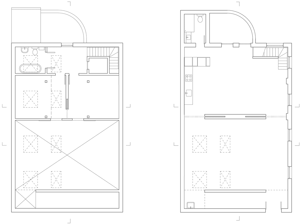
The building had previously been converted into three separate flats, meaning Nightingale had to completely re-plan the layout. This included removing existing walls, creating openings in the floor and rebuilding the original staircase.
“This project shows how a typical Victorian home can be opened up for more flexible use by a family, and also be adapted to positively reduce the carbon footprint,” Nightingale told Dezeen.
“The layout breaks down the traditional horizontal layering of this type of house, and the addition of a number of different types of insulation, photovoltaics and solar thermal panels greatly improve the energy efficiency,” he added.
Like many of London’s townhouses, the building has two storeys accessible from ground level – one that is slightly raised above the street and one that sits in line with a sunken garden. The architect transformed both of these floors into communal family spaces.
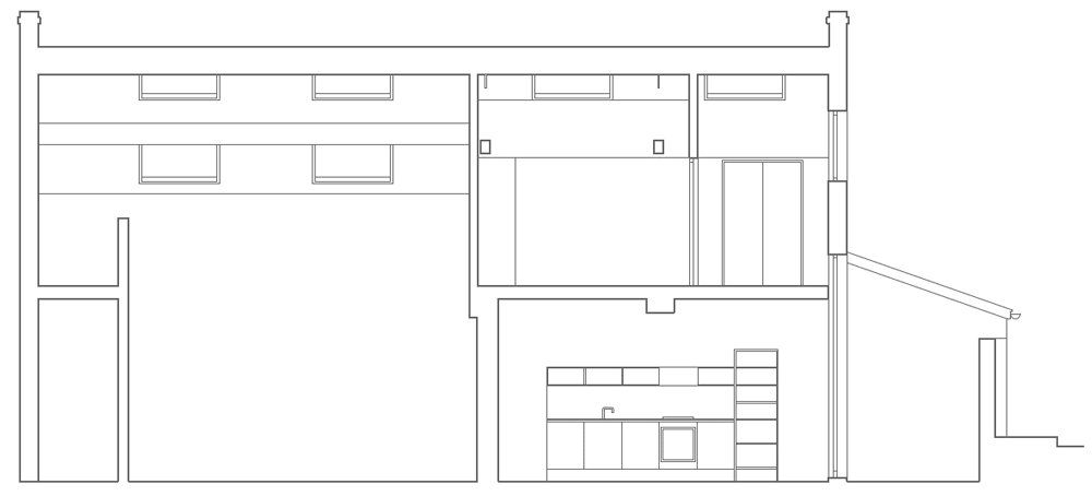
The lower ground floor accommodates a large kitchen and dining room that leads straight out to the garden beyond.
The double-height library area is positioned at the back, creating a visual connection with two living rooms on the floor above.
The first of these is a relaxed space facing out over the lawn, while the other is a formal area where the family can entertain guests.
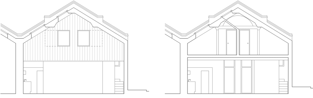
The architect worked with a local joiner to add new sweet-chestnut window frames and cladding to an old extension at the rear of the house, intended to “mask the original poor quality brickwork”.
Five bedrooms and two bathrooms occupy the two upper levels. The attic was also remodelled, creating a playroom for the children that doubles as a guest bedroom.
Here’s the project description from Kilburn Nightingale Architects:
71 Greenwood Rd, London E8 Repair/remodelling and refurbishment of an existing house
This project involves the conversion, repair and extensive remodelling of a semi-detached mid Victorian house in Dalston, Hackney.
The house was purchased by Ben and Jane Kilburn at auction as a freehold building containing three flats. Ben Kilburn is a director with Richard Nightingale at Kilburn Nightingale Architects, an architecture practice based near King’s Cross.
This project presented an opportunity for Kilburn Nightingale (with Ben in the role of architect/owner) to develop a design that would take into account the joint requirements of contemporary family living (with three daughters aged 10, 8 and 5) and the rehabilitation and improvement of a house that had been neglected and interfered with by previous owners.
The renovation was designed to provide a functional home taking into account a need for flexible living space that would allow for a number of different activities to take place concurrently (so that the family could be ‘together’). The arrangement also needed to allow more privacy when required. The design also avoids having the lower kitchen/living area separated from the rest of the house by a formal, underused living area at upper ground level.
To achieve this, upper and lower living areas are connected to each other through a new double-height space at the rear of the property, and also connected to the garden through double-height glazing. This sense of openness is enhanced throughout the house by a number of new windows in the flank wall bringing light into the middle of the house.
The lower ground floor of the house has been remodelled to provide kitchen, dining and living area, with the double-height space at the rear of the house opening up to a flowing living space above. This upper living space is loosely divided into a more relaxed area closest to the balcony and views to the garden, and a slightly more formal living room at the front of the house.
First and second floors are divided into bedrooms and new bathrooms, and the attic has been converted to provide a flexible study/sleep-over/play space. Access to the attic is via a ‘hit and miss’ stair that is designed to take up as little space as possible.
The connection of the lower two floors of the house with the garden is made partly through the large windows/doors at the rear of the house, but also through the construction of a new shed/studio at the back of the garden. The large glazed double doors of the shed face back to the big doors in the glazed screen at the back of the house, with the suggestion that the shed is akin to a piece of the house that has floated out into the garden.
London studio dRMM has completed a house and studio for Hackney artist Richard Woods, using his trademark cartoon-style print to add colour to the building’s facade and staircase (+ slideshow).
Richard Woods is best known for the painted woodgrain graphics he applies to furniture and textiles, so dRMM used the pattern to inject the character of the artist into the architectural design.
Panels in shades of white, yellow and green run horizontally along patches of the front and rear facades. They reappear inside the house as treads for the main staircase, which features a rainbow of colours ranging from pale pink and white to bold reds, blues and greens.
Entitled WoodBlock House, the project is described by the designers as “a chance for experimentation that resulted in domestic joy and Spartan pleasure in every aspect of the finished product”.
Functions inside the three-storey building are divided up by storey. A large-scale printing workshop occupies the entire ground floor, while the level above accommodates living spaces and the second storey contains four bedrooms for Woods’ family.
Externally, only the bedroom storey is clad with the colourful plywood. The rest of the exterior is clad with unpainted larch boards that are arranged vertically to contrast.
Timber also lines the walls, floors and ceilings of the two domestic floors. “WoodBlock House also has the unique atmosphere of a house built only in timber and glass, with a sensual quality that has to be seen, touched and smelt to be fully understood,” said dRMM in a statement.
The studio opens out to a yard at the back, ensuring easy access and constant ventilation, while the dining room leads to a balcony terrace where residents can dine al fresco.
The staircase also ascends to another terrace on the roof, which is accessed via a small library.
dRMM used a cross-laminated timber structural system to build the house. Only two types of windows were used, which include full-height sliding windows for the living rooms and smaller “punched hole” windows for bedrooms and corridors.
The interior is completed by a wood-burning stove, leather seating and a few select pieces of furniture by the artist.
This isn’t the first time dRMM has collaborated with Richard Woods. The pair previously worked together to create a gallery space for Modern Art Oxford.
Photography is by Alex de Rijke.
Here’s a project description from dRMM:
WoodBlock House, Hackney, London
WoodBlock House demonstrates a genuine collaboration between architect and client, a chance for experimentation that resulted in domestic joy and Spartan pleasure in every aspect of the finished product.
The brief was to create a studio, home and office for UK artist Richards Woods and his family. Woods’ working process requires a large-scale printing workshop where work can be manufactured with adequate space for him and his studio employees. The building had to be designed with the inclusion of an open yard at ground level, to ensure ventilation and ease of access – both essential to Woods’ work process. From the start designs evolved from extensive conversations with the client, whose own work traverses the boundaries between art, architecture and furniture design in the interplay between the functional and the ornamental.
The result was a simple, large workshop and printing studio space on the ground floor, with separate living accommodation above, all characterised by the qualities of timber, good spaces and daylight. The design principles of the scheme can be grouped as follows:
Articulated Massing
The massing and CLT panel structural system is expressed through the articulation of the facade in relief and choice of cladding. The building consists of three elements, the ground and first floor housing workshop and main living area, the second floor box of bedrooms with small rooftop library on the third floor. The building is positioned slightly away from its neighbours flank wall to include the careful brickwork in its composition.
The home section of the building is south-facing and sits on top of the north-facing studio. The former is horizontally clad painted plywood using a printing technique for which the artist-client is internationally renown; by contrast the studio is clad in unpainted larch.
Fenestration Principles
A simple, generous fenestration specification has been used throughout. Generally there are two types of window – full height, sliding windows to principal living areas, and smaller ‘punched hole’ windows to secondary living spaces such as bedrooms and circulation. All are laminated timber.
The building is a response to the family’s needs, as well as dRMM’s own commitment to sustainability in architecture through the use of engineered timber. Panelised construction was far quicker than an equivalent brick or concrete construction, and since noise, pollution and site traffic are lessened, relations with the neighbours were good throughout.
Apart from being environmentally sound, WoodBlock House also has the unique atmosphere of a house built only in timber and glass, with a sensual quality that has to be seen, touched and smelt to be fully understood. But perhaps its greatest success lies in something even more intangible: the feeling of a building that is in constant use, brought to life through the noisy combination of family, work and play.
Duggan Morris Architects was tasked with adding three storeys of office space to the four-storey Georgian property in London’s Shoreditch. As the building sits within a conservation area, the architects were required to preserve the existing residential facade above the ground floor shopfront.
“The challenge was to retain the domestic scale windows within a commercial office use, as well as to consider the proportional impact and aesthetic quality of the multi-storey addition,” said studio founders Joe Morris and Mary Duggan.
Behind the brick facade, the building has been completely remodelled to generate an interior suited to modern commercial uses. The basement and ground floor are dedicated to retail, but the rest of the floors all provide flexible office spaces that decrease in area towards the top.
The Curtain Road facade features a grid that divides the surface of the extension to correspond with the three bays of the original frontage. Local rights of light required some open sections at the rear to become roof terraces.
A recessed section at the top two storeys reveals a portion of the adjacent building’s flank, helping to anchor the extension into its surroundings and creating a small terrace.
The new facade was designed as a simple arrangement of horizontal and vertical units, rendered in visually lightweight modern materials to create a contrast with the existing brickwork.
“To retain the gravitas and independence of the urban block, the additional storeys are designed with an ambition to achieve a lightweight object quality, restrained from any references to the adjacent heavy masonry structure,” the architects explained.
A combination of bonded glazed units and panels covered in a wavy metal mesh were installed to create a flush surface with minimal jointing and surface detailing.
The metal panels are perforated with a pattern of holes that allows air to flow through and doesn’t obstruct views from inside.
Felt curtains that can be drawn across the large windows create a similar visual rhythm to the undulating surfaces of the mesh panels.
Preserving the facade during construction
Concrete lintels and cills are painted in a matte finish, as are the window frames. The anodised metal panels have a champagne finish to ensure consistency between the masonry and the new architectural features.
Preserving the facade during construction
Towards the end of the construction process, a neon lighting installation by artist Tim Etchells was installed in one of the windows, displaying the message “Shouting your demands from the rooftop should be considered a last resort”.
This is a speculative office development generating 20,000sqft (GEA) of retail and work space located at 141-145 Curtain Road, Shoreditch, East London. The project is located within a conservation area defined by Georgian brick buildings and requiring retention of the existing urban block.
The building prior to development was four storeys (G, B+2) in height and is fully remodelled behind a retained brick façade. Above this, three new floors of contemporary office space are added, extending the building to 7 storeys in total, almost doubling the usable area. Planning permission was obtained in September 2011. Construction commenced in November 2012 and completed in October 2013.
Model photograph
The scheme
To generate the required area of 20,000sqft, a further three storeys were necessary within the permissible building footprint which is defined by the alignment of the front facade at street level and the rights of light (RoL) envelope at the rear. There are 7 floors in total (B, G 1-5) diminishing is size as you ascend. Logic and efficiency dictate the plan arrangement. A compact circulation core contains toilets, showers, lift and stair, and is orientated on the tallest side of the building. The offices are maximised with external terraces also carved out of the RoL envelope.
The ground and basement are intended for retail use. As such two entrances at ground level occupy either end of the facade – 141 leading to the upper office levels and 145 directly into the retail unit. Ultimately the building is flexible and can accommodate a single or multi tenant let. To retain the gravitas and independence of the urban block, the additional storeys are designed with an ambition to achieve a lightweight object quality restrained from any references to the adjacent heavy masonry structure. Scale references to the adjacent buildings window punctuation are stripped back by reducing the extension to optimum modules horizontally and vertically. The materials are reduced to mesh and glass with minimal panels and visible jointing. The lack of reveals to windows are intended to further communicate the delicate object form by disguising the depth or make-up of the construction.
This object quality is further reinforced by the deep recess to the upper 2 storeys. By revealing a portion of the existing brick flank to the adjacent building block (139 Curtain Road) the weight of the existing fabric is further communicated. This obviously reduces nett lettable area but is counterbalanced by a maximised envelope to the rear. Also the precise fit of the building between party walls without visible overdressing of flashings is intended to allow the extension to read as an independent form intended to appear simply resting ‘upon’ the facade below and ‘between’ the adjacent warehouses. A 50mm gap is detailed between the existing masonry and the extension and projecting copings are omitted in lieu of self-draining window sections.
A grid is imposed on the front facade to respond subtlety to the 3 bay house facade below. The plot is trapezoidal in plan and as such a diagonal grid sets up positions of facades and balustrades to the rear. The grid is further enforced at the rear, with smaller staggered terraces, articulating the building where the mass responds to a RoL envelope. Thus a proportional logic of panel size – mesh and glass – is utilised across the facades with the positions of balustrades also defined by the RoL envelope.
The visible facade is made up of mesh and large bonded units. The principle behind the entire facade construction is to use a simple curtain walling system where possible, with bespoke inserts to achieve the non standard details. The bonded glazed units are tied back to the main super structure. The mesh is bracketed off the curtain walling to meet the same plain as the bonded units and to achieve the flush outer layer. This principle continues around the entire facade front and rear. In order to maintain a reading of the building as a whole the colour palette is carefully calibrated to respond to the masonry tones from grey concrete mortar to mid brown bricks. The reflectance of the materials increases as you ascend to sky and the textural quality of each material selected is emphasised by various means.
A champagne coloured anodised metal panel is used for the mesh on the upper storeys. This is perforated with small holes achieving 40% free air flow and is also calculated to appear almost invisible from the inside to retain views across London. A waved profile adds another layer of light quality maximising incident sun throughout the day. The anodised surface is iridescent in sunlight.
The transition from the mesh to the glazed bonded panel is carefully managed by introducing a matching fritt within the double glazed bonded unit. This softens the overall appearance of the glass which would normally be a contrasting frame and fritt colour. Felt curtains have been introduced to the larger windows fronting onto the street to extend the waved mesh detail across the entire facade. The brick has been lightly cleaned and repointed where spalling with the intention to retain the relic with minimal surface alteration. All concrete lintels and cills and window frames are painted a matt colour to match the brickwork attempting to simplify the reading of the retained element.
At ground level the shop front is framed in concrete supporting the building mass above. The glass panels within being as large as is permissible with the constraints of the tight street and working zone. Again a fritt has been selected to match the concrete colour to soften the junctions. The colour treatment stops at the facade. As a rule the entire office units are white including light fittings and all exposed services.
The building has been a challenge in many respects mainly imposed by the condition to retain the existing facade. To an extent the process to retain it required extensive counter intuitive construction works. The delicate quality of what is deemed to be ‘permanent’ and of historical value has been exposed through the very process of having to retain it. An installation by Richard Wilson at Liverpool Biennial 2007 entitled ‘Turning the place over’ played on this very condition. A permanent gritty piece of city fabric is explored as an adaptable component. An abstract portion of the facade was mechanically rotated exposing the inside.
Similarly, this revelation of the building fabric became an interesting part of the construction journey that was to be capitalised upon particularly given the visibility of the works from the street and the opportunity to promote the building as a theatrical contribution to Shoreditch, perhaps calling out to a particular tenant typology or exposing a opportunity to use the building in an unconventional way. The construction works required an oversized steel temporary structure to protect the facade from falling which needed to be pinned back to the superstructure. The entire shopfront below was removed leaving the brick facade suspended to allow alterations to take place behind it. Due to the close proximity to the street and the restrictions imposed by the Olympics 2012, temporary scaffolds and coverings were kept to a minimum thus the entire build process was evident throughout the construction phase. Due to the size of the bonded panels a complete weekend closure of Curtain Road to permit safe cranage positioning and installation was necessary.
An installation by Tim Etchells was exhibited to expand upon the theatrics. The piece was installed for 6 weeks from September to October 2013. The neon piece entitled ‘shouting your demands from the rooftops should be considered a last resort’ was selected for its obvious irony in the context of imminent marketing of the building, but also to demonstrate the opportunity to use the high level glazed pods for exhibition. The neon had the obvious benefit of retaining visibility during the dark early evenings.
Walls of dark brick connect the exterior and interior of this mews house in the north London borough of Hackney (+ slideshow).
Located next to the studio of its designers Form_art Architects in a traditional mews street, Blackbox house references the style of its archetypal brick neighbours but introduces light through a glazed courtyard and skylight.
“In contrast to the traditional mews architecture of solid brick enclosures with tiny windows and little daylight, this design is filled with light, but still respects the contextual language of a ‘solid box’,” explained the architects.
From the street, the house appears as a dark facade of slim Belgian brick punctuated with narrow horizontal and vertical windows, with the entrance concealed in an adjoining black wooden wall.
A lattice of wooden battens above the door enables daylight to reach a small brick-paved courtyard containing a birch tree and the entrance to the house.
The masonry that covers two sides of the courtyard continues across the wall that reaches into the open plan ground floor area and can be seen through the double-height glass screen that links the internal and external spaces.
A central staircase with a skylight above it allows light to spill down into the ground floor and divides the main living space and kitchen on one side from the dining room on the other.
A small landing at the top of the stairs leads to bedrooms on either side, the smaller of which is contained in a white box that projects over the dining area.
White walls and a further skylight at the far end of the living room enhance the brightness of the interior, which is intended to act as a gallery space as well as a home.
Form_art Architects sent us the following description:
BLACKBOX: Culford Mews London
The idea of the mews served as the starting point for Blackbox in more ways than just its physical location. In contrast to the traditional mews architecture of solid brick enclosures with tiny windows and little daylight, this design is filled with light, but still respects the contextual language of a ‘solid box’.
The design features of the entrance courtyard and staircase in this instance are key for the purpose of generating light into the heart of the house. As a result of the physical area given over to the courtyard, the ephemeral qualities created are ‘borrowed’ back so to speak.
This essentially refers to the light and views, with the staircase serving as a journey up Blackbox right through to the skylight. This can best be described as the layering of views and the ‘bouncing’ of light within the house.
Simultaneously developed as a house gallery and vice versa, the design is a continuation of Form_art’s work with artists and galleries, namely their current engagement with the Tate. The volume of space carved out by expressing the brickwork enclosure enables the inside to hold a pure white ‘floating’ box, suspended to further express the interior’s language of ‘objects’.
The project serves as a testimony to Form_art’s working ethos of generating work to test and develop ideas. This process provides Form_art with complete artistic freedom as designer and client and hence, there is an uncompromised approach from initial design through to completion.
Uses for community spaces are continually changing, along with the people and industries that inhabit them. As once quiet peripheral urban areas become revived and rapidly developed, certain opportunities arise for innovative use of space. One such area is the east London Borough…
by Emily Millett Infamous in some circles for bland curries, mushy peas and cardboard steaks, the Brits are currently in the midst of a culinary revolution. Helping the nation shake off its bad gastro reputation are epicurean innovators like chef James Ferguson and…
London architect Dingle Price has revamped a warehouse in Hackney to create a bright spacious home and studio for a painter and his family.
Dingle Price began by stripping the interior of the old Victorian warehouse where the artist and his wife had already been living for several years. Making use of an existing mezzanine, the architect divided the space in half to create two-storey living quarters on one side and a double-height studio on the other.
“This idea of subdividing the space into equal parts led to a concept of inserting a house within the studio,” Price told Dezeen. “The position of the existing mezzanine decided which half would be which.”
North-facing skylights allow daylight to flood the inside of the studio, where high ceilings offer enough room for several large canvases.
Windows puncture the partition wall so residents can look into the studio from their two upstairs bedrooms.
“It’s quite an internalised world,” said Price. “When you’re in there you don’t really look out. It’s a kind of internal landscape where, instead of looking at a landscape, you’re looking across a sequence of spaces.”
Walls and ceilings are plastered white throughout and there are a mixture of both painted and exposed pine floorboards.
Attracted by the large volume and excellent natural light, the artist and his wife lived and worked in this warehouse building in an ad hoc manner for some years, before the arrival of their first child necessitated a more formal inhabitation.
Dingle Price Architects proposed the insertion of a two storey house with a front facade overlooking and animating the studio space which attains the character of a small piazza or garden, a feeling further enhanced by the large landscape paintings in progress.
The design draws on the symmetrical character of the existing building to provide a series of interconnected rooms of varied scale and proportion. The existing interior consisted principally of white plastered walls, and both unfinished and white painted pine floorboards. Rather than introducing new materials, we chose to adopt and extend the use of this palette – staircase and cabinetry are constructed from southern yellow pine planks, and the elevation of the residence if partially clad in painted pine boards of a matching width to the floorboards.
Whilst the residence can be entirely or partially closed off from the studio when necessary, opening the doors and shutters reveals scenic views across the internal landscape.
News: architect David Adjaye has been commissioned to design a fashion hub in Hackney as part of efforts to regenerate the area after the 2011 riots.
The £100 million Hackney Fashion Hub will be supported with £2 million from a regeneration fund set up by the Greater London Authority to help businesses and retailers affected by the rioting.
Working with Manhattan Loft Corporation, the developers behind the restoration of London’s St Pancras Renaissance hotel, Adjaye will create a permanent retail space in two buildings to include shops, a cafe, restaurant and design studios.
“Our proposals offer a beacon for Hackney Central,” said Adjaye. “The buildings will create a light-filled, compelling environment that captures Hackney’s creative energy, gives local residents a sense of pride in their built environment and provides an exciting new draw for visitors.”
The area is already home to a small cluster of fashion outlets for luxury brands Burberry, Pringle and Aquascutum.
In 2006 the Tanzanian-born architect was shortlisted for the RIBA Stirling Prize for his Whitechapel Idea Store, a glass-fronted community building in another deprived part of east London. A year later he was awarded an OBE for services to British architecture.
New Hackney Landmark Looks Set to Create Hundreds of Jobs in East London
Renowned architect David Adjaye has been commissioned to design a new landmark for Hackney: a world class fashion development in E9.
Manhattan Loft Corporation, the developers behind the St Pancras Renaissance restoration and Chatham Works are looking to build a new ‘fashion hub’ on Morning Lane and Chatham Place.
As part of the plans, which will be submitted to the London Borough of Hackney at the end of March permanent retail space will be provided across two buildings over five and eight floors.
The buildings will be located on Morning Lane. Alongside leading fashion houses offering customers the opportunity to buy discounted goods, design studios will also be created where up and coming local designers can showcase and sell their products; making the fashion hub a unique centre for Hackney’s design community.
The hope is that the provision of a permanent fashion hub will create hundreds of jobs for local people.
It will be the UK’s first inner-city fashion outlet centre, providing a complete shopping experience.
Harry Handelsman, Chief Executive of Manhattan Loft Corporation, said: “The aim of this fashion hub is to establish a focus in Hackney Town Centre for the promotion of both local and international brands involved in the design, manufacture and sale of retail products.
“It will deliver major investment and lasting regeneration to this part of London and we hope to be able to encourage more creative people to bring companies such as Tatty Devine, Black Truffle and Fabrications into the area. We are incredibly excited about making the heart of Hackney an international focal point for the world of fashion.”
Jack Basrawy, of Chatham Works said: “We’ve been working closely with Hackney Council’s Ways into Work scheme, a programme that supports the unemployed, so that Hackney residents are at the front of the queue for the new jobs. Pringle and Aquascutum are already employing Hackney residents. Our proposals will hopefully create even more job opportunities for local people.”
David Adjaye, Principal Architect of Adjaye Associates, who was named Most Influential Black Figure of 2012 and is recognised as producing some of the best building designs in the world, said: “Our proposals offer a beacon for Hackney Central. The buildings will create a light-filled, compelling environment that captures Hackney’s creative energy, gives local residents a sense of pride in their built environment and provides an exciting new draw for visitors.”
Digby Nicklin, Commercial Director of Commercial Estate at Network Rail, said: “Across the capital, we are working with our neighbours to open up and renovate arches to attract niche entrepreneurs and build business communities.
“Working with small business through arch development schemes we are also helping to regenerate parts of London and creating employment opportunities.”
The permanent world class fashion development will replace the temporary structures which have already been created on site by Manhattan Loft Corporation and Chatham Works and which currently house leading fashion brands Pringle and Aquascutum.
Work has already started to convert the railway arches in Morning Lane between Churchwell Path and Link Street into new retail spaces; also designed by Adjaye Associates these will sit alongside the new development.
The plans for the development will see some 7,000 square metres of new retail space created for fashion outlets, a café, restaurant and design studios.
In addition to new open space, pedestrianised areas and signage will be created to encourage visitors to explore Hackney Central and visit Mare Street, Narroway and other surrounding retail areas.
Hackney Council, Network Rail and the Mayor of London have provided support for the scheme, which is set to create jobs for local people and benefit local businesses, with the expected increase in visitors to the area. Local people are currently being consulted about the plans. If granted permission in the summer of this year the fashion hub could be built by 2016.
Rounded shingles create wooden scales across the walls of this small house in Hackney that architect Laura Dewe Mathews has built for herself (+ slideshow).
Nicknamed the Gingerbread House by neighbours, the two-storey house sits behind the reconstructed wall of a former Victorian box factory and its tall windows overlap the mismatched brickwork.
“I and the planners were keen to retain something of the original building envelope,” Laura Dewe Mathews told Dezeen. “The pale grey/blue bricks were part of the workshop when I bought it and the clean London stock bricks were infills.”
The architect drew inspiration from decorative vernacular architecture in Russia to design the cedar-shingle facade, then added windows framed by thick galvanised steel surrounds.
“I was keen that the cladding somehow softened the sharp silhouette of the overall, stylised building form and thought the round ‘fancy butts’ might achieve this,” she said. “Contemporary architecture can often be perceived to be severe and alienating and I wanted to avoid that. I hope the balance of the sharp galvanised steel window reveals and cills versus the round singles manages to be more friendly.”
To avoid overlooking neighbouring houses, all windows had to be placed on the north-facing street elevation, so Dewe Mathews also added a large skylight to bring in natural light from above.
A double-height kitchen and dining room sits below this skylight on one side of the house and opens out to a small patio. The adjoining two-storey structure contains a living room on the ground floor, plus a bedroom, bathroom and small study upstairs.
Walls and ceilings are lined with timber panels, while a resin floor runs throughout the house.
Here’s a project description from Laura Dewe Mathews:
Box House / “Gingerbread House”
This is the first new build project by Laura Dewe Mathews. The motivation for the project was to create a domestic set of spaces with generous proportions and lots of natural light while working with a limited budget.
Above: ground floor plan – click above for larger image
The site was originally part of the garden of an early Victorian end of terrace house in Hackney. It was first built on in the 1880s, to provide Mr Alfred Chinn (the then resident of the end of terrace house) with space for his box factory, making wooden boxes for perfume and jewellery.
Above: first floor plan – click above for larger image
In discovering the history of the site, Laura Dewe Mathews was drawn to assemble yet another box inside the original envelope of the factory.
Above: cross section through kitchen and dining room
The one bed, new-build house was recently completed using a cross-laminated timber super structure, placed inside the existing perimeter brickwork walls and rising up out of them. The timber structure has been left exposed internally. Externally the palette of materials is limited to the original and infill brickwork, round “fancy-butt” western red cedar shingles and galvanised steel flashings, window frames and window reveals. The soft shape of the shingles contrasting with the crisp edges of the galvanized steel.
Above: cross section through living room and bedroom
The form of the proposal was a response to tricky site constraints, common for urban developments in already built up areas. The neighbours’ rights to sunlight, daylight and privacy needed to be respected. Consequently the only elevation that could have any windows was the north facing, pavement fronted elevation. The proposal counters this with large south facing roof-lights; added to this, light is brought into the main living spaces via a new private yard.
Above: front elevation
At 80msq the result is a small yet generously proportioned house. At ground floor level it retains the openness of the original workshop while feeling a sense of separation from the street immediately adjacent.
Above: side elevations
Structural engineer: Tall Engineers Main contractor: J & C Meadows, now incorporated within IMS Building Solutions
Above: rear elevation
Sub contractor/suppliers: KLH – cross laminated timber super structure Stratum – resin flooring Vincent timber – cedar shingle supplier The Rooflight Company – roof light supplier Roy Middleton – bespoke joinery including kitchen MPM engineering – stainless steel to kitchen
The fit-out is the latest in a string of installations at the venue by artists and designers. ”Normally it involves mostly the walls and perhaps some lighting,” East London Furniture’s Christian Dillon told Dezeen. ”We wanted to take over the whole bar.”
The team removed all the furniture and replaced it with tables made from pallets and ceiling joists, plus benches inspired by nineteenth century Shaker furniture.
“We created all of the free-standing seating, tables and lighting in our workshop, but left the inbuilt elements to be created in situ,” said Dillon. “So much of the inbuilt seating, especially the booth or ‘pulpit’, were conceived in the space from materials we had to hand.”
The team have lined the walls and front of the counter with wooden panels, while the throne-like seating booth is made from old skirting boards and fills the recess beside a staircase.
The cube-shaped lights hanging above the bar were created from the offcuts of other furniture made by the team and the wall-mounted lighting was produced from recycled wooden blocks.
Friend and regular collaborator Alessandro Mistrulli has decorated many of the surfaces with illustrations showing severed arms and wood-working tools. “I think I saw him reading a book on Russian prison tattoos the night before he delivered the main graphic,” said Dillon.
The installation will remain in place for two months, but was completed to coincide with the London Design Festival last week.
“For us to have a show in the festival, where people are actually using the furniture to have a nice meal, a nice beer or chatting to a nice girl or guy is so much more interesting than a static display of our furniture,” explained Dillon.
This is site is run by Sascha Endlicher, M.A., during ungodly late night hours. Wanna know more about him? Connect via Social Media by jumping to about.me/sascha.endlicher.


