Smolenka Apartment by Peter Kostelov

An oak capsule houses a raised living room and workspace inside this renovated apartment in Moscow by Russian architect Peter Kostelov (+ slideshow).

Smolenka by Peter Kostelov

The fifth floor apartment’s narrow proportions and lack of natural light led the architect to remove the existing interior walls and insert an elevated platform that would allow more light into the new living room and workspace.

Smolenka by Peter Kostelov

Accessed on each side by two steps, the tube has chamfered edges and a frame of black composite stone.

Smolenka by Peter Kostelov

Inside, oak planks cover the ceiling, floor and walls, and also extend to form shelves and a desk.

Smolenka by Peter Kostelov

A guest room is located at one end of the tube, sealed off by a glass wall and door, while a dining room leads to a balcony at the other end.

Smolenka by Peter Kostelov

From the kitchen, a corridor leads into the main bedroom, where every surface is also finished in oak.

Smolenka by Peter Kostelov

We recently featured a bright white summer house with a see-saw but no doors or windows by the same architect.

Smolenka by Peter Kostelov

See all our stories about Peter Kostelov »
See all our stories about Moscow »
See all our stories about apartments »

Smolenka by Peter Kostelov

Photographs are by Zinon Razutdinov.

Smolenka by Peter Kostelov

Here’s some more information from the architect:


Smolenka ‘Oak Tube’ Apartment

The apartment is on the 5th floor of a tall multi-storey building with inner yard. The large balcony next to the dining room, the low location of the apartment and the part of the house that strongly shadowed the inner yard all meant that the sun didn’t get into this very part of the house.

Smolenka by Peter Kostelov

The greater part of apartment has oblong proportions. The space between windows used to be large, 14 metres. The walls and balcony made it 2.5 metres larger so that now it’s 16.5 metres. The width between structural solid-cast walls was only 3.3 metres, while the places where ventilating shafts were embedded made it even less, just 2.8 metres. Having these proportions and spaces meant that the middle of the apartment was not well lit.

Smolenka by Peter Kostelov

The solution: there shouldn’t be dead walls in this part – instead they are to be replaced with glass walls, which if necessary can be blinded with curtains. In the end, the part of the apartment with the dining room, guest space, living space and working space was lightened from both sides.

Smolenka by Peter Kostelov

Thus the apartment’s proportions and poor lighting produced its design. The middle part was lifted on a podium to catch the light coming through the window. Smooth and rounded passages between walls, ceiling and floor visually join and expand the small space between the walls in the living room. This part of the living room is finished with light oak from ceiling to floor and walls with built-in closets, shelves and desk.

Smolenka by Peter Kostelov

The styling design concept was determined by an ‘oak tube’ which runs in the middle of the apartment through the working and leisure space, to which the dining room adjoins it from one side and the guest room from another. External parts of the tube are finished with composite stone. The butts of the tube imitate the cuts of its form, while loose airy joining to the walls underlines its ease, giving the illusion of something brought from outside.

Smolenka by Peter Kostelov

A similar idea was implemented for the bedroom. The room is divided into sections which also have smooth, closed passages between ceiling, floor and walls making up shelves, closets and a bed. The butts of the tube are also finished with stone, imitating the cut shape.

Smolenka by Peter Kostelov

The darker part of the apartment is given over to guest bathroom, dressing room and a bathroom adjoining the bedroom. The kitchen is sited as a separated block contra-lateral to a window.

Smolenka by Peter Kostelov

The floor in the common places like hallway, kitchen, dining room and corridor is finished with ceramogranite, while all private zones like leisure space, study, and bedroom are finished with oak planks.

Smolenka by Peter Kostelov

Built Area: 110 m2
Location: Moscow, Russia
Project Author: Peter Kostelov
Architect: Peter Kostelov
3D modelling: ZigotArt
Drawings: Yuriy Kurenskiy

The post Smolenka Apartment
by Peter Kostelov
appeared first on Dezeen.

Note et Silence by Specialnormal Inc.

A floating white box glides through this fashion boutique in Japan designed by Tokyo studio Specialnormal Inc. (+ slideshow).

Note et Silence by Specialnormal Inc.

Located inside a shopping mall in Kobe, the Note et Silence boutique was designed like a stage set, where moving walls and rooms can be used to reconfigure the layout of the space.

Note et Silence by Specialnormal Inc

“Humour and playfulness were key when we started this project,” explained designer Shin Takahashi. “If the box is placed near the entrance, it creates a corridor and a very aggressive atmosphere. If it is placed at the back of the shop, it creates a bigger area. With the effect of the box, the space can be configured for different scenes like a gallery.”

Note et Silence by Specialnormal Inc.

Each of the sliding walls is suspended from the ceiling and none of them meet the floor, so the ankles and feet of customers can be spotted moving behind them.

Note et Silence by Specialnormal Inc

Arched openings denote doorways, while square openings create windows to two sets of display shelves.

Note et Silence by Specialnormal Inc

Other interesting Japanese shops we’ve featured include a boutique filled with doors and a shop with a little house inside.

Note et Silence by Specialnormal Inc

See more shops interiors on Dezeen »

Note et Silence by Specialnormal Inc

See more projects in Japan »

Note et Silence by Specialnormal Inc

Photographs are by Koichi Torimura.

Note et Silence by Specialnormal Inc

Floor Plan – click for larger image

Note et Silence by Specialnormal Inc

Side elevation

Note et Silence by Specialnormal Inc

Front elevation

The post Note et Silence by
Specialnormal Inc.
appeared first on Dezeen.

Starbucks Espresso Journey by Nendo

This pop-up Starbucks coffee shop in Tokyo by Japanese design studio Nendo was designed like a library, where customers ordered drinks by taking books to the counter (+ slideshow).

Starbucks Expresso Journey by Nendo

Floor-to-ceiling bookshelves lined the curved interior walls of the shop and were filled with books with nine different coloured covers, to represent each of the drinks being served.

Starbucks Expresso Journey by Nendo

Customers were invited to read about different types of coffee from the cover sleeves of the otherwise empty books, before exchanging one at the counter for a corresponding drink.

Starbucks Expresso Journey by Nendo

With their coffee, each customer was also given the sleeve to keep, which they could use to customise their own Starbucks takeaway flask.

Starbucks Expresso Journey by Nendo

“The ‘library’ invites visitors to choose an espresso drink as they would a book, and verse themselves in espresso drinks as though quietly entering into a fictional world,” says Nendo. “Books and coffee are both important parts of everyday life, so we created a link between favourite books and favourite coffees.”

Starbucks Expresso Journey by Nendo

The shop was installed at the start of September in the Omotesando neighbourhood and was open for just three weeks.

Starbucks Expresso Journey by Nendo

Other Starbucks branches we’ve featured include one close to a Shinto shrine elsewhere in Japan and one inside a historic bank vault in the Netherlands.

Starbucks Expresso Journey by Nendo

We’ve also published a few Nendo projects lately, including an installation of chairs during the London Design Festival and a woodland nesting box, as well as a collection of watches that we’re now stocking at Dezeen Watch Store.

Starbucks Expresso Journey by Nendo

See all our stories about Nendo »

Starbucks Expresso Journey by Nendo

Photography is by Daici Ano, apart from where otherwise stated.

Starbucks Expresso Journey by Nendo

Above: photograph is by Hiroshi Iwasaki

Starbucks Expresso Journey by Nendo

Above: photograph is by Hiroshi Iwasaki

Starbucks Expresso Journey by Nendo

Above: photograph is by Hiroshi Iwasaki

The post Starbucks Espresso Journey
by Nendo
appeared first on Dezeen.

Cafe Craft by POOL

Freelance writers and journalists can work for as long as they want without being pestered by waiting staff at this black and white Parisian cafe by local design studio POOL.

Cafe Craft by POOL

Designed for professionals who don’t have a permanent office, Cafe Craft lets customers use the internet and power points while they work but doesn’t force them to continually order food and drink for the privilege.

Cafe Craft by POOL

“We chose black and white for the walls to highlight the architectural lines, staying mostly neutral so not to disturb the studious atmosphere,” designers Léa Padovani and Sébastien Kieffer told Dezeen. “We added yellow and brass details to blur the border between cosy cafe and workshop.”

Cafe Craft by POOL

Different floor materials denote the three areas of the cafe: speckled terrazzo is laid in the entrance, the serving area is surrounded by chequerboard tiles and herringbone parquet is used in the workspace area at the rear of the cafe.

Cafe Craft by POOL

Most of the furniture was designed or customised specifically for the cafe and is arranged to create a variety of working environments, such as the twelve-seat table in the middle of the workspace for collaborative work.

Cafe Craft by POOL

Noticeboards and shelves hang from a wall-mounted wire trellis, which also functions as a screen to separate seating areas.

Cafe Craft by POOL

The cafe is situated close to the Canal Saint-Martin, in an area with a large population of freelance writers, journalists and creative professionals.

Cafe Craft by POOL

Photography is by Samuel Kirszenbaum.

Cafe Craft by POOL

See all our stories about cafes »
See all our stories about Paris »

Here is some more information from Pool:


Design by POOL

POOL realized the graphic identity, interior design and most of the furniture of Craft. This is the first 360-degree project for the young studio founded in 2010 by Lea Padovani and Sebastien Kieffer. Dominated by the contrast of black and white, their project graphically highlights the architectural lines and plays on alternating floors to signify the various spaces, without hurting the depth of vision. Between diversion and refinement, noble and industrial materials, apparent mounting and precious finish, POOL expresses its dual style and writes a usage scenario faithfulto the spirit of the café.

Markings

Craft combines the visual codes of a coffee shop, an office and an apartment to give the space the shape of an ideal library. To materialize this ubiquity without betraying the unity of the place, POOL imagined three distinct floor areas and combined three materials rarely associated with each other.

Cafe Craft by POOL

Terrazzo

The place opens on a white-flecked black Terrazzo floor, a material often used in the mass catering universe. This is one of many winks sown by POOL as references to the imaginary of craft or industrial worlds. To complete the design, POOL added to the entrance a supported suspension light, which hangs over a conventional arrangement of tables.

Black and white tiles

Is the diamond shape POOL’s signature? Their first objects and projects were indeed giving hints in that direction, this project is confirming it. In a very subtle way, diamonds are present in the chevron-shaped junction between the terrazzo and the black-andwhite-checkered floor, which is a key feature in the imaginary of Parisian cafés. So is the alternating tiles motif on the baseboard around the counter, the second core area. Around it, apparently-pinned wooden stools are ennobled with a large brushed-brass handle to move them around easily. Thus, as it is often the case in furniture designed by POOL, the functional element becomes ornament; and so is the switch of the Vulcan lights, aligned on the large work table.

Herringbone parquet

Another chevron-shaped transition marks the junction between the checkered-tiles floor and the herringbone parquet, an implicit reference to the Haussmann-styled Parisian apartments. This area is split between the large coworking table and a lounge separated from the rest of the space by a metal trellis. Behind it, deep wooden benches covered with three-colored fabrics, mismatched coffee tables and a few ferns create a versatile environment suited both for focused meetings or total relaxation..

Cafe Craft by POOL

Community Table

At the heart of the concept, the large worktable embodies Craft’s identity. It provides clients with 12 comfortable workstations, from which they can freely use power outlets and Ethernet cables. The wooden apparent mounting of the base winks at the workshop while its composite material top surface refers to mass catering. Although from rustic inspiration, its details unveil unexpected sophistication, a duality that runs throughout the project and which characterizes the style POOL

Weft

Altogether separation element and wall decoration, the trellis frames echo the tile floor and offer a wide surface of expression. Halfway between a notebook page and a Facebook profile, it can bring together pictures, magazines, ads, menus and all sorts of information that calls to and stimulate the imagination of Craft’s regulars.

The post Cafe Craft
by POOL
appeared first on Dezeen.

Vertical Loft by Shift

Dutch architects Shift ripped out the walls of this central Rotterdam townhouse and replaced them with a three-storey bookshelf.

Vertical Loft by Shift

The bookshelf, which is 10 metres wide and nine metres high, replaces the load-bearing wall in the middle of the house.

Vertical Loft by Shift

Contained in the shelves are kitchen appliances, wardobes, a walk-in closet and even a doll’s house in the children’s bedroom.

Vertical Loft by Shift

The steel stairs have been fitted close against the shelves to make all the books easily accessible.

Vertical Loft by Shift

The house is situated on a block of dilapidated nineteenth century buildings which was bought in its entirety by a developer to be restored. Each house was stripped bare, leaving the new homeowners free to make their own changes inside.

Vertical Loft by Shift

“What used to happen is that the municipality would tear the houses down, but they have beautiful facades, so it’s a good thing to try to keep them, ” said Shift architect Oana Rades. “It’s been a really successful strategy and it means a lot of people won’t move out of the city to the suburbs now.”

Vertical Loft by Shift

We previously featured another Rotterdam project by Shift – a monolothic pavilion with sliding glass windows.

Vertical Loft by Shift

Photographs are by René de Wit and Jeroen Musch.

Vertical Loft by Shift

Here’s some more information from the architects:


Vertical Loft by Shift architecture urbanism – extreme makeover of a pre-war city dwelling in the centre of Rotterdam.

Vertical Loft by Shift

This so called do-it-yourself dwelling in the centre of Rotterdam is part of a bold experiment initiated by the municipality to revitalise dilapidated urban areas.

Vertical Loft by Shift

Run-down pre-war dwellings are renovated on the outside and brought back to their monumental appearance, while the interiors are stripped bare.

Vertical Loft by Shift

The empty shell dwellings are primarily bought by enthusiastic young people who transform them according to their specific needs, desires and budgets.

Vertical Loft by Shift

Real estate developers have picked up the initiative and a new demand driven market of urban housing has been generated in recent years.

Vertical Loft by Shift

Site plan

The result is a growing number of contemporary custom-made dream houses within the uniform old fabric of the traditional nineteenth and early twentieth century city.

Vertical Loft by Shift

Ground floor plan

Our dream was to create a vertical loft: a house without walls where all three floors are stitched together into one continuous space. The interior of the new house is organized by one oversized closet that connects all floors. It functions as a storage device for the whole house. This piece of XXL-furniture, measuring 10 meters in length and 9 meters in height, replaces the load bearing middle wall of the original house.

Vertical Loft by Shift

First floor plan

Its modular system integrates kitchen appliances, bookshelves, wardrobe, and a walk in closet. The introduction of a central void reinforces the presence of the closet. The void enables diagonal views through the house in which the closet is experienced in its full height. It also makes daylight penetrate far into the 14 meter deep house. Two steel stairs in the void make the bookshelves accessible and create a vertical circulation along and through the closet.

Vertical Loft by Shift

Second floor plan

The extreme makeover of the house is combined with a selective preservation of elements of the old casco. Industrial materials such as the phenol coated multiplex of the closet and the polyurethane flooring are balanced by the longitudinal brick wall that is left bare, the stained glass and the original doors that are restored and re-used. The roughness of the wall, full with traces of the past, tells stories about the continuous makeovers that the house has undergone in the last hundred years.

Vertical Loft by Shift

Section

Text: Shift architecture urbanism
Photography: René de Wit, Jeroen Musch
Shift architecture urbanism
www.shifta.nl
info@shifta.nl

Vertical Loft by Shift

Elevation

Design: Shift architecture urbanism, Rotterdam
Project architects: Oana Rades and Harm Timmermans
Contractor: JWK Bouwteam, Gerrit Kooiker, Ijzendoorn
Construction: B2CO, Richard Fielt, Ede
Installations: Installatietechniek Fred vd Pol & Zn., Ede
Floors: DRT, Oss
Fixed furniture: Gerrit Kooiker, Gaby van den Boom

The post Vertical Loft
by Shift
appeared first on Dezeen.

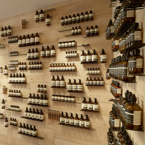
Aesop Tiquetonne by Ciguë

Glass bottles rest on rows of hand-made iron nails along the walls of this Aesop skin and haircare shop in Paris by French designers Ciguë (+ slideshow).

Aesop Tiquetonne by Ciguë

Located in one of the city’s oldest neighbourhoods, Aesop Tiquetonne was inspired by old-fashioned workshops and garages, where tools are often fixed to the walls with hooks or nails.

Aesop Tiquetonne by Ciguë

Architect Hugo Haas told Dezeen that he had bought the nails during a visit to Japan, and had decided later to use them to create an entire shelving system. ”The main idea with Aesop is to find different ways of displaying their products,” said Haas. ”The bottles are so classical they have their own existence. They just need a good background to help them levitate.”

Aesop Tiquetonne by Ciguë

The square-sectioned nails form neat rows along the sycamore-covered walls, creating spaces to hang and stand products of different sizes. ”These old nails are pretty hard to control, so to make sure we had straight lines we laser-drilled them to the wall,” explained Haas.

Aesop Tiquetonne by Ciguë

Unlike other Aesop stores designed by Ciguë, the counter and sink are separated from one another, due to the narrowness of the shop.

Aesop Tiquetonne by Ciguë

The taps and pipes are made from unpolished steel, and the architects chose to fit them themselves instead of consulting a plumber.

Aesop Tiquetonne by Ciguë

Pale blue paint gives the shop a colourful exterior. “The only place we wanted to put colour was the window,” said Haas. “We didn’t want to use colour in the store, as we prefer to use the colours that are inherent to materials. It seems a more natural process for us.”

Aesop Tiquetonne by Ciguë

Aesop regularly commission designers to come up with unique concepts for their stores and this is the fifth one created by Ciguë. Others we’ve featured by the studio include one filled with steel caps from the city’s plumbing network and one modelled on a medical laboratory.

See all our stories about Aesop »

Here’s some text from Aesop:


Aesop’s latest Parisian signature space, a fresh collaboration with Cigue, opened in rue Tiquetonne in mid-June. Home to many tradesmen in the mid-twentieth century, the area features a number of workshops that have remained unchanged for decades. The store’s design is entirely in keeping with this aesthetic – reminiscent of a garden workshop housing well-worn tools that defy obsolescence.

The design makes ingenious use of the most humble materials; shelving is fashioned from rows of large, hand-made square-sectioned wrought iron nailed – on which Aesop products are arranged like lovingly ordered implements. Walls feature stone and raw sycamore maple wood, which is also used for a large sink. A waxed concrete floor and pipes and taps of unpolished steel add further references to modest industry. The interior represents not only respect for local tradition, but a marriage of intelligent design, straightforward functionality and unadorned beauty.

The post Aesop Tiquetonne
by Ciguë
appeared first on Dezeen.

Prayer Chapel by Gensler

A wave-like wooden ceiling undulates above the heads of students at this chapel by architects Gensler in the basement of a Los Angeles university.

Prayer Chapel by Gensler

Despite being located within the rectangular confines of an old classroom, the chapel has curved walls and not a single corner.

Prayer Chapel by Gensler

Architect David Herjeczki explains how he was inspired by the thick black outlines of poché-style plans. “The design is conceived as a ‘heavy’ space deliberately set apart from, but fully formed within, the host classroom building,” he said.

Prayer Chapel by Gensler

Recycled strips of timber were mixed with wood harvested from olive trees around the campus to create the uneven finish of the chapel’s timber ceiling.

Prayer Chapel by Gensler

“The choice of such recycled wood is consistent with the poor and primitive sensibility of the chapel, but materially it provides a rich contrast to the fundamental nature of the space,” said Herjeczki.

Prayer Chapel by Gensler

A narrow skylight creates a band of light across the ceiling at one end and illuminated glass blocks create brightly coloured windows in the curved interior walls, but offer no views to the rooms beyond.

Prayer Chapel by Gensler

Other chapels we’ve featured include one in a school for friars in Portugal and one constructed by students in Istanbul.

Prayer Chapel by Gensler

3D diagrams – click above for larger image

See more stories about chapels »

Prayer Chapel by Gensler

Building plan – click above for larger image and key

Photography is by Ryan Gobuty, Gensler.

Prayer Chapel by Gensler

Floor plan and alternative layout

Project details:
Client: Biola University, La Mirada, CA USA
Design: David Herjeczki, Gensler Los Angeles

Prayer Chapel by Gensler

Conceptual section

The post Prayer Chapel
by Gensler
appeared first on Dezeen.

Zapata y Herrera lawyers’ office by Masquespacio

Spanish design studio Masquespacio have turned a dilapidated Valencia art gallery into an office for a law firm, featuring clusters of empty picture frames on the walls (+ slideshow).

Zapata y Herrera lawyers' office by Masquespacio

The 100 square metre office has been divided into compact work areas with full-length glazed walls.

Zapata y Herrera lawyers' office by Masquespacio

The original wooden ceiling beams were restored to complement the wood of the tables, counter and chair legs.

Zapata y Herrera lawyers' office by Masquespacio

The overlapping wooden picture frames on the meeting room wall are “a metaphor of the diplomas usually displayed in a law firm,” the designers explained.

Zapata y Herrera lawyers' office by Masquespacio

Thin strips of wood hanging vertically on the walls are partially painted in the company’s colours of grey and black, which are also picked up in the furniture around the office.

Zapata y Herrera lawyers' office by Masquespacio

Other buildings in Valencia we’ve featured include a house with a glass facade that reveals what’s going on inside and a nursery with circular holes in its concrete walls.

Zapata y Herrera lawyers' office by Masquespacio

We’ve featured lots of offices on Dezeen, most recently a Russian internet company with walls designed to look like pixels – see all of them here.

Zapata y Herrera lawyers' office by Masquespacio

See all our stories about offices »
See all our stories about Valencia »
See all our stories about Spain »

Zapata y Herrera lawyers' office by Masquespacio

Photographs are by David Rodríguez from Cualiti.

Here’s more information from the architects:


Masquespacio present their last project realised in an emblematic building from the end of the 19th century, situated in the historic centre of Valencia, Spain. The project designed for the law office Zapata y Herrera starts from his historic values to which are added the firm’s corporate values by the use of colours black, grey and natural wood tones.

At first the old beams have been restored, making them an essential element of the project. The noble wood is one of the protagonists of the office, not wanting to stand out, but in order to transmit confidence as one of the most important values of Zapata y Herrera. The grey colour takes over, symbolising stability and professionalism, while the powerful black transmits certain elegance and especially the seriousness with which the firm practices its profession.

Down the noble wooden entry stairs is standing out the combination of different sensations transmitted by the office. Some will call it elegant and sophisticated, while others call it sober and robust. Going further into the description of the lawyers’ office, on the left we can find the offices where the central element is a curtain of wood strips that repeats the colours of the firm’s values. The small space was maximised using L-shaped tables positioned above the storage lockers. The three pillars from the entry garden at their time are repeating the primary colours.

Zapata y Herrera lawyers' office by Masquespacio

Above: office plan

In front of the last offices and behind the reception we can find the interns’ area with a sense of green offered by a range of aloe vera plants matching with the Green chair from Javier Mariscal, 100% recycled and 100% recyclable

On the other way of the entrance we find the boardroom starring a bunch of frames proposing a metaphor of the diplomas usually exposed in a law firm. The oeuvre, as well as the wood strips curtains where created by Masquespacio’s creative director, Ana Milena Hernández Palacios. At last, alongside the boardroom is situated a lobby in which we can recognise the Float couch, the latest design from Karim Rashid for Spanish brand Sancal.

Masquespacio in this project didn’t want to fall into the usual clichés of a law firm, so they converted them into metaphors. The law office Zapata y Herrera can be considered as an example of a corporate space that transmits its values, giving more importance to the work of their employees highlighting their seriousness, professionalism and confidence, with a vanguardian look unusual for a law firm.

Finished: 22/09/2012
Space: 100 m2
Client: Zapata y Herrera
Address: Plaza San Nicolas 3, 46001 Valencia
Design: Masquespacio
Address: Paseo de la Alameda 65, 34 B, 46023 Valencia
Designer: Ana Milena Hernández Palacios
Graphic Design, oeuvre and interior design by Ana Milena Hernández Palacios
Materials:
Construction: José Manuel Paz Agra Construcciones
Visitor office chairs: De Vorm
Director chairs: Inclass
Couch and lobby tables: Sancal
Intern chairs: 114 Mobles
General lighting: Arkos Light
Reception lighting: Luzifer
Lobby and boardroom chairs: Hay
Storage lockers: BM2000
Floor: Rapidmix

The post Zapata y Herrera lawyers’ office
by Masquespacio
appeared first on Dezeen.

Granny.F by Hiroyuki Miyake

Architect Hiroyuki Miyake used a traditional English bricklaying pattern for the ceramic tiles on the walls of this beauty salon in Toyokawa, Japan.

Granny.F by Hiroyuki Miyake

“I tried to express alternative nostalgia by using glossy colourful tiles instead bricks,” Miyake told Dezeen.

Granny.F by Hiroyuki Miyake

Displaying a graduated pattern of autumn colours, the tiles line the inside of the shampoo area and also clad the building’s exterior.

Granny.F by Hiroyuki Miyake

A partition that separates the styling and shampoo areas features doorways that copy the rhythm of the windows opposite.

Granny.F by Hiroyuki Miyake

The are no tiles on the walls of the styling area, where free-standing mirrors are arranged in a line and naked light bulbs hang on copper fixings overhead.

Granny.F by Hiroyuki Miyake

This isn’t the first salon we’ve featured by Hiroyuki Miyake, following one with a zigzagging steel screen.

Granny.F by Hiroyuki Miyake

See more stories about salons and spas »

Granny.F by Hiroyuki Miyake

Photographs are by Rikoh Adachi.

Granny.F by Hiroyuki Miyake

Here’s a description from Hiroyuki Miyake:


Beauty salon “Granny.F” designed by Hiroyuki Miyake

This beauty salon is located in Toyokawa , Aichi , Japan. It was renovated from the existing empty building.

Granny.F by Hiroyuki Miyake

Although the outer wall of tiling is carried out based on the British brick pattern, it is expressing coexistence of tradition and novel by the gradation pattern, and rich gloss.

Granny.F by Hiroyuki Miyake

The sun takes for sinking and the tile loses own color gradually. However, instead, it becomes one big background which projects the expression of a town which always changes, such as the sky at sunset and a headlight of the car which goes a passage.

Granny.F by Hiroyuki Miyake

By suppressing the lighting to an outer wall side, the light from the window arranged at equal intervals is emphasized, and a homely atmosphere is expressed by showing an internal situation in fragments.

Granny.F by Hiroyuki Miyake

The tile which is visible to the opening side of an outer wall or a partition wall is settled like “skin”, and the gray space is emphasizing “inner side.”

Granny.F by Hiroyuki Miyake

The pendant light of the naked light bulb hung at random has given shiny and coloring into the space arranged symmetrically.

Granny.F by Hiroyuki Miyake

The pendant lights are covered with copper leaf.

Granny.F by Hiroyuki Miyake

Internal styling area is changed completely with the exterior, and the space of dim mortar gray spreads. This is a place which creates beauty and the leading role is a person to the last. Space is positioning that it is only a background.

Granny.F by Hiroyuki Miyake

A shampoo area is positioning called the exterior, being in an inside by choosing the same tile as an outer wall.

Granny.F by Hiroyuki Miyake

The gradation of a tile and indirect lighting wraps people in a rich feeling of tolerance.

Granny.F by Hiroyuki Miyake

People experience various services and spend a relax time while going those space back and forth.

Granny.F by Hiroyuki Miyake

Plan – click above for larger image 

The post Granny.F by
Hiroyuki Miyake
appeared first on Dezeen.

Chocolate Bar by Bro.Kat

Chocolate Bar by Bro.Kat

Chocolate appears to be dripping down the walls at this cafe in Opole, Poland, by interior designers Bro.Kat.

Chocolate Bar by Bro.Kat

Located in the market square, the cafe only occupies a 30-square-metre unit but the designers have built a mezzanine to fit extra seating areas into the space.

Chocolate Bar by Bro.Kat

“The chocolate melting on the walls is the only embellishment of the room,” said designers Roma Skuza and Bogna Polańska, before explaining that the “milk drops” hanging from the ceiling are lamps.

Chocolate Bar by Bro.Kat

Black, brown and cream are the only shades used for furniture and decoration, reflecting the three main varieties of chocolate.

Chocolate Bar by Bro.Kat

Ground floor plan – click above for larger image and key

A dark brown-coloured bar and kitchen are located beneath the mezzanine, which the designers refer to as ”a square of chocolate”.

Chocolate Bar by Bro.Kat

Mezzanine plan – click above for larger image and key

We’ve featured a couple of spaces with chocolate-like decorations. See our earlier stories about a chocolatiers’s shop in Belgium another one in Japan.

See all our stories about chocolate »

Photography is by Radosław Kaźmierczak.

The post Chocolate Bar
by Bro.Kat
appeared first on Dezeen.