Lavaflow 7 by Craig Steely

A huge concrete beam appears to balance on its edge along the roof of this Hawaiian house by Californian architect Craig Steely (+ slideshow).

Lavaflow 7 by Craig Steely

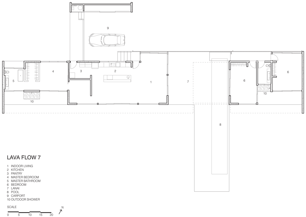
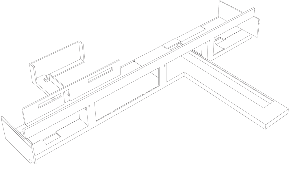
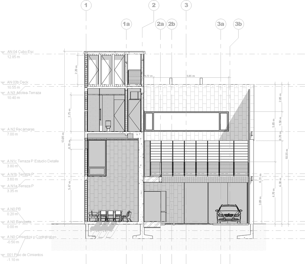
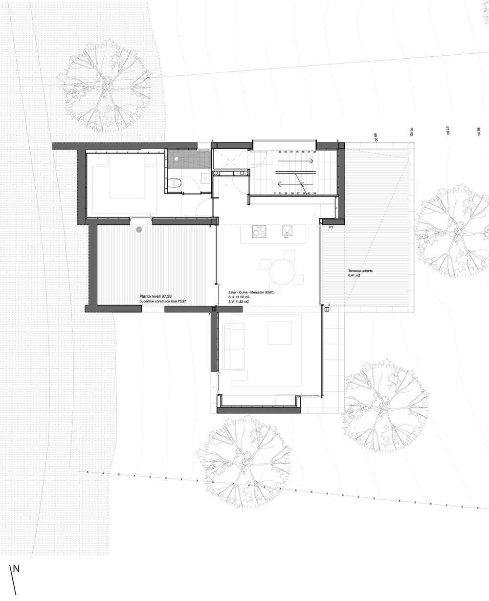
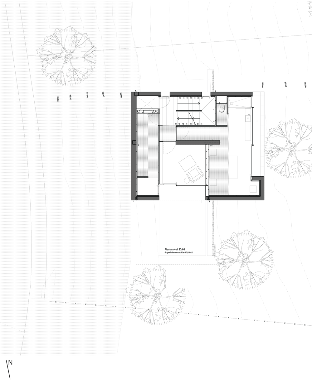
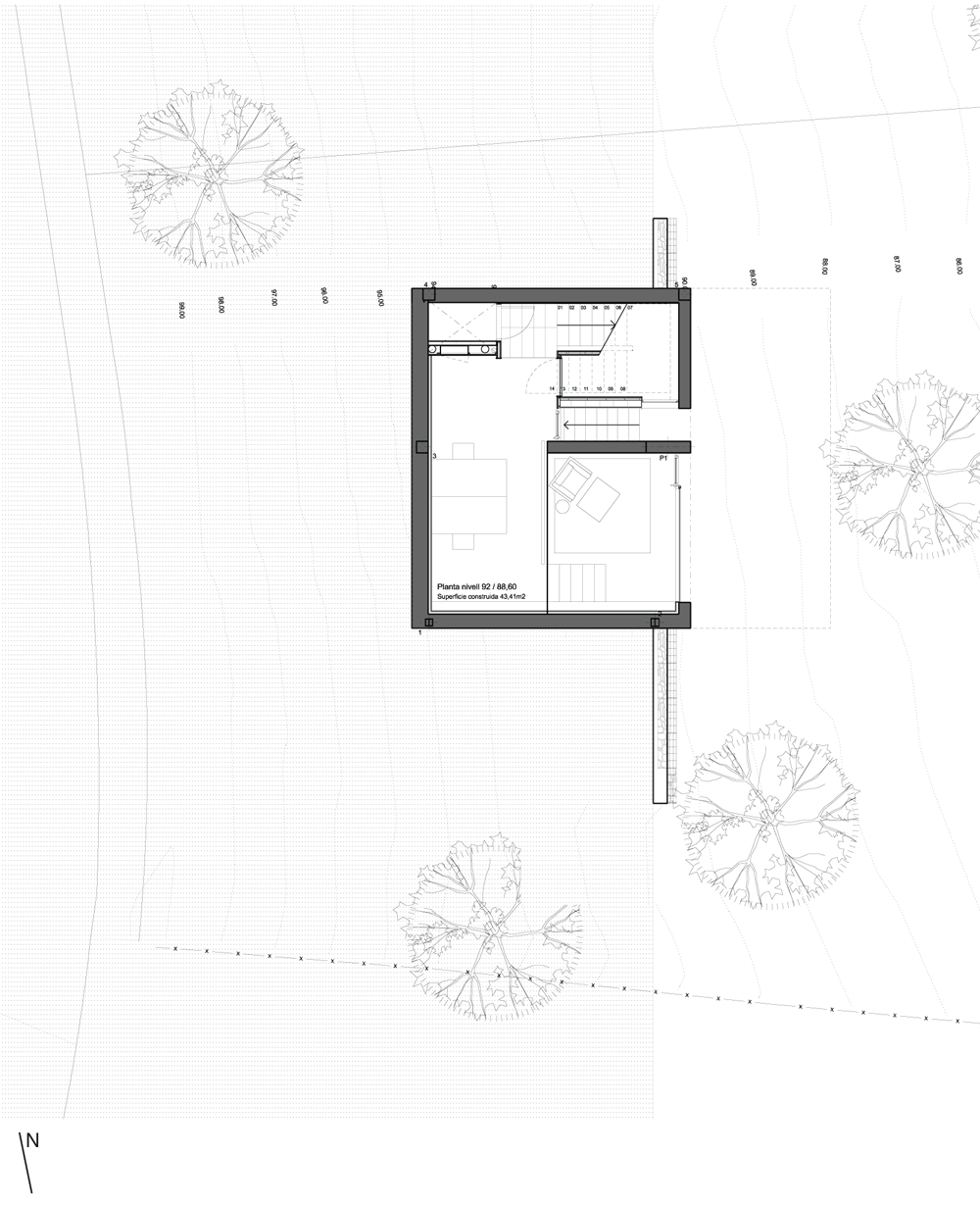
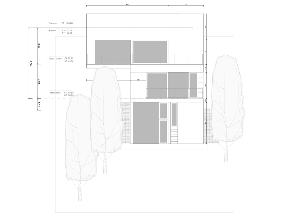
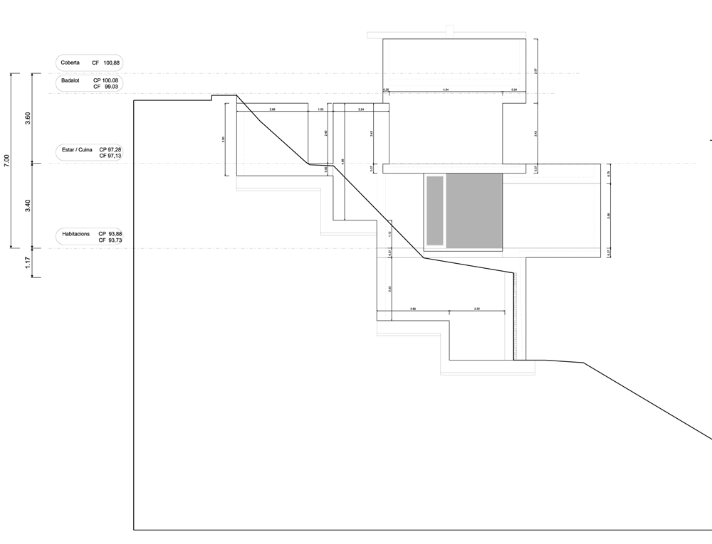
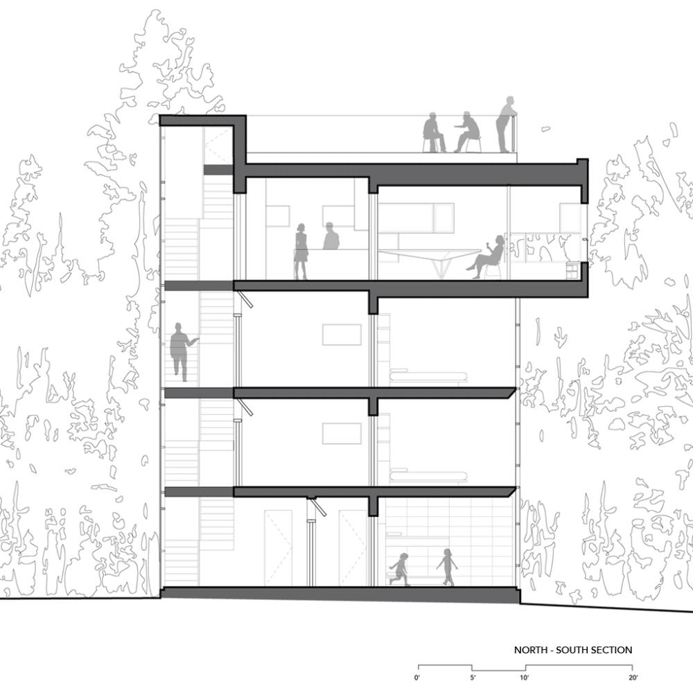
Constructed on the lava slopes of Hawaii’s most active volcano, the concrete house by Craig Steely is divided into two halves, connected by a long concrete beam that soars overhead.

Lavaflow 7 by Craig Steely

Timber beams and battons make up the roof, which runs beneath the concrete beam.

Lavaflow 7 by Craig Steely

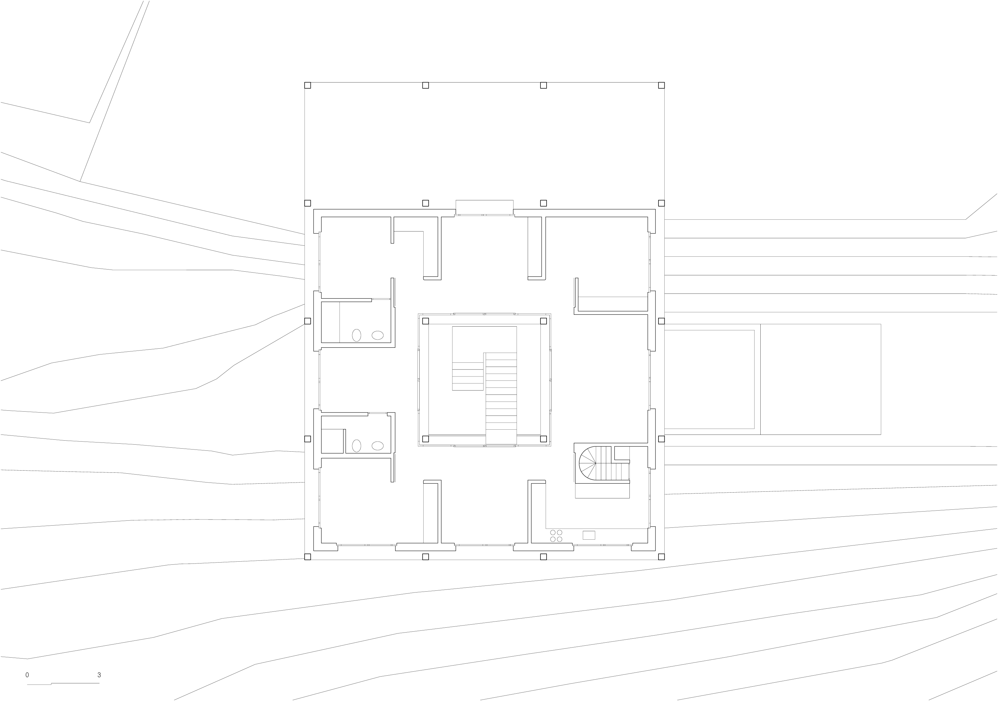
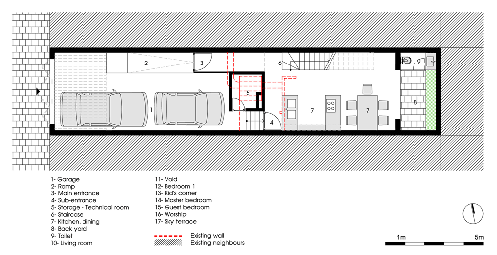
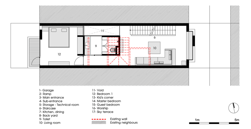
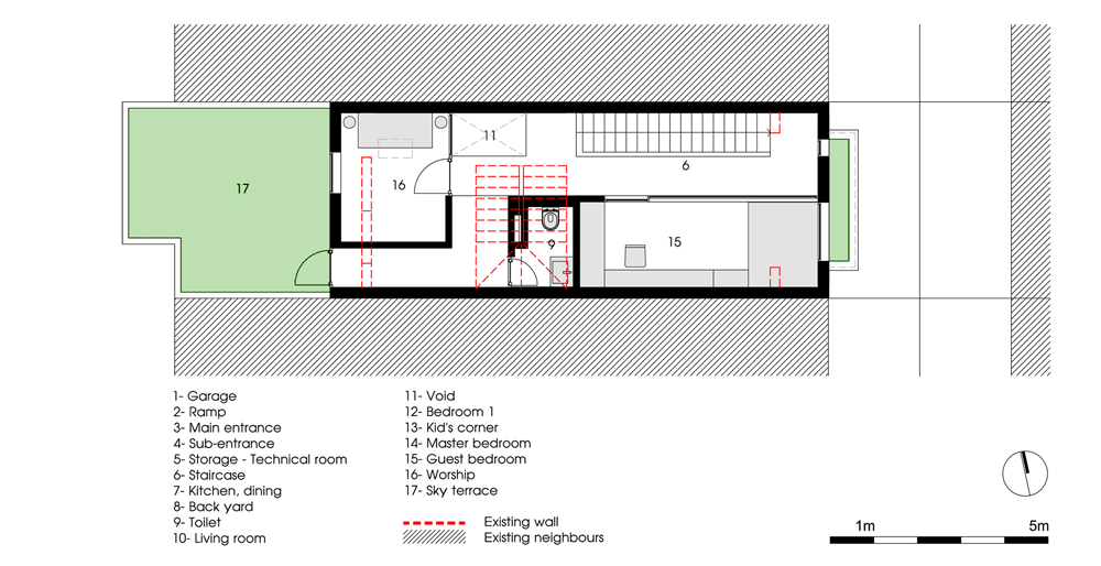
The living areas and master bedroom are separated from two further bedrooms by a lap pool and a veranda, which is partially covered by the overhanging roof.

Lavaflow 7 by Craig Steely

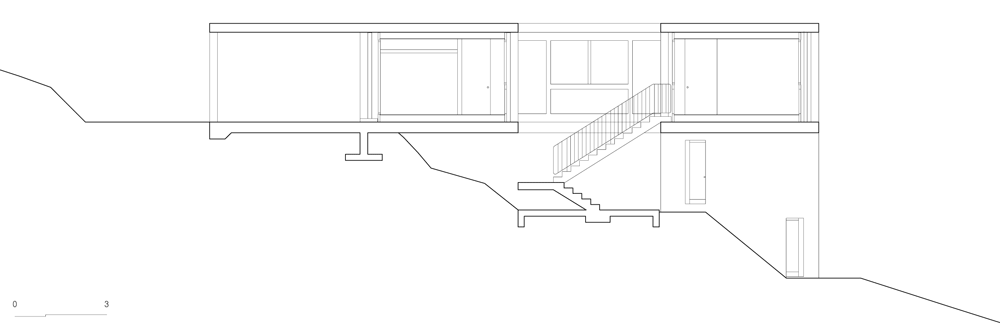
Floor-to-ceiling glass runs the length of one facade, allowing uninterrupted views into the surrounding Ohia forest and out to the ocean beyond.

Lavaflow 7 by Craig Steely

The architect was influenced by the native vegetation when designing the house. “The Ohia’s brilliant red flowers, called the Lehua, are a striking contrast to the ruddy green leaves and shades of gray of the tree’s bark and the black lava” says Steely. “Like the Ohia, the gray concrete house blends into the existing landscape of lava and trees while splashes of colour in the house mimic the Lehua.”

Lavaflow 7 by Craig Steely

The house is deliberately long and narrow so as to increase cross-ventilation, eliminating the need for the mechanical air conditioning.

Lavaflow 7 by Craig Steely

The building incorporates a rainwater catchment system, which provides the house with cold water as well as a solar heating system for hot water.

Lavaflow 7 by Craig Steely

Named Lavaflow 7, the house is the latest addition to a series of residences by Steely, all of which have been constructed on the rocky slopes of Hawaii.

Lavaflow 7 by Craig Steely

Other concrete dwellings we’ve recently featured on Dezeen include a house composed of a cluster of concrete cubes, stacked up on a steep hillside and a rural house raised off the hillside on a pair of gigantic concrete columns.

Lavaflow 7 by Craig Steely

See more stories about concrete design »

Lavaflow 7 by Craig Steely

Here’s some more information from Craig Steely:


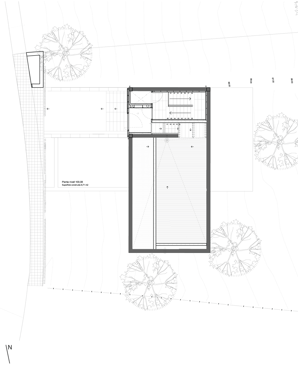
Located on five acres of dense Ohia forest, this cast-in-place concrete house frames indoor and outdoor living spaces along with views of the forest, the sky, and the coastline on Hawaii’s Big Island. It continues our exploration of a reductive architecture that enhances the experience of living in this compelling environment.

Lavaflow 7 by Craig Steely
Floor plan – click for larger image and key

The main feature of the house is a concrete beam, 140 foot long, 48 inch tall x 12 inch wide running the length of the building with only three short concrete walls supporting it along its massive span. Laminated beams and wood planks make up the roof that hangs below it. The concrete beam allows for sizable spans of uninterrupted glass and covered outdoor space, which creates a permeable edge between the man-made and nature. These huge expanses of openness amplify the sensation of living in the Ohia forest.

Ohia trees are endemic to Hawaii. They are the first trees to grow on new lava flows. Lavaflow 7 sits on a 1955 lava flow on the slopes of Kilauea crater. The Ohia’s brilliant red flower, called the Lehua, are a striking contrast to the ruddy green leaves and shades of gray of the tree’s bark and the black lava. Like the Ohia, the gray concrete house blends into the existing landscape of lava and trees while splashes of color in the house mimic the Lehua.

Lavaflow 7 by Craig Steely
Axonometric view of cast concrete – click for larger image

The nature of the house is long and thin, with private and public areas divided by a lanai and bisected by a lap pool. The thinness of the house provides passive cooling through cross ventilation allowing for the elimination of mechanical air conditioning, consistent and diffused light quality in the rooms through out the day, and a view of the forest, sky, and ocean from every room. Other sustainable features include a rainwater catchment system that supplies all water used along with a solar heating system for domestic hot water. A loose distribution of spaces around the few solid walls creates a house that is equally open in all directions and welcomes nature in.

The post Lavaflow 7 by
Craig Steely
appeared first on Dezeen.

Shadow House by Jonathan Tuckey Design

London studio Jonathan Tuckey Design has converted a historic chapel in Wiltshire, England, into a house with a blackened-timber extension conceived as the building’s shadow.

Shadow House by Jonathan Tuckey Design
Photograph by James Brittain

The architects were only permitted to build an extension that would be invisible from the street. “The form was generated by the parameters of building something as big as possible within the chapel’s shadow, so that led to the consideration of materials reminiscent of a shadow,” Jonathan Tuckey told Dezeen.

Shadow House by Jonathan Tuckey Design
Photograph by James Brittain

The roof and every wall of the extension is clad in bitumen-stained larch, with flush detailing around the edges of the gable and chimney. It is built over a series of reconstructed dry-stone walls.

Shadow House by Jonathan Tuckey Design
Photograph by James Brittain

“The clients, the planners and us were all keen to create something different to the original building, rather than mimic it,” said Tuckey.

Shadow House by Jonathan Tuckey Design
Photograph by James Brittain

All four of the house’s bedrooms are contained inside the new structure, while the former vestry of the chapel functions as a library and the large hall is converted into an open-plan kitchen and living room with a mezzanine gallery above.

Shadow House by Jonathan Tuckey Design
Photograph by James Brittain

A transparent glass corridor links the extension with the two adjoining buildings of the chapel and can be opened out to the garden in warmer weather.

Shadow House by Jonathan Tuckey Design
Photograph by James Brittain

Other church conversions we’ve featured on Dezeen include a bookstore inside a former Dominican church in Holland and a church converted into an auditorium in Spain.

Shadow House by Jonathan Tuckey Design
Photograph by James Brittain

See more buildings clad with blackened wood, including a weekend house in Japan.

Shadow House by Jonathan Tuckey Design
Photograph by James Brittain

Here’s a short project description from the architect:


Shadow House – Transformation of a Grade 2* listed chapel in Wiltshire into a family home

Our clients were intent on preserving the historic character of this elegant historic chapel but needed to adapt the building to accommodate the needs of their young family and connect it to the garden at the rear of the site.

Shadow House by Jonathan Tuckey Design
Site overview diagram – click for larger image

Complementing the existing chapel’s form and scale the new extension sits on re-built dry stone walls in the garden and is unseen from the street. It is clad in blackened timber, echoing the vernacular tabernacle churches of the West Country; a quiet shadow of the original building.

A glazed transparent passage, which can be opened entirely in warmer weather, links the extension back to the chapel where the mid-19th century spaces have been refurbished.

The post Shadow House by
Jonathan Tuckey Design
appeared first on Dezeen.

Casa CorMAnca by Paul Cremoux Studio

This family house in Mexico City by local architect Paul Cremoux conceals a three-storey wall of plants behind its slate-clad facade.

Casa CorMAnca by Paul Cremoux Studio

Concerned about the lack of sustainable construction in the country, Paul Cremoux Studio designed a building that uses plants to moderate its own internal temperature, whilst giving residents an indoor garden.

Casa CorMAnca by Paul Cremoux Studio

“Making sustainable eco-effective design in Mexico is pretty hard. Many clients do not yet realise the importance of changing the design strategy,” says architect Paul Cremoux.

Casa CorMAnca by Paul Cremoux Studio

He explains: “We would like to think about vegetation not only as a practical temperature-humidity comfort control device, or as a beautiful energetic view, but also as an element that acts like a light curtain.”

Casa CorMAnca by Paul Cremoux Studio

The green wall flanks a courtyard terrace, which occupies the middle floor and is open to the sky on one side. Meanwhile, most the rooms of the house are positioned on the levels above and below.

Casa CorMAnca by Paul Cremoux Studio

A driveway for two cars is located beneath the terrace and leads through to the dining and kitchen areas. A living room and three bedrooms occupy the second floor and can be accessed via a staircase tucked away in the corner.

Casa CorMAnca by Paul Cremoux Studio

The dark slate panels that clad the exterior also line some of the walls around the courtyard, contrasting with the light wood finishes applied elsewhere.

Casa CorMAnca by Paul Cremoux Studio

Other houses we’ve featured with indoor green walls include a residence in the Netherlands inside a timber-clad box and a house in Brazil clad with perforated golden metal. See more green walls on Dezeen.

Casa CorMAnca by Paul Cremoux Studio

Photography is by Héctor Armanado Herrera and PCW.

Here’s a project description from Paul Cremoux studio:


Casa CorManca

On a 12 metres by 13 metres (39ft by 42ft) plot of land, a monolithic volume is transformed in order to attain luminous indoor spaces. Slate stone at the exterior facades is contrasted with the soft beech-like wood finish, achieving great definition and space discovery.

Casa CorMAnca by Paul Cremoux Studio

Built in a small plot of land 176 m2, (1894 sqft), the construction rises looking south to the vertical vegetation garden wall. It is a three-storey-high assembly where the main terrace is to be found at the second level, follow by a small lecture studio.

Casa CorMAnca by Paul Cremoux Studio

This area is intent to transform radically the notion of “open patio garden” since there is not really space to ensure a ground courtyard, the main terrace plays a social definitive roll.

Casa CorMAnca by Paul Cremoux Studio

Recyclable content materials, VOC paint, cross ventilations highly used and passive energy-temperature control strategies are bound into the core design. Three heat exhaustion chimney work as main devices to control hot temperature at bedrooms areas.

Casa CorMAnca by Paul Cremoux Studio

Vertical garden is a mayor air quality and humidity creator, where before there was any plant, now we have planted over 4000.

Casa CorMAnca by Paul Cremoux Studio

Design Architect: Paul Cremoux W.
Project Team: Anna Giribets Martin
Structural Engineering: Arch. Ricardo Camacho
Equipment Engineering, Sustainability Consultant and vertical garden: Ing. José Antonio Lino Mina, DIA
General Contractor: Fermín Espinosa, Alfredo Galván, Factor Eficiencia

Casa CorMAnca by Paul Cremoux Studio
Ground floor plan
Casa CorMAnca by Paul Cremoux Studio
First floor plan
Casa CorMAnca by Paul Cremoux Studio
Second floor plan
Casa CorMAnca by Paul Cremoux Studio
Section one – click for larger image
Casa CorMAnca by Paul Cremoux Studio
Section two – click for larger image
Casa CorMAnca by Paul Cremoux Studio
Section three – click for larger image

The post Casa CorMAnca by
Paul Cremoux Studio
appeared first on Dezeen.

House in Sonvico by Architetti Pedrozzi e Diaz Saravia

This rural house in Switzerland by local studio Architetti Pedrozzi e Diaz Saravia is raised off the hillside on a pair of gigantic concrete columns (+ slideshow).

House in Sonvico by Architetti Pedrozzi e Diaz Saravia

The single-storey House in Sonvico is constructed on a 20-metre long concrete slab, which is elevated above the ground on one side to line up with the highest level of the site.

House in Sonvico by Architetti Pedrozzi e Diaz Saravia

“We and the clients both wanted to create a single-storey house,” architect Martino Pedrozzi told Dezeen. “Because of the slope, we invented a level section.”

House in Sonvico by Architetti Pedrozzi e Diaz Saravia

Rather than create an entrance at the point where the building meets the ground, Architetti Pedrozzi e Diaz Saravia designed the house with a hollow centre so that residents climb up from underneath to enter. This arrangement also creates a terrace beneath the building with a swimming pool alongside.

House in Sonvico by Architetti Pedrozzi e Diaz Saravia

Timber-framed windows sit within the houses’s chunky concrete frame. White ceramic tiles clad any walls between and feature a mixture of polished and matte finishes.

House in Sonvico by Architetti Pedrozzi e Diaz Saravia

The rooms of the house are arranged in sequence around the perimeter, while a corridor runs around the inside. There are also circular rooms inside the columns and one contains a staircases so it can double up as a second entrance.

House in Sonvico by Architetti Pedrozzi e Diaz Saravia

Other houses completed recently in Switzerland include a family home with a corner missing from its roof and a house with vertical seams. See more Swiss houses on Dezeen.

Photography is by Pino Brioschi.

Here’s a project description from Architetti Pedrozzi e Diaz Saravia:


House in Sonvico

A one storey house on a quite steep slope. That was the challenge imposed by topography and client. A most welcome challenge of course: to us one storey architecture is the best condition for good architecture. Its solution stays in the section of the project: a big horizontal prestressed slab of fifteen by twenty metres sitting on the natural land on one hand and laying on two gigantic round pillars on the opposite site. Above twenty pillars sustain the roof. Under a main space is created for outdoor living.

House in Sonvico by Architetti Pedrozzi e Diaz Saravia
First floor plan – click for larger image

The house structure is external and integrally made in concrete. None of its parts penetrate the internal insulated spaces that are organised around a central void, between slab and roof. Ceramic white tiles, shiny and opaque defining a graphic pattern, contrast with concrete and enclose the indoor living spaces.

House in Sonvico by Architetti Pedrozzi e Diaz Saravia
Ground floor plan – click for larger image

Where the house lays on the ground, there is the access. Descending upstream the slope a big porch introduces the house main door. Inside, the square-shaped ground floor is divided between public and private spaces. Public spaces like entrance hall, living room, dining room and studio are placed in the middle of the sides. Private spaces like bedrooms and kitchen find their place in the corners and when it is necessary can be isolated from the rest.

House in Sonvico by Architetti Pedrozzi e Diaz Saravia
Cross section – click for larger image

The central void makes the connection between indoor and outdoor living spaces. A staircase leads down to a paved and partially covered surface integrating a swimming pool, a laying and a dining area, surrounded by an impressive natural environment.

The post House in Sonvico by
Architetti Pedrozzi e Diaz Saravia
appeared first on Dezeen.

Nowhere but Sajima by Yasutaka Yoshimura Architects

Windows of various shapes and sizes give this weekend retreat on the south coast of Japan the appearance of a children’s shape-sorter toy.

Nowhere but Sajima by Yasutaka Yoshimura Architects

Designed by Tokyo studio Yasutaka Yoshimura Architects, Nowhere but Sajima forms part of the Nowhere Resort, a series of rentable holiday homes on the Miura peninsula of Kanagawa Prefecture.

Nowhere but Sajima by Yasutaka Yoshimura Architects

The house is located on the harbour of a small fishing village. It has a triangular plan, with rooms on three storeys.

Nowhere but Sajima by Yasutaka Yoshimura Architects

Each of the windows lines up with a different room and the ceiling of every room follows the profile of its window.

Nowhere but Sajima by Yasutaka Yoshimura Architects

The architects describe the rooms as “thin tube-like spaces” with views directed towards the ocean. “We have created a place reminiscent of looking out to sea from the deck of a ship,” they explain.

Nowhere but Sajima by Yasutaka Yoshimura Architects

Sliding doors and screens allow different rooms to open out to one another, plus a circular cutaway provides views between the first-floor study and the storey above.

Nowhere but Sajima by Yasutaka Yoshimura Architects

See more holiday homes on Dezeen, including a set of apartments above a yacht house on the Crimean coastline and a weekend fishing retreat in Germany.

Nowhere but Sajima by Yasutaka Yoshimura Architects

Here are more details from Yasutaka Yoshimura Architects:


Nowhere but Sajima

Cutting resort environment out of urban environment

Nowhere resort is the resort program that is renting out weekly vacation house. Suggesting new urban lifestyle by making shorter the distance to weekend house from standard 3 hours up to 1 hour. The environment must get close to urban when shorten the distance, the issue comes to how to cut off resort environment out of there. Therefore Nowhere but Sajima comes to build long and thin tube-like spaces that bundle them into one home unit. The tube-like spaces are facing toward the ocean and at the same time intercept the sight from the next condominium. The building is controlling both privacy and scenery.

Nowhere but Sajima by Yasutaka Yoshimura Architects

A home for guests

Nowhere but Sajima provides a temporary ‘home’ for its guests. The weekly rental service provided by Nowhere Resort is a relatively new method of operating resort properties in Japan, and allows different tenants the opportunity to inhabit a ‘home’ on a weekly basis. While the weekly term is short compared to a standard monthly rental and long compared to a hotel stay, this in-between length accommodates a new diversity of uses of a ‘home’. Serving as a space for exhibitions, as a classroom or for wedding parties, the unit easily adapts to the imagination and invention of the tenant and in doing so also re-defines the range of activities that can take place in the ‘home’. As well as accommodating the functions of work and business, the ‘home’ again becomes the space of many life events beside the basic function of ‘inhabitance’. In acquiring a new program for use, the ‘home’ regains the richness of activity that can take place all around of life.

Nowhere but Sajima by Yasutaka Yoshimura Architects

The building, a triangular block composed of tube-like volumes heading to the ocean, stands on a point of reclaimed land in a small fishing village. While the site meets the seawall and directly faces the sea, it is also faces other buildings across the water. To provide adequate privacy without the use of curtains, narrow tube-shaped spaces were bundled together and angled to provide openings toward the sea. The orientation of these tubes naturally blocks the line of sight from the adjacent apartments and while gazing down the length of the tube from inside only the ocean can be seen. While providing an escape from the tide of urbanism characterising what we normally call a ‘resort’, the design still maintains the key aspects of the resort experience. We have created a place reminiscent of looking out to sea from the deck of a ship.

Nowhere but Sajima by Yasutaka Yoshimura Architects

Location: Yokosuka Kanagawa, JAPAN
Principal Use: HouseStructure: RC 3 stories

Nowhere but Sajima by Yasutaka Yoshimura Architects

Site Area: 132.09 sq.m
Building Area: 63.88 sq.m
Total Floor Area: 176.65 sq.m
Max Height: 9,459 mm

Nowhere but Sajima by Yasutaka Yoshimura Architects

Architect: Yasutaka Yoshimura Architects
Client: Nowhere resort
Structural Engineer: Akira Suzuki/ASA
Services: EOS+
Electric Services: comodo
General Contractor: Heisei Construction

Nowhere but Sajima by Yasutaka Yoshimura Architects
Site plan
Nowhere but Sajima by Yasutaka Yoshimura Architects
Ground floor plan
Nowhere but Sajima by Yasutaka Yoshimura Architects
First floor plan
Nowhere but Sajima by Yasutaka Yoshimura Architects
Second floor plan
Nowhere but Sajima by Yasutaka Yoshimura Architects
Cross section one
Nowhere but Sajima by Yasutaka Yoshimura Architects
Cross section two

The post Nowhere but Sajima by
Yasutaka Yoshimura Architects
appeared first on Dezeen.

Mediterrani 32, Sant Pol de Mar by Daniel Isern

Mediterrani 32, Sant Pol de Mar by Daniel Isern

This house by Spanish architect Daniel Isern looks like a cluster of concrete cubes, stacked up on a steep hillside on the outskirts of Barcelona.

Mediterrani 32, Sant Pol de Mar by Daniel Isern

The rural site faces out towards the coast, so Daniel Isern designed the four-storey residence with balconies and terraces on three of its floors, as well as a pair of glazed sunrooms.

Mediterrani 32, Sant Pol de Mar by Daniel Isern

The form of the building comprises overlapping volumes that integrate several cantilevers. Isern explains: “The reduced dimensions of the plot and the desire to leave the minimum imprint on the land led us to seek out a floor plan which, matching the trees that surround it, emerges from a trunk well anchored to the land and opens up in branches on each floor.”

Mediterrani 32, Sant Pol de Mar by Daniel Isern

The entrance to the house is on the uppermost floor. There are no rooms at this level, so residents work their way downstairs to find a living room and bedroom on the next level down, a dining room below that and a master bedroom on the bottom floor.

Mediterrani 32, Sant Pol de Mar by Daniel Isern

A concrete walls extends out from the north and south sides of the house and integrates a storage area for firewood.

Mediterrani 32, Sant Pol de Mar by Daniel Isern

Other concrete houses from Spain to feature on Dezeen include a stark building with richly stained timber shutters and an X-shaped house that hangs over a hillside. See more houses in Spain.

Mediterrani 32, Sant Pol de Mar by Daniel Isern

Photography is by Adrià Goula.

Here’s a statement from Daniel Isern:


Mediterrani 32, Sant Pol de Mar 2012

“For me, a landscape does not exist in its own right, since its appearance changes at every moment; but the surrounding atmosphere brings it to life – the light and the air which vary continually. For me, it is only the surrounding atmosphere which gives subjects their true value.” Claude Monet.

Mediterrani 32, Sant Pol de Mar by Daniel Isern

The project for this house emerged from a very simple premise, to build on a very steep piece of land with a gradient of almost 100%, boasting wonderful views and on a tight budget. It was this highly complicated plot of land, surrounded by pine trees, that defined a good part of this project. The land, and its perspectives, constantly changing as the hours pass, the colour of the trees, the movement of sun and shadows…

Mediterrani 32, Sant Pol de Mar by Daniel Isern

On the one hand, the reduced dimensions of the plot and its complex orography, and on the other the desire to leave the minimum imprint on the land led us to seek out a floorplan which, matching the trees that surround it, emerges from a trunk well anchored to the land and opens up in braches on each floor, in such a way that each branch becomes the terrace of the upper level at the same time as it becomes the porch of the lower one.

Mediterrani 32, Sant Pol de Mar by Daniel Isern

All this helps create a very formal building, with huge cantilevers facing out to emptiness, the woods and the sea which lie before it. A structure which opens up to these views and the sun, and which thanks to the terraces and the porches confuse the interior with the exterior. A building which is equally formal in both its volume and the materials which compose it. Concrete, iron, timber and stone combining in a way that emphasises the character of each one. In the end, the whole building represents a dialogue between emptiness and fullness, between materials, between outside and inside; seeking out a balance between these highly contrasting parts.

Mediterrani 32, Sant Pol de Mar by Daniel Isern
Level four floor plan – click for larger image
Mediterrani 32, Sant Pol de Mar by Daniel Isern
Level three floor plan – click for larger image
Mediterrani 32, Sant Pol de Mar by Daniel Isern
Level two floor plan – click for larger image
Mediterrani 32, Sant Pol de Mar by Daniel Isern
Level one floor plan – click for larger image
Mediterrani 32, Sant Pol de Mar by Daniel Isern
East elevation – click for larger image
Mediterrani 32, Sant Pol de Mar by Daniel Isern
South elevation – click for larger image

The post Mediterrani 32, Sant Pol de Mar
by Daniel Isern
appeared first on Dezeen.

House in Takamatsu by Yasunari Tsukada

This renovated family home in Japan by designer Yasunari Tsukada features large internal windows and a mezzanine loft, creating apertures and vantage points for looking into different rooms (+ slideshow).

House in Takamatsu by Yasunari Tsukada

Adapting part of a three-storey house, Yasunari Tsukada planned the interior as a grid of partitioned rooms that maintain the same clarity as an open-plan residence.

House in Takamatsu by Yasunari Tsukada

“The client requested a home where he could feel the presence of his family throughout the building, while at the same time having the calm and relaxing sensation of being in a private room,” explains the designer.

House in Takamatsu by Yasunari Tsukada

The mezzanine floor runs across the centre of the space, accessed by a metal staircase near the entrance. There are no walls around it, only balustrades, so residents can look down onto any of the surrounding rooms.

House in Takamatsu by Yasunari Tsukada

Large windows and doorways also open rooms out to one another. There are a few sliding doors, so some of the spaces can be made more private when necessary.

House in Takamatsu by Yasunari Tsukada

“Each space also contains two or more windows or openings, giving rise to a multilayered space with no sense of hierarchy within it,” says Tsukada.

House in Takamatsu by Yasunari Tsukada

An existing glass-block wall that previously encased a stairwell gives a curved outline to a new living room, plus a single concrete wall is the backdrop for a television.

House in Takamatsu by Yasunari Tsukada

The ceiling of the residence follow the angle of the roof. Bare lightbulbs hang down from it on long cables, while others are mounted sideways onto the walls.

House in Takamatsu by Yasunari Tsukada

Japanese designer Yasunari Tsukada more recently completed a beauty salon in Osaka with a timber lattice stretching across one wall.

House in Takamatsu by Yasunari Tsukada

Other new Japanese residences include an apartment with a sunken circular living room and an opaque house balanced above a pet shop. See more architecture in Japan.

House in Takamatsu by Yasunari Tsukada

Photography is by Stirling Elmendorf.

Here’s some more information from Yasunari Tsukada:


House in Takamatsu

Our client was initially inclined to build a new house. After much consideration, however, he decided to partly renovate his three-storey family house, and use it as a residence for a two-generation family.

House in Takamatsu by Yasunari Tsukada

The client requested a home where he could feel the presence of his family throughout the building, while at the same time having the calm and relaxing sensation of being in a private room. By enveloping each room with a sloping ceiling to make use of the existing building, we wondered if we could create an ambiguously defined space that would feel as if it had been partitioned, while still maintaining a sense of coherence and unity.

House in Takamatsu by Yasunari Tsukada

The components that make up each individual room are gate-like walls, which consist mainly of openings. The roof gradient and heights of the sash windows were determined in accordance with the original height of the living room, which was 2400mm. The heights of the walls also took their cue from this figure, and were set at 2400mm. Although it seems as if this height has been deployed with excessive frequency within the space, doing away with ceilings for the individual rooms while covering them with a single, sloping ceiling and installing windows at a number of positions along the walls allowed us to create a sort of landscape that presented a very different face to the familiar surroundings. Each space also contains two or more windows or openings, giving rise to a multilayered space with no sense of hierarchy within it.

House in Takamatsu by Yasunari Tsukada

The renovation process involves thinking about how we can devise new spaces while respecting a given set of conditions imposed by the existing building, as well as the client’s requirements. The glass blocks from the large staircase and stairwell were transformed into a part of the living room and the reading space, while the innocuous reinforced concrete wall that originally supported the staircase was given a new lease of life as the wall that one notices most of all on a daily basis. For our client, this space helped to give things and objects new meanings, and became invested with new stories and narratives – a process that prompted him to rethink the possibilities of design through renovation.

House in Takamatsu by Yasunari Tsukada

Project Name: House in Takamatsu
Project Type: residence renovation
Location: Takamatsu-city, Kagawa, Japan
Completion: 2012 May
Design: Yasunari Tsukada design
Contractor: Shikoku Housing

The post House in Takamatsu
by Yasunari Tsukada
appeared first on Dezeen.

4.5×20 House by AHL Architects Associates

A narrow atrium brings daylight into windowless rooms on four storeys at this renovated house in Hanoi by Vietnamese office AHL Architects Associates.

4.5x20 House by AHL Architects Associates

The existing building was a typical Vietnamese “tube house”, with a long, thin plan and few windows. AHL Architects Associates was tasked with reorganising the plan to make better use of space and to increase natural light and ventilation.

4.5x20 House by AHL Architects Associates

The architects began by relocating the staircase from the centre of the house to along one wall, then added a large skylight overhead. They also removed sections of the floor, creating the four-storey atrium and a series of indoor balconies.

4.5x20 House by AHL Architects Associates

“The staircase and corridors were designed not as a simple and boring path but as a continuous and sequential space which becomes a living space,” explain the architects.

4.5x20 House by AHL Architects Associates

The wall running alongside the atrium is lined with white ceramic tiles, giving it a ridged texture, and all of the balustrades are glazed to let more light through.

4.5x20 House by AHL Architects Associates

Just in front of the staircase, the entrance to the house is set within a recessed driveway at the end of a ramped platform. Once inside, residents can walk through to a kitchen on the ground floor or head upstairs to a double-height living room on the floor above.

4.5x20 House by AHL Architects Associates

Bedrooms are located on the first, second and third floors, and the top storey also features a dedicated worship room and a roof terrace.

4.5x20 House by AHL Architects Associates

Another “tube house” we’ve previously featured on Dezeen is the four-storey Stacking Green house, which features a a vertical garden on its facade. See more Vietnamese architecture on Dezeen.

4.5x20 House by AHL Architects Associates

Photography is by Anh Duc Le.

4.5x20 House by AHL Architects Associates

Here’s more from AHL Architects Associates:


4.5×20 House

This house was designed for a young family with one child and grandmother, located in Van Phu, a new urban area in Hanoi, Vietnam. The existing design is boring (like thousands of other houses in Vietnam): lost of natural lighting and ventilation; simple space with core (staircase and toilet) in the middle and two bedrooms at two sides. Client (young family) needs something different from the existing. They need their own house, their style. This situation requires a smart solution for traffic, thereby creating interesting solutions of space, daylight and natural ventilation.

4.5x20 House by AHL Architects Associates

Based on their requirements, the program is quite simple: garage (for 2 cars), kitchen on the 1st floor, bedroom (for grand mother) and living room on the 2nd floor, master bedrooms on the 3rd floor, small guest room, sky terrace and worship on the 4th floor… but they need the architects focus on the creation of public spaces.

4.5x20 House by AHL Architects Associates

With a simple strategy “traffic creates space and function”, we started by changing the location of staircase. Unique and continuous spaces were proposed based on the new staircase. The staircase and corridors were designed not as a simple and boring path but as a continuous and sequential space which becomes a living space.

4.5x20 House by AHL Architects Associates

Along with identifying new locations for staircase, the voids are also determined for natural lighting and ventilation. An atrium in the middle of house was created to bring daylight to lobbies and all rooms without window to outside. In addition, that allows full connection between the four levels of the house vertically.

4.5x20 House by AHL Architects Associates
Ground floor plan – click for larger image and key

The central space is the biggest volume where a double height living room locates, is surrounded by opening staircase, autrium and big windows.

4.5x20 House by AHL Architects Associates
First floor plan – click for larger image and key

The restrained and limited material palette of white painted ceramic tiles, wood, and glass avoids unnecessary ornamentation in order movement through a variety of opening spaces.

4.5x20 House by AHL Architects Associates
Second floor plan – click for larger image

Type of development: Renovation of typical tube-house
Dimension: 4.5×20
Location: Van Phu New Urban Area, Hanoi, Vietnam
Status: Finished
Cost: 112,000 usd
Date: 2012

4.5x20 House by AHL Architects Associates
Third floor plan – click for larger image

Architects: AHL architects associates
Architects in charge: Hung Dao, Tuan Anh Mai, Son Chu, Hieu Hoang, Nghia Mai, Tung Nguyen, Truc Anh Nguyen

4.5x20 House by AHL Architects Associates
Long section – click for larger image

The post 4.5×20 House by
AHL Architects Associates
appeared first on Dezeen.

Panorama House by Moon Hoon

The latest building to feature an indoor slide is this South Korean house by Seoul studio Moon Hoon, where a wooden slide is slotted into a combined staircase and bookshelf (+ slideshow).

Panorama House by Moon Hoon

Named Panorama House, the three-storey residence is home to a family of six in North Chungcheong Province. The clients had asked Moon Hoon to include various spaces where their four children could play, so the architects designed a house where different floors belong to different residents.

Panorama House by Moon Hoon

The ground floor is dedicated to the children and includes the wooden staircase and slide. Open treads create bleacher-style seating areas for a home cinema, but they also double-up as bookshelves for a small study area tucked underneath.

Panorama House by Moon Hoon

“The key was coming up with a multi-functional space,” say the architects. “The multi-use stair and slide space brings much active energy to the house. Not only children, but also grown-ups love the slide staircase.”

Panorama House by Moon Hoon

Two twin bedrooms are located behind the study, plus the youngest children can also use the large second-floor attic as a playroom.

Panorama House by Moon Hoon

Family rooms are all located on the middle floor and lead out to two separate terraces. Underfloor heating was added to each of the spaces to encourage residents to sit on the floor, rather than on furniture.

Panorama House by Moon Hoon

A bedroom suite is separated at one end of this floor and features an en suite bathroom and dressing room.

Panorama House by Moon Hoon

The facade of Panorama House is divided into a basalt-clad base and a white-rendered upper. To accentuate the subtle zigzag of the plan, the architects added angled sections to create the illusion of three cubes in perpective.

Panorama House by Moon Hoon

Indoor slides have featured in a few residences in recent years. Architect David Hotson added a tubular steel slide to a penthouse apartment in New York, while slides have also featured in a house in Indonesia and a house in Japan. See more slides on Dezeen.

Panorama House by Moon Hoon

Photography is by Huh Juneul, apart from where otherwise indicated.

Panorama House by Moon Hoon

Here’s a project description from Moon Hoon:


Panorama House

The Client

They have four kids, and that is a big family by contempory standards. They are both teachers in their late thirties. The first and the most important thing they wanted in their new home was a place where their kids could play, read and study. They wanted lower floors for the kids and upper for themselves. They already tried it out with another architect, but it did not satisfy them, that’s when they said that they found about me, who appeared to be more playful and more creative.

Panorama House by Moon Hoon
Photograph by Huh Juneul

The Site

Irregular and sloped site boasted a great view. It is situated in a nice newly built surburb. The view reminded me of a scene from a movie, LA surburbs at night. Instantly, a name for the house came up – Panorama House – which they nodded with some ambience.

Panorama House by Moon Hoon
Photograph by Huh Juneul

The Design

The basic request of upper and lower spatial organization and the shape of the site prompted a long and thin house with a fluctuating facade, which would allow for a more differentiated view. The key was coming up with a multi-functional space which is a large staircase, bookshelves, casual reading space, home cinema, slide and many more.

Panorama House by Moon Hoon

The client was very pleased with the design, and the initial design was accepted and finalised almost instantly, only with minor adjustments. The kitchen and dining space is another important space where family gathers to bond. The TV was pushed away to a smaller living room. The attic has the best view is possible and it is used as a play room for younger kids.

Panorama House by Moon Hoon

The multi-use stair and slide space brings much active energy to the house. Not only children, but also grown-ups love the slide staircase. It is an action-filled, playful house for all ages.

Panorama House by Moon Hoon

The fluctuating facade is accentuated by mirrored bottom and top angles. It can bring about some illusion when looked at with some concentration. The various sized windows provide different outlooks. Korean houses are floor heated, which is quite unique and brings users to the floors more than to furniture such as sofa and chairs. So many windows are placed quite low, considering the long living habit. There is no high-legged dining table for the family, only a portable foldable short-legged table. The space kept empty until any specific function arises.

Panorama House by Moon Hoon
Photograph by Huh Juneul

Architect: Moon Hoon
Design Team: Lee Ju Hee, Kim Dong Won, Park Sang Eun
Client: Moon Sung Gwang
Total Site Area: 570.50 sqm
Total Floor Area: 209.14 sqm
Construction: reinforced concrete and wood frame

Panorama House by Moon Hoon
Concept diagram – click for larger image
Panorama House by Moon Hoon
Ground floor plan – click for larger image
Panorama House by Moon Hoon
First floor plan – click for larger image
Panorama House by Moon Hoon
Second floor plan – click for larger image
Panorama House by Moon Hoon
Long section – click for larger image
Panorama House by Moon Hoon
Cross section – click for larger image
Panorama House by Moon Hoon
Front elevation – click for larger image

The post Panorama House
by Moon Hoon
appeared first on Dezeen.

Tower House by Gluck+

This holiday home in upstate New York by US firm Gluck+ features an elevated living room that hovers nine metres above the ground (+ slideshow).

Tower House by Gluck+

As the weekend retreat for Thomas Gluck – one of the firm’s principals – and his family, Tower House was designed as a four-storey tower with a “treetop aerie”, affording mountain views across the nearby Catskill Park.

Tower House by Gluck+

The house is glazed on every side. In some places Gluck+ has fitted dark green panels behind to camouflage the walls with the surrounding woodland, while other areas remain transparent, revealing a bright yellow staircase that zigzags up behind the southern elevation.

Tower House by Gluck+

Taut vertical cables form the balustrade for this staircase and are interspersed with small lights, intended to look like fireflies after dark.

Tower House by Gluck+

One of the main aims of the design was to minimise the impact on the landscape. The architects achieved this by lifting the large living areas off the ground and stacking bedrooms and bathrooms on the three floors beneath, creating a base footprint of just 40 square metres.

Tower House by Gluck+

This arrangement also allows all of the wet rooms to be arranged in an insulated central core. When the house isn’t is use, this core isolates the heating systems, helping to reduce energy consumption.

Tower House by Gluck+

The three bedrooms are positioned on the north side of the house, where they can benefit from the most consistent daylight, and contain yellow furniture to match the colour of the staircase.

Tower House by Gluck+

The living room above is divided up into four different zones by the arrangement of furniture and features a 12-metre-long window seat that spans the entire space. There’s also a secluded roof terrace on the next level up.

Tower House by Gluck+

New York-based Gluck+ was known until recently as Peter Gluck and Partners. The firm is now run by Peter, his son Thomas, and three other principals.

Tower House by Gluck+

Other New York residences featured on Dezeen include a penthouse apartment with a tubular steel slide and a writer’s hideaway in the woods. See more architecture in New York.

Tower House by Gluck+

Photography is by Paul Warchol, apart from where otherwise stated.

Tower House by Gluck+
Photograph by Gluck+

Here’s a project description from the architects:


Tower House

This small vacation house is designed as a stairway to the treetops. Keeping the footprint to a minimum so as not to disturb the wooded site, each of the first three floors has only one small bedroom and bath, each a tiny private suite. The top floor, which contains the living spaces, spreads out from the tower like the surrounding forest canopy, providing views of the lake and mountains in the distance. An outdoor roof terrace deck above extends the living space above the treetops, offering a stunning lookout to the long view. The glass-enclosed stair also highlights the procession from forest floor to treetop aerie, while the dark green, back-painted glass exterior camouflages the house by reflecting the surrounding woods, de-materialising its form. At dusk, mini lights dotting the cable rail of the stair mimic local fireflies sparkling in the woods as day turns to dark.

Tower House by Gluck+

As a vacation home, the Tower House is used during a few weekends in the winter and most weekends in the summer. The design imperative was to develop a sustainable, energy efficient solution with minimal operating costs and maintenance for a house occupied part-time. The stacked north-facing bedrooms take advantage of light and views with floor to ceiling glass. In order to optimise energy savings for heating and cooling in this part-time residence, a two part sustainable strategy was employed to reduce the heating footprint of the house in the winter and to avoid the need for air conditioning in the summer.

Tower House by Gluck+

While the house is heated conventionally, by compressing and stacking all of the wet zones of the house into an insulated central core, much of the house can be “turned off” in the winter when not in use. When not in use, only 700 square feet of the 2,545 square foot house is heated. By closing the building down to only the insulated core, there is a 49% reduction in energy use. In the summertime, the house feels comfortable without air conditioning. Cool air is drawn in and through the house using the stack effect. South-facing glass throughout the stairwell creates a solar chimney and as the heated air rises, it is exhausted out the top, drawing in fresh air through the house from the cooler north side.

Tower House by Gluck+
Concept diagram – click for larger image

Project: The Tower House
Location: Upstate NY
Area: 2,545 sqft
Year: June 2012

Tower House by Gluck+
Site plan – click for larger image

Architecture and Construction: GLUCK+ (Peter L. Gluck, Thomas Gluck, David Hecht, Marisa Kolodny, A.B. Moburg-Davis)
Structural Engineer: Robert Silman Associates P.C.
Mechanical Engineer: Rosini Engineering P.C.
Façade: Bill Young
Environmental Engineer: IBC Engineering
Lighting: Lux Populi

Tower House by Gluck+
Ground floor plan – click for larger image
Tower House by Gluck+
Third floor plan – click for larger image
Tower House by Gluck+
Section north to south – click for larger image
Tower House by Gluck+
Section east to west – click for larger image

The post Tower House
by Gluck+
appeared first on Dezeen.