“Office buildings tend to be very boring” – Richard Rogers

In our next movie focussing on the work of Richard Rogers, the British architect talks exclusively to Dezeen about the challenges of designing an interesting office building and explains how the new Leadenhall building in London, dubbed “the Cheesegrater”, got its distinctive shape.

"Office buildings tend to be very boring" - Richard Rogers
Richard Rogers of Rogers Stirk Harbour + Partners. Photo copyright: Dezeen

The Leadenhall building is a new 225-metre skyscraper by Rogers Stirk Harbour + Partners in the City of London, which topped out in June and is due to be completed in 2014.

Positioned opposite Richard Rogers’ famous Lloyd’s building, the 50-storey office building features a glazed body that is tapered on one side – hence its popular nickname.

Watch a time-lapse movie documenting the construction of the Leadenhall building »

"Office buildings tend to be very boring" - Richard Rogers
Render showing Leadenhall building as it will look when completed in 2014

Office buildings, Rogers admits, “tend to be very boring”. The key to creating the Leadenhall building’s distinctive angular form, he says, was creatively working with the constraints of the site.

“One of the arts of architecture is to use constraints, turn them upside down and see whether they can help you to design the building,” he explains.

"Office buildings tend to be very boring" - Richard Rogers
The Leadenhall building’s tapered shape is designed to preserve views of St Paul’s Cathedral

“The main constraint on Leadenhall was the view to St Paul’s [Cathedral]. London is unique in being partly controlled by views; you have to leave certain views open to St Paul’s and we were on one of those views. So we made use of this and we cut it back at an angle and that gave us that prominent section and profile, [which can be seen] from all over London.”

"Office buildings tend to be very boring" - Richard Rogers
Leadenhall building under construction. Photograph by Dan Lowe

The Leadenhall building’s criss-crossing steel frame will be displayed prominently through the external glazing. Rogers claims that this has an important role to play in giving the building scale.

“The building itself expresses its system of construction because it’s one of the things in which we get scale,” he says. “Scale is critical. Height and length have limited use. You can make a building immensely large and overbearing, which is basically a single storey, or you can make a building which is very light and it’s got fifty storeys. How you break it down is critical.”

"Office buildings tend to be very boring" - Richard Rogers
Leadenhall building under construction. Photograph by Paul Raftery

Rogers claims that many of the ideas that informed his earlier buildings, such as placing the mechanical services on the outside of the building, are also present in the Leadenhall building. However, the nature of changing technology means that they are implemented in different ways.

“The elements which we’ve got to know well we’re using here,” he says, pointing out the banks of elevators located on the back of the building. “We are using a lot of flexibility obviously. So we’re using that but in a way that, more or less forty years after Pompidou, is very much machine-made.”

"Office buildings tend to be very boring" - Richard Rogers
Leadenhall building under construction. Photograph by Paul Raftery

He adds: “We thought Lloyd’s was the absolute ultimate in the art of technology. When I look at it now, it’s handmade practically. We had [a few] pieces [built] off-site. Leadenhall is all built off-site.”

Rogers says he enjoys the contrast between the two buildings, which stand in such close proximity to each other but were built nearly 30 years apart.

"Office buildings tend to be very boring" - Richard Rogers
Render showing how the banks of elevators at the rear of the building will look

“It’s very exciting to see the dialogue between these two, and actually, I think it’s really exciting to see the dialogue between Lloyds of London, Leadenhall and the dome of St Paul’s in the background, of a totally different period,” he says.

“To me that’s what architecture is all about. It’s not about fitting in, it’s setting up these dialogues. The enjoyment of St Paul’s was that it was seen against a very low and rather poor medieval background. That was a flourish. It’s exactly the same with any form of architecture. It’s a dialogue, it’s a beauty that comes from contrast.”

"Office buildings tend to be very boring" - Richard Rogers
Render showing Leadenhall building as it will look when completed in 2014

Rogers was speaking to Dezeen to mark the opening of an exhibition called Richard Rogers RA: Inside Out at the Royal Academy of Arts in London.

Watch our previous interview with Rogers about the exhibition »
See our earlier story about the exhibition »

The post “Office buildings tend to be very
boring” – Richard Rogers
appeared first on Dezeen.

Architecture Inspired Knitwear

La marque de vêtements londonienne Chinti and Parker s’associe avec le studio de création de motif Patternity pour une collaboration réussie : une série de 28 pulls aux inspirations architecturales, sorties des motifs qui se dégagent des façades d’immeubles. Un partenariat et une collection étonnante.

 width=

 width=

 width=

 width=

 width=

 width=

 width=

af
a6
a5
a4
a3
a2
a1

Scale Lane Bridge by McDowell+Benedetti

This apostrophe-shaped bridge in Hull, England, by London architects McDowell+Benedetti features a rotating mechanism so it can swing open to make room for passing boats (+ slideshow).

Scale Lane Bridge by McDowell+Benedetti

Scale Lane Bridge spans the river between Hull’s Old Town and the as-yet undeveloped industrial land on the east bank, creating a pedestrian route between the city’s museums and aquarium.

Scale Lane Bridge by McDowell+Benedetti

Working alongside engineers Alan Baxter Associates and Qualter Hall, McDowell+Benedetti designed the steel bridge with a slow movement so that pedestrians can continue to step on and off even when the structure is in motion.

Scale Lane Bridge by McDowell+Benedetti

The apostrophe shape creates two different routes across the bridge. The first is a gentle slope that stretches along the outer edge, while the second is a stepped pathway that runs along the inside.

Scale Lane Bridge by McDowell+Benedetti

A raised spine separates the two routes, creating a seating area overlooking the water as well as a lighting feature that points upwards like the fin of a giant shark.

Scale Lane Bridge by McDowell+Benedetti

The centre of rotation is a single-storey drum, with a restaurant inside and a viewing platform on the roof.

Scale Lane Bridge by McDowell+Benedetti

“The black steel bridge has a distinctive robust character and curving form, making it a memorable landmark that is unique to Hull and its industrial and maritime heritage,” said the design team.

Scale Lane Bridge by McDowell+Benedetti

The underside of the bridge is tapered upwards to allow smaller vessels to pass through without opening the bridge.

Scale Lane Bridge by McDowell+Benedetti

An installation by artist Nayan Kulkarni is also included, involving ringing bells and a pulsing light that are activated when the bridge starts to move.

Scale Lane Bridge by McDowell+Benedetti

“This has a practical purpose in alerting pedestrians to the imminent opening rotation and it heightens the drama of the ride,” added the designers.

Scale Lane Bridge by McDowell+Benedetti

Low-level lighting illuminates the walkways after dark.

Scale Lane Bridge by McDowell+Benedetti

McDowell+Benedetti has worked on several bridges in the UK. Others include a 130-metre long S-shaped footbridge in YorkshireSee more bridges on Dezeen »

Scale Lane Bridge by McDowell+Benedetti

Photography is by Timothy Soar.

Here’s some extra information from the architects:


Scale Lane Bridge on River Hull in full swing

An innovative swing bridge over the River Hull has opened to the public, offering pedestrians the unique experience of riding on the bridge as it opens and closes to river traffic, believed to be a world’s first.

The black steel bridge has a distinctive robust character and curving form, making it a memorable landmark that is unique to Hull and its industrial and maritime heritage.

The winning entry in an international 3-stage design competition held in 2005, the bridge has been built to the original concept by the competition team, main contractor and M&E engineers Qualter Hall, architects McDowell+Benedetti and structural engineers Alan Baxter Associates. The scheme includes a new landscaped garden and square designed by landscape architects Grontmij with lighting by Sutton Vane Associates and an integrated public artwork by Nayan Kulkarni.

Located in Kingston upon Hull east of Hull city centre the bridge connects Hull’s Old Town Conservation Area to the undeveloped industrial landscape of the east bank. Designed as the first stage of a wider masterplan it will unlock the potential of the riverside to promote wider regeneration in the areas east of the city centre. Scale Lane Staith on the west bank has been re-landscaped with a series of stepped gardens leading to a new public square at the threshold of the bridge. The bridge provides a walkable route connecting the Museums Quarter on the west bank to Hull’s major attraction The Deep.

The River Hull has a tidal range of almost 7 metres and has exposed mud banks on the west side. The 16 metre diameter drum of the bridge sits snugly into the raised river bed on the west bank and cantilevers 35 metres over the water to the east side. The spine of the bridge arches up and over the river, allowing enough room for smaller boats to pass under without need to operate the bridge, and rotates using an electrical drive mechanism to open the route to river traffic when required.

The bridge’s sweeping form creates two generous pedestrian routes, one gently sloping and a shorter stepped walkway. The roof of the drum provides an upper viewing deck with a seamless steel balustrade, which gives the feeling of being on board a docked ocean liner.

The central structural spine of the bridge includes seating areas, creating a variety of places for people to pause on route to relax and enjoy the riverscape views. The spine rises into a back-lit rooflight which provides a marker for the bridge at night.

When activated the mechanical movement of the bridge is sufficiently slow to allow passengers to safely step onto the bridge from the west bank whilst it is rotating.

Artist Nayan Kulkarni has created a public artwork on the bridge, a sonic landscape in which to enjoy the riverscape. When the bridge opening is activated a new sequence of rhythmic bells is triggered which increases in urgency and combines with a pulsing light developed by lighting consultants Sutton Vane Associates. This has a practical purpose in alerting pedestrians to the imminent opening rotation and it heightens the drama of the ‘ride’.

At night low level fluorescents integrated into the parapet posts light the profile of the bridge and bring colour and sparkle to the blackened industrial riverscape.

Hull City Council is now actively seeking a tenant to occupy the restaurant space in the bridge hub. Once in place Scale Lane Bridge will become a lively animated public place at all times of the day, fulfilling the design team’s intention to create more than just a crossing but a destination in its own right.

At the official opening on 28 June 2013 Councillor Nadine Fudge, Lord Mayor of Hull and Admiral of the Humber, said: “It’s an honour to open this unique footbridge on behalf of the city, which links the Old Town to the east banks of Hull. Our Old Town has wonderful museums and attractions and it’s great that we’re able to add another experience for people to enjoy. Hull’s strong maritime history is echoed in the ships bells ringing as the bridge opens and we should be proud that we are continuing to reflect on our heritage.”

Jacquie Boulton, Area Manager at the Homes and Communities Agency said: “The opening of this bridge gives the city an excellent opportunity to connect the east bank of the river to the city centre creating opportunities for new economic development. It is great that we have been able to work with our partners to create a bridge that is not only useful to local residents and visitors to the city but is also such a fantastic design.”

The post Scale Lane Bridge by
McDowell+Benedetti
appeared first on Dezeen.

Town house EM by Areal Architecten

Belgian studio Areal Architecten inserted this brick and concrete townhouse into a residential streetscape in Mechelen near Antwerp.

House in Mechelen by Areal Architecten

Internally the three floors are united visually by a void topped with a skylight, which brings light down the stairwell to the ground floor.

House in Mechelen by Areal Architecten

This internal “canyon” separates the open-plan living spaces from the bedrooms.

House in Mechelen by Areal Architecten

“It’s a single family row house in the city but with amazing views and voids, and the use of a combination of raw and refined materials,” says Thomas Cols of Areal Architecten.

House-in-Mechelen-by-Areal-Architecten-2

The brick facade is sliced and faceted to relate the otherwise austere volume to its neighbours.

House in Mechelen by Areal Architecten

Instead of a front door onto the street, the house is entered via a porte-cochère.

House in Mechelen by Areal Architecten

Inside, the material palette is restrained, with ribbed concrete soffits, brick walls, timber and concrete floors and large internal single-pane windows.

House in Mechelen by Areal Architecten

The staircase is of white-painted steel and features blade-like treads.

House in Mechelen by Areal Architecten

The upper floors are of timber while the living quarters and kitchen have fitted timber-fronted storage units.

House in Mechelen by Areal Architecten

The open-plan first floor features a living room giving on to a terrace while the kitchen is on the ground floor.

House in Mechelen by Areal Architecten

The stone-clad ground floor rises in steps to manage the transition between the street level and the lower garden.

House in Mechelen by Areal Architecten

Here’s some text from the architects:


House in Mechelen

By a set of subtle surfaces, the front facade is struggling to blend into the template of the street. It balances between integrating and standing out. Inside a continuous open space made of large and generous rooms, connected to each other by some unexpected views creates a compressed urban-like space.

House in Mechelen by Areal Architecten

A “canyon” of light allows to create a dinstinction between the living spaces and the bedrooms while extending itself to the ground floor through a void which receives the staircase.

House in Mechelen by Areal Architecten
Site plan

The traditional spaces of a house are put together here into a single organic space with raw finishing such as a concrete grid on the ceiling and the prominent interior brick wall.

House in Mechelen by Areal Architecten
Facade

A difference of level on the ground floor creates a smooth transition between the street and the back of the house which is ended with a longitudinal garden.

Through precise openings and a terrace in extension of the living room, the boundaries between inside and outside in this townhouse are fading.

Project title: Town house EM

Architect(en): AREAL  ARCHITECTEN

Location: Vrijgeweidestraat 42, 2800 Mechelen, Belgium

Finished: March 2013

Program: single family house, house in a row

Client: private commission

Built surface: 340 m²

Architect’s website: www.arealarchitecten.be

House in Mechelen by Areal Architecten
Ground floor plan
House in Mechelen by Areal Architecten
First floor plan
House in Mechelen by Areal Architecten
Second floor plan
House in Mechelen by Areal Architecten
Section
House in Mechelen by Areal Architecten
Section

The post Town house EM by
Areal Architecten
appeared first on Dezeen.

Swiss Abey Illusions

Installation de Romain Crélier située à Bellelay en Suisse, ‘La Mise en Abyme » est composée de grands bassins remplis d’huile à moteur usagée, dans lesquels l’image des spectateurs se reflètent les inscrivant dans un décor baroque grandiose. Un travail de détournement des matériaux et des images très intéressant.

 width=

 width=

 width=

 width=

 width=

 width=

 width=

 width=

o7
o6
o5
o4
o3
o2
o1
o

House in Geochang by studio_GAON

Seoul architects studio_GAON designed this house in the Korean countryside for a couple who want to retire and grow walnuts (+ slideshow).

House in Geochang by studio_GAON

The couple, who are in their sixties, required a house where they could live with their parents and daughter.

House in Geochang by studio_GAON

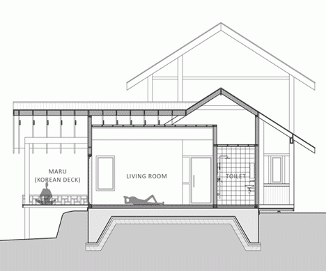
Located on a sunny hillside near the provincial town of Geochang, the timber-framed house has traditional Korean architectural features including a raised timber “maru” deck offering views of the surrounding countryside.

House in Geochang by studio_GAON

The daughter and parents are accommodated on the second floor and ground floor annex respectively, sharing the living room and maru with the owners.

House in Geochang by studio_GAON

The house is designed to engender a sense of tranquility and privacy, allowing the owners to rest after their long careers.

House in Geochang by studio_GAON

“The scenery is so peaceful that it feels like midday nap soaks into a body as softly blowing wind,” write studio_GAON. “Nobody hinders or prohibits ingoing, but the house is so peculiar located that nobody from outside can see the inside.”

House in Geochang by studio_GAON

Here’s some more information from the architects:


House in Geochang

House in Geochang is the house built on a sunny hill of Geochang, a Korean provincial city. There is a tall, brushy dogwood in the site, and a spring next to the tree which always provides fresh water. Also there is a small pool at the foot of the hill.

House in Geochang by studio_GAON

The scenery is so peaceful that it feels like midday nap soaks into a body as softly blowing wind. Nobody hinders or prohibits ingoing, but the house is so peculiar located that nobody from outside can see the inside. Slope of the hill is moderately steep, and wind is blowing quietly. This is an ideal land, which has hill, water, wind and tree.

House in Geochang by studio_GAON

The house was built by a sexagenarian couple who was going to live with octogenarian parents. The house owner, who devoted his entire life to social movements (labor movements) resembles Prometheus, a Titan in Greek mythology.

House in Geochang by studio_GAON

The couple helped others during their whole life, and even now they are taking care of others at every opportunity. They are planning to grow walnuts after completing the house. So they wanted a land which is suitable for farming, and a house which can provide true relaxation.

House in Geochang by studio_GAON

So we wanted a modest and cozy house, which will not wake the Titan, who takes rest after a long time, from his nap. Nap is a temporary sleep, a sleep which provides a clear mind after waking up. Here they will take sleep and rest soundly. For this reason, we decided to call the house as ‘House, where shade rests’.

House in Geochang by studio_GAON

Required spaces are rooms for the couple, parents and daughter respectively, living room as common space, two restrooms and an attic. The relationships whithin the family is good, but we targeted on keeping discreet distance and protecting private life in order to prevent discomfort due to overly nearness and excessive consideration.

House in Geochang by studio_GAON

On the East corner, where the dogwood is seen clearly, we put a kitchen and dining room, and on the opposite side, projected the living room to the main approach, and added a wide floor. For this reason, if we see the house from the front, the part of left side is a space for daughter-in-law, and the part of right side is a space for mother-in-law.

House in Geochang by studio_GAON

The living space for the daughter-in-law is a kitchen and dining room, where the dogwood and spring are very close to. The living space for the mother-in-law is living room and main room, which has a good view of a garden and village. For a daughter, who wants a separate space, assigned a room with a balcony on the 2nd floor, and from there she can have a talk with a person on a deck connected with a kitchen, looking each other.

House in Geochang by studio_GAON

Due to the form of the site, the house was slightly tilted along East-West axis and took elongated shape. Since the scenery of the hill located on North-West side was so beautiful, they should be seen from the kitchen and living room, and we made windows toward South and North in order to receive warm sunlight from South.

As the house owner wished, we hope the family will remember this house as their new home, as the cozy and comfortable house, receiving consolation from nature. The building, like a farmer who endured storm and eventually collected teemful harvest, will be a permanent living place for the three generation family.

Architect: Hyoungnam Lim, Eunjoo Roh + studio_GAON

Project Team: Sangwoo Lee, Minjung Choi, Sungpil Lee, Seongwon Son, Hanmoe Lee
Photographs: Youngchea Park
Location: Hangi-ri, Ungyang-myeon, Geochang-gun, Gyeongsangnam-do, South Korea
Program: House
Site Area: 596㎡
Building Area: 128.47㎡
Gross Floor Area: 163.78㎡
Building Scope: 2F
Building-to-Land Ratio: 21.56%
Floor Area Ratio: 27.48%
Structure: Wood Light Frame Construction
Finish: Stucco, Wood
Supervision: studio_GAON
Design Period: 2012.9.1 – 2012.12.4
Construction Period: 2013.1.12 – 2013.5.2

House in Geochang by studio_GAON
Site plan – click for larger image
House in Geochang by studio_GAON
Floor plans – click for larger image
House in Geochang by studio_GAON
Long section – click for larger image
House in Geochang by studio_GAON
Cross section

The post House in Geochang
by studio_GAON
appeared first on Dezeen.

“We thought Lloyd’s building was the ultimate in technology, but it’s practically hand made”

In our next movie focussing on key projects by Richard Rogers, the British architect talks exclusively to Dezeen about his radical Lloyd’s building in London and explains why he is not completely comfortable with the “high-tech” label that is often applied to his work.

"We thought Lloyd's building was the ultimate in technology, but it's practically hand made"
Richard Rogers of Rogers Stirk Harbour + Partners. Photo copyright: Dezeen

Completed in 1986 for insurance company Lloyd’s of London, Lloyd’s building comprises three main towers, each with an accompanying service tower, which surround a central rectangular atrium housing the main trading floor.

"We thought Lloyd's building was the ultimate in technology, but it's practically hand made"
Lloyd’s building in London. Photo courtesy of Shutterstock

Often cited as a pioneering example of high-tech architecture, Lloyd’s building was considered radical because, like Rogers‘ preceding Centre Pompidou in Paris, all of its services, including staircases, lifts and water pipes, are on display on the outside of the building.

"We thought Lloyd's building was the ultimate in technology, but it's practically hand made"
Photo courtesy of Shutterstock

“We were able to convince Lloyd’s that we would put the mechanical services on the outside because mechanical services have a short life,” Rogers explains.

"We thought Lloyd's building was the ultimate in technology, but it's practically hand made"
Central atrium of Lloyd’s building. Photo copyright: Richard Bryant / Arcaid.co.uk

As with the Centre Pompidou, the idea was to make the central spaces as open and flexible as possible. “[We] kept the floors clear because Lloyd’s said they wanted two things,” Rogers says.

“They wanted a building that would last into the next century – we met that one – and they wanted a building that could meet their changing needs.”

"We thought Lloyd's building was the ultimate in technology, but it's practically hand made"
Central atrium of Lloyd’s building. Photo copyright: Richard Bryant / Arcaid.co.uk

However, Rogers says that he does not completely agree with the use of the term “high-tech” to describe the building.

“I have no great love for high-tech,” he says. “One would like to think one uses the appropriate materials, but of course appropriate materials are shaped by the time you live in. So we use the technology of today – and the technology of yesterday where appropriate – to build the buildings of today.”

"We thought Lloyd's building was the ultimate in technology, but it's practically hand made"
Photo copyright: Richard Bryant / Arcaid.co.uk

He continues: “We thought Lloyd’s was the absolute ultimate in the art of technology. When I look at it now, it’s practically hand made. People say, ‘well, it’s technology and therefore it’s a high-tech building.’ It’s a bit too easy.”

"We thought Lloyd's building was the ultimate in technology, but it's practically hand made"
Photo courtesy of Shutterstock

A 200 year-old City of London institution at the time, Lloyd’s seemed an unlikely client for such a bold building.

“It was very traditional,” Rogers says. “The only bit of technology when we went to see the [previous] Lloyd’s building inside was a Xerox machine and some people were still writing with feathers and ink.”

"We thought Lloyd's building was the ultimate in technology, but it's practically hand made"
Photo copyright: Richard Bryant / Arcaid.co.uk

However, Rogers says that the company was actually very forward-looking. “It was backwards only in the process,” he says. “Of course, it was the most famous insurance firm in the world and obviously contained a very cutting-edge element within that.”

He continues: “We were again extremely fortunate, in the same way as we were with the Pompidou. The real critical thing in architecture is having a good client. A good client is not somebody who just says ‘yes’, it’s a client that is engaged in the evolution of the building, who responds.”

"We thought Lloyd's building was the ultimate in technology, but it's practically hand made"
Photo courtesy of Shutterstock

While Rogers worked closely with Lloyd’s on the functional aspects of the building, he says he had more freedom over the aesthetics. “We were dealing with people who knew about change, knew about risk, but hadn’t a clue about art,” he explains. “The ducts, the pieces on the outside, allowed us to play a game with light and shadow.”

"We thought Lloyd's building was the ultimate in technology, but it's practically hand made"
Model of Lloyd’s building currently on show at the Royal Academy of Arts

Despite enjoying a productive relationship with Lloyd’s initially, there were still challenges to overcome to get the building built.

“A year before the end of building, there was an investigation by the Bank of England into Lloyd’s and the chairman and everyone had to resign,” Rogers says. “The next chairman hated us, so we had a very tough last year.”

"We thought Lloyd's building was the ultimate in technology, but it's practically hand made"
Photo courtesy of Shutterstock

Rogers says that the general reaction to the building once it was completed was also hostile, although opinion changed over time. Lloyd’s building was Grade I listed in 2011, just 25 years after it was built, and Rogers sees parallels between it and Christopher Wren’s iconic St Paul’s Cathedral.

“Wren was in his seventies when he at last got St Paul’s built,” he says, recounting a story that the dean of St Paul’s Cathedral told him at the opening of Lloyd’s building. “He’d started thirty years beforehand and was so tired of having his building attacked and turned down, by the time he got to building it he put a twenty foot fence all around the site so that nobody could see it.”

"We thought Lloyd's building was the ultimate in technology, but it's practically hand made"
Photo courtesy of Shutterstock

“So even St Paul’s was a shock of the new. We think its been there forever – certainly Prince Charles thinks it has been there forever – but it hasn’t. It was a risky building to build in those times, which is why it is great.”

Rogers was speaking to Dezeen to mark the opening of an exhibition called Richard Rogers RA: Inside Out at the Royal Academy of Arts in London.

Watch our previous interview with Rogers about the exhibition »
See our earlier story about the exhibition »

"We thought Lloyd's building was the ultimate in technology, but it's practically hand made"
Rogers’ sketch of Lloyd’s building. Copyright: Rogers Stirk Harbour + Partners

The London home designed by Rogers for his parents, and which influenced his later design for the Pompidou Centre, was recently put on the market for the first time since it was built in 1968.

Read the full story about Rogers House »
See all our stories about Richard Rogers »

The post “We thought Lloyd’s building was the ultimate
in technology, but it’s practically hand made”
appeared first on Dezeen.

Sydney House by Fearns Studio

Long brick and wood volumes extend down the narrow plot of this house in Bondi, Sydney, by local architect Fearns Studio (+ slideshow).

Sydney House by Fearns Studio

While renovating a single-storey Victorian terrace, Fearns Studio filled the thin strip of land behind with a blackened wood cuboid on top of brick ground floor that’s painted white.

Sydney House by Fearns Studio

Under the pitched roof of the old house, a lounge faces the street and a bedroom behind is connected to a bathroom via a small courtyard.

Sydney House by Fearns Studio

These rooms are joined by a long corridor that leads from the front door to the large open-plan dining, kitchen and living area.

Sydney House by Fearns Studio

Ground-floor rooms are lit by skylights, as well as patio doors along the thin alleyway down one side of the house that leads to a courtyard.

Sydney House by Fearns Studio

“Skylight penetrations bring light into the centre of the plan, helping to define spaces within it,” said architect Matt Fearns.

Sydney House by Fearns Studio

Stairs behind one wall of the double-height dining space lead up to two more bedrooms, which both have a balcony and share a bathroom.

Sydney House by Fearns Studio

Kitchen units, tables and cupboard doors match the wooden window and door frames, which warm the neutral interior.

Sydney House by Fearns Studio

A guest bedroom and ensuite bathroom sit above a garage at the bottom of the garden.

Sydney House by Fearns Studio

More homes down under include a zinc-clad house with a sand dune-shaped body and a periscope-shaped extension to two terraced homes, plus we recently created a Pinterest board of all the best images of Australian houses.

Photographs are by Tom Ferguson.

See more Australian houses »
See more architecture and design in Sydney »

Read on for more information from the architect:


Bondi House by Fearns Studio

A renovation of an inner city, Victorian terrace house, the Bondi House was conceived as a first floor timber tube above a ground level brick box behind the retained portion of the house.

Sydney House by Fearns Studio
Ground floor plan – click for larger image and key

Skylight penetrations bring light into the centre of the plan, help define spaces within it and protect the privacy of neighbouring dwellings from upper level rooms while large glazed doors open new ground level interiors to unobtrusive garden courtyards.

Sydney House by Fearns Studio
First floor plan – click for larger image and key

Deep door reveals in the kitchen and living areas frame smaller spaces within the open plan with light and rhythm.

Sydney House by Fearns Studio
Roof plan – click for larger image

The doors themselves emphasise this further by sliding completely clear of their openings.

Sydney House by Fearns Studio
Long section – click for larger image and key

Warmth is given to the white plaster walls and ceilings and to concrete flooring with oak cabinetry, windows, doors and with blackbutt flooring through the remainder of the house.

Sydney House by Fearns Studio_20
Long elevation – click for larger image and key

The post Sydney House by
Fearns Studio
appeared first on Dezeen.

Chinese heritage group “offended” by Zaha Hadid’s RIBA Award for Galaxy Soho

Chinese heritage group "offended" by Zaha Hadid's RIBA Award for Galaxy Soho

News: a heritage group in Beijing has written an open letter to the Royal Institute of British Architects saying it is “disappointed and offended” that Zaha Hadid’s Galaxy Soho complex has been given an RIBA International Award.

The letter from the Beijing Cultural Heritage Protection Center attacked the RIBA‘s decision to award the 330,000-square-metre retail, office and entertainment complex in Beijing, which it labeled a “typical unfortunate example [of] the destruction of Beijing old town.”

“The Galaxy Soho project has violated a number of heritage preservation laws and regulations,” said the letter. “It has also caused great damage to the preservation of the old Beijing streetscape, the original urban plan, the traditional Hutong and courtyard houses.”

The letter urged the RIBA to “have a deeper understanding of the current situation in modern Chinese society.” It claims the award could encourage developers and authorities to continue with the “destruction of cultural heritage sites”, which it says has “been a very common offence committed by many of the growing rich and powerful.”

Zaha Hadid’s Galaxy Soho complex photographed from the surrounding streets by Hufton + Crow

The building is also one of three projects nominated for this year’s RIBA Lubetkin Prize, alongside Gardens by the Bay by Grant Associates and Wilkinson Eyre Architects in Singapore and an affordable housing project in New York by by Dattner Architects and Grimshaw.

“These cutting-edge schemes show the leading role that architects play in delivering visionary new thinking about urban issues,” said RIBA president Angela Brady on the announcement of the shortlist last month.

Completed in October last year, the Galaxy Soho complex comprises four domed structures fused together by bridges and platforms between curving floor plates.

Check out more photos of the structure taken from the surrounding streets here and take a movie tour through the complex here.

More about architecture and design by Zaha Hadid »
More about architecture in China »

Here’s the full letter from the Beijing Cultural Heritage Protection Center:


An Open Letter to the Royal Institute of British Architects (RIBA) on Its 2013 RIBA Award for Galaxy Soho

To Whom It May Concern at RIBA:

From the recent Weibo (Sina miniblog) post by the Honorable Ambassador of the United Kingdom, we have learned that the Galaxy Soho project, designed by British Architect Zaha Hadid, has won the 2013 RIBA award. Many of us in China were very shocked when they learned this news. The Galaxy Soho project has violated a number of heritage preservation laws and regulations, including the Measures for the Protection of Historical and Cultural Landmarks of Beijing, The Beijing City Master Plan, and Plans for Protection of Historical and Cultural Landmarks of Beijing. It has also caused great damage to the preservation of the old Beijing streetscape, the original urban plan, the traditional Hutong and courtyard houses, the landscape formation, and the style and color scheme of Beijing’s unique vernacular architecture. During the land acquisition process, the legal rights of the original hutong residents were also grossly disregarded. The Galaxy Soho Project is definitely a typical unfortunate example on the destruction of Beijing old town; but, not withstanding, it has been selected as a winner of your award. Many of us in Beijing are very disappointed and offended.

The destruction of cultural heritage sites and the violation of the public cultural rights have been a very common offense committed by many of the growing rich and powerful in Chinese society. Some developers work hand-in-hand with some corrupted officials to encroach upon the precious cultural heritage which should be enjoyed by the entire society, while they accumulate their own personal wealth. Due to the incompetence of law enforcement institutions, this kind of destruction is growing quickly, and the deliberate neglect is epidemic.

Many residents of Beijing, including us, sincerely wish that your institution would have a deeper understanding of the current situation in modern Chinese society, the severe challenges facing cultural heritage preservation in China, as well as the indecent conduct of many greedy developers. We strongly believe that this award by your institution will only encourage these developers and authorities to continue to commit the wrongs they have done and will increase the difficulties of cultural heritage preservation in China.

We sincerely hope that RIBA will understand this sorrow and concern of the Chinese people and take action to help make up for the negative impact this award has caused.

Earnestly,

Beijing Cultural Heritage Protection Center (CHP)

The post Chinese heritage group “offended” by
Zaha Hadid’s RIBA Award for Galaxy Soho
appeared first on Dezeen.

Paramount Residence Alma by Plasma Studio

This slatted structure by architects Plasma Studio looks like it’s crawling over an apartment building in the Italian Dolomites (+ slideshow).

Paramount Residence Alma by Plasma Studio

Plasma Studio were faced with the dual tasks of adding a circulation space and a new family home to an existing block in the South Tyrol village of Sesto, close to the Austrian border.

“An under-utilised roof space gave way to an angular crown, connected to a ground floor reception space and architectural office by the host’s renovated spine,” said the architects.

Paramount Residence Alma by Plasma Studio

Parametric software created an angular shape that folds around and on top of the original cuboid form, covered by thin strips of larch wood similar to the Strata Hotel the studio designed just down the valley.

The structure appears to grow out of the hillside, snaking up the back of the building as a series of faceted planes.

Paramount Residence Alma by Plasma Studio

Two levels are housed inside the extension, which uses the sloping site so the lower floor nestles against the top floor existing building but opens out onto a garden on the same level behind.

Inside, bedrooms face on to a corridor lit by a glass chasm that extends up and over the building.

Paramount Residence Alma by Plasma Studio

An open-plan living, kitchen and dining area are housed in the upper storey, which sits at a slight angle to the structure below to further differentiate it.

The large balcony on this level looks out to the forested hills and snow-capped peaks on the other side of the valley.

Paramount Residence Alma by Plasma Studio

These two floors are linked by internal and external staircases, and also connect to the circulation core that provides access to each of the six apartments in the whitewashed building underneath.

Plasma Studio has also designed an apartment block with jagged copper balconies and angular LED street lamps.

Paramount Residence Alma by Plasma Studio

More houses set in the rugged Italian landscape include a gabled home with stripy wooden walls and a holiday retreat that incorporates an enormous window frame into a reconstructed stone wall.

Photography is by Hertha Hurnaus.

See more residential extensions »
See more architecture and design by Plasma Studio »
See more Italian houses »

The architects sent us the project description below:


Paramount Residence Alma

This project was conceived to fulfil a two-part problematic: (1) Residence Alma -a Tyrolean guest house with 6 holiday apartments from the 1960s adorned with a pitched roof – was due for a common circulation and service core, and (2) the project architect, Ulla Hell, was looking for a new home for her young family of five in the mountain community of Sesto. The result: an under-utilised roof space gave way to an angular crown, connected to a ground floor reception space and architectural office by the host’s renovated spine.

Paramount Residence Alma by Plasma Studio
Extension diagram

Having already made their mark on nearby Residence Königswarte with the addition of the Strata Hotel in 2007, Plasma Studio sought to follow a similar skin organization. A timber strip section in larch wood was borrowed from the neighbouring Strata and extruded along two paths. The first stretches across the site, picking up the topography on either end of the building and climbing to enclose a third storey balcony. Here, the edge skirts around the existing footprint, leaving corners exposed to acknowledge its presence.

A second path draws the timber skin up from behind, folding around the chimney to return to the ground. Interstitial spaces between the exterior walls and wooden bands swell at ground level to offer sheltered outdoor living spaces. The design team employed parametric modelling software to optimize the density of these timber strips and their metal substrustructure, balancing budget, aesthetics, privacy and views. This approach allowed for flexibility throughout the design phase and output shop drawings for pre-fabricated elements at an efficient pace.

Paramount Residence Alma by Plasma Studio
Roof plan diagram

The Alma addition departs, however, from the Strata in its approach to volume. The practical constraints of a multi-room hotel structure called for a regular distribution of modules along a connecting spine. The perceived volume was achieved through horizontal sections around free-flowing terrace spaces. With the Alma, we took advantage of a more flexible program to create unique spatial conditions. These interior volumes are rendered legible from the exterior by the timber strips–an honest depiction of the playful activity within.

The interior of this family home is characterized by 360-degree views. Perhaps the most spectacular of these being a view of the sky through an incision over the central stair. This opening delivers an immediate reading of exterior weather conditions, collecting precipitation and receiving direct sunlight.

Paramount Residence Alma by Plasma Studio
Elevation diagram

The main living spaces are split over two floors with first floor bedrooms off a skylit corridor, and an open plan kitchen, dining and family room encircling a fireplace on the second floor. By grouping functional elements in orthogonal cores, the surrounding space is liberated. The exterior walls of the main living spaces collapse inwards to catch light, views and varying degrees of enclosure.

All living spaces in the private residence have direct access to the outside through a series terraces or gardens. Its multiple access points include: a main entrance through an internal connection to the neighbouring house, a series of openings that follow the natural topography, and an external stair connecting the third floor terrace to the garden. Each inhabitant has come to find their own favourite route.

Paramount Residence Alma by Plasma Studio
Isometric diagram

Limited material and colour palettes give strength to the space, with splashes of colour in the children’s washroom. The otherwise white walls provide a backdrop for an ever-changing display of shadows from the pleated roof above.

As the extension sits within the steep topography, substructural elements were developed in reinforced concrete, while the superstructure was built from prefabricated cross laminated timber (CLT) insulated with wood fiber and sealed with black bitumen. The outer skin in larch wood strips on a galvanized steel structure was determined according to cost and aesthetics by the aforementioned parametric model. A consistently limited colour code was applied to the exterior, allowing the volume to dissolve into the surrounding hillside when viewed from afar.

Through its use of form, materials and views, this newly completed addition flirts with its context at three scales. The first, and most immediate, with its host: as an addition to the Alma residence, it shares a newly renovated core, carrying the fractal geometry from the roof down to Plasma’s Italian office through the Alma’s cartesian skeleton. The second, with its neighbour: together the Strata and the Alma define the next generation of the family-owned hotel complex. And finally, with its terrain: the sculptural addition acts, not as a parasite, but as a mediator between the existing house and surrounding topography, extending from the landscape like a lichen.

The post Paramount Residence Alma
by Plasma Studio
appeared first on Dezeen.