A triple-height gallery housing a collection of prized paintings is concealed behind the wooden shingle facade of this house in Stuttgart by German architecture studio (se)arch (photos by Zooey Braun + slideshow).
Located to the south of the city, the gabled four-storey Haus B19 was designed by (se)arch as the home for a family of five, but the architects were also asked to include a gallery where the occupants could present a collection of artworks by “old masters”.
Three of the house’s exterior walls are clad from top to bottom with handmade Alaska cedar shingles, which will naturally fade from a warm yellow colour to a silvery grey tone. Meanwhile, the south-facing rear elevation is glazed to offer views of the distant mountains.
The lofty gallery is positioned on the northern side of the building and is separated from living areas by a bulky concrete core that contains small rooms, utility areas and the main staircase.
A kitchen is one of the spaces contained within the concrete volume, and it features windows on both sides to allow views between the gallery and a large living and dining room on the southern side of the house.
Sliding glass doors allow the living room to be transformed into a loggia. This design is repeated on the first floor, where three bedrooms open to a balcony spanning the width of the building.
A selection of walls throughout the house are painted with a dark shade of pink, standing out against the exposed concrete of the central structure and the warm brown joinery of kitchen units, doors and bookshelves slotted into its recesses.
Clerestory windows bring light down into the gallery at eaves height, while a narrow skylight along the ridge of the roof lets daylight flood into a master bedroom on the uppermost floor.
The bathroom is on the first floor and includes a window offering residents a view down to the gallery when taking a bath.
The double pitch roof building is located in a peaceful residential area in the south of Stuttgart.
The building houses a family of five and offers living space on several levels and it creates space for a private exhibition area. The client has a collection of paintings with works by old masters and the gallery space is an adequate framework. The floor plan principle consists of a functional bar in the centre of the building. This divides the gallery space and family living. This massive concrete core, which extends over all four floors, includes serving elements such as stairs, kitchen, bathrooms as well as technical supplies.
This also creates an exceptional entree: behind the door, the porch extends into the gallery space, which rises to below the fully glazed roof ridge. The closed, painted in warm brown north face offers a serene setting for the paintings, which will be staged by the interplay of natural and artificial light. In combination with the brittle surfaces of the concrete bar, this dynamic sculpture emerges anywhere in the room and captivates with a delightful interplay.
The living room on the south side is communicative family meeting place, a room with fireplace and dining area. Floor-to-ceiling glass doors open it over the entire width of the building of the offshore loggia and provide a view into the landscape. Similarly, the private retreat rooms on the two upper floors benefit from the beautiful distant view of the Swabian Alb. Picturesque perspectives, however, offers the bathroom on the first floor, which holds a glass eye contact with the gallery. Openings in the serving rail provide visual references and link free gallery and living room together.
Structurally, the concrete core, which results from the massive garden level is covered by a solid wood construction, which describes the outer shell of the building. The outside of the timber construction is covered with wooden shingles. The shingles of Alaska cedar are split by hand and are not only extremely durable, they gradually get a silver-grey patina and envelop the house with its natural environment.
London and Montreal designer Emilie F. Grenier has created set of brass tools and a silk outfit for mining feldspar – the most plentiful mineral on Earth.
Emilie F. Grenier‘s Disquiet Luxurians project considers redefining luxury so the process of creating products such as jewellery becomes the expensive factor rather than the material.
She proposes that if craft was to be valued higher than materials, gems for jewellery could be sourced and fashioned from the group of minerals called feldspar instead of rare stones.
Feldspars are formed from crystallised magma and make up around 60% of the earth’s crust.
Grenier’s collection of opulent tools becomes the luxury element of the process as opposed to the mined minerals, as one set of utensils can be used to eventually create many pieces of jewellery.
Her set comprises three chisels with square, hexagonal and oval cutting heads, plus a hexagonal block used to hammer the ends of each tool.
Grenier made the implements from brass, a much more malleable metal than those traditionally used to made chisels such as steel. “Brass is a softer alloy, hence rarely used to craft stone-carving chisels or hammer heads,” she told Dezeen.
She designed a green silk boiler suit to be worn when mining the mineral, which was purposefully made to be difficult to move in.
“Silk chiffon is an incredibly delicate textile with barely any give – potentially one of the worst materials to use for utility clothing,” said Grenier. “In doing so, the post-luxurian mining experience became a geological choreography, and the act of collecting less mechanical, and more unique. This was one of the strategies in this project to add value to the most plentiful mineral on Earth.”
Grenier also produced range of feldspar gems, cut into simple shapes with the help of lapidaries at Holt Gems in London.
“The set of gems was designed with über minimalist shapes to expose the fragility of the stone,” she explained. “Cutting them according to traditional gemmology standards would have rendered them too common, too commercial.”
A chunky ring she made is presented on a rough section of the material beneath a glass bell jar.
“The ring was inspired by art deco jewellery, from a time when women only wore the fanciest pieces at the fanciest soirées, but the jewels actually spent their lives in beautiful vanity cases and became instant heirlooms,” Grenier said. “This was why it was important for me to design a vanity case as well, using a rougher cut of the stone to highlight its provenance, and the lapidary’s craft.”
News: the American Institute of Architects (AIA) has announced 26 winners for this year’s Institute Honor Awards, including a holocaust museum beneath a hill in Los Angeles, a stone mausoleum in Minneapolis, and a concrete house on a rocky outcrop in Washington (+ slideshow).
Lakewood Cemetery Garden Mausoleum by HGA Architects and Engineers – photograph by Paul Crosby
The AIA awards, which recognise excellence in the fields of architecture, interior architecture and urban design, awards projects from all around the world by architects licensed in the United States, and this year’s winning firms include SOM, Olson Kundig Architects, KieranTimberlake and WXY Architecture + Urban Design.
Brooklyn Botanic Garden Visitor Centre by Weiss/Manfredi – photograph by Albert Večerka
Winners in the architecture category include the renovation of a Beaux Arts library in St. Louis, an art college at a former railroad complex in Georgia and a visitor centre with a curving green roof at a botanic garden in Brooklyn.
St. Louis Public Library by Cannon Design – photograph by Tim Hursley
A bar in a converted warehouse in San Francisco and an overhauled 1970s library in Seattle were among projects recognised in the interior design category, while urban design projects to pick up awards included a vision for Manhattan’s East River waterfront in the wake of Hurricane Sandy and a new zoning code for public spaces in Miami.
The East River Blueway Plan by WXY architecture + urban design
A jury of architects and academics selected this year’s winners from over 500 submissions and the awards will be presented at the AIA 2014 National Convention and Design Exposition in Chicago this June.
The Los Angeles Museum of the Holocaust by Belzberg Architects
See the full list of winning projects below with descriptions from the AIA:
2014 Institute Honor Awards for Architecture
Photograph by Albert Večerka
Brooklyn Botanic Garden Visitor Centre; Brooklyn, New York WEISS/MANFREDI
The Brooklyn Botanic Garden Visitor Centre is an inhabitable topography defining a threshold between the city and the garden, culture and cultivation. Nested into an existing berm, the LEED Gold building is a seamless extension of the garden path system, framing views through the historic garden. As a chameleon-like structure, the visitor centre transitions from an architectural presence at the street into a structured landscape in the botanic garden. The building redefines the physical and philosophical relationship between visitor and garden, introducing new connections between landscape and structure, exhibition and movement.
Photograph by Maris Mezulis
Centre for International Governance and Innovation (CIGI) Campus; Waterloo, Ontario, Canada KPMB Architects
This project is located on a 3.9-acre site and is a reinterpretation of a traditional academic quad building based on the Oxford model. The client asked for a campus to last at least 100 years, a “vibrant sanctuary”, to facilitate reflection, collaboration, and discussion. The solution consists of two three-story, interconnected buildings and an auditorium pavilion organised around a courtyard. The scale, proportions and materials of the brick elevations facing the street are a direct response to the 19th-century masonry industrial buildings in the surrounding neighbourhood. A limited palette of local limestone and brick masonry, wood and glass was used to create a serene atmosphere for study and reflection.
Photograph by Jane Messinger
New Boathouse for Community Rowing, Inc. (CRI); Boston Anmahian Winton Architects
This is the first permanent facility for Community Rowing, the largest public rowing organisation in the country. The project is composed of two buildings that form a courtyard that overlays two typically incompatible conditions: a public forecourt to the river and a staging terrace for the boats. The small building, a glass-shingled pavilion for single shells, displays the boats to the adjacent parkway. The large building houses longer boats, offices, and training rooms. The unique kinetic cladding system, which regulates natural ventilation and light, literally transforms the shape of the building and its relationship to the surrounding landscape.
Photograph by Matthew Millman
Jackson Hole Airport; Jackson, Wyoming Gensler
With respect to Teton National Park, The Jackson Hole Airport renovation and expansion considers the building as a simple, understated foreground feature intended to merely reside within the landscape. The queen-post trusses reduced beam depths, increasing the volume, allowing for an expansive glass curtain wall that reinforces the connection between interior and exterior. This LEED Silver Certified airport distinguishes itself from the aesthetics of typical airports because of its regional design approach, materiality, and intimate scale. The airport serves as passenger’s first and last impression to this truly unique region.
Photograph by Benjamin Benschneider
King Street Station; Seattle ZGF Architects LLP
The rehabilitation of King Street Station restores historic 1906 architectural finishes, re-establishes the station as a modern transportation hub and capitalises on materials and energy invested a century ago by reusing materials rather than replacing them. The project enhances public spaces, improves pedestrian and multi-modal connections in and around the station, and has served as a catalyst for additional redevelopment within the neighbourhood. Securing the station for the future, the rehabilitation also included significant seismic and structural updates to improve the building’s safety and durability. The project has achieved LEED Platinum certification.
Photograph by Paul Crosby
Lakewood Cemetery Garden Mausoleum; Minneapolis HGA Architects and Engineers
Addressing the intimacy of personal grieving and the shared rituals of commemoration, the design for the new Garden Mausoleum at Lakewood Cemetery in Minneapolis revisits an ancient building type whose setting demands contextual sensitivity and attention to materiality. The mausoleum minimises the visual impact on its historic context by nestling more than three-quarters of the building into an existing south-facing hillside. In each crypt and columbarium room, daylight strengthens the relationship between the spiritual and the earth-bound while offering a serene and healing environment. The material palette – stone, bronze, wood and glass – calls upon visual and experiential senses while recalling centuries of memorial tradition.
The Los Angeles Museum of the Holocaust; Los Angeles Belzberg Architects
The Los Angeles Museum of the Holocaust is submerged into the surrounding public park space allowing the landscape to continue over the structure. Pathways are morphed onto the building and appropriated as surface patterning. The museum emerges from the landscape as a single, curving concrete wall that splits and carves into the ground to form the entry. Entry to the building entails a gradual deterioration of this visual and auditory connection to the park while descending a long ramp. Inside visitors experience a series of isolated spaces saturated with interactive archival content with diminishing natural light while descending further into the earth.
Photograph by Benjamin Benschneider
The Pierre; San Juan Island, Washington Olson Kundig Architects
A secure and unexpected retreat nestled into a rocky outcropping, The Pierre (French for stone) celebrates the materiality of its Pacific Northwest site. The house – composed of concrete, wood, steel and glass, and topped with a green roof – visually and physically merges with nature. Inside, rugged surfaces of rock periodically emerge into the space, contrasting with the refined textures of the furnishings. While one side of the house is hunkered into the site, the other overlooks the water, balancing the dual desires of prospect and refuge.
Photograph by Michael Moran
Quaker Meeting House and Arts Centre, Sidwell Friends School; Washington; D.C. KieranTimberlake
With a minimum of means, this project transforms a non-descript 1950s gymnasium into a Quaker Meeting House and Arts Centre serving the entire middle and upper school community at Sidwell Friends School. The building program includes a worship space, visual art and music rooms, and exhibition areas. The essence of Quaker Meeting, and thus the Meeting House itself, is silence and light. Architecturally this is achieved by filtering light and sound through architecture, landscape, structure, and systems arranged in successive concentric layers around a central source of illumination, both literal and spiritual.
Photograph by SCAD
SCAD Museum of Art; Savannah, Georgia Sottile & Sottile and Lord Aeck Sargent in association with Dawson Architects
Resurrecting the ruins of the nation’s only surviving antebellum railroad complex, the Savannah College of Art and Design transformed a National Historic Landmark. The design process emphasised an artistically manual approach, honouring the humanity and integrity of the site’s heritage. Ruins were integrated within a contemporary concrete structure, preserving and highlighting the historic materials as a fundamental part of the new architecture. With its galleries, art studios, classrooms, theater, public gardens, and vibrant streetscape, this new civic landmark stands as a centre of intellectual exchange, artistic discovery, and urban evolution.
Photograph by Tim Hursley
St. Louis Public Library, Central Library Transformation and Restoration; St. Louis Cannon Design
St. Louis Public Library’s Central Library, designed by Cass Gilbert, fills a city block in the centre of downtown St. Louis. The transformation of the 3-story 1912 Beaux Arts structure focused on the north wing, replacing multistorey, non-public book stacks with a new “building within the building” for public use. Now light filled and welcoming to its urban neighbours, the north wing is a new entrance surrounded by upper stories of books visible to all. The original entry and public rooms are restored and revitalised, continuing their active use as a vibrant public resource.
2014 Institute Honor Awards for Interior Architecture
Photograph by Matthew Millman
Bar Agricole; San Francisco Aidlin Darling Design
This project is a 1,400-square-foot restaurant and bar located in San Francisco’s industrial South of Market district. A wooden “hull” -constructed of reclaimed whiskey-barrel oak, milled into thin strips, and suspended from the ceiling – creates a sense of intimacy in the long, tall interior of the former warehouse building. Above the hull, three existing skylights, fitted with delicate glass sculptures formed from warped Pyrex cylinders, filter natural light throughout the space. Designed to complement the restaurant’s seasonal menu, the interior palette balances warm textures with the use of durable, sustainable materials. Two bars, made of board-formed concrete and old barn beams, anchor the space. Inch-thick ribbons of ductal concrete form the high-backed banquettes.
Photograph by Richard Bryant
K&L Gates at One New Change; London, United Kingdom Lehman Smith McLeish
International law firm K&L Gates’ London office is seamlessly integrated into Land Securities’ complex and iconic One New Change, which was designed by Jean Nouvel. Commanding views of St. Paul’s Cathedral are a backdrop to technologically advanced meeting spaces and collaborative work areas that enhance the provision of integrated global services. The design responds directly to the dynamic and irregular building envelope, with enclosures, ceiling treatments, lighting, and site-specific art that define space and reflect K&L Gates’ physical and strategic brand.
Photograph by Elizabeth Felicella
Knoll Flagship Showroom, Offices and Shop; New York City Architecture Research Office
Architecture Research Office’s design of Knoll’s New York showroom, offices, and shop reflects intelligent planning, sensitivity to craft and joyful materiality. A choreographed path draws visitors from the ground floor shop through the showroom and offices. Colourful textile layers define the space, including a vibrant 55-foot wall that showcases 2,400 material samples. Two steel stairs display felt and leather and promote connectivity in the offices, where clients experience open plan, private office and activity spaces in use. This mix of spaces supports a variety of work styles – formal, informal, public and private.
The Los Angeles Museum of the Holocaust; Los Angeles Belzberg Architects
The interior architecture at The Los Angeles Museum of the Holocaust employs natural light and the morphing of space to open and lift or darken and compress the user’s experience at key points. The lighting of the interior galleries dim as the visitor steps deeper into the earth and subsequent rooms, while limited natural light serves as a companion to each patron’s unique experience. The final ascent up is filled with sights and sounds of unrestricted park land. The exhibition design incorporates educational content that is synthesised with all aspects of the design via innovative technology using integrated interactive design methods.
Photograph by Scott Frances
Marc by Marc Jacobs Showroom; New York City Jaklitsch/Gardner Architects PC; HLW International
The Marc by Marc Jacobs Showroom is housed within the Manhattan headquarters of the global fashion house Marc Jacobs. The showroom is a reinvention of the client’s original space and addresses the challenge to maximise the use of daylight within the building’s deep floorplate, while simultaneously addressing the need for areas of relative privacy. The design solution employs a central curvilinear glass form as an organising element of the space which is used to filter natural light while creating subtle visual screening to delineate the private zones.
Photograph by Lara Swimmer
Odegaard Undergraduate Library; Seattle The Miller Hull Partnership
The interior renovation of the Odegaard Undergraduate Library re-imagines the learning experience for 21st century students through the astonishing transformation of space in an outmoded 1970s building; accomplished in two years by state mandate. Updates to the massive 165,000 square foot library, serving 10,000 students, 24 hours a day, include removal of an imposing atrium stair, and a ‘kit of parts’ approach supporting key learning behaviours in a bright, open setting. New seating, individual and group workstations, and Active Learning Classrooms further enhance the academic experience for a collaborative and tech-savvy student body.
Photograph by Benjamin Benschneider
The Pierre; San Juan Island, Washington Olson Kundig Architects
A secure and unexpected retreat nestled into a rocky outcropping, The Pierre celebrates the materiality of its Pacific Northwest site. The house – composed of concrete, wood, steel and glass, and topped with a planted roof—visually and physically merges with nature. Inside, rugged surfaces of rock periodically emerge into the space, contrasting with the refined textures of the furnishings. Antique and vintage furniture is complemented by custom-designed pieces, while contemporary works of art are displayed inside and outside the house.
SoHo Loft; New York City Gabellini Sheppard Associates LLP
This 8284 square foot interior renovation enhances the SoHo-Loft typology while creating multi-level garden roof terraces. The design emphasises lightness, openness, spatial fluidity and permeability. Light, considered as a tangible material, is the premise on which the program and spatial organisations are based on, with the creation of light apertures helping to organise the uninterrupted space. Influenced by the client’s requests to blur the lines of separation between public and private, children and adult areas, thresholds are defined by sliding translucent doors, acting as light filters, while providing flexibility of use.
Photograph by Eric Staudenmaier
Venture Capital Office Headquarters; Menlo Park, California Paul Murdoch Architects; Kappe Architects Planners
Gardens, transparency and wood finishes create a warm, intimate work environment for this office headquarters of a venture capital firm in Silicon Valley. To reduce on-site construction, the two-story office building is made of prefabricated steel modules set by crane on a concrete parking podium. The building interior is designed to temporarily house and incubate young companies, adapting to their changing needs. Strong, accent-coloured glass expresses the company’s reputation for risk taking while fine, wire-brushed wood finishes form an elegant and understated feeling in keeping with the firm’s market sophistication.
2014 Institute Honor Awards for Regional & Urban Design
Image by University of Arkansas Community Design Centre + Marlon Blackwell Architect
The Creative Corridor: A Main Street Revitalisation for Little Rock; Little Rock, Arkansas University of Arkansas Community Design Centre + Marlon Blackwell Architect
The Creative Corridor retrofits a four-block segment of Little Rock’s historic Main Street based on aggregation of the city’s scattered cultural arts organisations. The project goal is to structure an identity for the Creative Corridor rooted in a mixed-use living environment anchored by the arts, rather than Main Street’s workaday retail base. A townscaping framework reliant on the urbanism of streetscapes—landscape architecture, water management, public space configurations, frontage systems, furniture, and miscellaneous assemblages―ensures a coherent evolution of the street. The street is seen as a platform for capturing value.
Image by Skidmore, Owings & Merrill LLP
Denver Union Station Neighbourhood Transformation; Denver Skidmore, Owings & Merrill
The redevelopment of the former rail yards at Denver Union Station is a case study of the power of transit-oriented urban design. The 42-acre master plan knits together light rail, commuter rail, and buses into a 21st-century intermodal transportation hub. Modal connectivity is facilitated by integrating land use and transportation infrastructure to support more than 4 million square feet of mixed-use urban infill. This substantial public investment has catalysed an unprecedented wave of private-sector activity, with over $1 billion in new projects shaping a transit-oriented precinct and new urban neighbourhood.
Image by WXY architecture + urban design
The East River Blueway Plan; New York City WXY architecture + urban design
The East River Blueway Plan, led by WXY architecture + planning, provides a new vision for Manhattan’s East River waterfront from the Brooklyn Bridge to 38th Street. It addresses issues that were overlooked for the last half century, including waterfront access from the land and water, environmental goals, climate change adaptation and storm resiliency for the waterfront and adjacent neighbourhoods. Completed shortly before Hurricane Sandy, the planning process offered innovations such as structures for storm water capture, saltwater marshes for wave attenuation and water quality, bridges supporting movement along the waterfront, and water recreation including boat launches, pools and fishing.
Image by Duany Plater-Zyberk & Co. LLC
Miami 21: a New Zoning Code for the City; Miami Duany Plater-Zyberk & Co. LLC
Miami 21 is a form-based zoning code that replaced Miami’s Floor Area Ratio (FAR) and land-use based regulations. Using the Transect and the SmartCode as its basis, the new code focuses on the control of building to assure pedestrian-oriented public space, and provide physical predictability for developers and residents alike. Multiple use and density types are consolidated, and the translation from FAR to FLR (floor lot ratio that includes parking) simplifies building capacity measure and reduces parking. A public benefits program encourages the provision of affordable housing, public open space and historic preservation.
The Pearl Brewery Redevelopment Master Plan; San Antonio Lake|Flato Architects
The Pearl Brewery Redevelopment Master Plan is serving as a transformative model and catalyst for green urban revitalisation in a long neglected portion of San Antonio’s inner city. Established in 1883, the Pearl Brewing Company once had the largest brewery in Texas but eventually closed their operation in 1985. After 15 years lying derelict, the creative reuse of this 26-acre brownfield site and its abandoned structures are drawing in a rich mix of new residents, small businesses, retail, and non-profits while emphasising community, conservation, and local economic development.
Image by Skidmore, Owings & Merrill LLP
Son Tra Peninsula Strategic Vision Plan; Vietnam Skidmore, Owings & Merrill
Son Tra is connected with Da Nang via the longest suspension cable bridge in Vietnam, the Thuan Phuoc Bridge, which was opened in 2009. This connection to the city has improved accessibility, but it has also brought development interest that threatens the environmental health of the area. The plan champions this territory as one to be enhanced, rather than exploited; it calls for the creation of a protected status for the “mountain-island”, and it establishes clear “no build” zones at altitudes above 100 meters while suggesting locations where development may enhance economic opportunities without affecting the environment and natural beauty.
News: a storage rail based on a traditional Shaker-style peg board, a scaly room divider and a magnetic lamp were revealed as the winners of the [D3] Contest for young designers at the imm cologne trade fair today.
Ordnungshaber wedge hook border by Christoph Goechnahts
This year the [D3] Contest first prize was awarded to Swiss designer Christoph Goechnahts for his Ordnungshaber storage system – a reinterpretation of the peg rails common to furniture made by members of the Shaker religious sect in 1800s America.
Ordnungshaber wedge hook border by Christoph Goechnahts
Wedge-shaped pegs slot into niches spaced along wall-mounted wooden rails.
Ordnungshaber wedge hook border by Christoph Goechnahts
The wedge hook border is designed to run around the perimeter of a room and can also accommodate removable shelves.
Reverso scaly room divider by Yann Mathys
In second place was Swiss designer Yann Mathys’ Reverso room divider featuring synthetic paper scales made of Tyvek, a lightweight material produced from plastic fibres, with one side shinier than the other. These tiles can be flipped by dragging a hand over the surface to create patterns across the screen.
Jella magnetic lamp by Lena Schlumbohm
The magnetic Jella lamp by German designer Lena Schlumbohm was given third prize. The desk lamp comprises a light source at one end of a pastel-coloured magnetic wand, which can be placed on any of the metal base’s angled faces.
The [D3] Contest awards prototype designs by up-and-coming designers as part of imm cologne each year.
Twenty-two nominated projects are currently display in Hall 1 of the Koelnmesse exhibition venue as part of the event, which continues until Sunday 19 January.
This small wooden pavilion was modelled on the design of a rural shed and added to an old museum in Germany by architects Von M (+ slideshow).
Bauernhaus Museum Wolfegg is an outdoor museum consisting of old relocated farmhouses that visitors can explore to discover the area’s rural way of life from 1800 to 1900.
Stuttgart-based firm Von M designed the BMH pavilion as a multifunctional space for exhibitions, events and workshops. It’s the only new structure on the site so needed to fit in aesthetically.
The building is clad in silver-grey spruce, while the gabled roof is covered with sheets of grey zinc.
Hinged wooden shutters open at intervals along the side walls and the main entrances are via glass doors at each end.
Architect Dennis Mueller told Dezeen that the building was always intended to be a simple structure.
“The context of the pavilion is quite unique so we needed a clear idea to react to the artificial but strong and old-looking context,” he said.
“The roof and the wall cladding have the same colour to achieve the monochromatic and calm appearance,” he added.
Photography is by Dennis Mueller.
Here’s a project description from Von M:
BHM Pavilion “Kulturschuppen”
The starting point for the design of a new building on the Wolfegg museum area was the need for a room that can be multifunctionally used. In this room special exhibitions as well as minor events and museal pedagogical workshops should take place.
Very essential in this connection was the location of the pavilion within the museal context. The new building complements the main entrance of the open-air museum around the already existing buildings “Blaserhof” and “Zehentscheuer” that had been transferred to Wolfegg as “museum – buildings” earlier.
Because of this prominent neighbourhood that aims at attractiveness in its entity, the new building had to subordinate itself under the existing housing of the museum area. Thus the pavilion is to be understood as a fine complement of the farmhouse ensemble, not as a centre of it.
Functional agricultural buildings served as an analogy for the conceptional design. The pavilion makes use of the characteristic shape and materials of a typical shed in a rural environment thus fitting in the environment of the transferred buildings.
Still, the monochrome colour design as well as the minimalist detailing distinctly demonstrate the exceptional position of the pavilion in the midst the farmhouses of former centuries.
Also structurally the pavilion aims at a preferably simple and clear principle. Massive spruce plywood panels define the interior in a rhythmical interplay with the opening folding shutters.
Because of the restriction on one single material of the simple industry quality surfaces a quiet and strong atmosphere emerges in an interplay with the surfaces of the roof elements and the spruce floor, both untreated.
Nearby shed used a reference for the design
The bright character of the interior on the one hand, contrasts the dark-grey exterior coating of the pavilion on the other. Thus it also stresses the interplay of open and closed wall surfaces as well as the transition from inside to outside.
British designer Tom Dixon will show his latest range of brass home accessories based on cogs at the Maison&Objet trade fair later this month.
Tom Dixon has designed two collections of brass items for the home. His Cog collection references industrial machine parts and tools.
“As we scour factories worldwide, we find ourselves constantly referring to great British engineering,” said Dixon. “Creating a sense of the tooled and the machined, these pieces are formed in brass-plated solid aluminium.”
The range features candle holders in two sizes, cone and cylinder-shaped tea light holders, different sized trinket boxes, a candelabra and a desk tidy.
Sections of each item have been turned on a lathe to create a diamond-shaped pattern, a process known as knurling, to create a better surface for gripping.
The Arc collection contains a two-piece trivet, a bottle opener and a corkscrew, all created in solid brass using a sand-casting process. Dixon called them “science fiction-inspired futuristic simplicity combined with practical shapes that are easy to use.”
A four-point star can be removed from the centre of the circular trivet so the elements can be used to protect table surfaces from hot or wet cooking utensils.
The bottle opener and corkscrew both have curved tops and embossed edges.
These new products will be exhibited at the Maison&Objet trade fair outside Paris from 24-28 January.
London architect and designer Daniel Widrig has printed a stool from a mixture of sugar, plaster and Japanese rice wine.
Widrig designed the shape of the Degenerate Chair using techniques typically employed in the creation of complex three dimensional characters for movies and computer games.
The shape of the stool was first modelled using 3D tiling software and optimised by removing material where it wasn’t structurally essential, before the resulting form was broken down into a high-resolution array of three dimensional pixels, or voxels.
When the 3D printing partner Widrig had lined up to produce the stool using an industrial stereolithography printing process pulled out of the project, he turned to an open-source recipe that combines plaster, sugar and sake to create a material that can be used in standard 3D printers.
“The recipe we used is based on existing research but we developed it further, because the original recipes usually result in parts that are too rough and fragile for high resolution prints,” Widrig told Dezeen. “To our knowledge it is the first time a 1:1 working product of that scale has been printed this way.”
Widrig’s studio used its own Z Corp machine to print the stool in sections that were limited to the dimensions of the printer. The parts were then assembled to create a fully functioning piece of furniture.
The designer added that the process results in huge cost savings, but is discouraged by the manufacturers of 3D printers who prefer users to purchase materials direct from them. “To give an idea of comparative cost, one litre of original binder is around £200, while a litre of Japanese rice wine is £8,” he pointed out.
Structural concept image
With further research, Widrig believes the organic binding material could offer an affordable alternative to existing expensive systems. “We are currently developing this process further since, in our opinion, it is the only way to 3D print for free,” he claimed.
Structural concept image
The furniture is on show at an exhibition about the relationship between digital architecture and the sciences called Naturalising Architecture at the FRAC Centre in Orléans, France, until March and has recently been added to the centre’s permanent collection.
News: architect Kathryn Findlay of London firm Ushida Findlay Architects has died at the age of 60 after suffering from a brain tumour.
Findlay, the co-founder and principal director of Ushida Findlay Architects, is best known for a series of inventive houses in Japan and the architectural elements of the ArcelorMittal Orbit sculpture at the London 2012 Olympic Park.
Soft and Hairy House in Tokyo
The architect graduated from the Architectural Association in London in 1979 before spending 20 years practising and teaching architecture in Japan, including a position with Tokyo University and a spell in the offices of architect Arata Isozaki.
She founded Ushida Findlay Architects in 1986 with her then husband Eisaku Ushida and went on to complete projects such as the Soft and Hairy House (1992-94) in Tokyo and the Truss Wall House (1993), also in Tokyo.
Kasahara Culture and Amenity Hall in Gifu
In 1999 the studio relocated to London and over the last 15 years has worked on projects including a pool house in southern England, another in the Chilterns, and a handful of projects back in Japan such as the Kasahara Culture and Amenity Hall in Gifu.
Most recently, Ushida Findlay Architects was appointed to realise the architectural elements of the 115 metre-high ArcelorMittal Orbit designed by artist Anish Kapoor and engineer Cecil Balmond at the London 2012 Olympic Park.
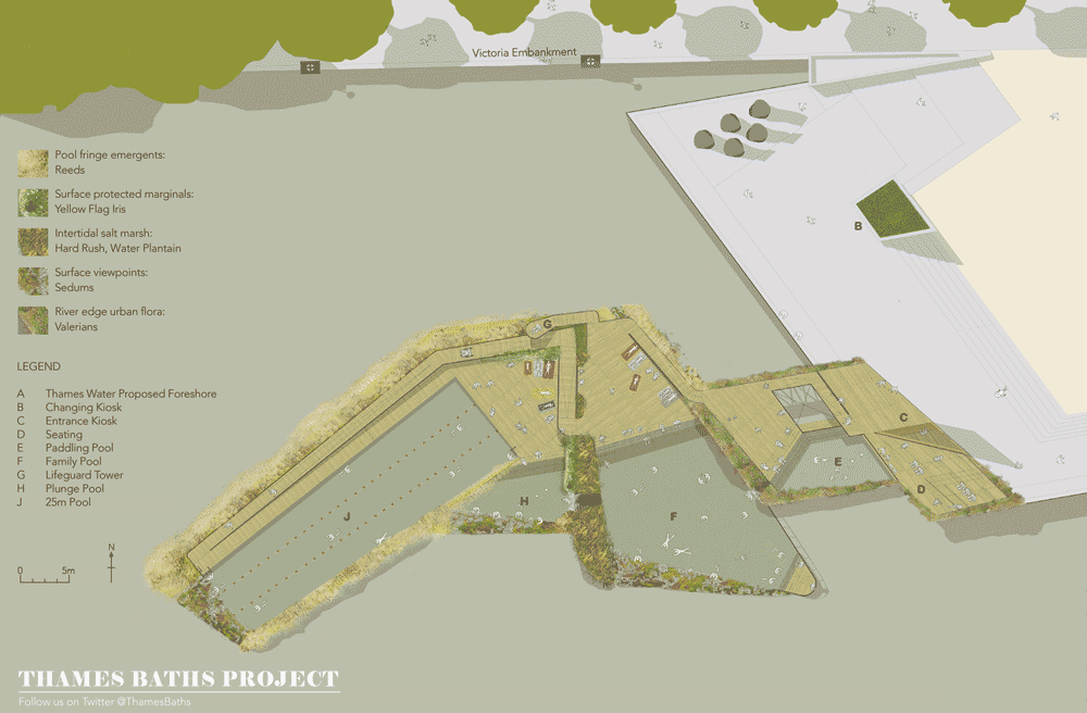
London architecture firm Studio Octopi has designed a concept for swimming pools that would enable Londoners to enjoy views of the city centre while bathing in the tidal waters of the River Thames.
Studio Octopi developed the proposal in response to plans from the city’s water supplier Thames Water to upgrade London’s 150-year-old sewage system, which would result in a huge improvement in water purity.
“A lot of people screw their noses up at the thought of swimming in the Thames but it already occurs within very controlled conditions, such as at Hampton Court and the Docklands,” Studio Octopi director Chris Romer-Lee told Dezeen.
Thames Water plans to construct a new tunnel, dubbed the Super Sewer, which will remove 96 percent of the sewage currently entering the river and is scheduled for completion in 2023, if planning permission is granted.
Exploded view of structure
Studio Octopi proposes building pools at two of the Super Sewer construction sites; Shadwell in the east of the city and Blackfriars Bridge in central London.
“Imagine the views from the waterline, downstream to the London Eye, upstream to the City,” said Romer-Lee of the Blackfriars location. “Whether it’s for sport or leisure, bringing these alternative uses to the heart of cities unites diverse communities, encourages physical activity and invigorates the flora and fauna of our much overlooked river.”
Romer-Lee pointed out that the concept doesn’t rely on the Super Sewer, but does require the UK government to take steps to improve the current sewage system and water quality in The Thames, which currently falls below European standards.
The architects worked with structural engineering specialist Civic Engineers to develop the design, which includes a pair of pools supported by a concrete slab and raised to the height of the high water mark on a series of steel columns. The pools would be replenished with fresh river water at high tides.
A further pool made from concrete waffle slabs anchored to fixed posts would float on the surface of the river, rising and falling with the tide while protecting swimmers from the tidal currents.
Sketch showing view from the water
Concrete decks with cast-in air pockets would surround the pools, providing places for swimmers to rest and counterbalancing heavy gabion cages filled with rocks and plants.
Jonathan Cook Landscape Architects contributed ideas for planting to enhance the natural look of the pools, including reeds to fringe the floating pool and perennials and ferns along the wharf edge. Over time, algae, ferns and saline plants would cover the supporting structure as it gradually weathers, while native plants would colonise the planted areas.
The concepts for new ways to make the most of the River Thames were presented last autumn as part of the exhibition Richard Rogers RA: Inside Out, at London’s Royal Academy.
London-based architects Studio Octopi propose reintroducing swimming in the tidal River Thames
As a result of the collaborative London As It Could Be Now project, developed by The Architecture Foundation with Rogers Stirk Harbour + Partners and the Royal Academy of Arts, Studio Octopi were selected as one of five teams to work up new visions for the Thames. The teams were encouraged to explore ideas that increased interaction with the waterway and raised awareness of this important artery running through the Capital. Thames Baths Project is collaboration between architects Studio Octopi, Civic Engineers and Jonathan Cook Landscape Architects.
In 1865, Sir Joseph Bazalgette’s London sewage system was opened. 150 years later the sewers are at the limits of their capacity. In 2012, 57 combined sewer overflows discharged 39 million tonnes of sewage into the River Thames.
Thames Water is planning the Thames Tideway Tunnel, or ‘Super Sewer’, for completion in 2023. This tunnel will remove 96% of the sewage currently entering the river. Instead of a weekly discharge into the river, the Super Sewer will overflow a maximum of 4 times a year.
When Sir Joseph Baselgette’s sewer system was finally completed in 1875 swimming in the River became a common occurence. In the same year a floating swimming baths opened on the foreshore at Charing Cross. Heated river water was pumped around an iron and glass structure. Then in 1878 Agnes Beckwith ‘the greatest lady swimmer in the world’ safely swam 20 miles from Richmond to Westminster and back again. The improvements in water quality open the possibility for once again swimming in the tidal Thames. The Thames Baths Project looks to re-establish an intimate and playful link between Londoners and the historic lifeblood of the city, the River Thames. Here is an opportunity for Londoner’s to reclaim ownership of their largest outdoor public space.
Studio Octopi’s proposals are focused on two of the Super Sewer construction sites: Blackfriars Bridge Foreshore and King Edward Memorial Park Foreshore. These sites were chosen for their contrasting London contexts. As well as creating a community resource and tourist attraction, its proposed that these floating and fixed aquatic landscapes should also continue to improve the ecology of the River Thames. Growing from planted rock cages (gabions) an array of native planting forms enclosure and frames views to the surrounding city. The fixed pools, lifted high on timber and steel piles, are replenished at high tide like coastal rockpools. The floating pools rise and fall with the tide offering a unique experience with the river. The sunken structure protects the swimmers from currents, whilst the planting offers tantalising views to the city beyond.
Intertidal Flora by Jonathan Cook Landscape Architects
Imagine swimming in the tidal river, surrounded by reeds that frame tantalising views of the city around you. The pools are not just for swimmers, but provide refuge and habitat for fish, birds and a wide range of flora.
Here in the heart of London is the upstream limit of saline plants on the Thames, and a series of layered habitats. From the algal slime at the base of the structure to the gabion-protected surface planting, the stages mimic salt marshes to freshwater wetlands.
As the supporting timbers weather they will be colonised by algae, ferns and saline plants such as sea beet and sea aster. The extensive planting of reeds around the pools will frame viewpoints edged with low sedums, and surface beds of yellow flag iris. The flooded pool will feature salt marsh species such as rushes and water plantains, while the wharf edge planting will be a relaxed mix of colourful perennials (red valerian) and ferns. All planted areas will soon be accompanied by naturally colonising plants, some native, others typical of London’s introduced alien flora.
Structural Principles by Civic Engineers
The fixed structure consists of a randomly ordered grillage of small sectioned steel channels founded in the river bed and extending to a height just below the high water mark. Embedded within the frame will be non-structural timber members to encourage the colonisation by flora. The fixed pools are split across two levels and sit on a concrete slab suspended on the steel frame.
The second adjoining floating structure is free to rise and fall with the tide. This is restrained with a series of substantial fixed posts which allow the open concrete waffle slab to rise and fall. Surrounding the pools, a concrete deck with cast-in air pockets counterbalances the weight of the planted rock gabion cages. The concrete deck can be precast off site and floated up the river into position.
News: American biotechnology company Bioglow has applied synthetic biology processes to develop ornamental glowing plants that its founder claims are “truly the first of their kind.”
Bioglow, which is based at the Donald Danforth Plant Science Center in St Louis, Missouri, claims its Starlight Avatar is the first plant that is able to light up autonomously, without the need for external treatments or stimuli such as chemicals or ultraviolet lighting.
“There are no comparables on the market, these are truly first of their kind,” the plants’ creator and Bioglow founder Alexander Krichevsky told Dezeen.
Krichevsky, a specialist in microbiology, developed the plants by introducing DNA from luminescent marine bacteria to the chloroplast genome of a common houseplant, so the stem and leaves constantly emit a faint light similar to that produced by fireflies and other bioluminescent organisms.
The Starlight Avatar plant is derived from the ornamental Nicotiana Alata plant family
Krichevsky is working on increasing the brightness of the plants, which currently need to be viewed in a darkened room. He told Dezeen that his technique could attract a new audience to the ornamental plant market and eventually provoke a revolution in lighting design.
“We think that glowing plants will particularly be of interest to the fans of the movie Avatar,” said Krichevsky, referring to the 2009 science fiction feature film set on an alien planet where flora and fauna are illuminated at night.
He added that they could also be used as efficient light sources for interiors, architecture or transport infrastructure. “In the long term we see use of glowing plants in contemporary lighting design, namely in landscaping and architecture as well as in transportation, marking driveways and highways with natural light that does not require electricity,” he pointed out. “We also have a capacity to make plants glow in response to environmental cues, making them effective environmental and agricultural sensors.”
Prospective buyers will be able to bid for one of a limited number of the Starlight Avatar plants via an online auction due to take place in late January. The plants are shipped in cultivation boxes containing a plastic nutrient-rich gel and can be transferred to a plant pot when fully developed. Each plant has a life cycle of two to three months.
This is site is run by Sascha Endlicher, M.A., during ungodly late night hours. Wanna know more about him? Connect via Social Media by jumping to about.me/sascha.endlicher.


