The second bakery to feature on Dezeen this week is designed by Japanese studio Airhouse Design Office and features a tree growing out of its curved timber counter (+ slideshow).
Located in the central Japanese prefecture of Gifu, Bread Table by Airhouse Design Office is small bakery with a shop space and kitchen divided by a structural plywood display counter.
Cane baskets piled with loaves of bread and wire racks of pastries are stacked at intervals along the counter, while translucent polycarbonate corrugated sheets line the front and give off a pink glow when the room is lit up in the evening.
The same corrugated sheets have also been used to line a wall and the interior of the door, which features a chunky wooden handle.
“The plywood counter can be used for a variety of purposes such as a display space, checkout counter or a working space to cut bread and knead dough,” said architect Keiichi Kiriyama.
The kitchen and selling space were designed to have equal weight, with the large table-like platform counter between them.
“For this shop with a small-sized staff the design enables the owner to always have knowledge of the shop situation and allows different actions depending on how much bread is produced,” Kiriyama said.
“As a result this creates an open atmosphere, fosters communication between the customers and bakers, and displays the process from the time the bread is baked to the moment it is sold,” he continued.
The whitewashed walls are lined with simple wooden shelves on each side of the shop space, filled with plants and more baked goods.
Also included are low-hung lamps, timber floorboards, and two stripped wooden chairs for customers next to the glass window front.
Portuguese architect João Mendes Ribeiro clad this swimming pool pavilion with mirrored panels so it disappears into the surrounding orchard (+ slideshow).
João Mendes Ribeiro added the pool and pavilion in the grounds of a countryside property in central Portugal without disturbing the garden too much.
“The swimming pool was settled in a way that would allow to avoid changes on the terrain morphology and not to interfere with the existing vegetation, keeping the orchard’s character almost untouched and favouring the landscape scenic atmosphere,” said the architect.
Polished stainless steel sheets cover the small building at one end of the pool, which houses a pantry, toilet, shower and small storage room arranged in a row.
These mirrors reflect the landscape around the pool so from some angles the building is camouflaged amongst the trees.
The small rooms within the structure are entered through panels that swing open on both sides of the building. Its thin roof overhangs to provide poolside shade.
The pool sits to one side of a granite platform that’s level with the ground at the pavilion end but is accessed by stairs at the other to compensate for the gently sloping site.
A single set of steps leads into the water from a corner by the pavilion.
The swimming pool in Chamusca da Beira is located in a rural property whose landscape is characterised by the presence of large and small scale trees, in an orchard area with ornamental and fruit trees.
The swimming pool was settled in a way that would allow to avoid changes on the terrain morphology and not to interfere with the existing vegetation, keeping the orchard’s character almost untouched and favouring the landscape scenic atmosphere.
The swimming pool is surrounded by a granite stone platform where, in one of its extremities, relies the volume containing the swimming pool dependencies (one pantry, one toilet, one shower and a small storage room). This volume is coated with polished stainless steel sheets that, by being highly reflective, allow the camouflage of the volume on its surroundings, dematerialising its presence and visually extending the landscape.
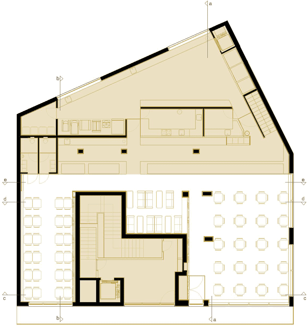
This bakery in Porto by Portuguese architect Paulo Merlini has a wavy ceiling that’s designed to look like a dripping cake topping (+ slideshow).
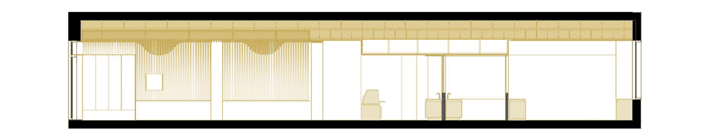
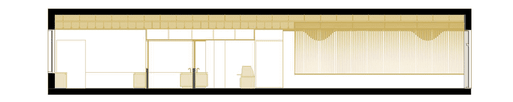
Paulo Merlini installed the stripy ceiling to fulfil two key functional requirements: reducing glare from the overhead lighting and improving the acoustics inside the bakery.
The wooden panels descend from the ceiling onto two of the walls, where shapes representing an abstracted version of the new logo designed by Merlini for the client become visible from certain angles.
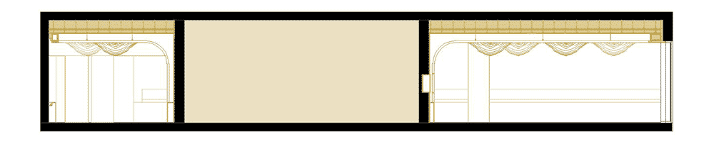
The interior comprises three separate areas with different seating arrangements so customers can choose the environment that best suits their mood.
As well as the ceiling, the colour of the walls was also chosen to reinforce the visual reference to baked goods. “We picked the twenty most wanted products of the bakery and, based on a pattern of global identification, we found a middle tone and applied it on the walls,” says Merlini.
Before designing this project we visited and analyzed other similar spaces trying to find some errors that could be corrected. We found out that a basic error being committed was that most of these services only had one type of space. This design attitude ignored the variation of mood one feels during the day, or even if he walks there alone or with friends, needs a place to read a book or just wants to socialize.
So, to bridge this flaw, we created three different environments so that the costumer can select the space that fits better to his or her mood, rather than have to adapt itself to an imposing environment. This way we provide a more emphatic place and consequently amplify three times the commercial potential.
But a customer isn’t one till he gets in. How could we get him inside?
In a metropolitan style of life, everyday people deal with millions of inputs, like Billboards, Signs, People, Cars.etc. The way the brain deals with this excessive information is to send most of it to the unconscious mind, releasing the conscious from the excessive information.
As one moves through the city the brain captures the information around and gathers all the similar inputs creating a mental “scenario” that, based on predictability is perceived by the unconscious mind, releasing the conscious to all variable inputs that he experiences outside that scenario. This is a surviving system that we inherited from the savanna era, so that if for example, a predator moved between the trees, without having to consciously capture every bit of information around, one could perceive the movement and react to protect their own life.
Joining to this line of thought the known fact that 70% of those inputs are visual, and that humans as many animals have an attraction to light, we knew that we had to create an input that could distinguish itself from the rest of the city scenario in such a way that it could activate the conscious perception, guaranteeing that people would notice and feel attracted to it. For that we’ve used light as the main attraction.
We studied the approximation of the observer to the space and realized that the most visually relevant plan from the exterior was the ceiling, and so we focused on that.
In our studies we also realized that the use of direct light tends to heat up the space and create shadowed corners turning space into uninviting places and that, in an auditory approach, the excessive noise mainly resulting of the reverberating sound was not being properly solved.
So, to solve these problems we knew we had to break the sound waves and refract the light. And so we did, by creating a second ceiling that results from the repetition of wooden stripes, we found a system that could solve the two problems in a row.
In our research we found studies that prove that the presence of color and forms that are food-like actually makes people hungrier.
So to get that input on the users, we picked the twenty most wanted products of the bakery and, based on a pattern of global identification, we found a middle tone and applied it on the walls.
We also proposed a new logo to the client, and designed the space partially based on it. The wooden stripes descend through two of the walls creating an effect that dialogs directly with the consumer. When one moves through space realises that some hidden forms start to appear on the walls. Those forms are an abstraction of the proposed logo. The intention is to unconsciously reinforce the image of the firm in one’s mind.
We like to think of our interventions as positive manipulation of the human brain. As such we focus on giving positive inputs to all the five senses (when possible) so that we can alter one’s homeostatic level, and as a result make people feel happier.
Portuguese architect João Branco has revamped a cluster of farm buildings and animal pens to create a weekend retreat for a family in Portugal’s Sierra de Janeanes district (+ slideshow).
The renovated house is contained within the rustic stone walls of the old agricultural structures and sheltered beneath a traditional clay-tile roof.
The ground floor of the building steps up and down to adjust to the hilly terrain, grouping the house into four different zones. There’s also a new corridor that forms an axis across the length of the plan.
“The usual program of a single-family house is organised so that each space can be used with a degree of intimacy and independence,” said the architect.
The largest room of the house is a central living area with a double-height ceiling, exposed stone walls and a combined stove and seating area.
In contrast, the mezzanine floor above is surrounded by wooden floors, surfaces and furniture, and is used by residents as a library. A long desk runs along one side, creating a balcony study space with enough room to seat several people.
A total of five bedrooms are arranged in two groups, positioned at opposite ends of the house. Each has direct access to one of two new courtyards, plus bathrooms are located alongside.
The main dining room and kitchen sit alongside one another in one corner of the building, but also lead out to an outdoor dining area at the highest point of the site.
There’s also an outdoor swimming pool that offers views out towards the distant mountains.
“Throughout the work process the idea of contrast and surprise was always present,” added Branco. “An exterior that mimics the stony and massive surroundings is very distinct from the sober and very illuminated interior that offers a delicate unexpected encounter in contrast with the rough brutality of the circumambient.”
The access area of this site is a welcoming space as the existing buildings and stone walls convert it in a confined and shady location. As you course along westward, the slope to reach the highest part of the garden is considerable. At this point, stripped of limits, the distant mountains are the only horizon.
The task consisted in converting the agricultural use buildings in a weekend home for a four generation family. Thus, the usual program of a single-family house: living room, dining room, kitchen and five bedrooms, is organised so that each space can be used with a degree of intimacy and independence. To this program was also requested the addition of a library.
The main areas of the house occupy the old corrals – four stony and dark volumes, with very occasional openings, adjacent amongst but with no communication between them, located at different levels and following the slope of the land with North orientation.
The project proposes two fundamental operations: first a new longitudinal axis that cuts across the various existing buildings, like a corridor carved in stone that unites the various spaces. Secondly, two new patios enable natural light to reach the innermost parts of the house.
The work is completed with an exterior dining area and a swimming pool located near the existing barn floor at the upper part of the land, taking advantage of the best views and most advantageous sun exposure. Throughout the work process the idea of contrast and surprise was always present. An exterior that mimics the stony and massive surroundings is very distinct from the sober and very illuminated interior that offers a delicate unexpected encounter in contrast with the rough brutality of the circumambient.
Interview: ahead of the opening of a permanent exhibition of David Mellor’s street furniture, the British designer’s son Corin talks to Dezeen about cataloguing an important moment in British design and how his father approached designing traffic lights and cutlery in the same way (+ slideshow).
Pedestrian signal box, 1965-9
Best known for his cutlery designs, David Mellor also developed innovative street furniture in the 1950s and 1960s, including bus shelters, street lights, bollards and the traffic lights and pedestrian crossing boxes that are still used on Britain’s roads.
National traffic light system, 1965-9
Corin Mellor says his father’s democratic approach to design was well-suited to street furniture, as well as to designing his popular kitchenware: “He was always keen on design not being elitist but being for the masses, and it’s the same with the street furniture.”
Abacus Bollards, 1965
Mellor adds that the standard of their design is the reason for the products’ enduring appeal: “The fact that these products have been standing in parks and on the sides of the road for fifty years is testament to good design.”
David Mellor Street Scene
On the site of the David Mellor Design Museum at Hathersage in the Peak District National Park, a mock up of a street incorporating Mellor’s designs has been built that Corin Mellor says is a tribute to his father’s vision “that he could change the street scene.”
Square pillar box, 1966
The installation features several products designed for street furniture firm, Abacus, as well as the traffic light system for the Department of the Environment and a square post box commissioned by the Post Office, which was intended to make the process of collecting mail more efficient.
Outdoor seating, 1962
Outdoor seating and colourful rubbish bins also feature in Street Scene, which opens to the public on 8 September.
Here’s a transcript of Corin Mellor’s conversation with Alyn Griffiths from Dezeen:
Alyn Griffiths: What was the idea behind the Street Scene?
Corin Mellor: I suppose I felt it was an important part of British design history and, although we’ve got a few exhibits dotted around, I wanted to group it together and display it as it would be in a street.
Traffic lights at the David Mellor Design Museum
Alyn Griffiths: What does the installation look like?
Corin Mellor: It’s basically laid out in a line, like a street, but made from beautiful York paving. It’s about 30 metres long and people walk from the car park through the street scene past the shop to the design museum.
Pedestrian crossing
Alyn Griffiths: How did you choose which pieces to put on display?
Corin Mellor: I really put in what I think are the key pieces – the ones that were the most used in the country. I left out a few that I knew he was never really happy with and just tried not to overdo it: three types of bollard is enough for anybody!
David Mellor
Alyn Griffiths: How did your father first get involved in designing street furniture?
Corin Mellor: He studied at the Royal College of Art and then he went on a sabbatical to the British School in Rome and was rather taken with the lovely ornate lampposts in the Borghese Gardens so he started designing a new lamppost while he was over there. I think he had a vision that he could change the street scene and I know it came from this sabbatical in Rome.
Alyn Griffiths: That’s a bold vision for someone who was still a student at the time.
Corin Mellor: It is. Whether he thought he’d achieve it I don’t know but I know that was his idea. And when he got back he literally drove around with rolled up pieces of paper trying to get manufacturers to take on his idea. He finally came across this firm in Derby called Abacus who were willing to give it a go and from then on most of his work was for Abacus, including the bus stop and the bollards; virtually all of it was through them.
Abacus street lighting column, 1954
Alyn Griffiths: The design of the street lights for Abacus was quite radical at the time – can you explain why?
Corin Mellor: It was about getting the most out of new materials. It replaced ornate cast iron Victorian lampposts with tubular steel, which had just emerged and marked the change to modernism and truth to materials.
Traffic light
Alyn Griffiths: The traffic lights are probably the most recognisable product displayed in the Street Scene. What was your father trying to achieve with the design?
Corin Mellor: I think he was trying to simplify it, to make it a coherent and easy system to use for both the motorist and the pedestrian. He wanted to do that through the choice of materials and a very simple but effective design. I think if it was very stylised it would have changed since then but it is difficult to date it; it’s just there, like the British motorway signs.
Square pillar box, 1966
Alyn Griffiths: The design of the square pillar box was a clever reinterpretation of an established archetype – what was so revolutionary about it?
Corin Mellor: The materials, square shape and the clever internal mechanism were all revolutionary but all had a definite purpose. The square pillar boxes were made from sheet steel so were efficient to produce and maintain. One of the requirements of the project was to allow easier and more efficient collection and the new square shape created internal space for special mechanism. There is clearance inside for a hook, lever and hinged floor. The postman attaches his bag, pulls the lever and a chute is formed sliding the letters into the bag. The design actually reduced collection times by half.
Alyn Griffiths: How does this design encapsulate your father’s vision for improving even the most familiar products?
Corin Mellor: As with my father’s other designs, the use of materials influenced the visual look of the design. His vision wasn’t about change for change’s sake but perhaps a belief that some things could simply be done better.
Alyn Griffiths: Was he disappointed that public opinion scuppered its widespread implementation?
Corin Mellor: The new design wasn’t scuppered totally (many thousands were installed and some examples remain in use to this day) but some members of the public had a problem with any changes to a familiar design. Having said that, he was disappointed that the design was never rolled out completely as it was, by any measure, an improvement.
Abacus bus shelter, 1959
Alyn Griffiths: It’s amazing that he was able to work across such vastly different scales – from cutlery to street furniture.
Corin Mellor: Yes, I suppose he had the same vision with the smaller scale things, that everybody should be eating with decent cutlery. He was always keen on design not being elitist but being for the masses, and it’s the same with the street furniture. Good design for everybody – everybody should be able to sit on a modern park bench. It’s the same process, whether you’re doing something that’s six inches long or sixty feet long, it’s about getting the best out of the materials.
Galvanised steel litter bin, 1957
Alyn Griffiths: Do you think the street furniture your father designed has endured well?
Corin Mellor: I think so. They’re starting to disappear now as there is much more contemporary street furniture around and it’s getting a lot better, but the fact that these products have been standing in parks and on the sides of the road for fifty years is testament to good design.
David Mellor Design Museum
Alyn Griffiths: Did he draw satisfaction from the public’s response to these products?
Corin Mellor: I think so. His interest in design would always just move on to the next project and he would never tell anyone he designed them but I’m sure it must have given him pleasure all the time, driving around and stopping at the traffic lights.
News: entrepreneur Elon Musk has revealed designs for a supersonic Hyperloop transport system to link Los Angeles and San Francisco in just 30 minutes (+ slideshow).
Hyperloop passenger capsule version cutaway with passengers onboard
Elon Musk, billionaire and founder of Paypal, electric-car firm Tesla Motors and space technology company SpaceX, has revealed designs for Hyperloop – a supersonic Jetsons-style transportation system for California. Travelling at over 700 mph, passengers would sit in a 1.35-metre-wide tube and be blasted through the 382-mile tunnel linking Los Angeles and San Francisco in just 30 minutes.
After months of speculation, Musk envisions using magnets and fans to shoot capsules that float on a cushion of air through a long tube. “Hyperloop is a new mode of transport that seeks to change this paradigm by being both fast and inexpensive for people and goods,” said Musk in the design study.
Hyperloop passenger capsule version with doors open at the station
In the designs, passenger capsules that float on a cushion of air are transported at high speed through a low pressure tube, elevated over the land between the two cities. “The capsules are accelerated via a magnetic linear accelerator affixed at various stations on the low pressure tube with rotors contained in each capsule,” Musk said.
Passengers would not notice the speed and travel by Hyperloop would feel a lot like being in an aeroplane, Musk explains: “It should really feel just super smooth and quiet. And there’d never be any turbulence or anything.”
Musk’s twin city vision. San Francisco to Los Angeles in 30 minutes by Hyperloop
Well-known for electric cars, civilian space travel and a vision for interplanetary evolution and sending humans to Mars, the transportation tycoon says Hyperloop would be twice as fast as an aeroplane, cheaper than a bullet train and completely self-powered. It would be both weather and earthquake resistant.
Hyperloop capsule in tube cutaway with attached solar arrays
“If we are to make a massive investment in a new transportation system, then the return should by rights be equally massive,” Musk said. “Compared to the alternatives, it should ideally be: safer, faster, lower-cost, more convenient, immune to weather, sustainably self-powering, resistant to earthquakes and not too disruptive to those along the route.”
The designs for Hyperloop are open source and Musk has asked for feedback from others to advance the design and make it a reality.
Schematic of air bearing skis that support the capsule
The transportation tycoon first mentioned Hyperloop in July 2012 – leaving amateur designers, engineers and investors speculating ever since. Musk described Hyperloop as the “fifth mode of transportation” – the previous four being train, plane, automobile, and boat. “It’s not a vacuum tunnel, but a cross between Concorde, a rail-gun and air hockey table,” he said.
“The Hyperloop is something that would go effectively faster than the speed of sound. Conceivably you could live in San Fran and work in LA,” said Musk.
Proposed Hyperloop route – San Francisco to LA in 30 minutes
Musk has said his Hyperloop designs rival the “high-speed” train the US are proposing. “The $60 billion bullet train they’re proposing in California would be the slowest bullet train in the world at the highest cost per mile.” Musk said. “They’re going for records in all the wrong ways. The cost of the SF-LA Hyperloop would be in the $6 billion range.”
Passenger capsules – 4.43 ft (1.35 m) wide and 6.11 ft (1.10 m) high
Watch a recording of Elon Musk talking about Hyperloop:
Musk’s ideas for futuristic transport don’t stop there. Speaking online during a Google “Hangout” event with Virgin Group CEO and founder of Virgin Galactic Richard Branson on Friday, Musk said he has another idea, to rival Concorde — a vertical lift-off supersonic electric passenger jet. He said that he envisaged journeys over 1000 miles long being done in aircraft that would travel faster than the speed of sound.
“If you fly high enough and have the right geometry of plane, you can make the sonic boom no louder than current planes,” he said.
SpaceX CEO Elon Musk with Falcon 9 rocket. Photo: SpaceX
Musk commented that vertical take-off and landings would mean passengers could land closer to a desired destination – eliminating the need for large airports and long runways. Too busy – with electric car innovations, hovering reusable rockets and passenger flights to Mars – to launch into the vertical jet business just yet, Musk did add: “If somebody doesn’t do [it] then maybe, at some point in the future, I will.”
Here is the full announcement from SpaceX/Elon Musk:
Hyperloop August 12, 2013 By Elon Musk, Chairman, Product Architect, CEO
When the California “high speed” rail was approved, I was quite disappointed, as I know many others were too. How could it be that the home of Silicon Valley and JPL – doing incredible things like indexing all the world’s knowledge and putting rovers on Mars – would build a bullet train that is both one of the most expensive per mile and one of the slowest in the world? Note, I am hedging my statement slightly by saying “one of”. The head of the California high speed rail project called me to complain that it wasn’t the very slowest bullet train nor the very most expensive per mile.
The underlying motive for a statewide mass transit system is a good one. It would be great to have an alternative to flying or driving, but obviously only if it is actually better than flying or driving. The train in question would be both slower, more expensive to operate (if unsubsidised) and less safe by two orders of magnitude than flying, so why would anyone use it?
If we are to make a massive investment in a new transportation system, then the return should by rights be equally massive. Compared to the alternatives, it should ideally be:
Safer
Faster
Lower cost
More convenient
Immune to weather
Sustainably self-powering
Resistant to Earthquakes
Not disruptive to those along the route
Is there truly a new mode of transport – a fifth mode after planes, trains, cars and boats – that meets those criteria and is practical to implement? Many ideas for a system with most of those properties have been proposed and should be acknowledged, reaching as far back as Robert Goddard’s to proposals in recent decades by the Rand Corporation and ET3.
Unfortunately, none of these have panned out. As things stand today, there is not even a short distance demonstration system operating in test pilot mode anywhere in the world, let alone something that is robust enough for public transit. They all possess, it would seem, one or more fatal flaws that prevent them from coming to fruition.
Constraining the Problem
The Hyperloop (or something similar) is, in my opinion, the right solution for the specific case of high traffic city pairs that are less than about 1500 km or 900 miles apart. Around that inflection point, I suspect that supersonic air travel ends up being faster and cheaper. With a high enough altitude and the right geometry, the sonic boom noise on the ground would be no louder than current airliners, so that isn’t a showstopper. Also, a quiet supersonic plane immediately solves every long distance city pair without the need for a vast new worldwide infrastructure.
However, for a sub several hundred mile journey, having a supersonic plane is rather pointless, as you would spend almost all your time slowly ascending and descending and very little time at cruise speed. In order to go fast, you need to be at high altitude where the air density drops exponentially, as air at sea level becomes as thick as molasses (not literally, but you get the picture) as you approach sonic velocity.
Vietnamese studio Vo Trong Nghia Architects has completed a house in Ho Chi Minh City with half of its floors screened behind hollow concrete blocks and the other half exposed to the elements (+ slideshow).
Working alongside architects Sanuki + Nishizawa, Vo Trong Nghia Architects designed the six-storey Binh Thanh House for three generations of a single family, adding curved concrete ceilings, a spiral staircase and gardens on each floor.
Alternating levels offer a mixture of both air-conditioned and naturally ventilated spaces. “The concept of the house is to accommodate two different lifestyles in a tropical climate,” said the architects.
The second and fourth floors have glazed facades that slide open, bringing natural light and cross ventilation through a pair of family living rooms that both occupy an entire storey. One features an undulating concrete ceiling, while the other is framed by a row of barrel vaults.
The hollow concrete blocks create patterned walls either side of the first, third and fifth floors on the building, allowing light to filter through to bedrooms, a kitchen, a small dining room and a home gym.
“Pattern blocks […] used to be a popular shading device in Vietnam to bring in natural ventilation,” said the architects. “While this house looks different from the stereotypical townhouses in Ho Chi Minh City, all the architectural solutions are derived from the local lifestyle and wisdom.”
These upper floors are staggered back and forth, creating balcony gardens on both sides of the residence, while the sunken ground floor accommodates a parking area.
Here’s a project description from Vo Trong Nghia Architects:
Binh Thanh House
Located in the centre of Ho Chi Minh city in Vietnam, Binh Thanh House was designed for two families; a couple in their sixties, their son, his wife and a child.
The plot has a bilateral character, one is facing to a noisy and dusty street in a typical developing and urbanising area in the city and one is very close to a canal and Saigon Zoo with plenty of greenery.
Against a backdrop of this duality of its setting, the concept of the house is to accommodate two different lifestyles in a tropical climate; a modern and well-tempered lifestyle with mechanical equipments such as air-conditioners, and a natural and traditional lifestyle, utilising natural lighting and ventilation with water and greenery.
The house is composed of two different spaces positioned alternately. Spaces for modern lifestyle are allocated in three floating volumes wrapped by concrete pattern blocks. And the spaces between these three volumes are widely open to the exterior and allocated for the natural lifestyle where the residents enjoy wind, sunlight, green and water.
Three volumes are shifted back and forth to bring natural light into the in-between spaces, as well as to create small gardens on each floor. The bottoms of the volumes become the ceilings for the in-between spaces. These surfaces are designed with various curved shapes, providing each in-between space with different lighting effects.
Bedrooms and other small rooms are contained in the floating semi-closed volumes to enhance security and privacy. On the other hand, the open in-between spaces are designed to be independent living spaces for two families.
Pattern blocks, which used to be a popular shading device in Vietnam to bring in natural ventilation, are made of pre-cast concrete with 60cm width and 40cm height. It not only prevents the harsh sunlight and heavy rain but also enhances the privacy and the safety.
While this house looks different from the stereotypical townhouses in Ho Chi Minh City, all the architectural solutions are derived from the local lifestyle and wisdom. The house offers an interpretation of the ecological lifestyle in the modern tropical city. It is where modern and natural life are compatible with each other.
Architect Firms: Vo Trong Nghia Architects, Sanuki + Nishizawa architects Principal architects: Vo Trong Nghia, Shunri Nishizawa, Daisuke Sanuki Status: built in June, 2013 Program: Private house for two families Location: Binh Thanh, Ho Chi Minh City, Vietnam GFA: 516 sqm Site area: 140 sqm
French studio Trust in Design modelled this table on a surfboard (+ slideshow).
Trust in Design was commissioned by Paris surf boutique Cuisse de Grenouille to create the one-off table using similar techniques to crafting a surfboard.
A solid ash lath runs through the centre, with two fins protruding underneath to which the wooden legs attach on either side.
Rounded corners and edges of the resin top were hand-sanded to mimic the profile of a surfboard.
South Korean architect Moon Hoon designed this home with missing corners for a figurine collector and his family (+ slideshow).
Moon Hoon designed the house for an empty plot beside a lake in Bangdong, an area of South Korea popular with tourists.
“The vacant site seemed to invite some kind of a sculptural object, unhindered by its neighbours, standing rather conspicuously,” said the architect.
Polygonal facades are created by slicing the corners off a narrow cuboid. On each wall these outlines are repeatedly scaled down and recessed until they form windows in the centre.
Conan House, which translates as Toy House, was designed for a local TV producer who wanted somewhere to display his toy collection.
“He is an avid collector of miniature robots and figures,” said the architect, “a hobby that started from an early age that has not stopped.”
Hoon created square niches in the railings that surround the central staircase to display the best objects in the client’s collection.
The staircase spirals up the centre of the building around a skylit atrium, dotted with the display cases all the way up.
More paraphernalia is stored on a wooden bookcase in the basement that nestles in the bottom of the stairwell and wraps around a study area.
Moving up the building, levels are staggered to separate the entrance and living room from the dining and kitchen area.
The main bedroom and ensuite bathroom sit a few steps down from two children’s rooms that share a window.
A red slide cuts across the atrium to join the play areas split over the top floors, which have a yellow ceiling and are lit by windows in the sliced-off corners.
Wooden floors and stair treads run throughout the dominantly white interiors. The entrance is through one of the cleaved wall junctions, easily noticeable from the outside as it’s painted red.
Bangdong is a famous place for sight seeing and leisure for nearby dwellers. It can be quite crowded during the holiday seasons.
The irregular plot of land situated right in front of Bangdong lake boasts a beautiful open view of the lake and a low mountain as a back drop. When visited for the first time, the vacant site seemed to invite some kind of a sculptural object, unhindered by its neighbours, standing rather conspicuously.
The client
He is a producer for a local TV station, with one kid and a lovely wife. His family visited my office one day and asked for a skip-floored house like Lollipop House, which they had seen in the magazines.
He was an avid collector of miniature robots and figures. A hobby that started from an early age, which has not stopped. His father was also an avid collector of natural stones shaped like something recognisable or possessing some abstract qualities. The collector gene was running in the family.
I am a playful architect. I have met the right client, who has kept his child-like mind intact with him. The design went through two alternatives, one each floor stacked and rotating, the other of a box with small broken floors moving up in a spiral.
Both had their ups and downs. The client chose the latter. The house has a central core that is used as an exhibition space and a railing for his toys.
The spiral and jagged floor levels follow the spiral stair case all the way up to the attic, where you can find a small red slide that traverses the void. The exterior expresses the inner spiral energy in a simplified form.
The spiral staircase is a place for movement, play and exhibition. It plays a central role in the house. the other functioning rooms such as living, kitchen, bedrooms are attached to the system.
The windows are placed in the centre of each wall, mimicking the concept and inviting ample amount of light. The void in the middle gives much vertical depth in a otherwise a compact house.
Researchers in Canada have designed a family of prosthetic musical instruments, including an external spine and a touch-sensitive rib cage, that create music in response to body gestures (+ interview + slideshow).
The instruments developed are a bending spine extension, a curved rib cage that fits around the waist and a visor headset with touch and motion sensors.
Each instrument can be played in a traditional hand-held way, but can also be attached to the body, freeing a dancer to twist, spin and move to create sound. All three are lit from within using LEDs.
“The goal of the project was to develop instruments that are visually striking, utilise advanced sensing technologies, and are rugged enough for extensive use in performance,” explained Malloch and Hattwick.
The researchers said that they wanted to create objects that are beautiful, functional and believable as instruments. “We wanted to move away from something that looked made by a person, because then it becomes less believable as a mysterious extension to the body,” Hattwick told Dezeen.
“The interesting thing would be either that it looks organic or that it was made by some sort of imaginary futuristic machine. Or somewhere in between,” he added.
Visor – worn on the head
The Rib and Visor are constructed from layers of laser-cut transparent acrylic and polycarbonate. “One of the layers uses a transparent conductive plastic film, patterned with the laser cutter to form touch-sensitive pads,” said Hattwick.
The pads are connected to electronics via a thin wire that runs through the acrylic. Touch and motion sensors pick up body movements and radio transmitters are used to transmit the data to a computer that translates it into sound.
Rib – fitted around the waist
The Spine is made from laser-cut transparent acrylic vertebrae, threaded onto a transparent PVC hose in a truss-like structure. A thin and flexible length of PETG plastic slides through the vertebrae, allowing the entire structure to bend and twist. The rod is fixed at both ends of the instrument using custom-made 3D-printed components.
“We used 3D printing for a variety of purposes,” Hattwick told Dezeen. “One of the primary uses was for solving mechanical problems. All of the instruments use a custom-designed 3D-printed mounting system, allowing the dancers to smoothly slot the instruments into their costumes.”
Speaking about the future of wearable technology, Hattwick told Dezeen: “Technological devices should be made to accommodate the human body, not the other way around.”
“Just as we’ve seen an explosion of DIY musical instruments and interactive art based on open-source electronics, perhaps we will see an explosion of DIY mechanical devices which create new ideas of how we use our body to interact with technology.”
Here’s a 15 minute documentary about the Instrumented Bodies project that features the instruments in action:
The team are now working to develop entirely 3D printed instruments and to radically re-imagine the forms that instruments can take.
Photographs are by Vanessa Yaremchuck, courtesy of IDMIL.
Here’s the full interview with PhD researchers Joseph Malloch and Ian Hattwick:
Kate Andrews: Why did you embark on this project? What was the motivation?
Ian Hattwick: This project began as a collaboration between members of our group in the IDMIL (specifically Joseph Malloch, Ian Hattwick, and Marlon Schumacher, supervised by Marcelo Wanderley), a composer (Sean Ferguson, also at McGill), and a choreographer (Isabelle Van Grimde).
In 2008 we worked with the same collaborators on a short piece for ‘cello and dancer’ which made use of a digital musical instrument we had already developed called the T-Stick. We decided to apply for a grant to support a longer collaboration for which we would develop instruments specifically for dancers but based loosely on the T-Stick.
Instrumented Bodies – digital prosthetics sketches
During the planning stages we decided to explore ideas of instrument as prosthesis, and to design instruments that could be played both as objects and as part of the body. We started by sketching and building rough prototypes out of foam and corrugated plastic, and attaching them to the dancers to see what sort of movement would be possible – and natural – while wearing the prostheses.
After settling on three basic types of object (Spine, Rib, and Visor) we started working on developing the sensing, exploring different materials and refining the design.
Kate Andrews: What materials are the spine, rib and visor made from?
Ian Hattwick: Each of the Ribs and the Visors is constructed from a solvent-welded sandwich of laser-cut transparent acrylic and polycarbonate. One of the layers uses a transparent conductive plastic film, patterned with the laser cutter to form touch-sensitive pads.
The pads are connected to the electronics in the base of the object using very thin wire, run through laser-etched grooves in the acrylic. The electronics in the base include a 3-axis accelerometer, a ZigBee radio transceiver, circuitry for capacitive touch sensing, and drivers for the embedded LEDs. Li-Ion batteries are used for power.
Each of the Spines is constructed from laser-cut transparent acrylic vertebrae threaded onto transparent PVC hose in a truss-like structure. One of the rails in the truss is a thin, very flexible length of PETg plastic that can slide through the holes in the vertebrae, allowing the entire structure to bend and twist. The PETg rod is fixed at both ends of the instrument using custom 3D-printed attachments.
For sensing, the Spines use inertial measurement units (IMUs) located at each end of the instrument – each a circuit-board including a 3-axis accelerometer, a 3-axis rate gyroscope, a 3-axis magnetometer, and a micro-controller running custom firmware to fuse the sensor data into a stable estimate of orientation using a complementary filter.
In this way we know the orientation of each end of the instrument (represented as quaternions), and we can interpolate between them to track or visualise the shape of the entire instrument (a video explaining the sensing can be watch on Youtube). Like the Ribs and Visors, the Spine uses a ZigBee radio transceiver for data communications and LiPoly batteries for power.
All of the instruments use a custom-designed 3D-printed mounting system allowing the dancers to smoothly slot the instruments into their costumes.
A computer equipped with another ZigBee radio transceiver communicates with all of the active instruments and collects their sensor data. This data is processed further and then made available on the network for use in controlling media synthesis. We use an open-source, cross platform software library called libmapper (a long term project of the IDMIL’s – more info at www.libmapper.org) to make all of the sensor data discoverable by other applications and to support the task of “mapping” the sensor, instrument and gesture data to the parameters of media synthesisers.
The use of digital fabrication technologies allowed us to quickly iterate through variations of the prototypes. To start out, we used laser-cutters at the McGill University School of Architecture and a 3D printer located at the Centre for Interdisciplinary Research in Music Media and Technology (CIRMMT). As we moved to production we outsourced some of the laser-cutting to a commercial company.
Kate Andrews: How did collaboration across disciplines of design, music and technology change and shape the project?
Ian Hattwick: From the very beginning of the project, the three artistic teams worked together to shape the final creations. In the first workshop, we brought non-functional prototypes of the instruments, and the dancers worked with them to find compelling gestures, while we tried a variety of shapes and forms and the composers thought about the kind of music the interaction of dancers and instruments suggested.
Later in the project, as we tried a variety of materials in the construction of the instruments, each new iteration would suggest new movements to the dancers and choreographer. Particularly, as we moved to clear acrylic for the basic material of the ribs, the instruments grew larger in order to have a greater visual impact, which suggested to the dancers the possibility of working with gestures both within and without the curve of the ribs.
These new gestures in turn required the ribs to have a specific size and curvature. Over time, the dancers gained a knowledge of the forms of the instruments which gave them the confidence to perform as if the instruments were actual extensions of their bodies.
Component tests
Kate Andrews: How was 3D printing used during the project – and why?
Ian Hattwick: We used 3D printing for a variety of purposes in this project. One of the primary uses was for solving mechanical problems – such as designing the mounting system for the instruments.
We tried to find prefabricated solutions for attaching the instruments to the costumes, but were unable to find anything that suited our purposes, so we designed and prototyped a series of clips and mounts to find the shapes that would be easy for the dancers to use, that would be durable, and that would fit our space constraints.
In addition, 3D printing quickly became a tool which we use any time we had a need for a custom-shaped mechanical part. Some examples are a threaded, removable collar for mounting the PET-G rod to the spine, mounting collars and caps for the lighting in the spine.
[A document detailing the use of 3D printing in the project can be downloaded here].Instrumented Bodies – digital prosthetics sketches
Kate Andrews: Where do you see this technology being used now?
Ian Hattwick: 3D printing, or additive manufacturing as it is known in industry, is increasingly commonplace. In the research community, we’ve seen applications everywhere from micro-fluidic devices to creating variable acoustic spaces. One of my favourite applications is the creation of new homes for hermit crabs.
Kate Andrews: Can we expect to see other live performances using the instruments?
Ian Hattwick: We are currently working with the instruments ourselves to create new mappings and synthesis techniques, and in October we will bringing them to Greece to take part in a 10 day experimental artist residency in Greece focusing on improvisation. We’ve also been talking with a variety of other collaborators in both dance and music, so we expect to have quite a few different performances in the next year.
Kate Andrews: What do you think is the future for interactive and wearable technology?
Ian Hattwick: I’m really excited about the coming generations of constantly worn health monitors, which is the first widespread adoption of the ideas of the “quantified self” movement. I expect in a relatively short time it will be normal for people to maintain logs of more than just their their activity, heart rate, or sleep patterns, but also the effect of their mood and environment on their body. I’m also excited about e-textiles, clothing which can change its shape or visual appearance.
One of the ways in which I see the prosthetic instruments making a real contribution is the idea that technological devices should be made to accommodate the human body, and not the other way around. Particularly, you see musical instruments created so as to be easy to mass-manufacture, rather than seeking to identify and support natural physical expressions during musical performance. At the same time, by creating technologies which are invisible to the performer we take away the physical interaction with an instrument which is so much a part of how we think about performance, both individually and in ensembles.
Kate Andrews: Does this present a new future for music? For dance?
Joseph Malloch: There is no one future for music or dance, but we can always count on new technologies being adapted for art, no matter their intended purpose.
Ian Hattwick: In interactive dance, the paradigm has always been capturing the unencumbered motion of the dancer; in music, there tends to be a fetishisation of the instrument. So in a sense, the idea of prosthetic instruments challenges the existing norms of those art forms. Certainly, using the prosthetic instruments requires a different conceptualisation of how we can perform dance and music at the same time.
The challenges of working with prosthetic instruments can be strongly appealing, however, and the level of mechanical sophistication which is provided by new generations of digital manufacturing will create opportunities for artistic exploration.
Just as we’ve seen an explosion of DIY musical instruments and interactive art based on open-source electronics, perhaps we will see an explosion of DIY mechanical devices which create new ideas of how we use our body to interact with technology.
Kate Andrews: What are you working on now?
Ian Hattwick: Documentation: We work in academia, and publication of in-depth documentation of our motivations, design choices, and insights gained throughout the process of development is an important part of the work. We are part of a much larger community of researchers exploring artistic uses for new technologies, and it is important that we share our experiences and results.
Mapping: The programmable connections between the gestures sensed by the instruments and the resulting sound/media really define the experiences of the performers and the audience. We are busy finding new voices and modes of performance for the prostheses.
Improvements to hardware and software: In particular, sensing technology advances very quickly, with price, quality, and miniaturisation constantly improving. There are already some new tools available now that we couldn’t use three months ago.
3D printing musical instruments: We are talking with a 3D printer manufacturer about developing acoustic instruments which are entirely 3D printed, and which take advantage of the ability to manipulate object’s internal structure as well as radically re-imagining the forms which musical instruments can take.
This is site is run by Sascha Endlicher, M.A., during ungodly late night hours. Wanna know more about him? Connect via Social Media by jumping to about.me/sascha.endlicher.


