News: Danish firm Henning Larsen Architects has won a competition to design the replacement city hall for a Swedish city that’s set to be relocated after mining caused huge underground cracks in the area.
The move has been planned for nearly a decade, after the state mining company warned city officials in 2004 that excavating more iron ore would destabilise the ground beneath the city of Kiruna, northern Sweden.
Around 2500 flats and a total of 200,000 square metres of shops, offices, schools and healthcare buildings will be rebuilt over the next 20 years on a new site two miles east, and the city hall is the first public building to be affected.
Henning Larsen Architects’ competition-winning proposal features a circular building with a crystal-shaped inner structure that is intended to resemble iron ore deposits.
Parts of the 1950s hall will be recycled where possible, including an original bell tower that will be reinstalled in the public square surrounding the new building.
The circular plan is designed to bring as much light as possible into the interior spaces, which will be arranged with offices around the perimeter and public facilities in the centre.
“Kiruna’s new city hall is a democratic building, open to everybody,” said studio director Peer T. Jeppesen. “Inside the building, the democratic process is supported by the interplay between offices at the periphery and public functions at the heart of the building.”
Here’s some more information from Henning Larsen Architects:
New city hall in Kiruna designed by Danish architects
Henning Larsen Architects in collaboration with Tema Landscape Architects Sweden, WSP Engineers Sweden and UiWE Cultural Designers have won the competition for a new city hall in Kiruna in Northern Sweden. The city hall will mark the beginning of the development of an entirely new city centre in Kiruna.
The city hall consists of two building volumes. The inner building is shaped like a crystal inspired by the great deposits of iron ore in the area’s underground. The outer building floats like a ring around the crystal, protecting it against the rough weather conditions of the region.
“It has been important for us to get the best out of the rough weather and wind conditions and allow as much daylight into the building as possible”, says Peer T. Jeppesen, Director and Partner at Henning Larsen Architects. “Kiruna’s new city hall is a democratic building, open to everybody. Inside the building, the democratic process is supported by the interplay between offices at the periphery and public functions at the heart of the building.”
The round shape of the new city hall creates a better microclimate both inside and outside. The shape allows 17% more daylight to pour into the volume. The city hall has already been named The Crystal. It is inspired by the city’s special character, culture and history. Kiruna’s existing city hall is a unique piece of architecture from 1958, which was designed by Artur von Schmalensee. The new city hall refers to the old one in several ways. The bell tower from the listed city hall will be re-used in the square, just as materials and building parts will be re-used to the extent possible.
“The Crystal is a city hall that we can be proud of, and we are delighted to present this particular proposal as winner today. In the assessment, we have sought help from several experts and various reports. We have also had many comments from the public, and naturally, we have considered these in the jury work, too”, says Lisbeth Nilsson, Chairman of the Jury.
Kiruna Municipality is moving the existing city hall and surrounding buildings, because of the effect of the excavations on the city’s underground. A total of 2,500 flats and 200,000 m2 of commercial, office, school and healthcare buildings will have to be moved by 2035. The city hall is the first large building to be affected by the excavations. Thus, the new city hall becomes the starting signal for the new city centre in Kiruna. According to plans, it is to be inaugurated in 2016.
Architecture studio Snøhetta of Oslo and New York has revealed designs for a community library in Queens, New York, with a shimmering golden exterior and a triangular entrance at one corner.
Proposed for the neighbourhood of Far Rockaway, the new building will replace a well-used but small existing library that functioned as a disaster relief centre during the aftermath of Hurricane Sandy last year.
Snøhetta’s design is for a two-storey structure that will double the floorspace of its predecessor.
The exterior will be screened behing fritted glass, creating a golden surface intended to reference the colour of the skies along the Long Island coastline. A sliced-off corner will be clad with transparent glass, providing the building’s entrance.
Snøhetta releases design of the new Far Rockaway Branch Library, Recipient of the 2013 Public Design Commission’s Design Excellence Award
Today, Snøhetta releases the design of the Far Rockaway Branch Library in Far Rockaway, Queens. The new building will replace the existing library building, while also doubling the area of library spaces. The project, currently in design development in New York City, has also received the Public Design Commission of the City of New York’s recognition for outstanding public projects, the Annual Award for Excellence in Design.
Community Context
The Far Rockaway Library is located at the prominent intersection of Mott and Central Avenues in Far Rockaway, among the more dynamic, ethnically diverse communities in the borough of Queens. While the current library is small, it is heavily used, and its local importance is well-demonstrated in the aftermath of Hurricane Sandy when it was used to provide disaster relief to the community. This new building seeks to increase the services needed by the neighbourhood, and it is hoped that along with other revitalisation efforts, it will serve as a catalyst for community transformation.
Design Intent
The massing is a simple volume clad in fritted, coloured glass, with a gradient of colour reminiscent of the sky off the coast of Long Island. The simple form provides a calm contrast to the visual noise of surrounding retail outlets. The combination of transparency and translucency of the façade provides an awareness of the activity within as well as a degree of privacy for occupants of the library.
The primary organising elements are indicated with simple, clear forms. The entry is announced with a tall transparent glass pyramidal opening at the corner. The interior is organised around an inverted pyramidal atrium, which allows the penetration of natural light to the ground floor as well as a view of the sky from within the building. Combined, they provide the entry and circulation sequence through the building, and orient the visitor within.
The Far Rockaway Branch Library will comply with Local Law 86, seeking LEED Silver Certification, and will be sited at an elevation exceeding the new FEMA flood zone guidelines. As part of the Percent for the Arts program, Snøhetta will be collaborating with an artist to create a site specific artwork within the library.
Architect: Snøhetta Structural: Robert Silman Associates MEP/FP Engineers: Altieri Sebor Weiber Sustainability/Lighting: Atelier Ten
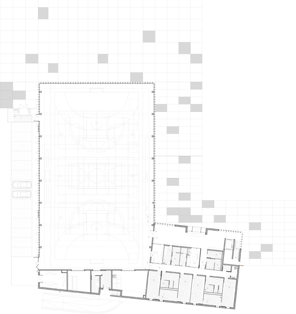
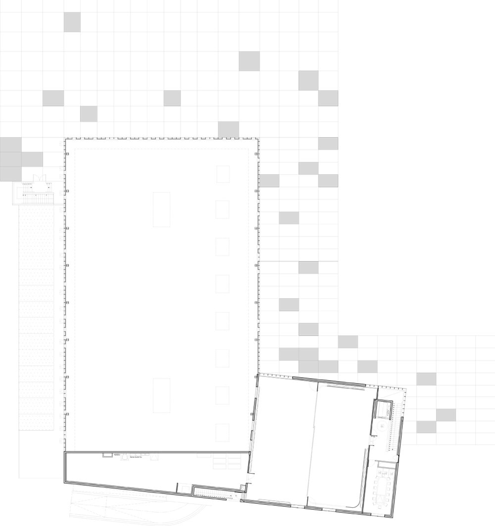
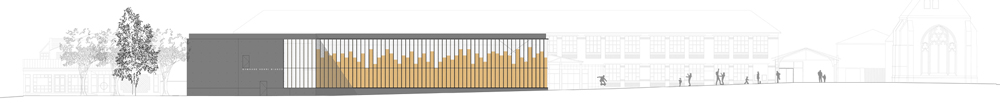
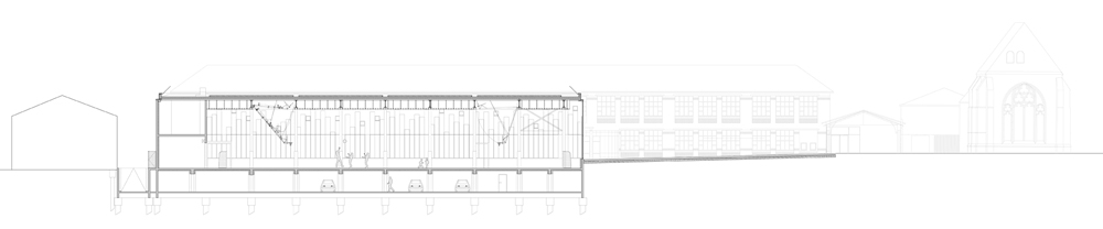
Copper-clad panels behind the glazed facade of this gymnasium by French firm LAN Architecture produce tinted reflections of the surrounding buildings (+ slideshow).
Paris studio LAN Architecture was also responsible for redeveloping the surrounding historic central square of Chelles, France, where the introduction of the L-shaped gymnasium alters the route between a park and the existing buildings.
“The orthogonal footprint of the building is parallel to the facades of the high school and the town hall,” the architects point out. “In this way, it helps to redefine and enhance urban spaces as well as to connect the park to the church through a journey.”
Full-height glass panels covering the gymnasium’s facade create refracted reflections that reduce the visual impact of the monolithic form and help to integrate it into its milieu.
Avoiding any typical sporting references on the building’s exterior, the architects instead created “a fragmenting urban kaleidoscope, diffracting and reflecting the image of the surrounding buildings in order to respond with a new, more sensitive vision.”
Behind the glass, timber panels clad externally in copper add depth and warmth to the reflections, while helping to dampen echoes inside the sports hall.
The panels also act as sunscreens, allowing daylight to filter through the staccato gaps along their top edges. When the sports hall is illuminated at night, light emanates from this upper section.
The smaller end of the L-shaped building houses offices, logistics, service spaces and smaller activity rooms with views into the main hall.
The design of the gymnasium and the square of central Chelles was an opportunity to use an architectural project to address urban issues that have been left aside in past developments.
The plot is indeed in a central position between the Park of Remembrance Emile Fouchard, the town hall, the Weczerka high school and the centre for contemporary art “les églises”: a highly heterogeneous environment where all the symbols and powers of the city (the church, State, culture, education and sports) are concentrated.
All these components, in this case, seem more juxtaposed than actually ordered, despite the delicate intervention by Marc Barani and Martin Szekely transforming the two churches into a center of contemporary art.
The aim of this project is to replay this rescheduling, elevating it into the category of an agora. The space, therefore, was in need of a strategic, volumetric insertion and an idea, contributing to the completion of the history and a new perception of the whole.
Urban role of the new building
Based on this observation, we considered the project as an operation of urban reassembly in which the gym and esplanade play the role of articulation. We relied on a detailed analysis of the operation, sequences and the scales of the various components.
The orthogonal footprint of the building is parallel to the facades of the high school and the town hall. In this way, it helps to redefine and enhance urban spaces as well as to connect the park to the church through a journey. These public spaces, the piazza and the new pedestrian street, are drawn in a conventional manner: regular, surrounded and defined by buildings. An urban object, a “catalyst” of views.
Once the volumes were constructed, the challenge of the architectural project has resided in the renewal of the traditional vocabulary of the gym: very often, we deal with an opaque box, blind and deaf to the context in which it occurs.
Here, we had to escape from the imagery related to sports facilities to implement an object which “lets us see” a fragmenting urban kaleidoscope, diffracting and reflecting the image of the surrounding buildings in order to respond with a new, more sensitive vision.
To this end, the facade is composed of two layers, the first (the glass) reflecting and letting in light, and the second (the copper), coloring and magnifying the reflection, providing protection from glass impacts.
While the simple shape and the orthogonal location of the building allows to order spaces, the facades create an ambiguity emptying the building of its materiality, making it disappear. The whole gives an impression of lightness and magic. At night, the game is reversed.
The gym, with its style and footprint, aims to be the symbol of a new vision of the city.
Once the urban strategy and the treatment of the facades were defined, the simplicity of the volumes allowed to turn the spatial organization of the gym into an efficient and functional area.
The technical system used for the envelope is simple: a steel structure, the bottom of the glass facades made of a concrete wall insulated by an indoor copper cladding. This double skin provides an ideal sound insulation. The copper, plated on timber, absorbs noise and reduces resonance in high volume areas such as multisport halls. The realization of this project is also a good example of an eco-construction. A project based on the logic of eco-construction
Ranked at the Very High Energy Performance (THPE) level, the building ensures a high level of comfort thanks to the inertia of its insulated concrete walls that contribute to cooling in summer and limited heat loss in winter. It is reinforced by the presence of night ventilation in the spaces. The system used consists of a power plant processing dual-flow air recovering energy from exhaust air. Each façade is equipped with a glazing area of 2.28 m2, STADIP 44.2 “securit” type, on the external side and tempered glass (8 mm), with a 14mm argon heat-resistant blade.
Heating The site is directly connected to the city’s geothermal heat network. A heating programmer prior to space occupancy is also implemented. The heat distribution ensures the needs of hot water and heating the gym, an extension, changing rooms and circulation spaces.
Electricity
Thirty-two photovoltaic modules with an output of 7360 Watts, or 6600 VA for resale to EDF, have been installed.
Water management Outside, the rainwater recovery system works together with the green roof. It supplies the gymnasium’s sanitary areas and the surrounding greenery.
The building receives natural light through large windows on the curtain wall and roof. It is emphasized by the external presence of a LED light recessed floor. The access points are marked by candelabra. Presence detectors are being used in all interiors, except for the great hall, optimizing power management based on attendance.
Programme: Gymnasium and redesign of the Town Hall square Client: City of Chelles Location: Place de l’Hôtel de Ville, Chelles (77) Budget: Gymnasium: € 4,34 M. excl. VAT, Esplanade € 967,000 excl. VAT. Project area: Gymnasium 2 322 m², Esplanade 2,857 m² Completion: Gymnasium: January 2012 Esplanade: October 2012 Team: LAN Architecture (lead architect), BETEM (TCE), Isabelle Hurpy (HEQ)
German studio J. Mayer H. Architects has completed a building housing a law court, university library, auditoriums and offices in the Belgian city of Hasselt (+ slideshow).
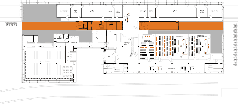
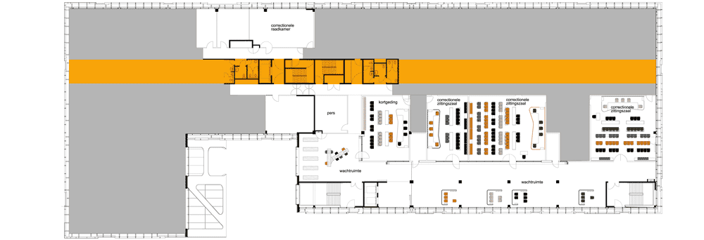
The court of justice building is divided into three separate units containing the courtrooms, student library and the office tower, which also houses a restaurant with panoramic views across the city.
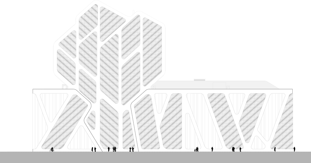
The form of the tower and the pattern of perforated panels on the facade reference the hazelnut trees found in the City of Hasselt’s coat of arms.
Photograph is by Philippe Van Gelooven
Steel cladding on the exterior evokes the area’s industrial heritage and the influence of art nouveau on this part of Belgium.
The tree motif continues inside the building, with a veined pattern covering a wall behind the main reception desk.
Photography is by Bieke Claessens, except where stated otherwise.
Here’s some more information from the architects:
New Court of Justice, Hasselt, Belgium
September 13th, 2013 marks the opening of “Court of Justice” in Hasselt, designed by the architects team of J. MAYER H. Architects, a2o-architecten and Lensºass architecten. After finishing the exterior skin already in 2011, the interior was completed in spring of 2013.
The new court of justice is an open, transparent building with direct public access, combining the Court of Justice with a university library and auditoriums for the faculty of law.
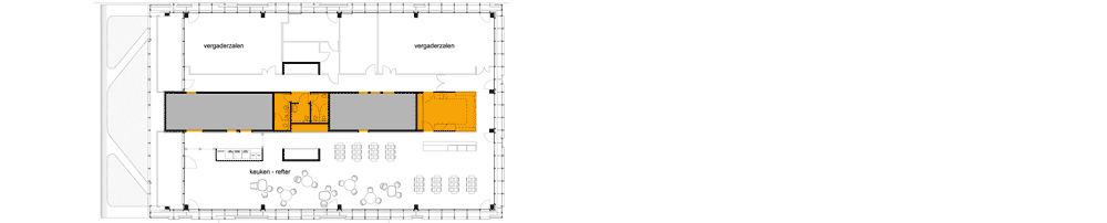
In keeping with the building’s logistical requirements and safety provisions, the structure is divided into three separate units: courtrooms, the library for students and an office tower with a 64-meters-high panorama restaurant on top from which offers a panoramic view of the city of Hasselt and its surroundings.
Based on a master plan by West 8, the former railway station site has been restructured with a park, public buildings, offices and hotels, as well as urban residential blocks.
Photograph is by Philippe Van Gelooven
The team of J. MAYER H. Architects, Lens °Ass and a20-architecten have realized one of the two high-rise buildings, “the new court of justice”, a structure that stands as a contemporary urban landmark of the new district.
Photograph courtesy of Lens°ass architects
References in the design process point to both the image of the “tree”, the hazelnut trees in the City of Hasselt’s coat of arms, and steel structures in the once industrial and Art Nouveau-influenced area.
Photograph courtesy of Lens°ass architects
Client: n.v. SOHA (Stedelijke ontwikkelingsmaatschappij Hasselt) – Autonoom Gemeentebedrijf Hasselt + Euro Immo Star) Architects: J. MAYER H. Architects, a2o-architecten, Lensºass architecten Construction Company: T.H.V. Hasaletum nv (Democo nv – Cordeel nv – Interbuild nv) Tenant: Regie der Gebouwen User: Federale Overheidsdienst Justitie Square Footage: 20.763 m² above-ground spaces (Offices, Meeting-Rooms, Library, Reception, Cafeteria, Court rooms) 4.694 m² Underground spaces (Archive), 3.384 m² Underground spaces Parking Lot
Photograph courtesy of Lens°ass architects
Construction Time: October 2008 – September 2013 Address: Parklaan, 3500 Hasselt, Belgium Project-manager: Eurostation NV
The sprawling topography of the Portuguese landscape provided the shape of this restaurant, guest house and wine showroom by architecture studio Carvalho Araújo (+ slideshow).
Sited just outside the town of Passos do Silgueiros, the building was designed by Carvalho Araújo for Portuguese wine brand Quinta de Lemos as a place where critics and customers can sample and critique different vintages.
Glass walls angle back and forth to give the concrete building its winding plan, which nestles closely to the rugged forms of the rocky hillside.
“The building’s drawing is developed starting from the topography, based in contour lines,” said the architects. “It defines an extensive course that represents the dimension of the territory on which it is placed”.
Visitors arrive at the building after traversing a winding pathway down from the road. Upon entering, they can either head into a large dining room, or make their way to one of three guest bedrooms.
The wine showroom is positioned just beyond, past a private indoor swimming pool that offers far-stretching views across the vineyards and hills.
A pair of long staircases tucked behind the building lead up onto the roof, which is covered with paving slabs and functions as a large viewing platform.
“The building is drawn by the land,” added the architects. “Its openings and orientation respect the main points of view over the vineyard, control of natural light and the discretion that is intended.”
Answering the request for the conception and design for a gourmet restaurant, we developed the project with the idea of a guest house, private equipment as complement of the first. The group intends to relate to the wine production, and to frame this investment in a global brand strategy, instead of an isolated act in the territory.
The guest house doesn’t have a formal reception; the services create an intimate atmosphere, family like and exclusive. The bedroom is not just the private domain; it includes other spaces of social character, which makes this equipment different from the usual offer of temporary lodging. The bedroom is really a small house.
The association established with the wine production justifies the restaurant. It includes spaces for wine proofs, and a reserved area to discussion, analysis and wine critic, suggesting a flexible drawing for the space in all these uses.
The building’s drawing is developed starting from the topography, based in contour lines, as a reference to the platforms and the distant association that unites them in time, characteristic of wine’s production especially in the Douro and Dão region.
It defines an extensive course that represents the dimension of the territory on which is placed and is built in a level quota, being the direct result of the topography.
The building is drawn by the land, and its openings, orientations and internal definition of the program respect the main points of view over the vineyard, control of natural light and the discretion that is intended for the group, in spite of its apparent dimension.
The attractive point where the building is located creates a tension between the existent building and the new construction, being constituted as two poles, forcing the accomplishment of a course to relate them. The implantation of the new construction is just the continuity of that course; a drawing in the landscape, a built course leaning towards the beauty of the linear rhythm of the vineyards.
Architecture: Carvalho Araújo, Arquitectura e Design Team: José Manuel Carvalho Araújo, Joel Moniz, Sandra Ferreira, Emanuel de Sousa, Ana Vilar, André Santos, Liliana Costa, Nuno Vieira, Pedro Mendes, Carlos Santos, José João Santos, Leandro Silva
Client: Celso de Lemos Esteves Date: 2007 – 2012 Location: Passos do Silgueiros, 3500-541, Viseu, Portugal
London studio Duggan Morris Architects has completed a community facility in south London that combines exposed concrete frames with raw brickwork and warm oak (+ slideshow).
Named ORTUS, the three-storey building provides an education and events centre for Maudsley, a charitable foundation that acts to promote mental healthcare and well-being, and is used to host workshops and exhibitions that involve the entire community.
Duggan Morris Architects drew inspiration from neighbouring Georgian architecture to formulate the proportions of the building’s facade. A precast concrete framework gives each elevation a strict grid, which is then infilled with a sequence of brickwork and glass.
“The building has a simple rectilinear form, with elevations composed to compliment the Georgian principles of proportion, scale, hierarchy and materiality,” said architects Joe Morris and Mary Duggan.
The brickwork appears to fade from the base of the structure to the top, changing from a typical London stock to a lighter greyish red.
Floors inside the building are staggered to create half storeys, helping to integrate activities in different spaces. These level changes are visible on the exterior walls and all centre around a grand top-lit staircase.
A cafe located near the ground-floor entrance is intended to entice visitors into the building. The first of several events spaces is positioned on one side, separated by a wide staircase that integrates an informal seating area.
“At ground level, the landscape is envisaged as a series of connected rooms, mirroring the internal configurations thus ensuring that learning activities can spill out in a controlled manner,” said the architects.
Flexible and sub-dividable spaces fill the two storeys above, plus there’s a concealed terrace on the roof.
ORTUS, home of Maudsley Learning is a 1,550sqm pavilion housing learning and event facilities, cafe and exhibition spaces. The central focus of this unique project, initially coined ‘Project Learning Potential’, is to create a totally immersive learning environment generating a series of interconnecting spaces to encourage intuitive learning activities either in groups or individually and also to create possibilities for digital learning via social media.
Site plan
The project was initially developed through an 18 month immersion process involving research and consultation workshops with user groups, Kings College Hospital, the Institute of Psychiatry and community groups, with Duggan Morris Architects commissioned to develop the client’s brief. This process was ultimately captured through a series of ‘Vision Statements’, which guided the wider team through the project providing a constant reference point during the design development stages.
The building is now home to Maudsley Learning, a Community Interest Company which has been set up to run the building. It’s vision is to raise knowledge and awareness of mental health and wellbeing which it intends to achieve through the building, through the development of a virtual learning environment and the creation of learning events focusing on mental health and wellbeing across a broad audience.
In response to locally evident contextual influences the building has been conceived as a free standing pavilion, regular in both plan and volume.
The building has a simple rectilinear form, with elevations composed to compliment the Georgian principles of proportion, scale, hierarchy and materiality. A 1200 mm vertical grid, of precast concrete fins, articulates the contrasting materials of brick and glass, whilst floor slabs are expressed in the same material ensuring the stagger of the floor plates is abundantly clear to even the casual passer-by. Terraces at ground, inset balconies above, and a large roof terrace further articulate the simplicity of the building, whilst creating positive connections between internal spaces and the abundant landscape which sits in and around the project.
At ground level, the landscape is envisaged as a series of connected rooms, mirroring the internal configurations thus ensuring that learning activities can spill out in a controlled manner. A cafe at the ground floor is intended as a marker near the building entrance, aiming to help de-stigmatise preconceptions of mental health and well being, by making the building more accessible to the wider community, sharing with the campus a vision which includes doctors, nurses, teachers, service users and carers in promoting an integrated learning environment; ‘Learning for anyone, anywhere, at anytime’.
Spatially, the building is planned as a series of flexible, sub-dividable spaces positioned around a central multifunctional tiered space, navigated by a grand ‘open’ staircase. In cross-section, these floor plates stagger across the section by a half storey, thus the grouping of learning spaces appears to extend from the half landing of the open stair; the aim being to create a stronger visual link between floors enhancing the ethos of an immersive learning environment. The open staircase with its shortened connections across the plan is intended to encourage a domestic scale circulation system and is set away from the lift core to encourage movement and visible activity.
The central space is key to controlling the environmental performance of the building, which is uniquely passive, by introducing abundant natural light from a glazed roof into the heart of the plan, feeding each floor plate. In turn automated glazed vents throughout the building envelope introduce cooling air as required at each level throughout day and night, feeding the central stack of the void.
The building was delivered through a PPC 2000 Partnering project, tailored for Construction Management procurement. It was delivered on time and on budget. As a highly sustainable building it is designed to BREEAM excellent standard and has an ‘A’ energy rating.
Dutch office UNStudio has developed a concept for a giant Ferris wheel in Japan that could rival the London Eye and the Singapore Flyer.
Proposed for an as-yet undisclosed location, UNStudio’s Nippon Moon will combine the familiar design of an observation wheel with a network of virtual interfaces that will allow visitors to create their own augmented realities.
Each of the wheel’s 32 capsules will offer a different theme. After downloading a dedicated app for smartphones and tablets, users will be able to introduce animations and sounds that enhance this theme, or initiate virtual realities within the glazed outer walls.
Studio founder Ben van Berkel told Dezeen: “The technology and engineering involved in observation wheels will always at first sight appear similar, however for the Nippon Moon we have not only introduced double-decker capsules for the first time, but have also concentrated on providing heightened engagement levels and a novel user-experience.”
Other functions of the app will include a queuing system, removing the need for visitors to wait in line before boarding, and a communications network that will permit interaction between different capsules. Visitors will also be able to share their images of the experience using a digital “hall of fame”.
“The latest technology is incorporated in the capsules to create integrated augmented reality that creates new levels of engagement – both in terms of the surrounding views and through communication and interaction between users,” said Van Berkel. “Through this, the Nippon Moon becomes not just an observation platform, but a platform for heightened observation and the stimulation of the imagination.”
UNStudio are working alongside user-experience designers Experientia to develop the interactive aspects of the project, while engineers Arup and Mitsubishi Heavy Industries are collaborating on the technical specifications.
Since the completion of the London Eye in 2000, observation wheels have been proposed for various cities around the world. The Singapore Flyer became the tallest in 2008, taking over from the Star of Nanchang in China, while others are proposed for New York, Dubai and Las Vegas.
In 2012 UNStudio was invited by Ferris Wheel Investment to formulate a vision for the design of a Giant Observation Wheel in Japan. Due to the popularity of Ferris Wheels in Japanese culture and a potential flow of millions of tourists from South-East Asia, the project was required to have an international impact and differ substantially from all existing wheels of its kind.
Structural constraints defined by Arup and Mitsubishi Heavy Industries – two of the world’s most specialised wheel engineers – left little room for manoeuvre due to the location and the size of the GOW. The challenge for UNStudio however was to find a typical language for the architectural design which would characterise the overall idea behind the function of the Observation Wheel. Essential to this approach was the creation of a coherent design strategy which could capture the full scope of the user-experience offered by the Observation Wheel. In order to individually suit this experience to the visitors, UNStudio partnered with Experientia to research how behaviour could influence user-experience.
UNStudio’s ‘Nippon Moon’ is a new cultural blockbuster in the broadest sense. It has been designed to create a journey in which learning about the environment, culture and one’s individual part in this is central. Four key elements define the logics of the socio-architectural design; enhancement of the senses, interactivity, experience and romanticism. Through the integration of interactive design elements it was possible to extend the design far beyond both the moment you physically become part of the wheel and long after you disembark. In order to achieve this, a virtual world was created in which the visitor becomes part of the social network which revolves around the GOW. Discovery, the Ride and the Return are three chapters of the design which contribute to attracting visitors and to the stimulation of the imagination.
The journey begins with the optional online purchase of tickets and the downloading of the Nippon Moon app. Visitors can not only chose the time of their ride, but can also choose the theme of their experience, as each of the single and double-decker capsules on the wheel focus on a different theme. Upon entering the visitor centre guests are greeted by the ‘Hall of Fame’, a dynamic installation of digital photographs taken by visitors during their ride. These photographs can be uploaded instantly to the Hall of Fame during the ride and discovered on display in the installation upon leaving. From the ticket pick-up point and cloakroom facilities on the ground floor, the visitor follows a circular ramp, along which retail, food & beverage and exhibition pockets are anchored. Due to a system of ‘Active Queuing’ which notifies the visitor of the time remaining until boarding, standing in line for extended periods of time is eradicated, leaving the visitor free to make use of all the facilities until it is their time to board their pre-selected capsule.
The Nippon moon app is designed as a strategy for a user-experience interface that can be installed on smartphones and tablets. During the ride, this accessible software makes it possible to communicate with people in the other capsules, who are otherwise physically and visually separated from you and whose capsule follows a different theme to your own. In addition the possibility to enhance the senses through the incorporation of augmented animations or sounds helps to focus the experience of the visitor. The app also allows the visitor to switch from reality to digitally altered views from the capsules, which are created through augmented reality techniques in the transparent skin of the capsules.
Interactivity is used to develop a greater sense and understanding of the surrounding reality and results in an active rather than a passive visitor. The experience mediates between the real and the virtual, bringing about a significantly different moment in time and creating a memory or ‘after image’.
Upon leaving the wheel, the visitor follows a second circular ramp with further facility pockets, eventually returning to the cloakroom area on the ground floor.
Romanticism is an integral part of the vision to ensure that the design and engineering of the wheel can become embedded in history as a new development in engineering and an integral part of modern Japanese culture. The concept of the observation wheel itself is not new, however the idea to merge the robustly designed and engineered physical wheel with a fully integrated virtual world creates the unique character of the Nippon Moon GOW.
Client: Ferris wheel Investment Co.,Ltd Location: Japan Building surface: Terminal and platform 7.200 m2 Building volume: Terminal and platform 90.000 m3 Capsules: 32 Building site: 18.000 m2 Programme: Giant Observation Wheel Status: design
UNStudio: Ben van Berkel, Gerard Loozekoot with Frans van Vuure, Filippo Lodi and Harlen Miller, Jan Kokol, Wendy van der Knijff, Todd Ebeltoft, Tina Kortmann, Patrik Noome, Jeroen den Hertog, Iain Jamieson
Engineer: Arup Tokyo + Melbourne Interactive design: Experientia, Italy Animation: Submarine, Amsterdam Visualisation: MIR
News: Austrian firm Coop Himmelb(l)au has landed a commission to design a winter sports resort and water park across an abandoned cement-mining quarry and lake near Changsha, China (+ slideshow).
Located at the Dawang Mountain Resort outside the city, the Deep Pit Ice and Snow World will be constructed from cliff to cliff across the old quarry, which itself will be transformed into an artificial landscape of islands, pools and pathways.
Coop Himmelb(l)au‘s competition-winning proposals combine an ice world and indoor skiing centre with a large water park. Highlights will include a cantilevered outdoor swimming pool, set to form a 60-metre waterfall into the pit of the quarry, while an upside-down glass cone will bring light through the centre of the structure.
A 100-metre-high hotel will accompany the resort, on the opposite side of a large public plaza. It will offer over 300 rooms, boasting views towards Tongxi Lake and Dawang Mountain.
Here’s a project description from Coop Himmelb(l)au:
Ice World and Five Star Hotel, Dawang Mountain Resort Changsha, China, 2013
The Deep Pit Ice and Snow World is located in the Dawang Mountain Resort Area near the city of Changsha. The project combines an Entertainment Ice World with an Indoor Ski Slope, a Water Park and supporting restaurant and shopping facilities with a total gross floor area of 120,000m².
The building volume is integrated into a beautiful landscape scenery and positioned directly on top of a historical cement mining quarry pit and lake. In the design solution towards the South and East, the existing quarry pit is revealed and the sculpted shell of the Snow and Ice World spans 170 meters from cliff to cliff over a sunken and hanging garden creating a new functional leisure space of islands, water, cliffside pathways and ramps connecting the building to this natural heritage. This unique framed open space in between architecture and landscape is also characterised through an impressive central glass cone providing controlled natural daylight down through the Ice World structure and on to the islands and water surfaces.
A cantilevered outdoor swimming pool is part of the Water Park attractions and creates a 60m high waterfall into the quarry pit. From the inside the leisure functions of the Snow and Ice World engage the space of the quarry pit with views through large glass façades to the natural cliff faces and hanging gardens, also with overviews to the water pools and islands below. At the same time visitors walking or standing on the Cliffside Pathways can also look into the building through the transparent façade; hence an interactive visual contact with the interior of the Snow and Ice World is created establishing more excitement and maximising the existing value of the industrial heritage.
A separate sculptural 100m high tower on the South end of the site hosts a 5 Star-Hotel and is connected to the Ice World via a Grand Garden Plaza. Arriving from the city of Changsha over Pingtang Avenue, the Hotel tower will be the most significant iconic landmark for the entire Dawang Mountain Tourism Resort Centre. It offers 270 high-class single and double bed suites, 60 Executive Suites with an Executive Club Lounge and a 6-room Presidential Suite, all with impressive views to Tongxi Lake, Dawang Mountain and into the Ice & Snow World. A spacious central Lobby around the tower core opens up into the service plinth containing a bar and restaurant on level one, flexible and multifunctional conference areas on level two and the fitness and spa and beauty facilities on level three. The façade of the Fashion Hotel Tower is a specially designed, highly economical system providing state-of-the-art sun shading, natural ventilation and a unitised, quick construction. The element façade system offers a maximum of flexibility to the inside room layout and allows a homogeneous appearance over the exterior facade.
Dutch studio Mecanoo has completed Europe’s largest public library in Birmingham, England, with a sunken amphitheatre, rooftop gardens and a shimmering facade clad with interlocking metal rings (+ slideshow).
Sandwiched between a 1930s building and a 1960s theatre, the new Library of Birmingham fronts one of three piazzas that comprises Centenary Square. The building is made up of a stack of four rectangular volumes, which are staggered to create various canopies and terraces.
Mecanoo designed the exterior of the building to reference the city’s jewellery quarter, adding a filigree pattern of metal rings over golden, silver and glass facades.
Inside, these rings cast patterns of shadows onto the floors of the reading rooms in the middle levels of the building.
“I didn’t want to make a brick building, because we needed a lot of light, but I didn’t want to make a glass building either,” architect Francine Houben told Dezeen. “It’s so beautiful to sit inside because of the reflections and the shadows, and the changing of the weather. It’s different from December to June.”
A gently sloping floor allows the building to negotiate the level change from the front to the back of the site, but also leads visitors down to the fiction area at the back, then down to the children’s library and music section at the base of the building.
“We needed many ground floors,” said Houben, “so we introduced a ground floor, a mezzanine, a mid-lower ground floor and a mid-mid-lower ground floor in the form of gently descending terraces.”
The lowest level extends out beneath Centenary Square, where the architects have created a sunken circular courtyard that functions as an informal amphitheatre.
The three main reading-room floors branch out from a staggered rotunda at the centre of the building, integrating rows of bookshelves and clusters of study spaces. There are also benches and stools lining the perimeter, offering views down the square below.
Archives and research spaces occupy the levels above, while an oval space at the top of the structure houses the Shakespeare Memorial Room – dedicated to the library’s extensive collection of works by English playwright William Shakespeare. Dating back to 1882, the room has been relocated twice from former library buildings.
Plant-filled terraces cover two of the rooftops, creating spaces for visitors to read and study outside.
Referring to the library as a “public palace”, Houben told Dezeen how she sees the building as an important landmark for the city community. “I think libraries at this moment are the most important public buildings, like cathedrals were many years ago,” she said.
Read on for a project description from Francine Houben:
A People’s Palace
In June 2008 I visit Birmingham for the first time of my life. Mecanoo is one of seven international architecture firms shortlisted to design the new Library of Birmingham integrated with the Repertory Theatre (REP). In this project, the written and the spoken word will be united. The client wants to select the best team to help them realise their ambitions for an innovative and world-class library that will become the largest library in Europe with ten thousand people expected to visit every day.
Birmingham is a multicultural British city of a little over one million people from very different backgrounds. It has many identities, both culturally and architecturally. It is not only Europe’s youngest city with 25% of the population under 25 years old but it’s also a student city with 50,000 students, second in student population only to London.
Library of the future for Birmingham
I meet library director Brian Gambles and his staff, he tells us enthusiastically that “the Library of Birmingham will become a centre of learning, information and culture that will help to foster Birmingham’s knowledge economy. It is intended to become the social heart of the city; a building connecting people of all ages, cultures and backgrounds. The modern library is no longer solely the domain of the book – it is a place with all types of content and for all types of people. The library’s influence will also extend beyond the physical boundaries of the building, its global digital presence allowing the public to access content from anywhere in the world.”
Shakespeare Memorial Room
The very first Library of Birmingham dates back to the year 1865. This building burns down in 1879, along with most of the collection. After the fire a group of citizens unite to form ‘Our Shakespeare Club’, a civic pride movement that brings together one of the most comprehensive Shakespeare collections in the world. When the Victorian Library opens its doors in 1882 at Radcliff Place, it incorporates a Shakespeare Memorial Room, a reading room designed especially for the Shakespeare Library by John Henry Chamberlain, a member of the city’s Shakespeare club. In 1974, the Victorian Library is replaced by the Central Library at Paradise Circus a brutalist building designed by architect John Madin. The Shakespeare Memorial Room is dismantled and stored. Twelve years later it is reassembled in the School of Music, located next to the Central Library. The intention is to integrate the Shakespeare Memorial Room in the new library.
James Watt and Matthew Boulton
Besides the extraordinary Shakespeare Collection, the library staff shows us their unique historic photo collection as well as original drawings and notebooks by 18th and 19th century inventors James Watt and Matthew Boulton. The Birmingham Music Library has extensive special collections. Music groups such as Black Sabbath, UB 40, Electric Light Orchestra, Duran Duran and The Streets are all “Brummies” from Birmingham.
The ‘Red Line’
For three days my husband and I endlessly walk through this city I’ve never been to before. I observe and photograph everything that catches my eye in order to unravel the essence of the city and the people. In the evening we go to a performance at the REP Theatre. From our hotel we try to take the shortest route by foot to the theatre but on our way we are blocked by highways that cut through the city centre. After the show we decide to follow the crowd and discover they take a logical, informal pedestrian route right through the heart of the city. I call this route the ‘Red Line’ as it connects the Bullring Shopping Centre, New Street Station, New Street, Victoria Place, Centenary Square, the ICC, the canals, Brindley Place and the Westside. The new library site is located in the middle of the Red Line next to the existing REP in Centenary Square.
The rhythm of architectural history
Two things strike me during our walks. First, when following the Red Line, the entire architectural and urban history of Birmingham passes by like a film. The city breathes a rich industrial history: Gothic buildings from the 17th, 18th and early 19th century, Victorian Classicist buildings such as Birmingham Town Hall from 1834, as well as many Victorian buildings made with beautiful craftsmanship. Birmingham has more canals than Venice. These narrow canals were created in the 18th and 19th century in order to guarantee the supply of coal. Also in this frame are buildings such as the Baskerville House from the early 20th century and concrete buildings such as the existing library from the 1960s, the ICC from the eighties, and the Bullring Shopping mall with the Selfridges blob from 2003. Scattered around the city, the steel skeletons of gas holders catch my eye.
Gently sloping hills
The second thing I notice is that Birmingham is built on gently sloping hills. It’s a green city, except for the city centre. I love these soft hills. They remind me of my native province of Limburg in the South of the Netherlands. I notice the way train tracks cut through these hills and valleys, appearing and disappearing in the landscape. Birmingham is the geographical centre of the UK and a junction of the British railroads. One train tunnel runs underground diagonally through Centenary Square. It occurs to me that we can surely build underground here, whereas in my own country this is a challenge. This idea becomes a source of inspiration.
Dream
After three days my dream slowly starts to take shape. Back at the office we develop our ideas further. Does the client expect us to make an icon? For sure we do not want to design a building that is just another “incident”. We want to make a building that brings coherence to the urban network of Birmingham. Our dream is to create a People’s Palace: inviting, welcoming, inspiring for all ages and backgrounds – a real public building that also creates an outdoor public space. One that entices passers-by to enter and embark on a journey of discovery. We imagine visitors moving from one floor to the next through interconnected and overlapping rotunda spaces that serve as the main vertical circulation route. Changing vistas and view lines unfold as you navigate through the building. On the lower levels the route continues below ground nearly to the train tunnel that passes in front of the building, and resurfaces in Centenary Square. At this point this interior route weaves itself with the ‘Red Line’ route revealing a piece of the inner library world to the public.
Team as a symphony orchestra
In August 2008 the Mayor announces that we have won. I feel confident. I trust that we can make a strong design within the tight one year time schedule. A contractor is to be selected within three months. Mecanoo has a strong team and a lot of experience with libraries and theatres. We also have architectural, urban planning, landscape, interior design and restoration disciplines in house. The Mecanoo team can work together as a symphony orchestra and along with a compact interdisciplinary consultant team. We open our Mecanoo UK office in Birmingham and roll up our sleeves!
Our search for the essence of the city continues. Local historian Carl Chinn guides us through Birmingham and explains that building materials used to come from local sources – hence the many buildings made with red and blue bricks and the extensive use of steel. Limestone was the material of choice to represent the international city in the 19th or 20th century. Examples of this are Town Hall and Baskerville House. In the last fifty years additional materials included: concrete, glass, modern red bricks and aluminium disks. So which material are we to use amidst the composition of this city?
The rhythm of the city: not one but two buildings
We want our design to fit into the rhythm of the city, so we make a critical decision that the Library integrated with the REP Theatre will not become one building, but two. Together with Baskerville House, they will form an ensemble of three palazzos along a square, each with its own materialisation – first, Baskerville House, a limestone building from 1938, then the REP Theatre, an optimistic concrete building from 1971. Between them is the library of 2013 with its metal filigree façade of interlocking circles. We propose the three identities to be reflected in Centenary Square: a more formal area in front of Baskerville House containing the Hall of Memory, an open event space in front of the REP and the Symphony Hall, and a more intimate soft landscaped space in front of the library.
In February 2009, I have lunch with Graham Winteringham, architect of the Repertory Theatre. I meet a respectable, enthusiastic man of age and a faithful visitor of the REP. “How did you actually come to this project?” I ask him. He tells me that he studied architecture in Birmingham after the Second World War. First he designed the small Crescent Theatre with a revolutionary 360 degree rotating stage. Because he was the only architect in Birmingham with theatre experience, he was commissioned in 1964 to design the theatre for one of the most influential theatre groups in the history of English theatre, the REP. He told me that the project was actually a nightmare. The program requirements were a hall with 900 seats, without balconies. Another salient detail in this program was that there had to be many more men’s than ladies’ toilets because the audience was mainly male! In 1964, the building is contracted, but the Wilson government orders all public projects on hold. Winteringham must wait three and half years, and in this time, his mind is still designing. But he can no longer make changes, no matter how many reasons there are to do so. Originally, the plan was to have a reflective pond in the front, so he designs arched windows. The water would reflect a beautiful scene. This pond never came to be. Stairs as exterior sculptural elements connecting the underground parking garage also never left the page. A steep slope that looks out of place at the rear of the building is a remnant of the idea to make Cambridge Street one storey lower, making it level with the abrasive highways that cut through the centre of Birmingham. Cambridge Street was never lowered.
I describe our first ideas to Graham Winteringham. We don’t intend to demolish the REP, but to maintain the unique hall in the shape of a Greek theatre. We want to restore the original auditorium and foyer and improve the façade by deep cleaning it and replacing the glass with high performance glazing. However, we intend to renew the entire back of house: the theatre technology, logistics and workshops. He is very glad to hear his building will not be demolished.
I realise that this architect has seen four master plans for the city come and go. In the thirties, it was the Grand Plan of a French signature in all public buildings, a monumental type of Champs Elysées. Three buildings have been built in the classical, monumental spirit with limestone facades, including Baskerville House and the circular Hall of Memory in front of it. The Second World War draws a line straight through the Grand Plan. In the sixties, a master plan reflecting the spirit of the times is produced: optimistic grand gestures, many demolitions, space for cars and lots of concrete. A new central library forms the transition to the old city centre. In 1974, a sculptural, brutalist building opens its doors. An influential city architect determines that the facade is created not of marble but in modern pre-cast concrete panels. The REP is also from this period. The master plan of the nineties – the era of urban renewal – generates a large conference centre, the ICC, next to the REP, with a concert hall on the other side of Centenary Square. This is indeed a successful project as Birmingham becomes the conference centre of the UK, second only to London.
In 2008, Birmingham works on its fourth Big City Plan with the new library and the REP as the most important buildings. I feel a great responsibility to bring every period of the last century together at last, in a sustainable way for the coming century.
The three palazzo’s are all on the sunny side of Centenary Square. We make a large inviting canopy at the entrance that welcomes visitors to both the library and the REP, protecting them from the rain and shading them from the sun. The foyers of both buildings are to be connected. At the transition, the Studio Theatre is located, merging the spoken and the written word.
Once the urban strategy is determined, we conduct several massing studies in order to discern the most appropriate relationship between the new building, its immediate surroundings and the wider city. The result is a building form with three stacked volumes, each connected to the city at a different scale – the lower volume and terrace relating to Centenary Square, the middle volume to the district, and the upper volume to the city scale.
The stacking of the library volumes creates an opportunity for outdoor gardens, each one relating to the city at a different scale. The lower terrace – The Discovery Terrace – overlooks Centenary Square, and is the most public. In contrast, the upper terrace -The Secret Garden – has a more introverted, intimate atmosphere, reflecting its elevated position in the building. The sloping beds of the garden respond to the gentle slopes around Birmingham.
Perceived as an extension of the street, the library’s interior journey is intended as a sequence of events and experiences, each discernible from the next. The potential for extending this concept to the exterior was explored and is expressed both in the circular outdoor amphitheatre on Centenary Square and a ‘crowning’ rotunda on top of the building which houses the Shakespeare Memorial Room.
The layout of the library is organised for maximum public accessibility. One might expect the archives to be placed in the basement of the building, but in collaboration with Brian Gambles, we decide to bring the archives up. When the archives are buried in lower levels, no one sees them. The archives of Birmingham are something to be very proud of, something worth putting on display.
The most public functions are on the ground floor which simplifies the expected flow of 10,000 visitors per day. We need many ground floors, so we introduce a ground floor, a mezzanine, a mid-lower ground floor and a mid-mid-lower ground floor in the form of gently descending terraces. Finally a spacious lower ground floor, which is extended until the edge of the train tunnel, reaches out into Centenary Square. The stepping terraces allow the soft northern light to enter deep into the interior space and the amphitheatre in the square provides yet another source of daylight penetration. The children’s library is located on this floor along with the music library. The outdoor circular amphitheatre sets the tone as a performance space. We imagine the sound of a grand piano filling the air, beckoning the passers-by above to peer into the space below and stay a while.
A sequence of rotundas
It’s the cross section that drives the building and is based on a sequence of rotundas with the Book Rotunda at its centre. The Book Rotunda connects three floors with three main functions: the Public Library, The Discovery Terrace with the gallery and the Research Library. The Book Rotunda itself has five floors. It is an iconic space that celebrates books and can also be used for different kinds of events. Via escalators and travelators visitors can make their own journey through the Book Rotunda and the building. A round lift leads to The Secret Garden. On this floor are also staff offices and meeting rooms for public use. The Shakespeare Memorial Room on the roof can be reached directly by lift. This public lift with stairs featuring a Mecanoo Blue core forms a point of orientation to visitors making their journey through the library.
With its many different functions, the library is wrapped in a filigree pattern of metal circles which are bold and refined interlocking stories of industrial heritage, jewellery, people and knowledge. The large circles may symbolise the craftsmanship of the steel industry while smaller ones might refer to the 200-year tradition of craftsmanship of the gold and silver smiths of the Jewellery Quarter of Birmingham unique in the UK and around the world. Every visitor – every Brummie – can provide their own interpretation, comparing them to the Olympic circles or to the Lord of the Rings. In fact, the façade of the building is designed primarily from within. Entering the library, the repeating circles generate shadows and reflections creating an unforgettable world inside the building. It is an inner world with its own panorama of continuously changing shadows, dependent upon weather, time of day and seasonal expression. With its rotundas and its façade, the building is an ode to the circle: an archetypical form that embodies universality, infinity, unity and timelessness.
In the many meetings we have with the enthusiastic and involved user groups, we decide to create an interior that is both flexible and timeless, bold and refined, as well as easy to maintain. In the library the main materials and colours are natural stone, white ceramic flooring, oak, Mecanoo Blue, gold, glass and metal, as well as fleeting circles and shadows. In the Repertory Theatre the main materials and colours are concrete, white and red. Inside and outside we try to create a bold and refined building that reflects the spirit of Birmingham.
An inflatable pavilion that looks like a soap bubble, by architects Plastique Fantastique, has been popping up around Copenhagen this month (+ slideshow).
Aeropolis is a transparent blow-up structure, designed by Berlin temporary architecture firm Plastique Fantastique, that can be inflated in any location and used as an enclosed event space.
The structure is made from a fire-proof PVC and when inflated industrial ventilators are used to retain the air pressure required to keep the bubble’s shape. Visitors enter the bubble through a zipped door on the side.
The Aeropolis pavilion has been used as an event hub for the Metropolis Festival 2013 in Copenhagen and has been erected in 13 locations, including a green park, under a bridge and inside a church.
Events held inside the bubble have included a light installation, dance performance, a star-gazing evening and a music concert.
Plastique Fantastique director Marco Canevacci told Dezeen the firm is looking to install the pop-up bubble at Remake Festival in Berlin.
Watch Aeropolis in use inside a church:
Here’s another movie, that features a yoga class taking place inside the bubble:
The Aeropolis community centre breathes new life into the city, and make the invisible visible.
The architecture of the 100 m2 pneumatic installation allows maximal mobility and will be installed in 13 different locations during the Metropolis Festival in August 2013. On its tour of the various Copenhagen districts, it will be a base for urban activities with all kinds of changing themes – all curated together with staff from the local community centres.
The scenography changes with the specific environment: there’s meditation and yoga by the lake, it opens up towards the sky above us in a cemetery, it invites us to a soundless discotheque at one of the noisiest intersections in the city, it provides performance at Islands Brygge, martial arts at Superkilen and Karom competitions in Versterbro, it blows up inside a church and shows a future cultural centre in Valby.
About Plastique Fantastique
Plastique Fantastique is a collective for temporary architecture that samples the performative possibilities of urban environments.
Established in Berlin in 1999, Plastique Fantastique has been influenced by the unique circumstances that made the city a laboratory for temporary spaces.
Plastique Fantastique’s synthetic structures affect surrounding spaces like a soap bubble does: similar to a foreign body, it occupies and mutates urban space. Their interventions change the way we perceive and interact in urban environments. By mixing different landscape types, an osmotic passage between private and public space is generating new hybrid environments.
Regardless the way people view a bubble, walk around its exterior or move inside it, the pneumatic structure is a medium to experience the same physical setting in a temporary extraordinary situation. A Plastique Fantastique installation has the ability to remove a subject from its surrounding context and transfer them into a new spatial realm.
Plastique Fantastique creates light and fluid structures that can lie on the street, lean against a wall, infiltrate under a bridge, squeeze into a courtyard, float on a lake and invade an apartment to generate an “urban premiere”.
This is site is run by Sascha Endlicher, M.A., during ungodly late night hours. Wanna know more about him? Connect via Social Media by jumping to about.me/sascha.endlicher.


