Design Initiative overhauls modernist Alabama home with new staircase and more windows

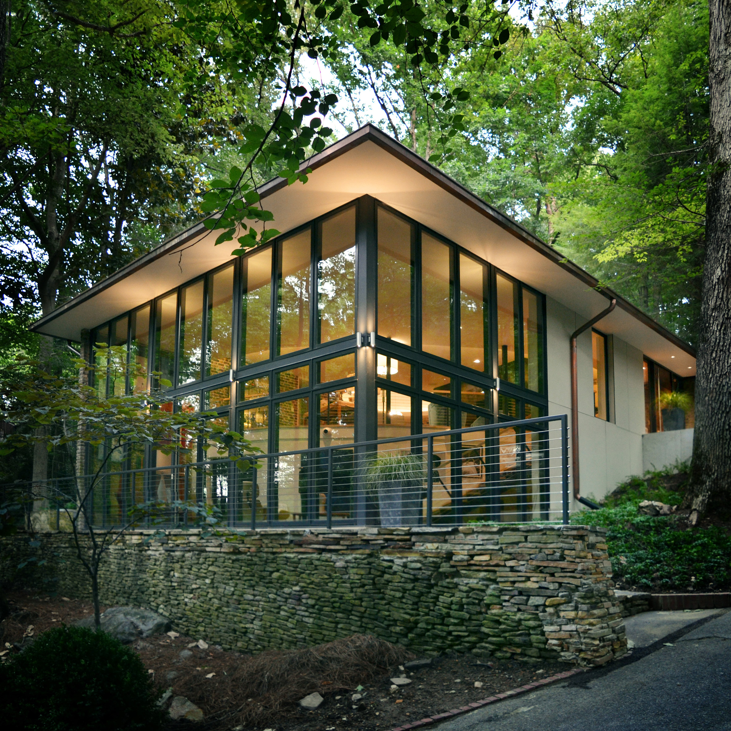
This 1960s home has been renovated by Birmingham-based architecture firm Design Initiative, which sought to return the building’s original charm, while modernising its interiors and improving circulation.

Mountain Brook Residence was originally designed by Fritz Woehle, the first architect from Alabama to be awarded the title of Fellow by the American Institute of Architects (AIA) in 1975.

Mountain Brook Residence by Design Initiative

The 3,200 square-foot (297 square metres) modernist home, completed in 1963, is located outside of Birmingham and surrounded by forest. It had undergone several renovations, “diluting” the architect’s original concept according to Design Initiative.

The building’s new owners admired Woehle’s vision, and were keen to return the home to its earlier state.
Mountain Brook Residence by Design Initiative

“A primary goal of the project was to restore the original intent of the design while updating the residence to function for the client’s needs,” said Design Initiative in a project description.

A radial plan organises the building around a central dining room, which is delineated by an interior brick wall. Previously, a rectangular terrace jutted out from the north-western corner of the home, but it was built out as an enclosed space by previous owners.

Mountain Brook Residence by Design Initiative
Photograph by Graham Yelton

The main entrance is on the upper level, through a vestibule that is separated from the living room by a fireplace. Two bedrooms, an eat-in kitchen, laundry room and office are located along the perimeter of the home on this level.

Although the original home was fully glazed, some of the rooms were enclosed over the years. “New windows replace the walls at the perimeter of the ‘drum’, opening up the views back onto the site,” said Design Initiative.

Mountain Brook Residence by Design Initiative

The architects also reconfigured the rectangular addition to the home. It was rebuilt as a double-height glass room, which now acts as a space for the owners to entertain guests and display their art collection.

“A two-story glass volume at the original deck location links the upper and lower levels, and increases the amount of usable square footage,” said Design Initiative.

Mountain Brook Residence by Design Initiative
Photograph by Graham Yelton

The two storeys are linked by a steel staircase with wooden treads, which follows the curved outline of the original structure.

The architects were also able to include space on the lower level for a wine cellar and home gym, in an area that previously only housed mechanical equipment.

Mountain Brook Residence by Design Initiative
Photograph by Graham Yelton

Mid-century-modern homes are being refreshed across the US. Other recently completed examples include a home under a Los Angeles bridge that was restored by Ras-A Studio, and a low-slung property in Connecticut updated by Joel Sanders.

Photography is by Andrew C Bryant unless otherwise indicated.

The post Design Initiative overhauls modernist Alabama home with new staircase and more windows appeared first on Dezeen.

Justin Peters’ Surreal Digital Collages

Justin Peters est un étudiant en design graphique à Stuttgart en Allemagne. Inspiré des peintres surréalistes et armé de Photoshop, il édite des photographies récoltées sur Internet pour créer des mondes parallèles et oniriques. Entre collages digitaux et imagerie naturelle, l’artiste réussit à créer une autre dimension où, selon lui, « tout est possible quand tu ouvres ton esprit ». Rien n’est attendu, et tout est surprenant dans chaque nouveau collage. Son travail défie la logique, créant une étrange beauté riche d’éléments. Découvrez le reste de son travail sur son site.


Link About It: This Week's Picks: From cannabis culture to public art, Pantera and more—our look around the web

Link About It: This Week's Picks

1. Artist Prune Nourry’s Incense + Blowtorch-Driven Catharsis
For the unveiling of “The Amazon,” artist Prune Nourry’s new sculpture outside The Standard High Line hotel, Nourry took a blowtorch to a portion of the work—igniting hundreds of sticks……

Continue Reading…

Corinna and Theresa Williams pair laundromat and cafe at Celsious in Brooklyn

Sisters Corinna and Theresa Williams have designed a laundromat in New York to include lounge areas and a coffee shop, as a welcoming alternative to other coin-operated wash places common across the city.

Celsious located in Williamsburg, a trendy area of Brooklyn known for its cafes, bars and loft apartments. The Williams sisters – born and raised in Germany – manage the space themselves.

Celsious by Corinna and Theresa Williams

Laundromats, where anyone can wash and dry their belongings, are ubiquitous across New York as most apartments lack the necessary appliances.

But they are often mundane and uninviting spaces, with nowhere to wait for wash cycles to finish, so Corinna and Theresa saw an opportunity to change this.

Celsious by Corinna and Theresa Williams

Previously a hair salon, Celsious features a double-height glazed front. Its ground floor is outfitted with a front desk, and an open space flanked by steely washers and dryers beyond.

A staircase leads to a lofted area, with a series of tables and chairs and a small coffee bar in the rear.

Celsious by Corinna and Theresa Williams

“There was a mezzanine in the previous space, but it wasn’t structurally sound, so we ended up re-designing and rebuilding the loft cafe, which allowed us to maximise floor space,” said Theresa.

This space, along with a garden at the back, provides users with the opportunity to complete other tasks or just sit and relax while doing laundry.

Celsious by Corinna and Theresa Williams

The duo credits Big Reuse for many of the shop’s details, like tiles on the stairs – some of which are original MTA subway tiles – and marble slabs.

Another reclaimed feature is the cork backdrop above the dryers, which was taken from the original mezzanine flooring.

Theresa sourced a majority of the furniture herself, such as Arne Jacobsen chairs found on Craigslist, while other pieces are reclaimed or IKEA hacks.

Celsious features light and bright tones to add a level of comfort to a place that is commonly thought of as sterile, due to the stainless steel equipment. A vibrant orange logo adds to this welcoming aesthetic.

Celsious by Corinna and Theresa Williams

Instead of stark white, walls are painted in a soft white or cream. The warm tones of natural materials like the reclaimed cork, and solid pine stools made from the shipping pallets, contrast with the washing machines.

“The colour palette was picked to reflect that airiness and welcoming feeling we want Celsious to convey: warm yellows, cozy corals and clean off-whites are needed as a juxtaposition to our equipment’s stainless steel,” said Theresa, who also works as a designer in the city. “The theme was ‘clean’, but ‘friendly’.”

Celsious by Corinna and Theresa Williams

Celsious is also decorated with indoor plants. “We planted on top of our dryers to create a calming atmosphere that makes laundry day a lot less stressful than most of our customers are used to,” Theresa said.

The duo explained that the laundromat’s name, although misspelt for dot-com rights, is a nod to their European upbringing. “We love the metric system,” said Corinna, who is trained as a journalist. “The precision, yet ease of calculating one-hundredth of a metre is a beauty.”

Celsious by Corinna and Theresa Williams

Users pay per wash, just like at a regular laundromat, but a free cup of environmentally safe detergent from The Simply Co is included in the service.

Continuing this energy-conscious branding, the designers also chose Electrolux machines because they are meant to be the most energy-efficient, coin-operated laundry equipment currently on the market.

Celsious by Corinna and Theresa Williams

Employees at the laundromat wear specially-designed aprons by German designer Inga-Lena, who also makes sustainable women’s wear produced in New York.

Other innovative laundromat concepts are one designed like a nightclub with dim interiors and neon lights in Barcelona and a laundromat in Ghent complete with a cafe and hair salon.

Photography is by Pedro Beraldo.

The post Corinna and Theresa Williams pair laundromat and cafe at Celsious in Brooklyn appeared first on Dezeen.

Studio8 looks to the landscape of eastern China for the design of Anadu Resort hotel

Studio8 referenced tea leaves and bamboo cane throughout the design of this hotel near Hangzhou, China, to keep guests’ attention on the surrounding rural terrain.

Anadu Resort is near the city of Huzhou, nestled at the bottom of Mogan mountain. The mountain forms part of Moganshan National Park, a popular tourist destination recognised for its lush vegetation and examples of early 20th-century Chinese architecture.

Anadu Resort by Studio8

Shanghai-based architects Studio8 were approached by a group of private investors to create a boutique hotel for the area that could offer guests a relaxing holiday experience.

“One of the requests from the client was to ‘design a room for the [guests] to stay for a whole day without stepping out’, where there is no TV or iPad,” the architects told Dezeen.

Anadu Resort by Studio8

“Therefore we came up with the concept of ‘finding yourself in nature’, where guests can stay by themselves, reading or thinking amongst nature,” continued the architects.

The 30,000 square-metre hotel is composed of three stacked rectilinear volumes, whose internal spaces have been arranged to offer different perspectives of the verdant landscape.

Anadu Resort by Studio8

While rooms looking out to the east can see a dense bamboo forest, those towards the south elevation have views of a distant mountain range. Suites facing the west overlook a sprawling tea field.

“We wanted to design a contemporary building, and by orientating the rooms to the different natural elements around, the shape of the building is in a way naturally formed,” explained the architects.

Anadu Resort by Studio8

These elements have gone on to directly inform the interior design of the guest accommodation – sheer, jade-green curtains have been introduced throughout the western rooms to echo the colour of white tea leaves.

Dark, stone-coloured shades like slate grey have then been applied to the mountain-facing suites, and bamboo wood has been employed to craft the several of the furnishings in the eastern suites.

Anadu Resort by Studio8

Strips of bamboo have also been used to create what the architects describe as a “second skin” around the hotel, screening its largely glazed facade and reducing its visual impact.

An infinity pool has been introduced on the roof of the hotel’s second level, intended to reflect the sky and surrounding environment. It’s punctuated by a series of square stepping stones that lead from the third floor suite to a sunbathing platform.

Anadu Resort by Studio8

“After first contact with the site, [we] felt something was missing: a lack of water presence,” said the practice.

“Water itself, and especially a very calm water surface, immediately generates a sense of relaxation.”

Anadu Resort by Studio8

Communal areas on the first floor have been decked out with concrete floors and walls – timber bench seats and dining tables provide touches of warmth. A large kitchen has also been constructed at this level where guests have the option of cooking their own meals using produce grown on the site’s land.

Much like Studio8, Sri Lankan practice Zowa Architects used bamboo canes to shroud the glass exterior of a the Kumoan Hotel in the Himalayas, which opened earlier this year.

Photography is by Sven Zhang.


Project credits:

Architect firm: Studio8
Lead architects: Shirley Dong, Andrea Maira
Collaborators: Luigi Arcadu, Stefano Bai, Alex Ho, Sara Ciribifera, Zhao Yue

The post Studio8 looks to the landscape of eastern China for the design of Anadu Resort hotel appeared first on Dezeen.

Studio Mutt creates Ordnance Survey Pavilion from cartographic symbols

Icons from Britain’s historic Ordnance Survey maps are reinterpreted as colourful architectural elements in this pavilion designed by Studio Mutt for England’s Lake District National Park.

OS Pavilion by Studio MUTT

The studio founded by Graham Burn, James Crawford and Alex Turner, developed the proposal in response to an open call organised by Lakes Culture, the body responsible for promoting tourism and cultural activities in the area.

As part of the Lakes Ignite 2018 initiative, the organisation called for projects that celebrate the Lake District as a “cultural landscape”. Studio Mutt’s response references how people have historically interacted with the landscape, both culturally and physically.

OS Pavilion by Studio MUTT

The main point of departure for the project was the Ordnance Survey maps, which have provided detailed information about the topography, buildings and roads of Great Britain since 1745.

The iconic and prosaically functional maps feature symbols, colours and design details that are a familiar part of Britain’s cultural heritage.

OS Pavilion by Studio MUTT

Mutt Studio wanted to translate some of these elements into a structure that celebrates the role the maps have played in enhancing the British population’s interaction with the landscape.

“The idea was to not only create an assemblage of OS references but to also create an intriguing and characterful structure which sat boldly in the landscape,” said the architects, “with a presence similar to a small isolated chapel – stranded within the vast rugged landscape.”

OS Pavilion by Studio MUTT

The Ordnance Survey Pavilion comprises a cluster of colourful forms compiled to form an interactive and semi-inhabitable sculpture situated behind a pub on the Langdale Estate.

The structure looks out towards the Langdale Valley from its setting on a riverbank between a small lake and the slate slag heap of an old quarry.

OS Pavilion by Studio MUTT

Mutt Studio chose to focus on a specific period of the Ordnance Survey’s history as the inspiration for the pavilion: the retriangulation of the country between 1935-1962.

During this period of roughly 30 years, the organisation undertook a laborious process of remeasuring the landscape, often using rudimentary tools and techniques that required a great deal of manual effort.

OS Pavilion by Studio MUTT

“The installation synthesises elements from this narrative of retriangulation through a collage of scenes and characters that form a peculiar pavilion, dedicated to the Ordnance Survey,” the studio added.

Various symbols from the OS maps are scaled up into three-dimensional forms that combine with other shapes and details informed by apparatus used by the surveyors during their work.

OS Pavilion by Studio MUTT

Black-and-white painted poles that form a framework with a sloping corrugated roof reference ranging rods used for measuring straight lines in the landscape, while a pink truncated pyramid evokes the trig points positioned on top of prominent hills and mountains.

Two of the structures provide inhabitable spaces that function as single-person art galleries displaying imagery relating to both the mapped landscape and the act of measuring.

OS Pavilion by Studio MUTT

Nearby in northern England, Charles Holland has created a colourful parrot-shaped pavilion at the Fountains Abbey & Studley Royal.

Studio Mutt designed, fabricated and installed the pavilion, which opened to the public on 27 January. It will remain in place until August 2018.

Photography is by Steven Barber.

The post Studio Mutt creates Ordnance Survey Pavilion from cartographic symbols appeared first on Dezeen.

This week, Christo spoke to Dezeen and Fumihiko Maki's Aga Khan Centre completed

This week, artist Christo compared the creation of his works to building a skyscraper in an exclusive interview with Dezeen, and Fumihiko Maki’s Aga Khan Centre was completed in London’s King’s Cross.

During an interview with Dezeen, Christo discussed the process behind his giant artworks including the recently installed London Mastaba, likening their construction to that of an architectural project such as a skyscraper or highway.

The 83-year-old Bulgarian also revealed how he self-funded the £3 million cost of the Mastaba by selling his own drawings and related artworks, saying it is “my money, it’s my freedom.”

Fumihiko Maki unveils Aga Khan Centre in London’s King’s Cross

Pritzker Prize-winning architect Fumihiko Maki completed an education centre featuring roof spaces and courtyards housing eight Islamic gardens for the Aga Khan Foundation, which forms part of the development of King’s Cross in London.

Dismantling of Glasgow School of Art set to begin in days

There was an update on the Glasgow School of Art fire this week, as it was announced that a partial deconstruction of the building was set to begin “as soon as possible”, after Glasgow City Council concluded that a sudden collapse was likely.

The news followed the revelation that a sprinkler system for the school had been delivered a day before the blaze, although it would have taken weeks for them to be installed and operational.

Olson Kundig reveals plans for Bob Dylan Center in Oklahoma

A proposal for a museum dedicated to Bob Dylan in Tulsa that would be located close to an archive housing 6,000 items belonging to the musical, was revealed by Architecture firm Olson Kundig.

Images of Tod Williams and Billie Tsien’s extension and renovation of postmodern architect Charles Moore’s Hood Museum of Art were also released this week. The extension will include new galleries to showcase an extended art collection, and expanded teaching facilities.

Dezeen Awards deadline is today

This week also saw a flurry of entries to Dezeen Awards, with the deadline closing at midnight UK time today.

To find out how you can submit your entry in time, visit the how to enter page.

Adidas reveals interactive match ball for knockout stages of World Cup

In technology news Adidas unveiled the Telstar Mechta, a new ball designed for the knockout stage of the World Cup, which includes a near-field communication (NFC) chip embedded into the top of the ball to allow users to interact with it.

Boeing revealed their concept for a hypersonic aircraft that would be able to reach most locations in the world within one to three hours, thanks to technology that would allow the plane to travel at Mach 5 (around 3,836 miles per hour).

Land Ark unveils modern take on classic American RV

Popular projects on Dezeen this week included Colorado startup Land Ark’s modern take on classic American RVa stripped-back coffee shop with raw concrete walls in Japan and Virgil Abloh’s debut rainbow-hued runway show for Louis Vuitton.

The post This week, Christo spoke to Dezeen and Fumihiko Maki’s Aga Khan Centre completed appeared first on Dezeen.

Funny Minimalist Tattoo by Chantal Frontale

Chantal Frontale est une tatoueuse basée à Nantes. Elle fait partie du «Panache Club», association multiculturelle qui regroupe plusieurs talents: architectes, illustrateurs, graphistes, journalistes, peintres, et deux tatoueurs, qui forment le «Panache Club Tattoo».

Avant de tatouer des corps humains en tant que «Chantal Frontale», elle s’est entrainée en pyrogravant des planches de skate, son nom de scène étant à l’époque « Chantal Tanchal ».
Venant du monde de l’illustration, ses tatouages ​​sont toujours des pièces mignonnes et pleines d’humour. Des lignes simples et de légers détails font partie intégrante Son talent s’exprime à travers des lignes simples et de légers détails.
Donc, si vous voulez vous faire tatouer une moule sur le bras ou un alpaga sur la jambe, rendez-vous au Panache Club tattoo pour la rencontrer!


Dezeen Awards deadline today

Dezeen Awards closes for entries today at midnight UK time. It’s not too late to submit your work to be in with a chance of winning.

Thanks to our low prices, entries have been pouring in from studios of all sizes, from global brands to emerging designers who are starting their careers.

Enter now to have your work seen by a jury of 75 leading figures from the design world, including John Pawson, Amanda Levete, Thomas Heatherwick and Es Devlin.

Enter now ›

There are a total of 30 categories spanning architecture, interiors and design available to enter, including six studio categories which will highlight the architects and designers producing the most outstanding work.

All winners will be announced at the Dezeen Awards ceremony on 27 November, and be presented with a unique trophy designed by Atelier NL.

The Eindhoven-based duo are creating a range of bespoke, hand-made trophies using London clay, the material that underlies much of Dezeen’s home city.

Create a Dezeen Awards account now ›

Registering for a Dezeen Awards account only takes a few minutes, so you can get started on your entry right away. Any questions? Send an email to awards@dezeen.com and we’ll help.

Remember, the deadline for entry is tonight at midnight UK time.

Good luck!

The post Dezeen Awards deadline today appeared first on Dezeen.

Swarm of drones perform at the opening of the Great Exhibition of the North

One hundred drones flew in formation through the night sky to electronic music last week at the opening of Great Exhibition of the North in Newcastle, England.

Leeds-based creative studio Newsubstance orchestrated the autonomously flown, swarm drone performance which featured one hundred drones made by Singaporean company Skymagic.

Equipped with colour-changing LEDs, the drones flew across the night sky to a track written and produced by electronic duo Darkstar that explores the notion of home. Skymagic’s choreography drew upon on the region’s heritage by flying in formation to create motifs such as the North Star.

Swarm of drones perform at the opening of the Great Exhibition of the North

The performance marked the beginning of a joint venture between the two companies as Skymagic becomes Newsubstance’s exclusive performance drone offer. With offices in Europe and Asia, Skymagic specialises in large scale drone-based light shows across the globe.

“Drone technology is now an established field and in recent years its use in creating aerial displays at large-scale ceremonies and live events has become more prevalent,” Skymagic’s director Patrick O’Mahony told Dezeen.

“While many of these performances have, on some level, been designed as a showcase or platform for tech giants, the work of Skymagic is different,” continued O’Mahony.

“Unlike any of the other companies out there, the team at Skymagic – through its newly formed joint venture with Newsubstance – is able to draw on a rich heritage of technological development, live entertainment experience and performance design.”

“This unique skillset within the team allows us to lead the design and development of the creative rather than simply placing a logo in the sky,” said O’Mahony.

“We understand the show design vernacular and our creative response demonstrates this, telling stories in the sky that always speak to the show and are not just about us and our technology. The show is king.”

Swarm of drones perform at the opening of the Great Exhibition of the North

“Another point of difference is our mantra that it is not simply about the number of drones in the sky but more importantly the narrative and the number of drones best deployed to represent this,” he added.

“Creativity is key rather than a race to break another world record. That said, it is important to state that our super stable system is, however, scalable with no limitation on airborne fleet size.”

Swarm of drones perform at the opening of the Great Exhibition of the North

Skymagic said that special effects, cladding, closer proximity flying, longer flight times, and more robust weather resistance are some of the elements that its team of internal software developers and engineers are currently focusing on.

“Drone technology is constantly evolving in what is a fast-paced environment,” said O’Mahony.

“Every day we see new advances in GPS accuracy, battery technology and system efficiencies – amongst other things. Our R&D team is constantly working to utilise and incorporate these advancements in industry technology.”

Hosted in Newcastle, Gateshead, Great Exhibition of the North is a free event that aims to tell the story of the North of England and its innovators, businesses, artists and designers. The event takes place across one of three venues – Great North Museum, BALTIC Centre for Contemporary Art or Sage Gateshead, which will host an 80-day programme of exhibitions and events.”

Other drone-based performances include a show at last year’s Design Miami event by Amsterdam-based Studio Drift, which choreographed 300 drones to mimic a flock of birds over the beach.

Dezeen’s drone documentary Elevation is currently being screened at festivals around the world including in Australia, Kosovo, Pristina and Madrid. The 18-minute film explores how drones will change architecture, cities and society.

The post Swarm of drones perform at the opening of the Great Exhibition of the North appeared first on Dezeen.