
May 21
Sloth Ring – lovely Sloth Ring
Posted in: Uncategorized
The Sloth Ring($25) is a tiny sloth mounted on an adjustable ring. The Sloth made by hand in po..(Read…)
The Sloth Ring($25) is a tiny sloth mounted on an adjustable ring. The Sloth made by hand in po..(Read…)
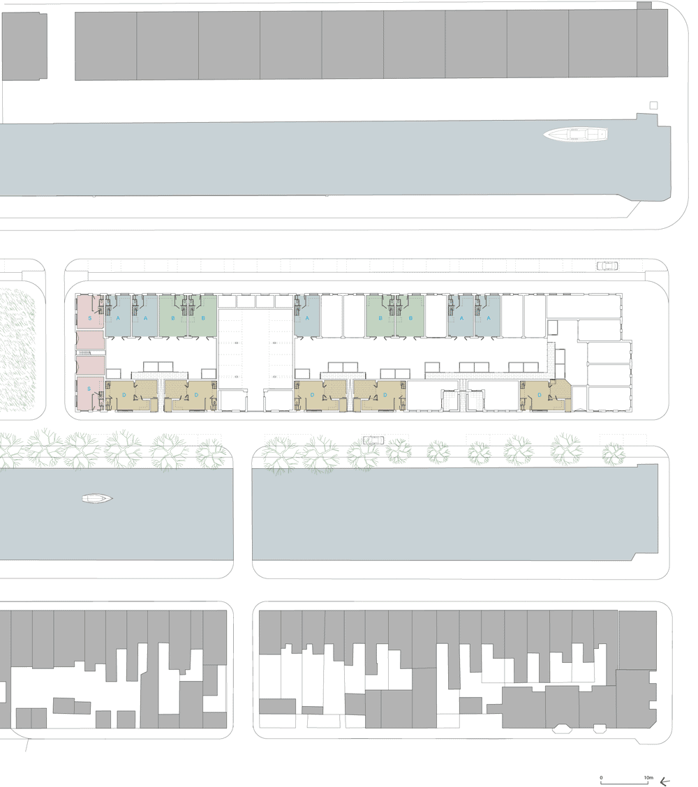
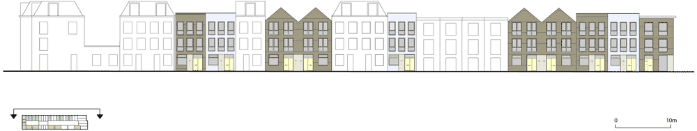
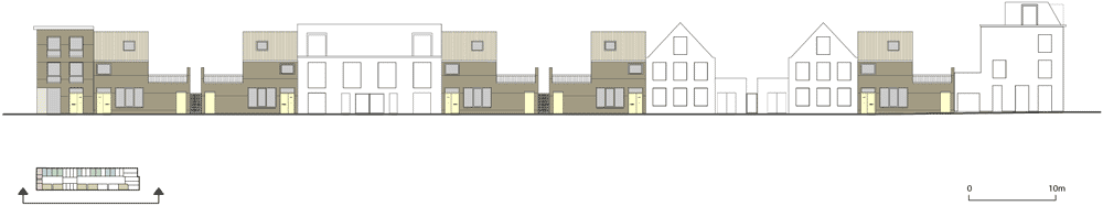
London firm Tony Fretton has sandwiched two rows of brick houses between a pair of canals in the town of Den Helder in the Netherlands (+ slideshow).

Tony Fretton Architects collaborated with Dutch firm Geurst en Schulze Architecten to design 16 houses for the Molenplein site, as part of a wider masterplan by West 8 that centres around the redevelopment of the town’s former navy base.

Three-storey houses stretch along the front of the site, facing out across the dockyard, while a row of smaller two-storey residences run along behind and are separated by private gardens.

Drawing inspiration from canal houses of the early twentieth century, the houses feature a mixture of linear and gabled profiles, and present both exposed and painted brickwork facades.

Bright yellow doors and ornamental marble panels mark the entrances to each house, plus the windows come with chunky wooden frames.

Each of the 16 houses has one of four standard layouts. There are few internal partitions and finishes, as the architects wanted to give residents the opportunity to design their own interiors.

Tony Fretton Architects is led by Fretton alongside partner James McKinney. Past projects by the firm include a Stirling Prize-nominated museum of fine art in Denmark and the Vassall Road housing project in south London. See more architecture by Tony Fretton Architects.

Photography is by Christian Richters.

Read on for more information from Tony Fretton Architects:
Houses in Molenplein, Den Helder, the Netherlands
Tony Fretton Architects has completed a new development of houses in the Dutch town of Den Helder.
Commissioned by Dutch developer Proper-Stok the development comprises 2 and 3 storey houses designed by Tony Fretton Architects and Dutch practice Geurst en Schulze Architecten configured within a masterplan designed by West 8.

Molenplein occupies a long site between two canals, the Helderskanaal and Werfkanaal, where it looks out onto Den Helder’s former Napoleonic naval yard. The development is part of a regeneration strategy by the municipality to attract middle-income people to the area following the relocation of the Dutch navy base. The Napoleonic dockyard has also been redeveloped, providing places for business and culture.
West 8’s masterplan for Molenplein preserves the character, scale and diversity of the city fabric along each canal; the plan comprises large three-storey houses facing the dockyard and compact two-storey houses to the rear, with private gardens in between, and intersperses designs by Tony Fretton Architects with those of Geurst en Schulze Architecten.

Houses designed by Tony Fretton Architects are distinguished by a simple profile and generously proportioned windows and entrance doors. The designs are abstracted versions of typical canal front and back houses and aim to reproduce the generosity of scale and abstraction seen in Dutch architecture from the Golden Age and early Dutch modernism. Materials comprise wooden window frames in facades of white painted brick or rose coloured brick with white pointing. A measure of ornament is given through the use of discreet panels of Belgian marble at eye level. In contrast the Geurst en Schulze houses have finely elaborated detail and provide punctuation in the terrace.
Inspired by the openness and energy that the practice observed in an earlier development they designed – De Prinsendam in Overhoeks, Amsterdam – where owners radically personalised their interiors, the houses are presented with unplanned interiors and carefully positioned service risers, fenestration and staircases that support a wide range of possible internal configurations.

Location: Den Helder, The Netherlands
Client: Proper-Stok
Gross external area: 2,300 sq m approx
Internal area: 3,200 sq m approx
Architects: Tony Fretton Architects
Design team: Tony Fretton, James McKinney, David Owen, Chris Snow, Chris Neve
Project Associate: David Owen
Project Architect: Chris Snow
Executive Architects: Geurst en Schulze Architecten
Masterplan & landscaping: West 8
Structural Engineers: Ingenieursbureau Dijkhuis bv
Services Engineers: Wolf Dikken adviseurs
Main Contractor: Tuin Den Helder bv
The post Houses in Molenplein by
Tony Fretton Architects appeared first on Dezeen.
An F-35B test aircraft completes the first-ever vertical takeoff (VTO) at NAS Patuxent River, Md., o..(Read…)

Always a high point of our NYC Design Week, Noho Design District has fast become a destination for up and coming and established designers looking to introduce their latest work outside the conventional confines of…
Continue Reading…
I really like the Man at Arms show, and this time he created something so awesome, the Buster Sword from Final Fantasy VII. The sword is made from steel, bronze and aluminum. It’s 6ft long, 12″ wide and weighs between 75-80lbs
 This past fall, I was contacted by the amazing people at Behance and 99U about contributing to a book series they’re editing and curating. I’m a big fan of 99U and have been in the LifeRemix network with Scott Belsky (the publisher behind Behance and 99U) for years. It took me exactly one second to agree to the project before I even really understood what it entailed.
The book, Manage Your Day-to-Day: Build Your Routine, Find Your Focus and Sharpen Your Creative Mind, released today is the first in a three-part series exploring creative productivity, time management, individually tailored processes, and great design. 99U’s traditional focus is the creative community (artists, designers, writers, etc.), but the information in this book is applicable to most everyone — especially those of us tied to desks all day.
Jocelyn K. Glei, the editor-in-chief of 99U and this book series, explains:
In Manage Your Day-to-Day, we address the specific challenges that this 21st-century influx of information presents for creative professionals, and offer solutions for how to build a daily routine, maintain focus amidst a constant stream of distractions, and keep your creative mind (and work) fresh … Rather than taking a one-size-fits-all approach, Manage Your Day-to-Day provides a playbook of tried-and-true best practices for producing great work. To accomplish this, we recruited 20 of the smartest creatives and researchers we knew—from Stefan Sagmeister to Seth Godin to Gretchen Rubin to Tony Schwartz to Dan Ariely—and asked them to share their road-tested insights on what helps them do great creative work.
The chapter I wrote for the book is “Learning To Create Amidst Chaos” and admits that “like it or not, we are constantly forced to juggle tasks and battle unwanted distractions” while working and to “truly set ourselves apart, we must learn to be creative amidst chaos.” I provide advice for ways you can train yourself to find focus in disruptive circumstances, much like a basketball player has to learn control so he or she can be successful throwing free throws on a rival team’s court.
The official book trailer:
The book is published by Amazon’s new publishing house and is available in paperback, audio, and digital format for the Kindle. Learn even more about the project and the contributors at 99U.
Let Unclutterer help you get your home or office organized. Subscribe to our helpful product shipments from Quarterly today.
Dezeen and MINI World Tour: in our next movie recorded at the MINI Paceman Garage in Milan last month, MINI head of design Anders Warming discusses the design of the new MINI Paceman and design journalist and curator Kieran Long gives us his thoughts on how the current generation of designers compares to the great masters.

Warming explains that the idea behind the design of the MINI Paceman was to combine the signature styling of the classic MINI with new features such as four-wheel drive and horizontal tail lights. “When you look at [the car] you feel and you see MINI, but you realise there is so much new to it,” he says.

He also stresses that a lot of the design of the car was done by hand. “People say cars are just [designed] by computers today,” he says. “A car is really done by hand. It’s designed with sketches, we choose the lines that we like and we also spend a [lot of] time forming the shapes in clay and then from that make the tooling.”

The guest in our Dezeen and MINI World Tour Studio is Kieran Long, senior curator of contemporary architecture, design and digital at the V&A museum in London. He believes the work of the current generation of designers lacks the boldness of the post-modern design Italy became famous for in the 1970s and 1980s.
“I sense a sort of tentative nature in the design that you see – even [work by] the younger designers, students and so on,” he says. “There’s not much boldness either in formal or colour terms, but also philosophical and ideas terms.

“It really struck me visiting the exhibition at the Triennale on Italian design, what a big contrast that is from the grand era of Italian design. You see the boldness of those forms and remind yourself of what Italian design was known for and you see now a sort of pastel-y sort of invisible feeling to design.”

Despite this, Long says there are detectable trends that young designers are exploring. “We’ve had this fixing, repairing, ad hocism thing now for a couple of years,” he says. “This year it’s really identifiable that young designers work is occupied by new materials, often sustainable materials, new organic materials in the kind of Formafantasma mould. If somebody would just capture that and make a manifesto about it, it would seem like a real movement.

“I think the big problem is that they have no grasp of design history,” he continues. “They have no idea of where they sit in relation to anything. It’s my observation that most of those designers wish they were taught a formal didactic history of design alongside the freedom that the art school education gives them.”
More generally, Long believes that design needs to be less introspective to remain relevant. “I think we’ve overrated what designers do as the thing that’s interesting about design,” he says. “What’s really interesting is the problem solved, or the relationship made, or the fashion trend started or ended – those cultural currents that design contributes to.
“I think they could learn something from architecture in that sense; when you’re an architect, when you write about architecture, you can also write about the city, and the city is everything in it. Design needs to find a category like that. They need to relax and say: ‘what I do is not the interesting thing about design, it’s what happens after it leaves my office.'”

See all our stories about Milan 2013.
The music featured in this movie is a track called Konika by Italian disco DJ Daniele Baldelli, who played a set at the MINI Paceman Garage. You can listen to more music by Baldelli on Dezeen Music Project.
The post “Young designers have no grasp
of design history” appeared first on Dezeen.

You’ve heard the expression that [American] football is a game of inches. So, increasingly, is living in Manhattan.
This video of Luke Clark Tyler’s apartment (captured by Kirsten Dirksen’s Fair Companies) has racked up nearly two million hits, and for good reason: Tyler downsized from his previous 96-square-foot palace to shoehorn his life into a 78-square-foot studio. But what really makes this video distinct from other “tiny living” vids we’ve seen, and what should be of interest to the Core77 reader, is that Tyler is a trained architect who can design, build and install his own things, like his sideways Murphy Bed.

Also observe the little details, like how he’s using eyehooks as toothbrush- and razor-holders and how the bottle-stays on his shelves are just wooden dowels held in place by two carefully-placed sheetrock screws on either side.

This is giving us a potentially cruel idea for design education—but before we get to that, watch the vid:
     |

Artists Amber Hsu and Katriona Chapman have launched a bi-annual artzine devoted to graphite.
The first issue of Tiny Pencil features some beautiful illustrations by 27 artists including Luke Pearson, Nick Sheehy, Jack Teagle, Kristyna Baczynski, Donya Todd, Rachel Bray, Sandra Dieckmann, Lizzy Stewart and Yoko Tanaka.

Each issue will focus on a particular theme which artists must respond to and pencil is the only medium allowed. The theme for the 64-page inaugural issue is forests and features sketches of deep dark woods, eerie creatures and sparse landscapes.

The publication was launched with a night of live drawing at London’s Gosh! Comics sponsored by Derwent Pencils. As well as producing a bi-annual anthology, Tiny Pencil will publish additional themed issues throughout the year. Chapman and Hsu have also launched a blog featuring discussions of artists’ work and creative processes.

Hsu and Chapman met at an illustration critique class, where both shared a love of pencil drawings.
“I work a lot in pencil and I’ve always loved it – it’s quite a raw material and it’s immediate. Artists can be quite free with it,” says Hsu.

Artists approached to work on the magazine have also been enthusiastic about picking up their pencils and taking a break from digital illustration.
“The artists have found it really refreshing – pencil is quite a personal medium and I think that’s another reason artists enjoy using it. There’s a strong personal element in all of the works in the current issue,” she adds.
Tiny Pencil is priced at £9 and is available at tinypencil.com and selected UK stockists.
Images (from top): cover illustrations by Nick Sheehy and Kristyna Baczynski; forest illustrations by Jamie Mills; Sigrid Rodli; Rachel Bray and Nick Sheehy.

Out now, the May 2013 issue of Creative Review is our biggest ever. Features over 100 pages of the year’s best work in the Creative Review Annual 2013 (in association with iStockphoto), plus profiles on Morag Myerscough, Part of a Bigger Plan and Human After All as well as analysis, comment, reviews and opinion
You can buy Creative Review direct from us here. Better yet, subscribe, save money and have CR delivered direct to your door every month. If you subscribe before May 3, you will get the Annual issue thrown in for free. The offer also applies to anyone renewing their subscription. Details here
CR for the iPad
Read in-depth features and analysis plus exclusive iPad-only content in the Creative Review iPad App. Longer, more in-depth features than we run on the blog, portfolios of great, full-screen images and hi-res video. If the blog is about news, comment and debate, the iPad is about inspiration, viewing and reading. As well as providing exclusive, iPad-only content, the app will also update with new content throughout each month.
Dutch graphics studio Experimental Jetset has redesigned the logo for the Whitney Museum of American Art in New York as a slender W that changes shape to respond to its setting (+ movie).

Experimental Jetset developed the graphic identity around the concept of a “responsive W” that forms both a symbol of the Whitney and a framework for accompanying text and images.

“We came up with the idea of the zig-zag line, with the zig-zag being a metaphor for a non-simplistic, more complicated (and thus more interesting) history of art,” say the designers.

“We think the line also represents a pulse, a beat – the heartbeat of New York, of the USA. It shows the Whitney as an institute that is breathing (in and out), an institute that is open and closed at the same time.”

The designers specified Neue Haas Grotesk – a redrawn version of a 1950s Swiss typeface – for any text positioned alongside the logo, while any images can be positioned underneath.

“We began to explore the possibilities of the W as a frame to put work in, or a stage to place work on,” they explain. “The lines [of the W] can be seen as borders, arrows, connections [or] columns.”

The new graphic identity replaces the Whitney’s thirteen-year-old logo, designed by Abbott Miller of Pentagram, and marks a period of change that will see the museum relocate to a new building by architect Renzo Piano, set to open in 2015.

Other logos designed in recent months include one for the estate of Thunderbirds creator Gerry Anderson and one for Nivea designed by Yves Béhar. See more graphic design on Dezeen.
Photography is by Jens Mortensen.
Read on more information from the Whitney:
As the Whitney approaches the opening of its new building in 2015, museum staff are taking stock of all aspects of programming and operations. While much of this work is happening behind the scenes, one very visible aspect of this focus is the Whitney’s graphic identity. While the museum has changed considerably in the thirteen years since it introduced the word mark designed by Abbott Miller of Pentagram, even more extensive institutional changes will come with the move downtown.
Two years ago, Museum staff began a thoughtful internal dialogue regarding the Whitney’s graphic identity and selected the design studio Experimental Jetset to develop an approach which embraces the spirit of the Museum while serving as a visual ambassador for our new building. The result is a distinctive and inventive graphic system that literally responds to art — a fundamental attribute of the Whitney since its founding in 1930. This dynamic identity, which the designers refer to as the “responsive ‘W'” also illustrates the Museum’s ever-changing nature. In the upcoming years it will provide an important point of continuity for members, visitors, and the public during the transition to the new space.
The post Whitney Graphic Identity
by Experimental Jetset appeared first on Dezeen.
This is site is run by Sascha Endlicher, M.A., during ungodly late night hours. Wanna know more about him? Connect via Social Media by jumping to about.me/sascha.endlicher.