Markthuis by Barcode Architects

Dutch studio Barcode Architects has renovated a house in Belgium to make room to display a collection of hunting trophies.

Markthuis by Barcode Architects

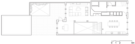
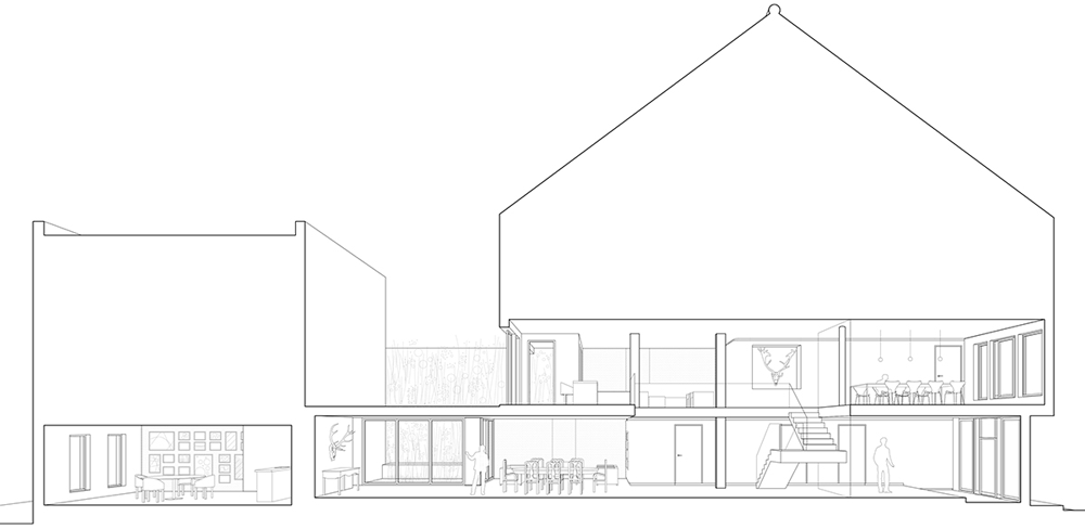
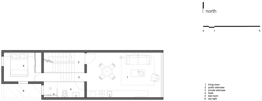
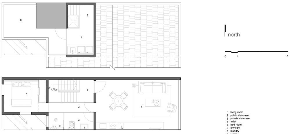
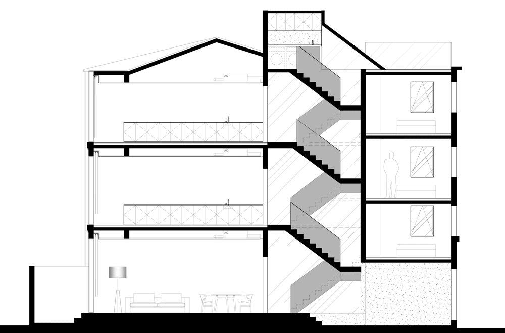
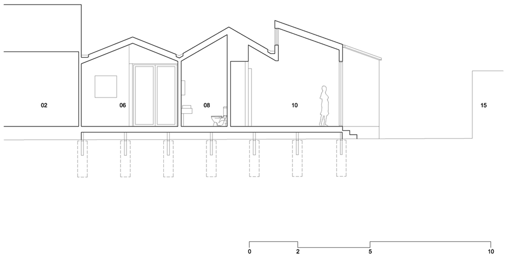
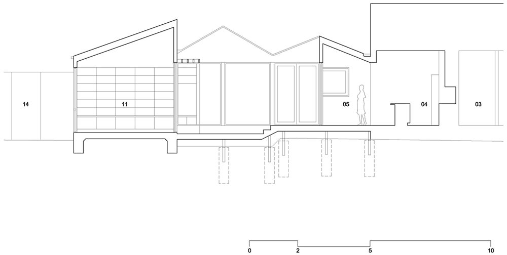
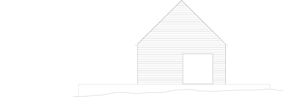
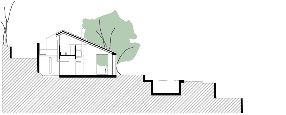
Named Markthuis, the two-storey residence has been reconfigured to create a central atrium, helping to bring more daylight onto a double-height “exhibition wall” of paintings and antlers.

Markthuis by Barcode Architects

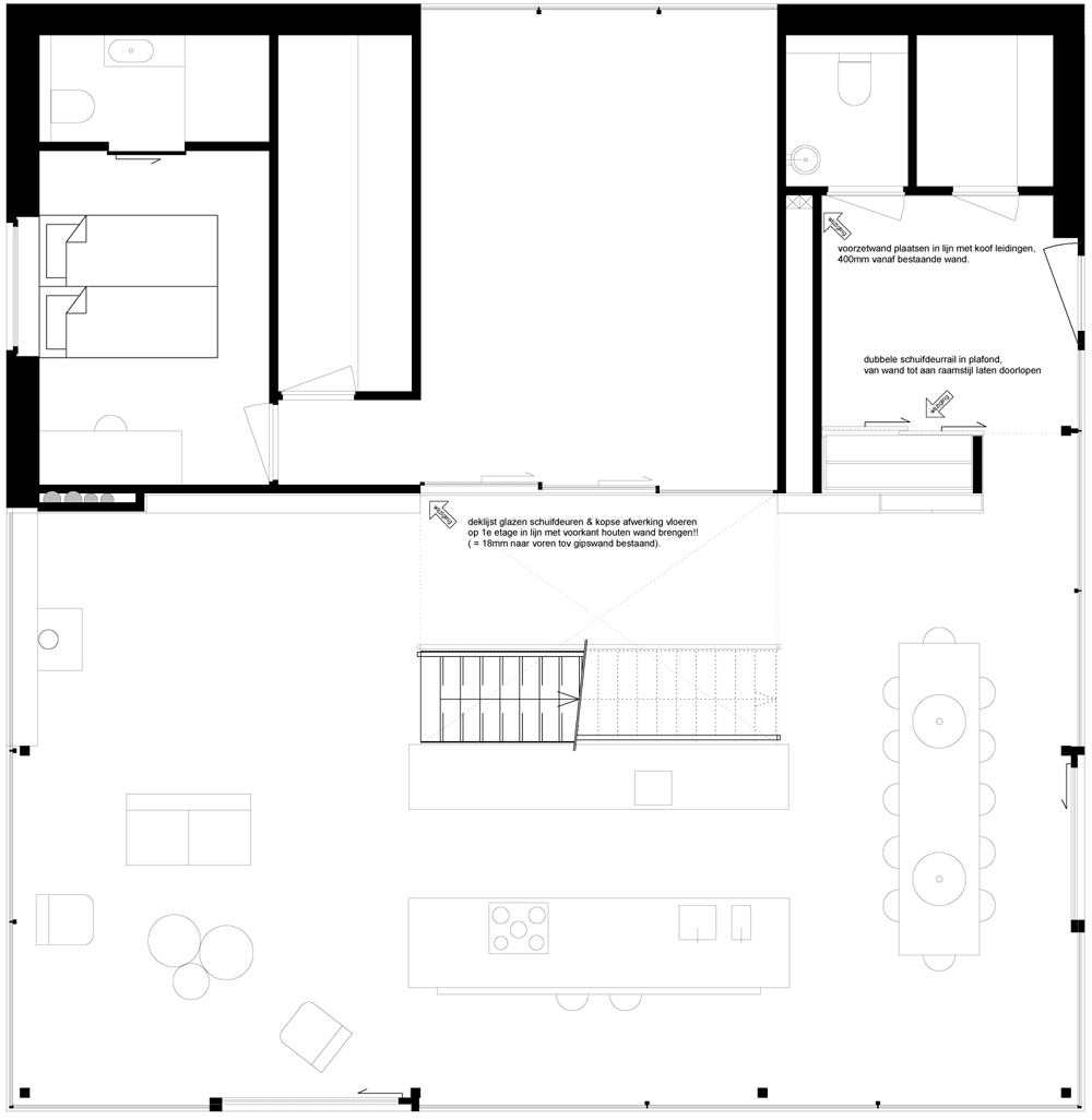
Barcode Architects replaced the original staircase with a freestanding wooden structure that folds back and forth through the atrium between clear-glass balustrades.

Markthuis by Barcode Architects

A frosted glass wall separates the staircase from the entrance lobby just in front, where a bearskin rug is spread across the floor.

Markthuis by Barcode Architects

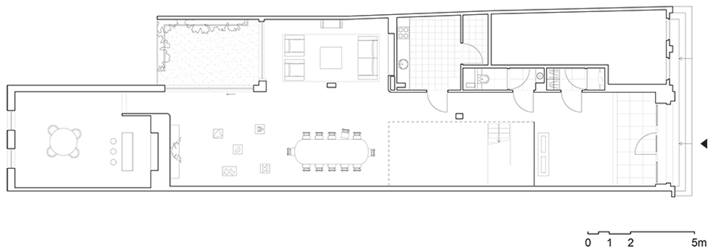
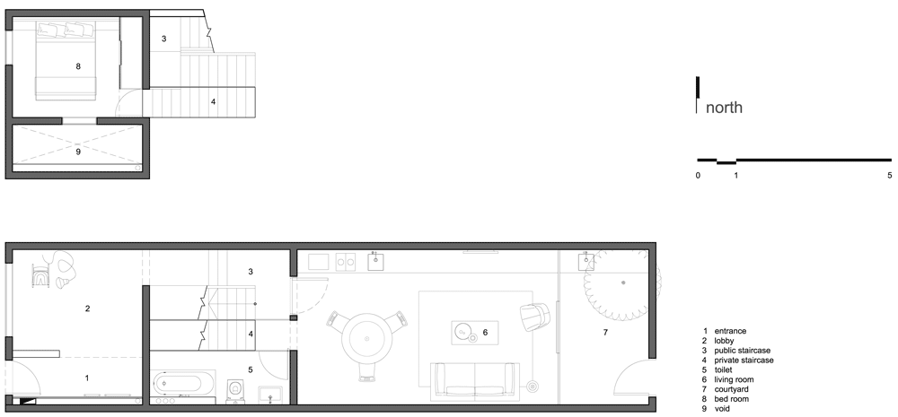
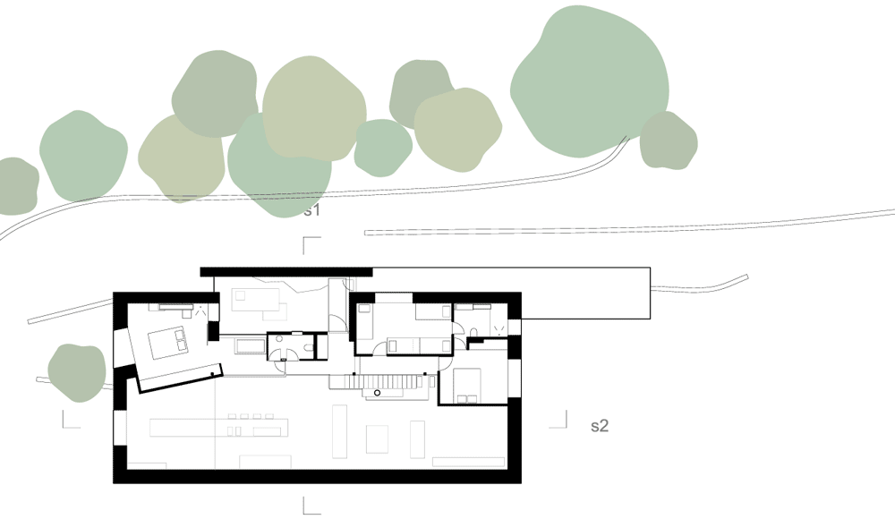
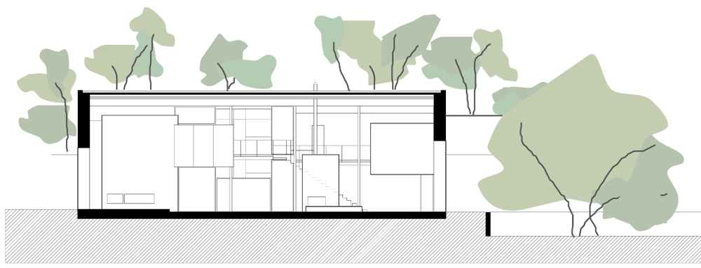
Beyond the atrium, most of the original partitions have been removed to create a large open-plan space on both storeys. At ground-floor level, this room functions as reception room for entertaining guests, while the floor above is used as a general living and dining room.

Markthuis by Barcode Architects

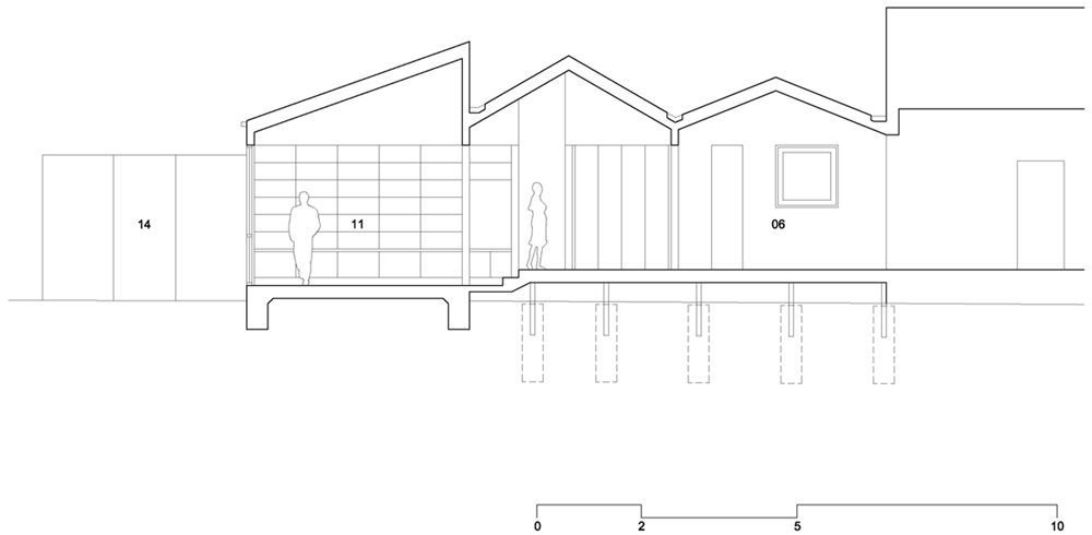
“From any point in the villa there is a clear view out, to the sky and the green,” says Barcode Architects. “Combined with the ‘lofty’ floor plan, it delivers the house with a unique transparency and quality.”

Markthuis by Barcode Architects

Other recently completed house renovations include a converted stable block in England and an overhauled townhouse in the Netherlands. See more renovations on Dezeen.

Photography is by Christian van der Kooij.

Here’s some more information from Barcode Architects:


Barcode Architects ‘Markthuis’ is completed

Barcode Architects design for the extension and renovation of ‘Markthuis’ is completed. The design is driven by the desire to optimise the daylighting in the house and the wish of the client to reserve a prominent place for his large collection of art and hunting trophies.

Markthuis by Barcode Architects
Ground floor plan – click for larger image

In order to maximize the spatial experience most of the interior walls are removed to remain with one open living space extending over the first two floors of the villa. Downstairs are comfortable spaces for receiving guests while on the upper first floor more intimate and private areas with an open plan kitchen, study, and lounge area are situated.

Markthuis by Barcode Architects
First floor plan – click for larger image

A large atrium connects the two layers and provides space for an exclusive, double high exhibition wall with an impressive amount of artefacts. The wooden staircase is placed as a freestanding piece of furniture within the vide, on one side guided by a 6 meter tall piece of glass. The glazed element separates the kitchen and the entrance lobby from the rest of the house and offers exciting plays of light and shadow.

Markthuis by Barcode Architects
Long section – click for larger image

Notice: Barcode Architects
Location: Belgium
Stage: Realized
Client: Private
Area: 400 sqm

The post Markthuis by
Barcode Architects
appeared first on Dezeen.

Rethinking the Split House by Neri&Hu

Rethinking the Split House by Neri&Hu

Chinese architecture studio Neri&Hu sliced away the rear wall and replaced it with glass for this renovation of a 1930s townhouse in Shanghai.

Rethinking the Split House by Neri&Hu

The three-storey building is located in the Tianzifang district of the Chinese city, where it originally functioned as a house for a single family. Neri&Hu‘s redesign converts the building into three divisible apartments, each with a combined living and dining room at the back and a bedroom at the front.

Rethinking the Split House by Neri&Hu

A bulky metal staircase replaces the old timber steps that previously connected the floors. Sandblasted glass (completed after photography) separates the stairway from the corridor of each apartment so that residents can see the outlines of neighbours passing by.

A 45-degree skylight brings daylight into the stairwell, while a shared laundry room and terrace are positioned at the top.

Rethinking the Split House by Neri&Hu

“The blurring of both the private and the public acts as the central concept that binds the split level together, and at the same time, bring life to the middle and darkest portion of the house,” says Neri&Hu.

Rethinking the Split House by Neri&Hu

The building is arranged over split levels, so the architects have also inserted a second set of stairs within two of the apartments. Unlike the main staircase, both are constructed from timber to match the flooring.

Bathrooms stretch along the southern side of each apartment and are enclosed behind another layer of sandblasted glass. Showers feature a west-facing window, offering a view down into the shared lobby below.

Rethinking the Split House by Neri&Hu

New windows were added to both the front and rear elevations, while the rest of the exterior has been coated in black paint. “The colour black was selected to make the building disappear,” add the architects.

Although the building was designed for three separate tenants, it is currently being used as one large house.

Rethinking the Split House by Neri&Hu

Lyndon Neri and Rossana Hu have worked on a number of renovation projects in Shanghai, where their studio is also located. Past projects include a design gallery in a former colonial police station and a hotel in a disused army headquarters building, which was the overall winner at the inaugural Inside awards in 2011.

Dezeen interviewed the architects in November, when they told us that Chinese architects need to develop their own design manifesto to stem the tide of “half-assed” building projects in the country. See more stories about Neri&Hu on Dezeen.

Rethinking the Split House by Neri&Hu

See more recent architecture in China, including an asterisk-shaped restaurant and winery near Beijing.

Photography is by Pedro Pegenaute.

Here’s a project description from Neri&Hu:


Rethinking the Split House

The magical lane houses, which were once the dominant fabric that made urban Shanghai the intoxicating place that it was in the 1930s, are now slowly being demolished, taken over by high-density developments all over the city. Neri&Hu was commissioned to reconstruct a dilapidated lane house left with almost nothing except its glorious shell in the historic and artistic Tianzifang area in Shanghai, and the mission was to transform it into three separate apartment units.

Rethinking the Split House by Neri&Hu
Ground floor plan – click for larger image and key

Neri&Hu’s strategy was to rethink the typology of the lane house – keeping the split level formation, a typical trait to lane houses in this city, and add spatial interest through new insertions and skylights to accentuate the architectural integrity of such a typology, contemporising it for today’s lifestyle.

Rethinking the Split House by Neri&Hu
First floor plan – click for larger image and key

Historically the lane houses are separated with two distinct spaces – a longer and often rectangular space with a smaller room half a level above that creates a split section connected by a winding stairway in between. These lane houses which were often occupied by single families during the turn of the century, have changed over the course of the city’s economic history. They are now typically occupied by three or more families, sharing the public staircase and landings, so that neighbours living on different levels or rooms have a chance to interact as they move in and out of their personal units.

Rethinking the Split House by Neri&Hu
Second floor plan and roof – click for larger image and key

To keep the spirit of this typology alive, a new continuous metal stair was inserted to replace the old decaying wooden stair that was not to code. It also serves to act both as a vertical connection to the three levels and at the same time a lock for the frontal room and room half a level above to be intact in its configuration. To keep these spaces pure and rigorous, all toilets were inserted into the stair spaces. The bathrooms, conceivably the most intimate spaces of each apartment, are inserted next to the most public stairway separated only with a sandblasted glass divider. Above this stairway, a clearstory skylight was added to bring light to the darkest space and also to the frontal room, the room half a level above, and the staircase space itself. The blurring of both the private and the public acts as the central concept that binds the split level together, and at the same time, bring life to the middle and darkest portion of the lane house.

Rethinking the Split House by Neri&Hu
Long section – click for larger image and key

Architecturally, the decorative elements added over the last 60 years were stripped off, and large openings were created on the frontal section to improve light qualities to the public spaces of each apartment. The colour black was selected to make the building “disappear”, in hoping that one would experience the split-section connected by a public stairway that is so vital to Shanghai’s urban life in the 30s. By capturing the spirit of the historic past and making new abstract insertions to meet modern needs, Neri&Hu infused life into a lane house in a neighborhood whose original fabric is dissolving too fast, too soon.

The post Rethinking the Split House
by Neri&Hu
appeared first on Dezeen.

Profile House by BLOXAS

A wooden wall with the silhouette of three little buildings lines the edge of this house extension in Melbourne by Australian architecture studio BLOXAS (+ slideshow).

Profile House by BLOXAS

Profile House is located within the industrial district of Brunswick East, so BLOXAS designed a new facade that would reference the surrounding brick and corrugated iron warehouses, as well as the timber-clad exterior of the original building.

Profile House by BLOXAS

The front entrance to the house remains in its previous location on the northern elevation, while the new rough-sawn ash facade grows out of a boundary fence on the western perimeter and stretches out along the length of the site.

Profile House by BLOXAS

The extension doubles the size of the single-storey house. The architects retained three front rooms and one small bathroom, then increased the size of the kitchen and dining room and added a new children’s playroom, living room and en suite bedroom beyond.

Profile House by BLOXAS

The zigzagging profile of the building gives angled ceilings to each of the new spaces and brings daylight in through high-level windows and rooflights.

Profile House by BLOXAS

“The defining character of each internal space is the high undulating ceilings,” says BLOXAS director Anthony Clarke. “These, assisted by a central wharf-decking courtyard and smaller lightwell to the west, allow natural light to penetrate throughout the entire plan.”

Profile House by BLOXAS

The long narrow lightwell sits behind the western elevation, while the split-level courtyard is tucked into a recess on the east side of the building so that both the dining room and living room can open out to it.

Profile House by BLOXAS

Most of the new rooms feature bamboo flooring, apart from the living room that has a polished concrete ground surface.

Profile House by BLOXAS

Clarke established BLOXAS, short for Black Line One X Architecture Studio, in 2009 and the studio is based in Fitzroy North, Victoria. See more Australian architecture on Dezeen.

Profile House by BLOXAS

Photography is by Peter Bennetts.

Profile House by BLOXAS

Here’s a project description from BLOXAS:


Profile House

The Profile House offers an evocative tribute to the defined industrial typology of Brunswick East, in Melbourne’s inner north. Simple planning creates clean, elegant and sculptural internal living spaces.

Profile House by BLOXAS

Seeking an addition to their typically dark Californian Bungalow, the clients emphasised the sustainable performance of their future home. Accordingly, they described a space with a feeling of openness, lightness, and visual continuity, connecting their home and landscape.

Profile House by BLOXAS

These values were reinforced by their professions, one specialising in environmental site characterisation and remediation, and the other practicing alternative medicine.

Profile House by BLOXAS

Located in a semi-industrial zone, the site offers visual proximity to the area’s brick and corrugated iron warehouses. Some warehouses and factories are still operational, whilst many lie dormant and in disrepair, ripe for either their imminent demise or redevelopment into multi-storey apartment blocks.

Profile House by BLOXAS

A strong internal vertical profile extrudes to form the western elevation. Clad with rough-sawn overlapping Victorian Ash timber, this distinct contour continues along the western boundary as the defining architectural expression of the Profile House, whilst delivering on the brief of a secure building.

Profile House by BLOXAS

The defining character of each internal space is the high undulating ceilings, these, assisted by a central wharf-decking courtyard and smaller light-well to the west, allow natural light to penetrate throughout the entire plan.

Profile House by BLOXAS

In addition to the retention of three front rooms and central bathroom, the plan now features a re-worked kitchen and dining area, an informal children’s area, and new living space. A new main bedroom, ensuite and private garden are also incorporated. The overall design strengthens family engagement and visual communication, reinforcing the relationships between space and activity.

Profile House by BLOXAS
Floor plan – click for larger image

In addition to dependable design strategies such as careful plan orientation and cross ventilation, solar hot water and water harvesting systems were also included, as well as the use of north facing thermal mass in the main living space. Natural material choices and finishes of low embodied energy including: un-seasoned, un-milled Victorian ash timber, and bamboo flooring through-out the addition adhered to the client’s environmental stipulations.


Profile House by BLOXAS
Cross section one – click for larger image

A refreshing change from housing that simply maximises developer returns, neighbours have responded appreciatively to the low scale design, whilst maintaining the area’s built integrity. In a subtle move the project further softens the corner, with the use of the timber in the boundary wall, juxtaposing against the materials of the factories.

Profile House by BLOXAS
Cross section two – click for larger image

This compact, economical and highly livable outcome was a result of inclusive dialogue between all consultants, the builder, architect and in particular the client.

Profile House by BLOXAS
Cross section three – click for larger image

Architect: Black Line One X Architecture Studio.
Location: Brunswick East, Melbourne, Australia.
Builder: Genjusho
Project year: 2012
Areas: Site = 371sq.m, Existing house area = 87sq.m, Additional area = 83sq.m
Furniture: ‘Earl Pinto’ and Ross Gardam

The post Profile House
by BLOXAS
appeared first on Dezeen.

Home 09 by i29

Dutch interiors studio i29 has added plywood walls, furniture and surfaces to every room inside this house in North Holland (+ slideshow).

Home 09 by i29

Located near the Kennemer dunes on the west coast, Villa Bloemendaal is a two-storey residence completed by Dutch firm Paul de Ruiter Architects in 2011. i29‘s role was to detail the interiors of each room, using a minimal approach and simple materials.

Home 09 by i29

The designers used plywood throughout the house to unite each of the different spaces. In the living room, the material was used to construct a fireplace, while plywood bookshelves line the walls of the kitchen and dining room, and plywood cabinets, wardrobes and beds can be found in the bedrooms.

Home 09 by i29

Jeroen Dellensen of i29 told Dezeen: “The villa has large expanses of glass, which results in lots of light and gives the inhabitants the feeling that the villa and the surrounding landscape are one. To bring nature inside even more, we decided to use a natural material on walls, cabinets and sliding doors.”

Home 09 by i29

To complement the natural finish of the wood, the architects added black and white furniture and light fittings.

Home 09 by i29

“A monochrome colour palette is something we use often in our work, in order to give selected interior elements more character,” added Dellensen.

Home 09 by i29

House 09 follow a sequence of numerically titled residential interiors by i29. Others include Home 06, which featured a wall of plants, and Home 08, where appliances are hidden inside timber cabinets. See more interiors by i29.

Home 09 by i29

Other recently completed houses in the Netherlands include a renovated townhouse in The Hague and a thatched residence in Zoetermeer. See more Dutch houses on Dezeen.

Home 09 by i29

Photography is by the architects.

Home 09 by i29

Here’s some more information from i29:


Close to Bloemendaal, on the edge of the Kennemer dunes, the site of Villa Bloemendaal is situated. A sustainable home that follows a minimalistic design and shows respect for man and nature alike, in a unique residential area where the existing flora and fauna are given full rein.

Home 09 by i29

i29 interior architects worked on the interior of a villa which was designed by Paul de Ruiter architects. A minimal approach to the materialisation and detailing of the building is a core value of both the interior and exterior design. The large expanses of glass and the patio result in maximum daylighting and give the inhabitants the feeling that the villa and the surrounding landscape are one.

Home 09 by i29

In order to bring nature inside even more, all of the interior functions in the house are made from natural materials. i29 interior architects created large surfaces of wood through the whole house to connect the different areas. Cabinets, wardrobes, walls, sliding doors, beds and even a fireplace have been made in one and the same material. Pine wood panels – normally a basic material – has been used as a high end finishing with fine details.

Home 09 by i29

Client: Private
Location: Bloemendaal NL
Floor area: 489 sqm

Home 09 by i29

Architect: Paul de Ruiter architects
Interior architect: i29 interior architects
Contractor: Scholz Groep – IJmuiden
Cabinet maker: Kastwerk
Materials: pine wood panelling, steel, concrete floor, glass walls, linoleum, painted wood

Home 09 by i29
Ground floor plan – click for larger image
Home 09 by i29
First floor plan – click for larger image

The post Home 09
by i29
appeared first on Dezeen.

Blockhouse by AZL Architects

Walls appear to be peeling back from the facade of this house by Chinese office AZL Architects, one of 24 architect-designed buildings underway in a forest near Nanjing, China.

Blockhouse by AZL Architects

The house forms part of the Chinese International Practical Exhibition of Architecture (CIPEA) programme, which was first conceived back in 2003 as a showcase of modern architecture featuring 11 buildings by Chinese studios and 13 more by architects from abroad. A total of 20 houses are planned for the site in Laoshan National Forest Park, as well as an art museum by Steven Holl, a conference centre by Arata Isozaki, a hotel by Liu Jiakun and a leisure centre by the late Ettore Sottsass.

Blockhouse by AZL Architects

For his contribution, Zhang Lei of AZL Architects designed a four-storey house with layered concrete walls, intended to resemble the curling forms of traditional Chinese scrolls. Each opening provides a wide aperture, framing views of the surrounding woodland from balconies that wrap the perimeter.

Blockhouse by AZL Architects

“The concept of Blockhouse is almost the living attitude of many Chinese; a minimal opening to the surrounding landscape is the only perforation of the richness inside the house,” say the architects.

Blockhouse by AZL Architects

Rooms are contained within a glass volume at the centre of the structure. A living and dining room occupies the ground floor, while the five bedrooms required by the brief are located upstairs along with bathrooms and a study.

Blockhouse by AZL Architects

A staircase leads up to the roof, where a wooden terrace and swimming pool sit just above the treetops.

Blockhouse by AZL Architects

Blockhouse is part of the first batch of completed CIPEA houses. Although each one is designed as a functioning home, none of the houses will be lived in and will instead serve as an extension of Holl’s Nanjing Sifang Art Museum, scheduled to open later this year.

Blockhouse by AZL Architects

See more stories about architecture in China, including a kindergarten in Tianjin and a museum for wooden sculptures in Harbin.

Blockhouse by AZL Architects

Photography is by Yao Li.

Blockhouse by AZL Architects

Here’s a little more information from AZL Architects


CIPEA No.4 House / AZL architects

Situated in Laoshan Forest to the west of central Nanjing city, China International Practical Exhibition of Architecture (CIPEA) began in 2003 to bring twenty-four renowned international & domestic architects together onto one site. CIPEA consist of four public buildings and twenty small houses, in accordance with the brief, the houses should have at least five bedrooms, public spaces and hospitality accommodations on 500 square meters.

Blockhouse by AZL Architects

The Number Four “Blockhouse” sits on a particularly valley site, nestling the house into the landscape. In the spirit of a pagoda, four cubic floors are stacked vertically, allowing for minimal site excavation and land use. The ground floor features living and dining spaces quietly enveloped in the surrounding forest and overlooking a stream, and a communal roof terrace rises to just above the trees. The roof merges into the landscape as another living space, complete with pool and wooden deck within the panorama of the forest. The geometric shape is sculpted from concrete and finished in a white protection surface.

Blockhouse by AZL Architects

The concept of Blockhouse is almost the living attitude of many Chinese; a minimal opening to the surrounding landscape is the only perforation of the richness inside the house. The horizontal break of each floor – in combination with larger unique curved apertures on each floor – frame vistas in the spirit of Chinese landscape scrolls. Prescribed views have a long tradition in Chinese art history and traditional Chinese gardens, designed to make the viewer reconsider and contemplate the landscape.

Blockhouse by AZL Architects
Site masterplan rendering

Location: Nanjing, Jiangsu Province, China
Architect in Charge: Zhang Lei
Project Team: Zhang Lei, Jeffrey Cheng, Wang Wang, Wang Yi
Collaborator: Architectural Design & planning Institute, NJU
Project Area: 500 sqm
Project year: 2008-2012

Blockhouse by AZL Architects
Site masterplan – click for larger image
Blockhouse by AZL Architects
Site plan – click for larger image
Blockhouse by AZL Architects
Ground floor plan
Blockhouse by AZL Architects
First floor plan
Blockhouse by AZL Architects
Second floor plan
Blockhouse by AZL Architects
Third floor plan
Blockhouse by AZL Architects
East and south facades
Blockhouse by AZL Architects
West and north facades
Blockhouse by AZL Architects
Cross section east to west

The post Blockhouse by
AZL Architects
appeared first on Dezeen.

Villa Wallin by Erik Andersson Architects

Black-painted pine clads the walls of this small gabled house by Swedish studio Erik Andersson Architects on an island in the Stockholm archipelago (+ slideshow).

Villa Wallin by Erik Andersson Architects

The single-storey house is covered with a traditional Falu Rödfärg paint to give it an austere appearance, while the symmetrical roof is clad with black tar paper to match.

Villa Wallin by Erik Andersson Architects

Erik Andersson Architects used an exact 1:3 proportion to generate the dimensions of the building, creating a six-metre height, a six-metre width and an 18-metre length.

Villa Wallin by Erik Andersson Architects

Located in a woodland area on the island of Yxlan, the building is constructed over a wooden podium that creates a continuous deck around its perimeter. This allow residents to sit in the sun at any time of day.

Villa Wallin by Erik Andersson Architects

Large square windows meet the ground on each elevation so that different rooms can be opened out to the deck.

Villa Wallin by Erik Andersson Architects

Contrasting with the exterior, most rooms inside the house have white-painted walls, floors and ceilings. The bathroom is the only exception and is lined with square black tiles.

Villa Wallin by Erik Andersson Architects

A living and dining room occupies the central section of the house. A double bedroom sits on one side, while a bathroom, a single bedroom and a sauna are positioned at the opposite end.

Villa Wallin by Erik Andersson Architects

The house also features an outdoor plunge pool, which can be heated using a wood-burning stove.

Villa Wallin by Erik Andersson Architects

Stockholm firm Erik Andersson Architects also recently completed a pedestrian bridge with a built-in heating system to keep it clear of ice and snow.

Villa Wallin by Erik Andersson Architects

See more houses in Sweden on Dezeen, including one with a glass-fronted lookout loft and one with an aquarium-like swimming pool.

Villa Wallin by Erik Andersson Architects

Photography is by Åke E-son Lindman.

Villa Wallin by Erik Andersson Architects

Here’s some more information from Erik Andersson Architects:


Strict proportions by Erik Andersson

On Yxlan in the northern Stockholm archipelago, Erik Andersson Architects has designed the archetypal house. Designed strictly by using the proportional ratio of 1:3, the house measures six meters in depth, eighteen meters in length and six meters in height.

Villa Wallin by Erik Andersson Architects
Ground floor plan

The facade windows also follow a clear pattern: they are all square in form and have the same size. The villa is situated on natural ground, surrounded by pine trees and spruces, and much of the surroundings have been preserved. A terrace runs around the building, making it possible for the residents to lounge and enjoy the sun at any time of the day.

Villa Wallin by Erik Andersson Architects
Cross section

Glass panels on both sides open views right through the house and provide a constant contact with the sea. The house is clad with horizontal pine panels, painted black with Falu Rödfärg – a traditional Swedish paint that can be traced right back to the 16th century – while the roof is covered with tar felt.

Villa Wallin by Erik Andersson Architects
North elevation – click for larger image

As a contrast to the black exterior, the interior is dominated by white. Everything from the walls and pine floors is painted white – except for the bathroom, where black tiles cover everything from the walls to the floor, and a window, high up in the ceiling, provides a glimpse of the sky.

Villa Wallin by Erik Andersson Architects
West elevation – click for larger image

The house also features a sauna with a panoramic view to the sea and the cruise ships passing by, as well as a custom made outdoor plunge pool, which can be heated for winter use with a wood-fired stove.

Villa Wallin by Erik Andersson Architects
South elevation – click for larger image

Project name: Villa Wallin
Type: Private Residence
Location: Yxlan, Stockholm archepelago, Sweden
Status: Completed
Client: Mats Wallin and Petra Ryrberg
Architect: Erik Andersson Architects
Budget: EUR 150.000
Size: 108m.

The post Villa Wallin by
Erik Andersson Architects
appeared first on Dezeen.

Off Grid Home in Extremadura by Ábaton

Madrid studio Ábaton has rebuilt a crumbling stone stable in the countryside of western Spain and converted the building into a self-sufficient family home (+ slideshow).

Off Grid Home in Extremadura by Ábaton

Located miles away from the nearest town, the old building was too remote to be connected to an electrical grid or water supply, so Ábaton had to make use of renewable energy sources. The orientation of the building helps to generate a solar heat gain, while two nearby streams provide hydro electricity, as well as clean water for drinking and bathing.

Off Grid Home in Extremadura by Ábaton

The stone and timber structure of the stable had significantly deteriorated, so the architects had to replace most of the walls. “[We] decided that building from scratch was the best option as the stable was in a terrible shape,” they explain.

Off Grid Home in Extremadura by Ábaton

The rustic stone exterior of the house was restored on all four elevations. Windows sit within deep recesses and can be screened behind large wooden shutters that reference the style of stable doors.

Off Grid Home in Extremadura by Ábaton

Many of the walls inside the house were removed and replaced with metal columns, opening up a large double-height living room along the entire length of the building.

Off Grid Home in Extremadura by Ábaton

Two bedrooms are positioned at the back, plus the old hay lofts were renovated to create an extra three upstairs.

Off Grid Home in Extremadura by Ábaton

A swimming pool runs along the front of the building, doubling up as an irrigation tank, plus a small patio is tucked away at the back, where it is overlooked by bedrooms and bathrooms.

Off Grid Home in Extremadura by Ábaton

The architects added limestone floors throughout the house, plus exposed concrete walls and wooden ceilings. “In short, a mix of modern cement and iron beams coexist with well-worn stone, weather-beaten wood and local stone,” add the architects.

Off Grid Home in Extremadura by Ábaton

We’ve featured a few converted stables on Dezeen recently. Others include a family house in England and a summer retreat in Portugal.

Off Grid Home in Extremadura by Ábaton

See more Spanish houses on Dezeen »

Off Grid Home in Extremadura by Ábaton

Here’s some more information from Ábaton:


Located in a privileged environment in the province of Cáceres, the goal was to transform an abandoned stable into a family home by completely renovating it in a way that would be consistent and respectful with the environment. At the end, the studio decided that building from scratch was the best option as the stable was in a terrible shape.

Off Grid Home in Extremadura by Ábaton

High on a hill and far from city water or an electrical grid, a thorough investigation resulted in the addition of photovoltaic and hydro power (weighted toward solar in summer and hydro in winter) and worked to ensure the home wouldn’t use much energy. The building’s original orientation also helped as southern exposure allowed for the sun to be the main source of heat during the winter.

Off Grid Home in Extremadura by Ábaton

A generous eave prevents much sun from entering the home during summer, thus keeping it cool. Large wooden shutters that slide closed like a second skin, cover the large windows at night to trap in most of the home’s daily solar heat gain.

Off Grid Home in Extremadura by Ábaton

As the building is located far from city water but perfectly located below two streams that flow year round the water is pure and can be used for drinking and bathing. The swimming pool acts as a holding tank for use in irrigation.

Off Grid Home in Extremadura by Ábaton

In the interior nature has been incorporated almost to every room in the house: bathrooms with views of the interior patio and its stone water fountain, bedrooms with huge picture windows overlooking the countryside.

Off Grid Home in Extremadura by Ábaton

The position of the architecture is as it was originally and the material used are also the same though given the home’s crumbling state the façade was built with a mix of cement and local stone.

Off Grid Home in Extremadura by Ábaton

In the interior, supporting walls were replaced by light metal pillars, the haylofts in the upper area were converted into bedrooms and the enormous central lounge serves different purposes. In short, a mix of modern cement and iron beams coexist with well-worn stone, weather-beaten wood and local stone.

Off Grid Home in Extremadura by Abaton
Ground floor plan – click for larger image
Off Grid Home in Extremadura by Ábaton
First floor plan – click for larger image
Off Grid Home in Extremadura by Ábaton
Section one – click for larger image
Off Grid Home in Extremadura by Ábaton
Section two – click for larger image

The post Off Grid Home in Extremadura
by Ábaton
appeared first on Dezeen.

Casa Montfullà by Hidalgo Hartmann Arquitectura

Barcelona studio Hidalgo Hartmann Arquitectura has completed a concrete house with a triangular profile in the rural outskirts of Girona, Spain (+ slideshow).

Casa Montfullà by Hidalgo Hartmann Arquitectura

Casa Montfullà is located on a hillside overlooking the plains, but the house’s plot itself is approximately level, so Hidalgo Hartmann Arquitectura added sloping walls to create a building that appears to grow out of the ground.

Casa Montfullà by Hidalgo Hartmann Arquitectura

“We placed a silent, hermetic volume that emerges from the site and adopts the original profile of the hill, like a fortress that visually dominates the landscape,” explain the architects.

Casa Montfullà by Hidalgo Hartmann Arquitectura

Laid out in three horizontal bands, the building contains both a two-storey house and a terrace behind its triangular concrete walls.

Casa Montfullà by Hidalgo Hartmann Arquitectura

A two-storey entrance area at one end accommodates bedrooms, bathrooms and a parking garage, while the middle section is a double-height living and dining room with a glazed elevation offering a view towards the fields.

Casa Montfullà by Hidalgo Hartmann Arquitectura

During warmer months residents can slide open the glass to make use of the split-level terrace and swimming pool at the far end of the structure.

Casa Montfullà by Hidalgo Hartmann Arquitectura

Hidalgo Hartmann Arquitectura is led by architect Jordi Hidalgo Tané and interior designer Daniela Hartmann. Other concrete buildings by the pair include a centre for rescued turtles, dolphins and birds and a house with four wings and an underground entrance.

Casa Montfullà by Hidalgo Hartmann Arquitectura

Other recently completed Spanish residences include a social housing block on the Canary Islands and a stark concrete house with richly stained timber shutters. See more architecture in Spain.

Casa Montfullà by Hidalgo Hartmann Arquitectura

Photography is by Jordi Hidalgo Tané.

Casa Montfullà by Hidalgo Hartmann Arquitectura

Here’s a project description from Hidalgo Hartmann Arquitectura:


Casa Montfullà

We find ourselves on a horizontal ground, a corner plot raised on two large slopes like a vantage point from which to enjoy superb views towards the agricultural plain that stretches at his feet until reaching Salt and the city of Girona.

Casa Montfullà by Hidalgo Hartmann Arquitectura

It is thus an exceptional setting that claims for an intervention that recognizes the attributes of the site and put them in value.

Casa Montfullà by Hidalgo Hartmann Arquitectura

We placed a silent, hermetic volume that emerges from the site and adopts the original profile of the hill, like a fortress that visually dominates the landscape.

Casa Montfullà by Hidalgo Hartmann Arquitectura

The volume encloses itself from the outside and is protected from the mediocre constructions that surround it by using the broken geometry of two thick walls. These walls comprise a continuous space from the inside out that creates in form of a terrace, a world of its own, which turns our attention to the distance.

Casa Montfullà by Hidalgo Hartmann Arquitectura

The section shows the continuity of its spaces from the outdoor space to the studio on the top floor across the living room and the courtyard that separates and unites at the same time. The use of concrete for the construction of the house gives the object weight, mass and texture which is needed to provide coherence to the idea.

Casa Montfullà by Hidalgo Hartmann Arquitectura
Site plan

Location: Montfullà. Girona
Year: 2007-2012
Surface: 340 sqm

Casa Montfullà by Hidalgo Hartmann Arquitectura
Ground floor plan

Authors of the project: Hidalgo Hartmann. Jordi Hidalgo Tané, arquitecto, Daniela Hartmann, interiorista.
Technical Architect: Rafel Serra Torrent.

Casa Montfullà by Hidalgo Hartmann Arquitectura
First floor plan

Collaborators: Ana Roque, arquitecto, Rafel Serra Torrent, arquitecto técnico, Julia Fernandez Roldán, arquitecto.
Promoters: Carme Ferrer i Xavier Puig.

Casa Montfullà by Hidalgo Hartmann Arquitectura
Roof plan

Construction:
Estructures Olot S.L (company structures)
LI-BRA S.L (general construction company)
Fusteria Serra (wood carpentry)
Plantalech (aluminium carpentry)
Electrica Masaló (company facilities)

Casa Montfullà by Hidalgo Hartmann Arquitectura
South elevation and section
Casa Montfullà by Hidalgo Hartmann Arquitectura
North elevation and section
Casa Montfullà by Hidalgo Hartmann Arquitectura
East elevation and section
Casa Montfullà by Hidalgo Hartmann Arquitectura
West elevation and section

The post Casa Montfullà by
Hidalgo Hartmann Arquitectura
appeared first on Dezeen.

Residence in Kato Kifissia by Tense Architecture Network

This family house in Athens by Greek office Tense Architecture Network comprises a boxy concrete upper floor perched atop a glazed living room and kitchen (+ photographs by Filippo Poli).

Residence in Kato Kifissia by Tense Architecture Network

Tense Architecture Network designed the residence with an industrial aesthetic, featuring exposed concrete walls, basalt-cobble flooring and a folded steel staircase suspended by wire cables.

Residence in Kato Kifissia by Tense Architecture Network

The ground and first floors are offset from one another and dark-tinted concrete columns support the overhanging bedroom floor.

Residence in Kato Kifissia by Tense Architecture Network

“The main volume is vigorously elevated – nearly four metres high – in order to liberate the ground floor,” architect Tilemachos Andrianopoulos told Dezeen. “The top floor’s austerity towards the public facade realises an intentional contrast to the receptivity of the ground-floor spaces, which open up completely to the garden through the sliding glass panels.”

Residence in Kato Kifissia by Tense Architecture Network

A system of wires is strung up around the house, intended to encourage climbing plants around the building. “The industrial material character of the house is advantageously complemented by the greenery,” explained Andrianopoulos.

Residence in Kato Kifissia by Tense Architecture Network

A pivoting door provides the entrance and leads through to the living room and kitchen, which are divided on split levels. The steel staircase ascends towards three bedrooms on the top floor, while a concrete staircase descends to the basement.

Residence in Kato Kifissia by Tense Architecture Network

Athens studio Tense Architecture Network also recently completed another concrete house in the Greek countryside. See more architecture in Greece.

Residence in Kato Kifissia by Tense Architecture Network

See more photography by Filippo Poli on Dezeen or on the photographer’s website.

Residence in Kato Kifissia by Tense Architecture Network

Here are a few words from Tense Architecture Network:


Residence in Kato Kifissia, Athens

The residence’s plot is small and an adjacent building almost blocks the southern sun. The complete “colonization” of the suburb has almost eliminated the previously exuberant vegetation in the rush to meet individualistic private housing.

Residence in Kato Kifissia by Tense Architecture Network

As a first act, the desire to reside defines an area and makes a house, in it: a cubic shell of plants creates a limit for the residence, as area. In order to reside, one withdraws inward.

Residence in Kato Kifissia by Tense Architecture Network
Ground floor plan

The residential space claims the whole field, as well as the sun; two parallelepiped volumes, one small and attached to the north, the other cantilevered and central, free the ground and enable the sun to enter.

Residence in Kato Kifissia by Tense Architecture Network
First floor plan

When the plants are fully grown the green facade will be penetrated only by the black, central column of the shelter by exposed concrete. The basalt-watery surface on which it is anchored reflects the light in the interior.

Residence in Kato Kifissia by Tense Architecture Network
Front elevation

Project Team: Tilemachos Andrianopoulos, Kostas Mavros, Nestoras Kanellos

The post Residence in Kato Kifissia
by Tense Architecture Network
appeared first on Dezeen.

ST-House by PANDA

Japanese studio PANDA gave this house in Tokyo a glazed ground floor, then enclosed it in a high concrete-block wall.

ST-House by PANDA

Named ST-House, the three-storey building was designed by PANDA to mimic the profiles of its neighbours, as required by local planning regulations. This created a steeply pitching roof on the north side and a right-angled volume to the south.

ST-House by PANDA

The single-storey concrete wall borders the site on every side, creating a partially-enclosed terrace surrounding the ground-floor living and dining room.

ST-House by PANDA

“By placing concrete block fence along the site border we create semi-interior zone between the walls and the house, so that the interior space is visually extended to the full extent of the site,” explains architect Kozo Yamamoto.

ST-House by PANDA

A narrow window stretches up on one side of the facade, revealing the position of a steel staircase leading up to a bathroom and study on the first floor, then a bedroom on the second floor.

ST-House by PANDA

Clerestory windows bring light into the top floor from the highest section of the walls, while at ground level glazing skirts the base of the building so that it is screened behind the outer wall.

ST-House by PANDA

“We want to provide various conditions of light on each floor,” says Yamamoto.

ST-House by PANDA

The house was constructed with a timber frame, while the facade is coated with a clean white render.

ST-House by PANDA

Japanese studio PANDA also recently completed NN-House, a little house with a triangular courtyard and an L-shaped roof terrace behind its walls.

ST-House by PANDA

See more Japanese houses on Dezeen, including a house that lets light in through the roof.

ST-House by PANDA

Photography is by Hiroyuki Hirai.

ST-House by PANDA

Read on for more information from PANDA:


ST-House

This small three-storey house is built on a 40m2 lot located in a residential district, which is a few minutes walk from the main road. It is a densely built-up area with small two- or three-storey houses, representing a common living condition in Tokyo.

ST-House by PANDA

Therefore our client’s request reflected common demands of urban residents: they wanted living space that is ‘closed’ for security and privacy, but also ‘open and bright’ with sufficient natural light inside.

ST-House by PANDA

Due to limited budget and modest lifestyle, the house is a simple three-storey house of wood construction, with each floor accommodating different function. Building height and ceiling heights are automatically determined by north side slant line regulation.

ST-House by PANDA

We intend to create a sense of spaciousness in this small volume. In order to maximize the verticality we provide living/dining/kitchen space adjacent to stairway on the ground floor, so that they can experience the full height of the volume from there. By placing concrete block fence along the site border we create semi-interior zone between the walls and the house, so that the interior space is visually extended to the full extent of the site.

ST-House by PANDA

We also want to provide various conditions of light on each floor. On the ground floor the entire space is illuminated with indirect light coming from above through the semi-interior zone and stairway, creating soft and diffused effect like artificial lighting. On the contrary they can enjoy direct natural light coming in from windows on the second and third floors.

ST-House by PANDA

Architects: PANDA
Architect In Charge: Kozo Yamamoto
Location: Tokyo, Japan
Structural Engineer: a・s・t atelier
Contractor: AZ Construction
Total Floor Area: 62.14 sqm
Building Area: 24.08sqm
Year: 2013

ST-House by PANDA

Above: ground floor plan – click for larger image

ST-House by PANDA

Above: first floor plan – click for larger image

ST-House by PANDA

Above: second floor plan – click for larger image

ST-House by PANDA

Above: roof plan – click for larger image

ST-House by PANDA

Above: section A – click for larger image

ST-House by PANDA

Above: section B – click for larger image

The post ST-House by
PANDA
appeared first on Dezeen.