Sci-fi goes minimal in Penguin’s new book series
Posted in: Uncategorized
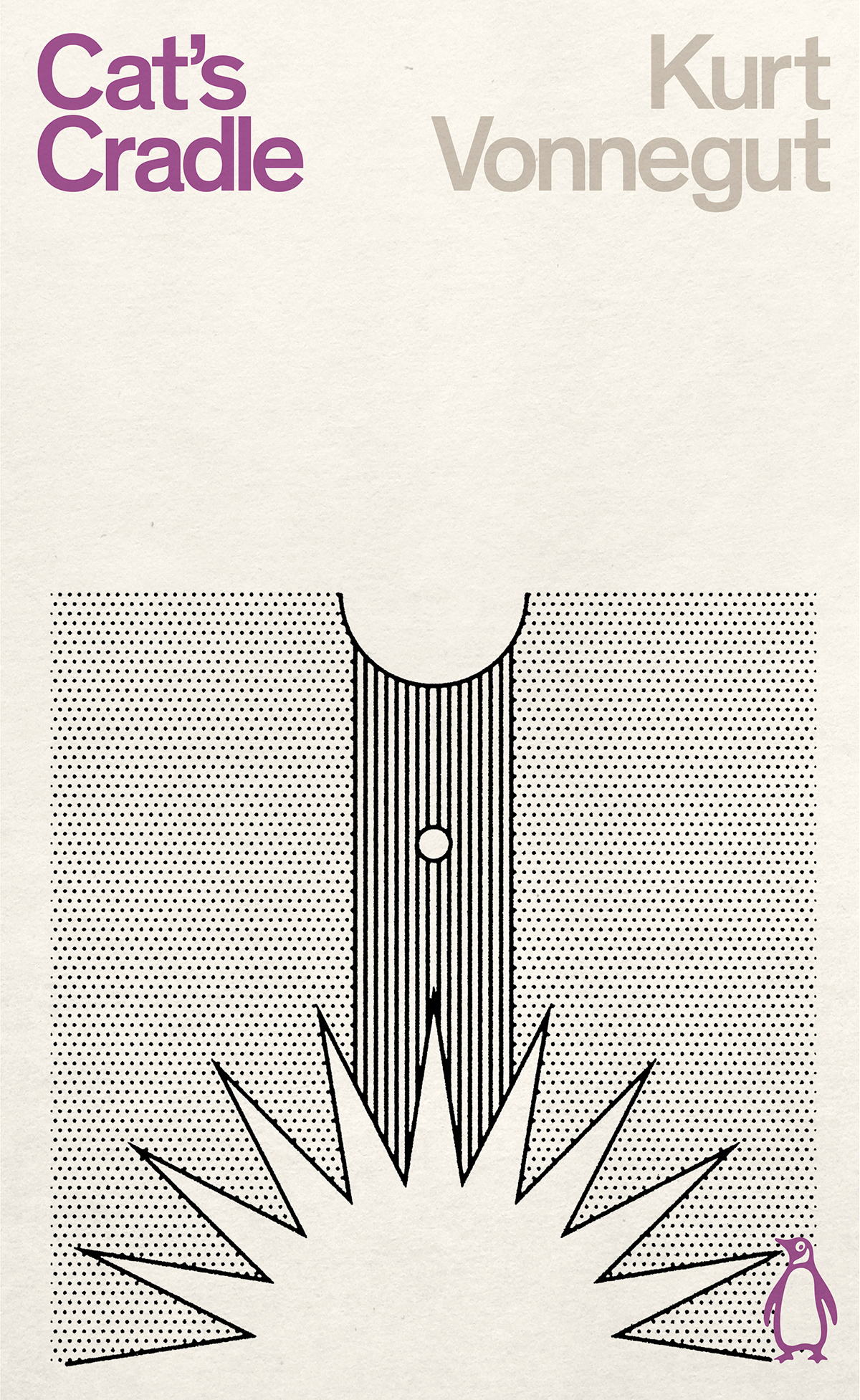
Penguin Classics has published a new series of ten sci-fi books that aim to give the genre something of a rebrand. The books included are written by authors from around the world and span the sci-fi spectrum, from satire to dystopia, yet they are unified by striking jacket designs that throw caution to the wind as far as mainstream sci-fi aesthetics are concerned.
A world away from the busy scenes and classic iconography many have come to associate with the genre, Penguin art director Jim Stoddart opted for line drawings to present the new series. “There is perhaps a tradition for science fiction books to illustrate unfamiliar conceptualised worlds on their covers. But when judging a book by its cover, even with all the best intentions, I really feel representational depiction often doesn’t do the writing justice, and perhaps unfairly ghettoises some amazing books which should have a much broader appeal.”
The refreshingly minimal line drawings were chosen to convey the human quality at the heart of the narratives. The covers also give a moment of respite rarely seen in sci-fi visuals, with the sparse designs and pared-back colour palette leaving breathing space for readers to construct their own imagined visions.
“The Penguin Classics Science Fiction series is the beginning of a collection of some of the most creative writing out there and it felt really important to turn a corner,” Stoddart explains. “These books are existentially mind-bending and the action best takes place in the imagination. It felt right to let the role of these covers be simply to allude to the pages held within, rather than illustrate them.
“The scope of eccentric worlds and vivid new concepts in these books is vast but the thing that unifies them is the human experience. The relatively minimal line drawings used on these covers express the essence of much more complex ideas,” he adds. “They have that sleight of hand that quick sketches manage to achieve when convoluted thoughts are still skitting around the mind.”
The eclectic series features books from the turn of the 19th century and across the 20th century. “This was the era that the representational arts lost their hold on the human imagination and blossomed – almost hand in hand with literary innovation – with the aim of finding new ways of articulating deeper ideas,” says Stoddart.

Some of the covers will be recognisable to readers, with designs showcasing works by Modernist masters like Picasso, Le Corbusier and Herbert Bayer.
“There is a vivid spirit of inventiveness in each of these drawings. For instance, Herbert Bayer’s extended field of vision diagram visualises so succinctly the multiple distractions thrown by the universe at the lead character in the Strugatsky brothers’ One Million Years to the End of the World,” Stoddart says.

“Yevgeny Zamyatin’s We is possibly the very first dystopian novel, where every person must live in unforgiving glass apartment buildings and is regulated in work, life and love by the state,” he explains. Stoddart channelled this on the cover using Le Corbusier’s Modulor drawing, which the painter and architect described as a “range of harmonious measurements to suit the human scale, universally applicable to architecture and to mechanical things”.
For the cover of The Cyberiad by Stansilaw Lem, the answer came from one of the most influential artists of the 20th century: “Picasso’s search for the limits of what makes us human chimes irresistibly with the very human relationship between the book’s two machine protagonists.”

Penguin Classics Science Fiction series is out now; penguin.co.uk
The post Sci-fi goes minimal in Penguin’s new book series appeared first on Creative Review.


Post a Comment