Pier 70’s new logo is a “love letter to San Francisco”
Posted in: Uncategorized
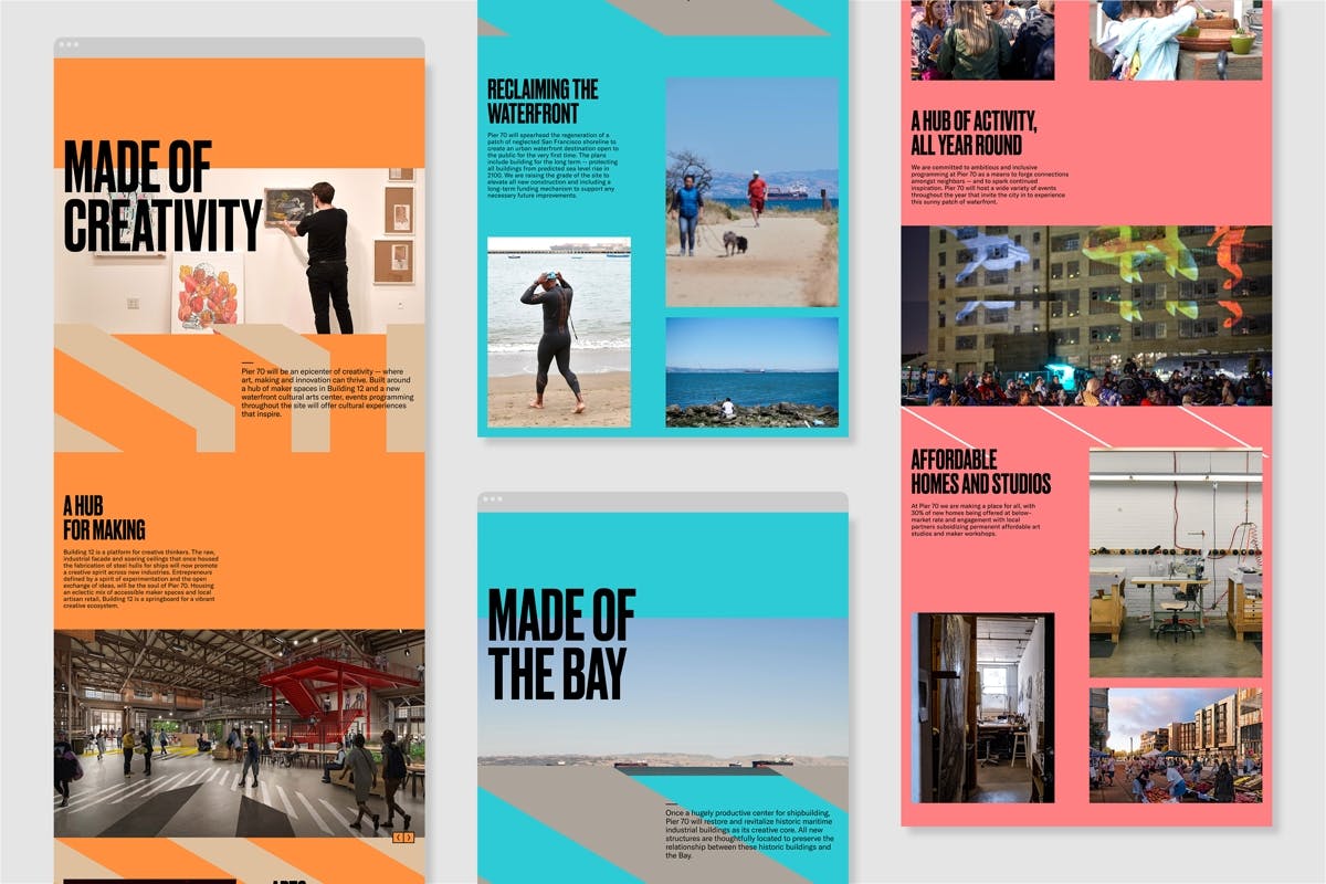
Once a shipbuilding and industrial hub, the area is in the middle of a 15-year regeneration project in the city that will open the waterfront up to the public and create a new home for the creative community as well as restaurants, homes, offices and shops.
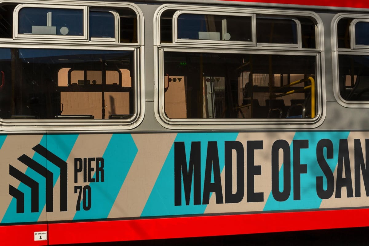
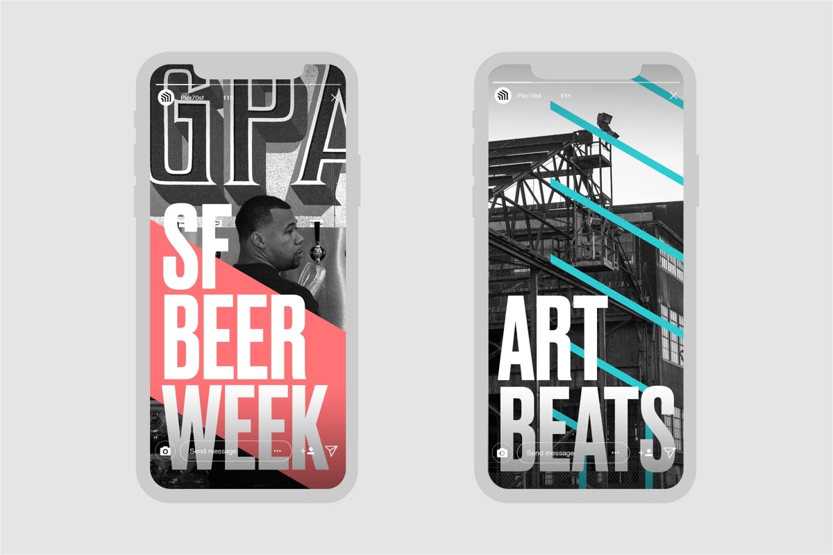
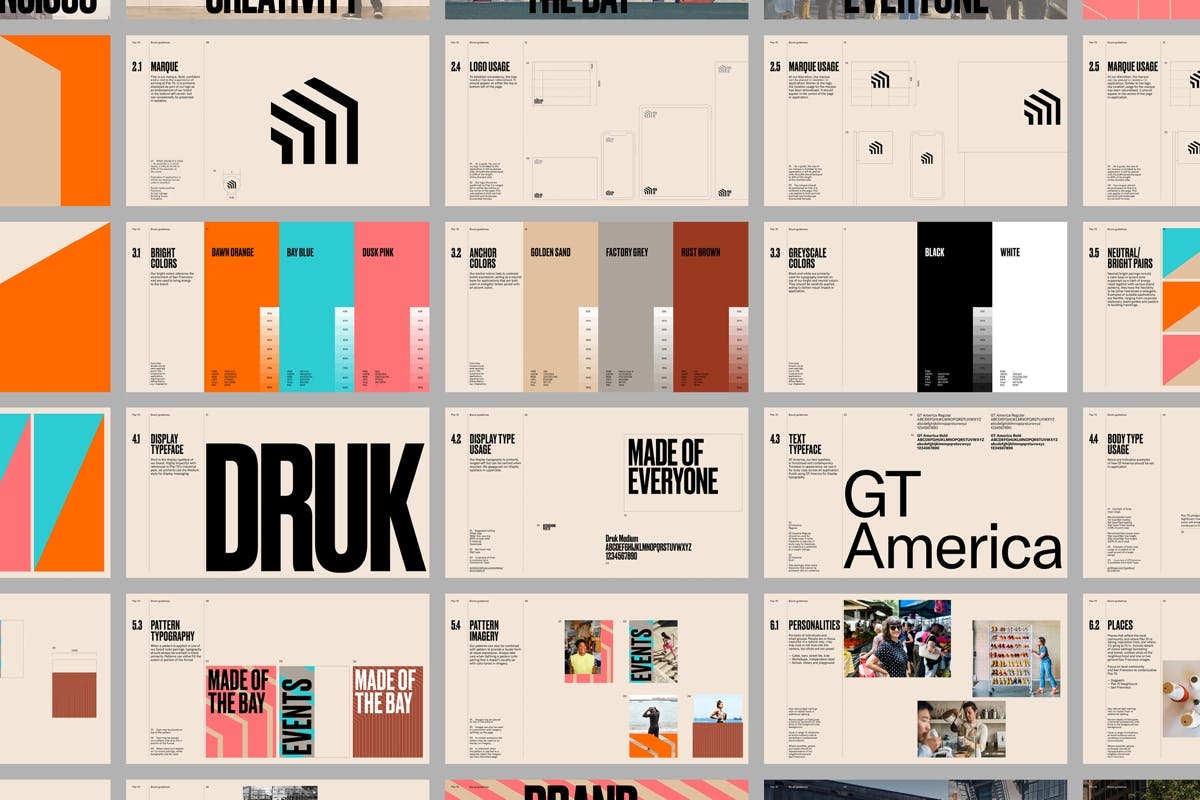
dn&co delved into Pier 70’s industrial past to create the new identity, which references the 50-foot steel frame that’s been turned into a new gateway for the area. The architecture also informs a series of linear patterns that cut through posters and adverts. According to the studio, the tagline, Made of San Francisco, is an effort to root the area in the heart of the community, after dn&co interviewed locals and found that many feel the city is losing its soul.


Brand colours reference the story of the pier as well as its surroundings, using bright orange, blue and pink alongside greys and browns that nod to Pier 70’s history. It takes Druk as its display typeface, using its solid letterforms as another reference to the area’s industrial heritage.
“In a city going through fierce debates about the loss of identity, we created a brand that looked instead at the key ingredients that have always made San Francisco great: its creativity, its openness and its relationship to the Bay,” says the studio. “The identity for this former shipyard signals a powerful renaissance of Pier 70’s industrial roots with a bold and distinctive visual language that’s a love letter to San Francisco.”
The post Pier 70’s new logo is a “love letter to San Francisco” appeared first on Creative Review.


Post a Comment