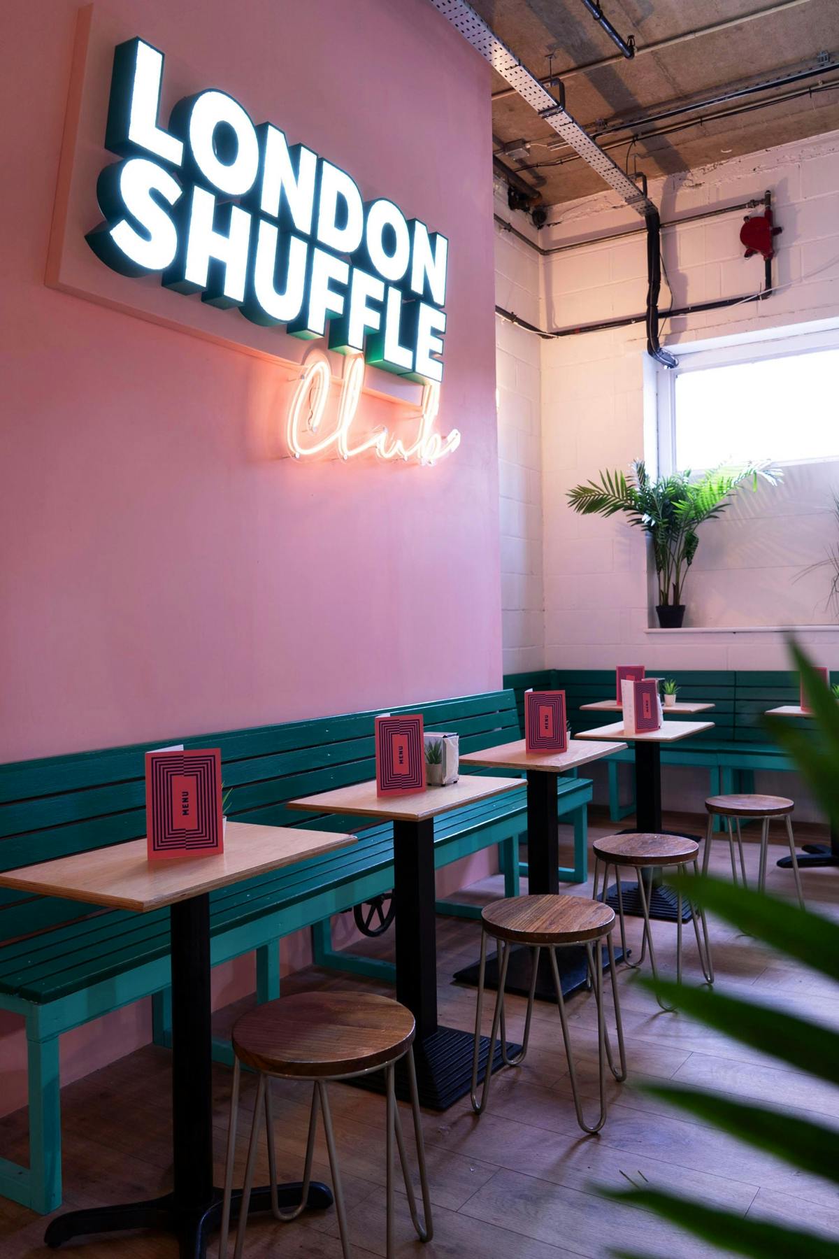
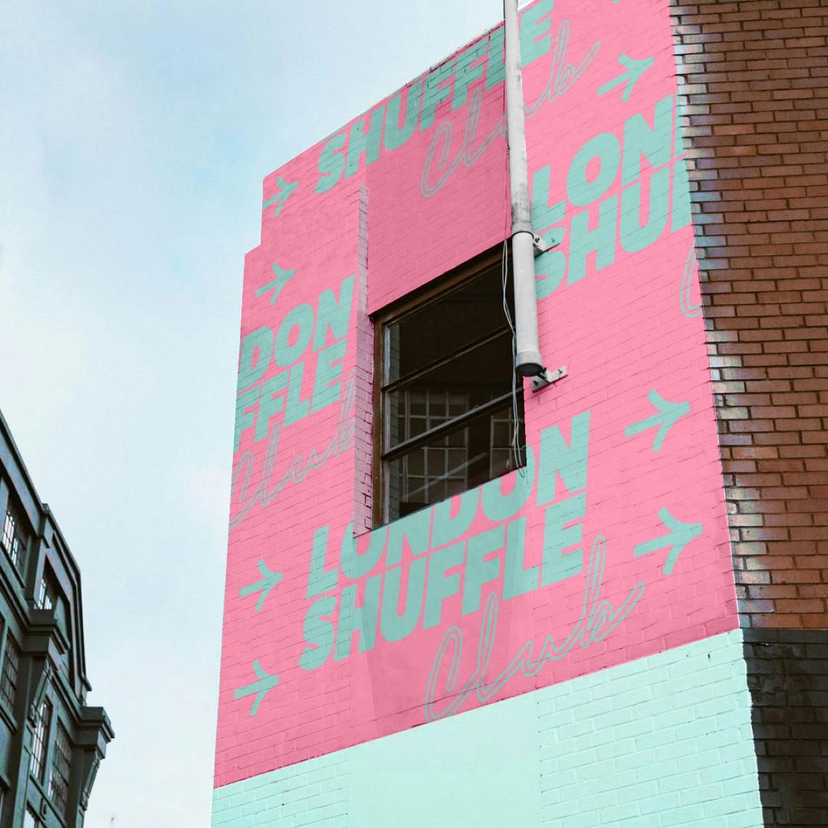
London Shuffle Club’s identity is all about the Miami pinks and blues
Posted in: Uncategorized
London studio A New Kind of Kick designed the club’s graphic language, having been briefed to create something “more grown up” as the club moved from a seasonal pop-up to a permanent venue. It also needed to reflect what Design Director Robert Loeber describes as the “social abandon” of the sport.
“The design strategy grew from the proposition of ‘For Fun. For Glory’,” he explains.” An irreverent nod at the competitive spirit that takes hold and allows us to let ourselves go.”


The studio developed a set of patterns and other graphic elements, loosely based around the game itself. The smiley face is a nod to the shuffleboard ‘biscuit’ or puck, as well as the stick that’s used to push it around – known as the tang. It appears in a series of social media animations, posters, and also merch for the club.
There’s an undeniably kitsch feeling to the identity, which Loeber says ties into the game’s reputation. “It’s known as something you do on cruise ships, especially for seniors,” he explains.” We wanted this sense of glory coming through, like it has an established history, which led us down the more retro feel on typography especially.”
londonshuffle.com; anewkindofkick.com
The post London Shuffle Club’s identity is all about the Miami pinks and blues appeared first on Creative Review.


Post a Comment