Jane Austen’s House has an elegant new identity
Posted in: UncategorizedAccording to Pentagram, the rebrand was a chance to avoid the “now-cliched iconography” that’s often associated with the writer.
Instead of stereotypical imagery, the design team turned to the collection of jewellery, books, furniture, and textiles located inside the museum in Chawton, Hampshire – which is the 17th century house Austen spent the final eight years of her life in.

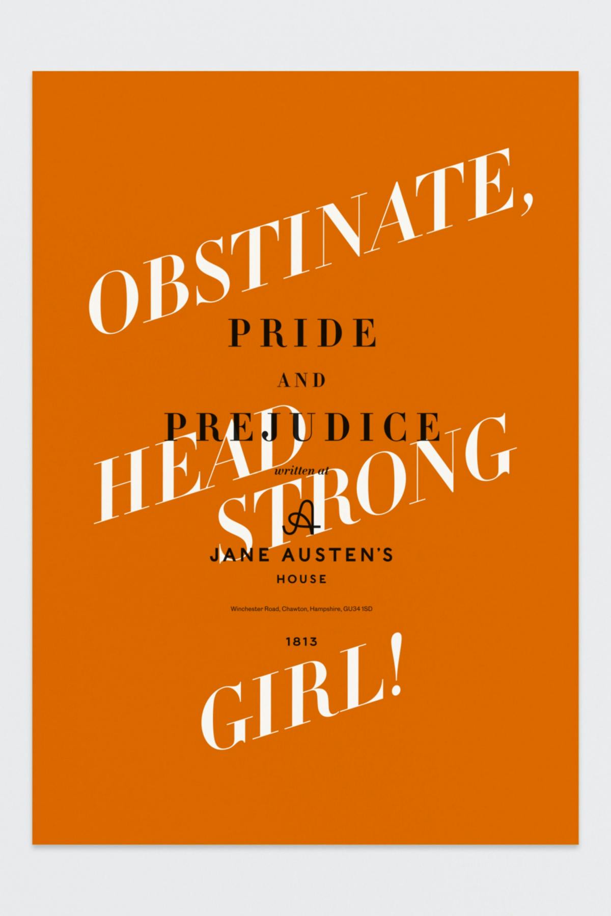
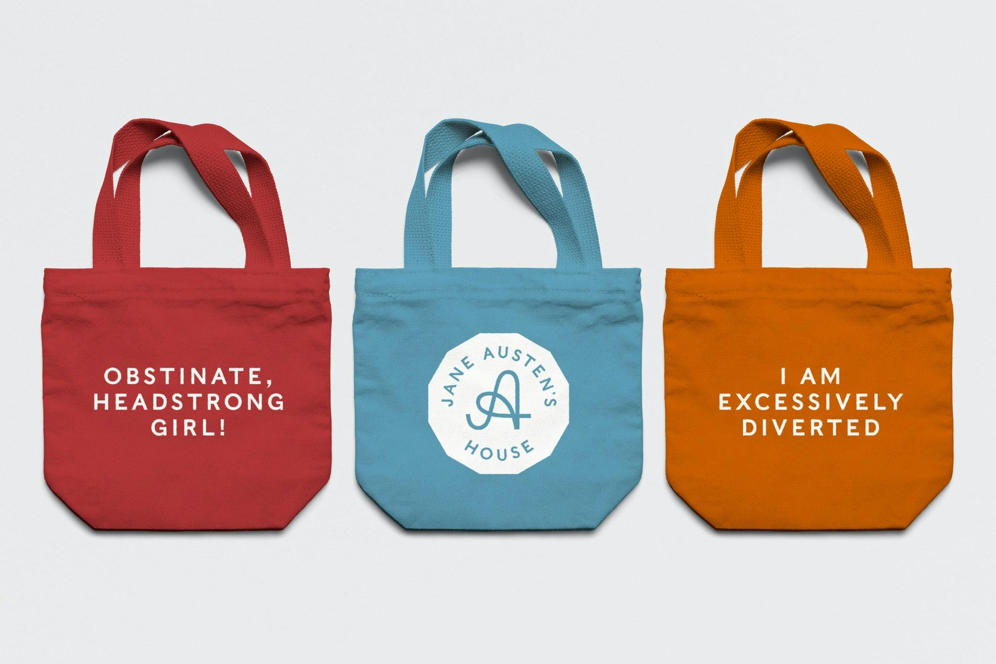
A capital A, found in one of Austen’s handwritten letters, formed the basis for the museum’s new wordmark, while a secondary logo echoes the distinctive 12-sided desk the author sat at to write.
The colour palette is based on original wallpaper samples from the home, and Pentagram chose a pair of typefaces for the identity – Caslons Egyptian, which was released in 1816, and Caslon Doric, designed by Commercial Type.
The identity will appear across all of the museum’s marketing materials, as well as on tote bags emblazoned with some much-loved Austen quotes.
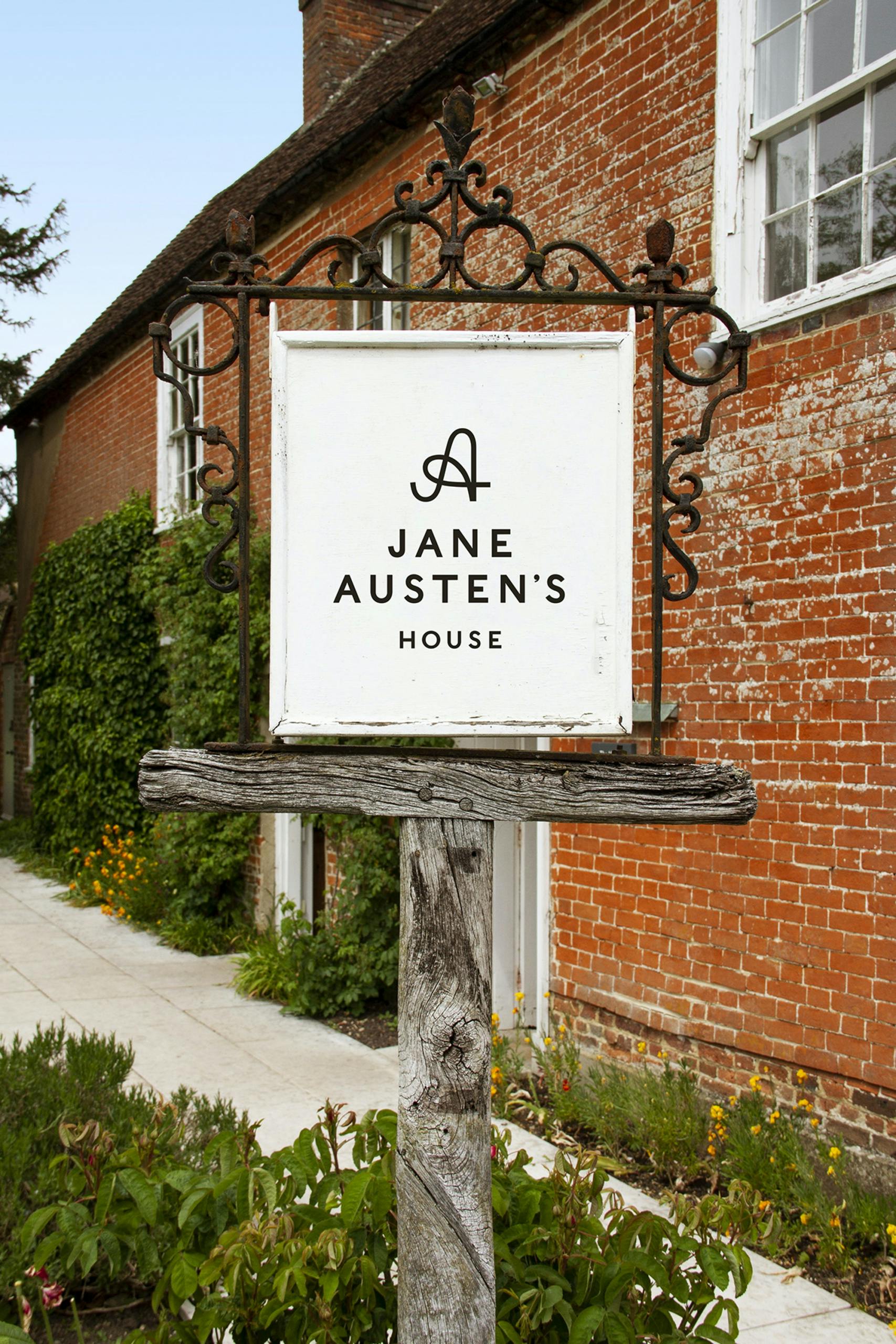
The improvement is particularly noticeable at the museum’s entrance, where its previously lacklustre italic signage has been replaced with the slick new monogram.
The post Jane Austen’s House has an elegant new identity appeared first on Creative Review.


Post a Comment