Daaf Geluk School by KoningEllis Architects

Dutch studio KoningEllis Architects used a combination of grey slate, warm timber and shimmering aluminium for the walls of a new building at this school for children with learning disabilities in Haarlem, the Netherlands (+ slideshow).

Secondary school Haarlem by KoningEllis Architecten

Daaf Geluk secondary school had previously been located on two sites, but the construction of new housing had created the opportunity to bring the entire school together on one campus. KoningEllis Architects was tasked with renovating one of the old buildings – a brick structure from the 1940s – and adding an additional block of classrooms and sports facilities.

Secondary school Haarlem by KoningEllis Architecten

To complement the red and brown tones of the existing brickwork, architects Suzanne Ellis and Ieke Koning designed a two-storey extension with a timber facade, then added a ribbon of grey slate around its middle.

Secondary school Haarlem by KoningEllis Architecten

“The two buildings are in agreement with each other not only in form, but also in appearance, without being copies,” said the architects.

Secondary school Haarlem by KoningEllis Architecten

A glass tunnel leads from the renovated building to the new structure, which accommodates 12 classrooms, offices and a pair of sports halls.

Secondary school Haarlem by KoningEllis Architecten

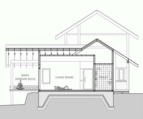
Rooms are arranged around a double-height atrium with a generous skylight. A wide staircase extends up through the centre and doubles up as seating, allowing the space to function as an informal auditorium.

Secondary school Haarlem by KoningEllis Architecten

To create a “quiet, homely atmosphere”, the architects used a simple colour palette of white, grey and lime green. They also added windows at the end of every corridor so that natural light floods through the building.

Secondary school Haarlem by KoningEllis Architecten

“White walls and ceilings combined with grey melange floors form a peaceful basis,” explained Ellis. “For the frames, the staircase, floor and ceiling of the auditorium white oak was used, to add a neutral, natural and warm-looking material.”

Secondary school Haarlem by KoningEllis Architecten

She added: “We only added one distinct colour – grass green. This fresh colour forms a stylish, modern combination with the oak.”

Secondary school Haarlem by KoningEllis Architecten

Each of the classrooms feature thick partitions walls, creating built-in storage closets on the inside and private workspaces in the corridors.

Secondary school Haarlem by KoningEllis Architecten

The two sports halls are housed at the western end of the building and feature first-floor viewing platforms for spectators.

Secondary school Haarlem by KoningEllis Architecten

Other recently completed school buildings in Europe include a timber-clad extension to a school near The Hague and a French nursery and elementary school with hilly rooftops that pupils can explore. See more school design »

Photography is by Maarten Noordijk.

Here’s a more detailed project description from KoningEllis Architects:


Secondary School Haarlem

The Daaf Geluk School is a special-needs school, which means that it provides education for secondary school pupils who need more attention, guidance and help. The school offers tailored-made education and provides lessons in small classes of up to sixteen pupils.

Secondary school Haarlem by KoningEllis Architecten

Renovation and Expansion

Formerly, the 350 pupils of the ‘Daaf’ were spread over two locations in Haarlem. When the annex had to give way to housing, the school got the chance to come together on one site. The choice was made for renovation and expansion of the existing building at the current location. The expansion consists of offices, a communal space, twelve classrooms and two sports halls.

Secondary school Haarlem by KoningEllis Architecten

Design

For the type of pupils of ‘the Daaf’ it is important that the school has a quiet, homely atmosphere. Structure, clarity, peacefulness and security were therefore important conditions for the design. The layout ensures that there is always light at the end of the spacious corridors. The interior design has been kept basic and light, to avoid too much stimulation.

Secondary school Haarlem by KoningEllis Architecten

The heart of the school is the auditorium, where the broad wooden staircase, also functioning as seating for the stage, immediately catches the eye. The wood extends as a carpet in front of the staircase and at the end curls up into natural casing of the stage. A large skylight above the stairs makes the auditorium light and pleasant.

Secondary school Haarlem by KoningEllis Architecten

The building has been logically and cleverly planned. For example, the common areas are situated at the nodes and there is no wasted space. In the corridors smart double walls have been constructed. On the classroom side, there are built-in cupboards and on the corridor side there are recessed lockers and workplaces where pupils can sit and work quietly. Through the window the teacher can monitor them as well.

Secondary school Haarlem by KoningEllis Architecten

At the far end of the extension is a double gymnasium. The height in this part of the building is used for changing-rooms on the first floor and to provide a balcony where spectators can follow the activities in the gym. By providing the gyms with their own entrance they can also be used outside school hours.

Secondary school Haarlem by KoningEllis Architecten

Renovation

On the site they found a beautiful brick school building from the forties, but it didn’t meet the current requirements any longer and the original structure was not visible anymore. By removing the superficial interior additions and careful renovation of the primary structures, the architects were able to bring back the beauty of the original building. Constructive interventions strengthened the improvement of the routing and lines of visibility.

Secondary school Haarlem by KoningEllis Architecten
Site plan – click for larger image

Sight lines are important to our design. From the new entrance square you look through the connecting corridor into the old building. The orientation of the buildings creates several outdoor areas: an entrance square, two playgrounds, and a secluded courtyard between the old and the new buildings. The old and the new are connected by a glazed corridor.

Secondary school Haarlem by KoningEllis Architecten
Ground floor plan – click for larger image

The new interventions were accentuated by using the colour green, which continues into the new building. To leave the historic appearance as much intact as possible, the iconic iron window frames were retained and renovated. Finally, a modern ventilation/air handling system was put in to improve the climate in the building. In this way the historic characteristics of the existing building have been preserved and the quality of the building environment has been optimised.

Secondary school Haarlem by KoningEllis Architecten
First floor plan – click for larger image

Exterior

The two buildings are in agreement with each other not only in form, but also in appearance, without being copies. The colour palette of the façade and the roof of the old building; brown and purple-grey, returns in the new building in contemporary materials such as preserved wood, aluminium and slate, all maintenance free materials. Hence the new building gets a warm feel to it, in tune with the old one, but still with its own character.

Around the school they put a ‘ribbon’; a horizontal stripe of purple-grey slate. In front of the entrance are the large steel letters ’DAAF’. The sign fits well with the modest building. No loud signs, just a stylish touch.

Secondary school Haarlem by KoningEllis Architecten
Sections – click for larger image

Detail

An aluminium strip ensures a tight transition between the different materials and gives the outline of the horizontal and vertical surfaces in the facade extra sharpness. The sun-blinds are hidden behind a removable panel. The technical drawings for the construction were not outsourced to ensure the quality of the design and to have maximum control during the building process.

Secondary school Haarlem by KoningEllis Architecten
Elevations – click for larger image

Surroundings

With the same attention to detail the building was integrated into the environment. Also, the neighbourhood, welfare and preservation organisations were consulted. It was a puzzle to get the new building onto the plot. The new building doubled the volume of the existing school, and residential homes are close. That is why the appearance of the school has been kept modest. By using a light colour wood at the top and the bottom, the building looks friendly and inviting.

The post Daaf Geluk School
by KoningEllis Architects
appeared first on Dezeen.

Archery Hall and Boxing Club by FT Architects

Complex wooden lattices provide a stage set for archery competitions and boxing matches at this pair of university buildings in Tokyo by Japanese studio FT Architects (+ slideshow).

Archery Hall and Boxing Club by FT Architects

Located on the campus of Tokyo’s Kogakuin University, the two structures are both dedicated to sporting activities and called for column-free spaces built from low-cost materials.

Archery Hall and Boxing Club by FT Architects

Katsuya Fukushima and Hiroko Tominaga of FT Architects used locally sourced timber for the construction of both buildings.

Archery Hall and Boxing Club by FT Architects

They said: “We have salvaged the purity of traditional Japanese timber composition, simply made up of horizontals and verticals, which has been somewhat disregarded ever since the advent of modernism in Japan.”

Archery Hall and Boxing Club by FT Architects

“Small timber sections, normally reserved for furniture making, were chosen for the archery hall, and timber members deemed defected because of insect damage, for the boxing club,” they added.

Archery Hall and Boxing Club by FT Architects

A simple bolt-and-nut assembly was used for both frameworks, but required meticulous accuracy to ensure that each grid is made up of only perpendicular elements.

Archery Hall and Boxing Club by FT Architects

Other projects by Tokyo studio FT Architects include a house pierced by eight concrete columns.

Archery Hall and Boxing Club by FT Architects

Another sports centre recently completed in Japan features an exposed timber frame and huge clerestory windows.

Archery Hall and Boxing Club by FT Architects

See more sports centres »
See more architecture in Japan »

Archery Hall and Boxing Club by FT Architects

Photography is by Shigeo Ogawa.

Here’s some more information from FT Architects:


Archery Hall and Boxing Club, Kogakuin University, Tokyo

Structure & Space – medium-span, column-free

The project consists of two buildings, an archery hall and a boxing club, standing a few hundred metres apart on the grounds of Kogakuin University in west Tokyo.

The formal rituals of Kyudo (Japanese archery) and the very physical nature of boxing may appear worlds apart. However, surprisingly, the two built facilities share a number of commonalities.

Archery Hall and Boxing Club by FT Architects

The University’s brief was for low-cost structures made of locally sourced timber to provide accessible and inspiring spaces for the students. By chance, both facilities called for a column-free space of 7.2m by 10.8m, a size that is comparable to a sacred hall in a traditional Japanese temple. In order to achieve this span, without columns and using low-cost methods of timber construction, it was necessary to come up with an innovative timber solution. We began the project by investigating a number of structural forms that would be appropriate for each sport.

Archery Hall and Boxing Club by FT Architects

Underlying Principles

Through collaborative exploration with timber experts, from researchers, manufacturers to suppliers, we derived at timber materials that are not commonly associated with structural or architectural usage. Small timber sections, normally reserved for furniture making, were chosen for the archery hall, and timber members deemed defected because of insect damage, for the boxing club.

We have salvaged the purity of traditional Japanese timber composition, simply made up of horizontals and verticals, which has been somewhat disregarded ever since the advent of modernism in Japan. Delicate lattice frame composed of slender ties beams and posts for the archery hall, and a bolder, stepped frame, was employed for the boxing club. Here, timber, a historical material, has been reanalysed and transformed into a new building material.

Archery Hall and Boxing Club by FT Architects

Contrast/Complement

The two structures have been constructed employing a simple, lo-tech method of bolt-and-nut assembly. However, due to the scale of the space and simplicity of construction, the execution had to be meticulous, in order to produce spaces that are out of the ordinary.

Archery Hall and Boxing Club by FT Architects

For each building, the main subject is the 7.2m x 10.8m space and the timber structure, merely its backdrop. The powerful presence of the timber structure emphasises the stark transparency of the void below. The whole is only achieved by the juxtaposition of these two contrasting and complementing qualities.

Departing from the same starting point, the two buildings have arrived at a shared architectural theme via two different structural and spatial solutions.

Archery Hall and Boxing Club by FT Architects

Completion: 2013
Location: Tokyo, Japan
Principal use: archery hall (Japanese archery=Kyudo) and boxing club
Total floor area: archery hall 106.00 sqm, boxing club 92.75 sqm
Structure: wood
Architect: FT Architects/Katsuya Fukushima, Hiroko Tominaga

Archery Hall and Boxing Club by FT Architects
Site plan
Archery Hall and Boxing Club by FT Architects
Archery Hall plan and section – click for larger image
Archery Hall and Boxing Club by FT Architects
Boxing Club plan and section – click for larger image

The post Archery Hall and Boxing Club
by FT Architects
appeared first on Dezeen.

Light Walls House by mA-style Architects

Perimeter skylights throw light across a grid of exposed wooden ceiling beams inside our second house this week from Japanese studio mA-style Architects (+ slideshow).

Light Walls House by mA-style architects

Positioned in a shady location between two neighbouring buildings in Aichi, Japan, the wooden house couldn’t have many windows, so mA-style Architects added skylights around each side of the flat roof.

Light Walls House by mA-style architects

Daylight disperses itself through the interior by bouncing off both the ceiling beams and the laminated wooden walls.

Light Walls House by mA-style architects

“The design intended to create a space with uniformly distributed light by adjusting the way of letting daylight in and the way of directing the light,” said the architects.

Light Walls House by mA-style architects

Bedrooms and storage spaces are contained within two-storey boxes scattered through the interior. Rectangular openings lead into the spaces, plus those at first-floor are accessed using wooden ladders.

Light Walls House by mA-style architects

“Considering each box as a house, the empty spaces in between can be seen as paths of plazas and remind us of a small town enclosed in light,” the architects added.

Light Walls House by mA-style architects

A bathroom, a study space, bookshelves and a kitchen with steel surfaces line the perimeter of the open-plan space.

Light Walls House by mA-style architects

White-painted wooden panels clad the exterior of the rectilinear structure, including a sliding door that gives the house a corner entrance.

Light Walls House by mA-style architects

Led by partners Atsushi and Mayumi Kawamoto, mA-style Architects has also completed a house with small attic spaces tucked into the triangular roof and an elevated house that points out like a giant rectangular telescope.

Light Walls House by mA-style architects

See more architecture by mA-style Architects »
See more Japanese houses »

Light Walls House by mA-style architects

Photography is by Kai Nakamura.

Here’s a project description from the architects:


Light Walls House

The site is in a shady location where a two-story neighbouring house closely stands on the south side, and even the shade and shadow on the path intensify the impression of darkness.

Light Walls House by mA-style architects

Therefore, the design intended to create a space with uniformly distributed light by adjusting the way of letting daylight in, and the way of directing the light.

Light Walls House by mA-style architects

By taking into consideration the space for the residents, the functions for living, and the relationship with the surrounding environment, creation of a diversity and richness in the house was intended by controlling the concept of light.

Light Walls House by mA-style architects

Along the edges of the 9.1m square roof, sky lights are made, as if creating an outline, in order to provide sunlight.

Light Walls House by mA-style architects

The roof beams narrow the sunlight, and the slightly angled clapboard interior walls with laminated wood reflect and diffuse the light.

Light Walls House by mA-style architects

As a result, soft and uniformly distributed light is created and surrounds the entire space.

Light Walls House by mA-style architects

Along the outline of lighting, work spaces such as a kitchen, bathroom, and study are arranged. Private spaces such as bedrooms and storage are allocated into four boxes.

Light Walls House by mA-style architects

The path-like spaces created between them are public spaces. Each box attempts to balance within a large spatial volume.

Light Walls House by mA-style architects

Light coupled with the rhythm of scale raises the possibilities of the living space for the residents.

Light Walls House by mA-style architects

Considering each box as a house, the empty spaces in between can be seen as paths or plazas, and remind us of a small town enclosed in light.

Light Walls House by mA-style architects

The empty spaces, which cause shortening or elongating of distances between people, are intermediate spaces for the residents, as well as intermediate spaces that are connected to the outside when the corridor is open, and these are the image of a social structure that includes a variety of individuals.

Light Walls House by mA-style architects

In terms of a natural component, in which light is softened by small manipulations, and of a social component, in which a town is created in the house, this house turned out to be a courtyard house of light where new values are discovered.

Light Walls House by mA-style architects
Floor plan
Light Walls House by mA-style architects
Concept diagram

The post Light Walls House by
mA-style Architects
appeared first on Dezeen.

Small House by Unemori Architects

Paper-thin shutters fold out from the walls of this narrow timber house in Tokyo by Japanese firm Unemori Architects (+ slideshow).

Small House by Unemori Architects

Unemori Architects clad the entire exterior with timber boards, then added matching shutters across the large windows.

Small House by Unemori Architects

“At the second and third floor there is a large hinged door in each room. If it’s opened, the inside of the room is enveloped in light and wind as if you are outside,” explained architect Hiroyuki Unemori.

Small House by Unemori Architects

Unemori positioned windows to offer the best views of the building’s surroundings. “The window is so big against the small rooms that every time a window opens or closes the view inside dramatically changes,” he added.

Small House by Unemori Architects

Small House accommodates a couple with a small child and is located within a densely populated suburban area of the city.

Small House by Unemori Architects

An entrance slotted into the corner of the building leads through to a circular white staircase, which spirals up to three storeys above and down to one below. Each floor contains one room, including two bedrooms, a dining room and a kitchen.

Small House by Unemori Architects

A glass-fronted bathroom is positioned on the roof and faces out onto the surrounding rooftops across a triangular roof terrace.

Small House by Unemori Architects

The architects used single layers of timber to construct the floors, which match furniture, surfaces and cupboards in the dining room and kitchen.

Small House by Unemori Architects

The compact site also includes a small driveway and a narrow space to park bicycles.

Small House by Unemori Architects

Other Japanese residences we’ve recently featured include a house with a staggered interior and gently sloping roof, a house lifted off the ground by a single central pillar and a tall house with views of a nearby observation tower.

Small House by Unemori Architects

See more Japanese houses »
See more architecture and design in Japan »

Small House by Unemori Architects

Photography is by Ken Sasajima.

Here’s some project description from the architects:


Small House

The small house which the married couple and their child live stands in the densely populated area in Tokyo. Though the neighbouring houses is very close, I aimed to design the house which exceed the physical narrowness living at the city.

Small House by Unemori Architects

I laid out the 4m×4m building as small as I could at the centre of site area 34m2 and made some space for flowing of light and wind around it. And by making the space, it’s possible to avoid setback regulation and it has the 9m high volume like a tower.

Small House by Unemori Architects

The inside is simple structure what is separated by the 4 floor boards and is jointed by spiral stairway.

Small House by Unemori Architects

Especially, by making some extremely thin floor boards (thickness 70mm) , the up and down floor boards got close and connected the whole space of the house without a break.

Small House by Unemori Architects

The space of around the house is useful to let light and wind in. The wall of the rooms borders the outside, so I put windows in the best position that harmonising with its surroundings.

Small House by Unemori Architects
Site plan – click for larger image

And the window is so big against the small room, every time the window opens or closes, the inside view dramatically changes.

Small House by Unemori Architects
Detailed site plan – click for larger image

Especially, at the second and third floor there is a large hinged door each room, if it is opened, the inside of the room is enveloped in light and wind as if you are outside.

Small House by Unemori Architects
Floor plans – click for larger image

By making the thin floor boards for connecting with their life and making the large windows what are opened toward the city, I aimed to exceed the segmentation, for example the upstairs and the downstairs, the inside and the outside, a building and the town, etc. to broaden the whole image of a house.

Small House by Unemori Architects
Floor plans – click for larger image

Location: Meguro-ku,Tokyo
Principal use: private residence
Family type: couple and child
Parking space: One car
Site area: 34.27 m2

Small House by Unemori Architects
Section – click for larger image

Building area: 17.47 sqm
Total floor area: 67.34 sqm
Plot ratio: 146.4%
Structural systems: steel frame
Scale: 1 basement and 4 storeys
Completion: August 2010

Small House by Unemori Architects
Detailed section – click for larger image

Materials:Exterior wall – flexible board t=8mm siding water-repellent coating, roof – FRP waterproof t=3mm topcoat, interior wall – whiteboard t=3mm, ceiling – lauan plywood t=4mm CL, floor – lauan plywood t=12mm UC
Architect:Unemori Architects
Structural engineer:Structured Environment
Developer : Taishin Construction

Small House by Unemori Architects
Elevation – click for larger image

The post Small House by
Unemori Architects
appeared first on Dezeen.

One, Two and Many by Marta Wengorovius

Lisbon Architecture Triennale: Portuguese artist Marta Wengorovius teamed up with architect Francisco Aires Mateus to create this small wooden library that can be used by only one person at a time.

Reading Cabin by Marta Wengorovius

On show as part of the Lisbon Architecture Triennale, the reading cabin comprises a shed-like structure containing nothing but a single bookshelf and a raised seating area.

Daylight filters in through a skylight that punctures the gabled roof.

Reading Cabin by Marta Wengorovius

Marta Wengorovius invited 20 guests to choose books for the library, creating a collection of 60 volumes.

“Sharing this itinerant project creates a community between people who read the books, the guests who chose the books and the people who will read the books wherever the cabin shall pass,” she said.

Reading Cabin by Marta Wengorovius

Visitors can reserve time slots to occupy the library, whether it be an hour or a whole day.

The cabin first opened in Paredes and has since moved to Lisbon. The artist plans to relocate it each year, translating the books into different languages for foreign countries.

Reading Cabin by Marta Wengorovius

Francisco Aires Mateus designed the structure. His studio also recently completed a pair of waterfront cabins in Grândola, Portugal.

Other buildings designed specifically for a single inhabitant include a micro home by Renzo Piano and a travelling performance venue.

Reading Cabin by Marta Wengorovius

See more stories from the Lisbon Architecture Triennale »

Reading Cabin by Marta Wengorovius
Floor plan

Photography is by João Wengorovius.

Here’s a project description from Marta Wengorovius:


Um, Dois e Muitos (One, Two and Many)

The project is an itinerant library that aims to be a compass of reflection concerning the themes: “One”, “Two” and “Many”. The 60 books in the library relate to: “One” (every single one chosen), “two” (every single one two chosen) and “many” (every single one many chosen).

Reading Cabin by Marta Wengorovius
Cross section

The books were chosen by 20 guests invited to collaborate with the artist and to be part of this project. With the intersection of these various books there is a desire to produce a sort of manifest, a synthesis to enlighten our roots, and searching some earth (roots?). I believe that the truthful ones cross our past and present, and give flowers throughout the ages, enlightening the time that goes by.

Reading Cabin by Marta Wengorovius
Long section

The library was planned to be in one different place per year. If exhibited in a foreign country the books will be translated to the native language of the country.

This art project had its first opening on December 2012 as part of the public art project in Paredes, north of Portugal.

Reading Cabin by Marta Wengorovius
End elevation

Using Instructions

The Reading Cabin is to be used by one person at a time. The books can be read inside the cabin and requested to the entity where the Library is located. Sharing this itinerant project creates a community between people who read the books, the guests who chose the books and the people who will read the books wherever the cabin shall pass. The cabin was designed by Francisco Aires Mateus.

Reading Cabin by Marta Wengorovius
Side elevation

A Project by: Marta Wengorovius
In collaboration with: Francisco Aires Mateus and Ana Almada Pimentel
Photographs: João Wengorovius
Construction: Cenário Perfeito
Graphic design: barbara says…

The post One, Two and Many
by Marta Wengorovius
appeared first on Dezeen.

Cabanas no Rio by Aires Mateus

Lisbon studio Aires Mateus used only reclaimed timber to construct this pair of waterfront cabins in Grândola, Portugal (+ slideshow).

Cabanas no Rio by Aires Mateus

Named Cabanas no Rio, which translates as cabins on the river, the two rustic structures offer a rural retreat for a pair of inhabitants.

Cabanas no Rio by Aires Mateus

One hut contains a living area, with a simple counter that can be used for preparing food, while the other accommodates a bedroom with a small toilet and sheltered outdoor shower.

Cabanas no Rio by Aires Mateus

Architects Aires Mateus used recycled wooden panels to build the walls, floors, roof and fittings of the two structures, leaving the material exposed both inside and out.

Cabanas no Rio by Aires Mateus

The edge of the roof sits flush with the walls, plus the wood is expected to change colour as it exposed to the weather.

Cabanas no Rio by Aires Mateus

“The wharf is medieval and assembled with wood,” said the architects, explaining their material choice. “Its identity is kept long beyond the material’s resistance, an identity that allows [it] to change, to replace, keeping all the values.”

Cabanas no Rio by Aires Mateus

With a combined area of just 26 square metres, the cabins were both built off-site and transported to the site on the back of a lorry.

Cabanas no Rio by Aires Mateus

Each was then hoisted into place, framing a small wooden deck that leads out onto a jetty.

Cabanas no Rio by Aires Mateus

The Aires Mateus brothers founded their studio in 1988. Past projects by the pair include the stone-clad Furnas Monitoring and Investigation Centre and the nursing home in Alcácer do Sal that was shortlisted for this year’s Mies van der Rohe Award. See more architecture by Aires Mateus »

Cabanas no Rio by Aires Mateus

Other micro homes completed recently include a holiday house in the shape of a cloud and a mobile home on the back of a tricycle. See more micro homes »

Cabanas no Rio by Aires Mateus

Photography is by Nelson Garrido.

Here’s a project description from the architects:


Cabanas no Rio

The wharf is medieval and assembled with wood. Its identity is kept long beyond the material’s resistance. An identity that allows to change, to replace, keeping all the values.

Cabanas no Rio by Aires Mateus

The project develops two spaces: one to unwind with the support of a kitchen integrated in the same material of the walls; other as a sleeping area with a small bathroom and a shower. The construction is entirely finished in reused wood, subjected to the weather that will keep on changing it. The forms, highly archetypal, are designed by the incorporation of the functions in these minute areas, and by the varied inclination of the ceilings that tension the spaces according to their function.

Cabanas no Rio by Aires Mateus

Name of the project: Cabanas no Rio
Location: Comporta, Grândola, Portugal
Construction Surface: 26m²

Cabanas no Rio by Aires Mateus

Authors: Manuel e Francisco Aires Mateus
Coordination: Maria Rebelo Pinto
Collaborators: Luz Jiménez, David Carceller
Client: João Rodrigues

Cabanas no Rio by Aires Mateus
Floor plan

Structure: Cenário Perfeito
Electricity: Cenário Perfeito
Construtor: Cenário Perfeito

The post Cabanas no Rio
by Aires Mateus
appeared first on Dezeen.

El Ray at Dungeness Beach by Simon Conder Associates

Our second project this week from British studio Simon Conder Associates is a timber-clad house built around a nineteenth-century railway carriage on Dungeness beach in Kent, England.

El Ray at Dungeness Beach by Simon Conder Associates
Photograph by Paul Smoothy

Simon Conder Associates designed El Ray beach house as the summer home for a family, who had previously lived in just the old carriage.

El Ray at Dungeness Beach by Simon Conder Associates
Photograph by Paul Smoothy

“We were asked by our clients to increase the accommodation area by approximately 50 percent and dramatically improve the environmental performance of the house,” said Simon Conder.

El Ray at Dungeness Beach by Simon Conder Associates
Photograph by Paul Smoothy

Completed in 2008, the house is located between two other shacks near the Dungeness power station. It features a bell-shaped plan, incorporating a sheltered front terrace and a pair of recessed courtyards that are protected from the prevailing winds.

El Ray at Dungeness Beach by Simon Conder Associates
Photograph by Paul Smoothy

The railway carriage is contained at the centre of house and accommodates a kitchen within its worn shell. A living room surrounds and opens out to all three terraces.

El Ray at Dungeness Beach by Simon Conder Associates
Photograph by Chris Gascoigne

Different tones give a striped pattern to the hardwood exterior cladding. There are also ramps leading into the house from the surface of the beach.

El Ray at Dungeness Beach by Simon Conder Associates
Photograph by Paul Smoothy

A flat sloping roof acts as an observation deck with sweeping 360-degree views of the surrounding beach and ocean.

El Ray at Dungeness Beach by Simon Conder Associates
Photograph by Chris Gascoigne

The walls, roof and floor are insulated using recycled newspaper, meaning very little energy is needed for heating, lights and ventilation.

El Ray at Dungeness Beach by Simon Conder Associates
Photograph by Chris Gascoigne

In extremely cold weather, electric heating is powered by a rooftop wind turbine to heat beneath the floorboards in the two bedrooms and bathroom.

El Ray at Dungeness Beach by Simon Conder Associates
Photograph by Chris Gascoigne

Simon Conder more recently completed a pair of timber-clad houses built on a steep hill in the town Porthtowan.

El Ray at Dungeness Beach by Simon Conder Associates
Photograph by Paul Smoothy

Other seaside houses in the UK include a shingle-clad house elsewhere on Dungeness beach, a small wooden house on the tip of the Isle of Skye and an experimental beach house at MaldonSee more British houses »

El Ray at Dungeness Beach by Simon Conder Associates
Photograph by Chris Gascoigne

Here’s a project description from the architects:


El Ray, Dungeness Beach, Kent

Dungeness beach is a classic example of ‘Non-Plan’ and the houses that populate the beach have developed through improvisation and bodge. This scheme develops this tradition in a way that responds to the drama and harshness of the landscape.

El Ray at Dungeness Beach by Simon Conder Associates
Photograph by Paul Smoothy

El Ray is part of a group of five beach houses located immediately to the east of the huge Dungeness A power station. The original house consisted of a 19th century railway carriage with flimsy lean tos to the north and south. It was in extremely poor condition and too small to accommodate our clients and their growing family. We were asked by our clients to increase the accommodation area by approximately 50%, and dramatically improve the environmental performance of the house.

El Ray at Dungeness Beach by Simon Conder Associates
Site plan – click for larger image

The new house incorporates the old railway carriage inside a highly insulated timber structure. The carriage forms the centre point of the main living area and accommodates the kitchen. A fully glazed southern elevation gives views out over the channel and a series of smaller slot windows on the other elevations give focused views of the adjacent lighthouse, coastguard station and nuclear power station.

The sloping roof deck acts as an observation platform with extraordinary 360 degree views of the beach and the sea. The plan incorporates two courtyards to provide shelter from the constant wind.

El Ray at Dungeness Beach by Simon Conder Associates
Floor plan – click for larger image

Environmental Performance

Environmental control is achieved through a combination of super insulation, passive solar gain, cross ventilation and a wind turbine.

El Ray at Dungeness Beach by Simon Conder Associates
Cross section – click for larger image

The high levels of insulation in the walls, roof and floor ensure that heat loss from the building is minimal and very little energy is required for heating, lighting and ventilation. External glazing consists of a combination of double-glazed, low ‘E’, argon- filled frameless fixed lights and thermally-broken, aluminium sliding doors. The structural timber frame is constructed from lightweight engineered timber I-Joists, braced inside and out with a sheathing material manufactured entirely from wood waste. The insulation between the I-joists and studs is made from recycled newspaper. The external cladding and decking is made from an FSC certified hardwood called Itauba and the internal wall linings, floors and all joinery are constructed from FSC certified birch plywood.

El Ray at Dungeness Beach by Simon Conder Associates
North and south elevations – click for larger image

A canopy projects out over the south deck to shade the living areas from the high summer sun, but allows the low winter sun to warm the house. When necessary a wood-burning stove, using drift wood from the beach, is used to supplement the passive solar gain in the winter months and in extremely cold conditions electric under floor heating, powered by the wind turbine, will heat the two bedrooms and the bathroom.

El Ray at Dungeness Beach by Simon Conder Associates
East elevation – click for larger image

It is anticipated that the during the year the wind turbine will generate more electricity than the house will consume, meaning that the house can be run at carbon negative. The client intends to sell any surplus electricity generated by the wind turbine back to the National Grid.

El Ray at Dungeness Beach by Simon Conder Associates
West elevation – click for larger image

Architects: Simon Conder Associates
Design Team: Simon Conder, Pippa Smith
Structural Engineer: Fluid Structures
Environmental Engineer: ZEF
Contractor: Ecolibrium Solutions
Construction cost per m2: £1,780.00
Completed: July 2008

The post El Ray at Dungeness Beach
by Simon Conder Associates
appeared first on Dezeen.

Prästgården by Arkitema Architects

Blackened wood buildings teeter on the edge of a precipice at this housing development in Sweden by Scandinavian firm Arkitema Architects.

Prästgården by Arkitema Architects

Arkitema Architects designed 22 family homes to skirt along the edge of a steep valley close to the centre of Gustavsberg town, just east of Stockholm.

Prästgården by Arkitema Architects

“The Prästgården development is situated tranquilly at the top of a rocky area with views towards an undulating landscape and pine forest on all sides,” said the architects.

Prästgården by Arkitema Architects

Two-storey houses are arranged in four terraced blocks that fan out along the edge of the crevice, around the bend of the access road.

Prästgården by Arkitema Architects

As the land falls away at the back of the buildings, a series of stilts on the rocky outcrops are employed to hold up the structures.

Prästgården by Arkitema Architects

Thick blackened wood walls frame individual houses and contrast the natural-coloured fir cladding on the end facades.

Prästgården by Arkitema Architects

Wood is used to reference the local vernacular of buildings around the Stockholm archipelago.

Prästgården by Arkitema Architects

Each identical unit contains living areas on the lower level and three bedrooms upstairs. Outdoor space is accommodated by a terrace in front of the house.

Prästgården by Arkitema Architects

The homes sit at an angle to the road, causing each to be staggered slightly from its neighbours.

Prästgården by Arkitema Architects

Roofs tilt upward towards the canyon and rooms at the back of the properties are glazed from side to side on both floors to make the most of views over the forest.

Prästgården by Arkitema Architects

We’ve published quite a few projects clad in blackened wood, such as an extension to a historic chapel in England and a charred timber pavilion with deceptively curved walls in a Sydney garden.

Prästgården by Arkitema Architects

See more blackened wood architecture »
See more housing design »
See more architecture and design in Sweden »

The architects sent us the following project description:


The development Prästgården lies close to the centre of Gustavsberg, Sweden – an area close to Stockholm with great natural qualities – close to the archipelago and still within commuting distance of Stockholm. The dwellings are subdivided into four groups of two storey row houses.

Prästgården by Arkitema Architects

The Prästgården development is situated tranquilly at the top of a rocky area with views towards an undulating landscape and pine forest on all sides.

Prästgården by Arkitema Architects

A special spot for a series of special buildings that have been carefully placed in a dialogue with the landscape, and with steep slopes and their differences worked into the lay out of the development resulting in a dramatic variation of the individual houses.

Prästgården by Arkitema Architects

Each dwelling is framed and characterised by a characteristic black frame that varies with the terrain down each row, creating small terraces and big balconies. The houses have been placed on stilts, making them seem almost weightless as they climb the hills of Gustavsberg.

Prästgården by Arkitema Architects
Site plan – click for larger image

Apart from taking the landscape into account the dwellings also mirror the local vernacular architecture, referencing the traditional wooden houses of the archipelago.

Prästgården by Arkitema Architects
Floor plans – click for larger image and key

The black natural colour of the facades is set off by natural coloured fir on all elements inside the black frame that melt with the landscape and the rocky nature of the site.

Prästgården by Arkitema Architects
House section

The post Prästgården by
Arkitema Architects
appeared first on Dezeen.

House in Geochang by studio_GAON

Seoul architects studio_GAON designed this house in the Korean countryside for a couple who want to retire and grow walnuts (+ slideshow).

House in Geochang by studio_GAON

The couple, who are in their sixties, required a house where they could live with their parents and daughter.

House in Geochang by studio_GAON

Located on a sunny hillside near the provincial town of Geochang, the timber-framed house has traditional Korean architectural features including a raised timber “maru” deck offering views of the surrounding countryside.

House in Geochang by studio_GAON

The daughter and parents are accommodated on the second floor and ground floor annex respectively, sharing the living room and maru with the owners.

House in Geochang by studio_GAON

The house is designed to engender a sense of tranquility and privacy, allowing the owners to rest after their long careers.

House in Geochang by studio_GAON

“The scenery is so peaceful that it feels like midday nap soaks into a body as softly blowing wind,” write studio_GAON. “Nobody hinders or prohibits ingoing, but the house is so peculiar located that nobody from outside can see the inside.”

House in Geochang by studio_GAON

Here’s some more information from the architects:


House in Geochang

House in Geochang is the house built on a sunny hill of Geochang, a Korean provincial city. There is a tall, brushy dogwood in the site, and a spring next to the tree which always provides fresh water. Also there is a small pool at the foot of the hill.

House in Geochang by studio_GAON

The scenery is so peaceful that it feels like midday nap soaks into a body as softly blowing wind. Nobody hinders or prohibits ingoing, but the house is so peculiar located that nobody from outside can see the inside. Slope of the hill is moderately steep, and wind is blowing quietly. This is an ideal land, which has hill, water, wind and tree.

House in Geochang by studio_GAON

The house was built by a sexagenarian couple who was going to live with octogenarian parents. The house owner, who devoted his entire life to social movements (labor movements) resembles Prometheus, a Titan in Greek mythology.

House in Geochang by studio_GAON

The couple helped others during their whole life, and even now they are taking care of others at every opportunity. They are planning to grow walnuts after completing the house. So they wanted a land which is suitable for farming, and a house which can provide true relaxation.

House in Geochang by studio_GAON

So we wanted a modest and cozy house, which will not wake the Titan, who takes rest after a long time, from his nap. Nap is a temporary sleep, a sleep which provides a clear mind after waking up. Here they will take sleep and rest soundly. For this reason, we decided to call the house as ‘House, where shade rests’.

House in Geochang by studio_GAON

Required spaces are rooms for the couple, parents and daughter respectively, living room as common space, two restrooms and an attic. The relationships whithin the family is good, but we targeted on keeping discreet distance and protecting private life in order to prevent discomfort due to overly nearness and excessive consideration.

House in Geochang by studio_GAON

On the East corner, where the dogwood is seen clearly, we put a kitchen and dining room, and on the opposite side, projected the living room to the main approach, and added a wide floor. For this reason, if we see the house from the front, the part of left side is a space for daughter-in-law, and the part of right side is a space for mother-in-law.

House in Geochang by studio_GAON

The living space for the daughter-in-law is a kitchen and dining room, where the dogwood and spring are very close to. The living space for the mother-in-law is living room and main room, which has a good view of a garden and village. For a daughter, who wants a separate space, assigned a room with a balcony on the 2nd floor, and from there she can have a talk with a person on a deck connected with a kitchen, looking each other.

House in Geochang by studio_GAON

Due to the form of the site, the house was slightly tilted along East-West axis and took elongated shape. Since the scenery of the hill located on North-West side was so beautiful, they should be seen from the kitchen and living room, and we made windows toward South and North in order to receive warm sunlight from South.

As the house owner wished, we hope the family will remember this house as their new home, as the cozy and comfortable house, receiving consolation from nature. The building, like a farmer who endured storm and eventually collected teemful harvest, will be a permanent living place for the three generation family.

Architect: Hyoungnam Lim, Eunjoo Roh + studio_GAON

Project Team: Sangwoo Lee, Minjung Choi, Sungpil Lee, Seongwon Son, Hanmoe Lee
Photographs: Youngchea Park
Location: Hangi-ri, Ungyang-myeon, Geochang-gun, Gyeongsangnam-do, South Korea
Program: House
Site Area: 596㎡
Building Area: 128.47㎡
Gross Floor Area: 163.78㎡
Building Scope: 2F
Building-to-Land Ratio: 21.56%
Floor Area Ratio: 27.48%
Structure: Wood Light Frame Construction
Finish: Stucco, Wood
Supervision: studio_GAON
Design Period: 2012.9.1 – 2012.12.4
Construction Period: 2013.1.12 – 2013.5.2

House in Geochang by studio_GAON
Site plan – click for larger image
House in Geochang by studio_GAON
Floor plans – click for larger image
House in Geochang by studio_GAON
Long section – click for larger image
House in Geochang by studio_GAON
Cross section

The post House in Geochang
by studio_GAON
appeared first on Dezeen.

Hut with the Arc Wall by Tato Architects

These public toilets in Japan by Tato Architects comprise a single curved wall sheltered beneath a gabled roof (+ slideshow).

Hut with the Arc Wall by Tato Architects

The toilets were installed by Japanese architect Yo Shimada of Tato Architects for visitors to the Setouchi Triennale, an art festival that takes place for three seasons on on Shodoshima Island.

Hut with the Arc Wall by Tato Architects

Shimada followed the shapes of local soy sauce factories, where large cedar barrels are contained inside timber warehouses, to create an angular canopy with curved forms below.

Hut with the Arc Wall by Tato Architects

“I decided to make the toilet adapt to such surroundings and make it the starting point of a walk by partitioning the space with curved surfaces, as softly as a cloth under a traditional cabin roof,” he said.

Hut with the Arc Wall by Tato Architects

The curving steel wall outlines three main enclosures, framing toilets for men and women, as well as one for disabled visitors.

Hut with the Arc Wall by Tato Architects

The roof is clad with a mixture of opaque and transparent tiles, allowing daylight to filter into each space.

Hut with the Arc Wall by Tato Architects

“The smoked tiles and glass tiles cannot easily be distinguished during the day,” said Shimada. “But the difference appears clearly when night falls and light begins to leak from inside.”

Hut with the Arc Wall by Tato Architects

Past projects by Tato Architects include a house where residents can climb up the walls and a residence with translucent sheds on the roof. See more architecture by Tato Architects »

Hut with the Arc Wall by Tato Architects

Other interesting toilets we’ve featured include a pair shaped like headless dinosaurs and a set designed to resemble origami cranes. See more toilets on Dezeen »

Hut with the Arc Wall by Tato Architects

Photography is by Kenichi Suzuki.

Here’s a project description from Yo Shimada:


Hut with the Arc Wall

I made a public toilet at Shodoshima Island as a part of the project of Setouchi Art Festival in which I came to participate from this time. The site is in the area called “Hishio-no-sato (native place of sauce)” where pre-modern architecture of soy sauce making warehouses remains collectively most in Japan. These warehouses are authourised as registered tangible cultural property, where soy sauce has been made still in the old-fashioned formula. Framing of a traditional cabin and large cedar barrels on the floor are the characteristic scene.

Hut with the Arc Wall by Tato Architects
Floor plan – click for larger image

I decided to make the toilet adapt to such surroundings and make it be the starting point of a walk by partitioning the space with curved surfaces as softly as a cloth under a traditional cabin roof.

Due to circumstances on the site the construction had to be completed in about two months. I tried to shorten the construction period by making the curved surfaces with steel plate and by, while making them at factory, proceeding with the foundation work at site at the same time.

I adopted tile roofing following nearby houses. Actually I roofed with smoked tiles and glass tiles in mosaic pattern as these are compatible with each other thanks to the standardisation, and I used FRP plates for the sheathing to make the place light as if sunlight came in through branches of trees.

Hut with the Arc Wall by Tato Architects
Cross section – click for larger image

The smoked tiles and glass tiles cannot easily be distinguished during the day, from outside and may be mistaken for the same as the unevenness of the aged roof tiles of the neighbourhood. But the difference appears clearly when night falls and light begins to leak from inside. The internal space will give feeling of being guided on while walking along the softly curved surface.

I think I may have realised such a place as looks more spacious than actually is and as being secured while being relieved.

The post Hut with the Arc Wall
by Tato Architects
appeared first on Dezeen.