Timonium

Tal Leming has built a career on his ability to deftly turn both the geometric (United, Bullet, and Mission + Control, for example) and the lettered (Burbank, Baxter, and Shag Lounge) into well-balanced typographic forms that are aesthetically rooted in their source material but function flawlessly in contemporary typographic applications.

This is a design challenge that appears simple at first glance, but it can be an exercise in hair-pulling frustration to get the letterforms sitting comfortably in both worlds while betraying neither. Timonium brings these two sides — the lettered and the geometric — together in a design that achieves lettered warmth within a geometric construction. The design takes a style that I associate with a certain French flavor (the high-contrast sans serifs of Deberny & Peignot, in particular) and with Optima (sans entasis), looks to that style in non-typographic traditions, and merges its influences in a design that doesn’t reference any certain era, but maintains a distinctive character.

Timonium’s capitals — including its small caps — give the family its geometric spine, while the warmth of the curves in the lowercase balances geometry with a letterer’s eye for softness. The italic, sloping at a sharp angle, amplifies the geometric side of the family, calling a good amount of attention to itself. All of this combines to give a designer working with Timonium a wide palette of typographic options.

As always with a typeface from Leming, everything in the family is drawn with deliberate attention to fit and finish, down to the asterisk. There are few typeface families that would work so easily on both a high-end cosmetic package and on a NASCAR race car; this is Leming’s achievement with Timonium.

Sodachrome

Display type invites experimentation and creativity, and fortunately Dan Rhatigan and Ian Moore have poured a lot of that into Sodachrome. I find the concept very appealing and I believe it pushes the boundaries of conventional type design.

First, Sodachrome is a chromatic typeface. That in itself is nothing new, but one of its inherent qualities is the way the two layers depend on each other. Chromaticism here is not only a visual gadget, but a faculty without which the design would not function.

Sodachrome consists of two individual fonts — left and right. Set by themselves, those fonts are (to say the least) very odd looking. But when set on top of each other, the two halves produce a whole: a beefy, sturdy serif face.

This is the moment where color — and genius — come into play: overprinting the two fonts in different colors results in beautiful, three-colored words, and immediately the viewer experiences a bright, refreshing look — the look of Sodachrome!

As an added bonus, the letter-halves have been drawn in a way that the overprinted middle reveals a modern sans-serif design. This is awesome.

Use Sodachrome for all kinds of work. I imagine everything crazy going perfectly well with it. Especially when using manual techniques (e.g. screen printing, risography, etc.) in combination with bright colors, fabulous results are ensured.

Sodachrome was designed some years ago, but it was only in 2012 that it became part of House Industries’ Photo-Lettering service; and I think there is really no better place for it. Leveraging the power of Photo-Lettering, designers will not have to go out of their way to achieve dazzling, chromatic effects. The Sodachrome experience is clear from the beginning … and users rejoice.

Finally, the name is just perfect! Sodachrome! No other typeface could be named like that.

Harriet Series

Warning: Upon licensing the Harriet Series, a sudden urge to set everything in italics may overwhelm. Take her in doses. For instance, you could print the lowercase ‘p’ from Harriet Display Light Italic and hang it on the wall, stare at it each morning, and develop a singular lust. The desire to italicize entire pages will soon seem less romantic.

This impressive family (appropriately titled “Series”) is made up of four text weights and six display weights. Jackson Cavanaugh released it on Valentine’s Day and it comes with a heart that has more soul than either of the two found in Zapf Dingbats.

Its own description calls it a rational serif, and you could acknowledge its vertical axis and then think nothing more of the term. But I believe that Harriet’s true rationality lies in how it solves this problem: there are too few worthy successors to Baskerville fit for today.

That does not mean Harriet is a revival. Nor does it mean Harriet is entirely a transitional design. The influence of mid-century moderns like Century is present, but, on the whole, Harriet maintains a historical elegance too often lost in contemporary typefaces. In truth, Harriet may be more reminiscent of Bell or Bulmer, which were early deviations of Baskerville’s forms. But no matter — all of these B-fonts feel drawn to the ground, like balloons loosing air. Harriet is fresh with helium.

So let’s not imply the influence of anything too regal — Harriet skirts nobility. Her nose may point, but not towards the sky.

Simply, she’s a joy to use (and to read once set), with styles ranging from delicate to downright fat. She’ll sit on her hands or bounce down the block. Her manners are always good, but good manners mean one thing in a teahouse and another in a taphouse.

A minor complaint may be Harriet’s embarrassment of riches. Four text weights will inevitably lead to settings too light or too heavy. Could three weights have been enough? Careful typographers won’t find this to be a problem — it will allow for plenty of play in settings ranging from ten to 16 points. By now it should be clear that Harriet is anything but prudish. Rational, yes. Restrained? Nope.

Axia

I’m in love with this ‘n’! Pause for a moment and dwell on its beauty. It was made by Sibylle Hagmann, best known for the superfamilies Cholla and Odile/Elido. This ‘n’ is from Hagmann’s most recent typeface, Axia, published on her own Kontour label late in December (and nearly overlooked during the end-of-year bustle). Missing this typeface would have been a shame, for Axia is more than just another square sans.

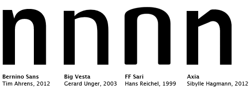
One central aspect of typeface design is how shoulders are treated. Do curves flow smoothly into stems, or do they meet at an angle? According to Tim Ahrens, this question is almost as defining as the presence of serifs. In order to prevent dark spots, arches are usually tapered. Gerard Unger has made acutely attenuated shoulders his trademark. Hans Reichel’s famous “spurless” designs are another extreme solution to the same challenge.

In designing Axia, Hagmann took a different approach, one that is refreshingly reckless: when a curve reaches its zenith, it kinks sharply and shears toward the stem. This treatment is applied to all letters where rounds and verticals join. It is particularly interesting to see how ‘b’/‘d’ and ‘p’/‘q’ are handled: the “sloped eyebrows” lend the face a stern look. Angular rigor shines through in other details, too. While I like the ‘B’, I find the chamfered top of the ‘t’ and the double-bent ‘J’ a little mannered.

When looking at many releases, I have no idea how the fonts might possibly be used. Not so with Axia, which has a pronounced modernist architectural feel. It’s easy to imagine this typeface applied in the arts, industrial design, and related fields. No wonder — Axia started out as a custom design for the Rice School of Architecture in Houston, Texas. Its shapes are robust enough to be placed on top of photographs, be it for posters or covers. At the same time, they are sufficiently sapid to be looked at — especially in the two fancy stencil cuts — e.g., in exhibition signage.

Axia is constructed and technoid, but not in a naïve or reduced way. Although obviously not made for immersive reading, Axia can also be used for text sizes. Ascenders project above cap height; the ‘g’ is double storied; oldstyle figures are the default. Axia is a text face with character — suitable not for novels, but for catalogs or brochures. As an extraordinary feature, all its styles share the same metrics. The italics are neither too compact nor too inclined. This renders the family ideal for multilingual publications: columns in different languages could be distinguished by using different styles, which will always take up an equal amount of space.

Axia’s uncompromising design execution, with its squarish and rather open forms, leads to some obtrusive glyphs like the oldstyle ‘3’ and ‘9’ with their heavy bottoms. The ‘ß’ (eszett) is too dogmatic for my taste. The designer insisted on accentuating the derivation from ‘ſ’ (long s) plus ‘s’, thereby accepting the resulting wide and complex glyph. At 660 glyphs per weight, Axia covers a considerable range of languages, but some of Axia’s diacritics appear off-center. Another bone of contention is the unorthodox placement of bridges in Axia Stencil.

Don’t let these small criticisms overshadow Axia’s many good aspects. This is a well-produced and full-featured family, including small caps for all styles (except the stencils); case-sensitive alternates; and a complete set of figures, including small cap figures. Incidentally, Hagmann solved the quote mark dilemma. Americans sometimes want their quotation marks top heavy, while Europeans prefer a consistent angle (see this discussion). Axia includes the mirrored American flavor as a stylistic alternate.

You can have a closer look at Axia and its features on the new Kontour website, which launched simultaneously with this remarkable typeface.