A new contest wants your best bad logo ideas
Posted in: Uncategorized
If a room full of people was asked to name the world’s most recognisable brands, it’s almost guaranteed that a few usual suspects would crop up. And while no singular element can be enough to carry an entire brand to success, these logos do some heavy lifting when it comes to recall, desirability and, eventually, legacy. But what exactly constitutes a strong logo – and what makes a bad one?
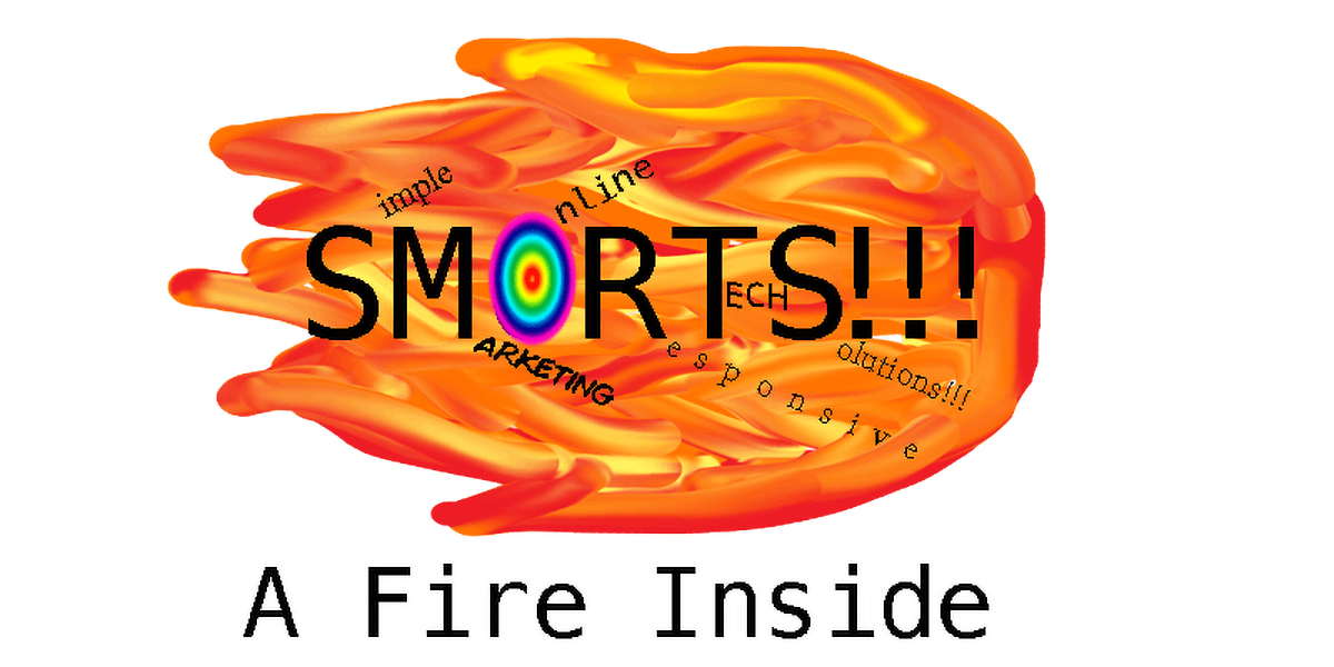
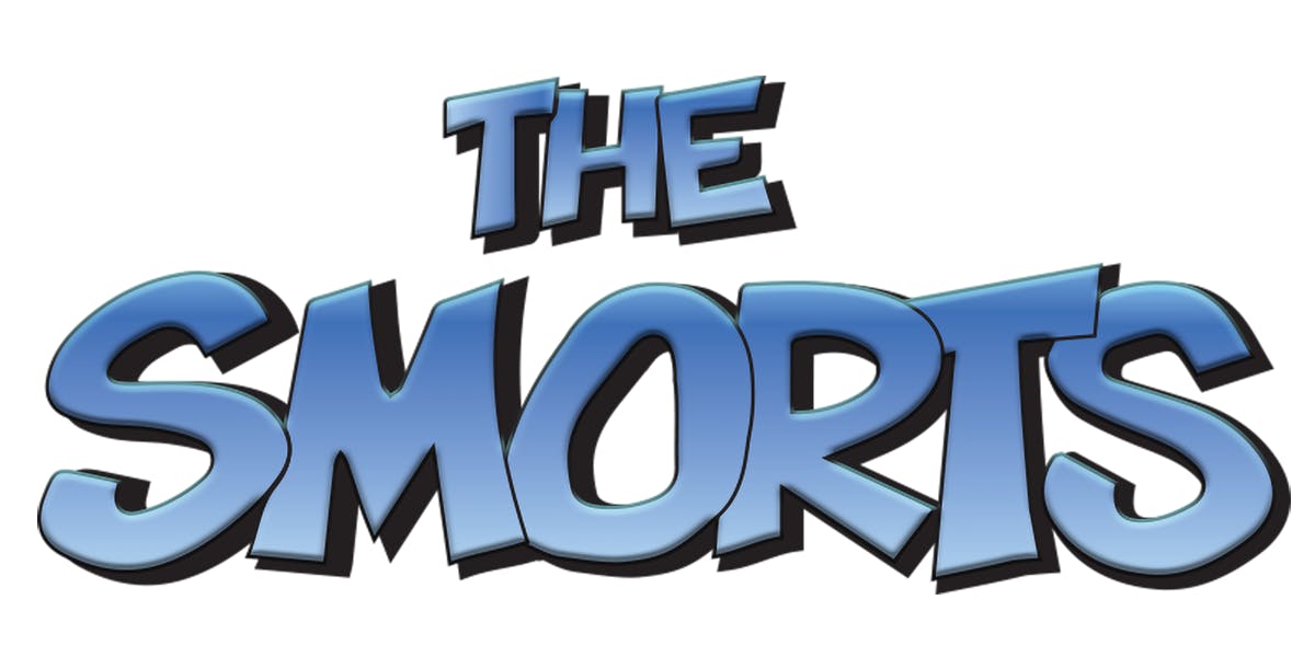
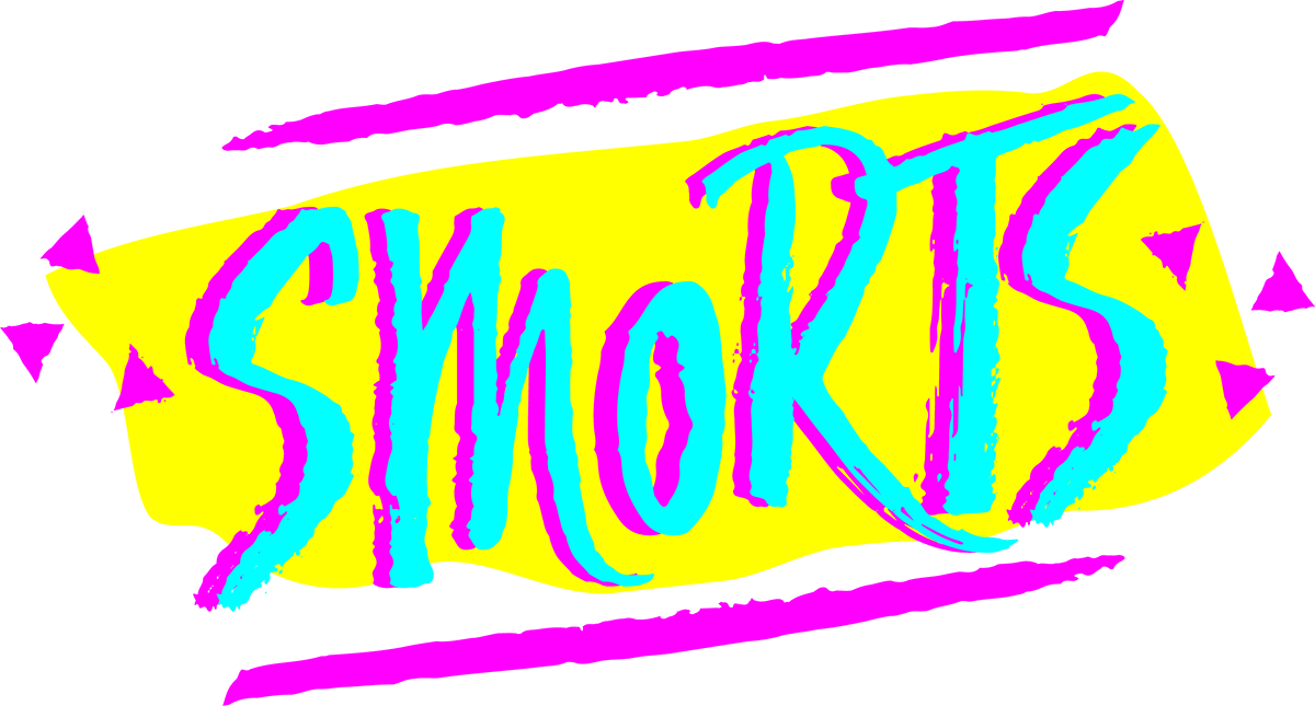
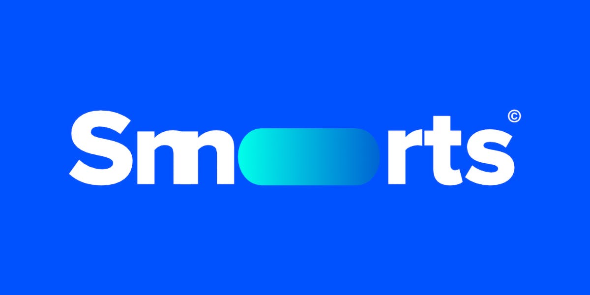
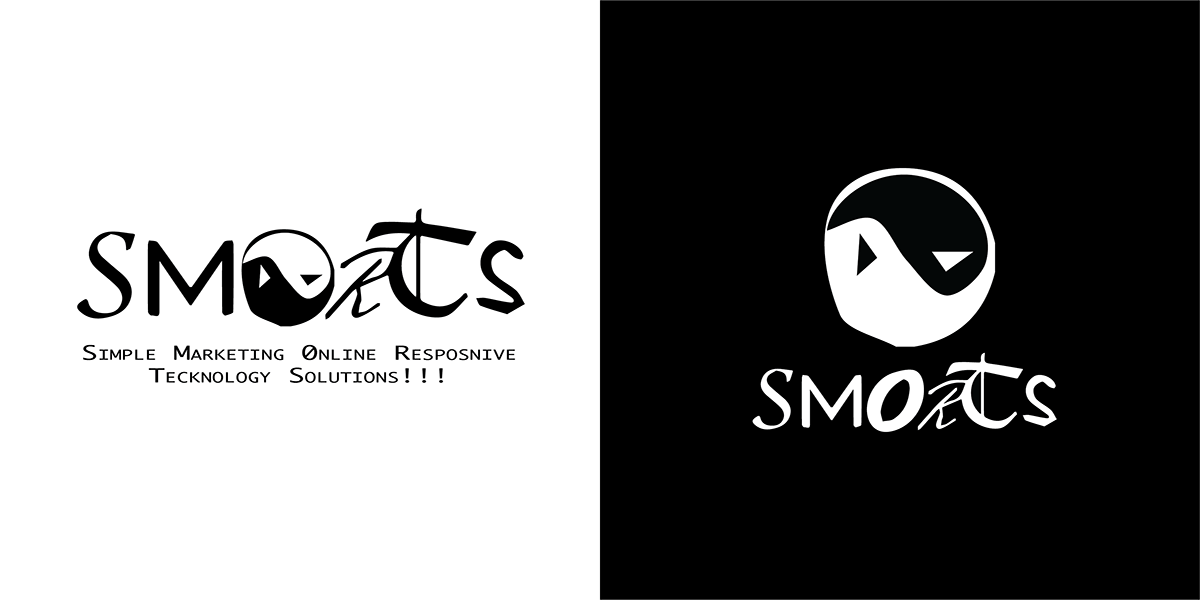
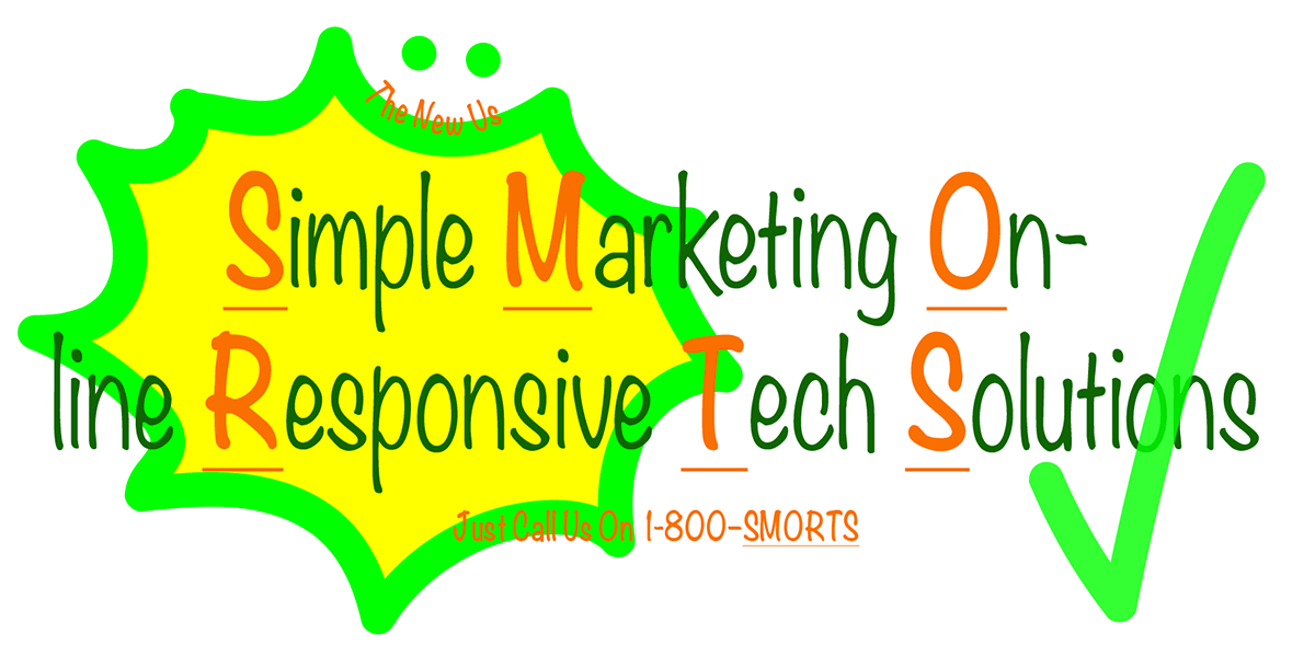
It’s a question that designers can pore over endlessly, but US creative studio Fuzzco is taking a fun approach to the subject with its new competition, How Low Can Your Logo? The brief is to create a bad logo (although in keeping with any poorly handled design challenge, people are free to skip the brief altogether). The client? Simple Marketing Online Responsive Tech Solutions, otherwise known as SMORTS.

The entries so far are satisfyingly ugly by most accounts, featuring heavy use of dodgy typefaces – including everyone’s (least) favourite of all time, Comic Sans. Clip art-style imagery figures prominently too, reminiscent of all those 2000s-era invitations and posters created in Microsoft Word that most of us thought we’d probably left behind. Many of the designs are cluttered and convoluted – perhaps indicative of the general gravitation towards minimalism – while misleading layouts of the brand name seem to be among the worst culprits.
The winning entry and runners up will be decided by a panel of six judges, including Pentagram partner Michael Beirut, illustrator and Wes Anderson collaborator Jessica Hische, and Google Design’s Carly Ayres. Creatives have until 10pm BST on Tuesday 21 April to enter their most ghastly logos.
howlowcanyourlogo.com; fuzzco.com
The post A new contest wants your best bad logo ideas appeared first on Creative Review.


Post a Comment