Five museums and exhibition projects designed by students

Dark red plastic object hanging in a white gallery space

Dezeen School Shows: we’ve picked five student museum and exhibition projects that were featured in Dezeen School Shows, which explore both history and futuristic technology.

These undergraduate and postgraduate students have developed museum and exhibition projects that explore modern technology, cultural heritage and the connection between traditional and contemporary fashion.

This roundup of projects includes a museum that showcases the remains of demolished buildings to create a “journey” through the history of a site, and a museum that aims to address the inequality experienced by women in the workspace during the industrial revolution.

The selection of projects comes from architecture, interior design, spatial design and exhibition design courses at international institutions including University of the Arts London, University of Brighton, Fashion Institute of Technology and University of Kentucky College of Design.


Dark red plastic object hanging in a white gallery space

Meta Museum by Nicholas Benjamin

Interior design student Nicholas Benjamin developed a museum where visitors can interact with virtual collections. The museum includes products from Scan The World, a network of 3D-scanned cultural artefacts.

“Meta Museum also takes advantage of its digital environment by implementing multiple features that would be impossible to display in a real-world space,” said Benjamin.

“This includes navigation of the space, as the space can now become non-Euclidean, allowing for efficient and creative ways to move around.”

Student: Nicholas Benjamin
School: University of the Arts London
Course: BA (Hons) Interior Design

View the full school show ›


Architectural drawings of a museum in Rye, England

The Museum of Rye by Regina Nakansere

Architecture student Regina Nakansere designed a museum in Rye, England, which explores the use of demolished buildings in preserving an area’s history.

Nakansere took pieces of a building – extracted by its demolition – and embedded them into a trail through Rye, creating a journey that tells a story of its past.

“This proposal transforms selected buildings within the centre of Rye into a changing and evolving museum of the town,” explained Nakansere. “The strategy employed uncovers or reveals aspects of the buildings, uncovering hidden aspects of their past as well as their current purpose.”

Student: Regina Nakansere
School: University of Brighton
Course: MArch (RIBA Part 2)

View the full school show ›


Architectural drawing and model of a Lexington, USA, legacy museum and civil rights memorial

Lexington Legacy Museum and Civil Rights Memorial by Ben Thornton

Architecture student Ben Thornton designed a museum and memorial that aims to exhibit the history of Lexington in Kentucky, USA.

Thornton collated the building’s material palette aiming to express “permanence, modesty and timelessness” to commemorate those who dedicated themselves to establishing and growing Lexington’s identity.

“The museum’s primary focus is a large interior atrium and civil rights memorial served by a skip-stop elevator and stair circulation system,” explained Thornton. “This encourages deep contemplation of Lexington, Kentucky’s history with a particular emphasis on the unidentified – yet to be credited founders of the city.”

Student: Ben Thornton
School: School of Architecture at the University of Kentucky College of Design
Course: Third-year Undergraduate studio, spring 2020

View the full school show ›


Visualisation showing entrance to an interactive gallery that spatialises the inequalities suffered by women in the workplace during the industrial revolution

Fabric-Women-Museum by Shiyuan Liu

Interior and spatial design student Shiyuan Liu created an interactive museum that aims to address the unfair work environment experienced by women during the industrial revolution.

The museum’s four rooms are designed to follow the themes of control, inconvenience, isolation and vulnerability. Each room guides visitors through a journey to experience its “emotion” while enabling visitors to gain a deeper understanding of the history at the time.

“The project is based on research into the history of Artiach during the industrial revolution when approximately 80 per cent of the workers were women,” explained Liu. “Although Artiach offered work opportunities for women, their working conditions and treatment were poor.”

Student: Shiyuan Liu
School: University of the Arts London
Course: BA Interior and Spatial Design

View the full school show ›


Visualisation of fashion exhibition advertisements

The Voice of Souls by Heeji Min

Heeji Min, an exhibition and experience design student, proposed an immersive exhibition that allows visitors to explore the creative process of designer fashion.

By including audio guides narrated by the designers themselves, visitors are able to gain an insight into the art of the traditional process of haute couture and discover its influence on modern fashion.

“Fashion is a creative and artistic forum for designers to express their ideas, thoughts, and emotions,” said Min. “But fashion exhibitions are stereotypically curated by luxury brands and viewed as just another form of marketing.”

“This project… explores ways of motivating the public to attend fashion exhibitions in the future and uncovers experiential approaches to curating them.”

Student: Heeji Min
School: Fashion Institute of Technology, SUNY
Course: MA Exhibition and Experience Design

View the full school show ›

Partnership content

These projects are presented in school shows from institutions that partner with Dezeen. Find out more about Dezeen partnership content here.

The post Five museums and exhibition projects designed by students appeared first on Dezeen.

This reversible mid-high bed concept can grow with your child

Buying furniture as adults can already be quite a stressful endeavor, but buying one for kids doubles or even triples the difficulty. Not only do you have to consider safety and comfort, but you also have to consider how they can grow up fast and make those products useless in just a year or two. That’s why parents might sometimes be tempted to buy more affordable furniture that they can either dispose of, resell, or give away quickly, which is a practical solution but not a smart one. It would be better if the furniture could actually change and adapt to the child’s growing needs, like this mid-high bed design concept that still be used by the same kid after they’ve grown a bit.

Designer: A Su (PUPUPULA)

It might be surprising to learn that there is a lot more variety when it comes to kids’ bed designs. Some types are better for certain ages, while others provide room for more than one person. Like most beds, however, these are often designed with a singular target audience in mind, which means they easily outgrow their use and their charm in just a few years. That wouldn’t be much of a problem if not for the expense and waste that comes with replacing those beds again and again.

The Big Eyes bed concept solves that problem by employing a design that can change its purpose depending on the number or age of its owners. And it doesn’t employ complicated tricks like modular or moving parts that could actually be dangerous for a toddler. Instead, you can simply flip it over to change it from a mid-high bed to a basic bed and vice-versa.

The mid-high bed position is perfect for younger kids or siblings who need to share the same bed space. The top bunk is the main bed, while the bottom space can act as a secondary bed or a spacious play area. Once the child grows up a bit, however, removing the ladder and turning the bed over changes the story completely, with the bottom now acting as a basic bed and the top frame as a place to hang cotton canvas play curtains for some privacy.

Big Eyes is made of birch plywood, which gives the bed a warm, welcoming tone. There are no moving parts or hidden compartments, making it easier to turn the bed over as needed. The bed’s design is actually quite minimalist, leaving the freedom of decoration and personalization to parents and kids. That same simple design, however, is also its strength, allowing it to have that reversible functionality you won’t be able to pull off on more sophisticated designs.

The post This reversible mid-high bed concept can grow with your child first appeared on Yanko Design.

Industrial Design Case Study: A Dual-Fuel Oven, by Pulse Design Group

Los-Angeles-based Pulse Design Group did the latest redesign of this hybrid electric/gas oven and range.

The BlueStar Dual Fuel Series Range is a hybrid electric and gas range top & commercial oven for your home. Pulse was given the opportunity to collaborate with BlueStar on their latest redesign of a restaurant-quality, performance-level oven range system.

Pulse worked to create a product that seamlessly combines high-performance functionality with elegant design. The Dual Fuel’s unique two source cooking design required an equally unique user interface. Pulse designed the UI for the Dual Fuel series, including all flow documentation, all custom iconography, and all pixel perfect digital assets. Finding a balance of modernity and unobtrusive, clean design was the challenge for this application.

Pulse had a blast coming up with innovations for the Dual Fuel with the BlueStar team. Equipped with unique features such as its pivoting interface screen, all new X-8 8-Point Burners, commercial-grade steel griddle, statement ergonomic handles, and a new modern foot profile… just to name a few! Not to mention, thanks to BlueStar’s endless color and finish customization options, the Dual Fuel seamlessly integrates into any kitchen.

Intuitive UI. Along with aiding in the industrial design of the Dual Fuel Series Range, Pulse developed its award winning user interface. A UI that is not only aesthetically pleasing, but fully tailored to the end user. Dual Fuel’s unique two-source cooking design required an equally unique user interface. Presented on an ergonomically pivoting touchscreen, it is packed with features such as: independent cooking settings for each oven, 10 distinct oven modes, one-press stop functionality, a full settings panel that includes Sabbath settings, two standalone kitchen timers, and more.

You can see more of Pulse’s work here.

Five interviews with industry leaders on where their practice stands on recruitment

As Dezeen Jobs turns 15 this year we’ve interviewed a number of industry leaders on where their practice currently stands on recruitment.

The series of interviews examines the skill sets studios are looking for, where they see recruitment heading and the impact that AI has had not only on their recruitment process but on their practice as a whole.

Here we have rounded some of the key comments from the first five interviews within the series, featuring director at dRMM, Saskia Lencer; creative director at Toogood, Jan Rose; global design director and partner at Henning Larsen, Jacob Kurek; director at Tonkin Liu, Anna Liu; and director of Megan Grehl design studio, Megan Grehl.


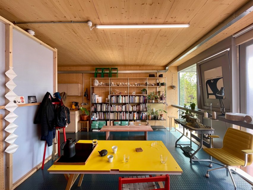
WorkStack's interior is made from CLT
WorkStack’s interior is made from CLT. Photo by Alex de Rijke

Saskia Lencer, director at dRMM

Lencer spoke about how architecture studio dRMM has grown in the last 10 years and how the studio’s recruitment process is now nearly all virtual.

The director explained that an untraditional route through architecture catches her eye in an application, particularly if a candidate has worked abroad.

Lencer also stressed that when applying for a role at dRMM, it is important for candidates to have developed on-site experience to demonstrate their technical knowledge.

“One of the most important things is really understanding how materials work, how they come together and how they can be used,” said Lencer. “This sets the candidate on the right path to understanding how we work.”

View more of the interview ›


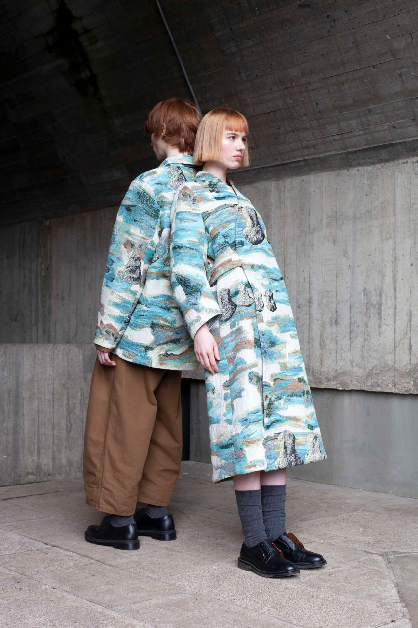
Two models wearing patterned blue and cream coats

Jan Rose, creative director at Toogood

Creative director Rose explained that the design studio Toogood has become increasingly rigorous in its recruitment process in order to expand the studio’s network as much as possible.

The studio has a motto of “restless experimentation” and Rose says that Toogood is looking for people who have experience in physical model-making, which he says is a key part of the studio’s design process.

Rose also said that when candidates are developing their portfolios, they should have an understanding of material sensibilities and have an aesthetic that aligns with the studio, while also displaying their individual ways of thinking and designing.

“The biggest mistake we normally see is endless portfolios,” said Rose. “Be bold in your choice, show us your three or four best projects – that should describe you better than 10 or 12 when half of them are not as polished.”

View more of the interview ›


Volvo's showroom designed by Henning larsen

Jacob Kurek, global design director and partner at Henning Larsen

Kurek discussed how architecture practice Henning Larsen‘s stance on sustainability is a key recruitment driver. The director also spoke about how he does not see AI as a recruitment threat as architects are being asked to facilitate AI processes in projects from the beginning to the end.

Kurek also spoke about how the skills and competencies that are needed in today’s practice might not be the ones that we see 10 years from now.

“The world has started to look more seriously at sustainability and our industry’s carbon footprint,” said Kurek. “Addressing the climate crisis will require more specific skills and competencies to ensure we can have the impact we need.”

“I can only see that recruitment will grow and we must get a move on, otherwise, we will be dinosaurs.”

View more of the interview ›


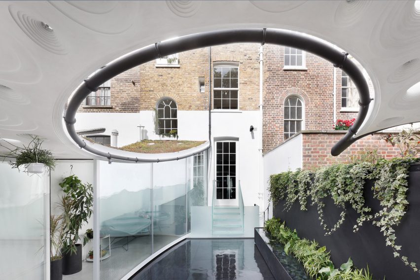
Exterior view of Sun Rain Rooms

Anna Liu, director at Tonkin Liu

Director Liu said that Tonkin Liu is on the lookout for candidates who have an “understanding of what good design is” and how their portfolio needs to show a level of rigour in the way that they think and develop a project.

Liu also discussed how AI in design shouldn’t be feared or put on a pedestal in the design process. She explained that the studio has found that when introduced too early, the team has found it has clouded their instincts and instead, AI is better introduced at a later stage for tasks that respond to speed and efficiency.

“I think the future is an ideal marriage of AI and ‘the hands’ because hands are very intuitive and they lead you to much more interesting answers than if you were to solely rely on AI,” said Liu. “Drawing on a computer or relying on the machine cuts you off from the ability to think intuitively, and to choose, from the myriad of AI options, the most holistic design solution.”

View more of the interview ›


Interior of a design studio featuring wooden flooring

Megan Grehl, director of Megan Grehl

Designer Grehl discussed how she looks for confident individuals in the recruitment process.

In the interview, Grehl also spoke about how she doesn’t see AI as a threat in the design process and that she believes that if studios don’t keep up with the latest software trends they’re at risk of falling behind.

The designer also discussed how 3D modelling is important when looking for a role at her studio and how understanding “spatial connections and the interactions of scale and proportions, 3D modelling is key”.

“The other thing is having great taste,” commented Grehl. “I think taste is something you’re born with, it’s not something you can teach. People who have good taste will be more efficient and picking beautiful objects, knowing proportions and knowing how we can solve a problem.”

View more of the interview ›

Dezeen Jobs: How We Recruit

This article is part of Dezeen Jobs: How We Recruit, a series of interviews to mark Dezeen Jobs turning 15, which explores changing hiring practices and future recruitment needs for companies around the world.

The post Five interviews with industry leaders on where their practice stands on recruitment appeared first on Dezeen.

SOM completes restoration of New York's historic Lever House

A building with a green glass facade

US-based architecture studio SOM has completed a restoration of the Lever House seventy years after the studio originally designed the historic New York City office building.

Under developers Brookfield Properties and WatermanClark, the project includes a restoration of the building’s lobby, plaza, interior office spaces, terraces, third-floor lounge and mechanical systems.

A building with a green glass facade
SOM has completed a restoration of the Lever House office building in New York City

The 22-storey building consists of a rectangular base that is suspended over a courtyard and plaza by columns, with a tower of office suites extending from the northern corner of its city plot.

Upon the developers’ purchase of the building in 2020, many of the interior spaces had fallen into disrepair.

A large courtyard with patio
The Lever House is known for its green-hued glass facade and small stature

“It still had all of the good bones, it had all its original parts, but it had, over that 70-year period, sort of suffered,” said vice president of design at Brookfield Properties Scott Kirkham.

“It wasn’t in particularly good repair and it certainly was showing certain signs of its ageing.”

A covered plaza with gray and white terrazzo
The renovation included updates to the lobby, plaza, office floors, terraces and mechanical systems

Along with interior designer Marmol Radziner and landscape architect Reed Hilderbrand, the team overhauled both interior and exterior spaces.

“This renovation reactivates Lever House for the 21st century,” said SOM partner Chris Cooper. “We’ve restored the plaza and podium to its original 1952 glory while comprehensively overhauling the mechanical systems.”

A covered plaza with gray and white terrazzo
SOM used historic documents to closely match contemporary materials to the make-up of previously installed materials

“The result is a landmark that is both renewed and reminiscent of its midcentury splendour – with revamped outdoor spaces, more natural light inside, and an efficient use of energy.”

In the building’s lobby, which is enclosed in floor-to-ceiling windows, SOM restored the terrazzo flooring, stainless steel-clad columns, white-marble planters, black limestone and white marble walls and a yellow tile mosaic wall that sits at the entrance to the elevators.

Large floor to ceiling glass surrounding a lobby
The lobby’s terrazzo floors and marble and limestone walls were restored

SOM design principle Frank Mahan explained the team used a “variety of data points” including the existing materials, historic drawings, photos and “contemporaneous descriptions” in order to closely match contemporary materials to their 1950s predecessors.

This included sending aged samples of the original terrazzo flooring to a lab, where they were used to create a new, stronger material composed of similar ingredients.

Interior designer Marmol Radziner created rosewood, mohair, and leather furniture and a large bar unit for the building’s newly restored third-floor common space, which is located in the building’s elevated rectangular base.

The central bar consists of two rosewood cabinets that bookend a glass screen by John Lewis Glass, while the floors were clad in “galaxy green” marble with a similar-hued soapstone on the walls.

A lobby building with velvet furniture
Soft, earthen-toned furniture was placed throughout the lobby and a third-floor lounge

“Experientially, it was important that Lever Club feel warm and refined, almost residential in feel,” said Marmol Radziner design partner Ron Radziner.

“This translated to our intentional colour-blocking of interior materials, the basis of which was the iconic green of the building facade.”

A lobby building with velvet furniture
Birch trees were planted in the courtyard

On either side, the lounge area leads out onto a terrace overlooking the street below. Along with horticultural designer Patrick Cullina, Reed Hilderbrand outfitted the terraces with Whitespire birch trees interspersed with low-lying vegetation, flowers, and shrubs.

The studio also restored architectural elements, including replacing red pavers on the terrace with grey precast concrete.

Finally, “a series of sweeping changes” to the mechanical systems, including replacing original induction units throughout the interior, will help push the building towards LEED Gold and WELL Platinum certification targets.

Originally designed by Gordon Bunshaft and Natalie de Blois of Skidmore, Owings & Merrill, the 307-foot (94 metre) high building housed the headquarters of soap company Lever Brothers.

A interior with plush earth tone interiors
A custom bar unit was made for the communal lounge

It is known for its green-hued glass curtain wall and small stature compared to surrounding office buildings, with each tower floor plate measuring just 11,000 square feet (3,350 square metres).

The curtain wall was the second to be installed in New York City amidst the era’s largely masonry architecture, helping to evolve the city’s office buildings to an International style.

A interior with plush earth tone interiors
Outdoor terraces were also updated

SOM previously replaced the building’s facade in 2001.

The studio is known for the construction of multiple skyscrapers internationally, including the world’s tallest skyscraper, Burj Khalifa in Dubai. Nearby, the studio recently completed a black terracotta-clad office building in Chelsea.

The photography is by Lucas Blair Simpson/SOM.


Project credits:

Lead architect: Skidmore, Owings & Merrill
Interior design: Marmol Radziner
Landscape architect: Reed Hilderbrand
Preservation consultant: Higgins Quasebarth & Partners

The post SOM completes restoration of New York’s historic Lever House appeared first on Dezeen.

Fantastic Industrial Design Student Work: Rapidly Deployable Venue Seating

This is an incredible student project executed by Industrial Design students Savannah Black, Ken Kirtland and Chermia Mathis, along with Engineering students Erin O’Hanlon and Seth Thurmond, done at the Georgia Institute of Technology. Both the work and the documentation are top-notch, revealing the full design process, including the early failures and how the team overcame them.

The project is called Folde.

My hat’s off, that’s some of the best nuts-and-bolts ID work I’ve seen this year.

Hover lampshade appears to be "magically hovering in the air"

Lodes Hover lamps

Italian lighting brand Lodes has collaborated with Tokyo-based design studio YOY to create Hover, a lamp with a shade designed to look as though it’s floating.

Designed to “surprise and create the unexpected”, Hover was recently shortlisted for in the Dezeen Awards. Available as a table or floor lamp, it has a lampshade that is detached from its base and connected by a single cable running through the lamp’s stem.

Hover table and floor lamp varieties featured in a living room
Hover comes as a table or floor lamp

“Extremely poetic in its simplicity, Hover perfectly exemplifies Lodes’ commitment to balancing technical know-how with contemporary design,” said Lodes.

“The Hover series includes a table lamp and floor lamp where the lampshades appear magically hovering in the air.”

Two Hover table lamps featured in a living space
The lamp aims to “surprise and create the unexpected”

The lamp has a matte white finish, which according to Lodes is informed by Japanese aesthetics “offering a light, minimalist touch”.

“The Japanese influence is clear in the aesthetic – allowing Hover to fit into several environments or moods seamlessly,” said the brand.

Three hover lamps displayed on stairs
The lampshade is detached from its base

Lodes describes the technological process behind Hover as “extremely complex”.

The light’s cable runs through the inside of the stem and then emerges from it “ensuring a continuity that gently supports the shade”.

Here, the cable is partly made from a metal pipe, which joins the shade and the pole, creating the illusion that the shade is floating.

Both variations of light feature a dimmer that’s controlled by a power switch situated on the upper part of the stem.

Close up image of Hover's lighting dimmer
Hover can be dimmed using the power switch  on the upper part of the stem

“The Hover collection marks an opportunity to play with new materials,” said Lodes.

“While the base is made of a white painted metal, the shade comprises a sheet made from a special compound of paper and polymer film, which further emphasises the lightness of the design language while extending its durability.”

Hover was shortlisted in the lighting design category for this year’s Dezeen Awards. Other lights shortlisted in the category include the Soft Serve light, which was informed by meringue and ice cream and Tom Dixon’s Portable lamps.

The post Hover lampshade appears to be “magically hovering in the air” appeared first on Dezeen.

An Electric Motorcycle Built Around a Cargo Cavity

With the help of imaginative design, EV technology should allow established form factors to evolve. Take the motorcycle, which since its inception has been built around the motor. But this P2 electric motorcycle, with batteries at the bottom of the frame and an electric motor within the rear wheel, is built around a large cavity.

Developed by startup Ponie, the P2 is targeting last-mile delivery in urban areas. (Fun fact: Ponie co-founder Netzah Sadeh conceived of the P2 as an Industrial Design student back in 2007.) The cavity beneath the rider can hold 115 liters (roughly 4 cubic feet) while another 300 liters (10.6 cubic feet) can be stacked on the rear platform. While that can’t compete with American UPS trucks, which have capacities ranging from hundreds to thousands of cubic feet, the P2 makes more sense in Europe, where conventional vehicles are increasingly being banned from city centers.

Utilitarian looks aside, Sadeh hasn’t forgotten his ID roots, and has included some basic niceties for the rider: There’s a lockable glove box with a USB port, and a 7″ display fore of the handlebars is Apple-CarPlay-ready.

The P2’s range is 150km (93 miles) provided you keep it at 35 km/h (22 mph). It has a top speed of 90 km/h (56 mph), and can carry a maximum weight of 200kg (441 lbs) counting the rider.

At press time no price nor release date had been announced.

Marmi Maximum surfaces by Fiandre Architectural Surfaces

Marmi Maximum surfaces by Fiandre Architectural Surfaces

Dezeen Showroom: Italian brand Fiandre Architectural Surfaces has added three new colours to its Marmi Maximum surface collection, which are unified by stone-like patterns.

The Marmi Maximum range includes large-format panels with surfaces informed by rare quarried marbles and other sought-after stone types. The existing range of 39 patterns is now joined by three new iterations.

Marmi Maximum surfaces by Fiandre Architectural Surfaces
Three new colourways join the Marmi Maximum range

Camouflage has a high-contrast pattern of greys and beiges designed to have a dramatic and timeless marble-like appearance.

Breccia Sarda has a more subtle, cohesive sand-coloured finish, while Palissandro White features a milky background marked with sweeping dark streaks.

Marmi Maximum surfaces by Fiandre Architectural Surfaces
The surfaces have a variety of applications

The panels are suitable for a range of uses from furniture decoration to floor and wall coverings.

They come in a selection of treatments, which change the degree of the surface’s reflectivity and texture.

Product: Marmi Maximum
Brand: Fiandre Architectural Surfaces
Contact: info@granitifiandre.it

Dezeen Showroom

Dezeen Showroom offers an affordable space for brands to launch new products and showcase their designers and projects to Dezeen’s huge global audience. For more details email showroom@dezeen.com.

Dezeen Showroom is an example of partnership content on Dezeen. Find out more about partnership content here.

The post Marmi Maximum surfaces by Fiandre Architectural Surfaces appeared first on Dezeen.

Analog digital hybrid clock presses the snooze button for you

One of the biggest struggles I have every morning is the constant battle between me and my smartphone’s alarm clock. I set alarms every 30 minutes for a period of 2-3 hours but more often than not, I still hit the snooze button so all my alarms run into each other. I’ve tried putting my phone away from me so I am forced to get up if I want to snooze it but that only results in me being in a horrible mood. But if i want a more convenient way to snooze (and lose), then this new kind of alarm clock may be what I need.

Designer: Nico Tangara for BHH Innovation Lab

The Self-Snoozing Alarm Clock may become your best friend or your worst enemy, depending on how you actually look at the snooze button. Instead of having to snooze the device yourself, it actually comes with a hand to snooze itself. It’s a device that uses a fusion of analog and digital and is powered by the Raspberry Pi compact computer module to help you beat the snooze button or actually fall victim to it.

The alarm clock looks like your typical analog clock with its rectangular box but with a digital clock showing on the screen. It is connected to a servo or an actuator that is able to push parts of the device with precision. The mechanism enables this tiny hand to extend from the clock and manually press the snooze button which will then activate the system to keep snoozing until you actually stop it.

If you have an appointment that you need to get to, then this may not be the best alarm clock to have beside you as it will keep you snoozing indefinitely. But it does help you in a sense that you don’t have to be the one to push the snooze button on your phone, although that may not be the best thing if you really think about it.

The post Analog digital hybrid clock presses the snooze button for you first appeared on Yanko Design.