"Brave and fearless" Viva Magenta named Pantone Color of the Year 2023

Pantone colour of the year 2023

A hot pink called Viva Magenta that is reminiscent of blush has been named as 2023 colour of the year by the American colour company Pantone.

Described by the brand as “an unconventional red for an unconventional time”, Pantone‘s Viva Magenta 18-1750 is a vibrant pinky colour with hints of purple that belongs to the red colour family.

“It’s assertive but it’s not aggressive – we refer to it as a fist in a velvet glove,” said vice president of the Pantone Color Institute Laurie Pressman.

“It’s a brave and fearless red shade that vibrates with vim and vigour,” Pressman told Dezeen. “Its exuberance promotes optimism and joy.”

A cut out of a pink Pantone colour
Pantone has named a magenta colour as its colour of the year 2023

Pantone’s trend-forecasting research department the Pantone Color Institute selects the colour each year. It said that this year’s colour choice reflects the “rebellious” spirit of the time and the renewed interest in creative experimentation following the coronavirus pandemic.

“Audacious, witty and inclusive of all, Pantone 18-1750 Viva Magenta welcomes anyone and everyone with the same rebellious spirit,” said the brand.

“Powerful and empowering, it is an animated red that encourages experimentation and self-expression without restraint; an electrifying, boundaryless shade that is manifestly ‘out there’ and is a stand-out statement.”

A Viva Magenta pink mug
Viva magenta sits between red and pink on the colour wheel

According to Pantone Color Institute’s research, magenta pinks are already popular among the fashion and beauty community. It expects the interior world to follow suit.

Earlier this year, Italian fashion house Valentino released a magenta pink coloured fall/winter collection and models have been wearing similar shades on their eyelids and lashes.

A digital image of a woman coloured in magenta
The colour is already being used in beauty and fashion

“It’s a great colour for reflecting light, which gives it a sense of fantasy and glamour,” trend forecaster and Pantone Color Institute member Jane Boddy said. “It’s so flattering across all skin tones and all genders.”

“Traditionally you would imagine this be a colour for the lips or the cheeks whereas now we’re seeing it as a solid eye colour in a painterly stroke,” Boddy added.

Although Viva Magenta is part of the red colour family, Pressman argued that the colour is not as expected or “aggressive” as traditional reds thanks to its pinky tinge. Red traditionally has connotations with rage and danger.

“When you think about a red, this is not the shade you’re thinking about,” she said. “You’re thinking about more of a true red, a classic red or an orange-red, not really these pinky red tones.”

Two pink shiny beetles
Similar colours can be found in insects and flowers

According to Boddy, despite the bright pink being relevant to today’s society, the colour is still rooted in nature, where it can be found in tropical flowers and insects.

“One of the biggest inspirations behind this was also the natural world too – you can kind of imagine these sort of colours in the natural world and it has a slightly exotic feel to it,” said Boddy.

This is not the first time Pantone has chosen a pink as its colour of the year. For 2016, the colour company chose a markedly lighter pastel pink with rose tones called Rose Quartz alongside Serenity, a calming light blue hue.

Last year, it named Very Peri, a purple colour described by Pantone as “a periwinkle shade of blue” as its colour of the year.

The controversy caused by the brand calling it blue was criticised by interiors expert Michelle Ogundehin, who called time on Pantone’s colour of the year exercise, writing in an article on Dezeen that “it’s time to reconsider the whole colour of the year carnival”.

The imagery is courtesy of Huge.

The post “Brave and fearless” Viva Magenta named Pantone Color of the Year 2023 appeared first on Dezeen.

Love Hultén’s latest custom synth build looks like something Darth Vader would commission

“Something really dark and retro sci-fi” is what Hultén says his client wanted, and the Nostrx2 synth is precisely that. Designed keeping the interiors of the USCSS Nostromo spaceship from the 1979 Alien movie in mind, The Nostrx2 is built around the Syntrx2 from Erica Synths, albeit with a darker vibe. The custom build (which took a total of 12 weeks to put together) also features a modified LVX Meris modular delay system, an Analog Heat distortion filter, an all-black Arturia KeySteo 32-key MIDI Controller, and a monitor displaying glitchy visuals as you play from Critter & Guitari.

Designer: Love Hultén

It’s safe to say that Hultén’s turned custom synth-building into an art-form, creating some incredibly elaborate music-making art installations – some of them even with their own NFT visualizer. This particular build for a mystery client may be his darkest build yet, given that the Swedish audiovisual artist does tend to inject a sense of fun and whimsy into his creations.

The black and red colorway, combined with the boxy cabinets definitely gives the overall design a major Vader vibe, with elements looking almost like the panel on Vader’s chest. Combine that with the smoke and fog around the cabinet and it genuinely looks like the kind of synth you’d find on the Death Star!

The post Love Hultén’s latest custom synth build looks like something Darth Vader would commission first appeared on Yanko Design.

This odd-looking robot concept is a live streamer’s dream crew

It wasn’t too long ago when YouTubers and live streamers were treated almost on the same level as Hollywood celebrities. Some are still stars, but that market has exploded in the past few years to the point that almost anyone and everyone is trying to make it big, especially when the lure of fame and fortune is just too strong. This is supposedly in the DNA of the so-called Gen Z, whose aptitude for recording even the most mundane parts of life has become legendary. After all, all you need is a smartphone, right? While that might be true to some extent, this dog-eat-dog “VTuber” market relies on getting every aspect of the shot right, from the lighting to the angle to the audio. Often, you’ll need half a dozen disparate tools for the job, but this stick-like robot brings all of that to you, literally.

Designers: Gabin Park, Byeonggwan Kim, Ramen Kim, Seokhyun Han

Calling this machine a “robot” probably requires a little stretch of the imagination. To some extent, it’s like a Roomba that grew a rod and a circle at the top. It can roll here and there, as well as rotate its “head” and the rod that acts as its arm, all controlled by a cylindrical remote. As far as being a robot is concerned, that’s pretty much it, but where it really shines for content creators is all the functions it houses in that cramped body.

1

That large circle at the top, for example, might be mistaken for just being that popular ring light, but it is definitely a lot more than that. It has a touch screen, for example, that acts both as a monitor when recording as well as a typical display for watching content. That circular shape might seem odd at first, even considering the ring light, but the choice was intentional to create a sense of flow and rhythm, adding a bit of dynamism to what would otherwise be a drab box.

The “arm” is actually a modular container for different parts you’ll need to stream or record videos. That includes a camera, of course, as well as a mic, more lights, and even a smartphone holder. Depending on what you may already have, you might need some or all of these, hence their modularity. Both the arm and the head can rotate and move to desired angles, giving creators the flexibility and freedom they need.

Despite all these features, the concept design named “LG Only i” retains a visual simplicity that is intended to put the minds of these creative individuals at ease. The choice of basic shapes, like a circle and two lines, was made to convey images of calmness and minimalism. Whether such a device can actually be made is a tough question, but it will definitely be an all-in-one recording studio dream come true for Gen Z and any other generation of content creators and consumers.

The post This odd-looking robot concept is a live streamer’s dream crew first appeared on Yanko Design.

The Potential of Dissolvable Cranberry Film

Since 2008, Yanyun Zhao—a professor of food science at Oregon State University—has been researching the potential of the humble cranberry. Even when juiced, the crushed berry maintains a fibrous substance that Zhao turned into a film that’s “edible, no-waste, anti-microbial and water-soluble,” and could replace plastic in many cases. “When you’re making this film,” Zhao says. “You need stretch, you need elasticity, you need a lot of functionalities. So, we incorporate other functional food, like other carbohydrates, a little bit of glycerin.” The film could be used in place of traditional packaging materials, especially for more delicate foods—including fruits and vegetables—as well as replacing items like cupcake holders, or even to encase liquids. While it’s still a little expensive to produce, Zhao says, “The future is very bright for me, because there’s more consumer education, which is important.” Read more at Modern Farmer.

Image courtesy of Ben Davis, OSU/Modern Farmer

Arena Renegade In-Ground Basketball Hoop

Spalding’s Arena Renegade In-Ground Basketball Hoop features advanced engineering to improve performance, from an Arena-style 180° breakaway and completely clear tempered glass backboard to Spalding’s signature boom arm and more. Durable and deluxe, the hoop is the closest to thing to recreating an arena experience at home.

LaRue Architects creates a copper-clad lake house in the Texas Hill Country

LaRue Architects has clad a lake house outside of Austin, Texas with patinated copper, limestone and oak in order to give it a “living finish”.

Called Cliffside, the house was constructed on a limestone bluff 75 feet (23 metres) above Lake Austin in the summer of 2021.

La Rue Architects copper house with tree in foreground
LaRue Architects created a copper-clad house in Austin

The 7,900-square foot (734-square metre) U-shaped house is nestled between heritage oaks on a steep 0.7-acre lot that previously contained a 1950s lake cabin.

“There are beautiful lake views and many oak trees on a very narrow site, so we weaved the house around the trees while still taking advantage of the views,” said Austin-based studio LaRue Architects.

Copper clad house in Texas
The home was built on a steep site

“We tried to reduce the mass of this three-storey home as much as we could while still keeping the home light and as see-through as possible,” the studio continued.

Strong horizontal rooflines and plate glass windows create the appearance of a double-stacked contemporary Texas ranch house.

LaRue Architects Texas home with copper and stone
The home’s materials come from the surrounding area

The home’s materials are native to the surrounding area.

Regionally quarried smooth Lueders limestone matches the tone of the stucco, while oak soffits run seamlessly from the interior to the exterior.

Fern Santini interior design for Austin house
Fern Santini designed the interior spaces

“Accents of patinated copper paneling pick up the color of the oaks providing a living finish that will get richer over time,” the studio said.

The interior spaces – designed by Fern Santini – have smooth plaster and light-coloured wood floors that complement the furniture, colourful art and sculptural suspended lighting.

Oak soffits on austin hill house
Oak soffits were placed throughout

The rooms are characterised by bright accents like walnut bathroom cabinetry, modish patterned wallpaper, forest green millwork in the bar area, and a charcoal-coloured accent wall with a raked fractal pattern.

The expansive glazing brings in the views of the surrounding heritage trees.

Trees through glazing of Texas Lake house
the home is surrounded by heritage trees

“The private primary suite and office are located in this quadrant, and the views out of these spaces are framed perfectly,” said founding principal James LaRue.

“The main staircase is centered between two walls where we decided on the floating treads, making the space look effortlessly beautiful,” the studio added.

“We wanted to lighten and open this area up as much as possible – by concealing the structural steel in between the wood treads – the aesthetic is simple and sleek.”

Landscape designer Rick Scheen and landscape architect John Hall of Landwest Design Group created modular steel planter boxes that mirror the home’s rectilinear frame, and a two-sided negative edge pool spills out towards the lake for an endless water effect.

LaRue architects Austin Lake house with hanging red chair
The home was filled with brightly coloured art and furniture

Nearby, LaRue Architects teamed up with Britt Design Group to renovate a 1950s waterfront cabin with a dogtrot-style breezeway and limestone and metal material palette.

Other residential projects in Austin include Nicole Blair’s suspension of a home addition above an existing bungalow.

Photography is by Casey Dunn.


Project credits:

Architecture: La Rue Architects, James LaRue, Emily Haydon
Interiors: Fern Santini
Builders: Reynolds Custom Homes
Landscape: LandWest Design Group

The post LaRue Architects creates a copper-clad lake house in the Texas Hill Country appeared first on Dezeen.

Saul Nash x Mercedes-Benz collaborate for a gaming centric sportswear collection

Gaming is largely a static activity that lacks any major muscle flexing like in real-life sporting regimes. Breaking this notion, British menswear designer Saul Nash has invested his skill in envisioning a world of movement – amalgamating fashion and Esports for a unique collection to celebrate the 25th anniversary of E-Sports team SK Gaming.

The third spearhead in this exclusive partnership is Mercedes-Benz to bring together a rare collaboration of three contrasting worlds. The final creation is a collection of garments clad in E-Sports influence with the “sleek design and exquisite heritage of the German automotive giant.

Designer: Saul Nash

Click Here to Buy Now!

This limited-edition capsule collection premiered at SK Gaming’s 25th-anniversary event in Cologne, Germany. There are two striking pieces in this fashion-forward collection that’ll make gamers look sexier than ever. A long-sleeve compression shirt (half-zipped and high-closing collared) Saul calls The Digital Gradient Top. The second one dubbed The Dashboard Jacket is a reversible sports jacket drenched in a lilac-blue mesh pattern. It has a recycled polyester inside lining and the back shows off both the big brands’ logos. The jacket gets mesh inserts on the sides and inside of the sleeve to address perspiration. Both these garments are tightly fitted without compromising the performance capabilities thanks to the lycra material.

As per Julia Hofmann, Mercedes-Benz AG Head of Brand Collaborations, the collection is not only aimed at E-sports fanatics but fitness-obsessed individuals who want functional sportswear that’s high on modern looks. Nash, resonated with the view and added that the project was an “exciting space to explore three worlds that at first instance may not fit together.” The talented designer is a perfect fit for the Mercedes-Benz approach who has a vision of reaching new audiences with its refreshing approach.

The Gradient Top can be bought for approximately $94 while the Dashboard Jacket will cost around $157 right away from the SK Gaming website.

The post Saul Nash x Mercedes-Benz collaborate for a gaming centric sportswear collection first appeared on Yanko Design.

The Epic Patchwork Body Pillow

Made from deadstock linen tinted with low-impact dyes and with an LA-made insert, this body pillow from Lindsay Rose Medoff’s sustainable sewing and production shop, Suay, is a design-forward, cozy home addition. Featuring patchwork in three different colorways (oatmeal, mustard or indigo), the pillow transforms upcycled materials into a lush way to lounge.

Dezeen Debate features SANAA's "overlapping" Sydney Modern extension

Roofscape of Sydney Modern by SANAA

The latest edition of our weekly Dezeen Debate newsletter features SANAA’s extension of the Art Gallery of New South Wales in Sydney. Subscribe to Dezeen Debate now.

Architecture studio SANAA has extended Sydney’s Art Gallery of New South Wales with rectangular pavilions. Set to open this weekend, the Sydney Modern volumes cascade down a hillside overlooking Sydney Harbour’s Woolloomooloo Bay.

The extension features saw SANAA design four galleries as well as learning studios for children, smaller exhibition areas, a studio for multimedia works and the Tank – a world war two naval fuel bunker that has been converted into providing 2,200-square-metres of space.

Overlapping buildings of Sydney Modern art museum viewed from above
The overlapping volumes of the gallery cascade down the hillside

The studio said it aimed for Sydney Modern, which is powered by renewable energy through the use of solar panels and rainwater, to be “harmonious with its surroundings”.

Commenters had mixed opinions on the project, with one labelling it an “appalling conceptual mess”, whilst another loved “how the complexity of the whole is formed from simple, interconnected and overlapping volumes”.

Other stories in this week’s newsletter include Herzog & de Meuron’s revamp plans for London’s Liverpool Street station, Denise Scott Brown’s plea to refuse proposed changes to the National Gallery and Space Encounters’ residential development in the Netherlands.

Dezeen Debate

Dezeen Debate is a curated newsletter sent every Thursday containing highlights from Dezeen. Read the latest edition of Dezeen Debate or subscribe here.

You can also subscribe to Dezeen Agenda, which is sent every Tuesday and contains a selection of the most important news highlights from the week, as well as Dezeen Daily, our daily bulletin that contains every story published in the preceding 24 hours.

The post Dezeen Debate features SANAA’s “overlapping” Sydney Modern extension appeared first on Dezeen.

Miami Art Week 2022: Art Basel Miami Beach’s Meridians Sector

20 powerful large-scale projects, from painting to sculpture and performance

For the 20th anniversary of Art Basel Miami Beach, the thought-provoking, powerful Meridians sector—composed of 20 large-scale artworks—returns for an inspiring third iteration. With performance pieces positioned alongside towering sculptures, subversive monuments, colorful reprieves and playful presentations, Meridians acts as a distillate of the international art world and a channel for the community’s pressing themes. It’s not only a highlight of the acclaimed fair, but of the entire Miami Art Week 2022.

Magalí Arriola, the director of Mexico City’s Museo Tamayo, returns as the curator behind the diverse display. Meridians “brings together the work of historical artists and groundbreaking feminists, major representatives of Latin American art, along with a younger generation of artists whose practices are giving visibility to obscured and marginalized voices,” Arriola said in her opening address at Art Basel this year.

Arriola says that some of the artists explore “the way in which we, as spectators, engage in the social and political urgencies of our times.” This is evident in many of the paintings and sculptures, but perhaps most electric in two performance works. In “Silla” (2011), Colombian artist María José Arjona addresses the role the body plays in political choreography by occupying a chair—for six hours each day—that’s suspended sideways from the ceiling. American performance artist rafa esparza portrays a lowrider cyborg turned coin-operated ride machine in “Corpo Ranfla 2.0” (2022), a clever collision of cultural messaging.

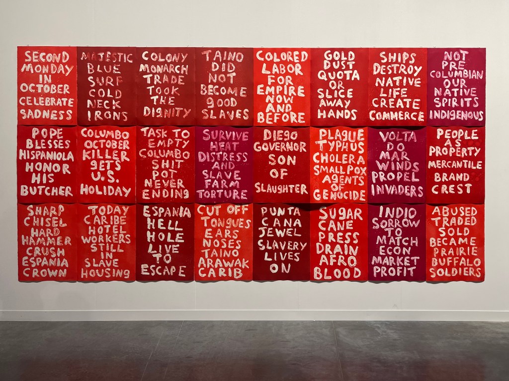
Other works range from Cauleen Smith’s mixed-media installation “SPACE STATION: A Rock in a River” (2018-22), with shimmering disco balls and accompanying films, to the protest poster-influenced “Columbus Day” (2019-20) by Hock E Aye Vi Edgar Heap of Birds (of the Cheyenne and Arapaho Nation) and Jonathas de Andrade’s “Lost and Found [Achados e Periods]” (2020-22), which features 25 burnt clay sculptures dressed in forgotten bathing suits the artist collected from swimming clubs in Recife, Brazil. Though some inclusions are more bombastic than others, even the more subtle works contribute to a sense of reflection and the search for new perspectives.

“Sculpted bodies, sexualized bodies, performing and singing bodies, brown, Black and white bodies, all come together to put into perspective concepts of beauty, feminism,” and more, Arriola adds. In the sector, works address gender and race, colonialism and cultural extraction, mechanized jobs and the lack of work. There’s even an imagined monument to the year 2020 by Devan Shimoyama. Though only a small sliver of the extensive art fair, Meridians is a staggering representation of artists and ideas.

Meridians is hosted in the north wing of the Miami Beach Convention Center. Art Basel runs through 3 December.

Images by David Graver