1991 Apron

Super-sturdy but soft and comfortable, Hedley & Bennett’s 1991 apron pays homage to the early ’90s thanks to its use of acid-washed 10-ounce denim. With two large lap pockets and a small double-compartment chest pocket, there’s plenty of room for notepads and pens for professionals, and whatever home cooks might need to tuck away. The generous 41-inch cotton waist straps make this piece one-size-fits-most, as does the adjustable neck strap.

Becoming a B Corp

B Corporations balance business with profit and have a legal obligation to consider how their practices affect those who work with them and the environment. But how do you become one? Danny Miller, co-founder of design agency Human After All, talks us through the process

The post Becoming a B Corp appeared first on Creative Review.

Studio Output creates rebrand for homeschooling platform Enjoy Education

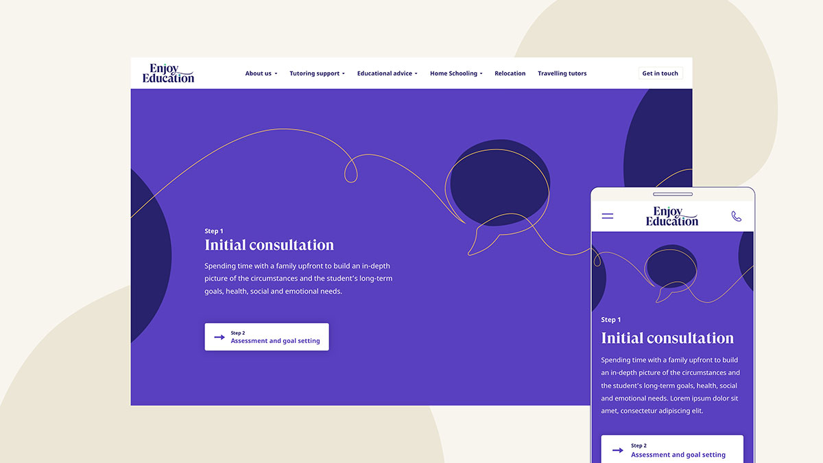
Home education has predictably seen a bit of a boom over the last six months. Enjoy Education, a private tutoring and homeschooling business that was set up in 2006, is just one in an evolving market of similar businesses, and so to help it stand out, Studio Output has created a new brand identity and website, which plays to the brand’s strengths. 

Perfectly timed for the back-to-school rush, the new identity has been inspired by Enjoy Education’s positive energy and vision for its clients which is, “happy, lifelong learning”. The brand aims to provide tailored support for all of its students in a joyful environment, so Studio Output has developed a playful design language centered around an organic ‘thread’. 

Enjoy Education brand guidelines

This so-called thread has been translated into an array of simple line illustrations and icons that can be manipulated easily, creating a sense of connection and movement, which is echoed throughout the identity.

Alongside the thread visuals are a series of freeform shapes that add interest to the modular design system, which is made up of structured grids and clear layouts. With injections of blues, purples and greens, the idea is to create a website that’s inviting but not overwhelming for newcomers. 

Enjoy Education’s previous logo was monochromatic and lacked character, and so the new iteration embraces the identity by mimicking this balance of rigour and spontaneity. For instance, the flourish of the y in Enjoy and the brightly coloured dotted i’s adds in a bit of interest and colour.

“It’s been a great journey with Output,” says Kate Shand, CEO and Founder of Enjoy Education. “They listened to our brief and worked in partnership with us to deliver our vision with a beautiful, innovative website.”


studio-output.com

The post Studio Output creates rebrand for homeschooling platform Enjoy Education appeared first on Creative Review.

The Royal Australian Mint launches the Donation Dollar

The Donation Dollar is the brainchild of Saatchi & Saatchi Melbourne, and at a time when charities are particularly struggling for donations in the pandemic, it is an innovative way to provide a gentle prompt for Australians to regularly give to charity.

Over time, the Royal Australian Mint plans to produce one Donation Dollar for each Australian, meaning that eventually millions of the coins will be in circulation. As legal tender, they can of course be spent on anything in the usual way, but the hope is that they will create “a loop of generosity” by inspiring people to donate. After all, if every Australian gave just one Donation Dollar a month, an additional $3 billion could be raised for charity over ten years.

The project, which launched on September 5, International Charity Day, has the full endorsement and support of the Community Council of Australia (CCA) – a collective of over 50,000 charity organisations.

“This is a world-first initiative that everyone at the Mint is very proud of,” says Mark Cartwright, Royal Australian Mint executive general manager – marketing, sales & innovation. “For over two years we have worked closely with our friends at Saatchi & Saatchi Melbourne to construct an approach that can make an extraordinary difference to Australians.

“We do hope that the Donation Dollars act as a gentle reminder that as individuals we have the power to help those that are doing it tough – the act of giving these dollars, multiplied over and over for many years, has the potential to make a significant contribution to the lives of many.”

More information on the Donation Dollar can be found at donationdollar.com.au

Credits:
Creative agency: Saatchi & Saatchi Melbourne
CCO: Mike Spirkovski
ECD: Simon Bagnasco
Creative director: Lee Sunter
Senior creatives: Adam Ferrie, Peter Cvetkovski
Head of design: Matt Alpass
Designer: Alice De Saulles
Finished artist: Juliet Symes
Digital design: Jarryd Hood
Production company: Revolver
Director: Stephen Carroll

The post The Royal Australian Mint launches the Donation Dollar appeared first on Creative Review.

Tom Wood’s 101 Pictures is a two-decade portrait of Merseyside

Tom Wood’s new photo book 101 Pictures features a range of the photographer’s work captured across a 23-year period around Merseyside, where he relocated from his native County Mayo, Ireland in 1978. Many of the photographs were taken within a ten minute walk from his home in Wallasey, and see-saw between high contrast flash photography and subtler takes on the everyday.

Images from Wood’s most celebrated photo series feature in the book, including All Zones Off Peak and Bus Odyssey, which are the fruits of his various journeys around the area by bus. In these series, Wood captures quiet moments among passengers, crowds waiting at bus stops, and views from the bus window.

Top image: Anyone got any hairspray?, 1983. Here: (Towards) Netherton, 1989. All images © Tom Wood, courtesy RRB Photobooks

The book also features images from his early 1980s series Looking for Love, including a photograph capturing a sea of meticulously coiffed women (shown top), affectionately titled Anyone got any hairspray?

The series captured the bustle and drunken interactions of people on a night out at the since shuttered Chelsea Reach disco pub in New Brighton – an area that also attracted the lenses of photographers Martin Parr and Ken Grant in the 80s and 90s.


Images from the series Photie Man (inspired by a nickname dished out to Wood by locals) and lesser-known photographs from his early career also feature. Elsewhere are glimpses of traditional gender roles and their associated rituals, whether in Women’s Market (the result of a 16-year Saturday morning ritual of visiting Liverpool’s Great Homer Street Market) or the shots of match day at both Liverpool and Everton grounds.

Spanning various series over a vast period, 101 Pictures offers a comprehensive view of Wood’s work in the Merseyside region. Yet beyond that, it serves as a warm documentation of the area, its people and their daily routines, while simultaneously capturing the easily overlooked magic of the everyday that has become a precious commodity in 2020.

King Street (tear stained), Wallasey, 1978
Finding a pair (colour film), 1990
Fashion sisters (sunglasses and platforms), 1973
Rachel, age 17, 1985
Our day out, 1982

101 Pictures by Tom Wood is published by RRB Photobooks; rrbphotobooks.com

The post Tom Wood’s 101 Pictures is a two-decade portrait of Merseyside appeared first on Creative Review.

Brave Ground named Colour of the Year for 2021

Brave Ground is Dulux's colour of the year 2021

Paint brand Dulux has unveiled a “reassuring” earthy beige hue called Brave Ground as its colour of the year for 2021.

Brave Ground was selected as an “elemental” hue that reflects “the strength we can draw from nature, our growing desire to align more with the planet and looking towards the future” – particularly in a world still dealing with the challenges of the coronavirus crisis.

Dulux decided on the shade after months of working with paint company AkzoNobel, and a roster of trend forecasters, design specialists, editors and architects from across the globe.

Brave Ground is Dulux's colour of the year 2021

“As a result of the global pandemic many people’s priorities are shifting significantly, to focus much more on their well-being,” explained creative director of Dulux UK Marianne Shillingford.

“Colour can play a significant role in this – and with the calming, restorative and natural tones of our ColourFutures 2021 palettes we hope to empower professionals to create spaces where occupants can reflect, recharge and recalibrate.”

Brave Ground is Dulux's colour of the year 2021

“The past year has seen how we live and work utterly transformed,” added Heleen van Gen, head of AkzoNobel’s Global Aesthetic Centre in the Netherlands.

“We have gone through the most uncertain of times, so it’s understandable that we see reassuring, natural tones returning, which can be used to create the calm and sanctuary people require.”

Brave Ground is Dulux's colour of the year 2021

As well as offering a sense of tranquillity, Brave Ground is also intended to be a versatile colour that can be applied to a variety of different settings. Shifting in tone throughout the day, the colour creates what Dulux and AkzoNobel describe as “subtly responsive environments”.

The two companies have additionally developed a handful of complementary colour palettes that can “sit comfortably” alongside Brave Ground – among them is Expressive, a collection of striking reds and pinks, and Timeless, a warm group of yellows and ochres.

Brave Ground is Dulux's colour of the year 2021

Brave Ground is slightly more muted in appearance than Tranquil Dawn, a cool-green shade that Dulux selected as its colour of the year for 2020.

At the time of its unveiling, interiors writer and former ELLE Decor editor-in-chief Michelle Ogundehin said in an opinion piece for Dezeen that the paint brand “could have been bolder” and opted for a stronger hue that more acutely reflected mounting global unrest.

American company Pantone is yet to announce its 2021 colour of the year – last year it chose Classic Blue, a “universal favourite” hue that is meant to “brings a sense of peace and tranquillity to the human spirit”.

The post Brave Ground named Colour of the Year for 2021 appeared first on Dezeen.

Manchester United reveals dazzle camouflage kit for 2020/21 season

Adidas creates Manchester United dazzle camouflage kit for 2020/21 season

Sportswear company Adidas has unveiled a striking, monochrome football kit for English club Manchester United with a pattern that looks like dazzle camouflage.

Set to be worn during the 2020/21 season, the Manchester United third kit features a black and white pattern that looks like dazzle camouflage – an arrangement of contrasting geometric shapes that was painted on warships during world war one to make range finding difficult.

However, although the shirt’s pattern has similarities with the 20th-century naval camouflage, Adidas did not look to the dazzle painting when designing the shirt.

Adidas creates Manchester United dazzle camouflage kit for 2020/21 season

“We call it dazzle because, obviously, it has a clear visual connection to it,” said Inigo Turner, design director at Adidas. “But, it wasn’t really part of our process in terms of the creation.”

“We looked at hacking culture, building things that are different from a collection of things which already exist, and then putting them together as an interesting combination,” he told Dezeen.

“I think, due to the black and white colour it ended up looking a lot more like dazzle than it had done before we went to the monochromatic colour palette.”

Adidas creates Manchester United dazzle camouflage kit for 2020/21 season

To create the shirt’s striking look Adidas looked back at some of Manchester United’s previous shirts and the history of Old Trafford stadium, which is celebrating its 110th anniversary this year.

Although the football club is not known for wearing stripes, the design team discovered that the club had worn them several times in its history.

Adidas creates Manchester United dazzle camouflage kit for 2020/21 season

“We came across a really interesting fact that 110 years ago at Old Trafford, Manchester United played with an alternative striped kit,” said Christiaan Barnard, global product manager at Adidas.

“And we thought, you know, that’s quite interesting considering that in modern-day football when somebody plays with an alternative kit, it’s never at the home stadium. It’s always on the road,” he told Dezeen.

“We soon came to realise that Manchester United had a few different striped variations throughout its history.”

Adidas creates Manchester United dazzle camouflage kit for 2020/21 season

The dazzle kit was created as an abstraction of the stripes found on the dark red hooped shirt used in 1900, the blue and white striped third kit worn 1994-96 and the three lines on the Manchester coat of arms, which represent the three rivers that run through the city.

The designers at Adidas wanted to use the stripes as the basis for a more adventurous shirt design.

“We didn’t want to do another striped shirt,” said Turner. “There are loads of striped shirts out there. Obviously everybody wears stripes, not just on football shirts.”

“We definitely didn’t want to just do something which would be easy or something kind of rather more predictable. So we really, really wanted to do something which redefined the way things can look,” he continued.

“We went into it with our eyes open and we know that it will divide opinion. I think it’s one of those kits which will grow on people and be looked back on in years to come.”

Adidas creates Manchester United dazzle camouflage kit for 2020/21 season

The abstracted black stripes cover the shirt’s front and sleeves as well as wrapping over the shoulders, while the rest of the back is plain white.

The shirts accents, including the player name and number, club logo, Adidas logo, and shoulder stripes are coloured red – the colour most associated with the club.

When Manchester United play in the kit it will be combined with white shorts and socks. Adidas has also created socks and shorts that are patterned with the dazzle effect for fans that want to complete the look.

Windbreakers and hats with different versions of the pattern will also be on sale.

Adidas creates Manchester United dazzle camouflage kit for 2020/21 season

Adidas hopes that the distinctive shirt will be remembered alongside previous bold shirts like Manchester United’s 1990-92 snowflake shirt or Germany’s 1990 World Cup shirt.

“I think it’s quite safe and straightforward to do a red home jersey a white away kit and a black third jersey every single season, and it’s fairly expected,” said Barnard.

“But what is a bit more interesting is taking fans on a bit of an immersion into what the club’s past. And it should be a journey. It should be something exciting it should it be something that fans look forward to every year – what’s the kit going to be, instead of kind of replicating the same thing every single season?”

Adidas creates Manchester United dazzle camouflage kit for 2020/21 season

“We were in the icon making business if we can achieve that then we’re happy,” said Turner.

“The proof will be in the test of time, that people will look back on it. I think like, something as iconic as this will be remembered.”

Adidas also looked back to history for its design of Arsenal’s 2020/2021 home shirt, which takes its form from the club’s 1930s art deco crest. While the sportswear company’s shirt for German club Bayern Munich pays homage to it Herzog & de Meuron-designed stadium.

The post Manchester United reveals dazzle camouflage kit for 2020/21 season appeared first on Dezeen.

This one universal cable was designed to Fast charge all your gadgets

The unofficial history of the MagSafe goes all the way back to Asia, when Asian electric kettle manufacturers used a similar magnetic detail to prevent kettles from falling over if someone tripped on the power-cord, and avoiding spilling scalding hot water on them. That safety feature found great use in the MagSafe too, which wasn’t designed so much to prevent human damage as it was to prevent tech-damage. Needless to say, the magnetic connector was a pretty great invention (whoever’s it was) but it never really carried forward into the modern smartphone era. It doesn’t make sense that it didn’t, considering smartphones are more likely to break than laptops are, and are arguably just as expensive.

The VOLTA Spark builds on a useful technology Apple abandoned years ago, and brings it into the modern age. The design revolves around a single cable and multiple magnetic pins that fit inside the ports of your various devices. The universal cable snaps onto the magnetic pins, allowing you to effectively charge different devices using the same cable without wasting time and energy fidgeting with connectors or aligning ports. The concept isn’t new, to be honest (we’ve seen our share of companies attempting it), but the VOLTA Spark does outdo them with its capabilities. For starters, the VOLTA Spark’s cables are far more durable than most, with a braided nylon outer cover to ensure your cable outlasts all your gadgets, and a lifetime warranty to drive the fact home. Anti-fray collars prevent any sort of damage, and the magnetic port-pins boast impact-proof durability too. The neodymium magnets on the cable and pins instantly align to create a secure connection, and disengage if you ever accidentally trip on the wire, so your gadget doesn’t go flying across the room!

Unlike most universal MagSafe cables, the VOLTA Spark is also capable of up to 100W of power delivery, allowing you to even use it to charge your USB-C laptop. The Spark supports fast-charging, giving you the ability to quickly charge your phones, laptops, and other devices, and even has an OTG power-delivery feature, which allows you to connect two devices to each other and transfer power between them. Armed with USB-C, Lightning, and MicroUSB pins, the VOLTA Spark covers all bases, working with phones, laptops, tablets, earphones/wireless headphones, gaming controllers, and a whole variety of other devices. Switching between devices is as easy as snapping the cable off one gadget and onto another, and the auto-aligning neodymium magnets do the rest – in fact the cables even come with a built-in LED to let you know your device is successfully charging.

The VOLTA Spark extends the convenience and safety the MagSafe brought when it came to charging expensive devices. Built to universally work across practically all your gadgets, the Spark seamlessly switches between devices so you don’t need to worry about having the right cable on you every time. Besides, that lifetime warranty even means it works with all the new devices you’ll buy too… speaking of which, rumor has that it the new iPhone won’t be coming with a charging cable inside the box.

Designer: Adedayo Charis of VOLTA

Click Here to Buy Now: $28 $42 (33% off). Hurry, only 61/150 left! Raised over $110,000.

VOLTA Spark – Charge Aall your Devices & Laptops

The VOLAT Spark is a universal cable that Fast charges all USB-C PD devices. Compatible with Apple MacBook Pro, iPhones, Samsung Galaxy, Google Pixel XL or any micro USB devices and more.

Overview Features:

– SnagSafe (Like MagSafe)
– 10x stronger than any other cable
– Supports: Data Transfer – CarPlay – Android Auto
– USB C-PD (60W – 100W)
– Reversible strong magnets
– Lifetime warranty
– Smart LED (Like MacBook chargers)
– Super fast charging (70% faster than regular cable)
– On-The-Go (Transform your phone into a battery pack)

SnagSafe – Like MagSafe

Like MagSafe, VOLTA Spark offers an extra protection by detaching from your device instantly if you accidentally snag the cord.

Cross Device Compatibility

Power any device with a micro USB, USB C (Universal/Android) or Lightning port (Apple). Unlike other charging cables, VOLTA Spark is equipped to power all USB-C devices including fast charging for the iPhone X series and MacBook Pro.

Charge Anywhere – On-The-Go

You can now transform your phone into a battery pack with VOLTA Spark. On-The-Go charging functionality allows you to share charge between your devices without the need for a charger or a power bank.

Premium Materials

– 18K gold-plated copper core plug guarantee a lightning-fast charge.
– 18K gold-plated needles deliver a faster, more stable current to your device.
– 3 layers of military-grade PVC protection, & anti-corrosive nickel-plating means your Spark will last forever.

World’s Strongest Magnetic Cable

Two perfectly aligned, N52-grade Neodymium reversible magnets in 360° orientation – at both ends – deliver an immediate, powerful connection in an instant. Just get the end of the cable close to the connector, and it snaps right into place.

VOLTA Spark connects (or disconnects) to your devices instantly, without effort. This is ‎especially useful at night when you’re trying to get a charge in the dark.

Lifetime Warranty

The Spark is 10 times stronger than the average ‎cable out there. The anti-scratch aluminum shielding ensures the ‎lasting, pristine condition of the connectors. PBV braiding and intelligent strain-relief collars ‎on the cable give it astounding agility, strength, and flexibility to enable our cables to be ‎strong enough to lift a brick or pull a vehicle.

3 Ways to Connect

1. Insert the charging tip into the port of your USB device or Smartphone or Laptop.
2. The Spark will magnetically connect when placed near the tip inside your device(s).
3. The smart LED lets you know your device is charging.

Data Transfer, Carplay & Android Auto

The Spark charges and sync at speed 480mbps.

Click Here to Buy Now: $28 $42 (33% off). Hurry, only 61/150 left! Raised over $110,000.

Daniel Schofield designs pinewood Crofton Stool that nods to Asian design traditions

Daniel Schofield's Crofton Stool

Products fairLondon designer Daniel Schofield has launched the Crofton Stool collection, made from locally-sourced pine, with Danish design company Please Wait to be Seated at 3 Days of Design.

The slender stool, which comes in three sizes and is made entirely from Nordic pine, was taken up by Please Wait to be Seated after creative director Thomas Ibsen saw the piece and got in touch with Schofield.

Daniel Schofield's Crofton Stool in black
The stools come in black stained pinewood, natural pinewood and cedar green stained pinewood

Schofield originally designed the stool in ash for an alumni stand at his university, Sheffield Hallam, at Salone del Mobile in 2018.

His aim was to create a robust stool that has a slender width but is still suitable for both bar and work areas.

The design of the Crofton Stool is reminiscent of Asian design traditions, though Schofield says this was more of a happy coincidence than something he had planned.

“I think that is something which Please Wait to be Seated see in the design, which I’m happy with!” he told Dezeen.

“Like many designers, I think the Asian aesthetic is a great influence on my work. It also has a lot to do with simplicity, so maybe that’s where they see the link.”

Daniel Schofield's Crofton Stool in pine
Crofton Stool collection was shown in Please Wait to be Seated’s Copenhagen showroom at 3 Days of Design

His intention with the Crofton Stool was to create a compact yet comfortable stool. “The design originally set out to try and save space when not in use and pushed up next to bars or workspaces, but still offer lots of comfort and solidity,” he said.

The stools are made from pine, a decision that Please Wait to be Seated made as the material is not only local but also fast-growing, which makes it a more sustainable option than many other types of wood.

“When you harvest the pine – in Sweden, Norway and Denmark – the forest owners plant new trees straight away, which creates a circle,” Please Wait to be Seated creative director Thomas Ibsen told Dezeen.

“Oak and ash grow very slow, so when it is cut it takes a hundred years for new trees to grow. And back in the days, pine was used for everything in Denmark – we didn’t import trees.”

Daniel Schofield's Crofton Stool in black and pine
The collection is made entirely from locally sourced pine

Schofield highlighted the use of the Nordic pine by following the grain of the wood when placing each piece and enhancing the surface with a subtle wood stain. He hopes that using it for the Crofton collection will help people to re-evaluate the material.

“Probably because it’s so ubiquitous to the area its perception can be somewhat undervalued, and Thomas really wanted to challenge that perspective,” the designer said.

Named after Schofield’s local London area, Crofton Park, the collection was unveiled at Please Wait to be Seated’s new showroom in Copenhagen as part of the 3 Days of Design festival.

The annual Danish design festival is spread across a number of showrooms, studios, shops and event spaces in the Danish capital and was originally set to take place in May, but had been postponed due to the coronavirus pandemic.

Product: Crofton Stool collection
Brand: Please Wait to be Seated
Designer: Daniel Schofield

About Dezeen’s products fair: the products fair offers an affordable launchpad for new products. For more details email sales@dezeen.com.

The post Daniel Schofield designs pinewood Crofton Stool that nods to Asian design traditions appeared first on Dezeen.

The Razer Naga Pro mouse comes with swappable shortcut-modules that let you easily customize it!

The guys at Razer strongly believe that a tech company shouldn’t dictate how you use their products. Products should serve their users, not the other way around, right?

Designed to customize based on your needs and applications, the Razer Naga Pro wireless mouse comes with 3 swappable key-modules to choose from. With 2, 6, and 12 keys, the modules attach on the left side of the mouse, right where your thumb would sit. The keys on the modules can easily be programmed to resemble keystrokes, trigger programs, commands, or even shortcuts, making it easy to play games, work with editing software, or just boost your productivity.

Apart from the swappable key-modules, the Naga Pro even comes with up to 8 buttons on its upper surface, giving you a total of 20 completely programmable buttons and a scroll wheel. The mouse boasts of an improved optical sensor with an industry-leading 20,000 DPI and 99.6% resolution accuracy, ensuring that even the finest of movements is tracked and registered with consistency. Even the keys on top are outfitted with optical switches with a response time of as little as 0.2 milliseconds, making sure whether you’re gaming or working, the mouse’s every movement executes as fast as your mind does. It does help that the Naga Pro comes with an incredible 150-hour battery life too, and a nifty charging dock to place it on when you’re not using it.

Designer: Razer

Click Here to Buy Now

Click Here to Buy Now