Therme Art presents panel discussion on Bauhaus in a post-pandemic world

Hans Ulrich Obrist, Virgil Abloh, Kunlé Adeyemi and others will discuss how the values of the Bauhaus can inform how we live through global pandemics in a panel discussion hosted by Therme Art and Dezeen. Watch live from 12:00 UK time.

Held at the Berlin Gallery Weekend, the talk is part of Therme Art‘s Wellbeing Culture Forum, a talks programme exploring the role of culture, art, design and architecture in promoting health and wellbeing in urban populations.

Therme Art is the creative arm of the Therme Group and provides artworks to its spas and resorts around the world.

Hans Ulrich Obrist, Serpentine Gallery artistic director, portrait
Hans Ulrich Obrist, Serpentine Gallery artistic director

Entitled Breaking Bauhaus, the talk is the first in a programme of events happening from 11-13 September at the König Galerie in Berlin.

The panel will discuss how Bauhaus principles can be applied to current challenges facing the world such as climate change and global pandemics.

Widely celebrated as the most influential art and design school in history, the Bauhaus was established by architect Walter Gropius in 1919 and is regarded for its approach to design education that combined both crafts and the visual arts, an approach that accelerated the development of modernist architecture and design.

Sumayya Vally, director of Counterspace, portrait
Sumayya Vally, director of architecture practice Counterspace

“The Bauhaus movement revolutionised our cities and lifestyles 100 years ago out of artistic impulse,” Therme Art explained.

“Today, under the mono-cultivation of our planet, climate change and viral pandemics, we ask ourselves what it could mean to renew the humanist Bauhaus idea?”

Serpentine Gallery artistic director Obrist, fashion designer Abloh and designer Adeyemi will be joined on the panel by artist Nicholas Grafia, London-based curator Roya Sachs, Counterspace director Sumayya Vally and Art Basel director Marc Spiegler.

Virgil Abloh portrait
Fashion designer Virgil Abloh

The talk is the latest in Therme Art’s Wellbeing Culture Forum talk series and the first to be held in real life following the ease of coronavirus restrictions in Germany.

The panels have dealt with topics such as how art and architecture can contribute to healthy urban environments, the importance of live events during global crises, the role of culture in the built environment, how to design healthy and happy cities and how to maintain the wellbeing of city dwellers.

As part of Dezeen’s collaboration with Therme Art,  we will also be livestreaming Therme Art’s Growing Gaia talk today, a panel discussion exploring how architects and designers can realise the Gaia Hypothesis proposed by biologist Lynn Margulis and chemist James Lovelock in the 1970s.

The panel will feature participants such as Obrist, architect Francis Kéré and founder of Parley for the Oceans Cyril Gutsch, amongst others, and will be split into two sessions, beginning at 2:00pm and 4:00pm UK time respectively.

The post Therme Art presents panel discussion on Bauhaus in a post-pandemic world appeared first on Dezeen.

Discover the MullenLowe NOVA Award winners 2020

Each year, the MullenLowe NOVA Award recognises the most innovative work produced by BA and MA students at Central Saint Martins, one of the world’s leading art and design colleges. Last year, womenswear designer Fredrik Tjærandsen won the top prize for his morphing inflatable rubber designs, while Elissa Brunato, who graduated from the Material Futures course, was awarded the Creative Innovation prize for her sustainable sequins.

Out of the 1,300 students graduating from Central Saint Martins this year, the winners of the five awards have been selected from 14 shortlisted entries, with BA Fashion Print graduate Sandra Poulson clinching both top spot and the people’s choice award for her project An Angolan Archive.


MullenLowe NOVA winner Sandra Poulson

Poulson’s inter-disciplinary work features roughly 200 pieces spread across garments, photography, performance, sound and video. It draws on other materials such as written texts, research images and common Angolan items that feature in the final piece, which explores the relationship between family and inherited societal memory from colonial Angola and the civil war.

“This project started with a research trip to Luanda, my hometown, where I spent a month capturing and engaging with the daily life of the city, from informal settlements to downtown Luanda. I documented around 3,000 pieces of information through photography, video and voice recordings,” Poulson explains.

MullenLowe NOVA winner Sandra Poulson
An Angolan Archive by Sandra Poulson

The work, she says, “acknowledges that an archive is colonial in outlook. Therefore, the task of decoloniality is central to An Angolan Archive, as the notion of African-led own archives is still to confront the current realities being depicted by external bodies.” Besides winning the main award, An Angolan Archive was also the recipient of the YourNOVA Award decided by a public vote.

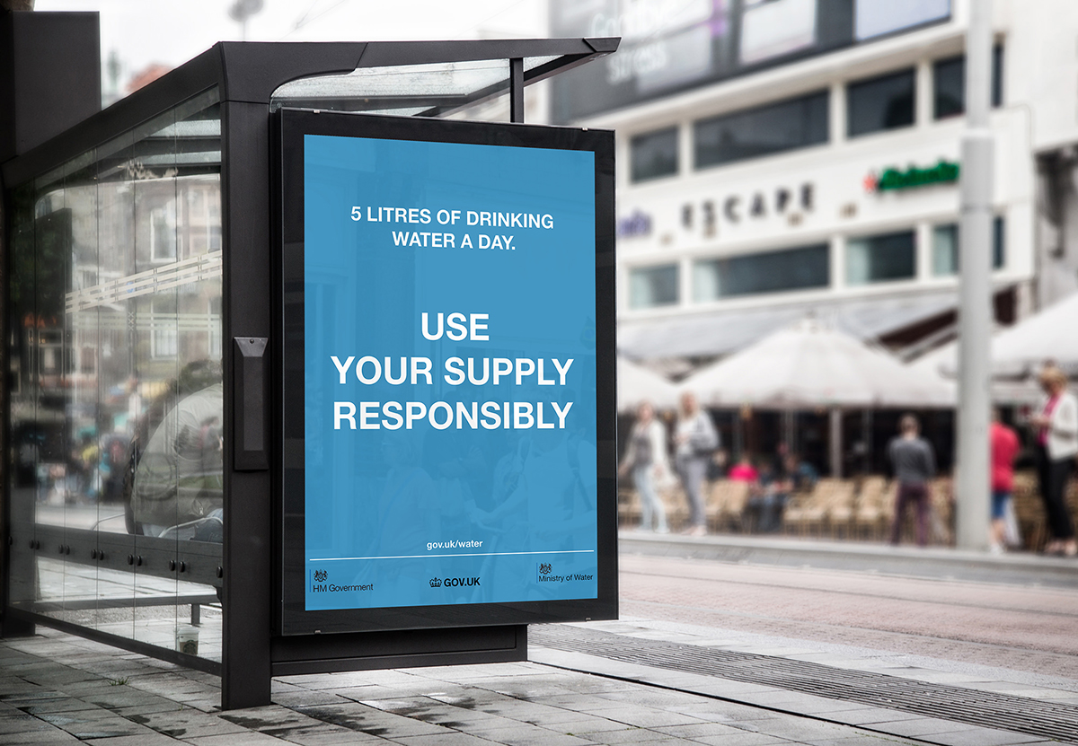
The runners up to the main award are MA Industrial Design graduate Joseph Standing, whose work Aqua No More questioned how England would look in the face of diminished freshwater supply. The speculative project takes the form of a public engagement campaign, utilising a combination of voicemails and graphics to warn the public of water pollution and fragile water ecosystems, and the future implications of these dangers.

MullenLowe NOVA runner up Sandra Poulson
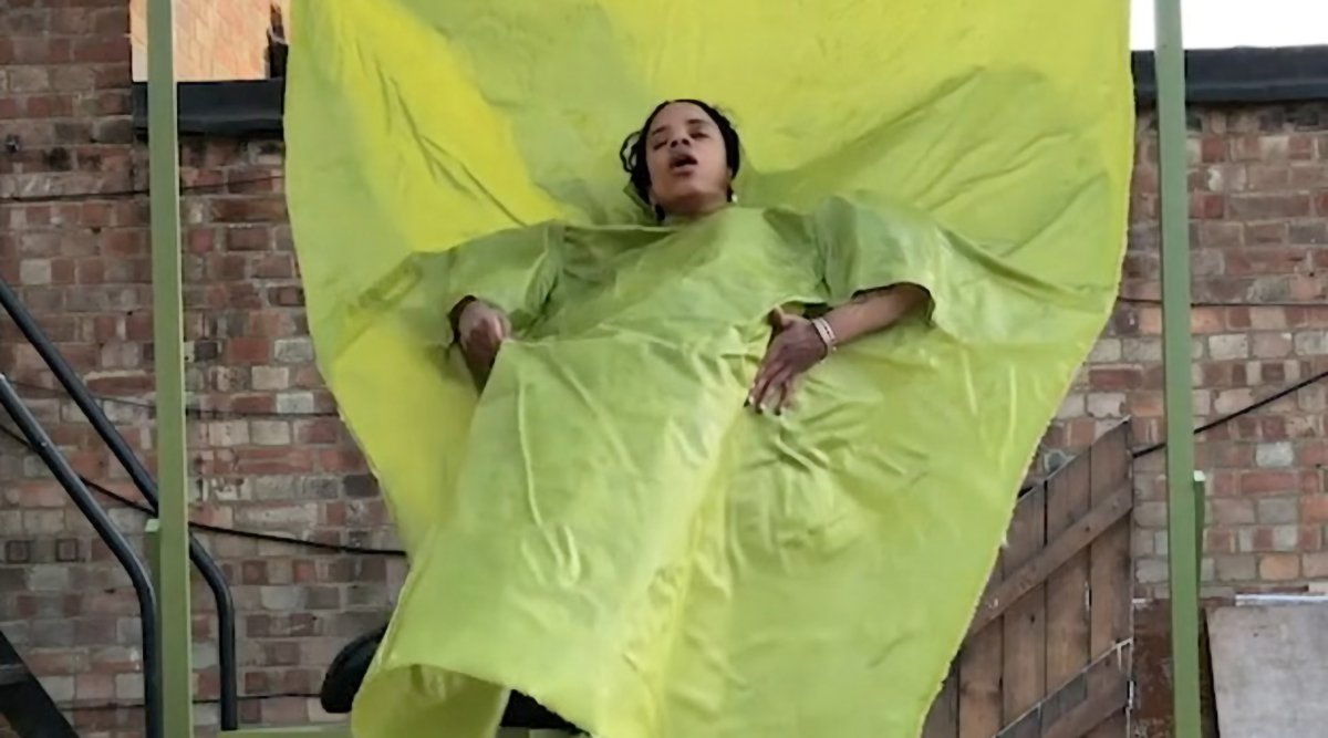
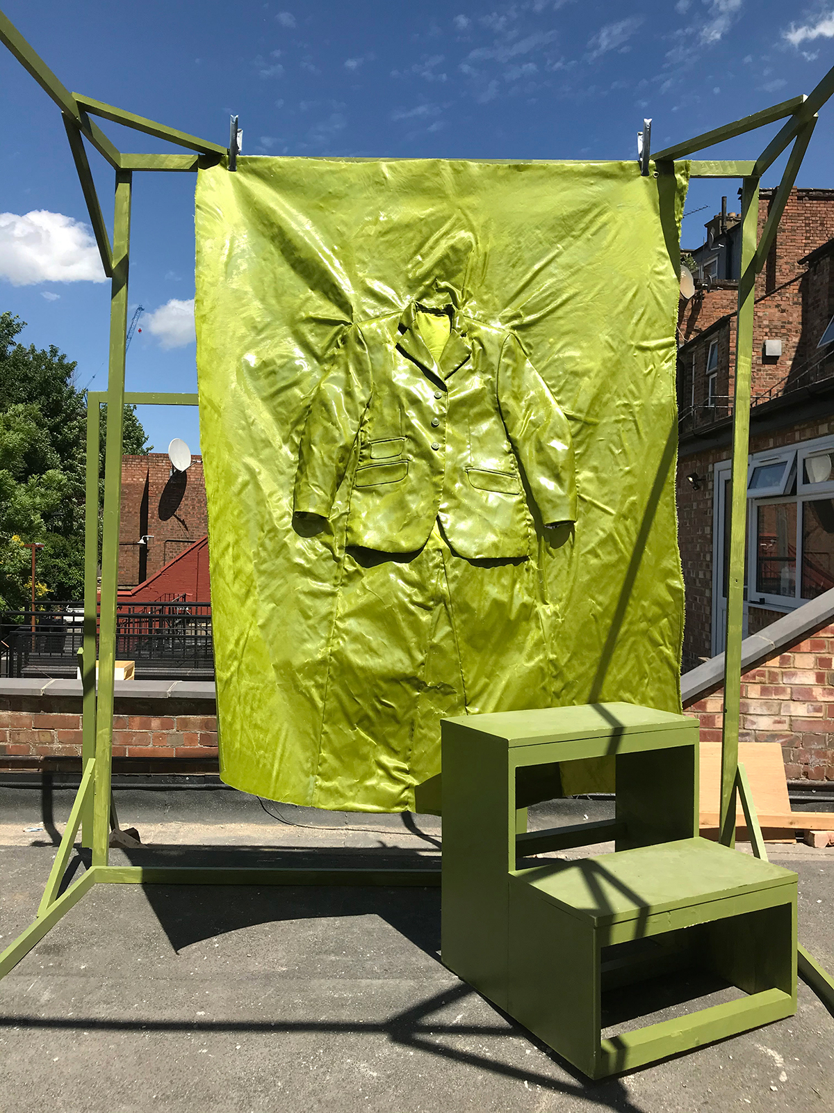
Top image and here: Modular Augmented Capsule by Mathilde Rougier

Fellow runner up Mathilde Rougier, who graduated from the BA Fashion Design Womenswear course, created a fashion collection that explores ideas of circular models, namely how restoring damaged data can act as a form of creation. The underlying concept aims to examine how existing materials and inspiration can be used for new ideas, using a modular assembly inspired by pixels on a screen.

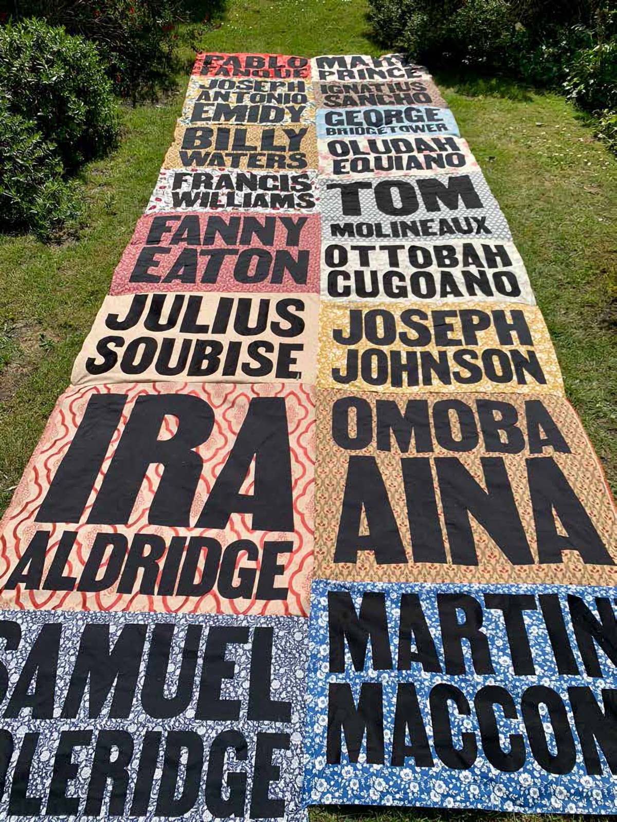
The final award – Unilever #Unstereotype – went to BA Graphic Communication Design graduate Jahnavi Inniss, whose project Representation investigates the contribution Black people have made to British society. Inniss explored methods of establishing visibility and representation when it comes to Black British History, producing a five-metre long quilt and an online directory to share stories, as well as a set of educational resources.

The project was influenced by Stuart Hall’s theory of representation and Roland Barthes’ semiotic theory, and used examined public monuments and memorials as well as the education system. Speaking of the project, Inniss said: “What I’ve explored is just one small fragment, and there are so many more stories and histories that need to be told.”

YourNOVA winner Jahnavi Inniss
MullenLowe NOVA runner up Joseph Standing

mullenlowenova.com

The post Discover the MullenLowe NOVA Award winners 2020 appeared first on Creative Review.

Revolutionising textiles with ecology

London-based designer and researcher Natsai Audrey Chieza has spent the best part of a decade evolving the use of natural systems in textile design and production. She talks to Megan Williams about her practice and why it’s still an uphill battle to engage with the fashion industry

The post Revolutionising textiles with ecology appeared first on Creative Review.

Introducing the D&AD Awards 2020 winners

In what has been an all-round difficult year for awards in the wake of the pandemic, D&AD announced the winners of the 58th edition of its annual awards scheme in a virtual ceremony last night.

Designed by Studio Dumbar and hosted by D&AD president Kate Stanners, the virtual ceremony saw four Black Pencils – the award scheme’s highest accolade – given out, and 618 pencils awarded overall.

Ingo Stockholm, David Miami and Publicis Bucharest took home a Black Pencil in the PR category for their striking Moldy Whopper campaign for Burger King, which demonstrated the fast food chain’s fresh food credentials by showing exactly what happens to its Whopper burger when it’s left for 35 days.

Other projects awarded Black Pencils include FCB Chicago’s The Gun Violence History Book for Illinois Council Against Handgun Violence, which visually captures how there has been so much gun violence in America that if it was all captured in a book it would probably stop a bullet, and FCB/SIX’s pan-African tourism campaign Go Back To Africa, which puts a clever spin on what has historically been used as a racial slur.

Universal Sans typeface by Family Type

Meanwhile, Universal Sans became the first typography entry to win a Black Pencil. Created by Family Type, the variable typeface allows for an extensive range of customisation and unique variations, bringing a flexible and adaptable typeface to a wider audience.

Following in the footsteps of 2019 recipient Es Devlin, this year’s President’s Award went to Yuya Furukawa, chief creative officer at Dentsu, for his outstanding contribution to creativity.

The organisation also named its top ad agencies, design studios, production companies and clients of 2020, with the top places going to David Miami, FCB Design Group, Iconoclast Paris and Burger King respectively.

Following a campaign by D&AD that looked back at the last ten years of Black Pencils, Rivers of Light, a 2012 campaign illuminating rivers with messages for soldiers in Colombia, was voted as the industry’s overall favourite, and advertising Black Pencil of the decade.

Meanwhile, Libresse’s 2019 spot Viva la Vulva was awarded Craft Black Pencil of the Decade and Palau Pledge – a 2018 campaign that asked visitors to Palau to sign an agreement in their passports promising not to damage the island’s resources – won in the design categories.

See all of this year’s winners at dandad.org/en/d-ad-awards

The post Introducing the D&AD Awards 2020 winners appeared first on Creative Review.

Django Django’s Spirals video is a fantascopic trip

The director returned to an animation technique that’s well over a hundred years old to create the video, which uses fantascopes – discs that spin on a turntable to create gif-like moving images.

The video features six of these fantascopes, all made by hand but combined with digital techniques. According to Kelly, the images are an attempt to “translate the psychedelic trip”.

“The visual illusion generated by spinning the disks at the correct speed coupled with the shutter of a camera is both confusing and hypnotic,” he explains.

“I was drawn to how the animations flow in and out, drifting and duping the mind and then back again. This felt a lot like the psychedelic experience to me. The challenge was to fuse the old with the modern. The analogue and the digital.”


Spirals is released on Because Music, djangodjango.co.uk

Credits:
Director: Maxim Kelly
Production company: Caviar
DOP: Jordan Buck
Art director:Jess Morgan

The post Django Django’s Spirals video is a fantascopic trip appeared first on Creative Review.

This transparent face mask is powered by a fan that pumps in clean, filtered air and pulls out CO2

I often get told that there are way too many masks out there, and my response is almost always “there are way too many smartphones, laptops, and cars out there too”. Each mask, just like each phone, each car model, or each sneaker design, hopes to make its own impression, solve its own set of problems, and create a positive impact on the user and help the company earn a fair amount of money that then goes into delivering better products. Meet the weetbe mask, one of many masks featured on this site. Unlike other masks though, weetbe has a set of properties unique to it. It’s transparent, comes with not two but three filters, has an attachable face-shield component, and the best part, a modular fan-unit that snaps onto the filter on the front, power-delivering clean, filtered air to your nose and mouth for as long as 8 hours.

Drawing on the analogy of masks and mobile phones, the weetbe mask offers a level of modularity that reminds me of Google’s Project Ara. The mask itself is a functional face-mask with a transparent body, hypoallergenic design, and certified filters… but its ability to snap-on extra modules is what makes it wonderful. The weetbe comes with a clear, see-through body complete with an air-sealing lining and an anti-fog coating. Adjustable straps help secure the mask around your face, while filters on the front as well as the sides help you breathe 98% clean, purified air. The mask comes fitted with Proveil filters, which are made from nanofibers that are small enough to trap respirable airborne particles including viruses. These filters are reusable, can be washed or steam-sterilized, and are made to biodegrade too, allowing you to replace them easily and guilt-free.

The most anticipated feature about the weetbe, however, is the snap-on fan module. Referred to as the ‘fan osaka’, the fan module snaps right onto the front, pushing air through the anterior filter to create positive air pressure inside the mask. Built with its own lithium-ion battery, the fan works for 8 hours on a full charge and works silently. The module is smaller and lighter than you’d think, still retaining the mask’s transparent appeal, and is perfect for snapping on while exercising, jogging, or even for elderly people who find it difficult to breathe through a mask. Backers of the weetbe can even opt in for the ‘screen osaka’ a snap-on-snap-off face shield made from clear polycarbonate, offering a pristine, see-through barrier that protects the upper half of your face. The screen sports a similar anti-fogging feature, making sure your view isn’t ever obstructed by condensation.

Other features of the weetbe include its ability to be customized, with a custom skin you can apply on the inside of the mask, turning its transparent body into a canvas of print. The head-bands are customizable too, allowing you to add a name or company logo on. The weetbe is even splash-resistant, which means you can easily wear it out in the rain… and its transparent design, aside from enabling you to use facial unlocking on your phone, just gives you the freedom to breathe clean air and be protected without having your face concealed by opaque fabric or plastic. Besides, it helps to be able to smile at friends, neighbors, and other people too!

Designer: Weetbe Design

Click Here to Buy Now: $30 $75 (60% off). Hurry, only 60 left!

weetbe – Transparent Face Mask with Attachable Shield & Fan

weetbe is an all in one transparent face mask that comes with three filters, has an attachable face-shield component, and a modular fan-unit that snaps onto the filter delivering clean, filtered air to your nose and mouth for as long as 8 hours.

fan osaka – Snap-on Fan Module

screen osaka – Attachable Face Shield

Designed to give extra protection to doctors, nurses, waiters/waitresses who are in constant contact with the public.

Transparent Design

The transparent design enhances visual communication between people. In addition, it makes listening and lip-reading easier for the hearing impaired.

+98% Air Filtration

Creative Process & Prototypes

Click Here to Buy Now: $30 $75 (60% off). Hurry, only 60 left!

Christ & Gantenbein unwraps Lindt Home of Chocolate on Lake Zurich

Architecture studio Christ & Gantenbein has completed a museum for chocolate brand Lindt alongside its headquarters in the Swiss town of Kilchberg on Lake Zurich.

Built alongside Lindt’s factories and corporate headquarters, Lindt Home of Chocolate contains a museum dedicated to the history of chocolate and the brand.

Lindt Home of Chocolate by Christ & Gantenbein facade
Christ & Gantenbein’s Lindt Home of Chocolate. Top image: The museum’s entrance 

Basel-based architecture studio Christ & Gantenbein designed the museum with a simple red brick exterior to match the surrounding historic factory buildings.

The entrance facade of the cuboid-shaped building, however, is clad in white glazed brick and shaped in a curve to create a focal point and public square.

Lindt Home of Chocolate by Christ & Gantenbein giant atrium
Lindt Home of Chocolate is arranged around a large atrium

“But the Lindt Home of Chocolate reacts with a cutout to form its entrance and a public space, so it doesn’t range in the purely utilitarian typology anymore,” the studio told Dezeen.

“Through this curvature, it becomes somehow monumental,” it added. “The gesture is emphasised by the change of material.”

Lindt Home of Chocolate by Christ & Gantenbein atrium
Circular balconies animate the space

Within the building, Christ & Gantenbein created a “playful” space to contrast the more utilitarian exterior.

“There is a certain contrast between its rather hermetic envelope and an open and playful interior,” said the studio.

“The chocolate is implicitly celebrated with round shapes, a soft touch, and maybe even a general sweetness.”

Lindt Home of Chocolate by Christ & Gantenbein spiral staircase
A series of spiral staircases also surround the atrium

The museum is arranged around a large – 64 metres long, 15 metres high, and 13 metres wide –  atrium that contains the world’s largest chocolate fountain, which is nine-metres tall and topped with an over-sized whisk.

Surrounding the atrium a series of spiral staircases, round load-bearing pillars and circular balconies animate the space.

Lindt Home of Chocolate by Christ & Gantenbein in Kilchberg on Lake Zurich
The museum was built alongside the Lindt headquarters in Kilchberg. Photo is by Raphael Alu

“Almost reaching an ancient Roman scale, we’ve created an exaggeration of industrial production with a certain tension; a tension that gives a strong presence to the architecturally distinct elements that define the interior, bridging the substantial gap between a commercial ambience and classical grandeur,” said Christ & Gantenbein co-founder Emanuel Christ.

“To celebrate the experience of chocolate in many ways, we’ve scripted the Lindt Home of Chocolate’s interior as a space that orchestrates the movement of people.”

Lindt Home of Chocolate by Christ & Gantenbein in Kilchberg on Lake Zurich
Lindt is based alongside lake Zurich

Alongside the atrium on the ground floor will be a reception area, a 500 square-metre shop and a cafe, which also has outdoor seating.

The museum exhibits including an interactive chocolate tour, which were designed by Atelier Brückner, were placed on the floors above.

Architecture studio Christ & Gantenbein, which is led by Christ and Christoph Gantenbein, was named Architect of the Year in Dezeen Awards 2018. The studio has previously completed a concrete extension to the National Museum Zurich and designed a monochrome building for Kunstmuseum Basel.

Photography by Walter Mair unless stated otherwise.

The post Christ & Gantenbein unwraps Lindt Home of Chocolate on Lake Zurich appeared first on Dezeen.

Atkinson Hyperlegible typeface is designed for visually impaired readers

Atkinson Hyperlegible typeface for visually impaired on Braille Institute branding

Graphic designer Applied Design Works has collaborated with the nonprofit organisation Braille Institute to develop a “hyperlegible typeface” for the visually impaired community.

The font family, which is named Atkinson Hyperlegible after Braille Institute founder Robert Atkinson, is composed of distinct and exaggerated letterforms crafted by Applied Design Works to increase character recognition and the readability of written content.

It is free of use by anyone who wants to make their own written materials widely accessible and can also be used for signage or to help people with good vision read quickly and accurately.

Overview of Atkinson Hyperlegible typeface for visually impaired people
Atkinson Hyperlegible is a typeface for visually impaired people

Atkinson Hyperlegible was developed by Applied Design Works while creating a new visual identity for the Braille Institute to reflect a growing number of people around the world with vision impairment and the organisation’s efforts to serve this community.

However, during this process, Applied Design Works discovered that a typeface that mirrored this goal and met the needs of people with low vision did not exist.

Atkinson Hyperlegible typeface for visually impaired on Braille Institute branding
It was made with the Braille Institute to have distinct and exaggerated letterforms

“There was no brief for the Atkinson Hyperlegible typeface, it was born simply out of a strong desire to improve the lives of people with low vision,” explained Applied Design Works.

“The number of people who live with low vision is increasing at an incredible rate as people live longer and chronic conditions like diabetes that cause damage to people’s eyes,” the studio continued.

“The Braille Institute asked Applied Design Works to help them with a new positioning and visual identity to reflect a significant shift in the way the organisation helps people adapt to vision loss.”

Atkinson Hyperlegible typeface for visually impaired on Braille Institute branding
It has been used as part of the Braille Institute’s rebrand and brochures

Atkinson Hyperlegible, which has since been shortlisted for the Dezeen Awards 2020 in the Graphic design category, is available in four font styles – regular, bold, italics, italics bold.

To ensure the readability of each font, they were developed in a collaboration with a low-vision specialist from the Braille Institute and a panel of people with visual impairments. The font family also has accent characters to support 27 languages.

Atkinson Hyperlegible typeface for visually impaired on Braille Institute branding
The brochures feature bold and regular Atkinson Hyperlegible fonts

Unconventionally, Atkinson Hyperlegible prioritises letterform distinction and clearly defined letter shapes over visual consistency and aesthetic appeal.

In this way, the typeface borrows elements from different font types and families that would not usually be teamed together.

“Atkinson Hyperlegible may prove to only the first of its kind in a newly imagined category of hyperlegible typefaces,” the studio explained. “Typefaces that break with the longstanding tradition of letterform harmony and focus instead on letterform distinction to increase character recognition.”

Atkinson Hyperlegible typeface for visually impaired on Braille Institute bag
A Braille Institute bag with the bold Atkinson Hyperlegible font

This is evident where the capital letter I has been characterised with serifs but the capital letter T has not. Serifs are the decorative stroke that finishes off the end of a letter stem and are typically consistent within a font family.

Similarly, some letters feature curved tails while others are straight – as seen when comparing the capital and lowercase Q.

Atkinson Hyperlegible typeface for visually impaired on Braille Institute logo
Atkinson Hyperlegible was used for the Braille Institute’s logo

Other key details that have been used to exaggerated shaping of letters include angled spurs, the part of a letter that extends from a curve.

Meanwhile, circular detailing on many of the letters is designed to evoke braille dots, as a nod to the history of Braille Institute.

Atkinson Hyperlegible typeface for visually impaired on Braille Institute business card
It has been used on Braille Institute’s stationary and business cards

Other new font families that feature on Dezeen include Body Type by Julius Raymund Advincula that is made from cleverly positioned body parts, the first digital typeface family for the Welsh language by Smörgåsbord and a typeface called Sans Forgetica that aims to aid memory.

The post Atkinson Hyperlegible typeface is designed for visually impaired readers appeared first on Dezeen.

Amazon’s 3-in-1 humidifier doubles up as an aroma diffuser and a night-lamp

No, it isn’t Harman Kardon’s latest speaker or a fancy upgrade of the Amazon Echo. This is, in fact, the Amazon Basics Humidifier which also comes with a built-in fragrance diffuser, as well an ambient lamp at night.

I’m not entirely sure whether the resemblance to the Harman Kardon Aura Studio is intentional or not, but it definitely gives the Amazon Humidifier a certain visual appeal. The humidifier is powered by ultrasonic tech that helps create a uniformly distributed mist of vapor in the air. An auto-sensing mechanism allows it to switch on when the air gets exceptionally dry, and turn off after a while. Available in 2 sizes (2L and 4L), the humidifier even integrates an oil-diffuser tray, allowing you to put a few drops of your favorite essential oil in and having the fragrance waft into the air around you, and comes with a built-in night-light that emits an ambient blue glow. Besides, you could easily just hide an Echo Dot behind it and pretend you’ve got yourself a fully pimped-out Harman Kardon setup… I promise I won’t judge.

Designer: Amazon

Click Here to Buy Now

Click Here to Buy Now

This entire cleaning spray fits into a single water-soluble tablet to help cut plastic consumption

Here’s some food for thought. That bottle of shampoo, disinfectant, liquid soap, or detergent is essentially 80-90% water. Extract all that water and reduce the product down to simply its dry ingredients and they hardly occupy any volume or weight. The fact that you’re literally paying for 9 ounces of water every time you buy a 10 oz bottle of cleaning liquid isn’t just an economical issue, it’s an ecological one too. Shipping a bottle with 90% water is a waste of cargo space and fuel, as well as a waste of that large plastic bottle which eventually gets thrown into the garbage when the liquid runs out.

1N9 helps cut all that down by condensing your bottle of cleaning liquid into a single compacted pill of dry-ingredients. Pop the pill into a regular plastic spray bottle filled with water and the pill disintegrates, turning the water into cleaning liquid… when the liquid runs out, just pop another pill in and repeat the process. You save up on money (because a pill of dry-ingredients doesn’t cost as much, and you end up reusing the same spray bottle instead of buying a fresh bottle every time! Plus, 1N9’s cleaning pills are made from 100% natural ingredients, making them safe for you as well as for the environment! Double win!

Designer: Supublic for 1N9 Modern Cleaner