This spotlight-inspired speaker solves three problems to elevate your Netflix binge sessions

Have you ever been told that you are sitting too close to the TV? Or do you have an urge to always turn up the volume so you can drown out the noises from the environment around you? Have you strained your eyes to read the subtitles because you cannot sit too close to it at night and neither can you increase the volume? We need technology that makes watching TV from a distance a convenient and pleasurable experience without being that noisy neighbor and this conceptual speaker is here to solve exactly that problem!

The sound/spot was designed to route the sounds from the TV to the viewer and limit it to their area. It promotes a healthier relationship with watching TV, especially for kids who tend to sit closer if they can’t hear or raise the volume to an obnoxious level without understanding the impact it has on the health. The aesthetic and the sound distribution was inspired by a spotlight’s directionality and scope to shine in a specific space. The technology in sound/spot is taken from a sound signage speaker that has been reimagined as a lamp to disperse sound instead of light while blending in your interiors, unlike a bulky sound system.

For product stability, the speaker protrudes a little outside the center axis. The stand also features magnetic clips to keep the wires seamlessly attached to itself than hanging around for a cleaner look. A round magnetic remote control is also included. Its unique shape makes it stand out because at a first glance you would never associate it with a speaker. The standing lamp style lets you fit it in tight corners without occupying much of floor space or adding visual weight to the room. This speaker is certainly shining a light into a new direction for designers to make experiences better while also accounting for the health factor.

Designers: Kihyeon Kim, Lee Hyo Min, and Seongmin Kwon

Holly Grounds develops dissolvable ramen packaging that turns into sauce

Holly Grounds develops dissolvable ramen packaging that turns into sauce

Product design student Holly Grounds has replaced the many plastic sachets that accompany a pack of instant noodles with an edible, spice-infused wrapper that breaks down when cooked to season the broth.

The packaging consists of a flavourless biofilm, which is made from only a handful of readily-available ingredients including potato starch, glycerin and water.

Once it has been heat sealed, the film keeps the dry noodles from going stale. But as soon as it comes into contact with boiling water it dissolves in less than a minute.

With herbs and flavourings embedded into the packaging itself, the resulting liquid effectively acts as the sauce, while larger ingredients such as dried shrimp are stored loosely in the parcel before being released into the broth.

Holly Grounds develops dissolvable ramen packaging that turns into sauce

“I was able to do all the testing and manufacture in my kitchen as the process is very simple,” explained Grounds, who is a recent graduate from Ravensbourne University London.

“The ingredients are blended and heated until the mixture is at the right thickness. At this point, I add the spices and flavourings before pouring it into a mould to set for 24 hours.”

Holly Grounds develops dissolvable ramen packaging that turns into sauce

The resulting film is then wrapped around the dried noodle blocks, reimagined in a doughnut shape to allow them to cook more evenly and fit more neatly into a bowl.

For hygiene purposes, the individual parcels are stored in a wax-coated paper sleeve.

Grounds was motivated by the many long days and nights she spent studying, which were fuelled by packets of instant ramen often containing “more plastic than noodle”.

She became hyperaware of the irony that a dish that was designed to be cooked and eaten in under ten minutes comes in packaging that takes upwards of eight decades to decompose.

Her dissolvable wrapper was conceived as an alternative to this mountain of single-use plastic, as well as to its bioplastic substitutes, which she says often fall short of their promises.

“While other bio-based alternatives to plastic claim to be compostable or biodegradable, from a consumer perspective it’s not always that simple,” Grounds told Dezeen.

“Many of the emerging bio-based films only break down in an industrial composter at 50 degrees Celcius, so they often end up in the wrong place without the consumer really knowing that they caused damage to the planet.”

In order to avoid this potential greenwashing, she created packaging that actually disappears before the eyes of the user and gives them peace of mind.

Holly Grounds develops dissolvable ramen packaging that turns into sauce

Grounds also conducted a speed-cooking test, to challenge the idea that plastic is always the more convenient option. She found that noodles wrapped in plastic took a full minute longer to prepare than ones packaged in her biofilm, due to the time-consuming process of opening and emptying individual flavour sachets.

“Convenience has become an inevitable part of everyday life but it often comes at a cost to the environment,” she said.

“The issue is that the world is not only confronting a rapidly growing mountain of plastic but also an even greater mountain of apathy. That’s why it was important to me to make the convenient choice the sustainable one. If the quick option for meals or snacks is eco-friendly, consumers can help the planet perhaps without even knowing.”

Holly Grounds develops dissolvable ramen packaging that turns into sauce

Earlier this month, her Dissolvable Noodle Packaging was featured in the VDF x New Designers graduate show, which spotlighted 20 standout student projects from across the UK.

The project was selected from a pool of more than 3,000 participants, who were set to be featured in the annual exhibition before it was called off due to the ongoing pandemic.

With the global waste crisis mounting in landfills and spilling into our oceans, more and more designers are looking at innovative ways to package our everyday goods.

Reykjavík studio At10 has created a bioplastic casing for different meats, which is made from the animal’s skin, while Polish designer Roza Janusz has grown edible food wrappers using bacteria and yeast.

Another packaging design that dissolves with use is the Soapack toiletry bottle by Central Saint Martins graduate Mi Zhou, which is itself made of soap.

The post Holly Grounds develops dissolvable ramen packaging that turns into sauce appeared first on Dezeen.

This Week on Fubiz Prints : Graphic Designer Tein Lucasson

Cette semaine, Fubiz Prints vous propose de découvrir un nouvel artiste dont vous pourrez acquérir les oeuvres jusqu’au 20 juillet 2020 12h (heure française). Nous vous présentons le Graphic Designer Tein Lucasson.

Graphiste de métier, Tein Lucasson est un directeur artistique néerlandais et producteur créatif de plusieurs marques. Il reprend les codes des portraits classiques pour créer des portraits d’animaux décalés. Il vous propose ainsi une sélection de créations dont chacune est disponible au prix unique de 39€.

Vous pourrez vous procurer une impression numérotée et donc unique d’une de ses créations durant une semaine, au format de 48 x 68 cm imprimée sur un Papier d’art de qualité MOHAWK (175gsm Superfine Eggshell). Vous avez jusqu’au lundi 20 juillet 12h (heure française) pour commander votre oeuvre favorite. Le temps vous est compté !


Montecarlos Snapchilled Coffee

Founded by engineer David Dussault, Elemental Beverage Company uses proprietary technology to “snapchill” hot coffee in seconds. This process maintains lighter, fruiter, and acidic notes without dilution or drawn-out freezing and thawing processes. These innovations benefit the brand’s canned collaborations, special blends made with a roaster. Elemental worked with George Howell, a Boston-based coffee company, to produce a snapchilled can of coffee from the Montecarlos farm in El Salvador. Light and refreshing, and almost a polar opposite of the typical dark-roasted cold brews, this release features notes of soft milk chocolate and fresh tangerine. The Montecarlos can is only available in six packs.

This infinity track topped school is a vertical forest that reduces air pollution!

It is 2020 and we have to get with the green program. Indian architecture studio Nudes, known for its unconventional innovative creations, has designed a school with an exterior wrapped in a forest-y cover and an infinity-shaped cycling track for its crown. Forest School was an idea that was born as an entry for a design competition and it is now a possibility to change Indian architecture to suit the environment.

Nudes was founded by Nuru Karim in 2007 with a mission to focus on sustainability and learning. The Forest School was designed for Pune which is a popular student city that has seen dramatic urban growth in the last decade. Due to this boom, the air pollution in Pune was four times higher than the safe standard set by the World Health Organisation. Nudes wanted to create a structure that served a purpose complemented by design – a healthy school environment, with opportunities for hands-on learning about the environment and climate change.

“The ‘green living skin’ serves to purify the air from pollutants and related challenges affecting the health of the inhabitants of a city,” says Karim. The plants are crucial in creating a healthy environment for breathing as they remove pollutants from the air through phytoremediation and the increased oxygen levels are beneficial too. Certain plants even absorb toxic chemicals via their leaves or roots which helps to maintain the health of the space and environment. Plants also help in keeping the building cool and also naturally reduces the city sounds.

The plan for the school is to build a conjoined pair of 32 meter high cylindrical towers with a lush green exterior cover and the infinity loop track on the top. There are six floors that will include a double-height auditorium at ground level with five floors of classrooms above it. To maintain the plants there is a service track accessible on each floor for professional horticulturists to access the plants anytime without disturbing classes. “A cycling track for a city starved for pedestrian walkways and cycling lanes,” says the team about the addition of the uniquely shaped track on top that also bridges the two towers. Additionally, a swimming pool and tennis courts will be built at the basement level. Green architecture, may you go to infinity and beyond!

Designer: Nudes

What Would I Change: Caterina Bianchini, Studio Nari

The designer and founder of Studio Nari kicks off our series exploring what creatives would change about their industry following this enforced period of lockdown and reflection

The post What Would I Change: Caterina Bianchini, Studio Nari appeared first on Creative Review.

New Audible ad points out that you don’t need to move to travel

The spot, directed by Mark Denton, has the charming style of a vintage travel ad, as it highlights some of the destinations that books can take you, including Hogwarts, Mars and – perhaps less appealing for many – Gilead from Margaret Atwood’s dystopian classic The Handmaid’s Tale.

The campaign is a clever response to the unusual times we find ourselves in due to the pandemic, with many families and individuals opting for a staycation this year rather than a trip away.

Accompanying the TV ad is a radio spot, which also invites you onboard Audible’s fictional airline.

Credits:
Agency: Fold7
Creatives: David O’Brien, Chris Bennett
Director: Mark Denton
Production company: Thomas Thomas Films

The post New Audible ad points out that you don’t need to move to travel appeared first on Creative Review.

Jean Jullien’s colourful characters take to the great outdoors

While the majority of arts festivals have been cancelled or reimagined in virtual form in the wake of the pandemic, France’s annual Le Voyage à Nantes is one of the rare events that has been given the green light this year.

Taking place in and around Nantes every summer, the social distance-friendly festival allows visitors to discover new works of art and installations while walking around the city’s public spaces.

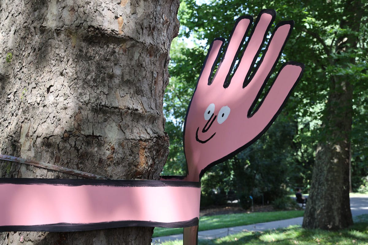
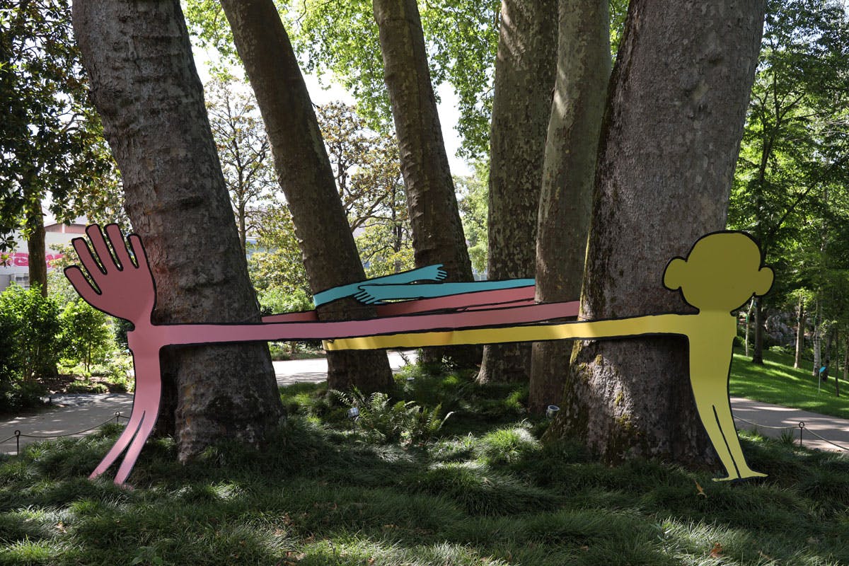
Alongside illustration duo Mrzyk & Moriceau and sculptor Vincent Mauger, one of the highlights of this year’s programme is Jean Jullien, who was born and raised in Nantes.

Unlike some of the illustrator’s earlier lockdown experiments, such as showing off his paintbrush skills in virtual exhibition Home Slice, his new artworks for Nantes hark back to the humorous depictions that he has become so well known for.


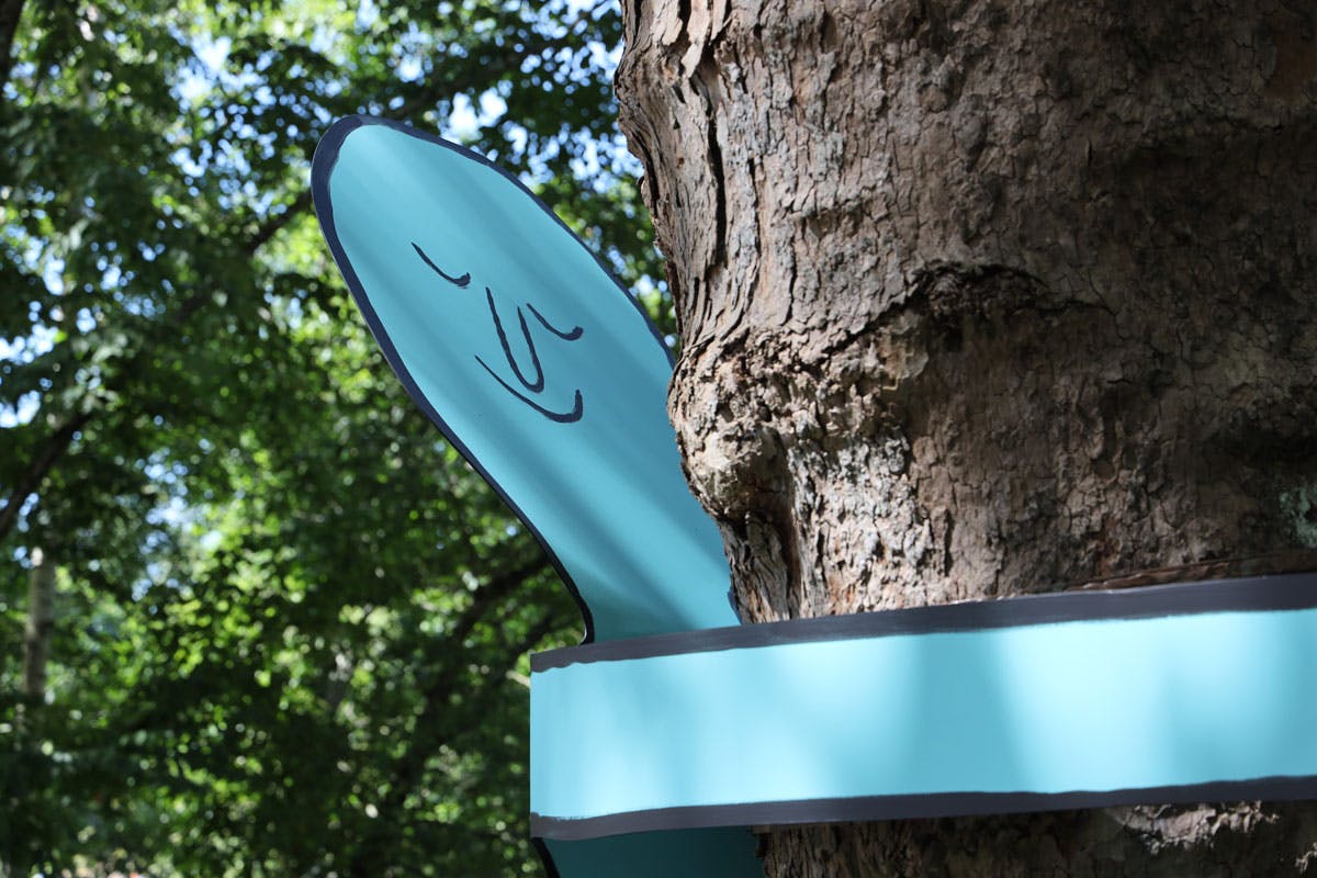
The series of four oversized characters are on display at Le Jardine des Plantes, and include everything from a couple of colourful tree-huggers to CR’s personal favourite, an eight-metre-long bather spitting water in the middle of a pond.

Le Voyage à Nantes runs from August 8 – September 27; jeanjullien.com

The post Jean Jullien’s colourful characters take to the great outdoors appeared first on Creative Review.

Viktor & Rolf channels coronavirus-related mentalities for latest fashion collection

Viktor & Rolf channels Covid-19-related mentalities for latest A/W 2020 fashion collection

Viktor & Rolf presents a high-fashion take on coronavirus with its Autumn/Winter 2020 collection, featuring silky nightgowns emblazoned with emojis and “unapproachable” coats covered in spikes and tubes.

The collection, titled Change, comprises three mini-wardrobes that all feature three looks including a nightgown, a dressing gown, and a coat.

Each wardrobe has been designed to illustrate a different state of mind related to “these extraordinary times of change” occurring as a result of the coronavirus pandemic.

The first represents a sombre mood, while the second illustrates conflicted emotions and the third symbolises love.

Viktor & Rolf channels Covid-19-related mentalities for latest A/W 2020 fashion collection

The first collection of outfits – described by the duo as a “panoply of gloom” – aims to emulate a feeling of sadness and anger, and features a navy satin nightgown embroidered with dark raincloud motifs made from lace.

This is presented alongside a flared, grey chenille dressing gown that takes design cues from “masculine” robes, adorned with a quilted bow tied around the waist and elongated sleeves with wide cuffs.

Viktor & Rolf channels Covid-19-related mentalities for latest A/W 2020 fashion collection

The third look is a black, voluminous coat made from faux leather, which is punctuated with spiky, fabric cones – some leather, some sheen and others glittery – that both “impress and make you feel safe”.

“There is a lot to feel angry about and this garment will communicate exactly that,” said the Dutch fashion house, which is made up of Viktor Horsting and Rolf Snoeren, who founded it in 1993.

Viktor & Rolf channels Covid-19-related mentalities for latest A/W 2020 fashion collection

The second wardrobe represents the “conflicting emotions” that many are experiencing during the pandemic. The glossy pink polka-dot nightgown is “manically” covered with emojis displaying different feelings, from angry and scared expressions to a smiling face wearing a halo.

Its one-shouldered style is also designed to convey confusion – marking the dress as “hesitant between covered and nude”.

The dressing gown look for this part of the collection is made from soft, plush fabric featuring asymmetric sashes and bows down the left sleeve that “frantically entangle one of the arms”, finished with canary-yellow quilted cuffs.

Viktor & Rolf channels Covid-19-related mentalities for latest A/W 2020 fashion collection

Glittery tubes protrude from the maximalist, candy-coloured coat made from faux leather, which has one extra puffy sleeve. Viktor & Rolf describes this look as “at the same time unapproachable as well as attractive”.

“Sometimes up, then again down, social media’s perplexing hypnosis put our stability at risk,” said the designers. “Luring us from the banal to plain horror and back again, they leave us bewildered.”

Viktor & Rolf channels Covid-19-related mentalities for latest A/W 2020 fashion collection

The third series of outfits aim to “radiate love”, starting with the floor-length white satin négligée embroidered with red, black and white lace hearts. These are designed to turn the “melancholy” of the first capsule collection into “serenity”.

The second bathrobe look is designed to “impart a feeling of royalty”, and has a fitted bodice that billows down into an A-line skirt, featuring two heart-shaped pockets in quilted red satin.

Viktor & Rolf channels Covid-19-related mentalities for latest A/W 2020 fashion collection

The final coat in the third collection is lined with rows of heart symbols in shades of red and pink, each outlined in glitter. Designed to represent unity, the coat illustrates that “we all deserve to be loved, regardless of age, colour, gender, race, religion or sexuality”.

“The world around us is changing rapidly,” said the duo. “Whether apocalypse or new spiritual era, you will continue to be able to step into the singular universe of spectacular beauty, unexpected elegance and spiritual glamour of Viktor & Rolf.”

Viktor & Rolf channels Covid-19-related mentalities for latest A/W 2020 fashion collection

The Change A/W 2020 collection was debuted in a film directed by Marijke Aerden and narrated by singer MIKA, who reads the words of Horsting and Snoeren while the models parade each of the looks in a room at the Waldorf Astoria in Amsterdam.

Previously, the design duo created a fashion collection using five miles of tulle, which formed puffy, oversized dresses emblazoned with kitsch slogans like “Give a damn” and “Sorry I’m late, I didn’t want to come”.

Called the Fashion Statements collection, it was presented as part of Paris’ haute couture shows in January 2019 and references the type of language used on social media or found on souvenir T-shirts.

The post Viktor & Rolf channels coronavirus-related mentalities for latest fashion collection appeared first on Dezeen.

MUJI-worthy product designs that are a must-have for any Japanese design lover!

MUJI is a success story that started as a local Japanese phenomenon and thanks to a unique vision on production, market, identity, etc… grew to become a universal brand and an icon in the design world. MUJI’s simplicity easily creates a color pallet that can be followed through in your home, with the Japanese attention to detail transforming a simple product design to a piece of art almost. It is this quintessential essence of products, minimalized to their core functionality with aesthetics that amplify their purpose, no wonder MUJI has a dedicated global fan-following that can’t get enough. This collection shows individual pieces by such designers/fans of MUJI who have created designs that are definitely worthy of being a part of the MUJI family!

Named the Muji 2.0, Sy Hyin Wong, draws inspiration from the strictly minimal and functional brand Muji to tell time using another Japanese classic – the paper fan! According to The National Institute of Health, “about 42% of Americans ages 12-54 are nearsighted”. This clock actually helps people with nearsightedness be able to tell time from afar because it is more comprehensible than the slim hands of a watch or small digits. Light strips are added in the folds of the fan so you can tell time at night too without your glasses. Removing the numbers instantly removes the urgency/anxiety that can come with clocks – and especially in quarantine when you look at it often, you want it to calm you down and if it looks beautiful then that’s a win-win. The clock’s design may seem confusing at first glance, but it is quite easy to identify the shapes and correlate them to the time. The clock’s fan moves in a clockwise direction, with the starting point of the fan representing the hour of the time and the other end pointing at the minute hand. In an almost meditative manner, the fan completely unfolds over an hour’s duration, regroups, and starts the process all over again, kind of like our everyday life.

Rich Park and Soohun Jung of BEBOP Design used metal extrusion, an incredibly precise and easily controlled manufacturing process to create this Aluminum Light. The minimal design language was designed to be scalable for MUJI, where it can be applied to a new line of products, and possibly even develop a system where different products can share the same components to maximize production efficiency. Aluminum Light takes advantage of silicone’s great tensile strength through an integrated strap. The silicone strap can be stretched to be wrapped and hang itself for an overhead light. When using the product as a flashlight, simply wear it as a wrist strap to prevent drops. The hygienic and tactile nature of the material makes it a great grip for a flashlight. And its translucent finishing diffuses the light evenly to be used as a lamp. A hidden screw mount is used to attach and detach the silicone light diffuser on either the front or back of the aluminum “head”, where the flashlight becomes a lamp and vice versa. Simple, multifunctional, modular – the Aluminum Light is designed to be a part of the Muji Family!

Bryan Wong and Chengtao Yi’s Zirconia Sharpener is the epitome of minimal design. This 2017 A Design Silver Award Winner is a sharpener and nothing else but the beauty of it lies in the use of materials, in this case, zirconia. We always sharpen our pencils – be it for note-taking or sketching. A pencil sharpener made with this level of beauty and durability is functional hence leads to desirability. The design is honest, thoughtful, simple, and analog with the blade and body are made from zirconia and fused into a single unibody block. By utilizing zirconia’s material property, the blade doesn’t need to be changed and offers a smooth sharpening experience. Almost poetic, this is a sharpener worth keeping with you forever.

After getting the sharpener right, let’s get the humble pencil the homage it deserves. Chengtao Yi realized that unlike most of the pens, pencils do not have a clip, which makes for very annoying user experience. He believes the pencil and notebook are made to be together. So he designed a notebook that has room for a pencil. Pencil Note is a notebook with a simple plastic (PC) cover that can house a standard pencil of almost any kind. The bulge on the cover provides the room and tightly secures the pencils. It also makes sure the pencil can be easily taken out. The translucent cover creates a frosted and vague silhouette of the pencil inside, almost looking like a health bar in video games, indicating how much of the pencil has been used.

Masamaro Fujiki started his design process with the question – why do we need a 2-in-1 air purifier with a humidifier? The multifunctionality of this design causes a very bulky form. Masamaro’s solution is to create an appliance that can do the functionality of both while operating separately from each other as well. The Air Purifier + Humidifier enables you to convert your room into the perfect environment by separating purifier function and humidifier functions. Winter nights keep your humidifier close while the purifier works the room from a corner, balancing the aesthetics of the room!

The ‘MUJI shower radio’ project was a case study project of working for one of the most unique and intriguing companies in the design world. Looking at MUJI as a Japanese brand that became universal, the students were to design the ‘German collection’ of MUJI. In the same way that MUJI offers general universal items mixed with more ‘Japanese items’, the aim was to adapt local (German) heritage and items into becoming universal Muji items. A shower and kitchen radio, inspired by the MUJI’s wooden brush was designed by Gerhardt Kellermann. The radio consists of a waterproof body with a built-in speaker and features intuitive tuning and volume control. In Europe, a lot of people turn on the radio for their morning shower or when cooking in the evening. This simple product is easy to use and fulfills the requirement without any additional frills.

Absolutely pure in its design language, the Maison TV by Seongkyeong Son & PDF Haus looks like something Muji would build. The simple white block form with the four detachable legs gives the TV a certain elegance which makes the television look like an object fit for a home, rather than a showroom. The thickness of the TV stems from its inclusive design, which has empty spaces in the back for storing streaming boxes, and even for cable management so that you’re left with a TV that doesn’t have any odd boxes or wires corrupting its beauty. The Maison TV comes with beautiful flush controls on the side, along with a remote that echoes the same style that makes the Maison TV’s design language tick every single box in Rams’ ten commandments of good design!

Nope, that’s not a new sculpture that you have put on your side table, it’s the Folded Cleaning Tool by Jinyoung Noh, Sua Jo & Boram Han. One of the reasons why I like brands like Muji is because they design everyday products that you don’t mind displaying in your living space – in plain view of every guest! This broom and dustpan set is something on these lines. Crafted from two sheets of aluminum, the design has clean lines and smooth curves, giving it the ‘extra appeal’ and worthy of being highlighted, when not in use.

What would a Muji power tool look like? It would look like it meant business but still retain an aura of serenity. The Muji power drill concept by Changho Lee takes two contrasting things and wonderfully combines them. The drill’s aesthetic couldn’t embody Muji’s style any more than it already is. The white color scheme and the simple cuboid meets cylinder design brilliantly represents what the Japanese design house stands for. Absolute, unquestioned simplicity!

rotating

wireless charging

I forgive you for mistaking the Wall-Ti Tap Power Strip by Eunsang Lee as a famous CD player by Muji – let’s slide this by as inspiration – the purpose of the power strip is completely different than a music player. Typically, we see long devices with multiple sockets and switches, but the Wall-Ti Tap has an amusing donut form. You are expected to fit the plugs in the inner wall of the circle, while you can wirelessly charge your phone on top of the device. “Unlike the typical cuboid power strips, this power strip has a doughnut-shaped design. The round-shaped power strip can be put vertically, so it reduces the problems of dust getting into the sockets,” explained Eunsang Lee.

Muji’s clear-cut minimal design has garnered hard-core fans around the globe, you can check out more inspirational designs by IKEA here!