At Home: COOL HUNTING in May

Highlights from what we’ve read and watched this month

Over the last month, all members of our editorial staff have (like everyone else) spent substantial time seeking distraction from the news by way of film and television, as well as all types of books. We all recognize the value of quality content—thoughtful independent cinema, detailed nonfiction biographies, well-written streaming series—but we also cherish the escapism provided by blockbusters, binge-worthy programs and, to be honest, whatever else works. There are so many options available, with more released daily. But what we’ve shared below represents what moved us most, coupled with a little bit of what we’re most excited about. We’d also love to continue encouraging people, when shopping for books, to buy from your local independent stores.

What have you been reading?

“Along with what feels like countless cookbooks, I recently read Stay with Me by Ayobami Adebayo for my book club and found it to be a super-engaging read that I have various thoughts and feelings about,” says director of editorial Katie Olsen. “Also just started reading Lucia Berlin’s A Manual for Cleaning Women and ordered Olivia Laing’s Funny Weather: Art in an Emergency (from my local bookshop, Word).”

“It has been three years since writer Glenn O’Brien passed. His humorous, sort of grouchy spirit and knack for crafting enviously excellent prose lives on in Intelligence for Dummies: A Portrait though,” says Evan Malachosky, assistant editor. “Comprising short essays, musings, interviews and more, the book provides practical advice alongside intermittent profiles of those he held close. From Andy Warhol and Jean-Michel Basquiat to the fluid newsroom at Interview and Fran Lebowitz, there’s much to learn from them and O’Brien’s dissections of art, politics and style.”

Evan Orensten, executive editor, delved into science fiction via Max Barry’s Providence, while editor David Graver fell for YA (once again). “I was eager to get my hands on The Fascinators from the moment it was announced,” he says. “A YA novel that takes place in a small Georgia town, where there’s both magic and queer culture—two things I love. It’s a splendid read, peppered with the unexpected; though, anyone who’s fallen in love with a close friend will connect with it.”

Were you moved by any television series?

The Great British Baking Show has everything I want right now: sweet characters and sweet treats, corny puns, low-impact drama, camaraderie and encouragement, plus excellent accents from all around the UK—altogether an entirely wholesome viewing experience,” says Olsen.

Courtesy of ESPN’s The Last Dance

“With the NBA season paused (and probably canceled), I—and millions others—redirected my attention to ESPN and Netflix’s The Last Dance, a 10-episode profile of Michael Jordan, the Chicago Bulls, and their impressive stretch of championships throughout the 1990s,” says Malachosky. “More than a highlight reel, the series encapsulates the era, drawing prominent figures into its orbit and contextualizing what they meant to the moment and how these moments impacted their lives moving forward.”

Graver says, “I began my time at home with the mission to knock off all three seasons of Ozark but because of the frequently anxiety-inducing scenarios within I kept taking substantial breaks between episodes. I have yet to reach season two. Of course, I valued the writing and performances but I found that the show Hollywood, which released 1 May on Netflix, offered me the fantastical, colorful entertainment I needed.” Orensten adds that he’s been transfixed by The Magicians.

Has any film stood out?

Olsen says, “Horror has been my genre of choice recently—not torture/splatter movies, but rather gothic spooks. After seeing this year’s The Turning, which is based on the 1898 novella The Turn of The Screw by Henry James, I rewatched The Innocents from 1961 (the first film adaptation of the story) and it’s just brilliant—eerie, complex and nuanced.”

“I am not great at keeping up with movies,” says Malachosky, who still hasn’t seen Parasite. “But, I did catch James Mangold’s Ford v Ferrari. It was thrilling, well shot and acted, and a dramatized look at one of the auto world’s most absurd feats. If nothing else, the film looks (and sounds) incredible.”

“I paused my personal classics checklist (after Chitty Chitty Bang Bang, Easy Rider and American Graffiti) to watch Portrait of a Lady on Fire,” says Graver. “When the film won best writing at the Cannes Film Festival I knew I needed to see it. None of the advance information I read could prepare me for how bewitching the performances were. Every single motion, movement, expression and exchange from the all-woman cast carried profound depth. Afterward I could not stop thinking about the narrative, the score, and returning to Quiberon in Brittany, where the exterior shots were filmed.”

Orensten adds that the Beastie Boys documentary, Beastie Boys Story, by Spike Jonze, moved him the most.

At Home is a monthly series dedicated to the quieter observations of COOL HUNTING’s editorial staff and contributors from their homes

Hero image from Portrait of a Lady on Fire

This panoramic view cabin keeps bugs out using a unique Japanese technique

I am obsessing over outdoor cabins since we are all stuck indoors. My favorites are the ones like LUMIPOD because they bring the vastness of nature into your cabin through the thoughtfully designed structure and, in this case, creative windows! We all know windows are a true blessing in quarantine and LUMIPOD seems to have the one so large its basically a door into the wild.

The LUMIPOD are a series of prefabricated cabins that are installed 1000m above sea level in the French Alps (here is when you start planning your post-pandemic getaway) so you can only imagine how pristine the views are. To do the French Alps justice, the design team built the structure with one aim – giving you a fully immersive experience of being in nature with a luxurious upgrade. The most unique feature about this cabin is its LUMICENE windows – the curved window provides a 180º view and makes you feel like you are in a snow globe. The window is set in aluminum frames sliding between two rails so you can blend the indoors and outdoors by simply opening the window.

The circular cabin measures 5.45 m with interiors specifically designed to resemble a high-end hotel. The structure is made from steel to provide top grade stability that is required by the LUMICINE windows. Another interesting feature about this house is how it keeps the insects away – the exterior has been wrapped in Douglas fir which has been charred using a Japanese technique (shou-sugi-ban) proven to keep bugs outside your bedroom! The interiors have earthy tones because of the light oak and merino wool usage which provide a warm ambience while also keeping the cabin literally warm through their insulation properties.

It is a minimal cabin that allows you to focus on the scenic experience rather than being distracted by free toiletries. “This prefabricated housing module, a real cocoon of simplicity, settles in the middle of Nature to welcome city dwellers willing to relax away from the concrete jungle,” says the LUMIPOD team. The cabin has three different sizes to accommodate your needs and can be installed in 2-3 days. It feels like a personal snow globe and I will continue to imagine all the little details about it until the next cabin getaway.

Designer: LUMIPOD

Awesome Illustrations by Jan Siemen

Jan Siemen est un artiste allemand vivant à Cologne. Il travaille dans un studio de design graphique depuis 2013. « Au studio, je créé des illustrations et tout type de communications visuelles pour des clients, ou juste pour mon propre plaisir. » nous dit-il.

Jan a toujours été intéressé par l’art comme il nous l’explique : « J’ai toujours été fasciné par la possibilité d’exprimer des sentiments et des émotions dans une ou plusieurs illustrations ou photographies. Il y a tellement d’artistes doués qui peuvent exprimer une émotion d’une façon belle et attrayante, c’est une chose qui m’impressionne et m’inspire. J’aime le challenge de trouver des idées ou des concepts qui divertissent les gens ou moi-même. C’est un passe-temps génial, qu’importe si l’on est créateur ou spectateur. »

En 2017, Jan a eu besoin de créer quelque chose de plus personnel que ce qu’il concevait pour son boulot. « Ne vous méprenez pas, j’aimais vraiment mon job, mais j’avais besoin de faire autre chose que du design graphique pur et dur. » Jan a donc par la suite posté ses créations sur son compte Instagram, voilà comment la machine fut lancée !

« J’espère que mon art s’explique de lui-même. J’essaie d’inclure ma propre vision des choses, mon humour et ma compréhension du monde dans mes illustrations, j’espère que cela déclenche une émotion chez le spectateur. Chaque illustration est une petite histoire ou un sujet de réflexion. Je n’ai pas un seul message ni un seul thème à transmettre. J’illustre parce que j’aime ça. Je suis donc vraiment heureux et reconnaissant quand on like mes illustrations, je crois d’ailleurs que c’est ma plus grosse motivation. » nous dit-il à propos de ses créations. Découvrons-les ci-dessous !


Papa Bear Arm Chair

From solid oak and Edelman shearling (alpaca bouclé yearling and dark blue and white bouclé), Pierre Yovanovitch’s whimsical Papa Bear Arm Chair is handmade in France by the artisans of Ateliers Jouffre. Yovanovitch looked to the Goldilocks and the Three Bears fairytale for inspiration, evidenced by the ear-like additions and cuddly, anthropomorphic aesthetic. It’s absurd, aspirational and all-around entertaining. Price is available upon request from the Invisible Collection.

JG Phoenix creates meditative interiors for Danilo showroom in Shantou

Danilo paint showroom designed by JG Phoenix

The ancient concept of yin and yang informed the serene aesthetic of this paint showroom in eastern China designed by JG Phoenix.

Located in the city of Shantou, the Danilo paint showroom has been designed by JG Phoenix to encourage visitors to “explore, reflect and encounter”.

Fusion Danilo paint showroom designed by JG Phoenix

A key point of reference for the studio was the ancient Chinese philosophy of yin and yang, which is based on the idea that opposing forces in the natural world can actually be complementary or interconnected.

The studio also felt that the dual forces of yin and yang nodded to the idea that paint, in its most basic form, can be made from just two elements – water and soil.

Fusion Danilo paint showroom designed by JG Phoenix

Visitors access the showroom via a long, sloping corridor that has been entirely covered with Danilo’s white paint.

“It takes people away from the outside world for a while and leads to a journey of art,” explained the studio.

Fusion Danilo paint showroom designed by JG Phoenix

They’re led to a dramatic entrance hall which is anchored by a curved terracotta partition.

It’s punctuated with a large hole that offers glimpses of the main salesroom.

Fusion Danilo paint showroom designed by JG Phoenix

A traditional yin and yang symbol has been embedded in the floor – half of it has been lowered and filled with water to form a shallow, rippling pool.

The shape of the yin and yang symbol is echoed by the curved opening that’s been created in the ceiling, and the steel sphere that seems to balance on the surface of the pool.

Fusion Danilo paint showroom designed by JG Phoenix

An adjacent room where customers can sit and chat with staff about their paint choices has been completed with simple black, white and grey surfaces.

The space becomes animated over the course of the day as shards of light shine through a narrow skylight in the roof.

An art piece made from disused mechanical parts has also been placed in the corner.

Fusion Danilo paint showroom designed by JG Phoenix

The wall that runs down the centre of the room features different-sized circular cut-outs, which look through to a cosy rest area.

This has been painted a deep shade of orange and dressed with a timber bench. Strip lighting embedded in the floor emits a warm glow.

Fusion Danilo paint showroom designed by JG Phoenix

The monochromatic colour palette picks back up in the salesroom, but is offset by a handful of quirky furnishings and ornaments.

This includes a glossy, cherry-red desk, totemic sculptures and a light which has bulbs dangling from drooping metal poles.

Paint samples are displayed behind a chunky white counter.

Fusion Danilo paint showroom designed by JG Phoenix

Some rooms are connected by gloomy vaulted corridors, but the showroom overall has been made to have a looping floor plan.

“There is no boundary between the beginning and end of time,” added the studio. “sisitors will be immersed in a moment where time pauses.”

Fusion Danilo paint showroom designed by JG Phoenix

JG Phoenix – otherwise known as Jingu Phoenix Space Planning Organization – was established in 2008. In February of this year, the studio completed work on a private museum in the city of Shoutou.

The owner uses it to display his prized collection of aged fish bladders, which are considered a culinary delicacy in China.

Inside, it features glossy wooden floors, clean white walls and an oversized iron sculpture of a fish.

Photography is by Ouyang Yun.


Project credits:

Design firm: Jingu Phoenix Space Planning Organization
Chief designers: Ye Hui, Zeng Dongxu
Decoration team: Feng Qi Wu Tong
Construction firm: Wan You Yin Li

The post JG Phoenix creates meditative interiors for Danilo showroom in Shantou appeared first on Dezeen.

"I've been the first and only African American to work with all my clients," says Stephen Burks

Designer Stephen Burks discusses the lack of diversity in the design industry and explains how his early experiences with European brands led him to work with artisans in the developing world in our latest VDF x Friedman Benda talk.

“I’m trying to find a way to express my identity in some regard,” Burks told curator and historian Glenn Adamson in the latest of New York gallery Friedman Benda’s Design in Dialogue interviews that we are publishing as part of Virtual Design Festival.

“Because, as you know, international design isn’t the most diverse place. It’s been my great privilege to be the first and only African American to work with all my clients. And that’s kind of crazy. You realise that design is kind of this final frontier of culture.”

Stephen Burks of Man Made studio
Stephen Burks features in the latest Design in Dialogue talk

Burks founded his New York studio, then called Readymade Projects, in 1997. His big break came in 2000, when Italian furniture brand Cappellini put his first designs into production.

“I did my first pieces for Cappellini in 2000 and that was huge and mind-blowing,” he said. “It’s hard to explain to the current generation how important that was. There were only two or three American designers working in Europe with the big companies when I started.”

“Europe very quickly reminded me that I was African American”

According to Burks, his early experiences in Europe made him much more aware of his African heritage.

“Not only was I American, but Europe very quickly reminded me that I was African American,” he said, recounting stories of how European media compared him to a basketball player, a jazz musician and even Barack Obama.

“I hadn’t really seen myself through that lens,” he continued. “I was just there making the things that I believed in.”

Missoni Patchwork vases by Stephen Burks for Missoni Missoni
Burks worked with Italian brand Missoni to produce his Patchwork series of vases in 2004

Burks explained that the stereotyping he experienced led him to steer away from mainstream European industrial design and start exploring his African heritage through his work, which in turn led him to working with artisans across the world.

“I hadn’t thought of myself as a black designer before, I hadn’t thought of myself as African American, but of course I am,” he said.

“It forced me to be considerate of the fact that the politics of design are present, that my politics are present, that they see me in relation to a broader diaspora. We have such rich historic and cultural traditions to draw from that aren’t from a European context. So moments like that only pushed me further and further into the field and wanting to make a difference with design.”

“Design doesn’t include the majority of the world and their culture”

In 2004, Burks worked with Missoni, another giant of Italian design, to create a series of vases covered with fabric offcuts called Missoni Patchwork.

“Those vases and that project with Missoni kind of made me consider, or reconsider, the processes of the means of production,” he said. “Did I have to work in this 20th-century model of the designers on tour, the kind of signature designer?”

“I like to say that design is a western concept, because it is. We look at the western canon – the industrial revolution in Europe and America, leading to the Bauhaus, leading to the idea that a designer can be in the service of industry.”

“And so all the products and the way that we think about design doesn’t include the majority of the world and their culture and their cultural perspective.”

“At the time, no-one was really looking at the rest of the world and wondering why aren’t these people, the majority world, also participating in what we consider to be contemporary design?”

Stephen Burks Man Made basket weaving in Senegal
Burks has worked with artisans around the world, such as these basket weavers in Senegal in 2015

In 2005, off the back of the success of the Missoni project, Burks was invited to South Africa by non-profit organisation Aid To Artisans and design brand Artecnica to act as a product development consultant.

Burks worked with eight craftspeople to develop commercially viable pieces of contemporary design using their traditional craft skills.

“This was a pivotal moment for me, because I’d never been to the ‘motherland’,” said Burks.

The project resulted in a collection of painted-wire tables called TaTu, which Artecnica unveiled in Milan in 2007, and set Burks on a path of working with artisans in developing countries all over the world to create products for a host of leading brands, including Cappellini, BD Barcelona, Moroso and Roche Bobois.

“All of that work has led to this perspective of trying to find a way of getting the rest of these people involved in design and trying to find broader markets for them,” Burks said.

Stephen Burks Man Made exhibition
Burks’ 2011 exhibition Man Made showcased design pieces produced by artisans around the world

In 2011, Burks’ work with artisans in South Africa, Senegal, India and Peru was featured in an exhibition and monograph titled Man Made, a name that Burks later adopted for his studio to reflect its new mission to “bring the hand to industry”.

Burks said he is still working on the best way to include artisans in the developing world in the production and development of contemporary design. But he believes his studio’s work is helping to shift the perception of the value of artisanal craft in developing countries.

“I’ve worked in a lot of different ways,” he said. “I’ve tried to be the middleman, I’ve tried to broker the relationship – they make it, you sell it. We’re still looking for the right model, we’re still looking for the right way for this to continue.”

Grasso ceramics by Stephen Burks for BD Barcelona
Burks has worked with a host of international brands, including BD Barcelona on his Grasso ceramics in 2018

“I like to compare postwar Italy with what’s happening around the world in the places I’ve worked,” he continued. “Most of the companies that we know of in Italian design today were family-owned businesses that were rooted in craft production.

“With investment, they grew into the major manufacturers that we know of today. So if that can happen in 50-60 years in Italy, why couldn’t it also happen in Senegal? So i think it’s really about how we value and see craft and artisanal production.”

Design in Dialogue

Dezeen has partnered with Friedman Benda to broadcast a selection of the best conversations in its Design in Dialogue series as part of Virtual Design Festival, publishing one a week throughout May and June.

Burks’ conversation with Adamson is the fourth in a series of Friedman Benda’s Design in Dialogue talks we are broadcasting as part of Virtual Design Festival.

Previous interviews in the series we have published include conversations with pioneering architect James Wines, who lamented the predominance of digitally created forms in architecture, and designer Faye Toogood, who revealed she suffers from imposter syndrome.

Ron Arad told Adamson that “business is always a necessary evil” in the previous discussion we published last week.

The post “I’ve been the first and only African American to work with all my clients,” says Stephen Burks appeared first on Dezeen.

Authentic Street Photography from Tokyo by Siarhei Piatrou

Le Japon est une destination devenue prisée par les amoureux de photographie et plus particulièrement de photographie de rue. Siarhei Piatrou est un artiste visuel qui travaille avant tout pour les films et les jeux vidéo. Pour son métier il a besoin de parfaire ses compétences dans la construction de compositions et de texture. La photographie, qu’il pratique comme hobby, est le médium parfait.

Lors d’un récent voyage au japon il a pu découvrir l’ambiance des rues de Tokyo. Il a ainsi été fasciné par l’authenticité, la capacité à évoluer du pays. Il en documente l’architecture, l’ambiance des rues et les jeux de lumières qui les habitent de jour comme de nuit. Chacune de ses images nous emmène dans la ville où l’inspiration se présente à chaque coin de rue. Entre ombres et lumières, néons et reflets, Siarhei Piatrou joue avec les ambiances lumineuses pour nous dévoiler des images remplies de poésie.


New Nike spot parallels sports resilience and hope with our challenging times

The spot, created by Wieden + Kennedy Portland, features a wealth of elite athletes, including Serena Williams, Tiger Woods, Rafael Nadal, Cristiano Ronaldo, and Naomi Osaka, overcoming famed moments of adversity.

In its voiceover, it makes a direct connection between the challenges the world is facing with coronavirus and the hope that can be inspired by sport. Speaking in the film, James says: “Right now, we’re fighting for something much bigger than a win or a championship. But if we’ve learned anything from sports, It’s that no matter how far down we may be. We are never too far down to come back.”

“The whole world, we’re fighting for something bigger than a championship right now,” comments James on the ad’s message. “People are struggling and this continues to be an incredibly difficult time. For me, thinking forward to a time when we’ll be able to play again, it keeps me going. Even if basketball looks different for a while, I’m excited about the possibility of getting back in the game because I know how inspiring and powerful sports can be. I think the lessons we learn from sport can inspire us all.”

Credits:
Agency: Wieden + Kennedy Portland
ECDs: Eric Baldwin, Jason Bagley
Creative directors: Alberto Ponte, Ryan O’Rourke
Creatives: Lee Jennings, Kevin Steele
Production company: Park Pictures
Director: Lance Acord

The post New Nike spot parallels sports resilience and hope with our challenging times appeared first on Creative Review.

Why culture matters, now more than ever

The culture of your agency or studio stretches far beyond fancy decor, ping pong tables or DJs in the foyer, says leadership coach Tanya Livesey. And it can prove vital in how businesses navigate the difficult times we are in

The post Why culture matters, now more than ever appeared first on Creative Review.

Oslo’s Edvard Munch museum unveils its backwards-slanting identity

Estudio Herreros designed the new building, which is located in Oslo’s Bjørvika harbour area and designed as a replacement for the city’s Munchmuseet – which needed extra space for its collection of Munch artworks, as well as the visitors flooding in.

According to the museum, the architects were influenced by a photograph of the artist on the beach, leaning forward as he painted another semi-naked man.

Photograph by Tove Lauluten

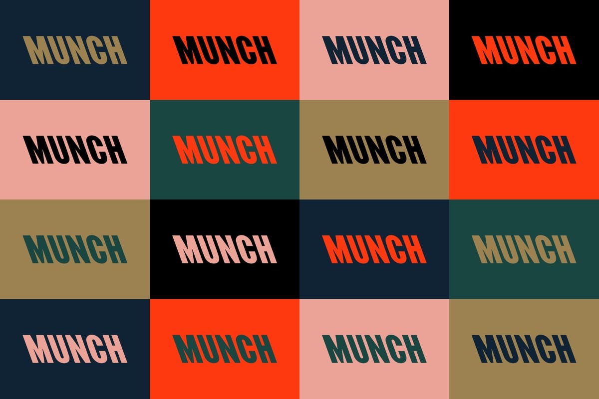
North worked together with designer Radim Peško to create a custom font for the new museum’s identity, taking the distinctive profile of the museum and referencing it in the backward slant of the letters. The studio says it’s not just about typographic expression, it’s also an effort to capture the Expressionist artist’s “unconventional spirit”.

As well as marking a fresh start for the Munch collection, North’s work hopes to appeal to a younger audience – and the identity certainly evokes a sense of energy.

It’s supported by a colour palette derived from the artist’s work, which includes a punchy ‘Munch red’, pink, black, green, navy and gold. The identity especially comes to life in a series of animated pieces, which will appear across the museum’s 20 digital screens.


northdesign.co.uk; munchmuseet.no

The post Oslo’s Edvard Munch museum unveils its backwards-slanting identity appeared first on Creative Review.