David Lynch interrogates a monkey in surreal detective short

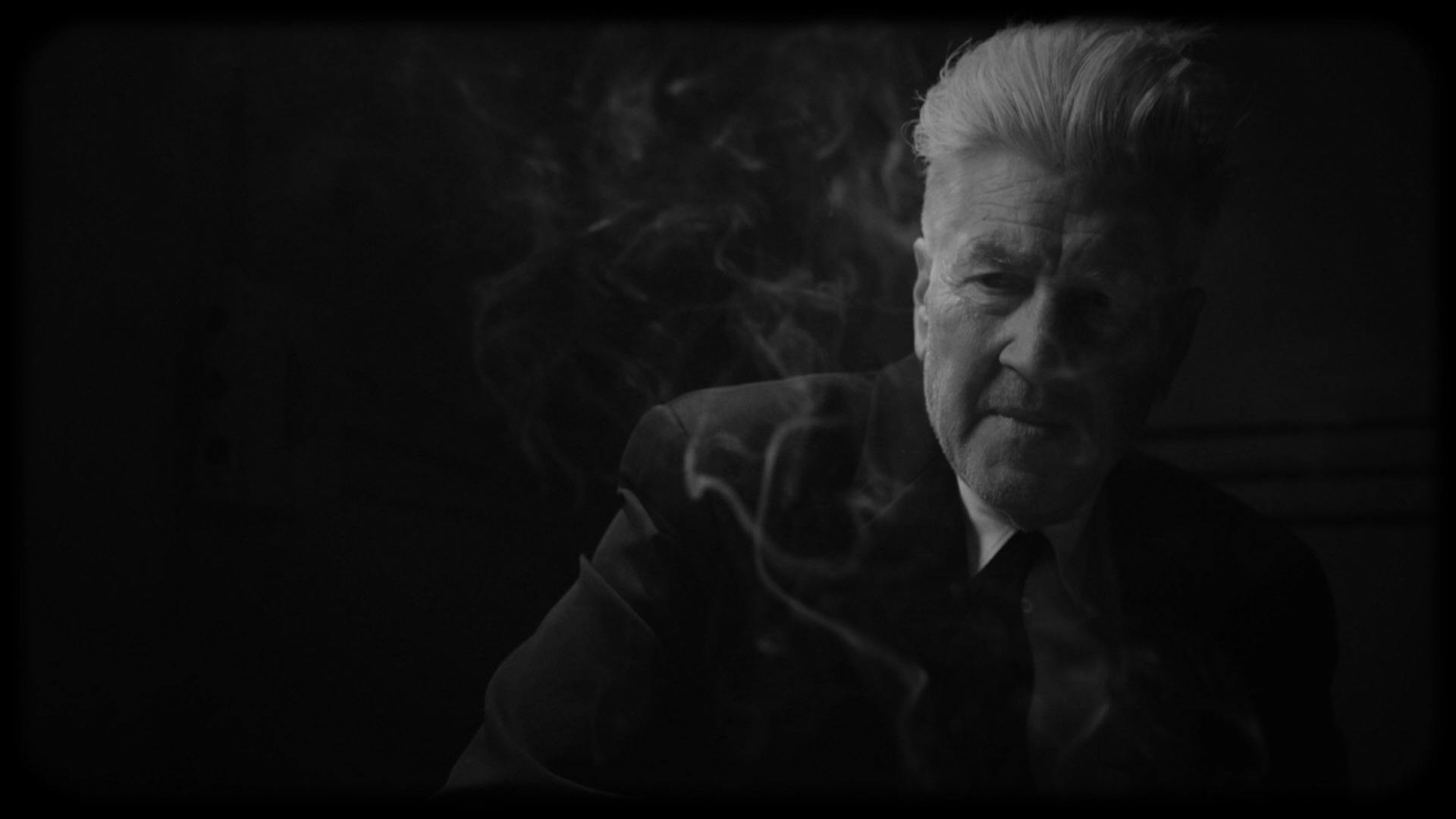
Netflix has released a 15-minute short film by David Lynch, who stars alongside a talking monkey sporting what appears to be Lynch’s mouth. The short, titled What Did Jack Do? takes place in a locked down train station, and follows an interrogation between a detective (played by Lynch) and Jack, a ‘tormented’ monkey suspected of murder.

Between the vignetted, monochrome cinematography and endless close ups, the short feels like a warm ode to film noir. Though it’s not without Lynch’s hallmark twists and turns, from the nonsensical dialogue to the weird editing and, of course, a cup of Joe. “It’s just a simple question,” the detective says at one point. But, as with any Lynchian tale, it’s never a simple answer.

A still from What Did Jack Do? by David Lynch
David Lynch starring in What Did Jack Do?

Before the dramatic conclusion of the short, which involves Jack’s love interest Toototabon, the monkey performs a rendition of True Love’s Flame written by Lynch and Dean Hurley, the supervising sound editor on Twin Peaks: The Return. The scene remains in keeping with much of Lynch’s back catalogue, which often features surreal musical performances.

While in recent years Lynch has been gaining attention for his art, critics and the public alike were evidently delighted when the short landed, demonstrating his indelible mark on the world of cinema – as well as Netflix’s ongoing embrace of the weirder pockets of visual culture.

What Did Jack Do? is available on Netflix now; netflix.com

The post David Lynch interrogates a monkey in surreal detective short appeared first on Creative Review.

How Palace grew up with a grin on its face

The skateboarding brand has broadened its appeal, attracting everyone from the halfpipe to the runway to the football pitch, but it’s still held onto its playful spirit. We talk to MPC’s Richard Skinner about creating fun ads for the brand, even as the stakes get higher

The post How Palace grew up with a grin on its face appeared first on Creative Review.

The Economist’s latest campaign reacts to trying times

As far as classic ads go, it’s tough to beat David Abbott’s 1988 poster campaign that effectively launched The Economist brand as we know it today in just nine words: “I never read The Economist” – Management trainee. Aged 42.

Since then, the simple but effective red and white graphic has become a regular feature of the publication’s advertising, championing both the quality of its reporting and the intellect of its readership.

AMV BBDO decided to return to the tradition in its latest billboard campaign for the publication, but with an added topical twist.

Each billboard in the series acts as a clever nod to the turbulent times we are living in, whether it be the echo chamber mentality that has played such a big part in social media and politics over the last few years, or the questions around data and privacy that come with the rise of the likes of Siri and Alexa.

The campaign also comes at a time when an increasing number of mainstream news publications are seeking to remind their readers of the value of good journalism, from The New York Times’ ongoing series of truth-focused ads, to the Guardian’s recent Hope is Power campaign.

Credits:
Agency: AMV BBDO
Creative Directors:Nicholas Hulley and Nadja Lossgott
Creatives: Augustine Cerf and Lauren Peters, Etyan Smith and Tim Van Der Mee, Andy Vasey, Tim Riley

The post The Economist’s latest campaign reacts to trying times appeared first on Creative Review.

Eckmannpsych & Cheee

James Edmonson’s Eckmannpsych and Cheee may look different, but they share a similar spirit.

Eckmannpsych is a revival of Otto Eckmann’s eponymous Eckmann-Schrift, originally released in 1900 at Rudhard’sche Gießerei in Offenbach. Eckmann’s training as a fine artist is evident in this typeface, which is expressive rather than utilitarian. Eckmann-Schrift is an embodiment of the art nouveau style, fashionable at the time of its release.

Cheee is a free interpretation of Aldo Novarese’s Sintex, originally designed in 1973 for the Phototype foundry Visual Graphics Corporation (VGC). Novarese is known for his designs for the Nebiolo foundry, like Microgramma or Stop; Sintex (a space-age design with heavy horizontals and thin stems) is a bit of an outlier in his repertoire.

In revisiting these designs, Edmondson didn’t attempt faithful replicas of the originals. Instead, he took what was good about them and brought those ideas to the next level, replacing (in the case of Eckmann, at least) century-old design decisions with a healthy dose of funk.

Originally drawn as lettering for Vulfpeck’s North America Tour Posters, these free revivals often stray from the originals much further than expected — if Edmonson hadn’t disclosed the influence of Sintex on Cheee, I never would have made that association. With its spaghetti-thin stems and blobby terminals, his interpretation made me think of balloon modeling rather than the distinct shapes of Sintex.

It’s difficult to imagine what would have happened if Eckmann had been reincarnated in San Francisco in the sixties. Eckmannpsych gives us at least an idea. Edmonson’s interpretation of Eckmann’s work carries it to an extreme by exaggerating the contrast, changing the proportions, and making the floral forms of 1900 become more . . . exotic? At any rate, Eckmannpsych looks much more dangerous than the original Eckmannschrift.

2018 was not only a year of excellent type releases; it also saw the birth of Future Fonts, a platform that allows designers to sell typefaces in progress.

Eckmannpsych and Cheee were released as some of the first Future Fonts. Supporting uppercase letters only, one might think of them as digital rub-down alphabets — the low introductory price of $6 seemed fair.

The story could have ended here, but the feedback loop built into the Future Fonts website (and — presumably — its commercial success) encouraged Edmonson to keep thinking about these projects. As a consequence, both designs quickly gained useful additional glyphs like numbers and punctuation, and accumulated additional weights.

2018 was also the first full year in which major design applications (such as Adobe Illustrator) supported variable fonts. Luckily, Edmonson decided to enthusiastically embrace this technology.

Eckmannpsych received a size axis, which allowed users to interpolate the psychedelic high-contrast display variant to a much friendlier looking, wider (almost blobby) text size. This axis alone is worth several lessons in typography: it clearly illustrates the benefit of (and need for) optical sizes.

Cheee was outfitted with a weight axis, which allowed the user to change both heaviness and contrast at the same time. Only a month later, a “gravity” axis was added, which enabled the movement of letter mass up or down (weight being renamed “yeast”). The final axis (so far, at least) is “temperature”, released just in time for Halloween — it entices the user to create dripping letters, revisiting the idea of a Hobeaux dripping with blood.

Edmonson’s playful approach managed to explain the whole point of variable fonts better than any technical demonstration could. Cheee and Eckmannpsych may not be everybody’s cup of tea, but I think they teach us two valuable lessons:

  • Opinionated revivals are much better than historically accurate ones (I don’t see the “faithful” Eckmanns used very often).
  • New technologies are meant to be embraced (and made fun of).

I congratulate Edmondson for effortlessly drawing two of the most impressive fonts of 2018 (and letting everyone take part in their development). I can’t wait to see what he will come up with in 2019!

Seven sofas that deserve to be centre of attention

Sofas: Luizet by Luca Nichetto for La Manufacture

The sofa is one of the most well-used pieces of furniture in the home, so it’s a good way to make a statement. Dezeen editor-at-large Amy Frearson picks out seven new designs that do exactly that.


Sofas: Assemble by Destroyers Builders for Valerie Objects

Assemble by Destroyers Builders for Valerie Objects

Belgian designer Linde Freya Tangelder imagined pebble stones when designing Assemble, the first sofa from homeware brand Valerie Objects, launched at the Maison&Objet furniture fair in Paris.

As the name suggests, the idea is for you to assemble your own sofa out of the various different elements. Single and double seaters can be paired with asymmetric backrests, corner elements, side tables and poufs, creating endless configurations.

“This universal fit was a very important feature in my design process,” explained Tangelder.


Sofas: Stack by Nendo for La Manufacture

Stack by Nendo for La Manufacture

Japanese studio Nendo has gone to a lot of effort to make this sofa look effortless.

Debuting in the Paris showroom of newly launched brand La Manufacture, Stack looks like a pile of cushions that have been casually thrown together. In fact, its large padded elements are actually held in place by a hidden structure.

The design team carried out numerous tests and built many prototypes to ensure that each arrangement offers plenty of comfort.


Sofas: Luizet by Luca Nichetto for La Manufacture

Luizet by Luca Nichetto for La Manufacture

Another piece in the La Manufacture collection, Luizet was designed by the brand’s art director Luca Nichetto.

Designed to look good from any angle, the sofa comprises various geometric elements that can be mixed and matched. Seats can be circular, semi-circular or square, while the back and armrests are formed of both rectangular cushions and large curving tubes.

The design can also be customised with the addition of side tables and poufs.


Sofas: Major Tom by Thomas Dariel for Maisondada

Major Tom by Maisondada

The first sofa from Chinese furniture brand Maisondada was designed by co-founder Thomas Dariel with fashion in mind.

The cushions and upholstery are available in a range of Kvadrat fabrics, but typically the inside and outside surfaces are in contrasting shades to create the impression that the sofa is wearing a jacket.

The name, Major Tom, is a subtle reference to this feature – Dariel likens it to the Pierre Cardin jacket that David Bowie wore in the video for Space Oddity. “Fifty years after the moon landing, we are still looking at the stars,” said the brand.


Sofas: Pukka by Yabu Pushelberg for Ligne Roset

Pukka by Yabu Pushelberg for Ligne Roset

Comfort was the utmost consideration for Canadian duo George Yabu and Glenn Pushelberg when creating Pukka.

Debuted at both the IMM Cologne and Maison&Objet furniture fairs, the design is one of four new sofas from French brand Ligne Roset, and it is by far the most simple and effective of the collection.

It is made up of layers of foam of different density, ensuring it is extremely comfortable and supportive. Different stretchy fabrics can be chosen to cover this soft  structure, although a wool stretch velvet is recommended.


Sofas: Asmara by Bernard Govin for Ligne Roset

Asmara by Bernard Govin for Ligne Roset

In celebration of its 60th anniversary, Ligne Roset is also reissuing a classic 1960s design that is guaranteed to become the centrepiece of any room it is displayed in.

Created by French designer Bernard Govin, Asmara is a sectional sofa system made up of modules with convex and concave surfaces. When placed together, they create an undulating landscape that you can sit on or lie over.

Ligne Roset describes the design as a symbol of “sexual freedom and sensual emancipation”.


Sofas: Wonder Sofa by Space Copenhagen for Gubi

Wonder Sofa by Space Copenhagen for Gubi

Lounge furniture from the 1970s gets a contemporary update in this design by Danish studio Space Copenhagen.

On show at the Gubi store in Copenhagen, the Wonder Sofa is a generously sized sectional that comes in various configurations. Plump cushions are neatly folded over the backrest, making it as comfortable to lean against as it is to sit on.

“The Wonder Sofa has details that radiate welcome, relaxation and comfort, while remaining calm and minimal in its expression, making it the perfect centrepiece,” said Gubi owner and creative director Jacob Gubi Olsen.

The post Seven sofas that deserve to be centre of attention appeared first on Dezeen.

Swatch’s reimagined classic Jellyfish is now bigger, bolder and quirkier!

Swatch recently launched The Big Bold Jelly, a revamped version of its iconic Jellyfish which rocked the 1980s. However, this one promises to be bigger and bolder. Forfeiting the original 34 mm case, Swatch adopted a more impressive 47 mm dial, fully transparent with a semi-transparent silicone strap! This adds a pop of modernity to a beloved classic, and to be honest, prevents us from squinting our eyes whenever we need to know the time.

Crafted from plastic, the case features a height of 44.80 mm and a thickness of 11.75 mm. The larger case has been teamed up with red, blue, and yellow hands, making for a watch that looks as though it likes to have some fun! The splash of color adds a certain edge to an otherwise subtle watch. The Big Bold Jelly’s translucent nature allows you to sneakily watch the quartz movement, an interesting way to pass the time.

The Big Bold Jelly is a quirky timepiece, its transparent elements allow it to remain low-key, while its colorful hands simultaneously call out for attention, creating the perfect contrast! Priced at 110 USD, it’s an affordable watch that makes telling time fun, and isn’t too heavy on the pocket either!

Designer: Swatch

Click Here to Buy Now!

Steel and glass exoskeleton transforms abandoned warehouse into concert venue

Sudraba Arhitektüra has reinforced the dilapidated shell of an abandoned 20th-century railway warehouse in Riga and turned it into a concert hall.

Called Hanza Platform, the venue is in a cargo warehouse that was formerly part of a large freight railway station on the edge of the Latvian capital’s historic city centre.

The abandoned warehouse, the last of 15 that once stood by the train tracks, had been deemed structurally unsound.

Sudraba Arhitektüra built an external load-bearing steel structure that encases and extends the original building.

Hanza Platform by Sudraba Arhitektūra

A column-free hall at the centre of the warehouse measures about 15 by 80 metres and hosts concerts and exhibitions.

Hanza Platform’s original brickwork and timber fabric is covered by a new roof with skylights.

Hanza Platform by Sudraba Arhitektūra

“[The] old, jewel-like structure made of brick and wood has become a part of the interior, like a gemstone embedded in precious jewellery,” said the practice.

At the warehouse’s southern end, a new double-height space has been created to act as a main entrance lobby.

Hanza Platform by Sudraba Arhitektūra

The new structure follows the original brick gable and has views along the edges of the building framed by the buttress-like elements of the steel super structure.

Vertical wooden planks clad the exterior of this new lobby.

Hanza Platform by Sudraba Arhitektūra

At the basement level a cloakroom area has been created and is supported by concrete columns.

Canopies on either side of the warehouse that once covered rail platforms have been extended by the new steel shell.

Hanza Platform by Sudraba Arhitektūra

These glazed areas make a bright lobby space along the western edge, which can be opened-up to become the primary entrance during summer.

To the east, office space has been tucked in behind the main hall, extending down into a basement level that also houses the venue’s plant room.

Hanza Platform by Sudraba Arhitektūra

Internally, the original materials have been left wherever possible.

New materials such as the terazzo flooring, concrete, steel and glass provide a start contrast.

Hanza Platform by Sudraba Arhitektūra

As a nod to the railway connection, Sudraba Arhitektüra built a ghost train – a steel pavilion in the shape of an old railway carriage that sits atop a preserved section of track.

Bespoke benches that can be folded upwards also pay homage to Hanza Platform’s history.

Hanza Platform by Sudraba Arhitektūra

Several recent projects in Latvia involve putting modern buildings in heritage structures.

The Cēsis Beer Brewery is set to be transformed by Matlītis ATM into a science and arts hub, and another brewery in Riga is due to be turned into offices and a hotel by Schmidt Hammer Lasson

Photography is by Reinis Hofmanis.


Project credits:

Architect: Sudraba Arhitektūra
Senior architect: Reinis Liepins
Concept: Ilze Liepina
Architects: Ilze Liepina, Ieva Landmane, Ainars Plankajs, Martins Ostanevics, Jurgis Prikulis, Ieva Leja.
Supervision: Pillar Architecten and Sudraba Arhitektūra. Reinis Liepins, Anete Salma, Ieva Landmane, Diana Kula
Construction: Pillar Constructor
Client: Pillar Development


The post Steel and glass exoskeleton transforms abandoned warehouse into concert venue appeared first on Dezeen.

Zaha Hadid's One Thousand Museum in Miami features private aquatic center and helipad

One Thousand Museum Residences by Zaha Hadid Architects

Zaha Hadid‘s recently completed Miami skyscraper One Thousand Museum – one of the late architect’s last buildings – is revealed in a short movie and photography.

One Thousand Museum Residences by Zaha Hadid Architects

Completed at the end of last year, One Thousand Museum is a 62-storey residential skyscraper located on Biscayne Boulevard in Downtown Miami among a row of towers opposite Museum Park.

One Thousand Museum Residences by Zaha Hadid Architects

It rises 700 feet (210 metres) high and has glass facades encased by a curvaceous “exoskeleton” that comprises 5,000 pieces of lightweight glass-fibre-reinforced concrete.

The exterior formwork curves at the corners of the building to form balconies for residences on the lower levels, and then traces sinuous lines higher up that “tuck” in other terraces.

One Thousand Museum Residences by Zaha Hadid Architects

While the curvaceous forms are typical of Zaha Hadid’s style, the exterior was devised to respond to the weather conditions of Miami which is prone to hurricanes.

At the base, these structures widen and splay out to form “rigid tubes”  that are “highly resistant” to demanding wind loads, according to Zaha Hadid Architects.

One Thousand Museum Residences by Zaha Hadid Architects

“The design expresses a fluidity that is both structural and architectural,” said the firm’s project director Chris Lepine.

“What you see is literally structure getting thicker and thinner, as needed,” he added. “There’s a continuity between the disciplines, between the architecture and engineering.”

One Thousand Museum Residences by Zaha Hadid Architects

The tubular elements cover outdoor areas interspersed with a swimming pool and gardens on the ground level – a number of luxury amenities in the condo tower.

Others include the double-height swimming pool at the top of the tower, which is covered by a rippled, metallic ceiling. Called the Aquatic Center, it has large windows that provide views across the city and ocean from the pool, as well as the adjoining seating area.

One Thousand Museum Residences by Zaha Hadid Architects

Residents have access to a spa complete with a sauna, steam room, rain shower, as well as private rooms for treatments and massages.

There is also an all-black multimedia theatre for private movie screenings, a helipad on the roof, the Sky Lounge events space and a fitness centre.

One Thousand Museum Residences by Zaha Hadid Architects

Curvaceous features continue throughout the interior of the building, including larger rounded windows and the slanted, white forms of the reception desk in the lobby that mirror the shape of the curved ceiling above it.

In the lobby, the white surrounding is contrasted by black floor tiling in the lobby that is marked with sinuous lines and a weathered wooden feature wall.

One Thousand Museum Residences by Zaha Hadid Architects

Eighty-three residences are located in the condo tower in a variety of layouts, from four townhouse-style properties to 70 half-floor apartments, eight duplex penthouses that occupy entire floors and one penthouse.

Six of the residences have been completed and fitted out by furniture brands Artefacto, B&B Italia, Roche Bobois, Luxury Living Group and Meridiani.

One Thousand Museum Residences by Zaha Hadid Architects

Zaha Hadid created One Thousand Museum for developers Louis Birdman, Gregg Covin, Kevin Venger, Regalia Group and New York-based Plaza Construction. First unveiled in 2013, it marks one of the last that the architect worked on before she died suddenly in 2016.

One Thousand Museum draws similarities to Hadid’s New York residential tower 520 West 28th, which includes an array of impressive amenities, and curvilinear details.


Project credits:

Architect: Zaha Hadid Architects
Design: Zaha Hadid and Patrik Schumacher
Project director: Chris Lepine
Project team: Alessio Constantino, Martin Pfleger, Oliver Bray, Theodor Wender, Irena Predalic, Celina Auterio, Carlota Boyer Competiton Team: Sam Saffarian, Eva Tiedemann, Brandon Gehrke, Cynthia Du, Grace Chung, Aurora Santana, Olga Yatsyuk
Local architect: O’Donnell Dannwolf Partners
Structural: DeSimone
MEP: HNGS Consulting Engineers
Civil: Terra Civil Engineering
Landscape: Enea Garden Design
Fire protection: SLS Consulting Inc
Vertical transportation: Lerch Bates Inc
Wind tunnel consultant: RWDI

The post Zaha Hadid’s One Thousand Museum in Miami features private aquatic center and helipad appeared first on Dezeen.

One of a Kind Machine-Made Ceramics

Israeli designer Ofri Lifshitz’s “Industrial One Of” addresses our fear of automation overtaking craft. Lifshitz created a machine-run reproduction of a ceramic jigger that can produce impressive plates and bowls—complete with unique inclusions and a maker’s signature. The deviation is made using a string she programmed to stroke at a particular moment in the process, but each remains slightly different due to the jigger’s sporadic jolts and jumps. The project is an important exploration of craft, human touch and its value. Read more at Design Milk.

Ellen von Unwerth’s “Devotion! 30 Years of Photographing Women” Retrospective at Fotografiska New York

Seven galleries worth of thoughtful, provocative pop culture imagery from the acclaimed photographer

The creative forces behind Fotografiska (co-founders and brothers Jan and Per Broman) continue to open international locations that share a mission with their Stockholm flagship. More than photography museums, these social art spaces focus on curatorial topics that push boundaries and address the humanity behind the artistry and craft. Few exhibits could propel such concepts further than Devotion! 30 Years of Photographing Women, an expansion of a retrospective dedicated to the work of German photographer Ellen von Unwerth that debuted in Sweden several years back. Seven galleries in the revitalized faux-Gothic landmark on Park Avenue South highlight von Unwerth’s exploration of gender and celebration of lust and transgressive humor. Further, this inaugural exhibition heralds the capabilities of Fotografiska New York.

Von Unwerth taps into bliss. In this exhibition, her work may have been arranged into seven thematic chapters (play, gender, drama, love, power, passion and lust) but, regardless of classification, all her subjects convey emotion, empowerment, joy and spontaneity. From Bananarama and Rihanna album covers to Dior campaigns, Vogue spreads and celebrity portraiture, von Unwerth’s portfolio crisscrosses cultural milestones and media. Some 30 years ago, she began to work with Claudia Schiffer. Their relationship helped to usher in the age of the supermodel. This is only one example of her influence on fashion.

Passing through the galleries, a cinematic sensation takes hold. A curator assisted von Unwerth in the search through her archive, for images that would accent the show. In the process, the photographer rediscovered many she’d forgotten. On the walls, they collide with force—some illicit a quick reaction, others provoke a double-take. At the end, one understands that von Unwerth will continue to influence photography and the overlap between fine art and commercial work.

Devotion! 30 Years of Photographing Women runs now through 29 March. It occupies one of three exhibition floor spaces in Fotografiska New York. The six-floor, 45,000-square-foot renovation features a ground-floor cafe and bookstore; a Roman and Williams-designed restaurant and bar, named Verōnika, helmed by Stephen Starr; and a top-floor event space with vaulted ceilings and skylights.

Images courtesy of Fotografiska, hero image of Naomi Campbell and Kate Moss for Vogue US 1996 © Ellen von Unwerth