Karim Rashid’s latest Ikon travel kit doubles up as collectible art!

“I believe that we could be living in an entirely different world – one that is full of real contemporary inspiring objects, spaces, places, worlds, spirits, and experiences,” says Karim Rashid. And for the past twenty-plus years, he’s been trying to do exactly that, with over 4000 designs in production, 300 awards and an extensive portfolio of work that spans over 40 countries.

Recently he joined hands with Dentiste, the South Korean oral care brand, to design The Ikon Collection, a travel kit. Karim’s Ikons, a series of hieroglyphics including crosses, stars, splats, blobs, and more have been highlighting his work for years. And this time around he’s embossed the symbols on a travel toothpaste kit!

The kit is made up of eight 40g tubes of toothpaste, accompanied by a waterproof silicone pouch. The tubes and the pouch have been imprinted with fifty-five of Karim’s Ikons. The long glossy toothpaste tubes come in four different packaging designs. Shrouded in a silvery glow, the Ikons trail down the length of the tube. The Ikons represent Love, Nature, Life and Empathy, qualities that wholly embody Dentiste’s brand identity. Karim sealed the deal with his own name flowing across the top of the tubes, in a vivid hot pink color.

The combination of the radiant symbols, the soft white tubes and the splash of pink all come together to create what may seem like a work of art. Designed to function as collectible art, the tubes of toothpaste can be preserved as individual graphic art objects. Karim’s first collaboration with Dentiste birthed a super cool travel kit, that also doubles up as decorative art! We can’t wait to see what he has in store for us next.

Designer: Karim Rashid in collaboration with Dentiste

Competition: win a three-night stay at the Ameron Frankfurt Neckarvillen Boutique hotel

Ameron Frankfurt Neckarvillen Boutique hotel

In our latest competition, we’re offering our readers the chance to stay at the Ameron Frankfurt Neckarvillen Boutique hotel, which occupies a series of historic buildings at the heart of the German city’s centre.

One fortunate reader and their guest will be invited for a three-night stay at the Ameron Frankfurt Neckarvillen Boutique, which includes use of the hotel’s breakfast buffet and complimentary chocolates and wine.

Ameron Frankfurt Neckarvillen Boutique hotel

Situated in the city’s buzzing Bahnhofsviertel neighbourhood, the hotel takes over a row of four early 20th-century buildings which formerly served as villas. Together they’ve been carefully renovated to accommodate plush guest rooms and communal areas.

Its interiors are the work of Italian designer Luigi Fragola, who has worked to develop an aesthetic that merges art-deco style with “classic elegance and modern lightness”.

Ameron Frankfurt Neckarvillen Boutique hotel

This mix is seen in the grandiose hotel lobby, which boasts pale-blue surfaces and wooden parquet floors. Red and egg-yolk yellow velvet furnishings have been dotted throughout, complemented by brass-edged side tables and glass light fixtures.

A similar colour and material palette has been applied throughout the 133 guest rooms, some of which have huge porthole windows that overlook the surrounding Frankfurt streets. Calacatta oro marble has been used to form bathroom sinks and herringbone-pattern shower cubicles.

Rooms are also adorned with an array of artworks specially curated by artist Celena Ohmer.

Ameron Frankfurt Neckarvillen Boutique hotel

The ground-floor restaurant, named Le Petit Royal Frankfurt, has been given a cosier feel. Textured gold wallpaper covers almost every surface of the room, while some of the windows have been inlaid with amber-hued glass.

Cushioned booths provide seating for almost 80 diners, who can order from a French-inspired menu of steak, seafood and seasonal vegetables.

Ameron Frankfurt Neckarvillen Boutique hotel

Should guests opt to head out for dinner, they can choose from the wealth of eateries in Bahnhofsviertel which offer a variety of global cuisines.

The neighbourhood is also just a stone’s throw from attractions like the Schauspiel Frankfurt theatre, as well as popular shopping streets Zeil and Goethestrasse.

Ameron Frankfurt Neckarvillen Boutique hotel

Ameron Frankfurt is just one of the hotel chain’s German locations, joining branches in Berlin, Hamburg, Cologne and Bonn. There are also Ameron properties in the Swiss towns of Lucerne and Davos.

The hotels are presided over by hospitality group Althoff Hotels.

“With the new space in Frankfurt, we are implementing the first boutique concept on a luxury level for Ameron, while remaining true to the brand’s DNA with our special location and focus on exceptional design and art,” said Thomas H Althoff, founder of Althoff Hotels.

Ameron Frankfurt Neckarvillen Boutique hotel

One winner and a guest will enjoy a three-night stay at Ameron Frankfurt, with complimentary use of the hotel’s breakfast buffet.

Photography is by Robert Rieger.

Loading…

Competition closes 15 January 2020. One winner will be selected at random and notified by email, and his or her name will be published at the top of this page. Terms and conditions apply. Flights not included.

The post Competition: win a three-night stay at the Ameron Frankfurt Neckarvillen Boutique hotel appeared first on Dezeen.

Rooms Studio remakes post-Soviet era objects for Design Miami

In Circulation at Design Miami by Rooms Studio

Visitors to a booth at Design Miami were invited to damage furniture created by Georgian design duo Rooms.

In Circulation, displayed at Design Miami earlier this month, featured several pieces taken from previous collections by the Georgian practice Rooms Studio.

In Circulation at Design Miami by Rooms Studio
Rooms’ Bus Stop Benches made from wood and stone to formed the centrepiece of the exhibition

A number were designed to look vandalised, like a bench graffitied by Tbilisi designer Max Machaidze, and were intended to be reminiscent of public pieces found in Post-Soviet Georgia, an era marked by new freedoms and artistic expressions.

“A notion of privacy and personal belonging – a basic concept for most – was difficult to comprehend for a society that was raised in a socialist country,” Rooms founders and designers Nata Janberidze and Keti Toloraia said.

“At school, one could find knife-carved desks and chairs,” they added. “The same story was continued on benches in public spaces with names and personal messages rigidly scratched into them.”

In Circulation at Design Miami by Rooms Studio
Visitors to the Design Miami booth were encouraged to etch their names or other phrases into the wooden seats

Works in the collection were painted and etched with graphics and words similar to the “hidden protests” and “personal marks” left behind by citizens after the regime fell.

“In Circulation explores both the visual appeal of these historic objects as well as the reason behind such trashing,” the studio continued.

“Perhaps the desire to perform an act of destruction was a hidden protest against the system where nothing belonged to an individual,” it said. “Or maybe it was motivated by the desire to privatise everything that was public by leaving a personal mark.”

Two Bus Stop Benches, one made of wood and the other of stone, formed the centrepiece of the exhibition.

In Circulation at Design Miami by Rooms Studio
Glossy patches cover the low-lying Stone Carved Supra coffee table designed by the Georgian duo

Visitors were also encouraged to carve their names or other messages into the wood seat. Georgian hip hop and visual artist Max Machaidze spray-painted graffiti words and phrases on the stone version of the bus-stop seat, modelled on the shape of those installed in soviet countries between 1922 and 1991.

An iron floor lamp, with a rounded shade attached to a rectangular stand, matched a chandelier that hung from an iron chain and frame also displayed in the studio’s booth. Both light fixtures represent “iconic and forgotten public objects” from Georgia’s past.

Iron light fixtures that represent “iconic and forgotten public objects” from Georgia’s past were also showcased

“Rooms Studio gives a second life to the iconic and forgotten public objects of native Georgian ethnic design from different eras,” the designers said.

The artists aimed to express deconstruction through an oversized chess set. Play pieces made from sculpted wood and even metal feet were created for an elongated chess board table. “The Deformed Chess Console and sculpted symbolic Chess pieces convey the idea of deconstruction itself,” they added.

In Circulation at Design Miami by Rooms Studio
Also exhibited was Lions at Night, a hand-knotted rug designed by Italian company Cc- tapis, produced in Nepal. Photograph is by Mattia Iota

Other works in the exhibition that embrace the former Soviet country’s designs are the low-lying Stone Carved Supra coffee table with various-sized glossy patches and Lions at Night, a hand-knotted rug designed by Italian company Cc- tapis, produced in Nepal.

Design Miami 2019 took place from 4 to 8 December, with exhibits including hanging chairs by Porky Hefer influenced by the form of molecular compounds and a green cabinet of curiosities created by designer Daniel Arsham.

In Circulation at Design Miami by Rooms Studio
A chess set with an elongated board and oversized play pieces was created to “convey the idea of deconstruction itself”

Janberidze and Toloraia founded Rooms in 2007, and have previously presented some of the featured pieces in an exhibition at Milan design week and a showcase of female designers at this year’s NYCxDesign festival.

Rooms’ other projects include the conversion of a Soviet-era building into the boutique Rooms Hotel in Kazbegi. The studio designed the overhaul with Georgian hotel group Adjara, which creatives have credited for prompting Georgia’s cultural renaissance.

Photography is by Guram Kapanadze, unless noted otherwise.

The post Rooms Studio remakes post-Soviet era objects for Design Miami appeared first on Dezeen.

Painted Sweater With Mushrooms

This playful, luxurious sweater features hand-painted mushrooms based on illustrations by multi-disciplinary artist Adam Shrewsbury. The heavyweight 100% cashmere garment’s ribbed cuffs and boxy shape make it ideal for all genders, shapes and sizes. It’s available in sizes ranging from XXS to XXL.

Xen Nerve Stimulator Set

Meant to stimulate the Vagus nerve (a regulatory bodily component that starts within the ear and runs through nearly every organ) while its user listens to music, this tech-forward set—which includes the Xen device, headphones, interchangeable earbuds, a display stand, and the necessary charging accessories—replaces typical listening devices. It connects via Bluetooth to your mobile device and streaming service and offers a proprietary in-ear treatment that improves sleep, enhances focus, and overall wellbeing. The stimulation is painless—equivalent to how it feels to use your usual earbuds. Best results—our testing coaxed on calmer sleep after listening just before bed—are achieved with consistent use.

Ads of the year 2019

It’s been another year of trials and tribulations for the ad world. The industry remains drawn to brand purpose, even when it backfires spectacularly (see Gillette’s attempt to address toxic masculinity in January) and ads of this ilk still seem to dominate when it comes to awards season, creating what can feel like a vicious cycle of over-worthiness.

Meanwhile, a new report from advertising body IPA suggested that creative effectiveness in advertising is in crisis, and there was further chatter about the threat of AI to the industry.

It wasn’t all bad though; 2019 proved once again that when advertising is done well, it has the power to surprise, delight and, most importantly, sell. Here, we select our ten favourite ads from this year, listed in chronological order. Get stuck in!

Nike, Dream Crazier – Wieden + Kennedy Portland

Nike followed up a hugely successful year creatively in 2018 with this brilliant spot, directed by Kim Gehrig and starring Serena Williams. Making reference to how Williams has previously been criticised for her ‘angry outbursts’ on court, the ad cleverly addresses the derogatory language often used to describe female athletes, urging them to “dream crazier” instead.

BBC, This Time With Alan Partridge – BBC Creative

Following a 24-year hiatus, the Beeb brought back Britain’s most excruciatingly awkward radio host, Alan Partridge, to temporarily fill in as a presenter on fictional TV show This Time. In classic Partridge fashion, he took it upon himself to send a round-robin email to the broadcaster’s 20,000 staff ahead of the show airing, complete with the particularly inspired subject line ‘Clearing the air’. Cue the email going viral on social, and all without spending a penny.

Mothercare, Body Proud Mums – Sophie Mayanne


In the era of wokeness, there’s a real risk of campaigns focused on issues such as body positivity coming across as contrived. Thankfully, Sophie Mayanne’s raw, beautiful and, crucially, non-Photoshopped portraits of ten new mums with their babies were nothing short of authentic. Shown across the London Underground, the campaign has been widely applauded for its celebration of post-partum bodies in all their glory.

Pornhub, #BeeSexual – BETC Paris

Best known for its NSFW video content, 2019 was the year that Pornhub marked itself out as an unlikely champion of creativity. Its campaign in collaboration with charity Operation Honey Bee was no exception, and saw it create a standalone channel to house an array of ‘funny kinky nature porn’, narrated by some of the world’s most popular porn stars.

Ikea, Real Life Series – Publicis Spain


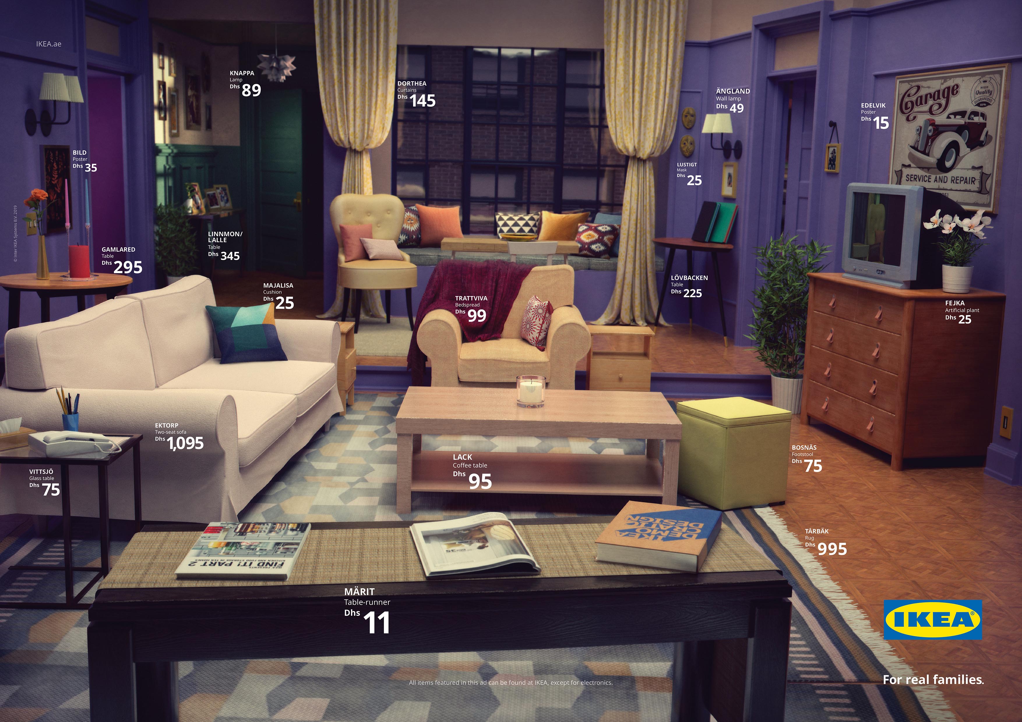
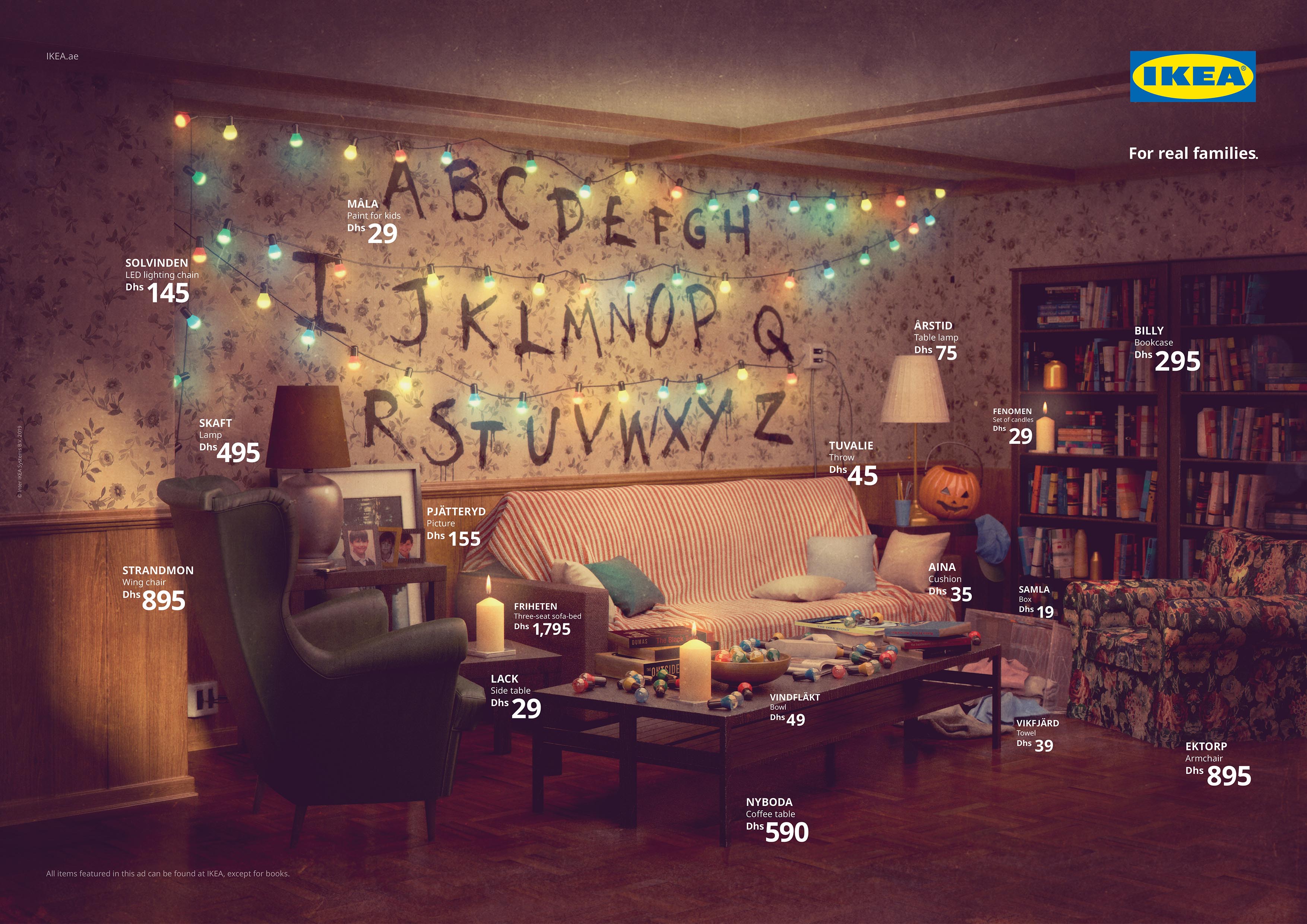
Ikea is well known for its refreshingly unconventional campaigns. This one, aimed at expat UAE customers who are less familiar with the brand, put a clever twist on the age-old concept of product placement by using Ikea furnishings to recreate some of pop culture’s best-loved lounges – including The Simpsons, Friends and Stranger Things.

Subscribe now & join our global community of creatives

The Female Company, The Tampon Book – Scholz&Friends Berlin

Another example of brand purpose done well, The Female Company’s subversive take on the tampon tax debate in Germany (which took the form of an illustrated book filled with tampons to avoid the usual 19% tax rate – books are only taxed 7%) saw it win big on the awards circuit this year. Beyond the campaign hype, it also helped to bring about real-world change, when the tax was finally changed in Germany in November.

Channel 4, Complaints Welcome – 4Creative

While trolling isn’t a new phenomenon, Channel 4 shone new light on the issue with its recent spot, which featured famous faces including Big Narstie and Grayson Perry reading out some of the more disturbing real-life complaints made about them. The message behind the ad feels all the more pertinent given the Tories’ recent threats about the broadcaster’s future, after it replaced a noticeably absent Boris Johnson with an ice sculpture during an election debate on climate change.

Lego, Rebuild the World – BETC Paris

Everyone’s favourite toy company made a splash in September when it launched its first ad campaign in 30 years. Shot by Traktor, the film had all the key components of a blockbuster ad spot. Alongside being filled with a plethora of delightful visual effects and creative in-jokes to please Lego fans, its more serious underlying message acted as a powerful rallying cry to society to help ‘rebuild the world’ we live in.

Spotify, Wrapped – in-house


Spotify’s end-of-year deep dive into how we stream music has become an annual event since it first launched in 2017, as everyone and their mother rushes to share their listening stats on social. This year is extra special though, as we bid a collective farewell to a whole decade. To mark the occasion, Spotify spotlighted some of the more memorable (and regrettable) musical moments from the past ten years in a series of well-executed poster campaigns and films. Beyond the ads though, Spotify users once again spread the message far and wide on social, with Spotify’s unusual description of music genres (pop rap anyone?) causing particular debate.

For the latest thinking & sharpest analysis subscribe now

The post Ads of the year 2019 appeared first on Creative Review.

MagCulture’s Christmas cards are raising money for the homeless

By Alice Bowsher

CR readers looking for an alternative to the usual grinning snowmen and plump robins can take heart in MagCulture’s take on the festive season. Designer Richard Turley and photographer Sophie Hur have gone straight for the heartstrings, with an image of a couple embracing, while illustrator Nina Carter has designed something cosy, but unconventional.

Lovers of minimalism will appreciate the typographic snow created by The Gentlewoman creative director Veronica Ditting, as well Tony Brook and Jonathan Nielsen’s stacked roof Christmas tree. Illustrator Alice Bowsher has borrowed straight from MagCulture’s London shop, taking its distinctive black-and-white floor as the backdrop for her piece.

By Richard Turley and Sophie Hur
By Tony Brook and Jonathan Nielsen
By Veronica Ditting
By Nina Carter

The cards cost £12, with every penny going back to Shelter from the Storm which offers free emergency night shelter to homeless people in London.

Buy the cards at magculture.com; stfs.org.uk

The post MagCulture’s Christmas cards are raising money for the homeless appeared first on Creative Review.

The Photography Annual 2019 is out now

BUY THE ISSUE HERE

The end of the year is in sight, which means the Creative Review Photography Annual is here. To set the scene for the issue, Diane Smyth gives a detailed recollection of the photographers, exhibitions and key trends that touched the world of photography this year, as well as the ways in which politics, activism and social change shaped proceedings.

We then present the winners of our annual photography competition: David Ryle, Todd Antony, Tommy Kha, Catherine Hyland, Enda Bowe and Sophie Mayanne. Each photographer takes us through their winning project in a series of insightful interviews that shed light on the methods and motivations behind their work. The issue also features the projects that captured the judges’ attention in our Honourable Mentions category.

Alongside our main competition, we also select six photographers for our Zeitgeist award, which goes to those who we believe have had a breakthrough year – including Ronan McKenzie, who photographed this year’s cover. Each thoughtful profile delves into their creative practice, their ambitions and, of course, their outstanding photography.

A feast for both the eyes and mind, the issue also comes with plenty of insights, advice and opinion pieces from leading industry voices, who tackle everything from disaster to fame, fickle budgets to leaps of faith.


BUY THE ISSUE HERE

The post The Photography Annual 2019 is out now appeared first on Creative Review.

Vertical video: creative tips from We Are Social

We Are Social has created vertical campaigns for some of the world’s biggest brands – from Audi to Google and Netflix. The agency’s specialists Sports division has also spent the past two years creating a wealth of Instagram Stories content for Adidas – from interactive look books to polls – and has driven 2 million consumers to the brand’s website in the process.

As part of our Create partnership with Facebook and Instagram – a new series which explores how to make great vertical videos – we caught up with We Are Social Sport’s Group Creative Director Gareth Leeding to discuss how Instagram Stories can be an effective platform for driving sales as well as telling stories.

Leeding also offers some advice on video length and creating standout content that works with or without sound.

This article is part of Create, a new content series from Creative Review, Marketing Week, Facebook and Instagram which offers advice on making brilliant vertical video content. See creativereview.co.uk/create for more insights and tips from brands and creatives 

The post Vertical video: creative tips from We Are Social appeared first on Creative Review.

The Traces Left Behind by Catherine Hyland

For almost two years, Catherine Hyland has been working on a project in New Malden, a London suburb that’s home to the largest population of North Korean defectors outside of the Korean Peninsula. In The Traces Left Behind, an ongoing series, Hyland hopes to capture a renewed understanding of this community, by documenting the rituals of a broad range of North Korean defectors. “It’s a visual testimony of the traces and rituals they cherish, which shape who they are and how they connect to their cultural heritage,” she says.

Around 600 defectors have settled in New Malden to build a new life, free from the regime. “People defect for political, ­ideological, religious and economic reasons. The brutality of the regime is impossible to ­imagine: starvation, propaganda and ­political pressure and punishments are just some of the extreme problems they face daily,” says ­Hyland. “Many talk of feeling like a stranger in a strange land. The concept of freedom is difficult to comprehend after decades of repression.”

The long-term project takes the form of chapters, and the first focuses on a senior citizen dance troupe and choir. Helped by art director Gem Fletcher, Hyland spent much time learning about the experiences of the community and building trust. Working with a translator was key in creating those relationships and forging new leads. “We connected with the Korean Senior Citizen Society, which is part charity shop and part education centre, running all kinds of lessons to help people in the community,” says Hyland. “There, we met some of the incredible older women who formed the traditional dance troupe and now practise their routines in the back of the shop.”

The dance troupe offers solace and joy for these women, and Hyland conveys this throughout the project. “These people connect through dance. By performing in front of each other they are putting themselves in a vulnerable position, but they are so enthusiastic, and that creates a really positive space,” she says. “Their determination to enjoy their lives and hold on to happiness is apparent in everything they do, and that shows such strength and purpose. It’s really touching.”

In this chapter of the series, Hyland captures the ­members of the troupe performing in a simple pastel-coloured set. “I was looking at the colours that appear naturally in North ­Korean architecture,” says Hyland. “Oliver Wainwright’s book Inside North Korea was a great resource in terms of studying the colour associated with the regime; these quite sickly pink, blue and green pastels are a recurring theme throughout.”

The result is a set of images that are mesmerising and graceful, and a celebration of rituals. “The aim is to promote acceptance, understanding and camaraderie between the resilient communities that reside in London,” Hyland says of the overarching project. “It is the simple things such as dance and sharing food that have established a democratic setting, whereby everyone is accepted. Here is a safe space for people to express themselves freely, no matter what their background.”

@cathyland1

The post The Traces Left Behind by Catherine Hyland appeared first on Creative Review.