New manifesto from David Shrigley (in the form of a book)

The arrival of a new book from David Shrigley is always a pleasant way to begin the week: titled Weak Messages Create Bad Situations, this latest tome from the artist is published by Canongate and features over 400 new drawings. As you might imagine, it is rather amusing…

Shrigley has found fame both within the art world and beyond for his witty yet surreal drawings, sculptures and installations. Humour is central to his art, making him an unusual proposition in galleries and museums, where chuckles are often hard to find. He has been hugely successful in these realms despite this, with a major retrospective at the Hayward Gallery in London in 2012 proving immensely popular. The release of this book precedes another significant retrospective in November, this time held at the National Gallery of Victoria in Melbourne.

There are several books of Shrigley’s work in existence, and print is the perfect format to view his drawings, which will initially make you laugh out loud, before you notice the dark profundity that lies behind the humour. The printed page was also apparently the first medium Shrigley chose for sharing his work, by creating booklets on a Xerox machine and selling them in the pubs around Glasgow, where he studied at Glasgow School of Art and still lives.

This new book comes in the form of a manfiesto, opening with the statement: “It is my duty to represent the world as I see it.” Shrigley then divides the drawings into eight chapters, where he takes on topics as varied as politics, the arts, and insects. According to the press release, the book proposes to be an antidote to the views of the “feeble-minded” people running the country who “don’t know what the hell is going on”. In this Shrigley is in good company, arriving at a time when extremist views appear to be particularly in vogue. Unlike some others however, Shrigley’s manifesto is full of hilarity, alongside observations about the world that are both astute and absurd. Here’s a selection of pages from it:

Weak Messages Create Bad Situations is published by Canongate for £25 as a hardback, or £19.99 as an ebook. More info is here. Fans of Shrigley also have the arrival of his Fourth Plinth sculpture in 2016 to look forward to, when he will deliver a 10 metre-high thumbs up to Trafalgar Square in London.

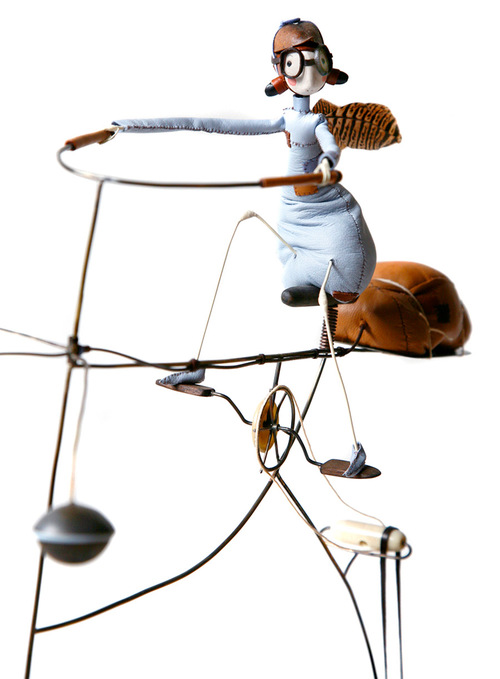
Samantha Bryan's Fairies

Samantha Bryan, designer and maker of fairies. { discovered on Mary & Patch }

From Germany with LUUV: Tim Kirchner on Starting a Tech Hardware Company in Berlin

luuvinprogress.jpg

Berlin has rapidly made a name for itself as one of the foremost cities for tech startups to ahem, start up. In addition, to the budding companies that call the German capital home, we also have heavy hitters such as Soundcloud, Eyeem, plus satellite offices of Twitter and Etsy for good measure. With such an array of software and online products I’ve been asking around—dewy-eyed as a newly minted Berliner—where are all of the hardware tech companies?

One answer is that they do in fact exist, the tech hardware scene is growing tremendously particularly as wave after wave of creative and technologically inclined young people flock to the city. I first came across LUUV, a promising group of Germans building a camera stabilizer for your trek through the Bavarian Alps or skateboarding in Alexanderplatz during the international betapitch global event in Berlin.

luuvwithlogo.jpg

The design philosophy of LUUV reads almost as a Design 101 case study on the importance of fast prototyping and direct user research. Fresh from a long series of pitch competitions and as new alumnus of the tech accelerator HARDWARE.co, co-founder Tim Kirchner shared his thoughts on 3D printing and skateboarding culture in Germany. In the interview below, Kirchner elaborates on LUUV’s success and the hardships of bringing a product to market, setting your sights on international distribution, and building a community from the ground up.

Core77: How did you guys started with LUUV?

Tim Kirchner: The idea of LUUV goes back to one of our co-founder Felix, who was filming with cameras like the GoPro. From the beginning, he was having this problem from the beginning that when filming with it either in the hand or attached to your head, you always end up with shaky, crappy footage you don’t want to show your friends. In December 2012, Felix was on a snowboarding trip to Austria, and built a little DIY stabilizer, basically a stick with a weight on it to film for fun around the cabin and in the evening. He was traveling with a friend of his who works a big media studio in Germany, when the friend was looking at the footage, he started saying, “Wow, it’s really impressive and stable.” That’s really where the idea of LUUV was born.

luuvwithgirlboy.jpg

(more…)

Kalimist K Boog Gives Funk a Modern Facelift: The Tel Aviv-based producer's debut album is a gritty, sexy affair

Kalimist K Boog Gives Funk a Modern Facelift


The words “hip-hop,” “funk” and ” Tel Aviv” usually aren’t uttered in the same sentence, but one musician is making sure it will soon become a commonplace. Daniel Kalimist has been flying under the radar for some time, DJing at local venues…

Continue Reading…

Didier Faustino adds "explosive architectural installation" to André Bloc's 1950s villa

A spiky red wall reminiscent of a cartoon explosion is one of two installations that French artist Didier Faustino has inserted in the grounds of a 1950s villa designed by architect and sculptor André Bloc (+ slideshow).

This Is Not a Lovesong by Didier Faustino

Didier Faustino is the latest in a series of artists invited by gallerist Natalie Seroussi, the current resident of Villa André Bloc, to create interventions in and around the architectural structures built by Bloc in the gardens of the residence he designed in Meudon, near Paris.


Faustino, whose previous sculptures have included a kissing clamp and a shipping-container tower, created two temporary additions at the villa – one in architecture, and one with lighting and sound.

This Is Not a Lovesong by Didier Faustino

The first is entitled This Is Not a Lovesong, after the Public Image Limited hit song of the 1980s. Comprising a red-painted floor and two adjoining red walls, the installation frames the entrance to an existing concrete folly.

This Is Not a Lovesong by Didier Faustino

The artist describes the piece as an architecture “framing a space waiting to be inhabited”.

This Is Not a Lovesong by Didier Faustino

It was built from brickwork with unrefined mortar joints, creating a texture that is visible through the paintwork. The bright red colour creates a striking counterpoint to the green tones of surrounding trees and bushes.

This Is Not a Lovesong by Didier Faustino

“This conjectural proposal reflects André Bloc’s architecture,” stated Faustino. “In one liberating movement, Bloc limits the place of the body in his architecture. That is the history of this place.”

This Is Not a Lovesong by Didier Faustino

Comparing the ambiguity of Bloc’s work between the fields of architecture and sculpture to his own, he said: “These days social structures are as responsible for regaining architecture as the physical body. The success of architecture as an imposed subject must end.”

This Is Not a Lovesong by Didier Faustino

“My proposal is therefore a sculptured event surmounting the sculptured habitat.”

Nowhere Somewhere by Didier Faustino

The second installation, Nowhere Somewhere, occupies another of Bloc’s structures. An array of neon arrows highlight all of the various exits, aiming to disorientate the visitor, while three whispering voices encourage them “not to trust architects”.

Nowhere Somewhere by Didier Faustino

Past artists invited by Seroussi to create installations at Villa André Bloc include Ernesto Neto, Mathieu Briand and Phill Niblock.

Villa André Bloc by André Bloc
The grounds of Villa André Bloc

Photography is by Felipe Ribon.

The post Didier Faustino adds “explosive architectural
installation” to André Bloc’s 1950s villa
appeared first on Dezeen.

Vapor Bath

The Vapo hopes to bridge the gap between lathering up with suds to washing them out. We tend to let the shower run even when we are soaping up and this is mainly because we want to feel the warm spray whist we lather. Its blatant waste of water, but we do it! No excuses mister! The Vapo provides vapor (or a warm mist) to keep us warm and damp, thus reducing the amount of water used in a single shower. Super excellent I tell ya!

Designers: Students of ZheJiang University


Yanko Design
Timeless Designs – Explore wonderful concepts from around the world!
Shop CKIE – We are more than just concepts. See what’s hot at the CKIE store by Yanko Design!
(Vapor Bath was originally posted on Yanko Design)

Related posts:

  1. The Water Vapor Project
  2. Vapor – the Steamer Insert by Jonathan Mello
  3. Plinth Bath


The Power of Cooking

The EtKøkken (Akitchen) is a unique kitchen that consists of three stations: a water station, a block station and a fire station. In essence it’s a tribute to the three elements that get a meal going. In the process, the basic kitchen utilities and functions are covered. Take a look at this new kinda layout…does it appeal to you?

Materials: Terrazzo, steel and wood.

Designer: Mette Schelde Studio


Yanko Design
Timeless Designs – Explore wonderful concepts from around the world!
Shop CKIE – We are more than just concepts. See what’s hot at the CKIE store by Yanko Design!
(The Power of Cooking was originally posted on Yanko Design)

Related posts:

  1. Autonomous Power Train Power
  2. New Age In Cooking
  3. The Joy Of Cooking


Hidden Unveiling Japanese Design by Nendo

Au sein du National Design Center à Singapour, le studio japonais Nendo a une nouvelle fois montré toute l’étendue de son talent avec une curation d’objets japonais mis en scène sous le nom de ‘‘Hidden – Unveiling Japanese Design ». Des objets simples et inspirants, mis parfaitement en scène par les designers nippons.

Hidden Unveiling Japanese Design by Nendo13
Hidden Unveiling Japanese Design by Nendo12
Hidden Unveiling Japanese Design by Nendo10
Hidden Unveiling Japanese Design by Nendo9
Hidden Unveiling Japanese Design by Nendo8
Hidden Unveiling Japanese Design by Nendo7
Hidden Unveiling Japanese Design by Nendo6
Hidden Unveiling Japanese Design by Nendo5
Hidden Unveiling Japanese Design by Nendo4
Hidden Unveiling Japanese Design by Nendo3
Hidden Unveiling Japanese Design by Nendo2
Hidden Unveiling Japanese Design by Nendo1

RH+ creates daycare centre with a crumpled facade

A crumpled white shell patterned with tiny perforations wraps around this cluster of small-scale buildings by French studio RH+ that form a children’s centre in Paris (+ slideshow).

Child care centre in Paris by RH+ architecture

RH+ designed the nursery to occupy an undeveloped piece of sloping land on Gustave Geffroy Street, in the south of the French capital.


Child care centre in Paris by RH+ architecture

The centre provides educational, play and health facilities for children aged up to three years old and their mothers, as well as housing for nursery staff.

Child care centre in Paris by RH+ architecture

“The main idea was to design several small volumes instead of a bigger one,” the architects told Dezeen. “This goes with the spirit of the Gustave Geffroy street, that gives the impression of being in a small town instead of Paris.”

Child care centre in Paris by RH+ architecture

The centre comprises a series of small buildings that are designed to blend in with the differing roof levels of nearby structures.

Child care centre in Paris by RH+ architecture

Three individual blocks house a community nursery and daycare centre with a capacity for over 100 children, as well as a healthcare centre for both infants and mothers, and on-site accommodation for the nursery manager.

Child care centre in Paris by RH+ architecture

A crumpled shell made from white fibre-reinforced concrete in an egg-box style arrangement surrounds the buildings. The architects designed the textured material to contrast the smooth facades of the main volumes.

Child care centre in Paris by RH+ architecture

“We wanted to create a material that interacts with the sun and the changing lights that also creates a link between the three facilities,” said the architects, whose previous projects include a university library with a timber-latticed facade in French Guiana.

Child care centre in Paris by RH+ architecture

Perforations in the facade allow light to filter through to the interior spaces, while maintaining privacy from the street.

Child care centre in Paris by RH+ architecture

On the interior, the architects have continued this textural theme with slabs of ceiling plaster that have tiny holes punched through the surface. The plasterwork provides an acoustic absorbent for the space, and conceals overhead cabling, lighting and air conditioning units.

Child care centre in Paris by RH+ architecture

Spaces for children in three age bands, ranging from three to 36 months, are marked by a change in the colour of architectural elements, mosaic tiles, furniture and signage. The architects used a spectrum of oranges, yellows, and light and dark red to differentiate the areas.

Child care centre in Paris by RH+ architecture

“Each category has its own colour, to help children to recognise their sections,” said the architect.

Child care centre in Paris by RH+ architecture

Large panels of glazing allow nursery staff to overlook terraces, play areas and nurseries.

Child care centre in Paris by RH+ architecture

“In a first instance it responds to a programatic requirement, as it is compulsory for a nurse to always have views of the other rooms and watch the children,” said the architect.

Child care centre in Paris by RH+ architecture

“But, we pushed the idea further to have an impression of an open space instead of a series of rooms. It contrasts with the opacity of the outside of the building.”

Child care centre in Paris by RH+ architecture
Site plan – click for larger image
Child care centre in Paris by RH+ architecture
Lower ground floor plan – click for larger image
Child care centre in Paris by RH+ architecture
Ground floor plan – click for larger image
Child care centre in Paris by RH+ architecture
First floor plan – click for larger image
Child care centre in Paris by RH+ architecture
Second floor plan – click for larger image

The post RH+ creates daycare centre with
a crumpled facade
appeared first on Dezeen.

LONGO

Longo is a modular system consisting of sofas, operative and managerial desks, with storage solutions (cabinets, libraries), accessories and sound abs..